Tag Archives: film noir

I’ll Be Watching You

I haven’t done anything creative in quite awhile. Life just kept getting in the way. I don’t know about you but not making things drags my soul down.  Everything becomes harder.  I needed something to raise my spirits.

I needed a simple artistic project to get back and feel like myself again, something that wouldn’t spiral into a huge task that would never get finished.

I’ve been reading these EC comic book collections recently.  They have fantastic art and stories from the early to mid 50s.
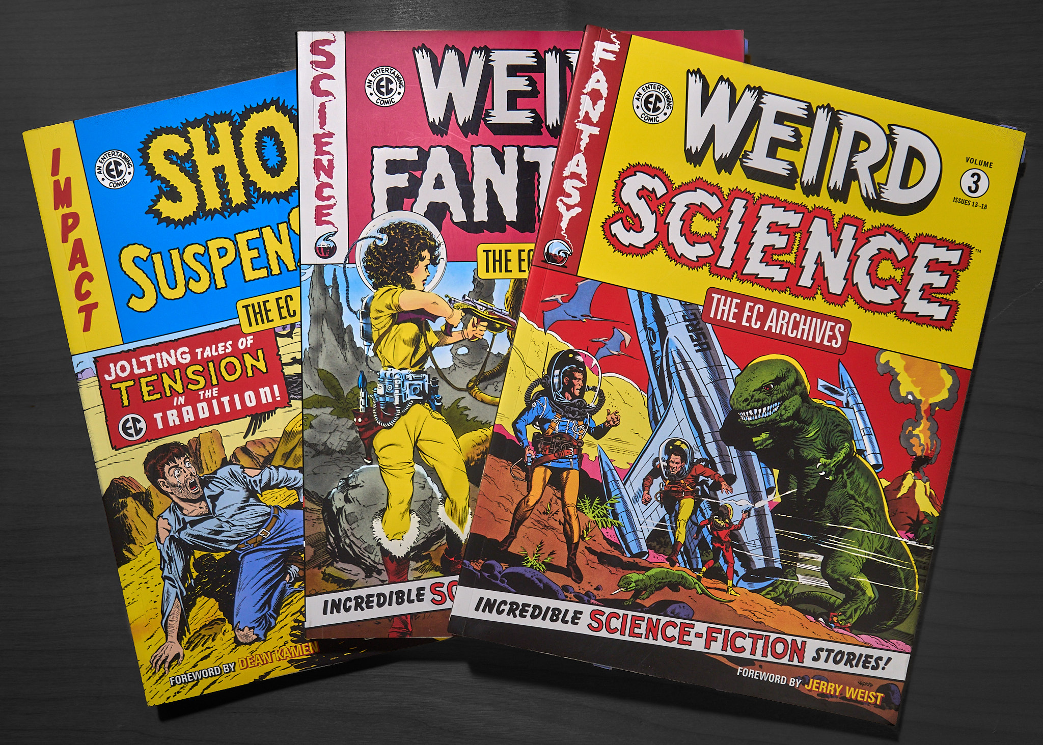
On the back of one of them is this image:
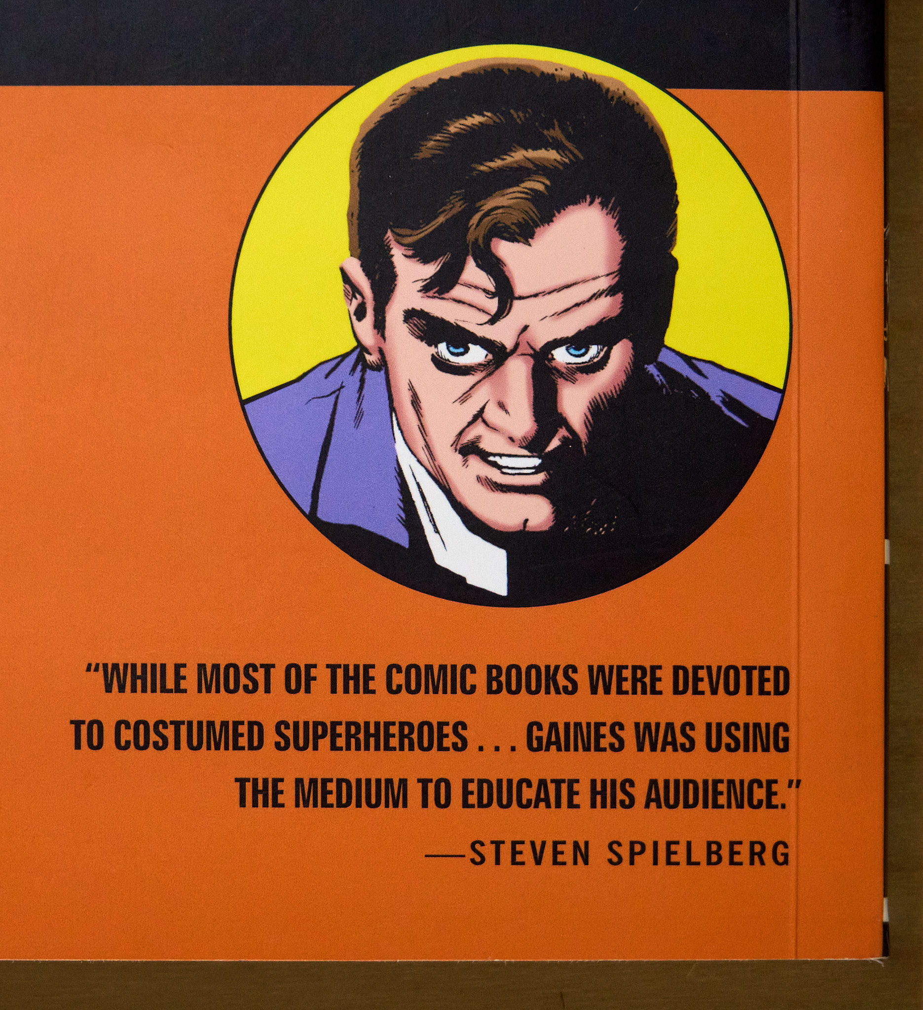
A simple portrait.  One character.  Exactly the kind of thing I should try to do.  I imagined an image like this printed three feet square on the wall.

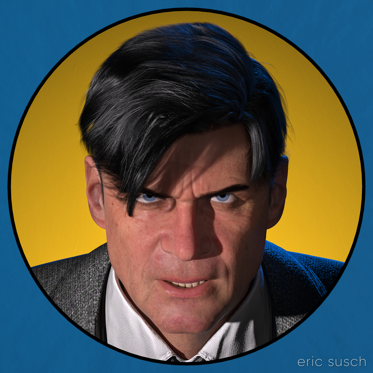
A realistic computer graphic version of this seventy year old drawing would be interesting.  The circular graphic element would call back to the drawing’s comic book roots and it could also reference the modern avatars of social media.  Mixing a realistic character with flat graphic elements would be interesting too.

I could create the graphic elements in photoshop of course, but I wondered if it were possible to build the whole thing in 3D… all “in camera” so to speak.

I fired up my computer…

After setting the character in DAZ Studio and lining up the camera, I created a cylinder one meter in diameter for the background yellow circle.  I parented it to the camera and moved it down the lens axis until it was the proper size behind the character.  The exact procedure is this:

  1. In the Scene Tab menu select Parenting and UNCHECK Parent Items in Place.  Most times you want this checked so that when you parent something it stays where it is, but this time you don’t.
  2. In the Scene Tab drag the object to the camera to parent it.
  3. The object will move to the camera position.
  4. You can then drag the object exactly along the axis of the lens and position it as far away as you want.  The object will always stay in view and centered even if you move the camera.
  5. Lastly, make sure you re-check Parent Items in Place so the next time you parent something it doesn’t move.
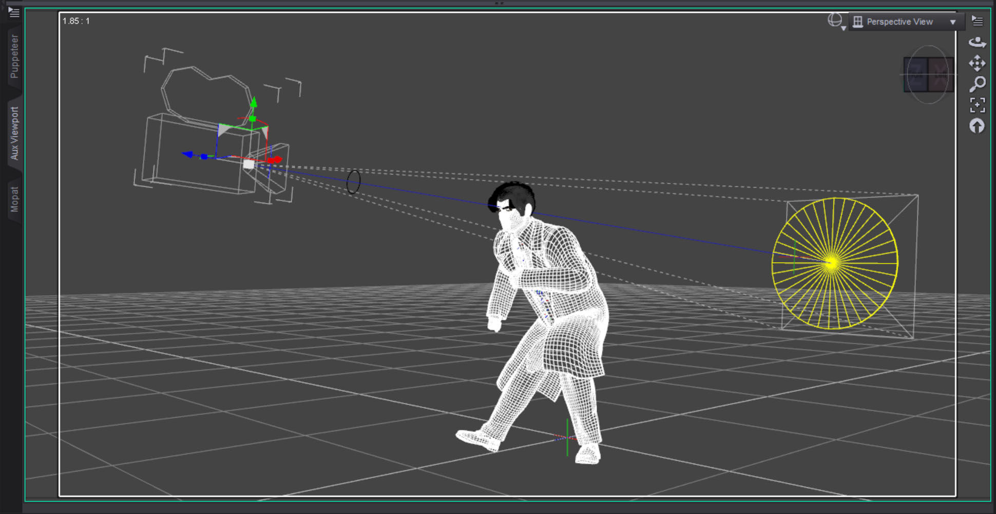
I then created a torus with a ten centimeter diameter for the black line and parented it to the camera in front of the character.  I lined up the black line so it just covered the edge of the yellow circle.  It worked perfectly as this test render shows.
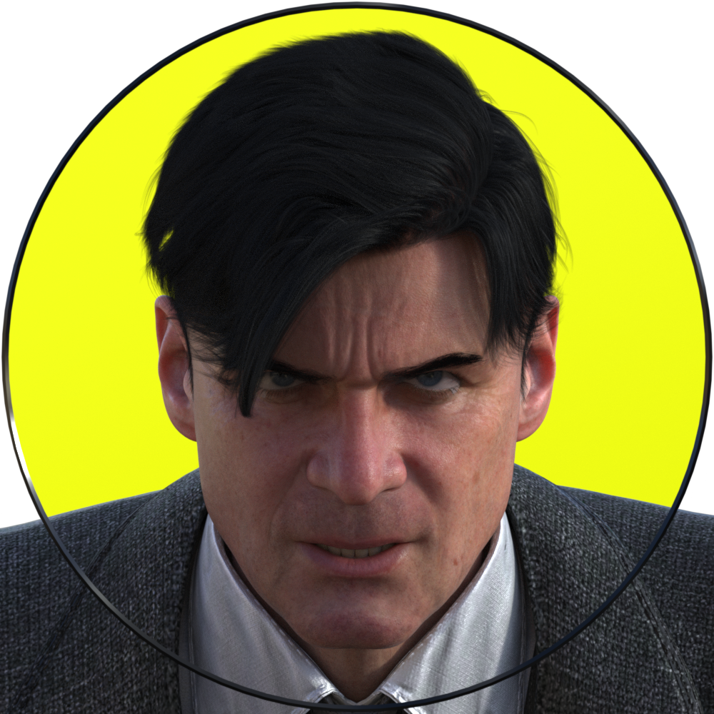
If you’re trying this at home, make sure you have Depth of Field switched OFF in the camera, otherwise it will destroy the illusion.  Everything needs to be in sharp focus for this to work.
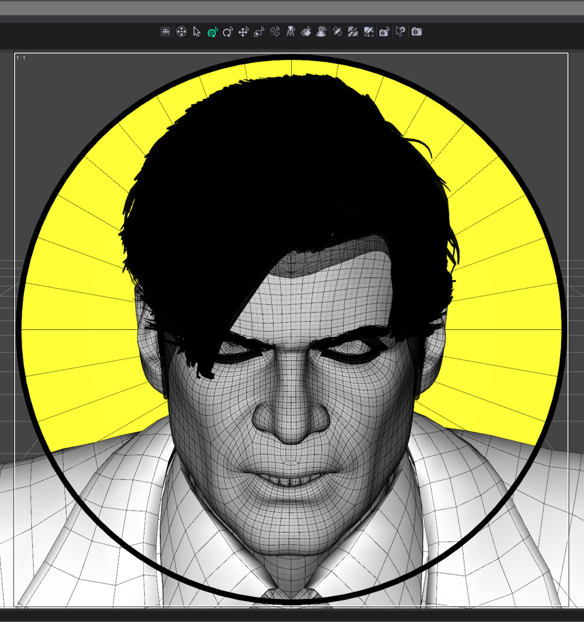
I originally imagined the image to be just a circle with the outside corners transparent.  I needed to eliminate the characters shoulders though.  At first I thought I could just eliminate some of the geometry but I couldn’t do that with a precision that could be hidden behind the thin black line. I decided to create another graphic element covering the outer edge, in front of the character.
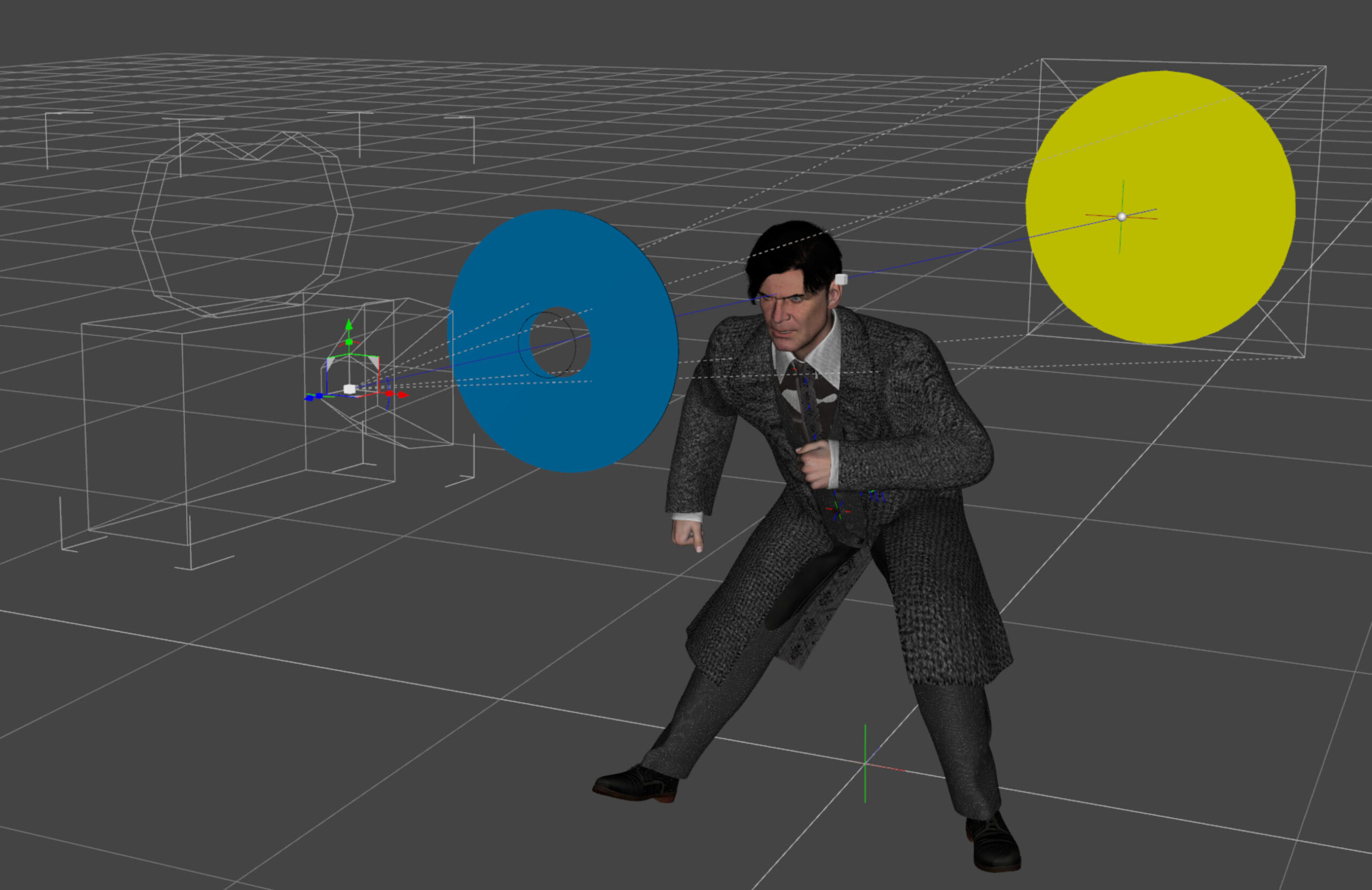
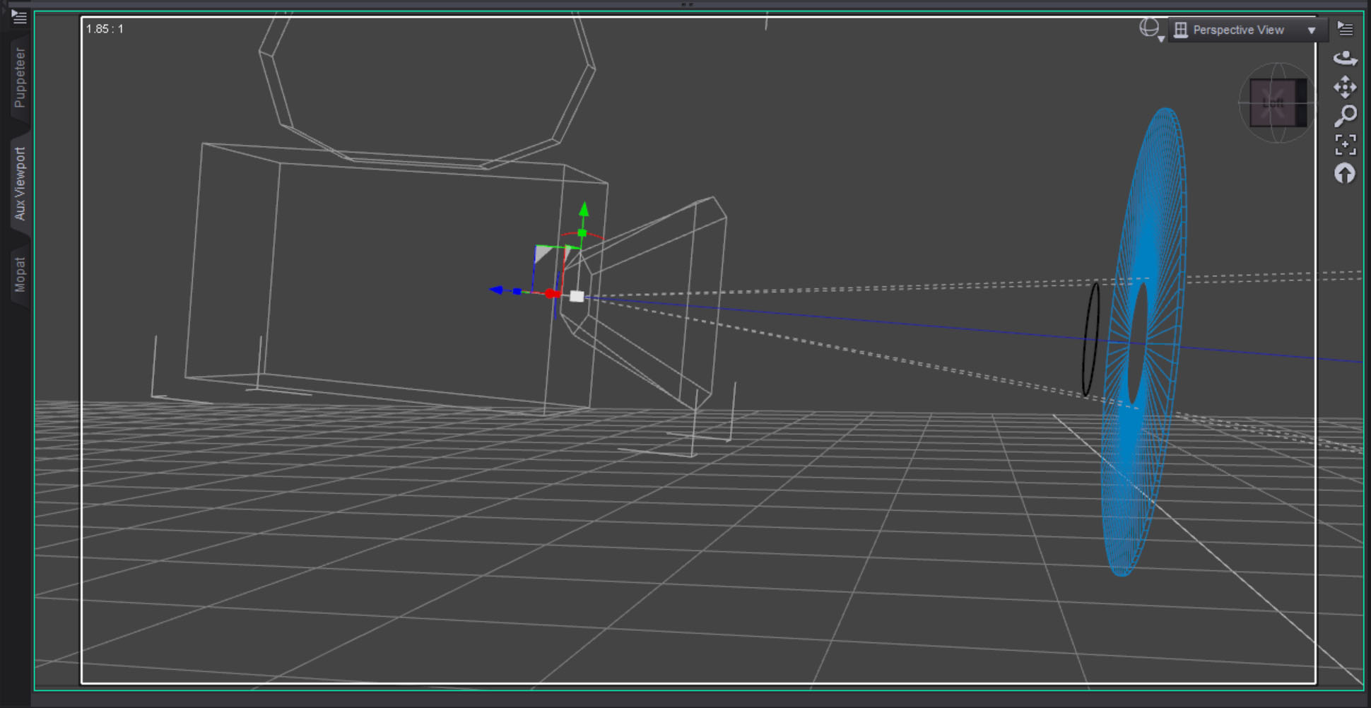
The blue surface was created with a three sided torus that was scaled flat along one axis.  The center is eleven centimeters, slightly bigger than the black circle.  I wanted to make sure the black line could sit in front of and separate from the blue torus.
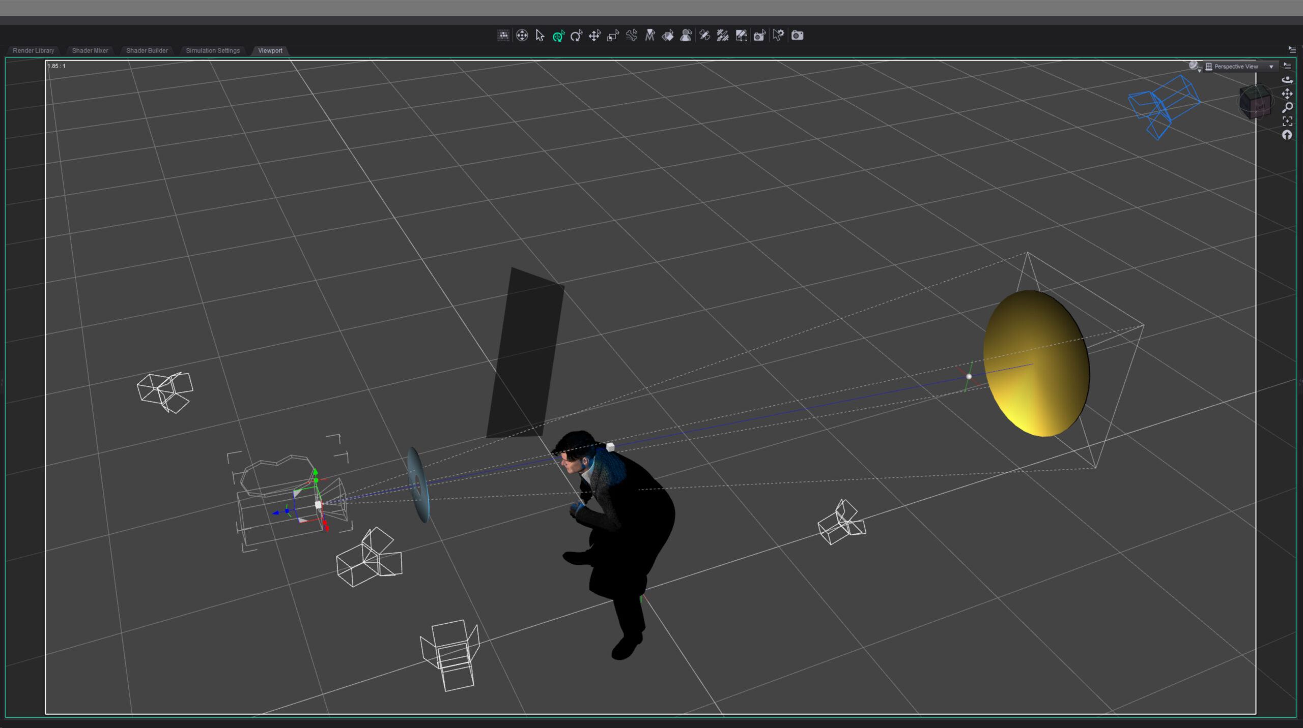
I lit the character with three lights: a hard key light from the side to suggest a noir style, a backlight to bring out the hair and jacket, and just a bit of fill on the face.  I decided to make the backlight blue because I thought a blue highlight would suggest how black hair is colored in comic books.

Finally I set lights for the graphic elements.  I wanted the blue foreground light to be even across the object but I had to light it from the side to keep it off the character.  I didn’t think it would work but after a bit of tweaking I was able to get the light relatively even.

For the yellow background I wanted the opposite.  I set the light low and shot it up across the surface, creating a gradient effect.
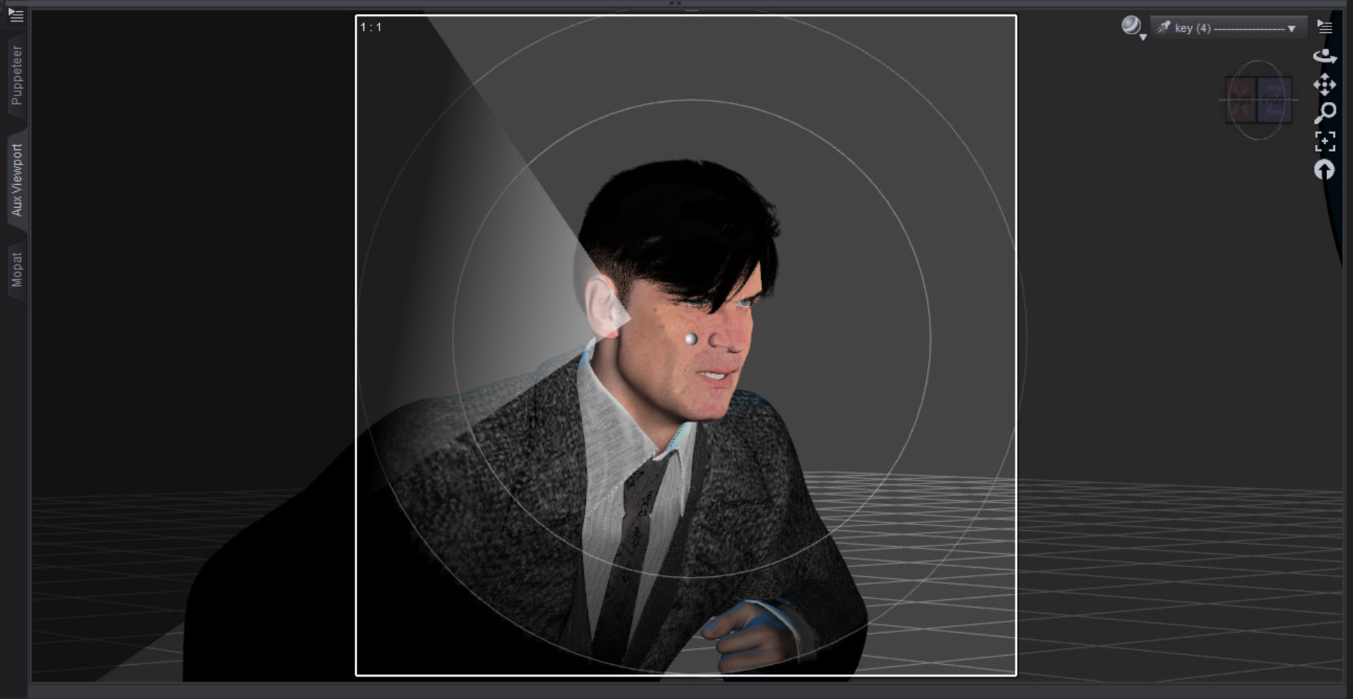
The hard key light on the face looked a little flat on one side so I created a simple plane to make a “flag.” I parented it to the key light, then brought it in just a bit to break things up.  I reduced the surface Cutout Opacity to make it semi-transparent and only block some of the light.  I guess that makes it more of a “net” in filmmaking terms.
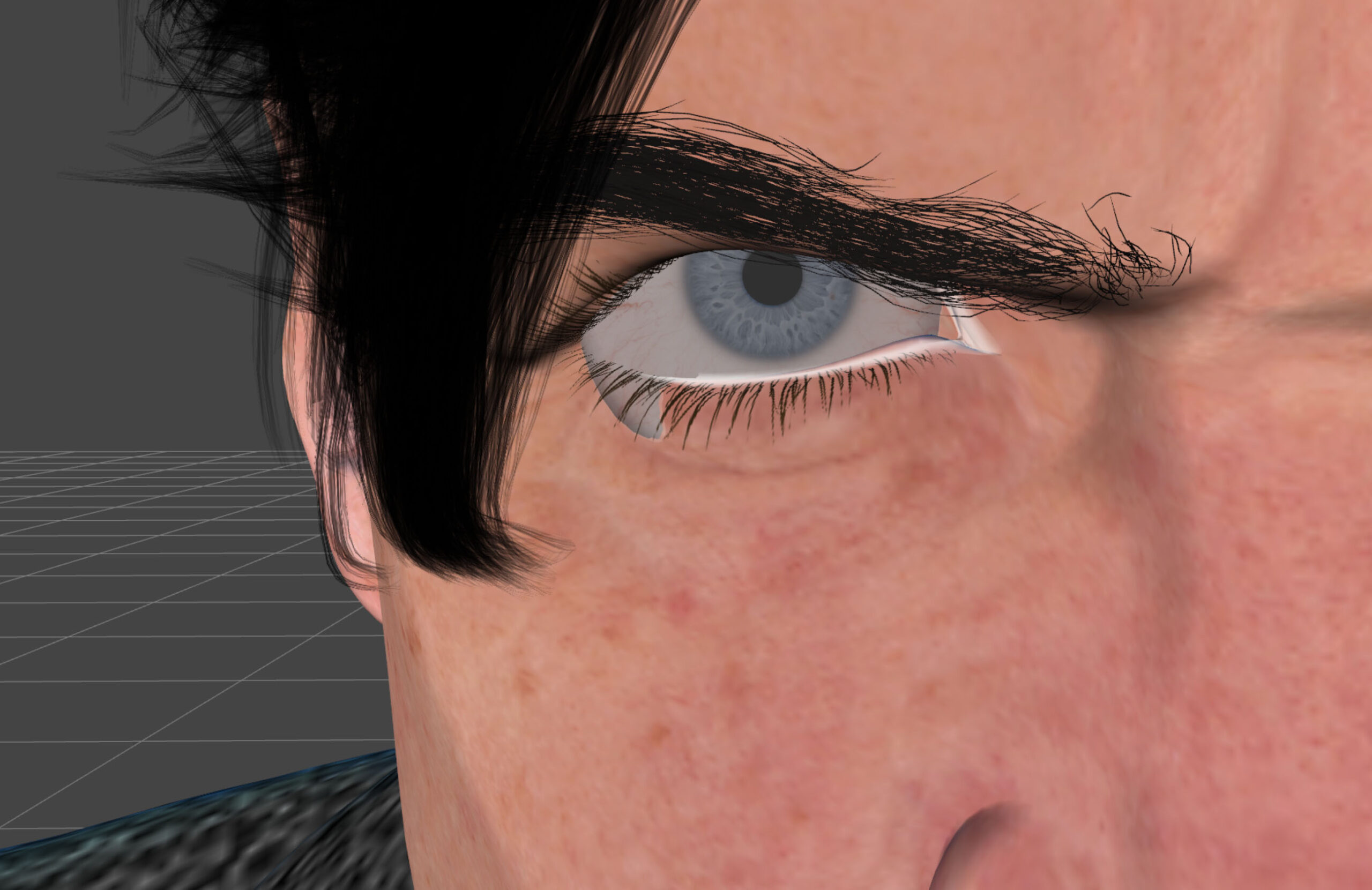
At one point I had this strange problem that I never had before where the eyeballs were hanging out of the sockets on either side.  I thought it might be a problem with the expression settings I was using but that turned out to not be the case.  I never figured out what it was.  I solved the problem by translating both eyeballs in slightly.
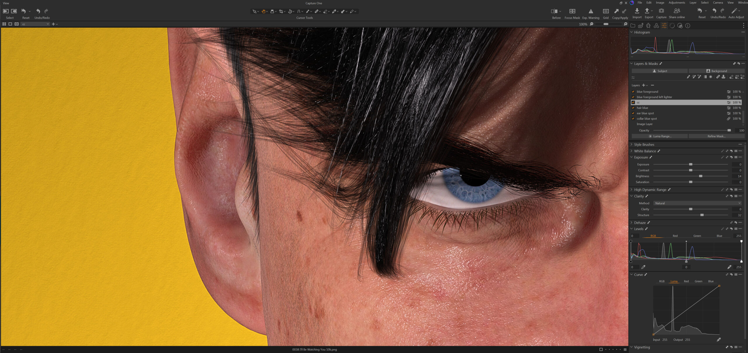
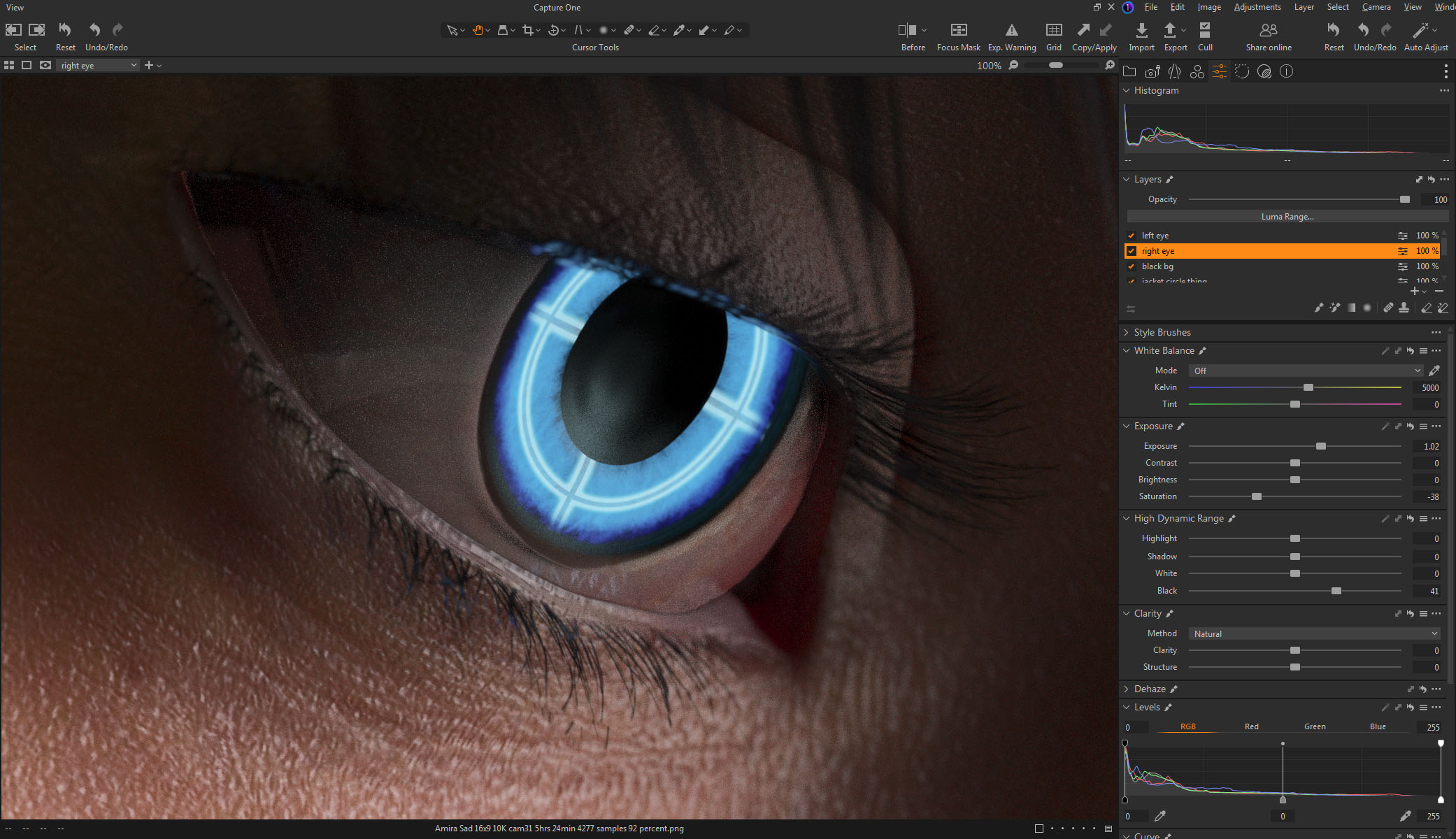
Color correction in Capture One was relatively simple.  I brightened up the character a bit and re-balanced the lightness of the graphic foreground and background separately.  I also combed over all the minor details and fixed any small imperfections.  If I print this big you will be able to see everything.

Overall I’m quite happy with the way this image turned out.  It feels good to be creating again.

Created in DAZ Studio 4.24
Rendered with Iray
Color Correction in Capture One
 

Mysterious Stranger

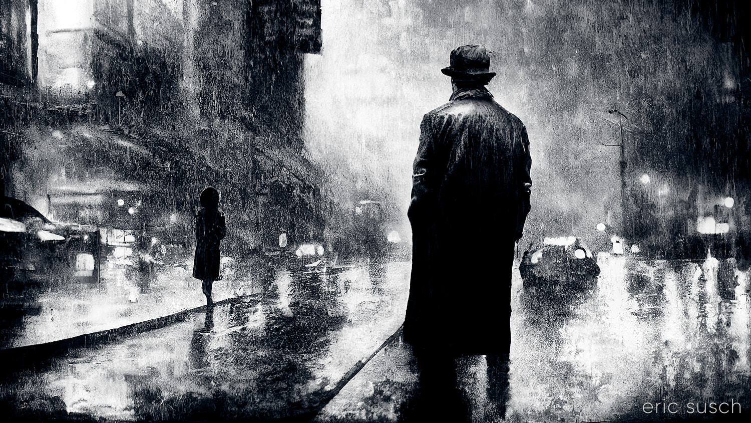
Looking back at some of my earliest AI renders and scrounging thru the thousands of rejected varriations, I’ve been finding several interesting pieces.  This was a test image created when Midjourney was developing a “remaster” feature two years ago.  It’s a variation on the second image I ever created, re-rendered using a later Midjourney model… maybe version 3 or 4, I’m not sure.  Of course that newer version is now old and instead of seeing the improvement in the technology I’m looking at this render with new eyes and seeing it for what it is.  I love the texture and contrast of the whole thing so I fixed up the composition and re-did the color correction.

Personally I’m getting less excited by the newest versions of Midjourney.  The development seems to be barreling toward pure photographic realism, losing all the interesting artistic textures.  I’m going to have to try to find ways to add additional prompts to get some of the abstract goodness back in current version 6.1.

#Art I made with #Midjourney #AI

Is This The Life We Really Want?

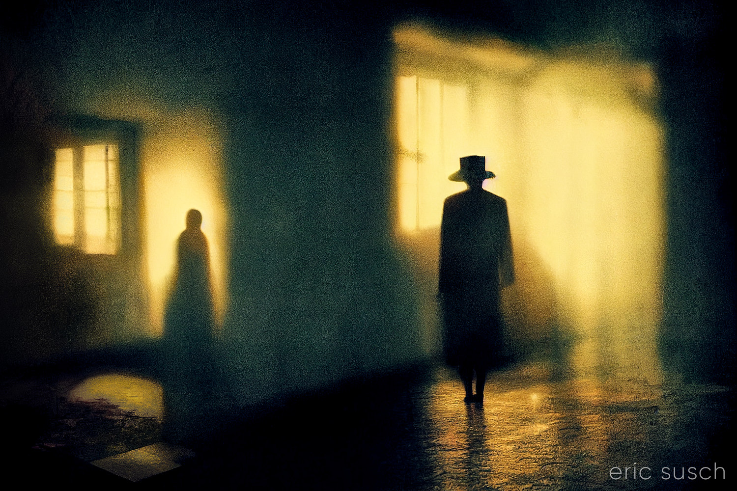
I’m still trying to make some of my CGI art look like it’s from a motion picture.  What makes something look cinematic?  Color?  Framing?  I’m still not sure.  That’s what I was experimenting with in this portrait – a real person, in a real location, in a movie…  A simple moment from a larger scene.

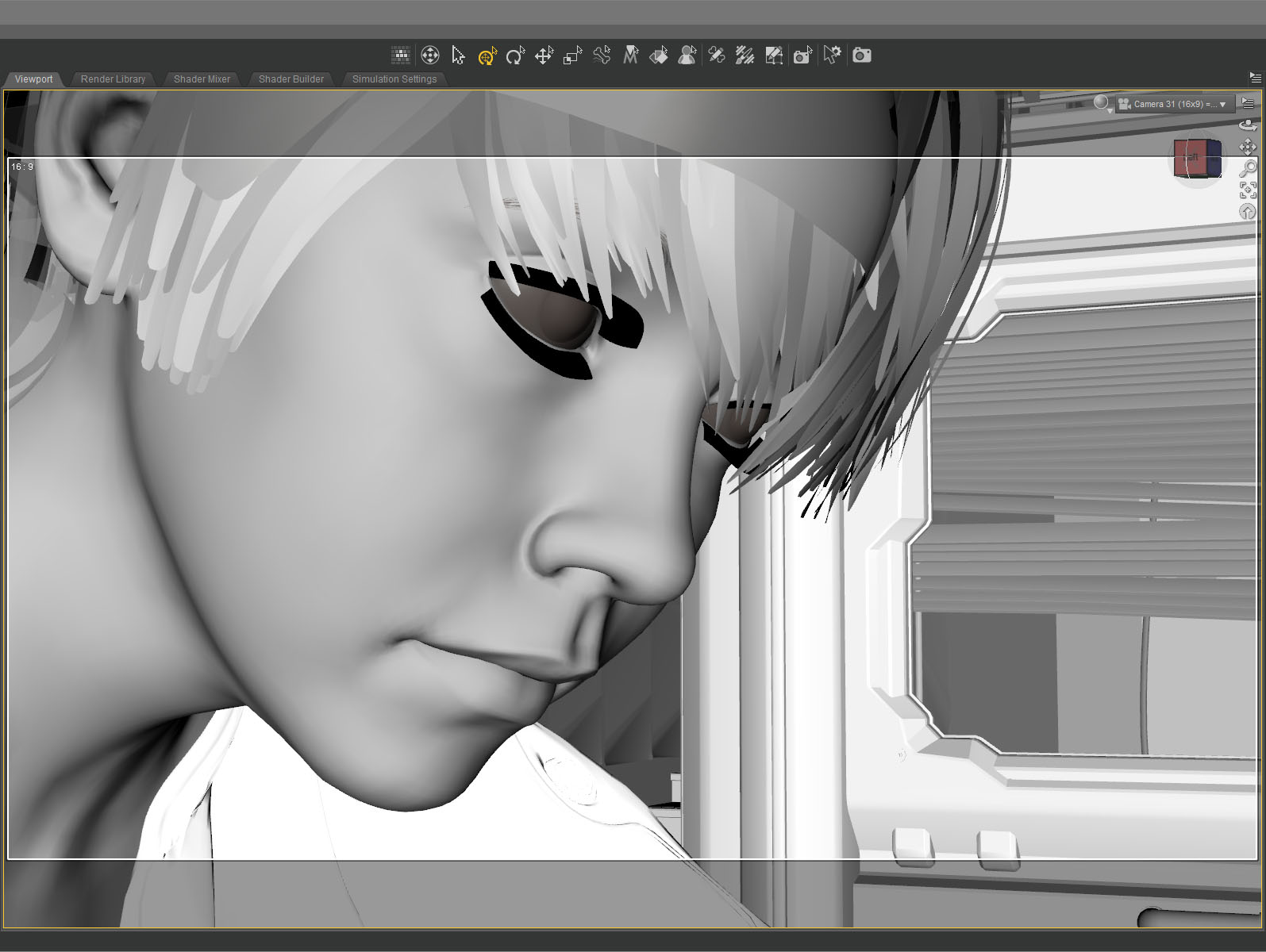
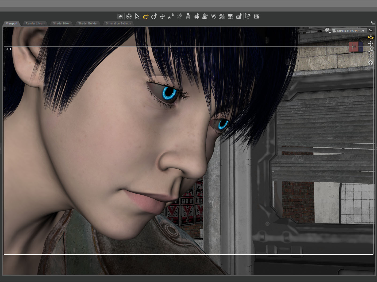
The setup was simple: face, hair, jacket, background.  I set the camera lens at 100mm, 16×9 aspect ratio and found a good closeup.  I messed with the depth of field quite a bit to get the background soft but not too soft (this isn’t a DSLR movie.)

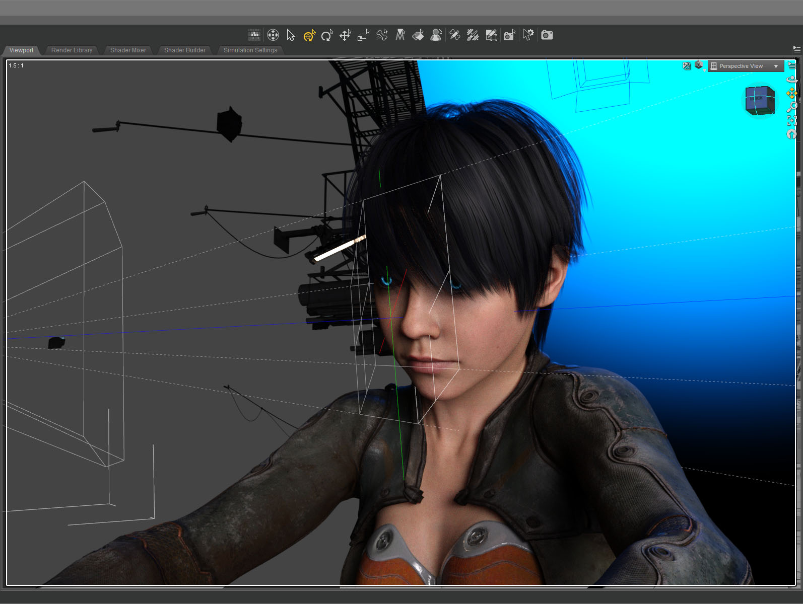
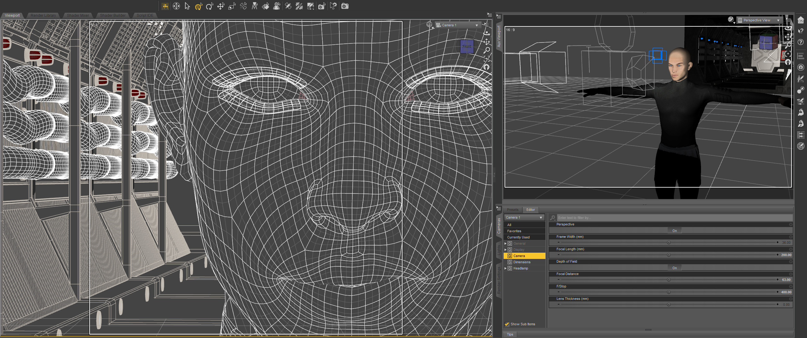
The green line in this screenshot shows how the camera (on the left) is focused precisely on the nearest eye and the two planes show the narrow depth of field on the face.  The other eye is slightly out f focus.

The blue in the background is the soft blue backlight. I used only three lights, a key light on the face, the back light, and a light in the window.  (And the eyes light up too.)  No fill light.

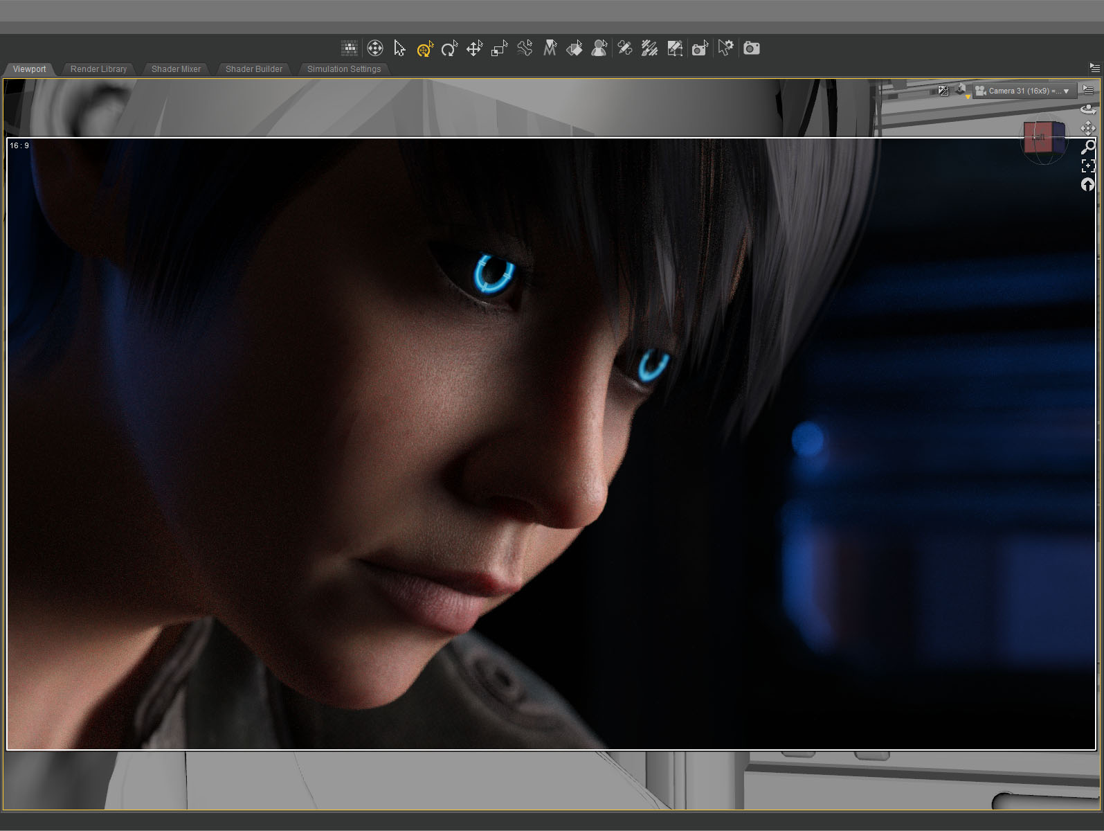
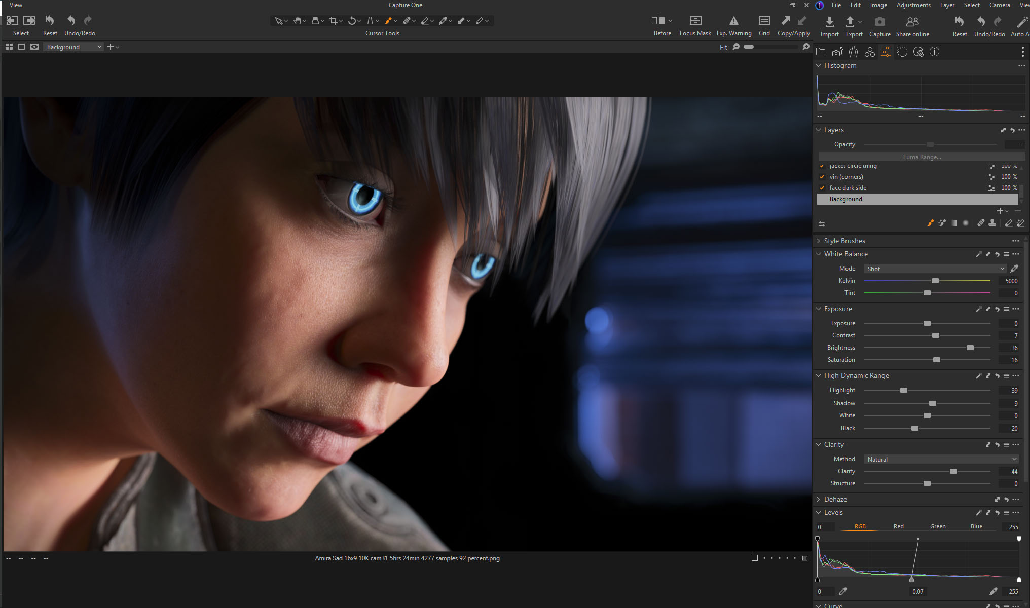
This screenshot shows how the initial render looked before color correction. It’s quite dark which means it takes longer to render but I liked the quality of light so I went for it.  It took about five and a half hours to render the final file at 10800 x 6075.    I stopped it at 4277 samples and 92 percent convergence even though my minimum is usually 95 percent and/or 5000 samples.  It didn’t look like baking it any more would make a difference.

The whites of the eyes ended up quite dark in the render so I brightened them up in post.  The eyes are a really old product and I don’t think I updated the reflectivity on the sclera quite right to render properly in iray.

I also pulled the background completely black because I thought the muddy dark shapes distracted from the face.

This is the part of the post that I feel I really should evaluate the final result… then I decide not to say anything because I can only see the mistakes.  After a few months not looking at it, I’m sure I’ll be able to figure out if I love it or hate it, but not now…

Created in DAZ Studio 4.21
Rendered with Iray
Color Correction in Capture One
Music in the Metaverse

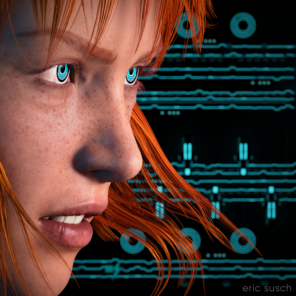
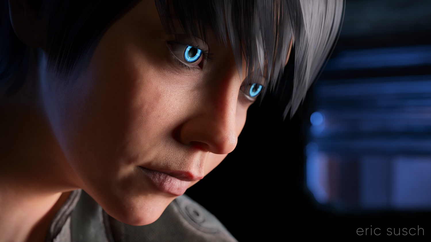
I think my CGI images tend to look better when I have something in closeup.  It avoids the “medium shot of a character just standing there” that I struggle with.  For this piece I started with an extreme close up and added cool robot eyes and dramatic flowing hair.

I also wanted a graphic background, something flat, technical.  I have an ongoing issue with backgrounds.  I get creatively stuck and I don’t know what to put back there.  I end up trying scores of different things and nothing works.

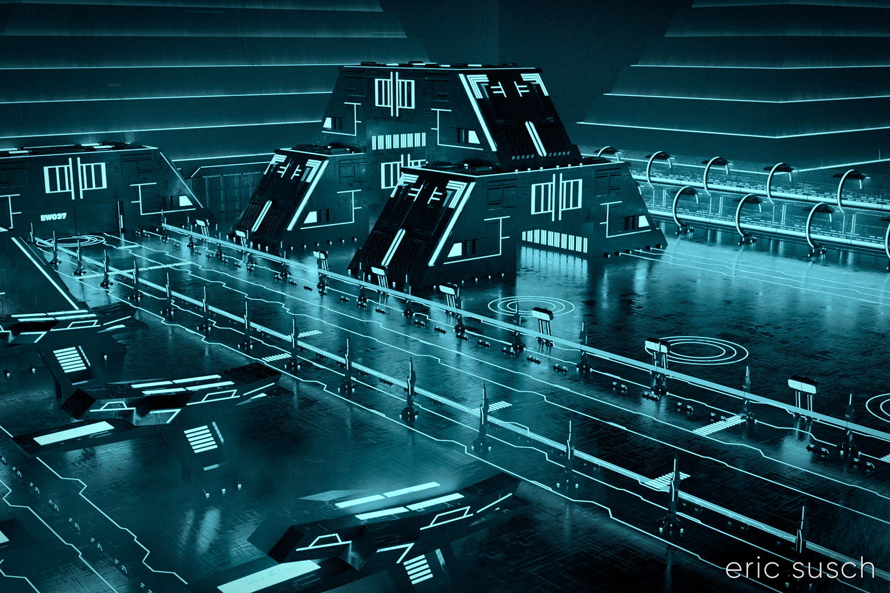
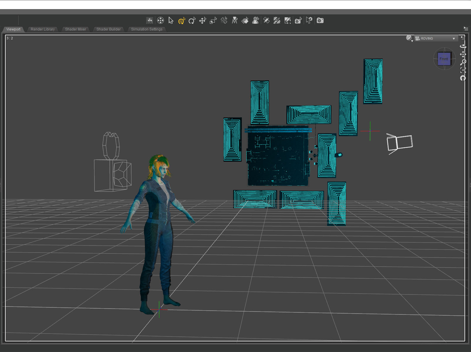
What I ended up using here was actually a huge Tron like cityscape.  The shapes and lines are actually building size structures seen from the top.  This is what the cityscape looks like normally.

The entire environment is standing on it’s side waaaaaay far away.  I turned on and off different elements depending on what looked good.  It ended up being a real hassle having the background so far away though.  Making adjustments took a long time.  (I went back and figured it out.  it’s 1.8 miles away!  …or 3 kilometers)  I should have scaled down the whole thing and moved it closer.

I named it Music in the Metaverse because the graphic lines in the background ended up looking similar to a music staff.

Created in DAZ Studio 4.20
Rendered with Iray
Color Correction in Capture One
Mister Zero

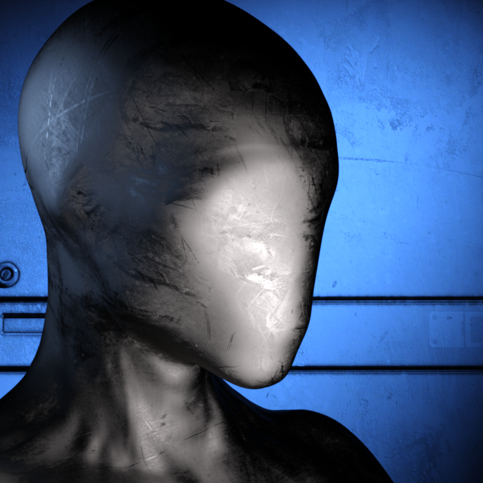
Mister ZeroMy eternal quest for the perfect CGI avatar continues.  I’ve grown tired of my current avatar artwork.  People think it’s a picture of me and I have to explain that it’s CGI.  I need something that doesn’t look human.  Perhaps something creepy…

What to do?

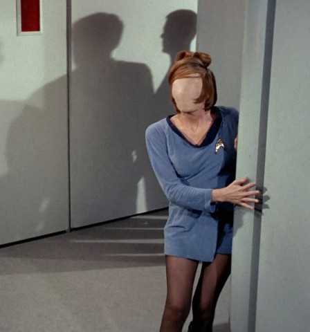
Mannequins and faceless people have always freaked me out ever since I was young.  I attribute that to this scene from Star Trek…

charliexhd487crop…and the Anything People on Sesame Street.

A freaky “no face” avatar would be cool and no one would think it was supposed to be me.  Perfect!

Building a Mannequin

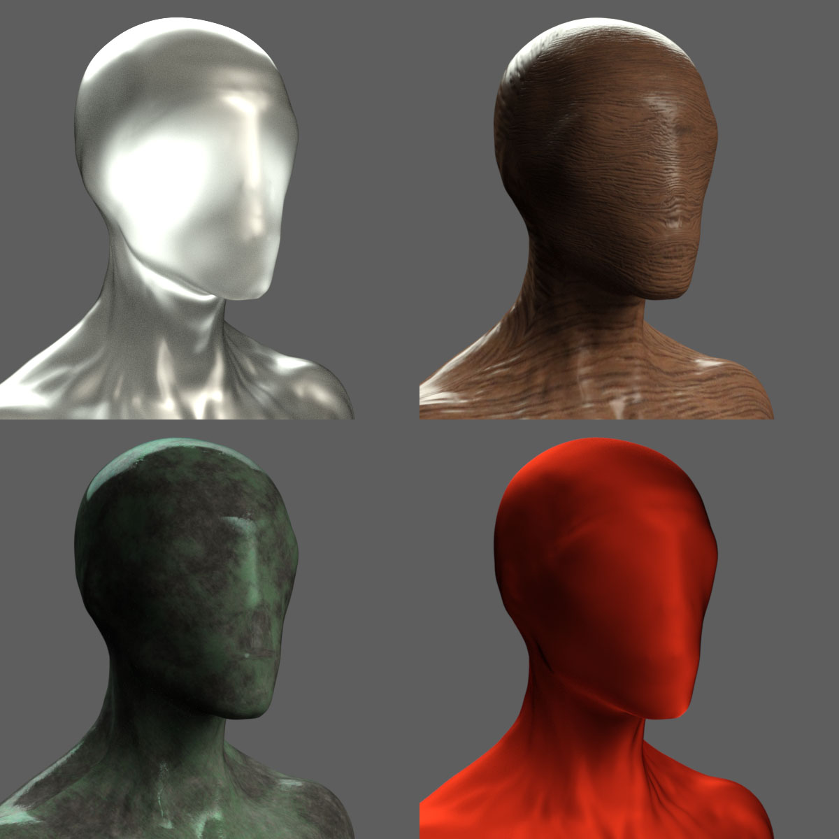
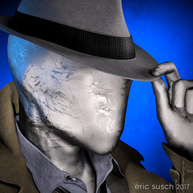
I started with a faceless character model I had and I replaced the skin like surface with a different shader.  I experimented with many, many different surfaces trying to find something cool.

no face shader test 01I tried cloth, wood, metal, rock, plastic, glass, grunge, paint, rubber, wax, anything I could think of.

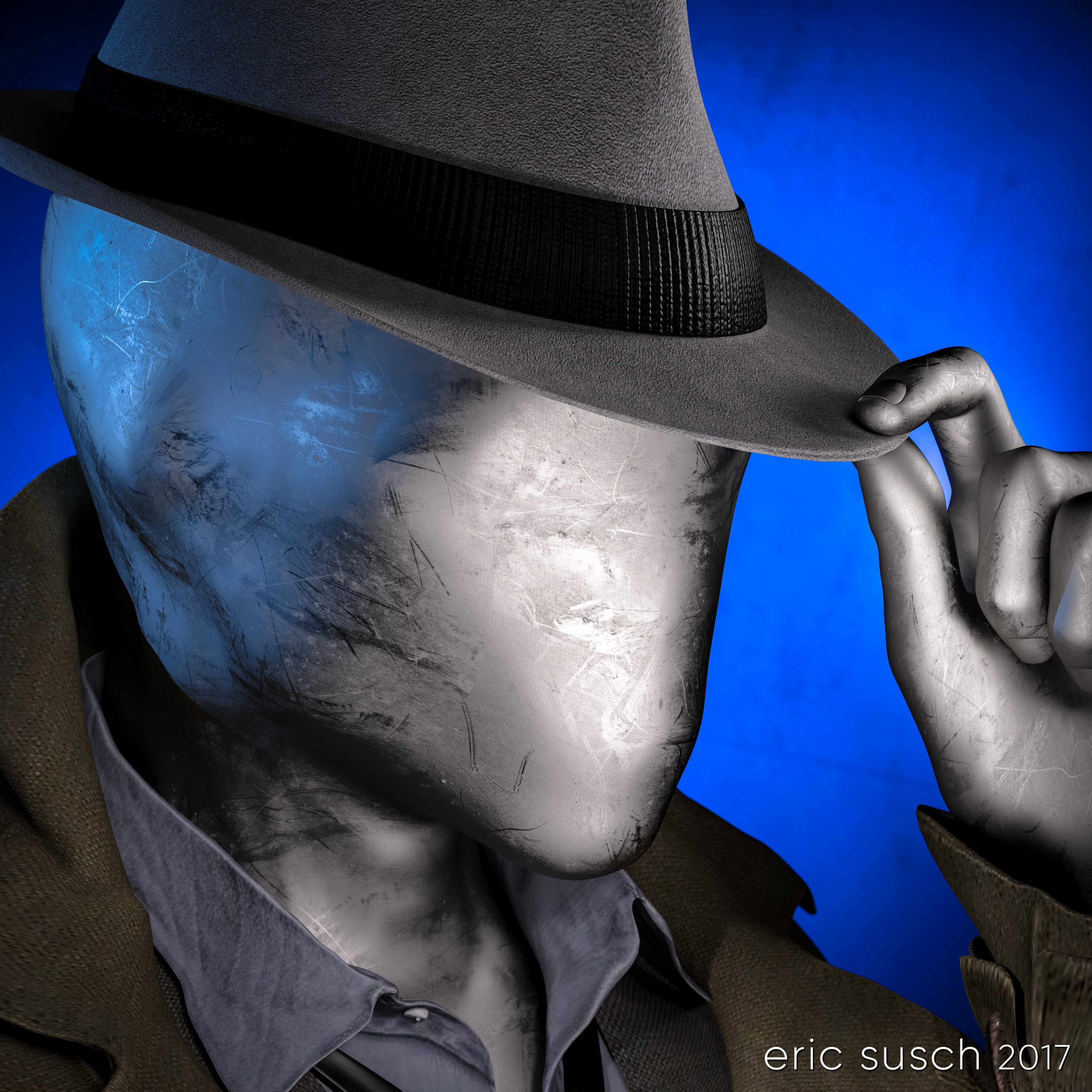
no face shader test 02I tried to avoid chrome because I had done that several times in the past but in the end I caved, because I really liked this particular dusty anodized aluminum surface.

no face 02 chrome headI posed the figure tipping his hat with a 1960s fedora.  I wanted him to be creepy and friendly at the same time.  A sloppy overcoat and loose necktie seemed to fit so I added that too.

no face 01 test 03 dome and sceneGive that man a hand

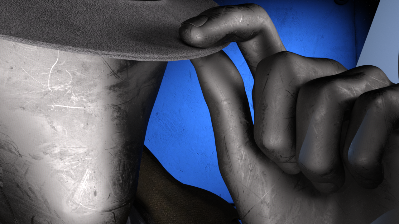
The fingers of the alien no-face character were creepy long, which looks OK but I like to make everything difficult so I decided to try and replace the hand with one that was human sized.

To do that I had to add another entire human sized figure and position the hand in the same place, grabbing the hat.  It took awhile but I got it into position.  Then I “turned off” (made invisible) the rest of that human character.  For the no-face character I turned off the hand.  The sleeve of the jacket was just long enough to hide the fact that the arm and hand didn’t meet exactly correctly.  Everything came together when I layered the same aluminum shader on the human hand.

hand shader tile 08 looks goodDramatic Light

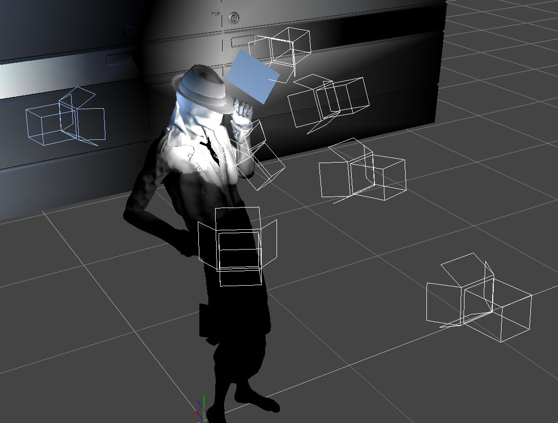
The lighting was difficult because of the reflective metal on the face.  I ended up with a lot more spotlights than usual for a simple head shot just to get the reflections right.  There are seven spot lights on the character and one blue spot on the background, which is just a gray wall panel.

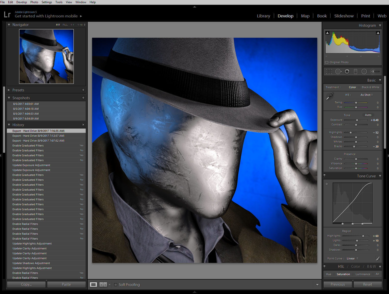
no face BTS lights After rendering it out I pumped up the color a little in Lightroom…

Mr Zero cc lightroom BTS…and uploaded the avatar to Facebook.

facebook avatar

Unfortunately I saw almost immediately that you couldn’t tell what the picture was at very small sizes.  It was the high contrast lighting, the same problem I had before on my first CGI avatar.  It looked fine at larger sizes but when it was super tiny the bright shine of the face looked like an unrecognizable white blob on a blue background.

Flat Light

I went back into DAZ Studio and tried to even out the lighting.  The best way was to set up a few more lights to fill in the dark spots.  I didn’t like it as much when I was done but I rendered it out anyway just to test it on facebook.  This is the “flat light” version.Mister Zero (flat light)It worked better at small sizes as you can see but still not as well as other avatars I’ve created.  Humans are programed to recognize faces easily, which is why facebook can make their avatars so small.  I’m asking people to recognize “no face” so I guess that’s more difficult.

facebook flat light avatar 02So it sort of works at the tiny sizes and doesn’t look as good as it could at larger sizes.  I guess that makes this avatar attempt a bit of a failure.  I still like it though, so I’m going to keep it for a time before I try again.  I can also upload the first version to other sites that don’t have such small avatars.  What do you think?

Mister ZeroCreated in DAZ Studio 4.9
Rendered with Iray
Color Correction in Lightroom

Figures used:
The Slim Man for Genesis 3 Male
Mec4d PBS Shaders vol.3 for Iray
Amazing Hat
Eldritch Seeker

The Future Starts With You

The Future Starts With Youout of focus art SQUAREI’ve been using the same avatar across all of social media for many years.  It’s not very good.  If you look at the original it’s actually out of focus, but you can’t tell when it’s a teeny tiny avatar on facebook.  My wife CAT is in it too, which is nice.

I always intended to replace it but it was working, doing it’s job, so I didn’t.  When I shaved my beard over a year ago I thought, “Well now it doesn’t even look like me.  I really need to make a new one!”  But it was still working.  People still knew it was me.  So I didn’t change it.

Cut to a few days ago.  I was in DAZ Studio and I decided to experiment with different ideas for a new avatar.  I figured I could come up with some “concept art” and then take a picture of myself with the same theme, same lighting.  Simple.  Maybe even use the same CGI background so I wouldn’t have to deal with that in the photograph.  But, what to do?

What Makes a Good Avatar?

To all those people who have their kid, or their dog, or cat, or a movie star, or an anime character, or their feet, or a sports team logo, or Abe Vigoda in their avatar:  Nobody can figure out who you are!  I go through this all the time.  The name sounds familiar…  Did I know this person in college?  Did we grow up together on the same street?   Did we work together ten years ago?  Is that YOU as a kid?  Or is that YOUR kid?  Now I have to be a detective.  It’s frustrating.  Put your friggin’ face in your avatar!   /rant

Square One

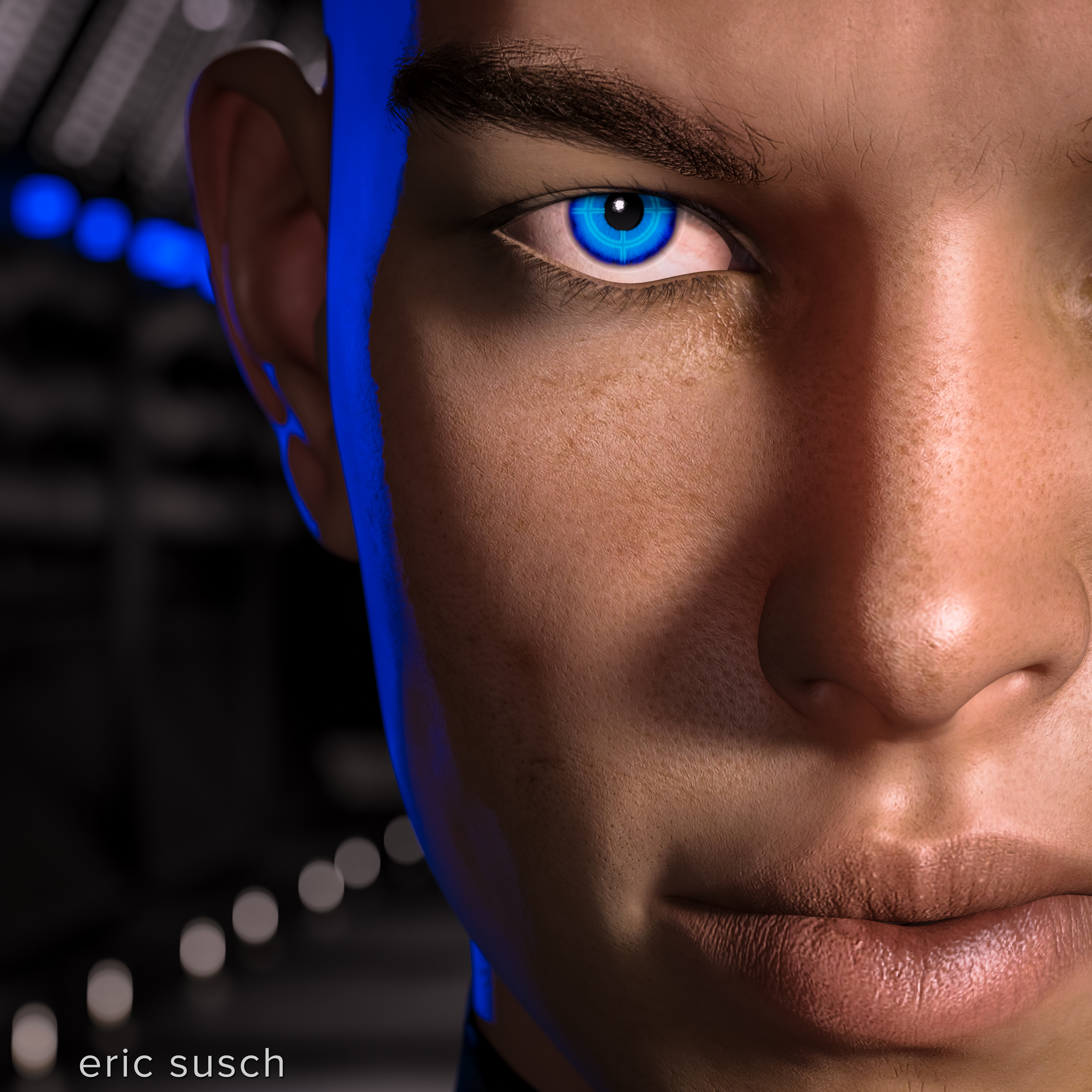
I like an avatar with a big face so I started with that.  The bigger the better because sometimes these things are super small.  I decide to try something similar to what I have now, an evolution if you will – the same but better – a big face but a little arty and off to the side.  Centered is so boring.  I used a long 200mm lens to blur the background, making the face stand out.

The Future Starts With You BTS (mesh)I decided to go for hard side light with a blue kicker (back light) to give it a shadowy tech-noir feel.  I wanted the style to reflect my personality.  I’m one-hundred percent SciFi and my avatar should be too!

Reality Is an Illusion

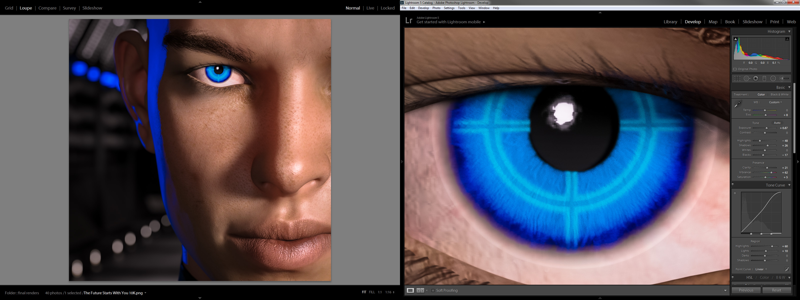
I then spent a lot of time trying to get good skin.  There’s a trend in CGI these days.  Reality.  I think reality is overrated but in this case it makes sense.  An avatar is supposed to represent a real person.  …And it doesn’t hurt to learn new things.  I spent a lot of time experimenting with skin translucency, glossy reflections, roughness, bump maps, and scores of other surface controls.  Endless tweaking.  (Welcome to CGI.)  Ultimately I got something that looks like a real person.  The guy doesn’t look like ME, but he looks relatively real.

And then I put a glowing cross hair in the eye.  Screw reality!  I like robots!

The Future Starts With You BTS ccAbout-Face

And here it is.  It turned out much better than the “concept art” that I intended so I’ve decided to use it straight-up as my new avatar.  So to the people who have their kid, or their dog, or cat, or a movie star, or an anime character, or their feet, or a sports team logo, or Abe Vigoda in their avatar:  I’m now one of you!  My avatar is now a synthetic man that doesn’t look like me.  If you can’t beat ’em join ’em.  We’ll see if it works.

The Future Starts With You on facebook

Created in DAZ Studio 4.9
Rendered with Iray
Color Correction in Lightroom

Figures used:
FWSA Aiden HD for Michael 7
SciFi Passageway
Awesome Fantasy Eyes

UPDATE:  After using my new CGI profile picture on facebook for awhile I started to dislike it.  More in this post: My quest for the perfect CGI avatar

Gimme Some Candy!!!

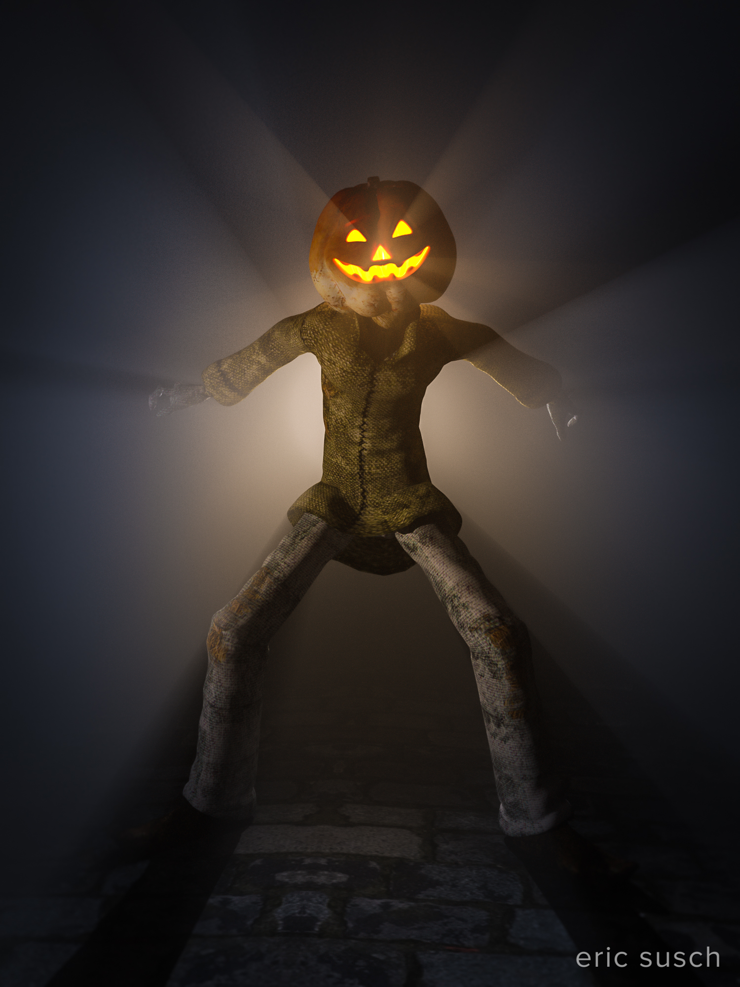
Gimme Some Candy!!!

This is just a quickie I did for Halloween.  I followed SickleYield‘s demo for creating volumetric lighting in DAZ Studio’s Iray.

It’s the first time I’ve ever done an effect like this. What do you think?

Created in DAZ Studio 4.8
Rendered with Iray
Color Correction in Lightroom

Figures used:
Jack Pumpkin
The Streets of Old London

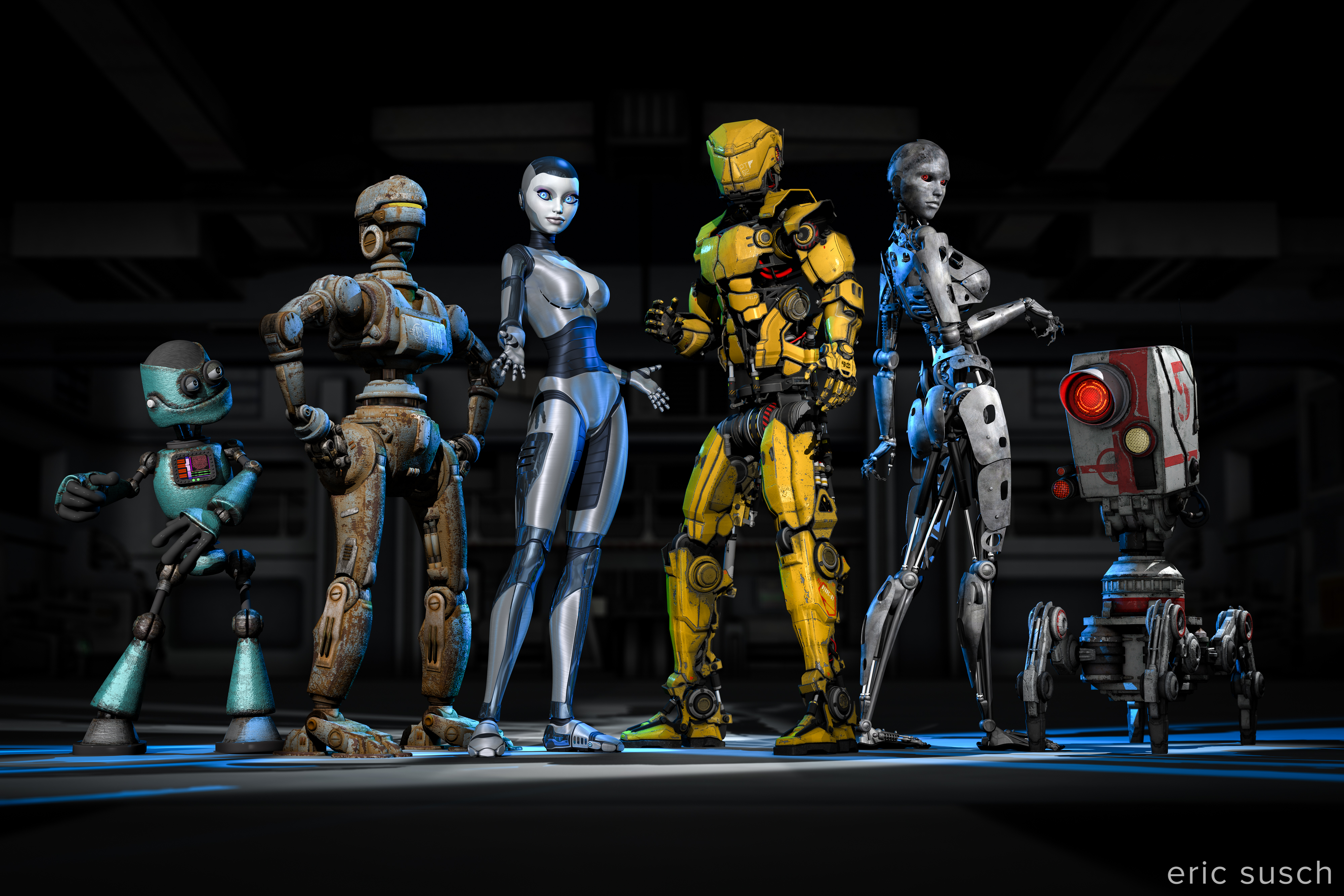
A Collection of Rusty Robots

Can six rusty robots fight crime without driving each other crazy?

A Collection of Rusty RobotsThis one was complicated. Six characters and twenty-five lights.

I was trying to emulate a team freeze frame at the end of an anime intro. I wanted to capture the uniqueness of each character. I even wrote out a short description of each robot to help me differentiate them. Looking at this piece now though, I think it ended up a little too “characters just standing there.” It could do with a few more action poses, but it’s done now so here it is.

I’m going to post my usual more in depth behind-the-scenes info but that will have to wait a few days since this piece is so complicated. It’ll probably end up as multiple posts. For now I’ll leave you with the character descriptions I wrote. Let me know what you think!

Meet the team!

(from left to right)

Gomer is a wise guy. He always has an opinion and he doesn’t take lip from anybody. He thinks he’s the leader but nobody else listens to him. When attacking a bad guy’s hideout the others always make him crawl in thru the air ducts which pisses him off. He thinks Brigitte is “hot stuff.”

Barney is a “can do” fella. He can fix just about anything. Knows how to make explosives too. He gets the job done while the rest are goofing around. Currently he’s in a romantic relationship with Alice.

Alice is a fighter. She can swiftly and silently take out a whole gang of bad guys. She’s a bit fussy though and, unlike the others, she likes to stay clean. She avoids the general dirt and grime of crime fighting. She’s in love with Barney even though he always seems to be a bit dirty. It’s OK though because she’s confident she can change him.

Jim is the leader of the team. He’s a powerful warrior but is totally lost trying to get the rest of the team to work together. He thinks Alice is his girlfriend even though she wants nothing to do with him. Alice thinks Jim is too full of himself.

Brigitte is a master of disguise and can wear a rubber mask to look human. She doesn’t really enjoy fighting crime but she hangs around because she likes Jim. Gomer is in love with Bridget but she can’t stand him.

Gronk (AKA “Five”) has a powerful Plasma Death Ray to blast holes in buildings and blow up cars. He wants to do more but doesn’t really have the ability. He trys.

Buy a print here –> http://www.deviantart.com/print/38109712/

Love Is Not Enough

love is not enoughAdvanced lighting class!  A black suit against a dark background and forties film noir style glamor lighting on the face.  I’m now comfortable setting lights, well the spotlight at least, which is the most like a real Fresnel movie light.  Still not too sure about some of the other style lights available in the program.  I tried using a point light as a fill light and it was a disaster, very unrealistic looking.  I’m going to stick to spotlights for interior lighting.  Wish they had barn doors to make a quick slash on the wall.  I made a “flag” with a flattened solid primitive cube though and that worked.

The background is actually a scifi medical bay set with diagnostic beds and everything.  I spent hours trying different background lights but eventually settled on leaving it dark with only the computer monitors lit.  It just seems more mysterious that way.  It’s the same on a movie set.  If the lighting isn’t working you’re probably using too many lights.  Turn some off and see what it looks like.  Chances are it will be better.