 I haven’t done anything creative in quite awhile. Life just kept getting in the way. I don’t know about you but not making things drags my soul down. Everything becomes harder. I needed something to raise my spirits.
I needed a simple artistic project to get back and feel like myself again, something that wouldn’t spiral into a huge task that would never get finished.
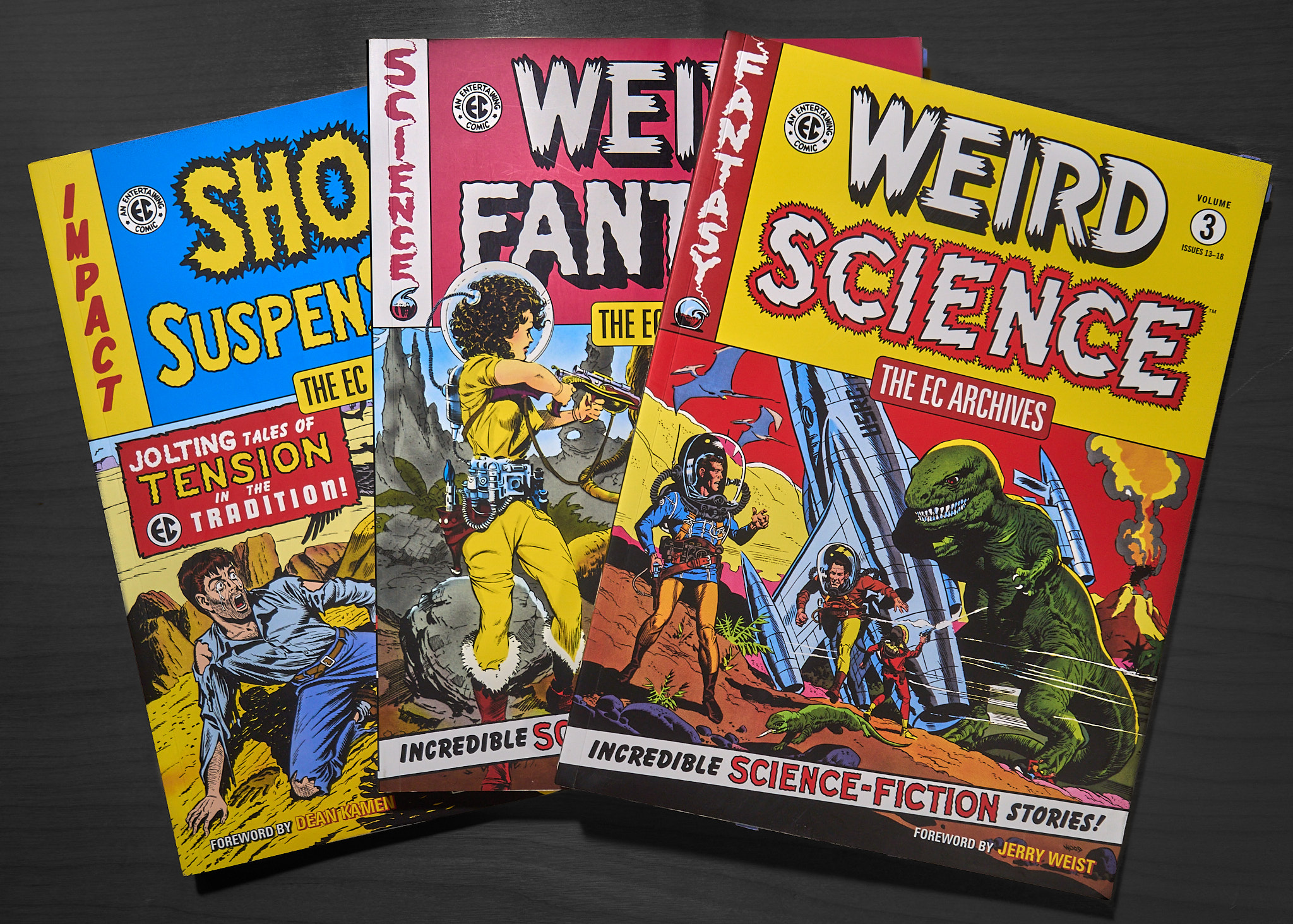
I’ve been reading these EC comic book collections recently. They have fantastic art and stories from the early to mid 50s.
 On the back of one of them is this image:
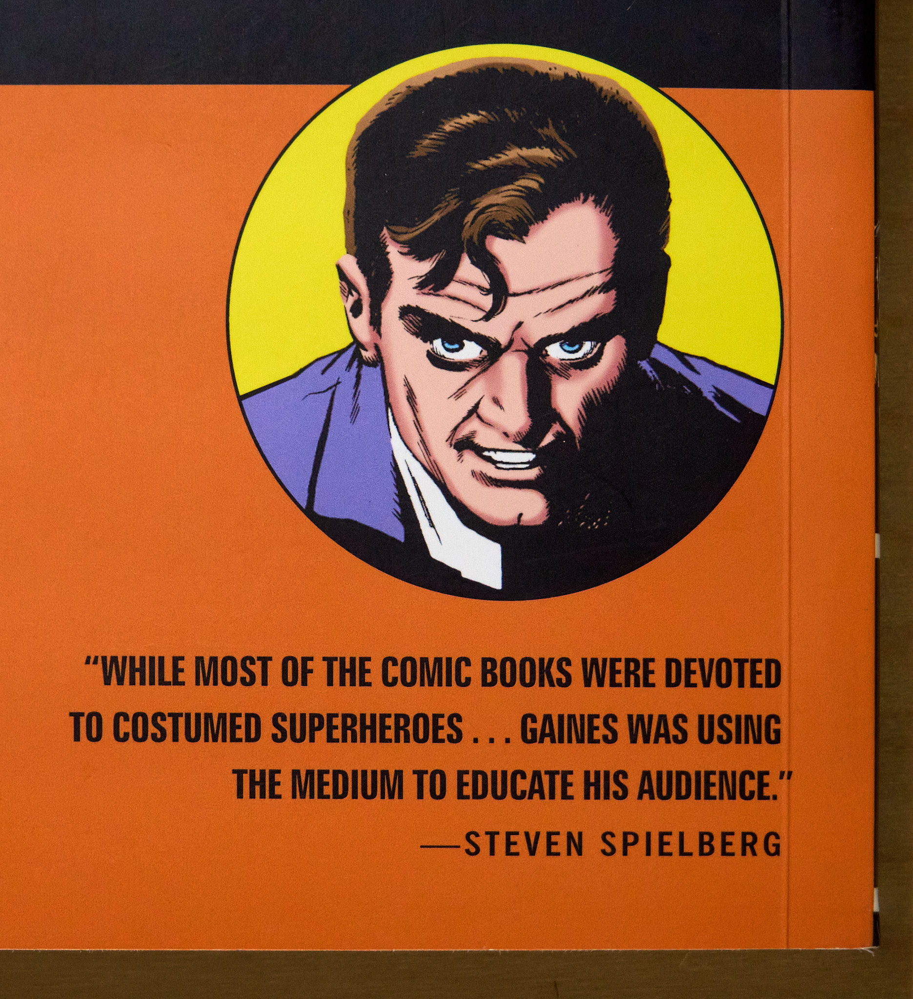 A simple portrait. One character. Exactly the kind of thing I should try to do. I imagined an image like this printed three feet square on the wall.
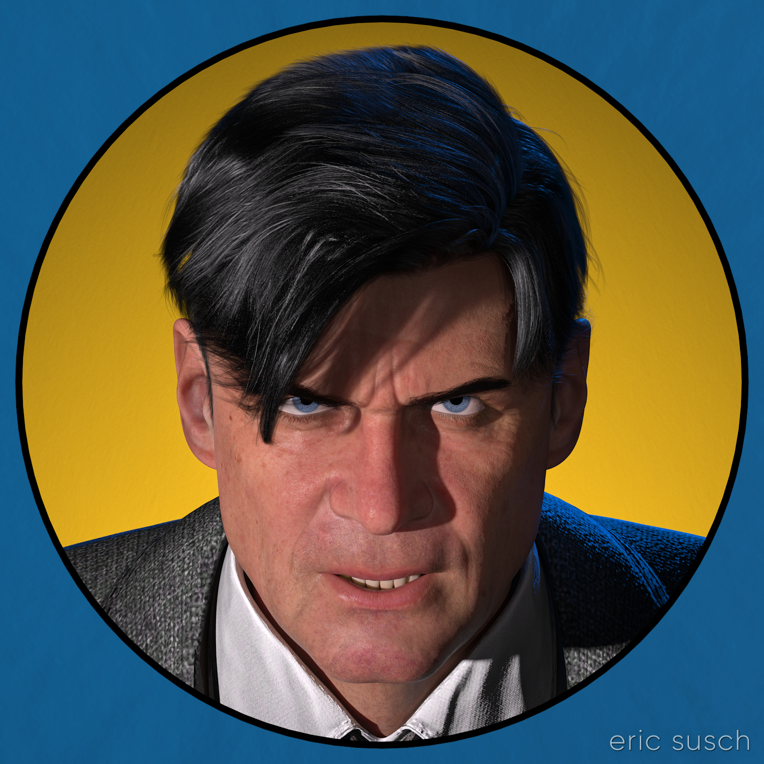
A realistic computer graphic version of this seventy year old drawing would be interesting. The circular graphic element would call back to the drawing’s comic book roots and it could also reference the modern avatars of social media. Mixing a realistic character with flat graphic elements would be interesting too.
I could create the graphic elements in photoshop of course, but I wondered if it were possible to build the whole thing in 3D… all “in camera” so to speak.
I fired up my computer…
After setting the character in DAZ Studio and lining up the camera, I created a cylinder one meter in diameter for the background yellow circle. I parented it to the camera and moved it down the lens axis until it was the proper size behind the character. The exact procedure is this:
- In the Scene Tab menu select Parenting and UNCHECK Parent Items in Place. Most times you want this checked so that when you parent something it stays where it is, but this time you don’t.
- In the Scene Tab drag the object to the camera to parent it.
- The object will move to the camera position.
- You can then drag the object exactly along the axis of the lens and position it as far away as you want. The object will always stay in view and centered even if you move the camera.
- Lastly, make sure you re-check Parent Items in Place so the next time you parent something it doesn’t move.
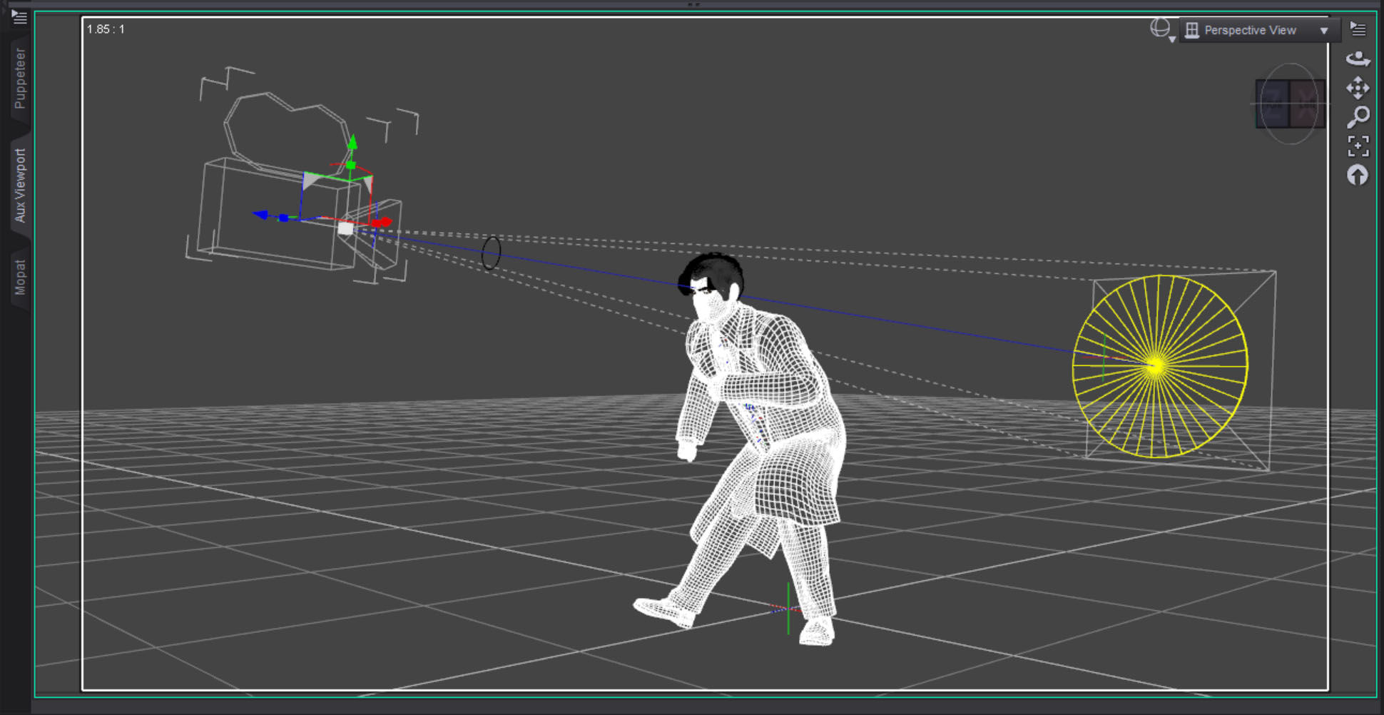 I then created a torus with a ten centimeter diameter for the black line and parented it to the camera in front of the character. I lined up the black line so it just covered the edge of the yellow circle. It worked perfectly as this test render shows.
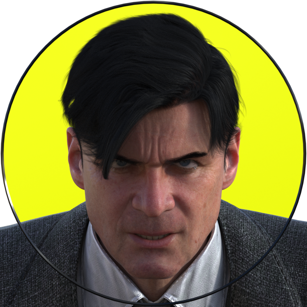 If you’re trying this at home, make sure you have Depth of Field switched OFF in the camera, otherwise it will destroy the illusion. Everything needs to be in sharp focus for this to work.
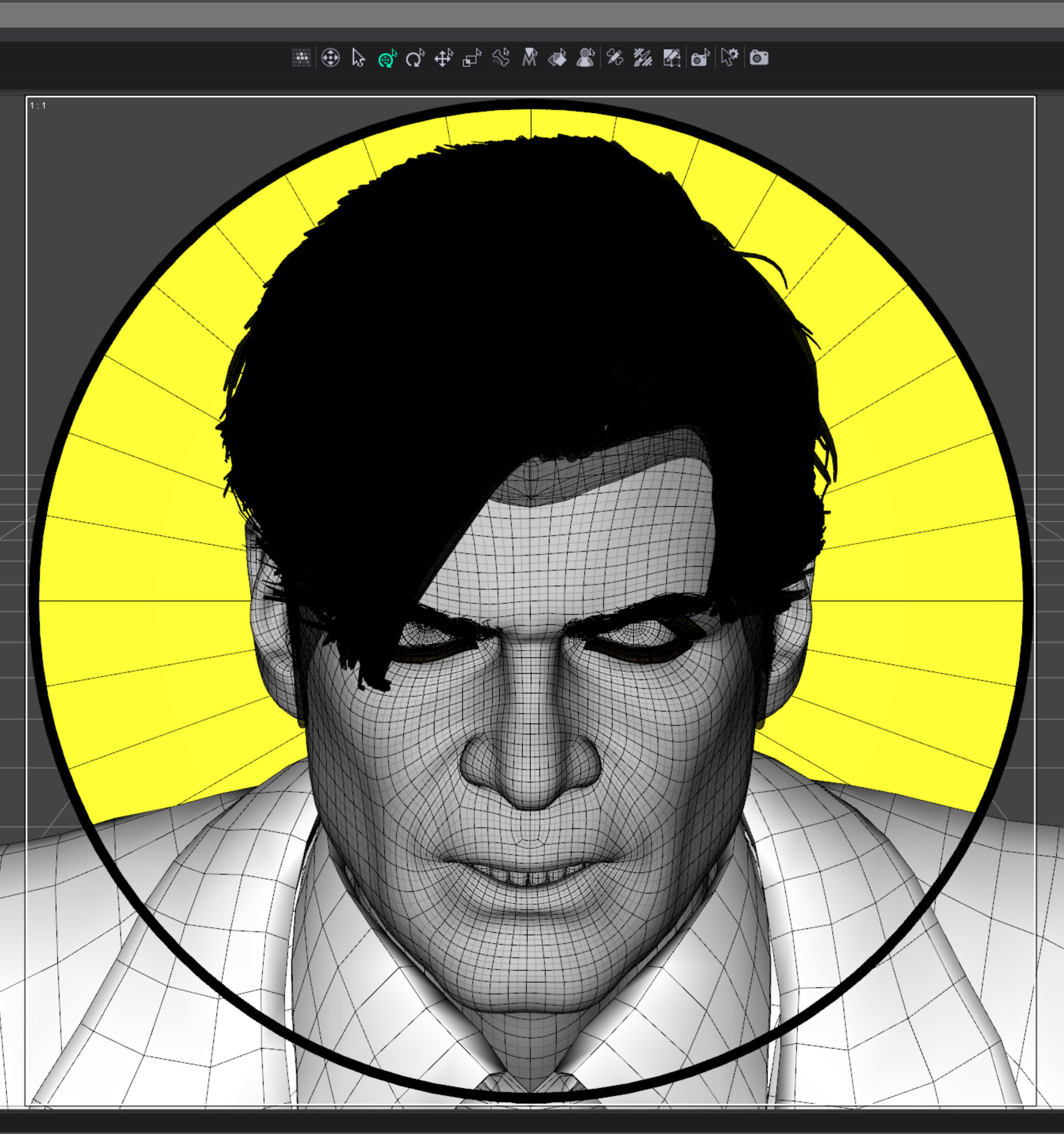 I originally imagined the image to be just a circle with the outside corners transparent. I needed to eliminate the characters shoulders though. At first I thought I could just eliminate some of the geometry but I couldn’t do that with a precision that could be hidden behind the thin black line. I decided to create another graphic element covering the outer edge, in front of the character.
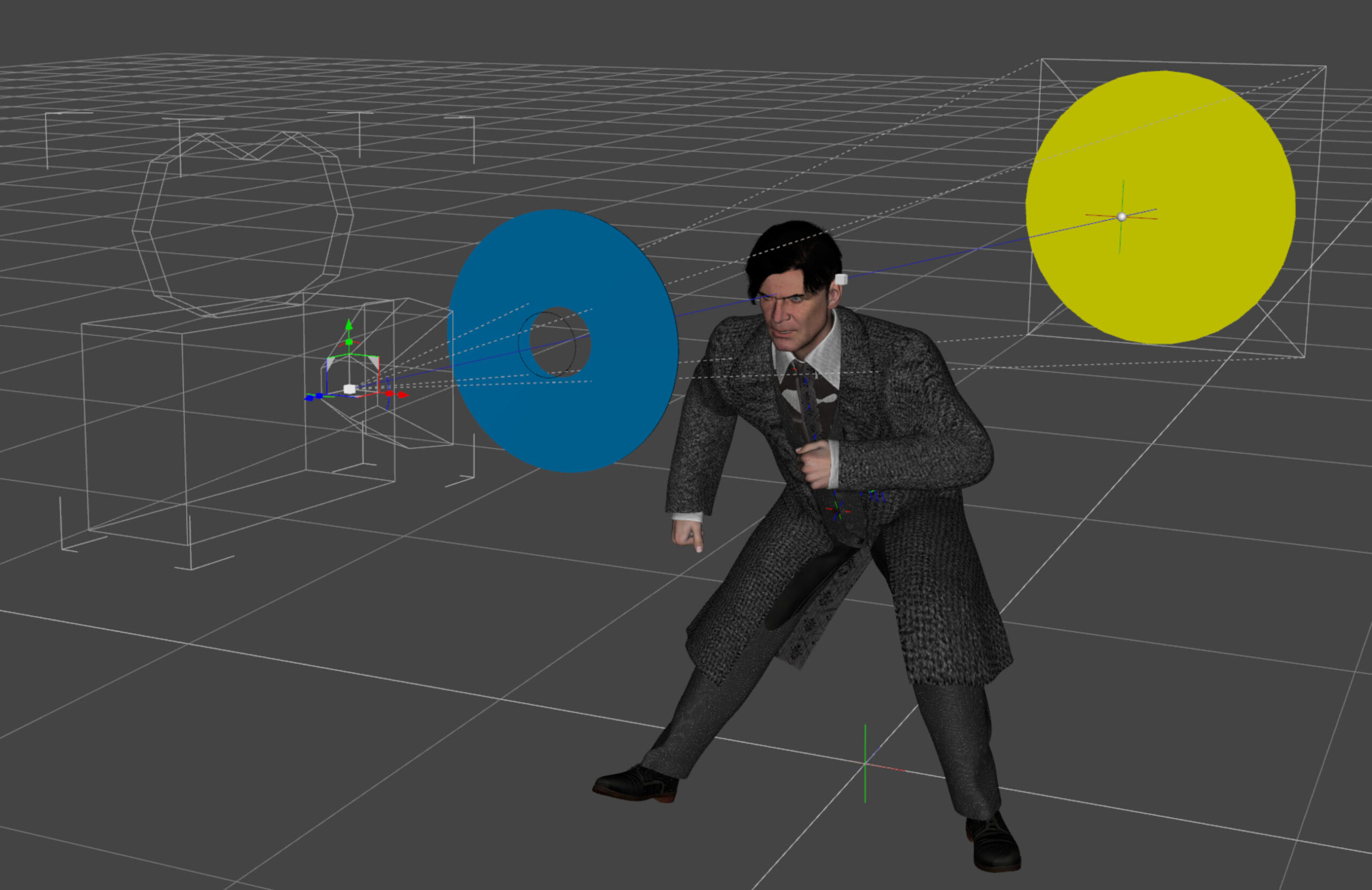
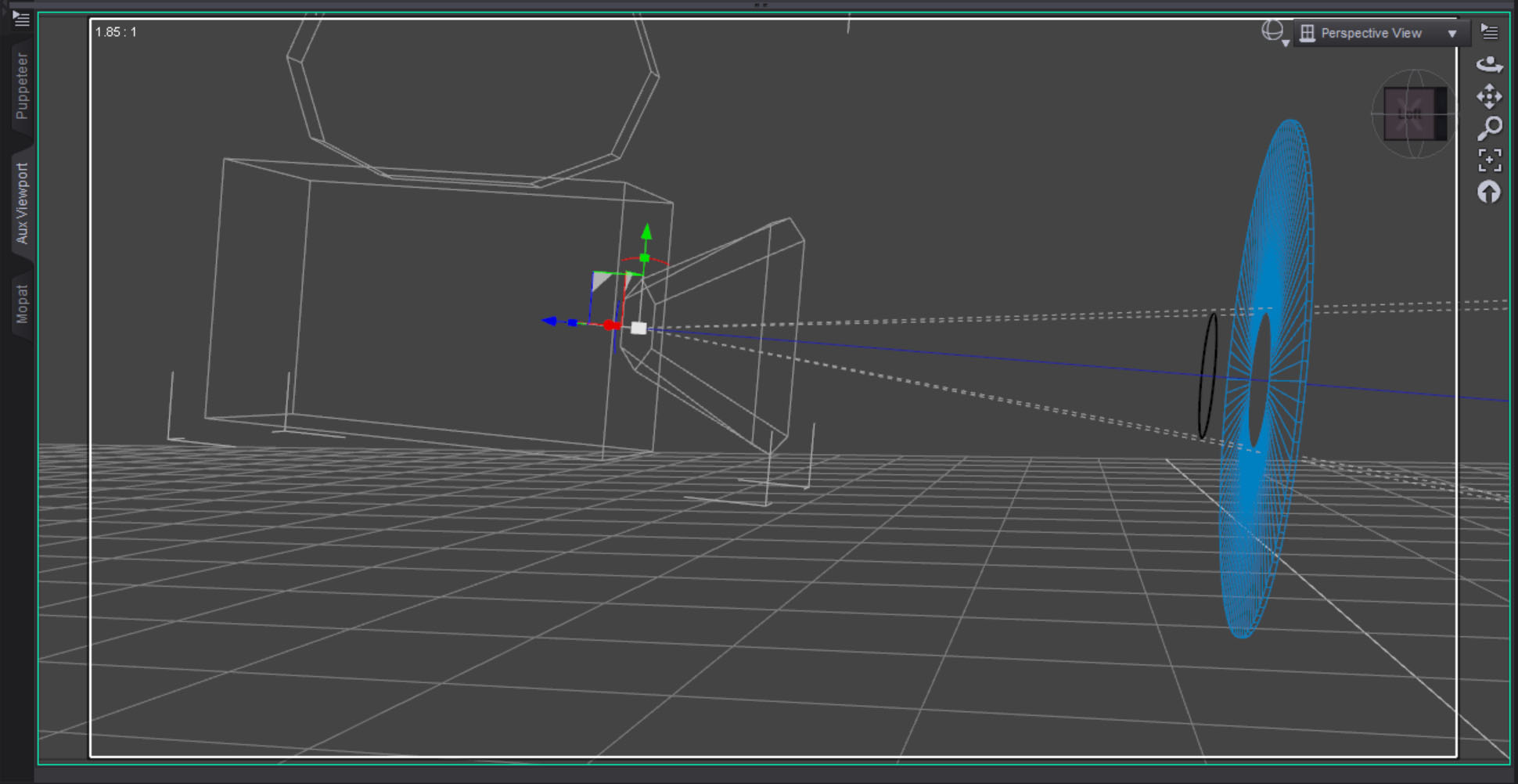 The blue surface was created with a three sided torus that was scaled flat along one axis. The center is eleven centimeters, slightly bigger than the black circle. I wanted to make sure the black line could sit in front of and separate from the blue torus.
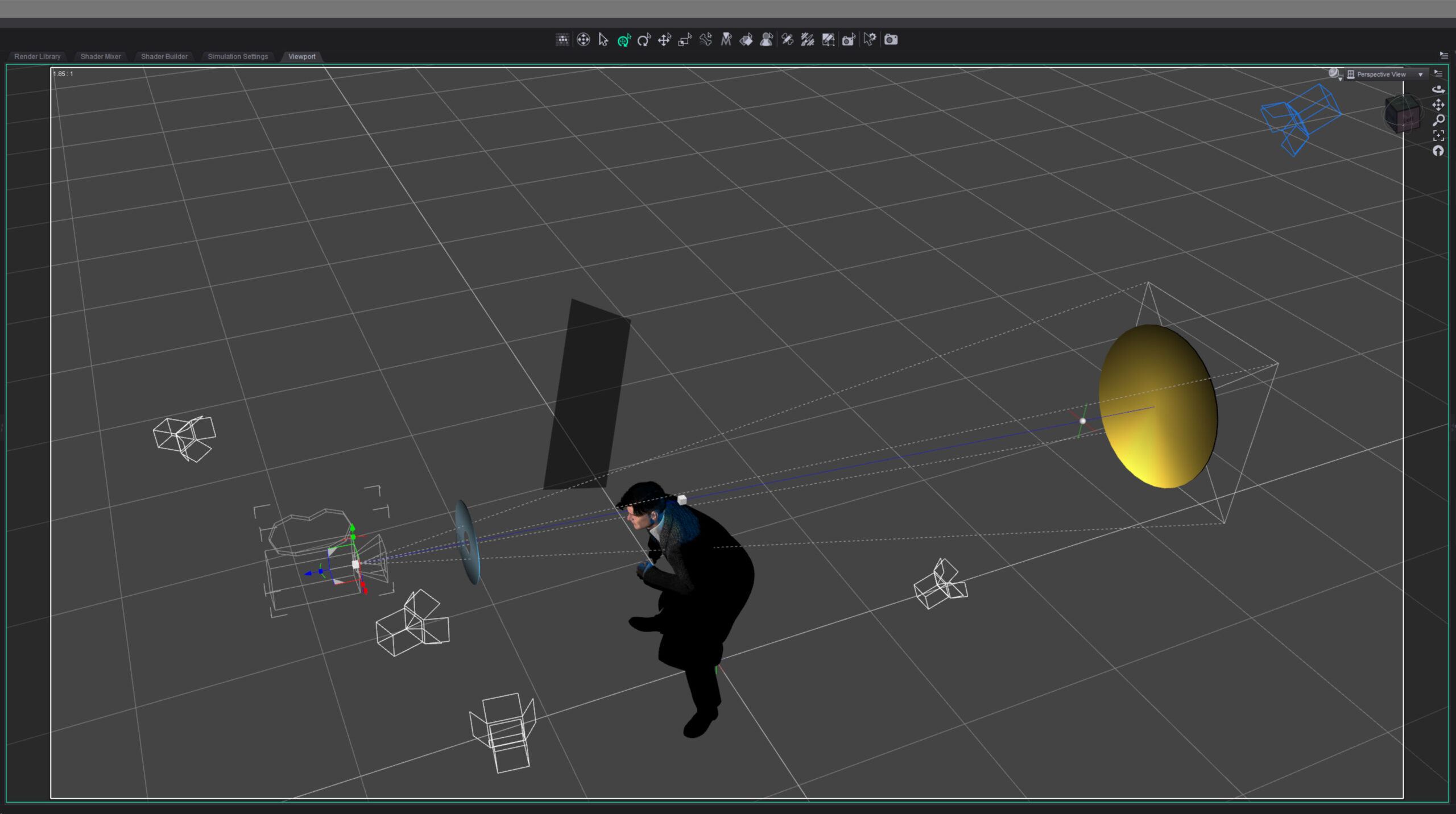 I lit the character with three lights: a hard key light from the side to suggest a noir style, a backlight to bring out the hair and jacket, and just a bit of fill on the face. I decided to make the backlight blue because I thought a blue highlight would suggest how black hair is colored in comic books.
Finally I set lights for the graphic elements. I wanted the blue foreground light to be even across the object but I had to light it from the side to keep it off the character. I didn’t think it would work but after a bit of tweaking I was able to get the light relatively even.
For the yellow background I wanted the opposite. I set the light low and shot it up across the surface, creating a gradient effect.
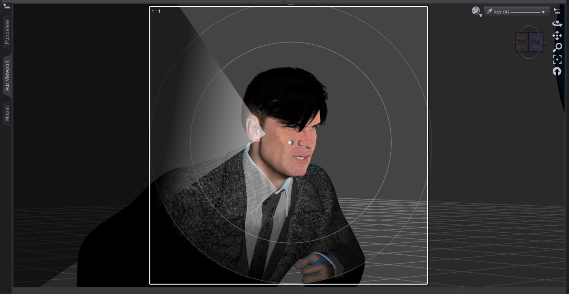 The hard key light on the face looked a little flat on one side so I created a simple plane to make a “flag.” I parented it to the key light, then brought it in just a bit to break things up. I reduced the surface Cutout Opacity to make it semi-transparent and only block some of the light. I guess that makes it more of a “net” in filmmaking terms.
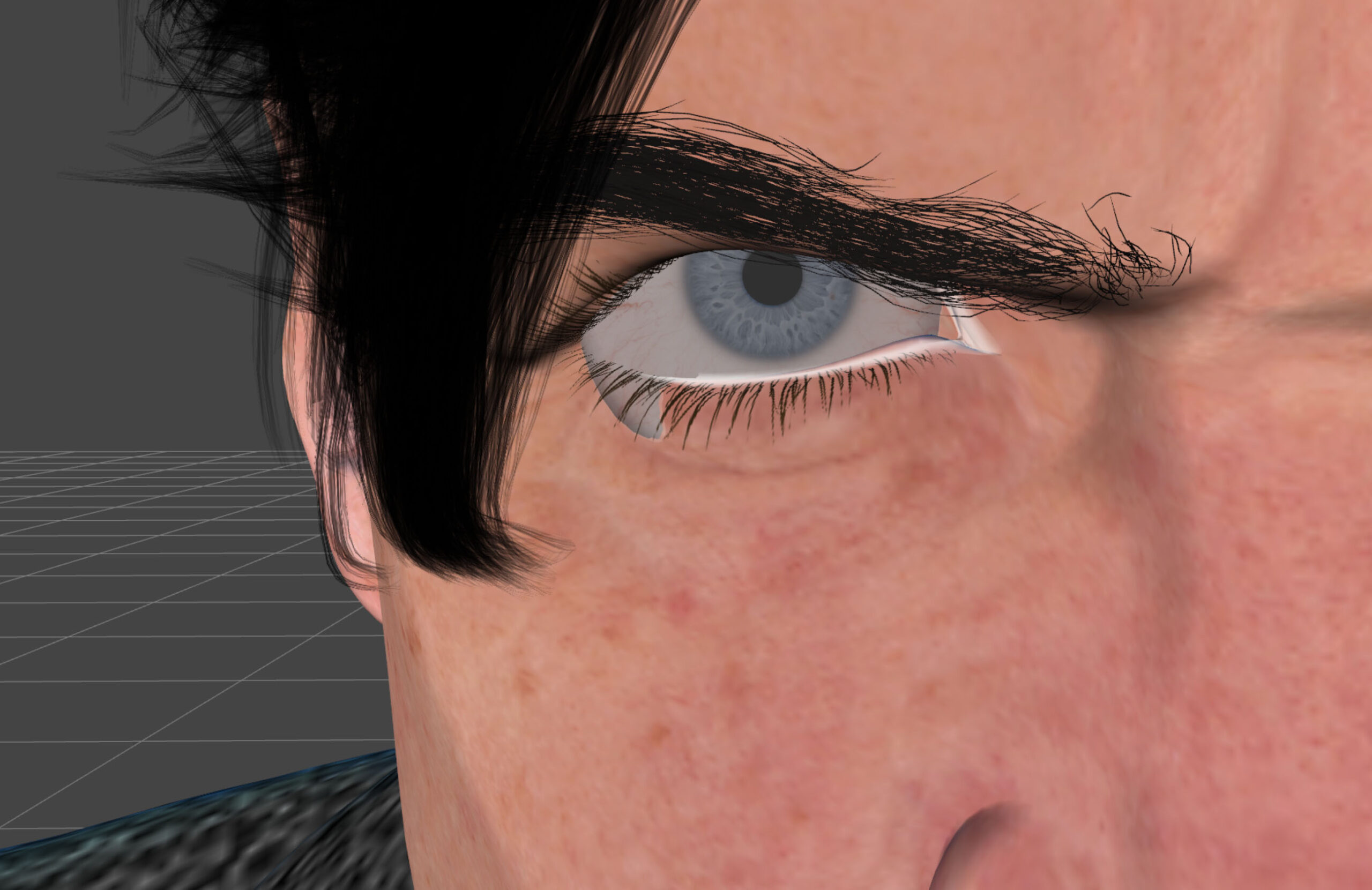 At one point I had this strange problem that I never had before where the eyeballs were hanging out of the sockets on either side. I thought it might be a problem with the expression settings I was using but that turned out to not be the case. I never figured out what it was. I solved the problem by translating both eyeballs in slightly.
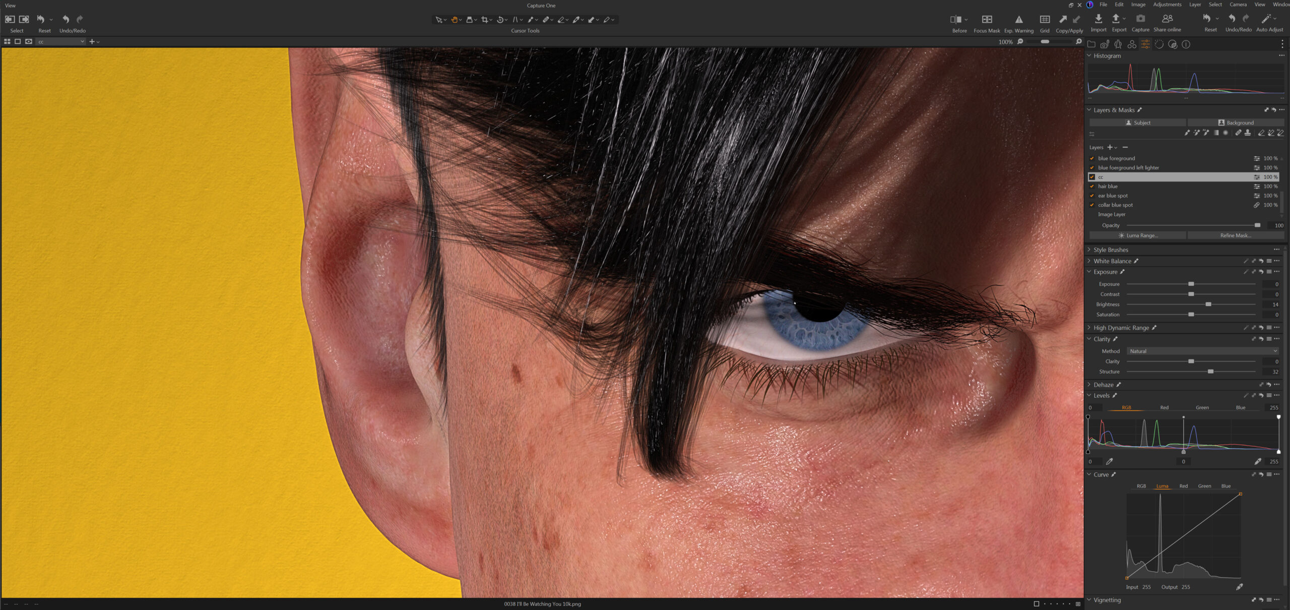 Color correction in Capture One was relatively simple. I brightened up the character a bit and re-balanced the lightness of the graphic foreground and background separately. I also combed over all the minor details and fixed any small imperfections. If I print this big you will be able to see everything.
Overall I’m quite happy with the way this image turned out. It feels good to be creating again.
Created in DAZ Studio 4.24
Rendered with Iray
Color Correction in Capture One