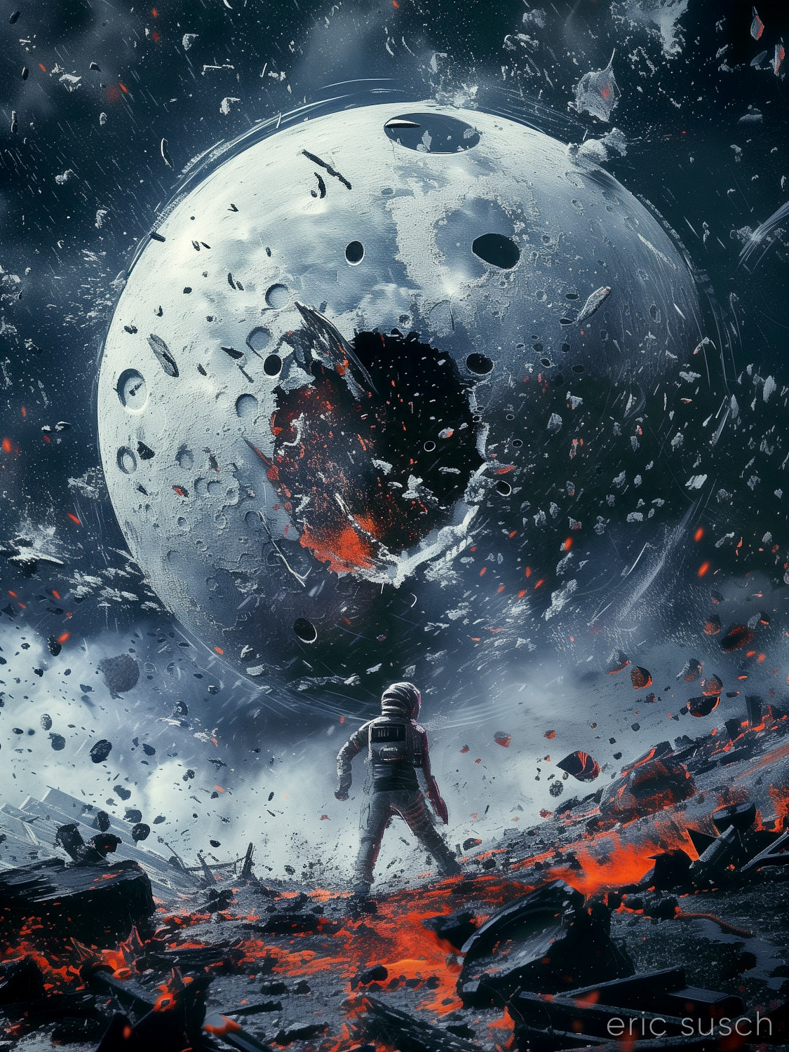
 #Art I made with #Midjourney #AI
My Will Brings Down the Moon and Shatters It to Pieces
Leave a reply
#Art I made with #Midjourney #AI
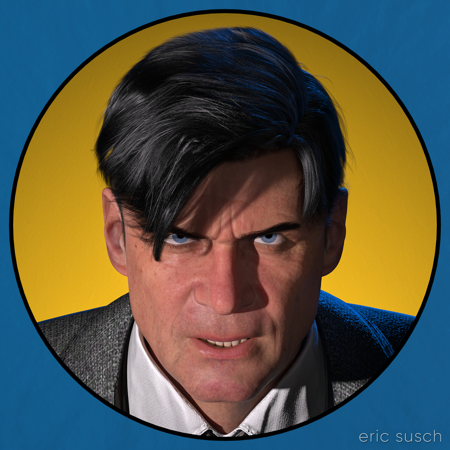 I haven’t done anything creative in quite awhile. Life just kept getting in the way. I don’t know about you but not making things drags my soul down. Everything becomes harder. I needed something to raise my spirits.
I needed a simple artistic project to get back and feel like myself again, something that wouldn’t spiral into a huge task that would never get finished.
I’ve been reading these EC comic book collections recently. They have fantastic art and stories from the early to mid 50s.
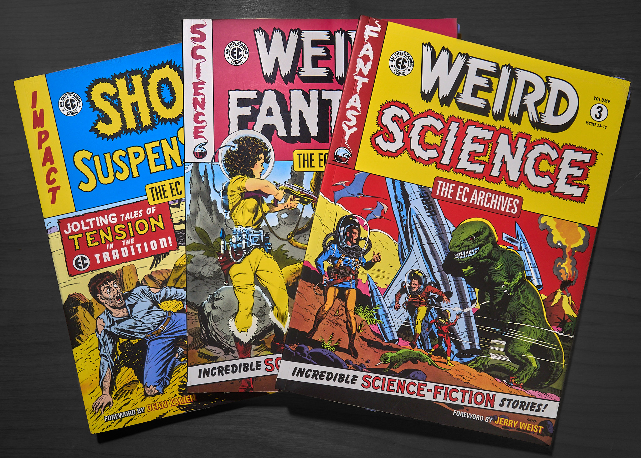 On the back of one of them is this image:
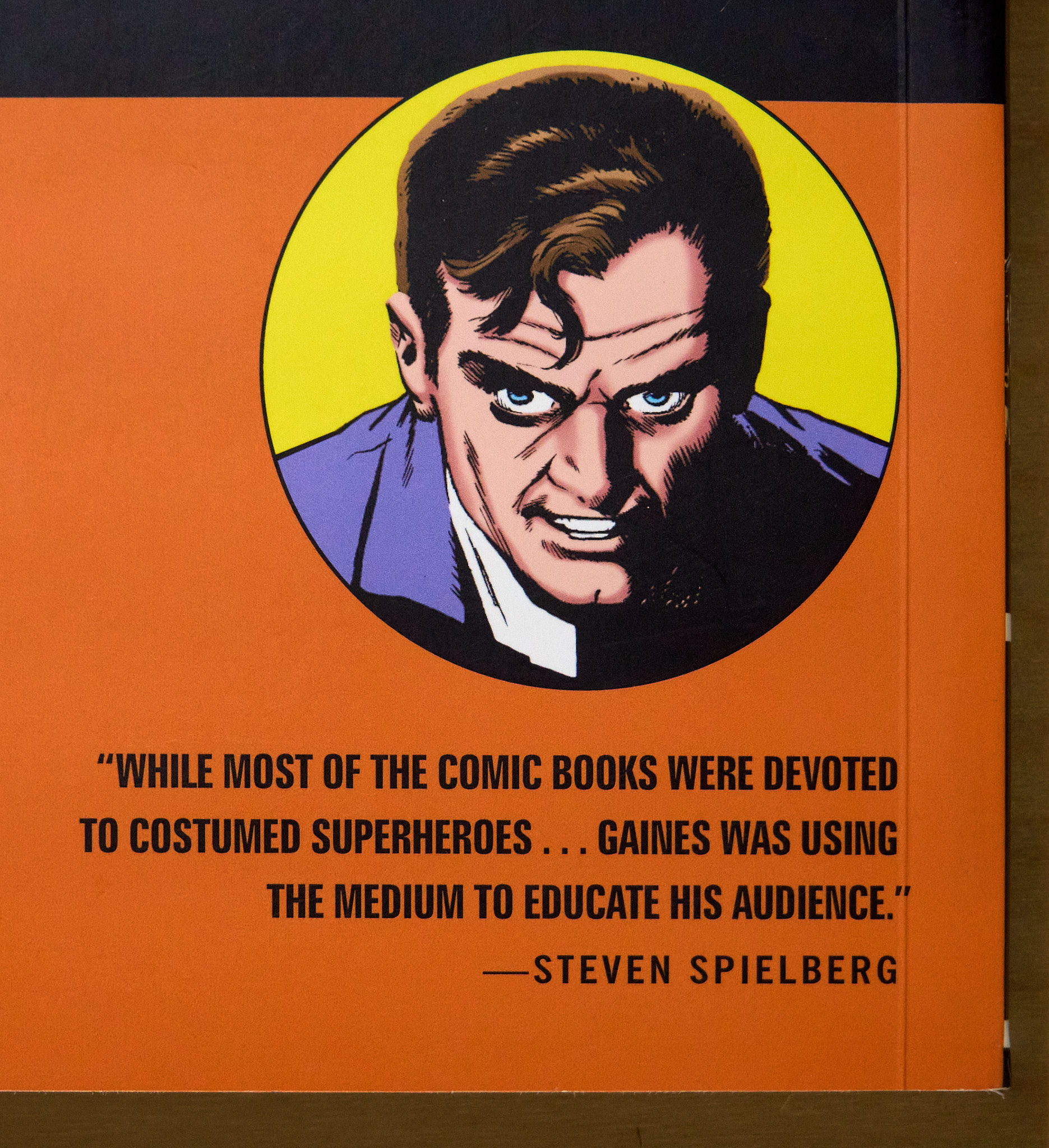 A simple portrait. One character. Exactly the kind of thing I should try to do. I imagined an image like this printed three feet square on the wall.
A realistic computer graphic version of this seventy year old drawing would be interesting. The circular graphic element would call back to the drawing’s comic book roots and it could also reference the modern avatars of social media. Mixing a realistic character with flat graphic elements would be interesting too.
I could create the graphic elements in photoshop of course, but I wondered if it were possible to build the whole thing in 3D… all “in camera” so to speak.
I fired up my computer…
After setting the character in DAZ Studio and lining up the camera, I created a cylinder one meter in diameter for the background yellow circle. I parented it to the camera and moved it down the lens axis until it was the proper size behind the character. The exact procedure is this:
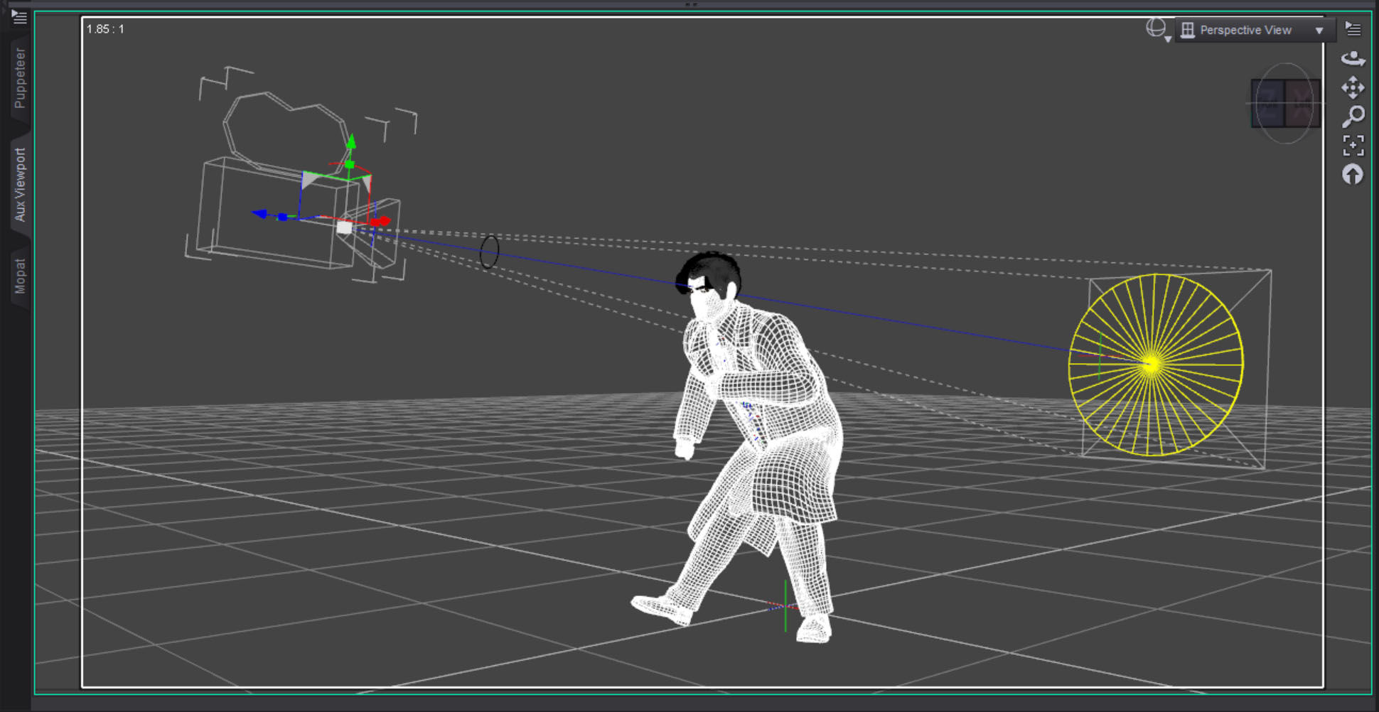 I then created a torus with a ten centimeter diameter for the black line and parented it to the camera in front of the character. I lined up the black line so it just covered the edge of the yellow circle. It worked perfectly as this test render shows.
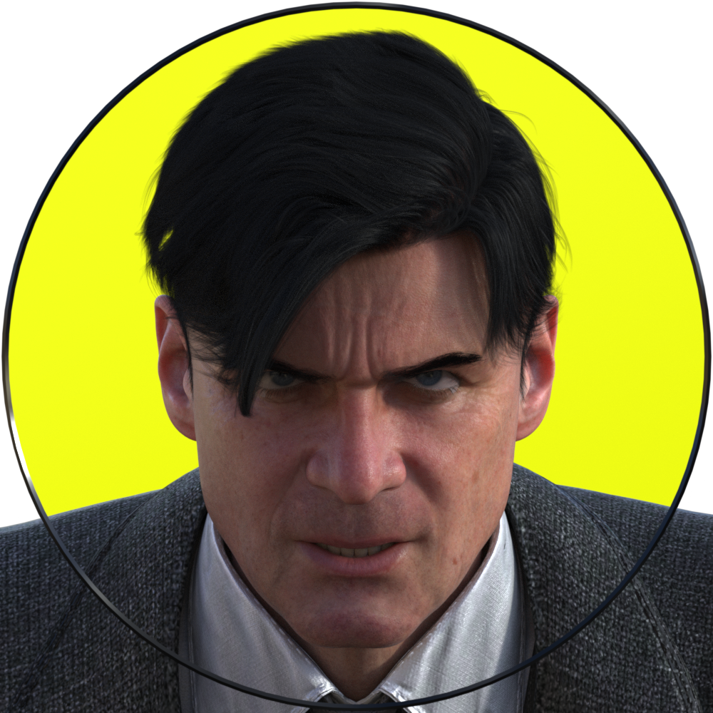 If you’re trying this at home, make sure you have Depth of Field switched OFF in the camera, otherwise it will destroy the illusion. Everything needs to be in sharp focus for this to work.
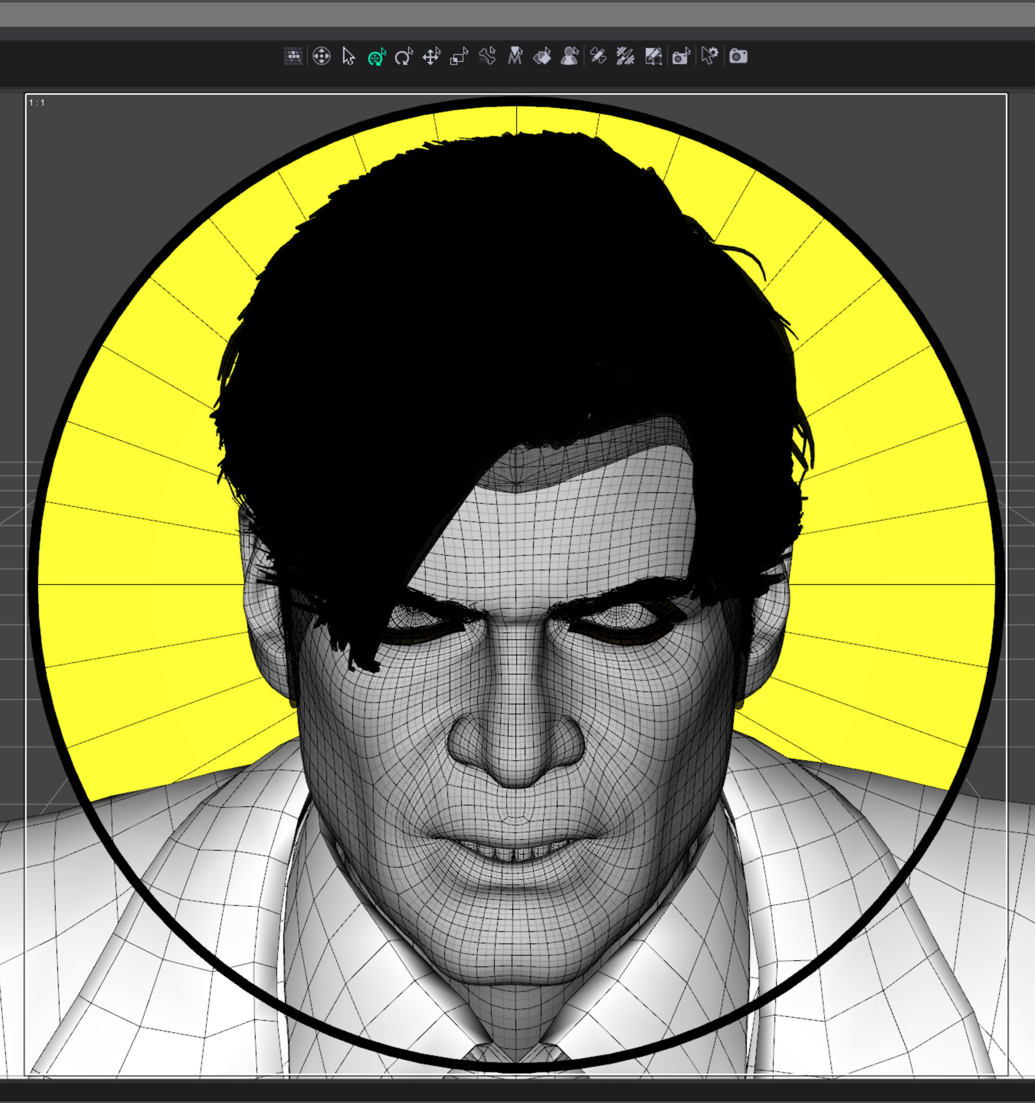 I originally imagined the image to be just a circle with the outside corners transparent. I needed to eliminate the characters shoulders though. At first I thought I could just eliminate some of the geometry but I couldn’t do that with a precision that could be hidden behind the thin black line. I decided to create another graphic element covering the outer edge, in front of the character.
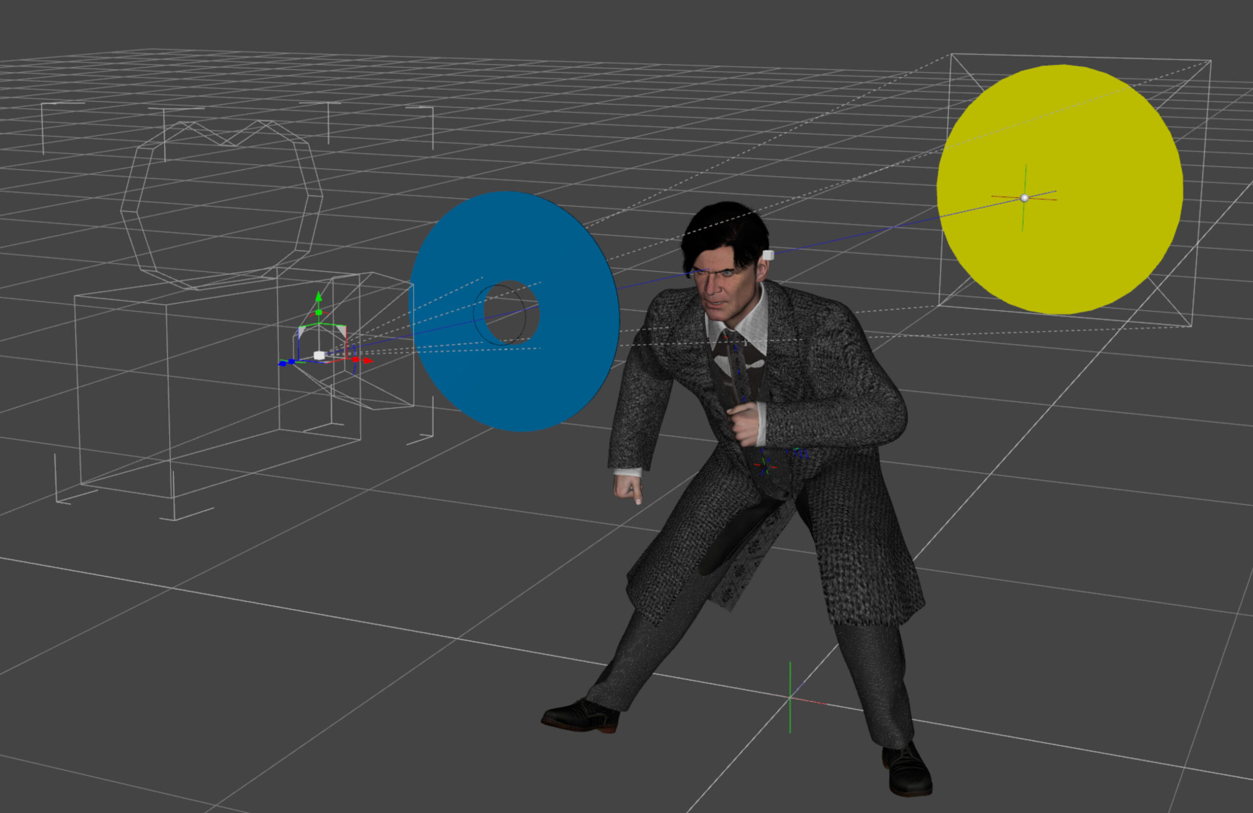
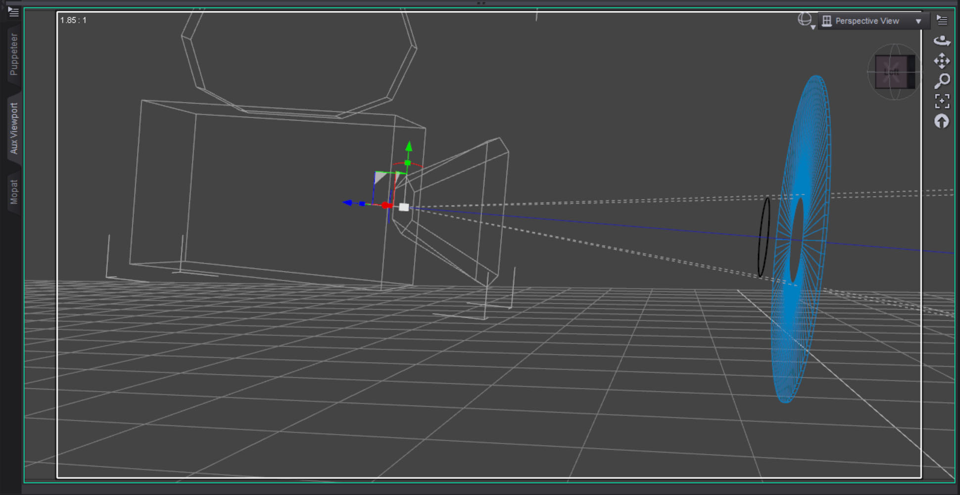 The blue surface was created with a three sided torus that was scaled flat along one axis. The center is eleven centimeters, slightly bigger than the black circle. I wanted to make sure the black line could sit in front of and separate from the blue torus.
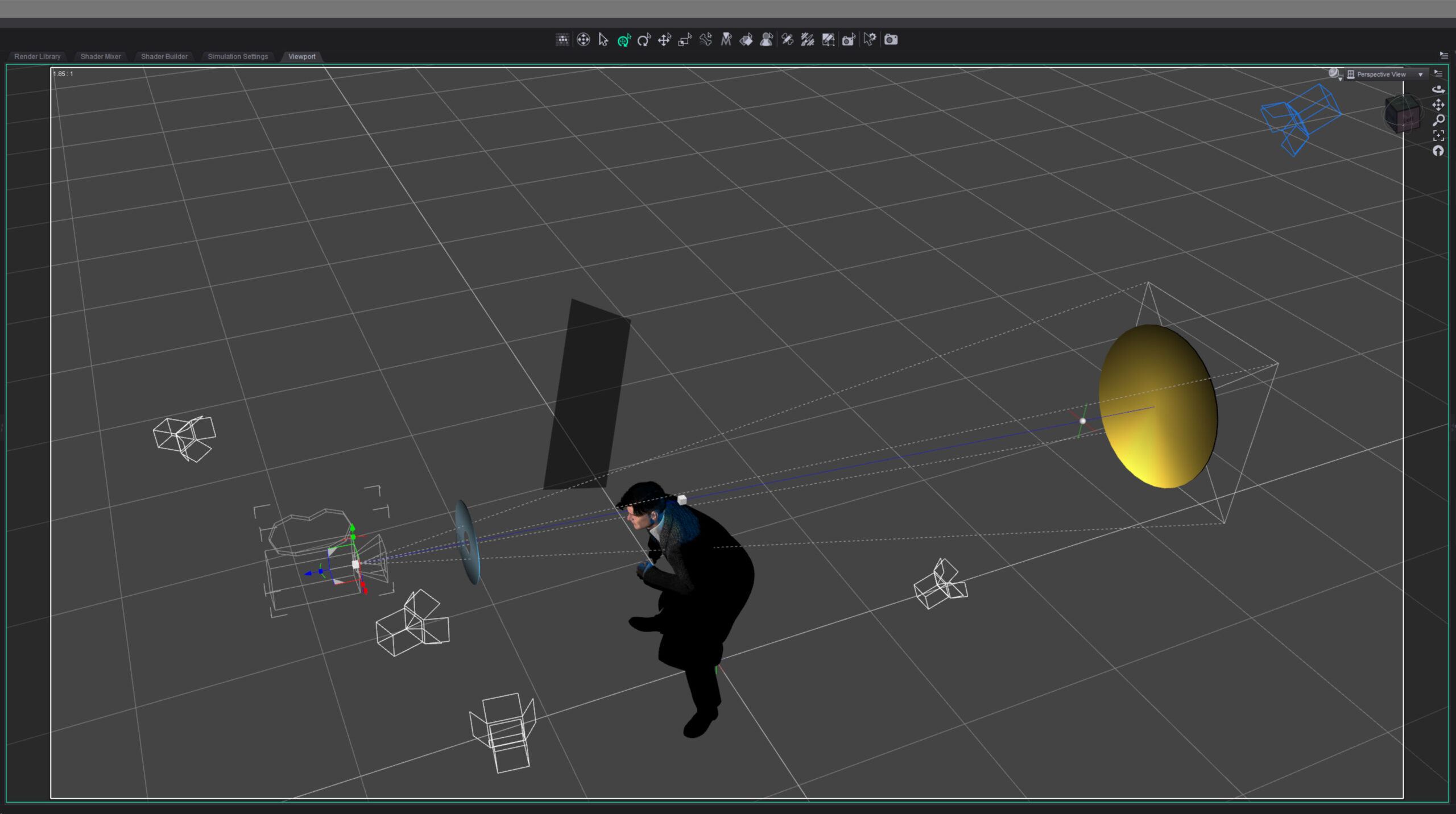 I lit the character with three lights: a hard key light from the side to suggest a noir style, a backlight to bring out the hair and jacket, and just a bit of fill on the face. I decided to make the backlight blue because I thought a blue highlight would suggest how black hair is colored in comic books.
Finally I set lights for the graphic elements. I wanted the blue foreground light to be even across the object but I had to light it from the side to keep it off the character. I didn’t think it would work but after a bit of tweaking I was able to get the light relatively even.
For the yellow background I wanted the opposite. I set the light low and shot it up across the surface, creating a gradient effect.
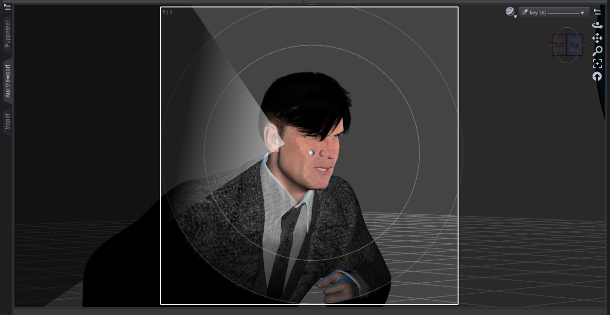 The hard key light on the face looked a little flat on one side so I created a simple plane to make a “flag.” I parented it to the key light, then brought it in just a bit to break things up. I reduced the surface Cutout Opacity to make it semi-transparent and only block some of the light. I guess that makes it more of a “net” in filmmaking terms.
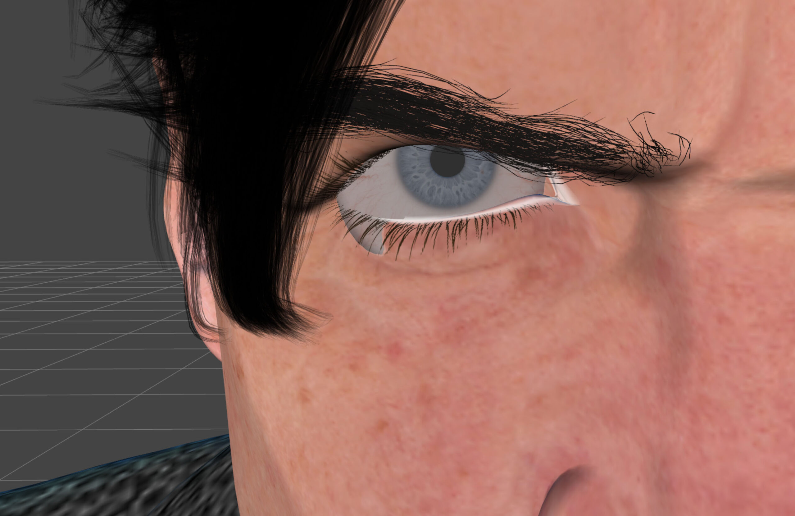 At one point I had this strange problem that I never had before where the eyeballs were hanging out of the sockets on either side. I thought it might be a problem with the expression settings I was using but that turned out to not be the case. I never figured out what it was. I solved the problem by translating both eyeballs in slightly.
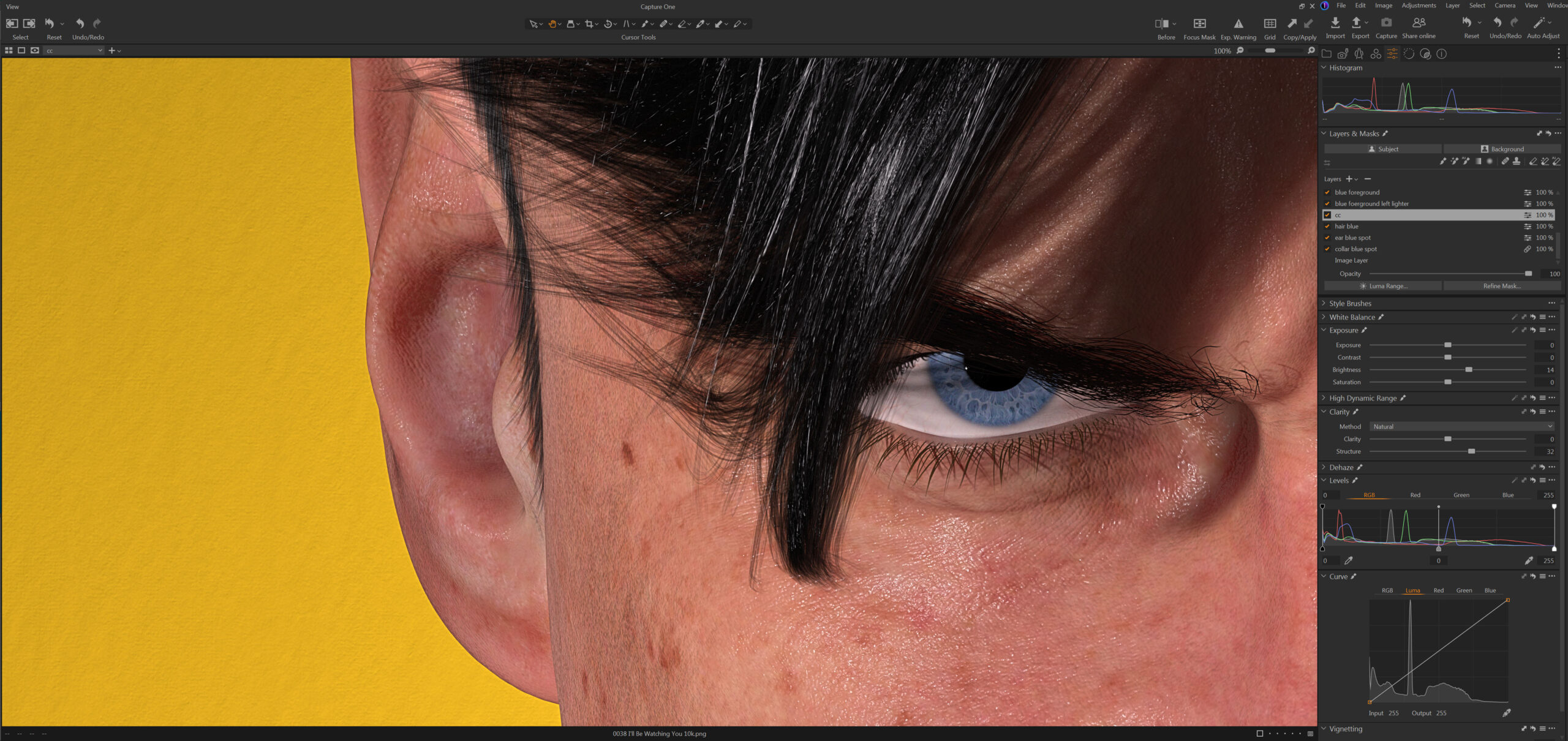 Color correction in Capture One was relatively simple. I brightened up the character a bit and re-balanced the lightness of the graphic foreground and background separately. I also combed over all the minor details and fixed any small imperfections. If I print this big you will be able to see everything.
Overall I’m quite happy with the way this image turned out. It feels good to be creating again.
Created in DAZ Studio 4.24
Rendered with Iray
Color Correction in Capture One
 #Art I made with #Midjourney #AI
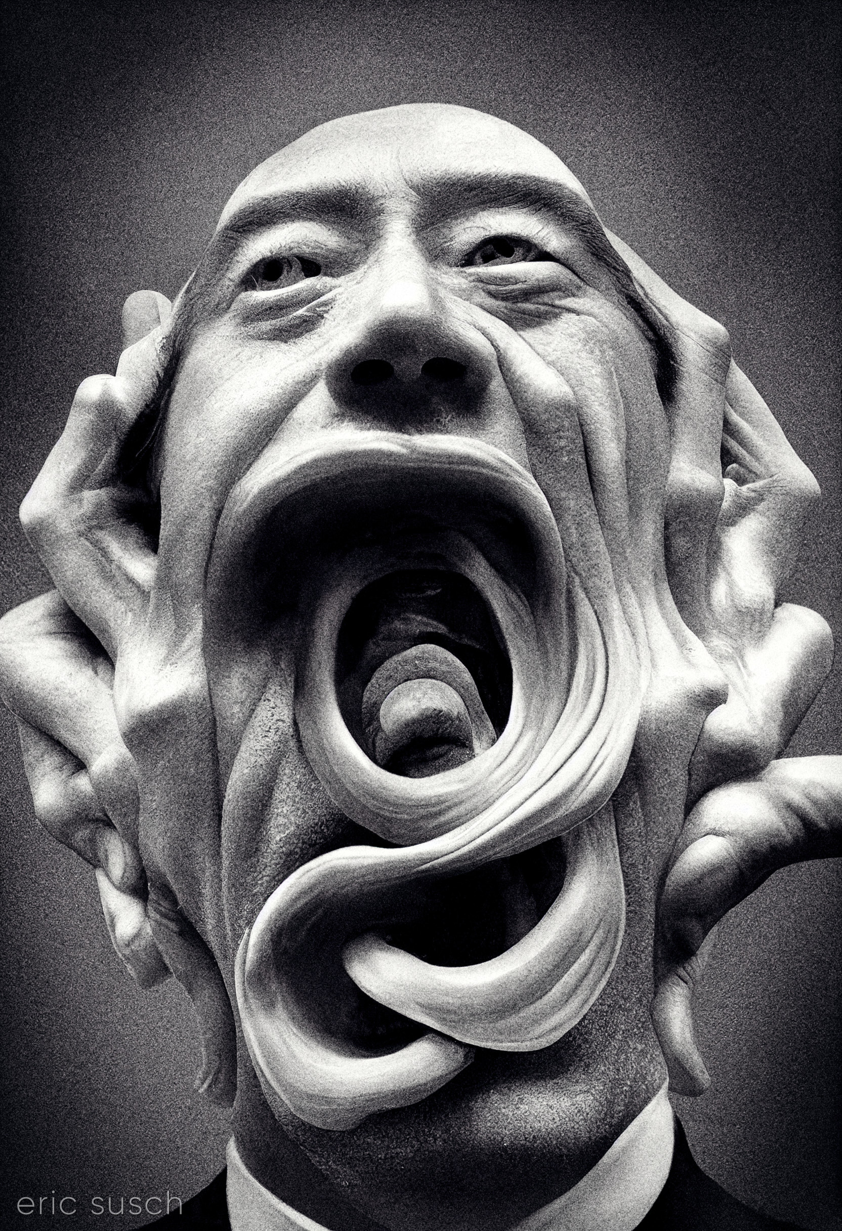 I’m posting this AI art I created today, because I’m thinking about the children in Springfield Ohio who are afraid to go to school because of bomb threats. We need less lying made-up culture-war nonsense, and more discussion about the future.
#Art I made with #Midjourney #AI
 This guy has a lot of issues. He also has a tie.
#Art I made with #Midjourney #AI
 #Art I made with #Midjourney #AI
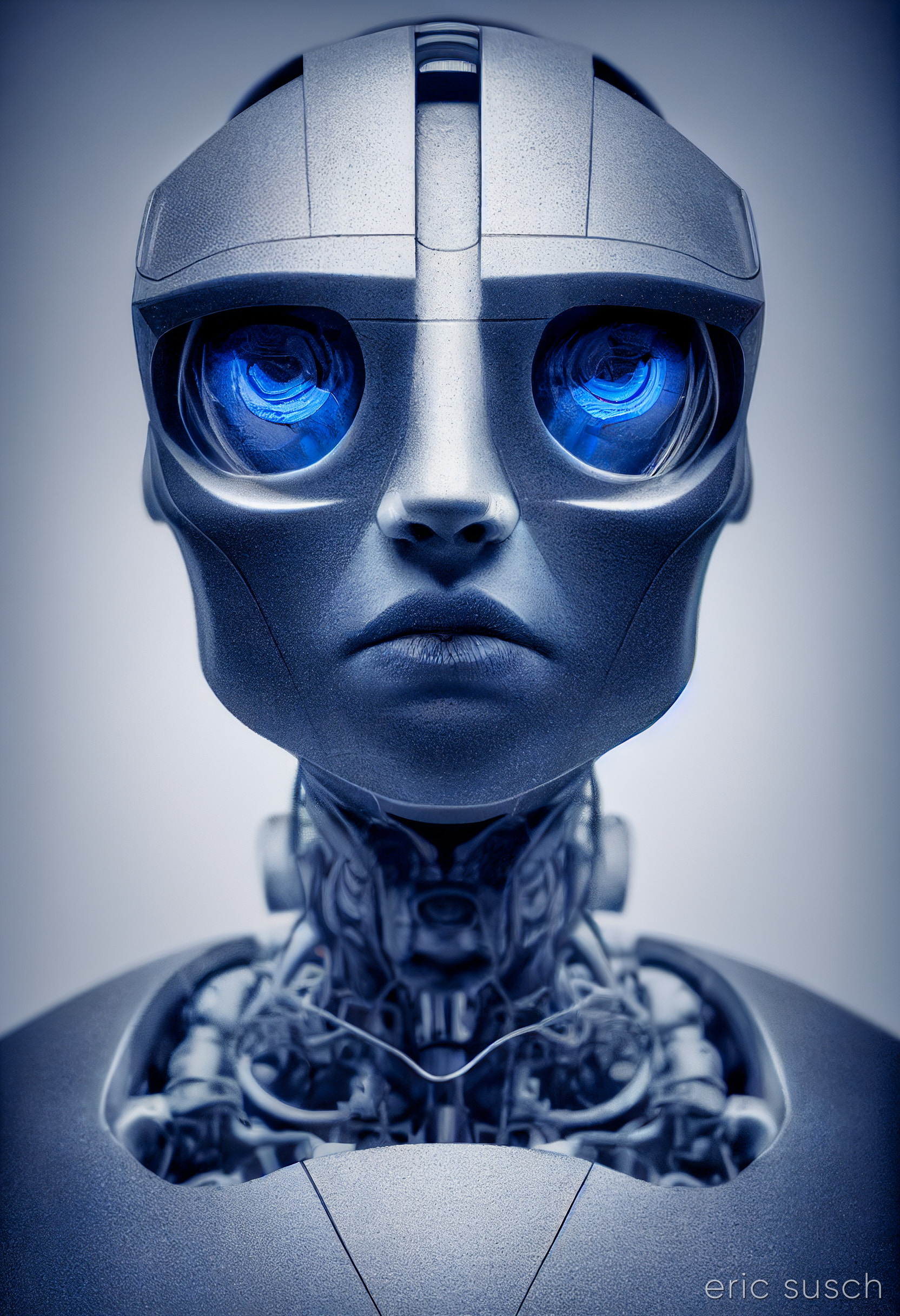
Robot Roll Call 0005
#Art I made with #Midjourney #AI
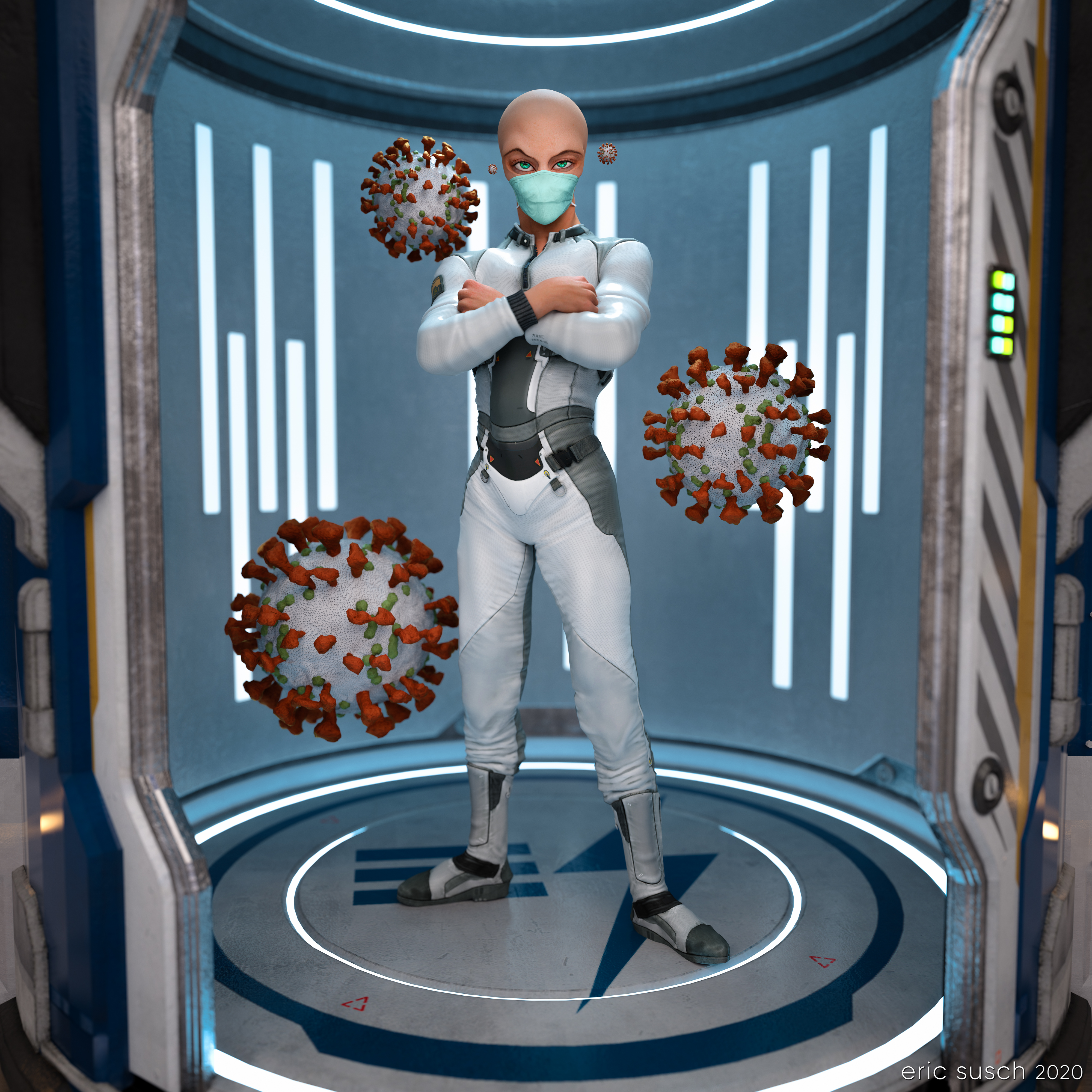 What is outside the door when it opens? This is the question I ask myself everyday now. Some alien organism hitchhiking on a friend? Wear a mask!
For this piece I went back to one of my TikTok animations, set up another camera with a square aspect ratio, and exported a high rez still.
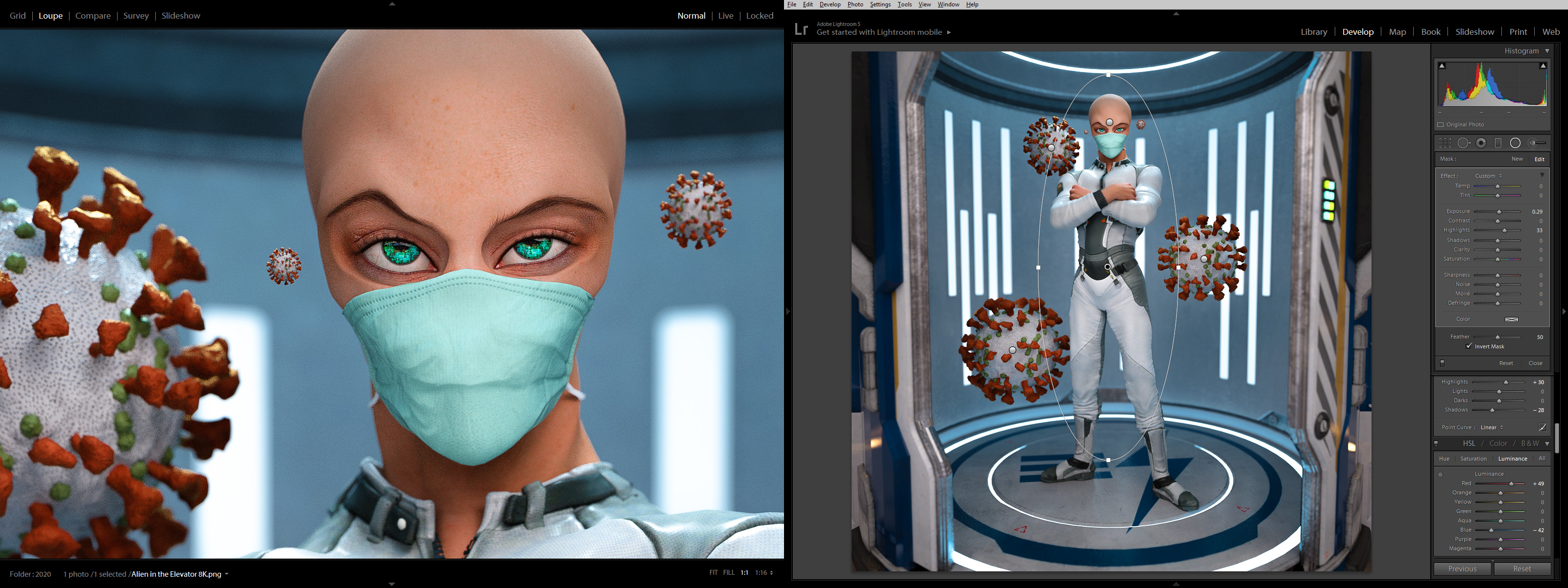 The color correction in lightroom made it pop quite nicely.
Created in DAZ Studio 4.12
Rendered with Iray
Color Correction in Lightroom
As you already know, my previous attempt to make the perfect social media avatar didn’t work out too well. Facebook was the biggest problem because sometimes their avatars are really, really tiny and the “man with no face” concept didn’t read. Also, shortly after I started using the side-view no-face avatar every single social media site changed their avatars from a square to a circle. Twitter, facebook, instagram, artstation, flicker… Everywhere. Aaaaarrrrrrgggggg!
OK, I needed something new, something simpler to understand and centered so it would look good in a circle. Enter Generic Man:
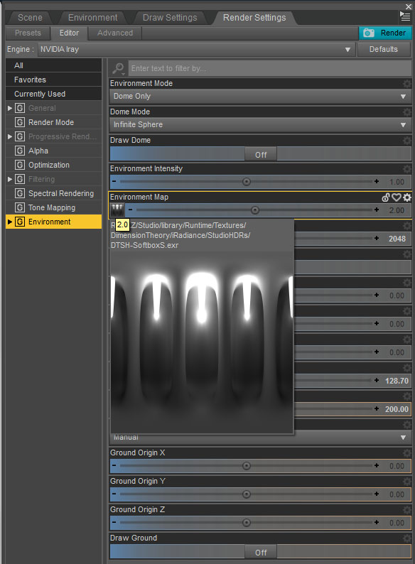
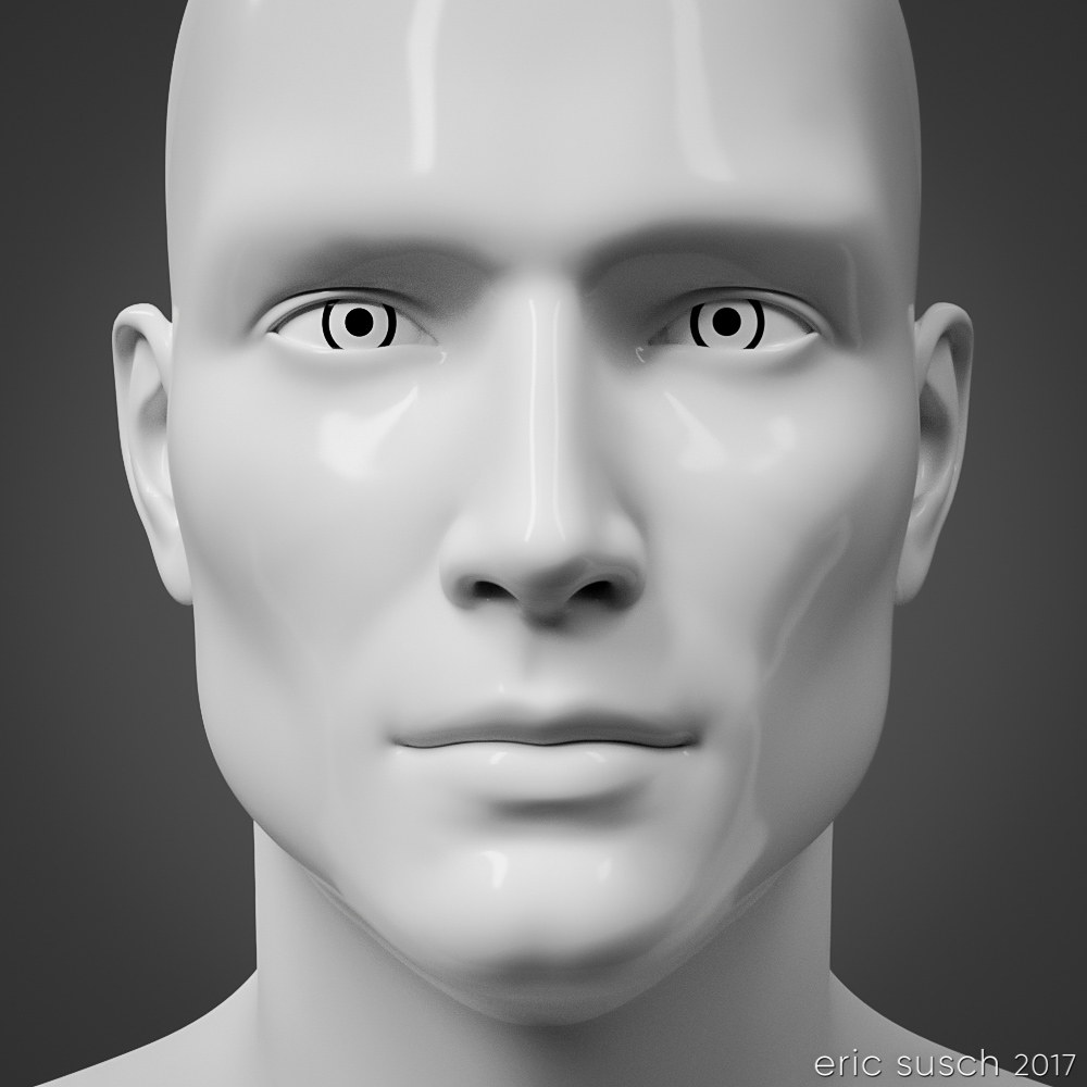 I kept things as simple as possible, centered face, no color, plain background. Getting the light right took time. Usually I like to set my own lights but this time I tried lighting exclusively with an HDRI dome. I tried many different light patterns until I got the glossy highlights and the deep set eye shadows just right. I didn’t want the light to be too flat but I also didn’t want it to be too shadowy either. This particular light pattern worked the best.
I also had to spend quite some time working on the white porcelain “skin” material too, especially since the neck of the original model was a different material. Finally I dialed in a slight asymmetrical facial expression just to give it a little something.
When I first rendered it out I kept the contrast very low. I liked the way it emphasized the eyes but it didn’t read well online at smaller sizes so I upped the contrast in Lightroom. This is the original render.
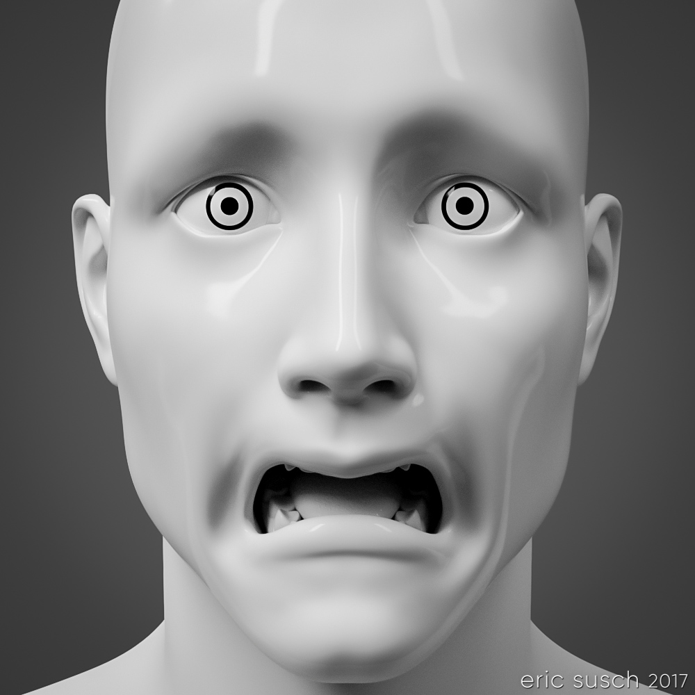
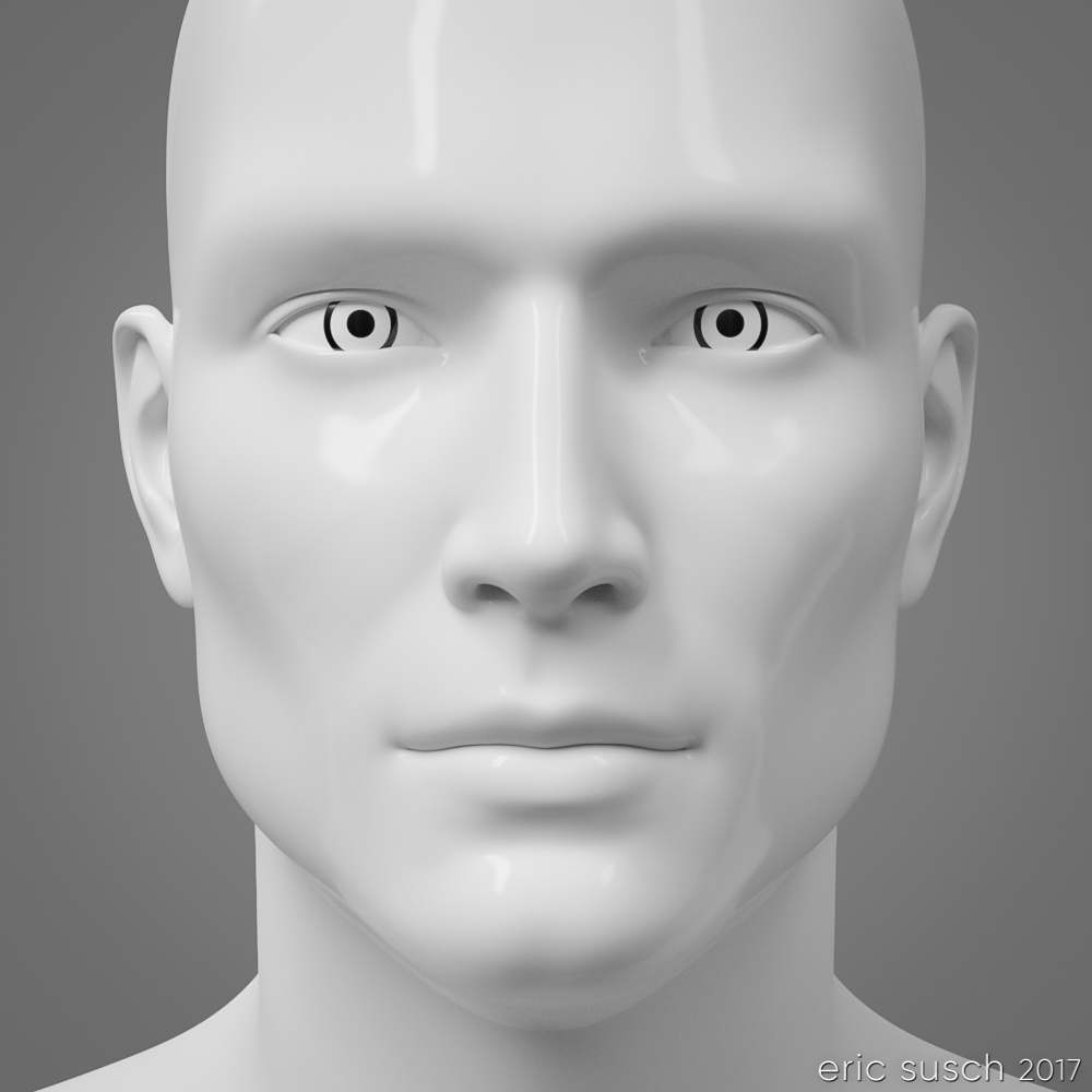 I’ve been using this avatar for several months now. It seems to work well at all sizes, even really small. It works in a square or a circle too. On Halloween I made an alternate and posted it for a day on facebook.
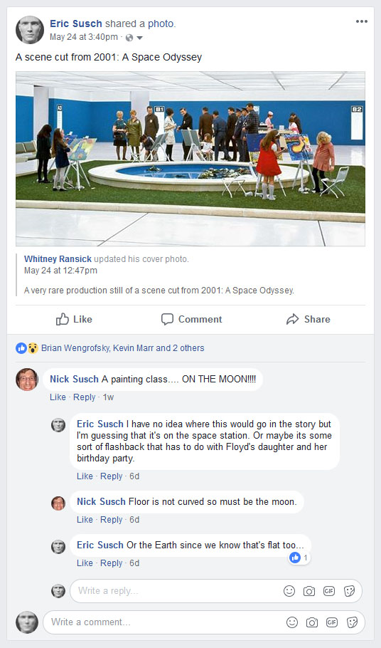
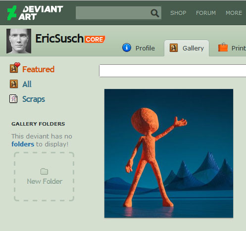
 Here’s a few screenshot examples on social media. Facebook (so tiny!):
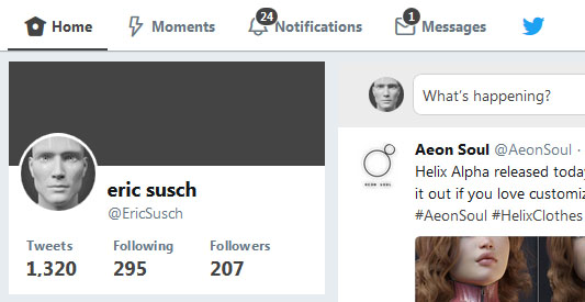
 Twitter:
Deviant Art:
Tumblr:
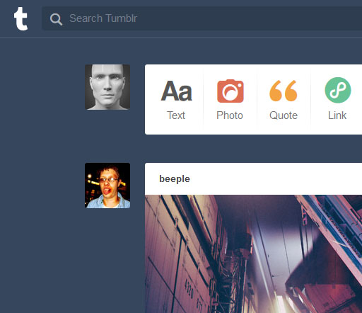 It looks good in a square or circle, even very teeny-tiny on facebook. I think this one is going to last me for quite awhile.
Created in DAZ Studio 4.9
Rendered with Iray
Color Correction in Lightroom
Figures used:
HP Prototype YC-7 for Genesis 3 Male
iRadiance – Studio HDRIs for Iray
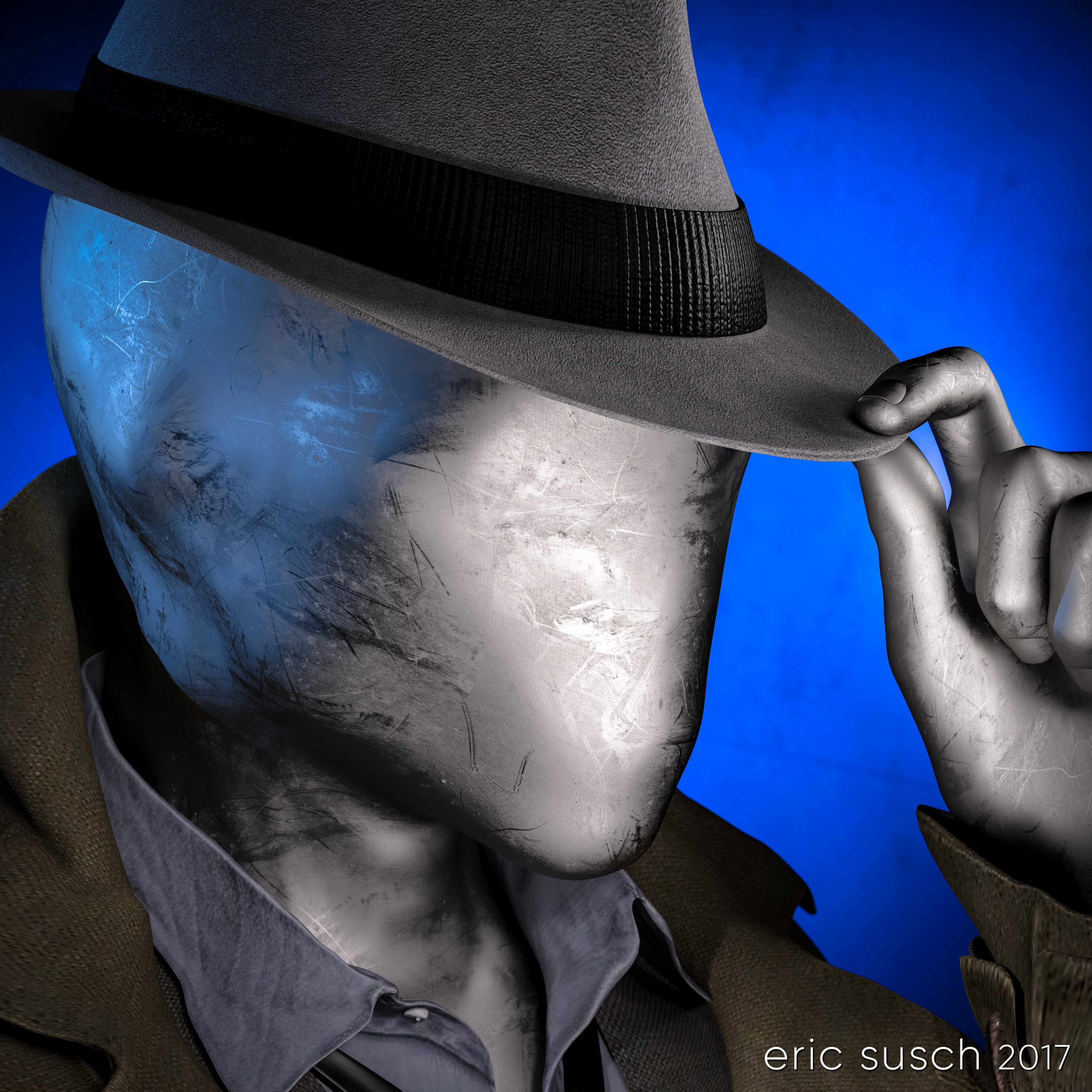 My eternal quest for the perfect CGI avatar continues. I’ve grown tired of my current avatar artwork. People think it’s a picture of me and I have to explain that it’s CGI. I need something that doesn’t look human. Perhaps something creepy…
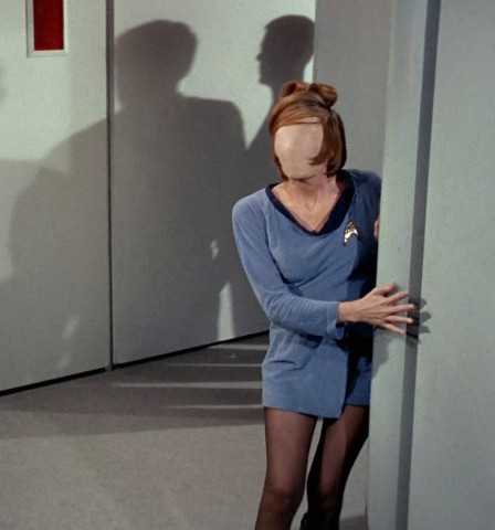
Mannequins and faceless people have always freaked me out ever since I was young. I attribute that to this scene from Star Trek…
 …and the Anything People on Sesame Street.
A freaky “no face” avatar would be cool and no one would think it was supposed to be me. Perfect!
I started with a faceless character model I had and I replaced the skin like surface with a different shader. I experimented with many, many different surfaces trying to find something cool.
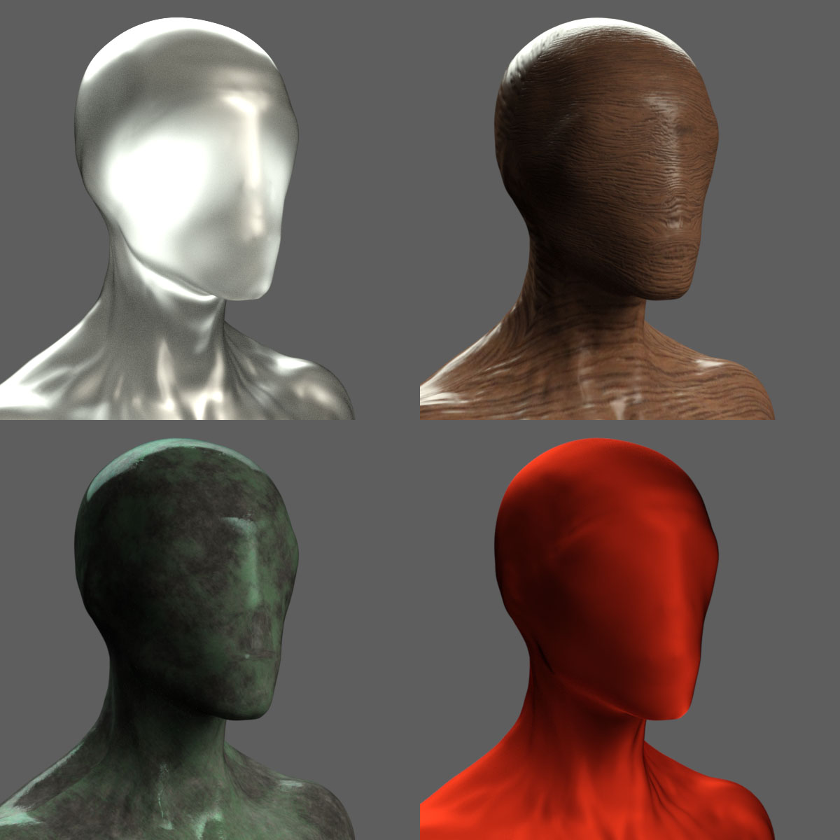 I tried cloth, wood, metal, rock, plastic, glass, grunge, paint, rubber, wax, anything I could think of.
 I tried to avoid chrome because I had done that several times in the past but in the end I caved, because I really liked this particular dusty anodized aluminum surface.
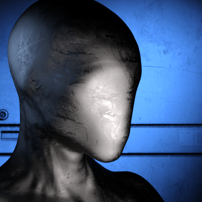 I posed the figure tipping his hat with a 1960s fedora. I wanted him to be creepy and friendly at the same time. A sloppy overcoat and loose necktie seemed to fit so I added that too.
 Give that man a hand
The fingers of the alien no-face character were creepy long, which looks OK but I like to make everything difficult so I decided to try and replace the hand with one that was human sized.
To do that I had to add another entire human sized figure and position the hand in the same place, grabbing the hat. It took awhile but I got it into position. Then I “turned off” (made invisible) the rest of that human character. For the no-face character I turned off the hand. The sleeve of the jacket was just long enough to hide the fact that the arm and hand didn’t meet exactly correctly. Everything came together when I layered the same aluminum shader on the human hand.
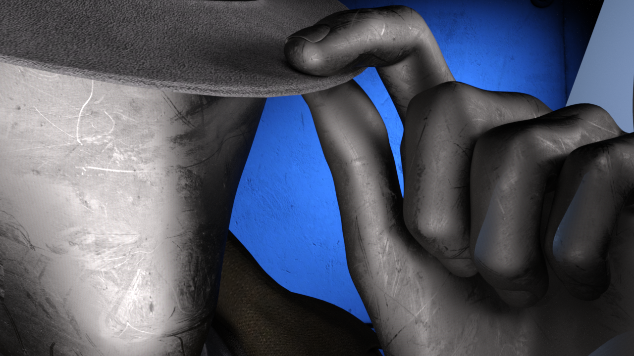 Dramatic Light
The lighting was difficult because of the reflective metal on the face. I ended up with a lot more spotlights than usual for a simple head shot just to get the reflections right. There are seven spot lights on the character and one blue spot on the background, which is just a gray wall panel.
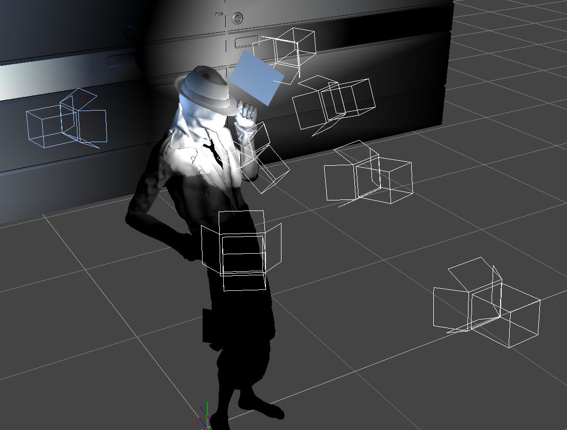 After rendering it out I pumped up the color a little in Lightroom…
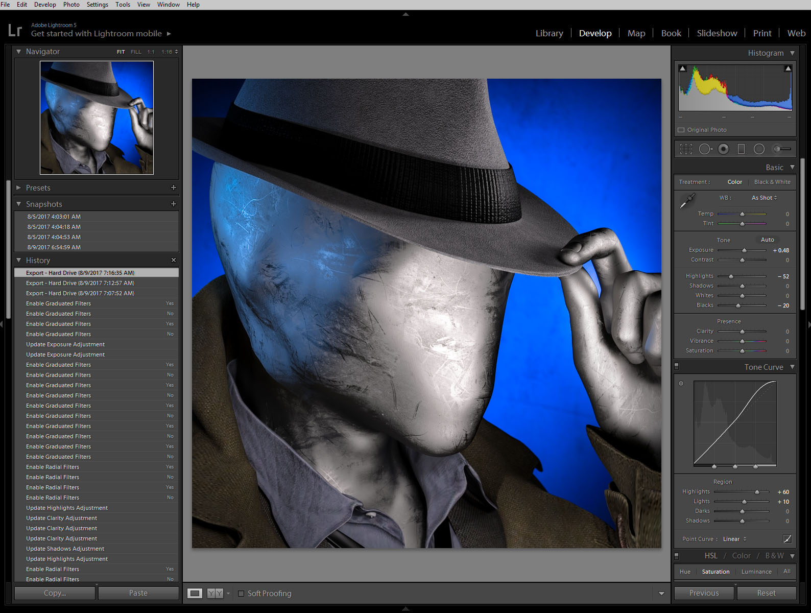 …and uploaded the avatar to Facebook.
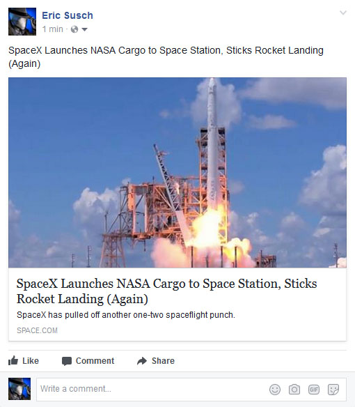
Unfortunately I saw almost immediately that you couldn’t tell what the picture was at very small sizes. It was the high contrast lighting, the same problem I had before on my first CGI avatar. It looked fine at larger sizes but when it was super tiny the bright shine of the face looked like an unrecognizable white blob on a blue background.
I went back into DAZ Studio and tried to even out the lighting. The best way was to set up a few more lights to fill in the dark spots. I didn’t like it as much when I was done but I rendered it out anyway just to test it on facebook. This is the “flat light” version.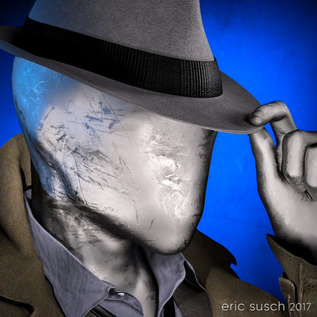 It worked better at small sizes as you can see but still not as well as other avatars I’ve created. Humans are programed to recognize faces easily, which is why facebook can make their avatars so small. I’m asking people to recognize “no face” so I guess that’s more difficult.
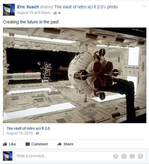 So it sort of works at the tiny sizes and doesn’t look as good as it could at larger sizes. I guess that makes this avatar attempt a bit of a failure. I still like it though, so I’m going to keep it for a time before I try again. I can also upload the first version to other sites that don’t have such small avatars. What do you think?
Created in DAZ Studio 4.9
Rendered with Iray
Color Correction in Lightroom
Figures used:
The Slim Man for Genesis 3 Male
Mec4d PBS Shaders vol.3 for Iray
Amazing Hat
Eldritch Seeker