Tag Archives: toon

I Reveal My Innermost Self

While I was working on a previous art piece called Quirky Girl, I stumbled through a wormhole and accidentally created this:

I Reveal My Innermost SelfI stopped everything and rendered it out immediately!  Enjoy!

I Reveal My Innermost Self

Created in DAZ Studio 4.11
Rendered with Iray
Color Correction in Lightroom

Figures used:
HPFK Lenora for Star 2.0 and Aiko 7
System 50 for G3F
Classic Bob Hair for G3+8F

Quirky Girl

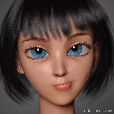
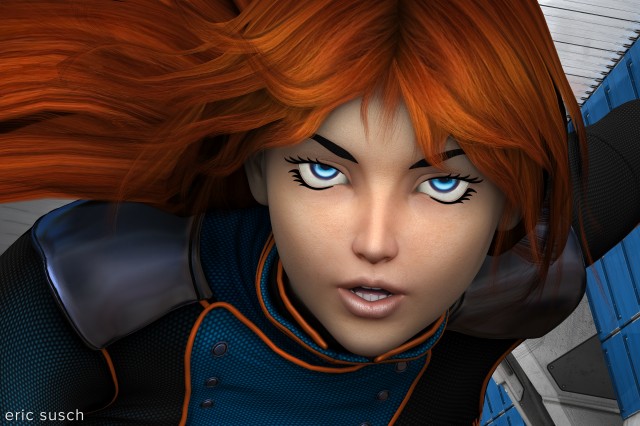
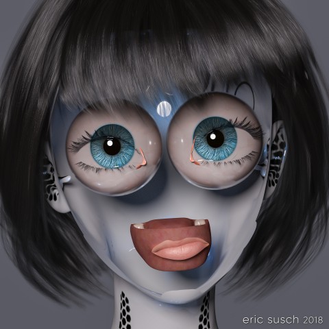
This piece started off as a study of volumetric light.  I wanted to practice creating an atmosphere in a large open space.  I was also determined to make some art with a male figure instead of always using females.  I ended up doing none of that!  Hurtling down the creative path I diverged several times and ended up with an extreme close up of a toon anime girl. That’s the way it goes sometimes.

Quirky GirlThe base shape is a toon doll like character that was designed to be goth with lots of “broken china doll” features.

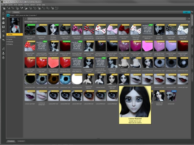
Quirky Girl BTS LenoraI tried some of the “broken” materials as well as the gothic makeup on the character but eventually moved on to other materials from elsewhere.  One of those experiments lead to a happy accident and created a bizarre horrifying variation which ultimately became a completely new piece of art.  …But that’s a post for another day.

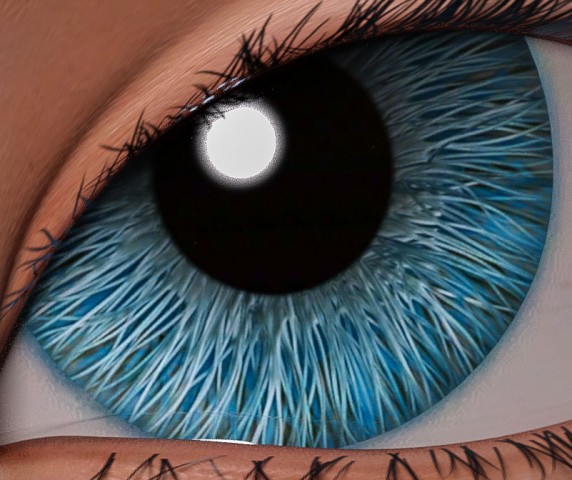
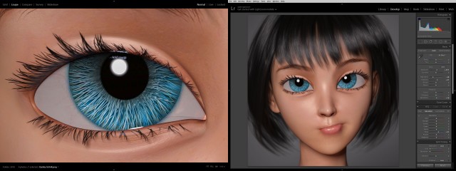
Quirky GirlFor this piece I eventually layered a more human material across the mesh and found these interesting eyes that look like they were made of brush bristles.  They appeared realistic and fake at the same time.  I wanted those eyes to be the focus.

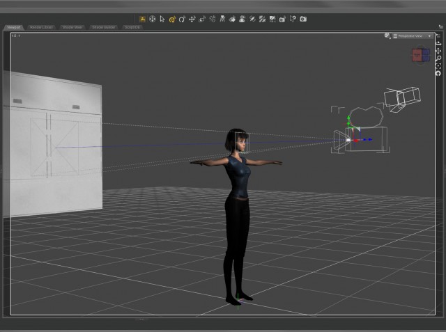
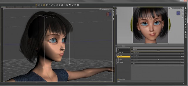
Quirky Girl BTS setupI set up a simple layout with the camera close on the face and only one light on the character.  I spent a lot of time working on the quirky expression because I knew that would be where the emotion came from.

Quirky Girl BTS DOFEven though the shot is essentially flat, I set up a limited depth of field on the camera anyway.  The effect is subtle – the hair in the back, the neck, and the ears are a little soft – but I think it gives it a little something.

Quirky Girl BTS ccColor correction in lightroom was fairly straightforward.  I bumped up the saturation of the blue channel to bring out the eyes.  Simple.

Quirky GirlQuirky Girl

Created in DAZ Studio 4.11
Rendered with Iray
Color Correction in Lightroom

Figures used:
HPFK Lenora for Star 2.0 and Aiko 7
Tamara Character and Hair for G3F
Classic Bob Hair for G3+8F

Set the Controls for the Heart of the Sun

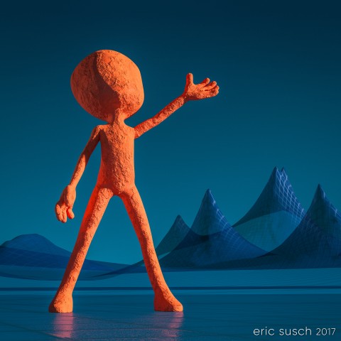
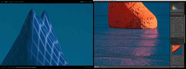
Set the Controls for the Heart of the SunI’ve been wanting to do an abstract piece for some time.  I love the way this came out.  I’ll definitely be doing more art like this in the future.

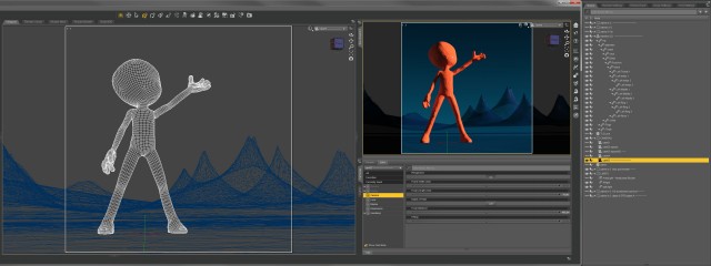
Set the Controls for the Heart of the Sun BTS wireframeThere’s not much to say about this piece. It’s pretty straight forward.  The light is from the HDMI which is essentially a gradient with a bright spot that becomes the “sun.”  The gradient did create a very slight banding across the sky and I had to bring the piece into photoshop to add some noise to try and smooth it out.  That was the only postwork I did in Photoshop.  You can still see the banding a bit but it’s much better than it was.  You can see the grain actual size behind the mountain in the color correction image if you click to embiggen it.

Set the Controls for the Heart of the Sun BTS ccI tried to make the ground look like ice by playing with the Metallic Flakes Weight setting in the Surfaces tab.  All in all I’m very happy with this one.

Created in DAZ Studio 4.9
Rendered with Iray
Minor post in Photoshop
Color Correction in Lightroom

Figures used:
Blank Boi
Planet X-3
Mec4d PBS Shaders vol.2 for Iray
Wireframe and Hologram Shaders


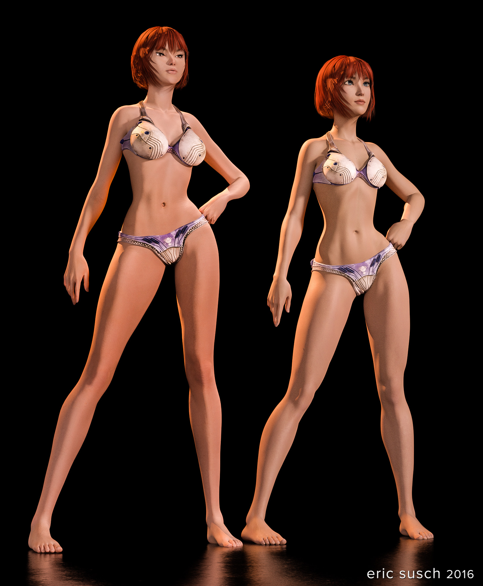
Aiko 6 and 7 Comparison

Aiko 6 is one of my favorite DAZ character models.  I’ve been waiting for some time for Aiko 7 to come out and yesterday was the day.  Here is a quick comparison render.

Aiko 6 and 7 comparisonAs I expected they changed the character’s proportions and made her more realistic.  This is a trend at Daz with the new models.  I think it’s a mistake especially with characters that have a toon, or in this case, anime flavor.  It bleeds the style out of the models and makes them bland.  What’s the point of CGI without a little artistic flare?  If you want realism just take a photograph.

I do like the new eyes.  Aiko 6’s eyes look droopy sometimes, like here:

I was fluid, like water (close up)Of course if the new model were exactly the same then it wouldn’t be new.  Also, you can always change the proportions of any model so it’s not too hard to dial the anime back.  What do you think?

Alien Avatar

Aien AvatarI started a facebook page for my artistic work several years ago.  Ever since then I’ve wondered how to separate what I post to my personal profile, which I keep essentially public, and what I post to my page.  After years I still haven’t figured it out.  The page is reserved for my work and general SciFi culture, but I also post that stuff to my personal profile too, so I end up cross sharing a lot which I hate.

It’s easy to get confused between the profiles so I make sure they at least have different avatars.  I created this one similar to my new personal avatar but with an alien.  I won’t know what to post where, but at least I’ll know who I am when I’m posting!

Eye Light

I had to light this differently from my personal avatar.  Usually I go for the control of spotlights but for this I needed something to reflect in the big black eyes.  I lit this image solely with a skydome that surrounded the entire scene.  Since that put too much light on the back panel, I then modified the surface and made it darker, so it would look similar to the original background.

Created in DAZ Studio 4.9
Rendered with Iray
Color Correction in Lightroom

Figures used:
Grey Alien for Genesis 3 Female

A Collection of Rusty Robots

Can six rusty robots fight crime without driving each other crazy?
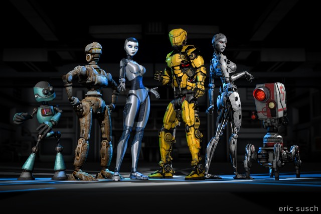
A Collection of Rusty RobotsThis one was complicated. Six characters and twenty-five lights.

I was trying to emulate a team freeze frame at the end of an anime intro. I wanted to capture the uniqueness of each character. I even wrote out a short description of each robot to help me differentiate them. Looking at this piece now though, I think it ended up a little too “characters just standing there.” It could do with a few more action poses, but it’s done now so here it is.

I’m going to post my usual more in depth behind-the-scenes info but that will have to wait a few days since this piece is so complicated. It’ll probably end up as multiple posts. For now I’ll leave you with the character descriptions I wrote. Let me know what you think!

Meet the team!

(from left to right)

Gomer is a wise guy. He always has an opinion and he doesn’t take lip from anybody. He thinks he’s the leader but nobody else listens to him. When attacking a bad guy’s hideout the others always make him crawl in thru the air ducts which pisses him off. He thinks Brigitte is “hot stuff.”

Barney is a “can do” fella. He can fix just about anything. Knows how to make explosives too. He gets the job done while the rest are goofing around. Currently he’s in a romantic relationship with Alice.

Alice is a fighter. She can swiftly and silently take out a whole gang of bad guys. She’s a bit fussy though and, unlike the others, she likes to stay clean. She avoids the general dirt and grime of crime fighting. She’s in love with Barney even though he always seems to be a bit dirty. It’s OK though because she’s confident she can change him.

Jim is the leader of the team. He’s a powerful warrior but is totally lost trying to get the rest of the team to work together. He thinks Alice is his girlfriend even though she wants nothing to do with him. Alice thinks Jim is too full of himself.

Brigitte is a master of disguise and can wear a rubber mask to look human. She doesn’t really enjoy fighting crime but she hangs around because she likes Jim. Gomer is in love with Bridget but she can’t stand him.

Gronk (AKA “Five”) has a powerful Plasma Death Ray to blast holes in buildings and blow up cars. He wants to do more but doesn’t really have the ability. He trys.

Buy a print here –> http://www.deviantart.com/print/38109712/
The Space Between Us

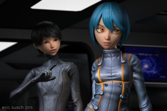
Prints of this image are available on my Deviant Art page.The Space Between Us

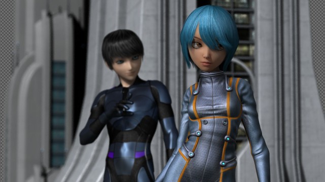
I’ve started working on a few CGI images with multiple characters but this is the first one I’ve been able to finish.  Right now I have five or six projects that are stuck at various stages.  One thing I’ve realized is I’m having tremendous difficulty with backgrounds.  I’m consciously starting my scenes with character ideas first because I see that as the most important element in the image. I then end up trying eight or nine “sets” for the background and nothing seems to fit.  It’s easy to move entire sets in and out in virtual space and try different things but I guess my brain just doesn’t work that way since it’s not how you make movies in the real world.  All my creative experience starts with the location first, then the actors come in to block the scene, and finally the camera positions are locked down.  I think I’m going to have to change my workflow and do it the way I know.

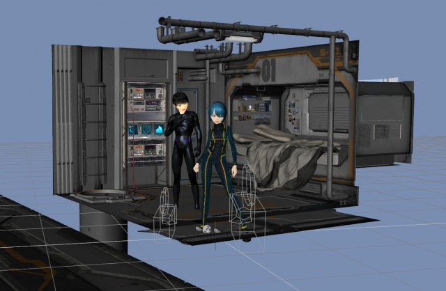
the space between us BTS extI originally envisioned this scene as an exterior, but that didn’t work so I tried several interiors including this space bedroom complete with professional video tape rack.

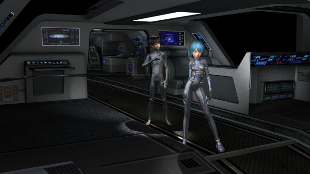
the space between us BTS space bedroomI eventually settled on the interior of a shuttle type spaceship.

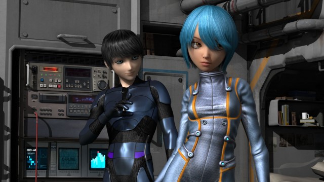
the space between us BTS vanguardYou may have noticed I originally had a different character for the boy.

the space between us BTS space bedroom2He was anime style but a bit too realistic for skinny toon/anime girl (Keiko 6.)  Modifying a straight up toon style boy character (Animated Shapes for G2M) with a different skin texture and bigger eyes created a figure more in line with the anime style of the girl.

I had that kinky hair problem that I’ve mentioned before.  You can see it here above the right eye.

kinky hair detail

I asked about it on a DAZ facebook group and there is a fix!  There’s a hidden control in the hair parameters called “smoothing iterations.”  Increase it a bit and the kinkiness goes away.  I found that you should only increase the smoothing just enough to solve the problem because higher numbers thin out the hair considerably making your character look like a post-apocalyptic radiation victim!  (…which, come to think of it, may be a hair style I need some day.)

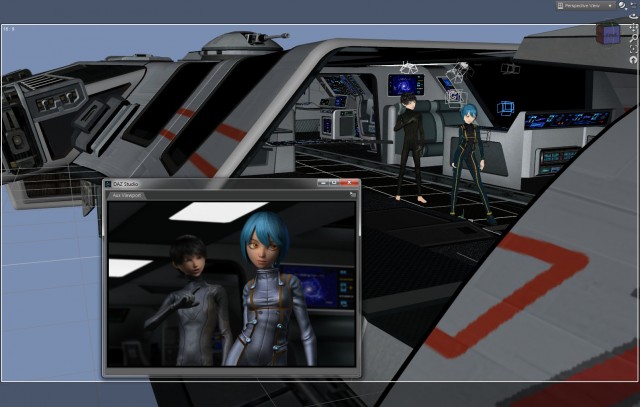
the space between us BTS aux viewerWhile working on this piece I started using the new Aux viewport in DAZ Studio 4.7.  You can set it to continuously render so that, as you are working it will keep updating.  It sort of works.  My processors and fans were churning hard as it was trying to keep up with the changes.  It’s usable for lighting, only re-rendering the area of the picture effected when you move a light.  For moving models around the space it’s not as good.  The screen update gets slow and you end up waiting a lot.The Space Between Us

All in all I’m very happy with this piece.  It’s my first with two characters interacting in a two shot which is more like a movie and less like a character just standing there.

Prints of this image are available on my Deviant Art page:
http://ericsusch.deviantart.com/art/The-Space-Between-Us-513716053