Tag Archives: DAZ

I Was Fluid, Like Water (close up)

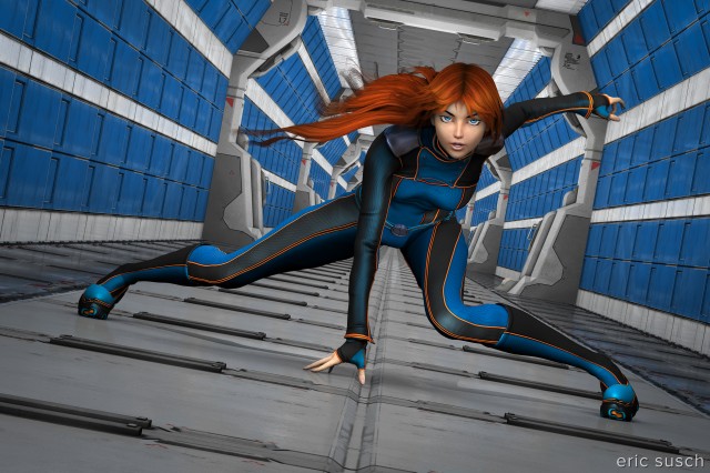
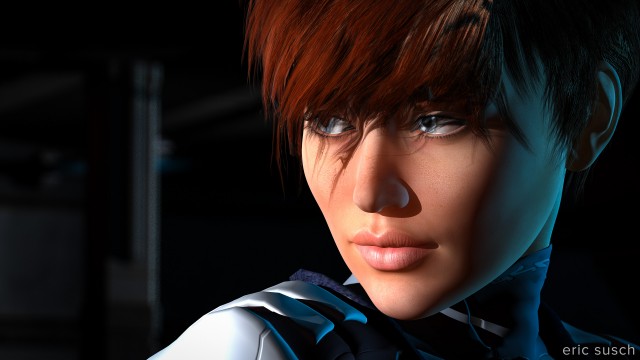
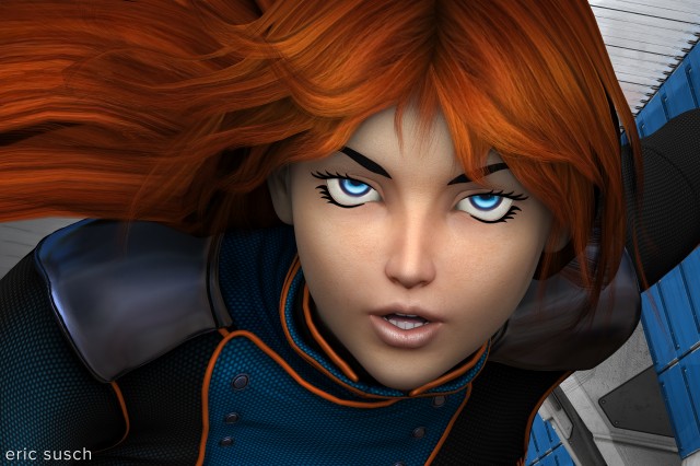
I was fluid, like water (close up)I’m frustrated with my work.  In most of my previous CGI pieces I started out with an idea that should be dynamic but ended up with something less exciting.  Most of my ideas have become medium to long shots of characters just standing there.  If I was directing a movie, this is when I would punch in for a close up to capture more of the emotion.

As an experiment, I’ve taken a previous piece I Was Fluid, Like Water and created a close up of the face.  It looks like a cropping of the previous image but that’s not how I created it.  I went back into the 3D space, set another camera in the exact position, and composed a new shot with a longer focal length.  That allowed me to create a new 10K render and not lose any of the small details like the stitching on the jacket.

The hair is still a problem, maybe even more so in the close-up.  I fixed it up a little in Photoshop but it’s still kinky and unrealistic.  The overall style is on the “doll-like anime” side with fake eyebrows etc. so maybe the kinky hair is OK.  What do you think?  Which do you like better, the original long shot or the close up?

I was fluid, like water

A Collection of Rusty Robots

Can six rusty robots fight crime without driving each other crazy?

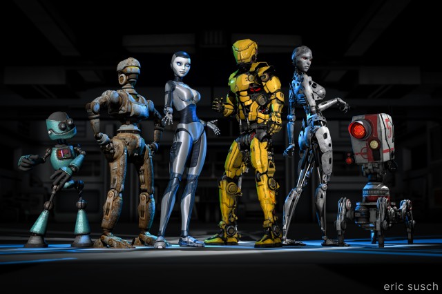
A Collection of Rusty RobotsThis one was complicated. Six characters and twenty-five lights.

I was trying to emulate a team freeze frame at the end of an anime intro. I wanted to capture the uniqueness of each character. I even wrote out a short description of each robot to help me differentiate them. Looking at this piece now though, I think it ended up a little too “characters just standing there.” It could do with a few more action poses, but it’s done now so here it is.

I’m going to post my usual more in depth behind-the-scenes info but that will have to wait a few days since this piece is so complicated. It’ll probably end up as multiple posts. For now I’ll leave you with the character descriptions I wrote. Let me know what you think!

Meet the team!

(from left to right)

Gomer is a wise guy. He always has an opinion and he doesn’t take lip from anybody. He thinks he’s the leader but nobody else listens to him. When attacking a bad guy’s hideout the others always make him crawl in thru the air ducts which pisses him off. He thinks Brigitte is “hot stuff.”

Barney is a “can do” fella. He can fix just about anything. Knows how to make explosives too. He gets the job done while the rest are goofing around. Currently he’s in a romantic relationship with Alice.

Alice is a fighter. She can swiftly and silently take out a whole gang of bad guys. She’s a bit fussy though and, unlike the others, she likes to stay clean. She avoids the general dirt and grime of crime fighting. She’s in love with Barney even though he always seems to be a bit dirty. It’s OK though because she’s confident she can change him.

Jim is the leader of the team. He’s a powerful warrior but is totally lost trying to get the rest of the team to work together. He thinks Alice is his girlfriend even though she wants nothing to do with him. Alice thinks Jim is too full of himself.

Brigitte is a master of disguise and can wear a rubber mask to look human. She doesn’t really enjoy fighting crime but she hangs around because she likes Jim. Gomer is in love with Bridget but she can’t stand him.

Gronk (AKA “Five”) has a powerful Plasma Death Ray to blast holes in buildings and blow up cars. He wants to do more but doesn’t really have the ability. He trys.

Buy a print here –> http://www.deviantart.com/print/38109712/

Welcome to DAZneyland

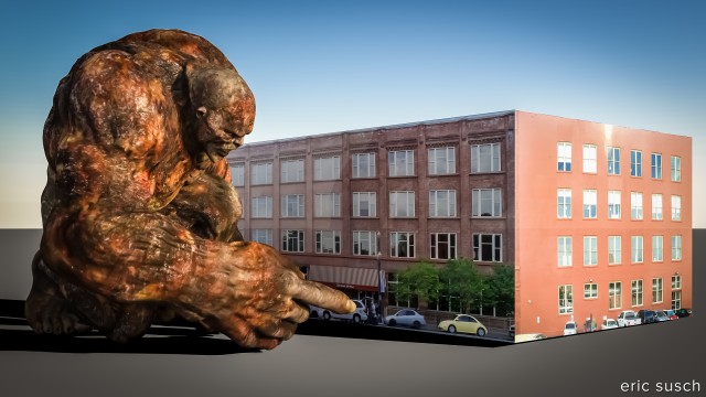
Welcome to DAZneylandAfter walking for ages, our hero finds a curious place with two dimensional beings.

I put this image together mainly as my first test of the new nVidia Iray rendering engine in the just released DAZ Studio 4.8 beta.  The changes at first glance seem a bit like re-inventing the wheel but I’ve just started working with it and I’m still finding my way around.

I was initially attracted to DAZ Studio because of it’s simplicity.  Throw some twenty dollar models in a scene, light it properly, hit render, and it looks fantastic.  This new render engine seems much more complicated and I’m not sure what you get for all that extra work.  I’ve seen others rave that the renders look more “real” but so far I haven’t seen any comparisons where the Iray version is significantly better.  In fact in many comparisons I’ve seen the Iray version is significantly worse but it’s still early days and people are still learning.

One problem I’m seeing immediately with this new engine is the render time.  The very simple 3D scene above took about an hour to render at 4K (4000 x 2667) which is quite long for my relatively powerful system.  For comparison some of my previous (more complicated) scenes took anywhere from fifteen to thirty minutes to render at 10K.  Maybe I’m doing something wrong but I don’t see how.  This piece has only three elements: one character (with no clothes,) a sky dome, and two flats with photos on them.  This needs more testing but these types of render times just won’t work for me, especially when I get into animation.

I also had trouble with the sky dome.  I had to work quite hard in Lightroom to eliminate significant color banding across the sky in the picture above.  Everything was set to the default so I’m not sure how I could have avoided this.

As far as the rest of the picture quality, we’ll have to see.  The rendering technology is different and for a fair comparison I’ll need to get more proficient with all the new settings.  I’d like to see the best this new technology can do and compare it to the best of the old engine.  That’s the only true comparison and that’s going to take some time.  The old 3Delight render engine is still available in the new version of DAZ Studio so I’ll probably keep using that for my serious pieces while I continue further testing of the Iray engine.

Created in DAZ Studio 4.8 beta
Rendered with nVidia Iray
Color Correction in Lightroom

Figures used:
Infernal Behemoth
DAZneyland

The Creation of ATOM

Prints of this image are available on my Deviant Art page:
http://ericsusch.deviantart.com/art/The-Creation-of-ATOM-516835191
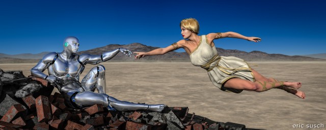
The Creation of ATOMAfter Man destroys the planet Earth with nuclear weapons, God creates machine life to take his place.

This CGI piece took me awhile. It’s based on the The Creation of Adam by Michelangelo, from the ceiling of the Sistine Chapel at the Vatican.  CAT and I were recently in Rome and were able to spend five minutes in the Sistine Chapel admiring all the artwork.  You couldn’t take any pictures of course, since the Japanese own the copyright.  (The Vatican is a strange place.)  So when we got back I decided to make my own creation imagery to hang on the wall.

I used this project to learn how to pose characters manually.  The poses were iconic and predetermined so I didn’t have to worry what was going to look good, just how to get the characters into position.  In the end It took some doing to get everything adjusted in three dimensions and looking correct for the camera.
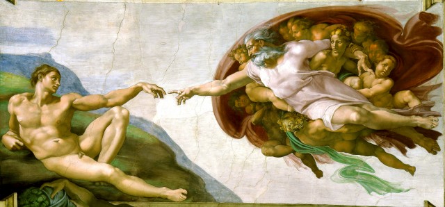
Creación_de_Adám

I don’t think a man can actually lean back in the real world the way Adam does in the original, at least an android can’t.  I have several of the robot joints pushed way beyond their limit and still he isn’t really in the same position.  It’s close enough to get the idea though.  The posing process was long and tedious but ultimately rewarding.  I’m especially happy with the hands in the center.The Creation of ATOM - handsI had problems again with kinky hair.  The short style I chose was an older mesh and didn’t have the smoothing control I used in the last piece.  I then discovered that the smoothing controls can be added to any object by selecting it and accessing the DAZ Studio menu in the upper right of the scene tab.  Select Edit / Apply Smoothing Modifier and then the smoothing controls will appear in the object’s Parameters tab.  This fixed the kinks but I still had hair shadow trouble.  Some of the underlying shadows were ending abruptly probably because some of the hair was poking into the skull.  Adjusting the hair didn’t resolve the problem.

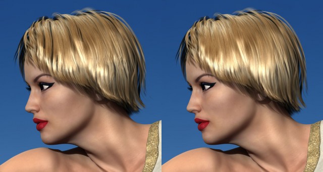
The Creation of ATOM - bad hair 03To fix the funky shadows I rendered the hair again without shadows.  I then layered this underneath the head and used a matte in Photoshop to erase only the parts of the hair where I wanted to remove the shadows.  This left the shadows at the edges and bottom of the hair but eliminated the distracting ones deep within.

The biggest problem I had was the horrible, horrible dress.  I purchased and tried several Greek/Roman toga-esque dresses which were similar to what God is wearing in the original piece.  I really liked a dress that had one long sleeve but unfortunately it covered the wrong arm and I couldn’t figure out how to flip it.  This next best alternative was nice looking but turned out to be a disaster.  It had a million shaping controls but I couldn’t get it to fit correctly without the mesh bunching, tearing, and dripping all along the chest.  It was the only dress I had that looked right so I grit my teeth and fixed it with the spot healing brush in Photoshop.  That kind of fix isn’t going to work when I get into animation.
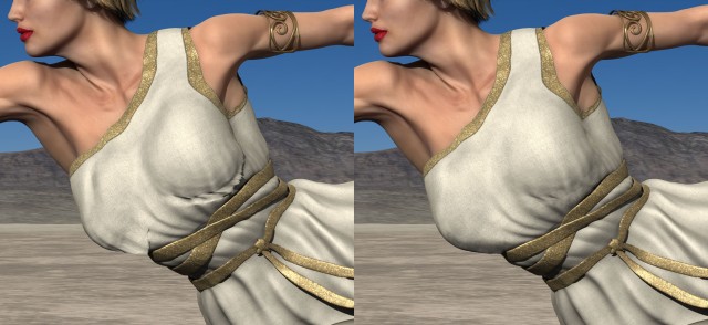
The Creation of ATOM - bad dress 03I struggled with the background again too.  The original idea was a destroyed city like after an earthquake or a nuclear attack.  It was way too busy and difficult to separate the characters, especially the chrome of the android, from the background.  There was just too much detail in the rubble.
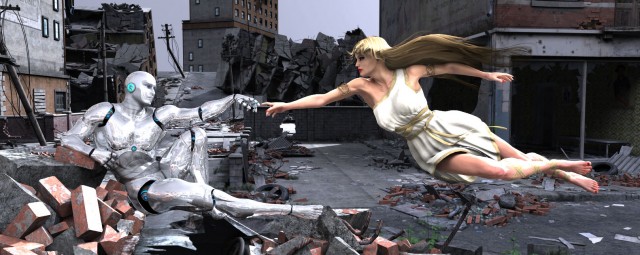
creation of ADAM BTS 04CAT suggested I try a desert background.  I wasn’t sure.  I didn’t want it to look like an unrelated background photo.  After I tried it I changed my mind because the background became a metaphor to me.  It suggests nuclear testing, or maybe a Mad Max type social collapse.  What do you think?

The Creation of ATOMCreated in DAZ Studio
Postwork (fixing hair and dress) in Photoshop
Color Correction in Lightroom

Figures used:
bot Genesis
Lilith 6
City Ruins: Vehicles
Dry Mud Desert

Prints of this image are available on my Deviant Art page:
http://ericsusch.deviantart.com/art/The-Creation-of-ATOM-516835191
The Space Between Us

Prints of this image are available on my Deviant Art page.The Space Between Us

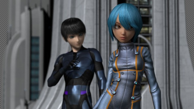
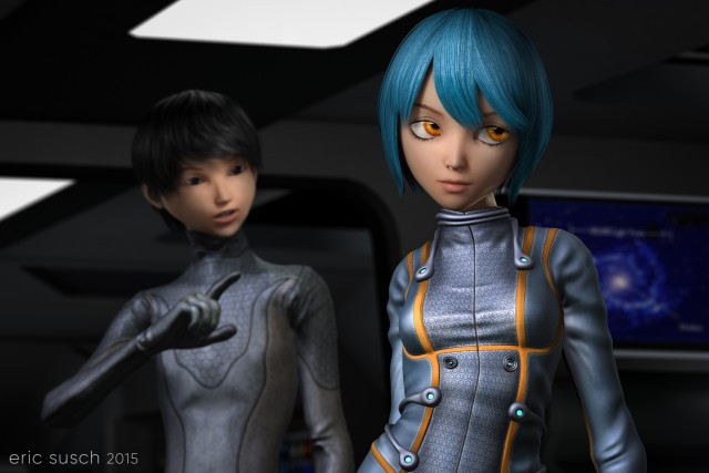
I’ve started working on a few CGI images with multiple characters but this is the first one I’ve been able to finish.  Right now I have five or six projects that are stuck at various stages.  One thing I’ve realized is I’m having tremendous difficulty with backgrounds.  I’m consciously starting my scenes with character ideas first because I see that as the most important element in the image. I then end up trying eight or nine “sets” for the background and nothing seems to fit.  It’s easy to move entire sets in and out in virtual space and try different things but I guess my brain just doesn’t work that way since it’s not how you make movies in the real world.  All my creative experience starts with the location first, then the actors come in to block the scene, and finally the camera positions are locked down.  I think I’m going to have to change my workflow and do it the way I know.

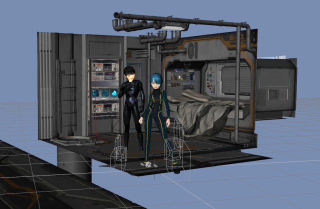
the space between us BTS extI originally envisioned this scene as an exterior, but that didn’t work so I tried several interiors including this space bedroom complete with professional video tape rack.

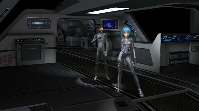
the space between us BTS space bedroomI eventually settled on the interior of a shuttle type spaceship.

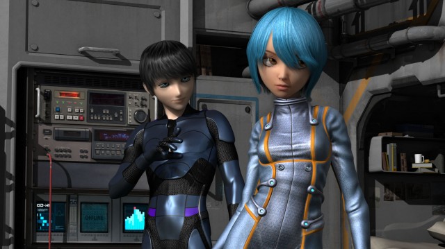
the space between us BTS vanguardYou may have noticed I originally had a different character for the boy.

the space between us BTS space bedroom2He was anime style but a bit too realistic for skinny toon/anime girl (Keiko 6.)  Modifying a straight up toon style boy character (Animated Shapes for G2M) with a different skin texture and bigger eyes created a figure more in line with the anime style of the girl.

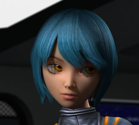
I had that kinky hair problem that I’ve mentioned before.  You can see it here above the right eye.

kinky hair detail

I asked about it on a DAZ facebook group and there is a fix!  There’s a hidden control in the hair parameters called “smoothing iterations.”  Increase it a bit and the kinkiness goes away.  I found that you should only increase the smoothing just enough to solve the problem because higher numbers thin out the hair considerably making your character look like a post-apocalyptic radiation victim!  (…which, come to think of it, may be a hair style I need some day.)

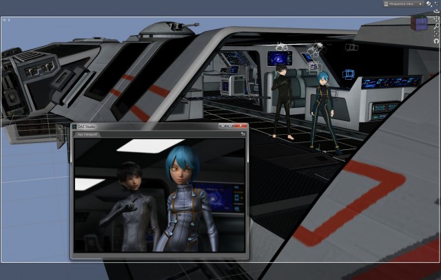
the space between us BTS aux viewerWhile working on this piece I started using the new Aux viewport in DAZ Studio 4.7.  You can set it to continuously render so that, as you are working it will keep updating.  It sort of works.  My processors and fans were churning hard as it was trying to keep up with the changes.  It’s usable for lighting, only re-rendering the area of the picture effected when you move a light.  For moving models around the space it’s not as good.  The screen update gets slow and you end up waiting a lot.The Space Between Us

All in all I’m very happy with this piece.  It’s my first with two characters interacting in a two shot which is more like a movie and less like a character just standing there.

Prints of this image are available on my Deviant Art page:
http://ericsusch.deviantart.com/art/The-Space-Between-Us-513716053

This World is MINE!

Prints of this image are available on my Deviant Art page.This World is MINE!

In keeping with my goal of making my images look like stills from a motion picture, I set the camera on this piece low with a long lens.  If I were shooting this as a film that’s what I would do.  Unfortunately that makes the background environment flatten and, in this particular image, I think it makes it look like a layered composite over a still.  I spent a lot of time trying to adjust the depth of field and the camera angle to make it look “whole” but I think I was ultimately unsuccessful.  There may be several reasons for this but I think it may be partially psychological.  In a film this style is common and accepted without question, but here we know beforehand that the image is synthetic and therefore our eye is on the lookout for signs of fakery.

One thing I learned from my early experience with actual physical model making is that a shallow depth of field will make the model look small, regardless of how well it’s done.  You always need everything in focus to fool the eye and make it look bigger, otherwise the eye will notice other cues and the actual scale will be revealed.

I really don’t want to be limited in that way with my CGI work.  I need to find a way to use a shallow depth of field and make it look right, especially on medium and close shots.

Rendered in DAZ Studio
Color correction in Lightroom

Prints are available on my Deviant Art page.  Hang one on your wall today!

Love Is Not Enough

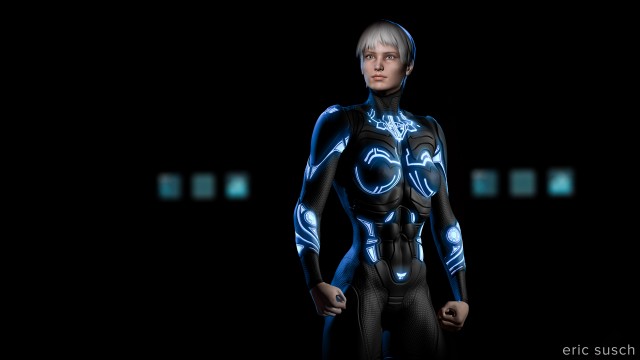
love is not enoughAdvanced lighting class!  A black suit against a dark background and forties film noir style glamor lighting on the face.  I’m now comfortable setting lights, well the spotlight at least, which is the most like a real Fresnel movie light.  Still not too sure about some of the other style lights available in the program.  I tried using a point light as a fill light and it was a disaster, very unrealistic looking.  I’m going to stick to spotlights for interior lighting.  Wish they had barn doors to make a quick slash on the wall.  I made a “flag” with a flattened solid primitive cube though and that worked.

The background is actually a scifi medical bay set with diagnostic beds and everything.  I spent hours trying different background lights but eventually settled on leaving it dark with only the computer monitors lit.  It just seems more mysterious that way.  It’s the same on a movie set.  If the lighting isn’t working you’re probably using too many lights.  Turn some off and see what it looks like.  Chances are it will be better.

A Million Faces, A Million Lies

a million faces, a million liesMaking movies is something I know about.  I know how to light a space and frame a shot on a real world film set.  It’s a process that makes sense to me.  That’s comforting when I’m floundering around with all the thousands of CGI controls that I have no clue about.  It gives me more time to experiment and learn.

This image actually came about serendipitously when I was setting the depth of field on the camera in the previous shot. I was off to the side (in a virtual sense) measuring the focal distance from camera to subject and this is what I saw. I set another camera, moved the red light a bit to adjust the shadow, and threw a cool blue light on the back wall. It’s just one of those happy accidents that sometimes becomes the coolest shot in your film.

a million faces, a million lies

What Do You Want?

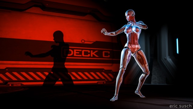
What do you want?One of the things I’m trying to do with my CGI work is develop a cinematic style.  Some of the digital art I see around the internet looks like it’s trying to imitate traditional illustration, other pieces look more like comic book or manga style, a lot looks like computer games.  This is all fine but I want my work to look like it came from a motion picture.  I want it to look like The Godfather, High and Low, Barry Lyndon, Days of Heaven, or Night of the Hunter.  I want these early test images to look like a still frame ripped from a longer dramatic story.

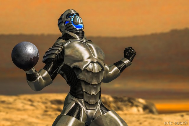
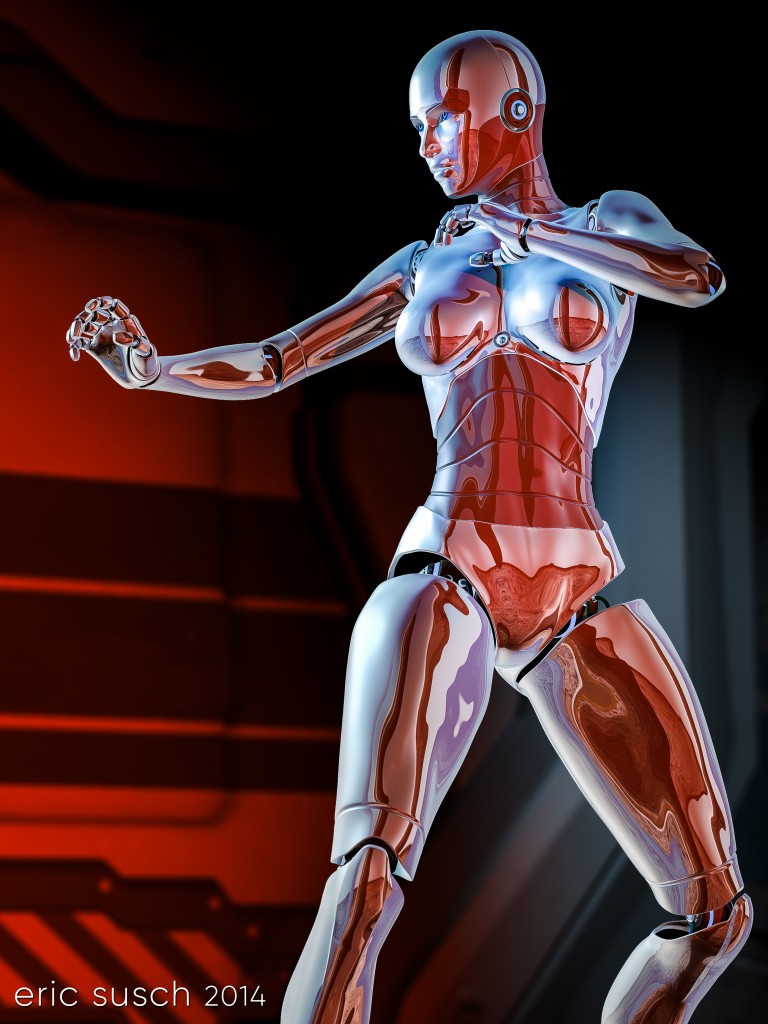
I actually thought this image would be more of a challenge than it actually was.  Lighting chrome in the real world is difficult.  I was ready to abandon it if it looked terrible.  I imagined I would have to light the entire set around the character but I tried lighting it directly first and it looked OK.  There are only four lights working here, a cool bluish key and two reddish fills on the character, and a light on the background.  I’d really like to see this character moving with all those reflections but that’s a little advanced for me right now.  I’ll have to come back to this one later when I start experimenting with animation.

Created in DAZ Studio 4
Rendered with 3Delight
Color Correction in Lightroom

Figures used:
Bot Genesis
Utopia Deck C

Thinking Of You

Thinking of You

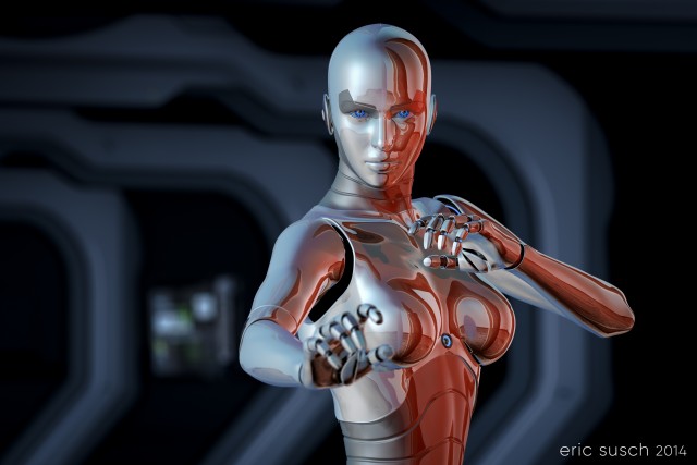
I went back to my first setup to try a long lens closeup.  I’m not really happy with the hair.  It’s a bit unrealistically kinky.  The shadow makes it worse, but that’s not what this shot is about.  The super exciting major point of this shot is the column in the background!  I actually set a light and adjusted it myself so you could see something back there!  Now I know how to set both cameras and lights!  Onward…

Make sure you click on the image to see it in the original 4K size.  The detail of these inexpensive models is stunning!