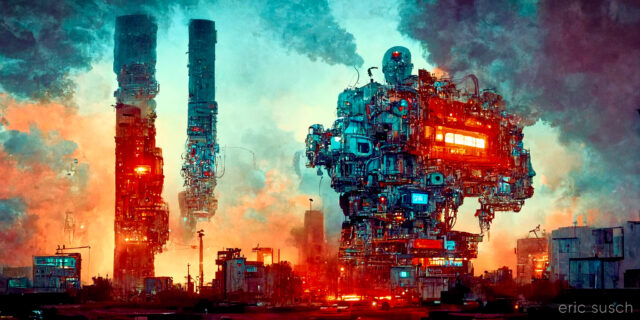
If you ignore the clickbait title and skip the first two and a half minutes of seizure inducing “teaser” montage, this video ends up being the best discussion I’ve seen in a long time about the history of information technology and it’s effect on Democracy. Highly recommended.
Tag Archives: tech
We Are the Dreamers of the Dream (sky grid update)
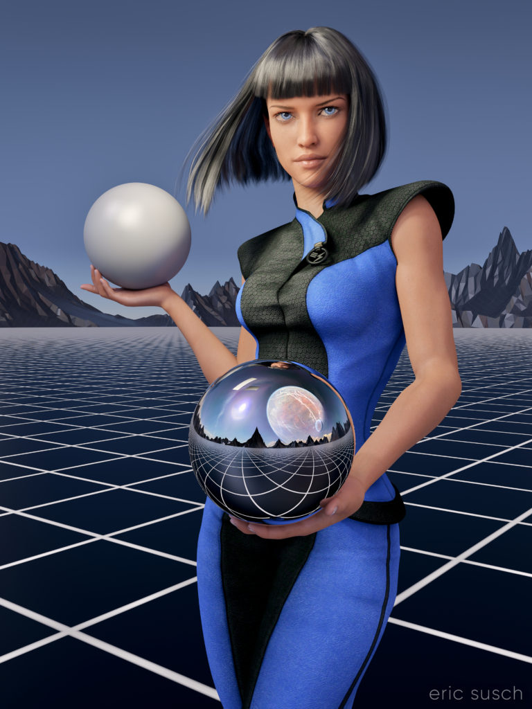
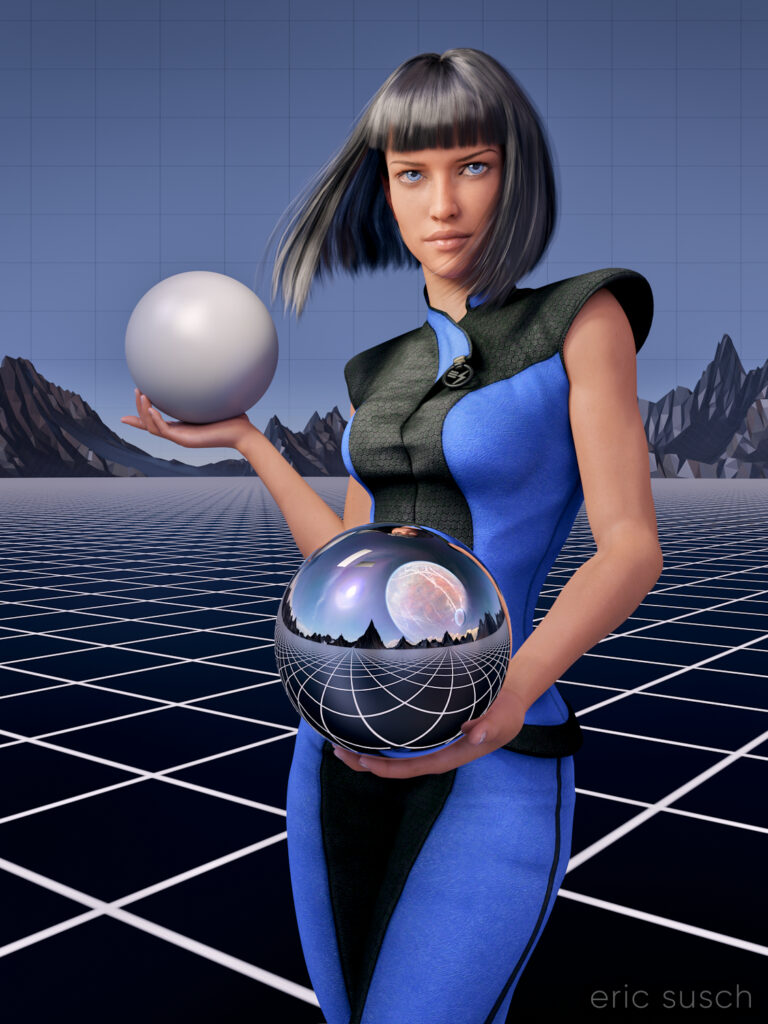
After my first experience making a puzzle I decided to update the artwork before printing another test puzzle. I always thought the sky was a little plain in this piece especially since the sky reflected in the chrome sphere has a planet and clouds. The plain blue at the top was also more difficult to piece together as a puzzle. To give it some detail I decided to put a grid across the entire sky. I think thematically this new grid shows that the image reflected in the sphere is actually a future dream. The actual metaverse environment isn’t built yet.
I actually went all the way back into DAZ Studio to place the grid in 3D space and re-render the entire scene from the beginning. I also took the chance to re-adjust the camera slightly to give more room around the edge of the frame for print bleed. Final color correction is also slightly different. If you’re re-doing it anyway, why not fix the things that bug you?
I also took the opportunity to fix another problem that I previously didn’t know how to fix and which has driven me insane since I first rendered the image. In the original you’ll notice that the left armpit of her “space samurai” outfit is screwed up.
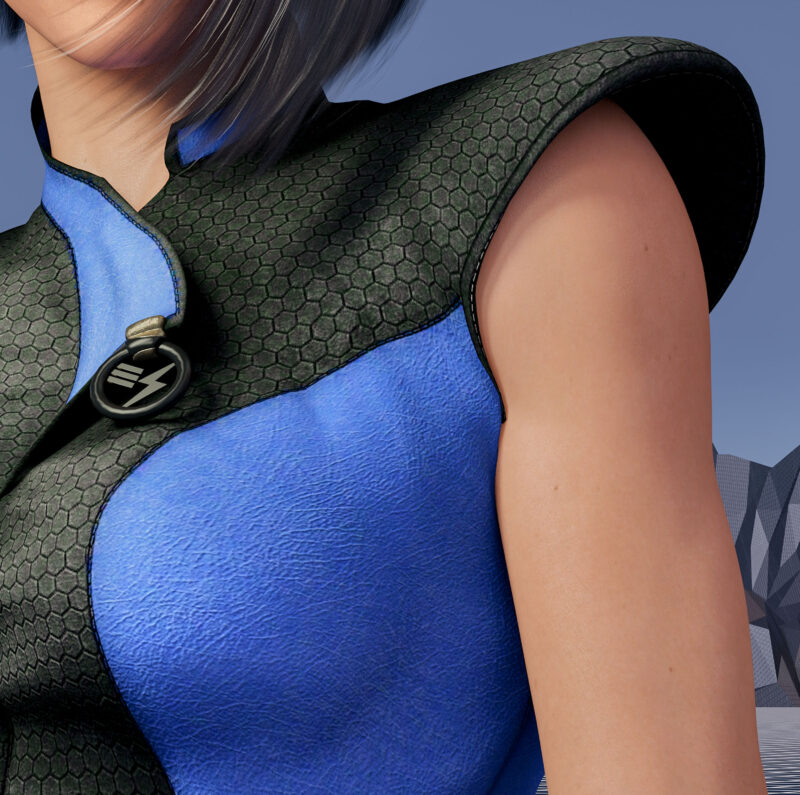 That’s because the clothing mesh is getting confused between the arm and the torso which are colliding. I was able to grab the clothing mesh with a DAZ Studio plugin and pull it back toward the torso. I actually had to stretch it quite a ways into the center of the character like a rubber band to get this small area to look better.
 These changes were relatively small but I think they make a big difference. Can’t wait to see this new version printed out.
 Created in DAZ Studio 4.22
Rendered with Iray
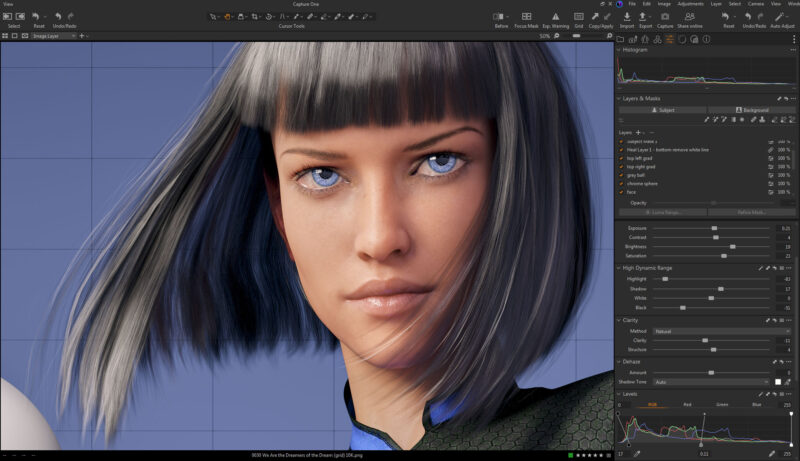
Color Correction in Capture One
Industry is Progress!
Is This The Life We Really Want?
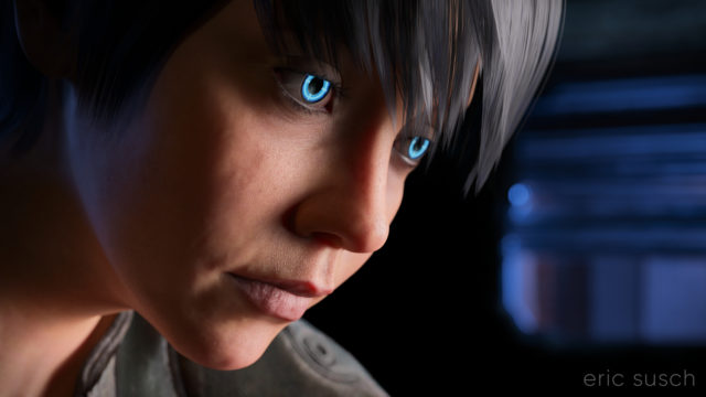 I’m still trying to make some of my CGI art look like it’s from a motion picture. What makes something look cinematic? Color? Framing? I’m still not sure. That’s what I was experimenting with in this portrait – a real person, in a real location, in a movie… A simple moment from a larger scene.
The setup was simple: face, hair, jacket, background. I set the camera lens at 100mm, 16×9 aspect ratio and found a good closeup. I messed with the depth of field quite a bit to get the background soft but not too soft (this isn’t a DSLR movie.)
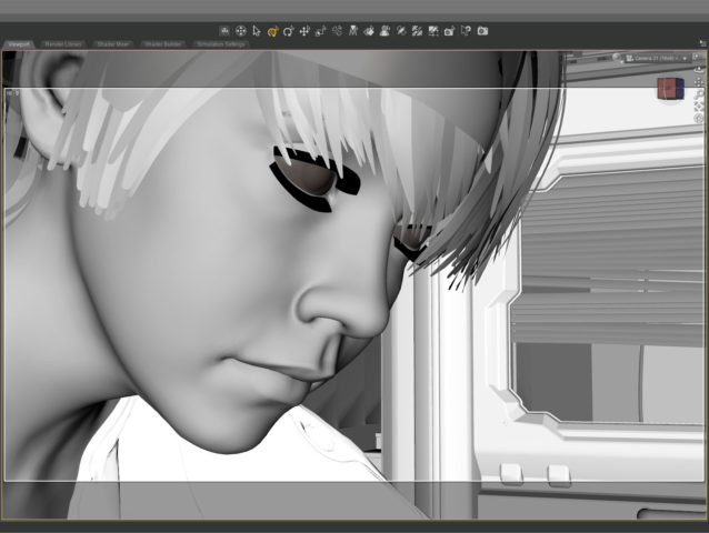
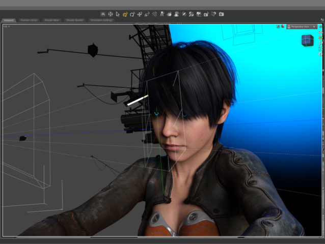 The green line in this screenshot shows how the camera (on the left) is focused precisely on the nearest eye and the two planes show the narrow depth of field on the face. The other eye is slightly out f focus.
The blue in the background is the soft blue backlight. I used only three lights, a key light on the face, the back light, and a light in the window. (And the eyes light up too.) No fill light.
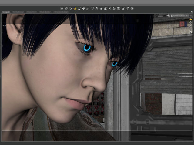
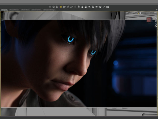 This screenshot shows how the initial render looked before color correction. It’s quite dark which means it takes longer to render but I liked the quality of light so I went for it. It took about five and a half hours to render the final file at 10800 x 6075. I stopped it at 4277 samples and 92 percent convergence even though my minimum is usually 95 percent and/or 5000 samples. It didn’t look like baking it any more would make a difference.
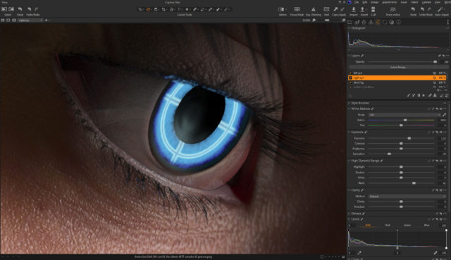 The whites of the eyes ended up quite dark in the render so I brightened them up in post. The eyes are a really old product and I don’t think I updated the reflectivity on the sclera quite right to render properly in iray.
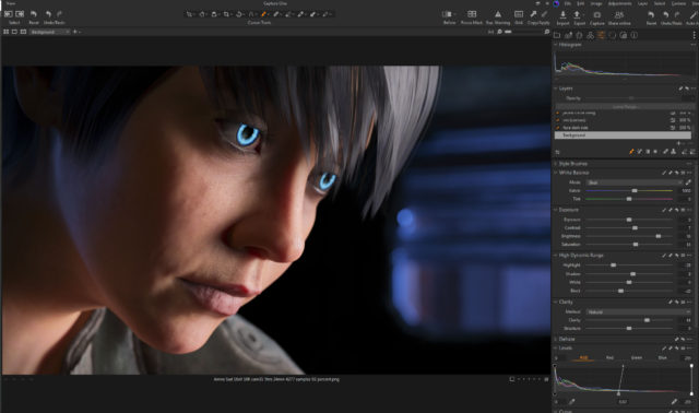 I also pulled the background completely black because I thought the muddy dark shapes distracted from the face.
This is the part of the post that I feel I really should evaluate the final result… then I decide not to say anything because I can only see the mistakes. After a few months not looking at it, I’m sure I’ll be able to figure out if I love it or hate it, but not now…
Created in DAZ Studio 4.21
Rendered with Iray
Color Correction in Capture One
Music in the Metaverse
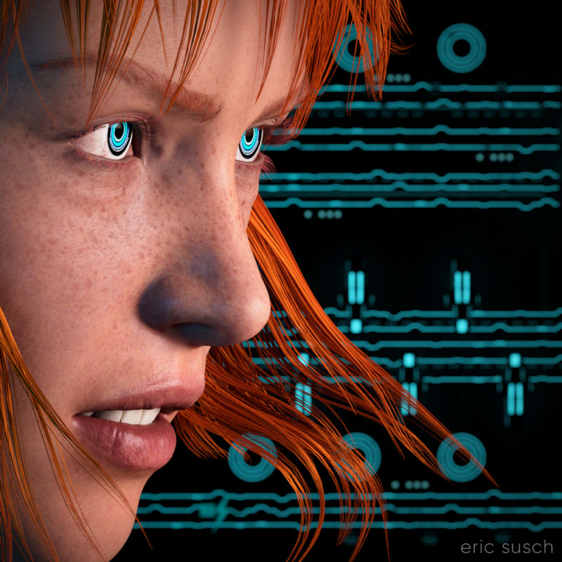 I think my CGI images tend to look better when I have something in closeup. It avoids the “medium shot of a character just standing there” that I struggle with. For this piece I started with an extreme close up and added cool robot eyes and dramatic flowing hair.
I also wanted a graphic background, something flat, technical. I have an ongoing issue with backgrounds. I get creatively stuck and I don’t know what to put back there. I end up trying scores of different things and nothing works.
What I ended up using here was actually a huge Tron like cityscape. The shapes and lines are actually building size structures seen from the top. This is what the cityscape looks like normally.
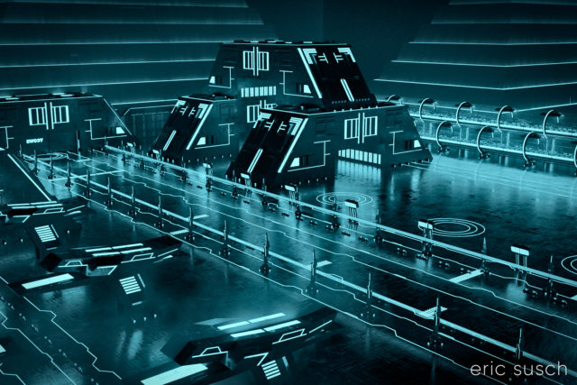 The entire environment is standing on it’s side waaaaaay far away. I turned on and off different elements depending on what looked good. It ended up being a real hassle having the background so far away though. Making adjustments took a long time. (I went back and figured it out. it’s 1.8 miles away! …or 3 kilometers) I should have scaled down the whole thing and moved it closer.
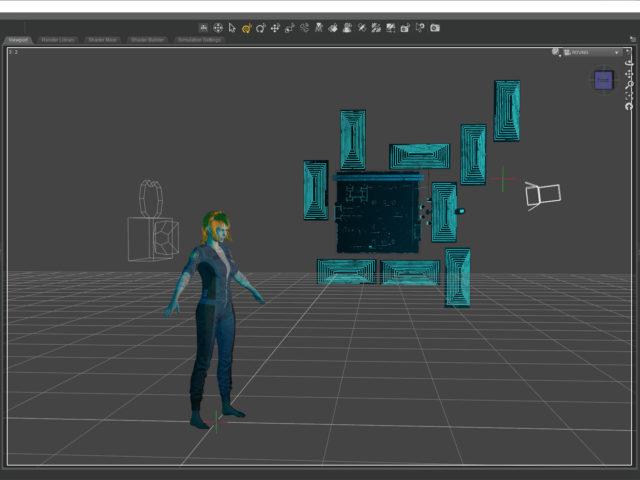 I named it Music in the Metaverse because the graphic lines in the background ended up looking similar to a music staff.
 Created in DAZ Studio 4.20
Rendered with Iray
Color Correction in Capture One
We Are the Dreamers of the Dream
I made this CGI image about a year ago when the Metaverse was the shiny new tech thing. Most people probably won’t get what it’s about so I’ll explain it, even though David Lynch would probably scold me for doing that.
The grey and chrome sphere are tools that special effects artists use to match 3D computer graphics to real world photography. If you are shooting a film for example, and part of the scene will be CGI, you shoot a few extra feet of the environment with someone holding a grey and chrome sphere. The chrome sphere reflects the entire environment and that reflected image can be “unwrapped” and placed as a dome over the CGI so the same light and colors shine on the computer generated elements as in the real scene. (The chrome ball is actually an old fashioned “poor man’s” way of doing this. There are 360 degree cameras now that can actually just take a picture of the entire environment right on the set.)
The grey sphere shows the quality of light shining on a specific place in the shot.
This image is about building a computer generated Metaverse that people can walk around in, just like real life. It’s the dream of constructing a Metaverse as well as the Metaverse as a dreamscape… the birth of a new alternate world.
OK, enough of that…
The main difficulty I had in creating this image stems from the fact that the reflection in the chrome ball is actually the real reflection of the CGI environment. It’s not a composite. The mountains actually go all the way around the environment. The grid floor goes out in all directions. The “planet” and the “sun” seen in the ball are on the HRDI dome over the scene that is creating the ambient light. The dome had to be lined up so the “planet” reflected in the sphere correctly. The mountains had to be rotated in such a way that the peaks behind her and the ones in the chrome ball both looked good. The main light in the scene is the keylight on the character which can be seen in the chrome sphere as a bright rectangle in the upper left of the sphere. I could have removed that in post but I left it in because that’s the point.
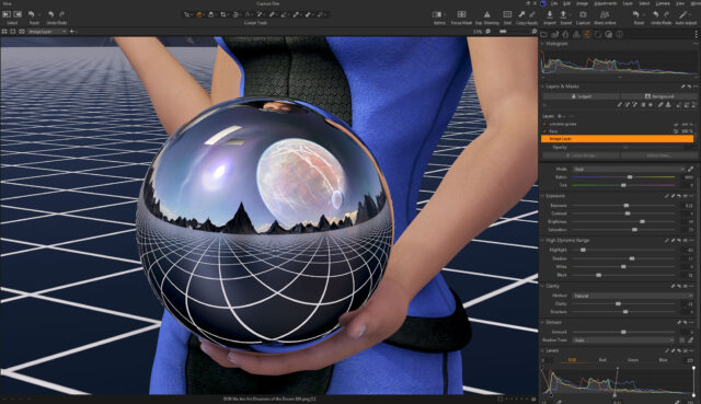 The metaverse was supposed to be the future of everything. Facebook even changed their name to Meta. Now AI is the new thing. Will the metaverse be created? Will AI create the metaverse for us? Who knows…
Created in DAZ Studio 4.20
Rendered with Iray
Color Correction in Capture One
I Reveal My Innermost Self
While I was working on a previous art piece called Quirky Girl, I stumbled through a wormhole and accidentally created this:
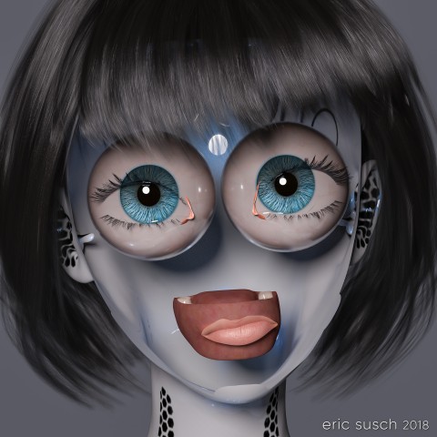 I stopped everything and rendered it out immediately! Enjoy!
I Reveal My Innermost Self
Created in DAZ Studio 4.11
Rendered with Iray
Color Correction in Lightroom
Figures used:
HPFK Lenora for Star 2.0 and Aiko 7
System 50 for G3F
Classic Bob Hair for G3+8F
I Have Captured Motion!
My quest for the perfect CGI avatar
After using my new CGI profile picture on facebook for awhile I started to dislike it. It looked mean, especially at small sizes. Part of the reason I think was the contrasty film-noir lighting. I thought I would try something a little different with softer light. I also turned the face to the side similar to my original photo that I used for years. This is what I came up with.
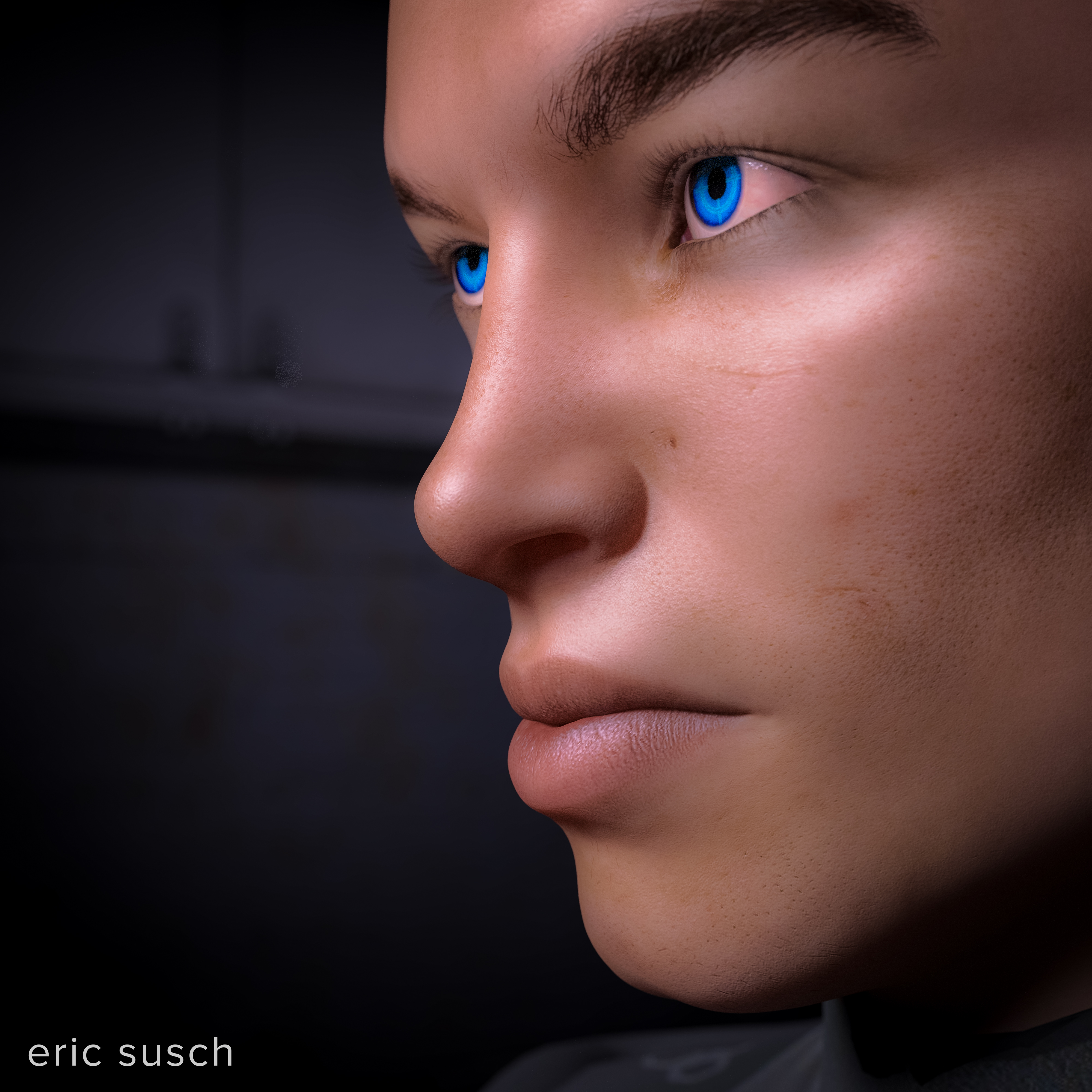 I started to dislike it as soon as I uploaded it. I thought the face looking away from the text had an aloof quality. I turned things around, used a longer lens so the face wouldn’t be so distorted, and gave him some hair. This is my newest avatar.
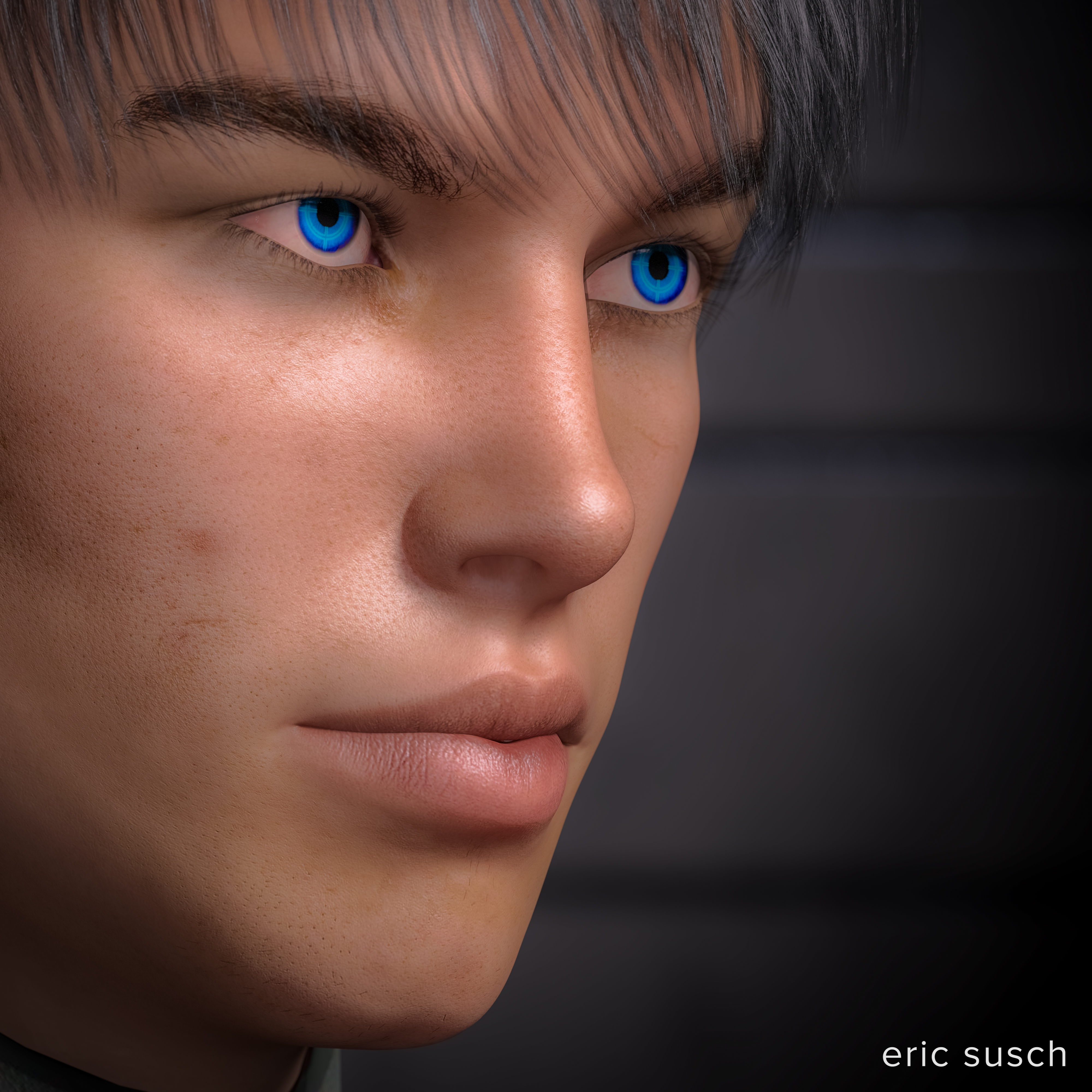 I’ve been using it on facebook for about a day now. So far I like it. I’ll upload it to other social media sites and live with it for awhile.
Created in DAZ Studio 4.9
Rendered with Iray
Color Correction in Lightroom
Figures used:
FWSA Aiden HD for Michael 7
Awesome Fantasy Eyes
The Future Starts With You
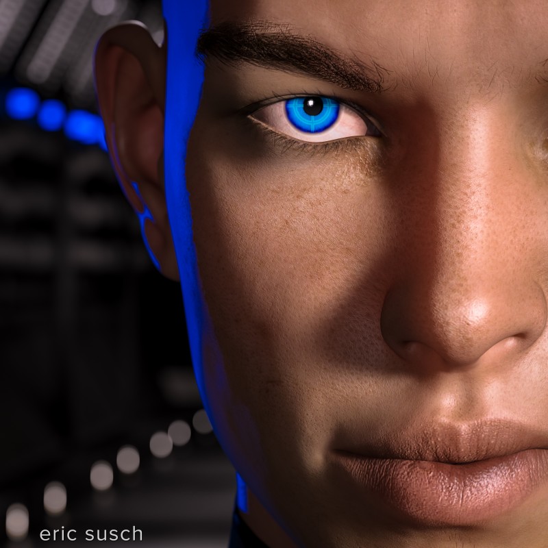
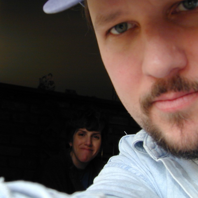 I’ve been using the same avatar across all of social media for many years. It’s not very good. If you look at the original it’s actually out of focus, but you can’t tell when it’s a teeny tiny avatar on facebook. My wife CAT is in it too, which is nice.
I always intended to replace it but it was working, doing it’s job, so I didn’t. When I shaved my beard over a year ago I thought, “Well now it doesn’t even look like me. I really need to make a new one!” But it was still working. People still knew it was me. So I didn’t change it.
Cut to a few days ago. I was in DAZ Studio and I decided to experiment with different ideas for a new avatar. I figured I could come up with some “concept art” and then take a picture of myself with the same theme, same lighting. Simple. Maybe even use the same CGI background so I wouldn’t have to deal with that in the photograph. But, what to do?
What Makes a Good Avatar?
To all those people who have their kid, or their dog, or cat, or a movie star, or an anime character, or their feet, or a sports team logo, or Abe Vigoda in their avatar: Nobody can figure out who you are! I go through this all the time. The name sounds familiar… Did I know this person in college? Did we grow up together on the same street? Did we work together ten years ago? Is that YOU as a kid? Or is that YOUR kid? Now I have to be a detective. It’s frustrating. Put your friggin’ face in your avatar! /rant
Square One
I like an avatar with a big face so I started with that. The bigger the better because sometimes these things are super small. I decide to try something similar to what I have now, an evolution if you will – the same but better – a big face but a little arty and off to the side. Centered is so boring. I used a long 200mm lens to blur the background, making the face stand out.
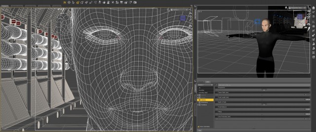 I decided to go for hard side light with a blue kicker (back light) to give it a shadowy tech-noir feel. I wanted the style to reflect my personality. I’m one-hundred percent SciFi and my avatar should be too!
Reality Is an Illusion
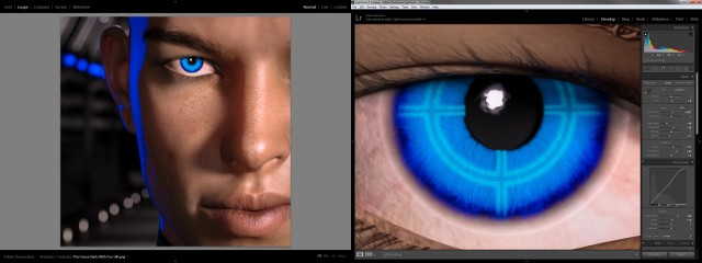
I then spent a lot of time trying to get good skin. There’s a trend in CGI these days. Reality. I think reality is overrated but in this case it makes sense. An avatar is supposed to represent a real person. …And it doesn’t hurt to learn new things. I spent a lot of time experimenting with skin translucency, glossy reflections, roughness, bump maps, and scores of other surface controls. Endless tweaking. (Welcome to CGI.) Ultimately I got something that looks like a real person. The guy doesn’t look like ME, but he looks relatively real.
And then I put a glowing cross hair in the eye. Screw reality! I like robots!
 About-Face
And here it is. It turned out much better than the “concept art” that I intended so I’ve decided to use it straight-up as my new avatar. So to the people who have their kid, or their dog, or cat, or a movie star, or an anime character, or their feet, or a sports team logo, or Abe Vigoda in their avatar: I’m now one of you! My avatar is now a synthetic man that doesn’t look like me. If you can’t beat ’em join ’em. We’ll see if it works.
Created in DAZ Studio 4.9
Rendered with Iray
Color Correction in Lightroom
Figures used:
FWSA Aiden HD for Michael 7
SciFi Passageway
Awesome Fantasy Eyes
UPDATE: After using my new CGI profile picture on facebook for awhile I started to dislike it. More in this post: My quest for the perfect CGI avatar
