Tag Archives: DAZ3D

Stepping Outside She Is Free

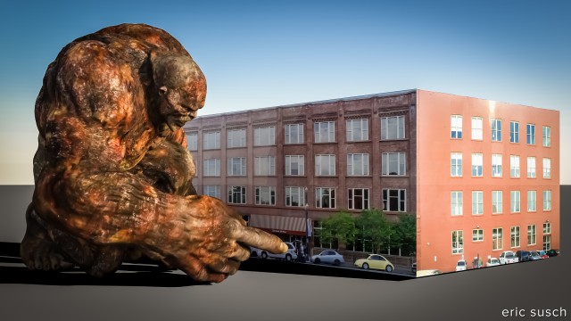
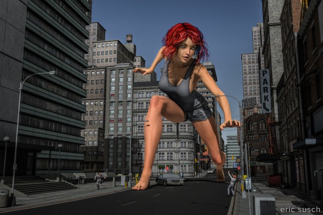
Stepping Outside She Is FreeI’ve been wanting to do a “big character” for a long time.  CGI scales easily so I thought it would be simple.  Well, the scaling was simple, then I needed a city so you could tell the character was twenty times normal size.

urban renewal

I used Stonemason’s Urban Sprawl 2 The Big City which is absolutely fabulous.  Once I found a good spot for the “incident” I needed to add some buildings and extend the street another block or so in the background.  I also moved some buildings around and shortened one in the back to get the skyline I wanted behind the girl.
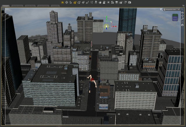
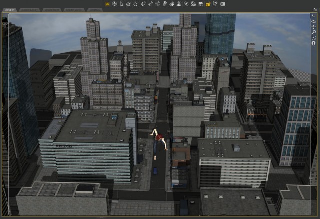
Big Aiko BTS - city 01Big Aiko BTS - city 02I’m tremendously impressed with Stonemason’s work on this city model.  It’s incredibly detailed with 20 or so different buildings – lots of props like streetlights, signs, mailboxes, and trash bins – and yet the model is very light.  It doesn’t slow things down that much even when you have all four city quadrants loaded as I do here.

bad skin

The scaling of the girl created a problem I didn’t anticipate.  When I started lighting I did a screen render and the skin was all messed up.
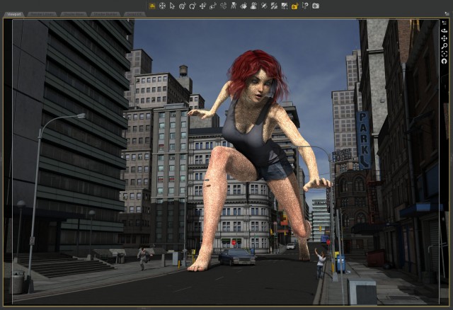
Big Aiko BTS rendering SSSI tried different skins and some were better but all seemed to have problems.  I eventually figured out that the Subsurface Shader (SSS) was the issue.  Apparently it didn’t scale well.  While I was trying to fix the problem I discovered that it got better if I added in HD details.  The character Aiko 6 doesn’t have an HD add on so I tried adding the Victoria 6 HD details.
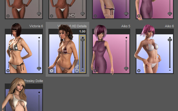
Big Aiko BTS - V6 HDThe screen render turned out better but there was still some problems as you can see here on the arms.  (click to embiggen to see the issue)
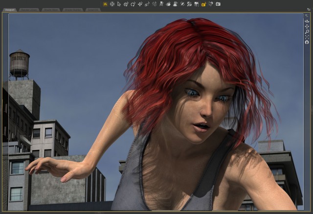
Big Aiko BTS - HD skin renderIt turns out though, that the problem doesn’t present itself if you render it out huge (at 10K) which is what I always do at the end anyway, so I stopped trying to fix it.  The final render came out fine.

crazy pants

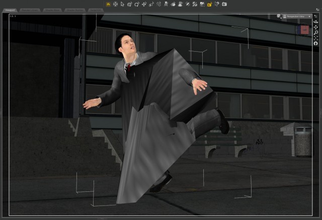
This was a most annoying problem.  Every time I closed the project and re-opened, the guy’s pants over on the left would go nuts!
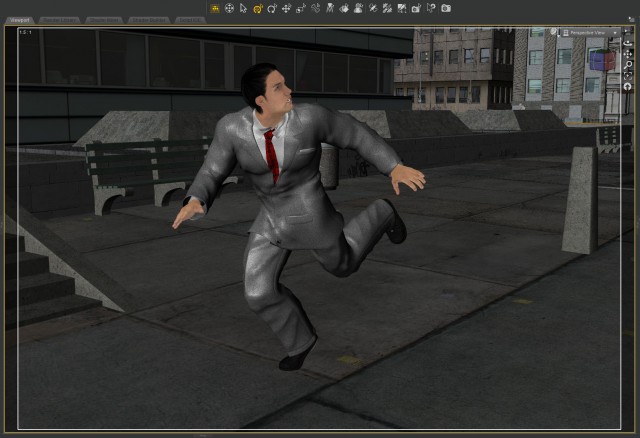
Big Aiko BTS - normal pantsBig Aiko BTS - crazy pantsNow maybe this was because I had Genesis clothing on a Genesis 2 character, but I’ve done that before and I’ve never seen this.  It’s the Morphing Business Suit on Gianni 6.  Never found out why this was happening.  The only solution was to delete the pants and re-load them onto the character.  That worked at leased until I closed the project and re-opened.

big finish

For the final color correction in lightroom I decided to pump up the color on the main character while keeping the city bland and gray.  What do you think?
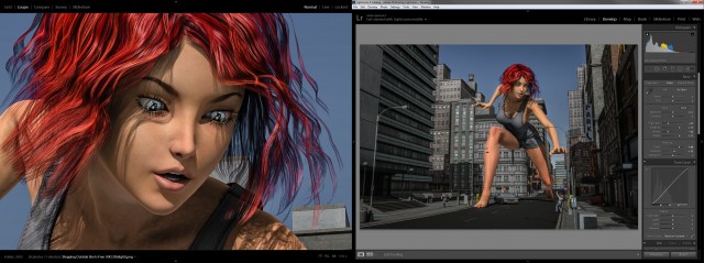
Big Aiko BTS - lightroomCreated in DAZ Studio 4.8
Rendered with 3Delight
Color Correction in Lightroom

Figures used:
Aiko 6
Michael 5
Gianni 6
Victoria 7
Urban Sprawl 2 The Big City
Goodbye Cruel World

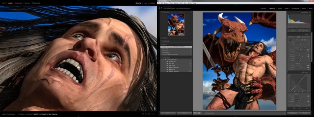
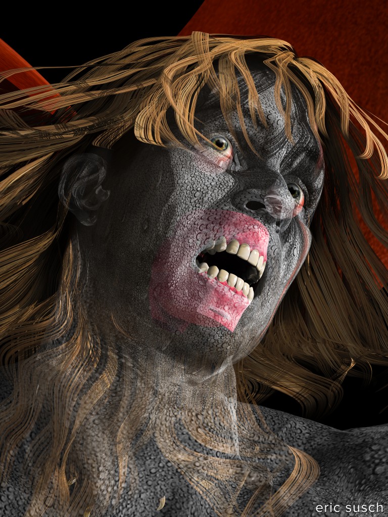
Goodbye Cruel WorldThis image was created by mistake.  Occasionally while you are working in DAZ Studio the materials and shaders get screwed up, disappear, turn solid white, etc. and have to be reset.  This happened while I was creating I Spit My Last Breath At Thee.  I was trying out a wet body geometry shell attempting to make it look like sweat and as I was adjusting it the guy’s skin material disappeared.  The water droplets created a ghostly transparent shell and you could see the inner mechanisms of the mouth and eyes.  Creepy!  So I set up a camera close on the face and rendered it out at high quality.  A happy accident.

Created in DAZ Studio 4.8
Rendered with 3Delight
Color Correction in Lightroom

Figures used:
Gianni 6
Wet Body Geometry Shells
Kaylum Hair

Trembling on the Brink of Infinity

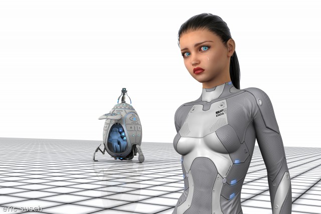
Trapped in a space time loop with no escape.Most of my work is dark, film-noir like with tiny spotlights in a black void.  It was time for something different.  I wanted something bright with lots of negative space, hard graphic lines, and very little color.  Something that looked like Space:1999, or THX-1138, or any other SciFi that has a number in it.  (2001: A Space Odyssey?)

A line in the egg

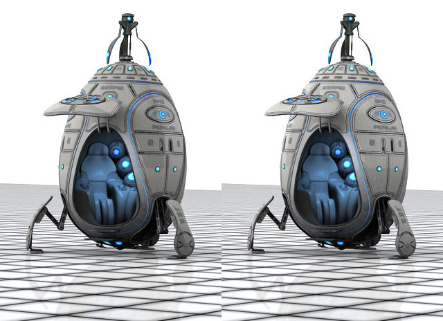
Creating this piece was pretty straightforward.  The only trouble I had technically was a strange shadow line on the egg ship.  The front of the ship was significantly darker even though that’s where the light was coming from.

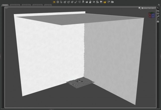
trembling on the brink of infinity BTS 2eggsI finally realized the line was a reflection of the edge of the huge white background.  The environment was simply two planes.

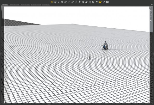
trembling on the brink of infinity BTS gridI had to put a huge side and top on it to solve the reflection problem.

trembling on the brink of infinity BTS worldIt probably would have been easier to create a white dome over the whole scene but I was worried the horizon would be curved and ruin the grid line effect.

My constant conundrum

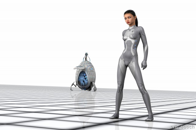
When I’m building a scene I usually drop cameras here and there when I find a new perspective that looks good.  It’s the filmmaker in me I guess, shooting from multiple angles.  When I’m finished setting the scene and lighting it’s always hard for me to decide which angle is best.  My original perspective for this piece was a full body wide shot that featured the expanse of the void.

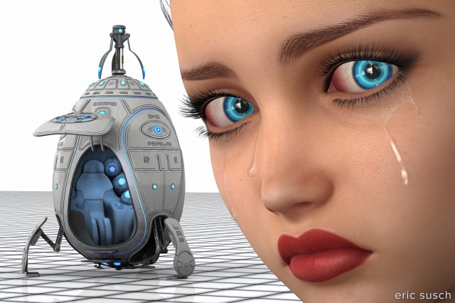
I finally settled on the medium shot because it was easier to see she was crying and I think it conveys more emotion from the character.  Of course I also came up with this crazy extreme close-up which I totally love.

It was a difficult for me to pick only one.  Which is your favorite?  Wide, medium, or close?

Prints are available on my Deviant Art profile.  CLICK HERE

Created in DAZ Studio 4.8
Rendered with 3Delight
Color Correction in Lightroom

Models used (from DAZ3D.com):
Teen Josie 6
Letizia for Lilith 6
Awesome Fantasy Eyes
Stalker Girl Hair
Sci-Fi Body Suit SF-001
Actual Tears
Nomad Module 2

Victoria 6 and 7 comparison

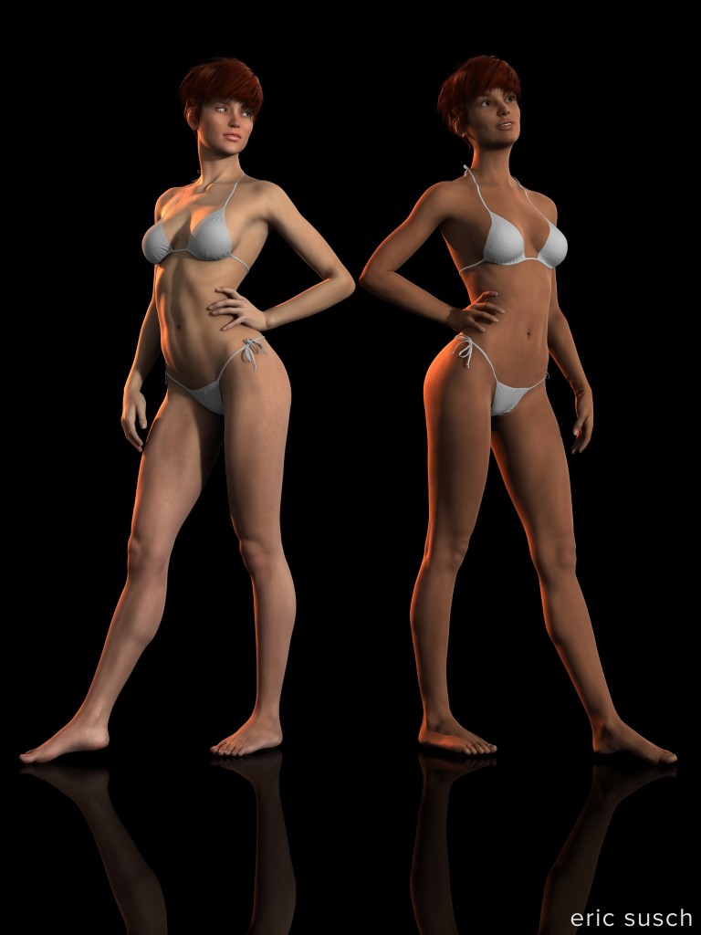
DAZ3D released a new model yesterday, Victoria 7.  It signals the beginning of a new generation of figures, Genesis 3.  Here’s a quick comparison of the new model to the old Victoria 6.

Victoria 6 and 7 comparisonFor this comparison I set V6 (on the left) with pose #4 from ‘Perfect 10’ Standing Poses for Genesis 2 Female and converted the mirror pose for V7 via the new Genesis 2 to Genesis 3 Pose Converter. It wasn’t 100 percent. I had to pull the right hand out of V7’s side and her left foot was in the floor a bit but other than that it was a close conversion. The V6 pose is unmodified except for the head turn.

Hongyu’s Bikini for V6 was auto fit to V7 and that too is a little off as you can see. Pyrit Hair for Genesis 2 Female is auto fit to V7 as well and that seems fine. (Note, the weirdness on V7’s left wrist isn’t a problem with the model, it’s the shadow of the bikini tie.)

V7’s expression is using the new Genesis 3 Female Expressions (100% happy and 10% excitement.) It looks good and there are lots of controls to play with. V7’s eyes were horribly cross-eyed however, maybe from the pose conversion? I don’t know. I had to work with pointing V7’s eyes quite a bit. I don’t think I got it resolved. Right now her eyes are pointed at an object in the sky and they look better but still a bit cross-eyed.

Figures posed in DAZ Studio 4.8.  I used the V6 Belle all (default skin) materials for V6 and the default all 3Delight materials for V7. Rendered in 3Delight with no postwork.

I Spit My Last Breath At Thee

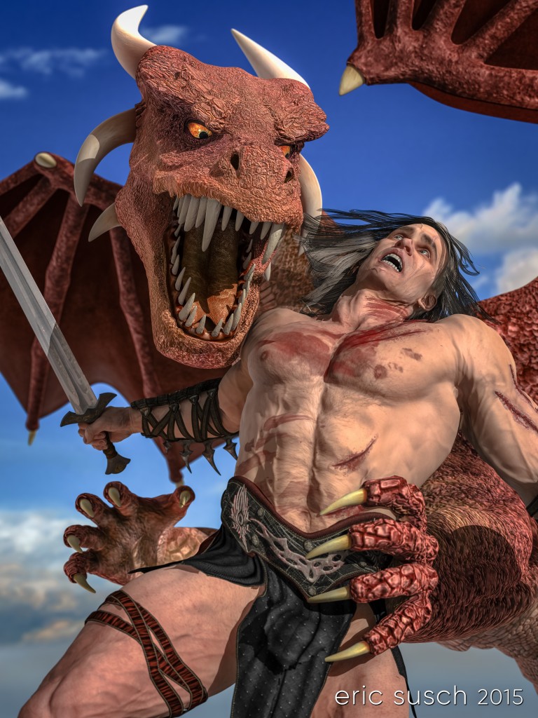
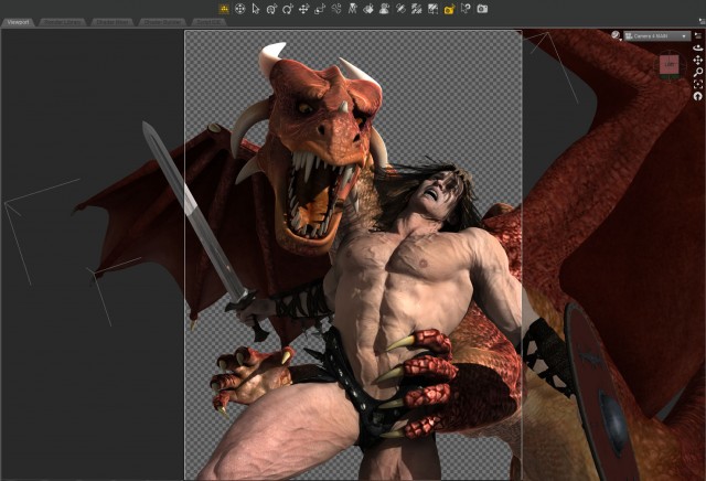
I Spit My Last Breath At TheeMy wife CAT suggested the idea of a man fighting a dragon some time ago.  It’s been banging around in my head but I wasn’t sure how to compose the characters in the heat of battle and still see both of their faces.  I had a few false starts that really didn’t work but then DAZaholics, one of my favorite groups over on Deviant Art, announced a weekly challenge with the theme: Trial By Combat.  I strapped myself to a chair Monday morning with the goal of figuring this one out.  Apparently the challenge worked because by Monday evening the pieces were all fitting together quite nicely.  I had the basic construction of the piece, but if I wanted to enter the contest I would have to finish and upload it by Thursday 7AM Pacific time.

Vertical Integration

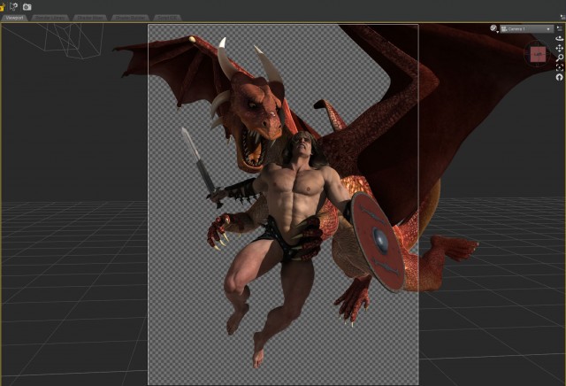
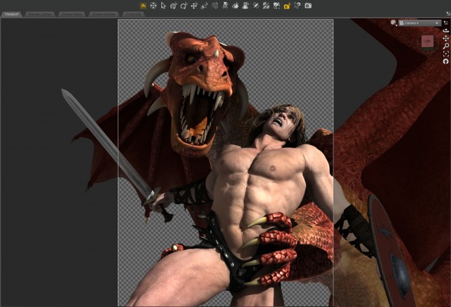
That first day I focused mostly on the character poses, facial expressions, and camera position.  I wanted to try a vertical frame which I had never done before.  As a filmmaker I’m used to a horizontal frame and I wasn’t sure if I could make it work.  I also wanted to keep the shot as close as possible for the most dramatic impact.  Ultimately that meant losing the shield off the edge of frame but It felt so much more dramatic in close.

dragon BTS 00I’m spending more and more time in these pieces getting the expressions right.  It’s not easy.  There are hundreds of morph sliders to adjust and it’s hard to get a realistic expression on a human.  Lots of tedious work with breaks to keep perspective.  Much of the dragon’s expression is due to the shape of the head so I concentrated on that, and getting the eyes right.  For our hero, I just kept at it over the three days.

dragon BTS 01One Light (or six)

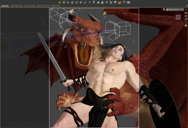
The light was tricky.  It’s outdoors so it’s basically just one light, the Sun.  I wanted to dramatically rake the light across the guy’s chest but at the same time I needed to get the light in his eyes and illuminate the dragon’s face as well.  I found a position that worked but it took some doing including adjusting the characters a bit.  Unfortunately that left the sword arm in darkness under the wing.  To bring it out a bit I shot a warm spotlight up from below simulating  a reflection from the ground.  I set another cool spotlight from the left to simulate skylight.  That highlighted the ribbing on the dragon’s wing and added a nice rim light on the side of the guy’s chest.

The dragon’s eyes are very deep set.  It was impossible to get the sun in there so I also aimed two spotlights at just the eyeballs.  I’ve been doing this for awhile now, especially with robots.  It gives the eyes a nice glow.

dragon BTS eyelightsWhat the hell is a Cucoloris?

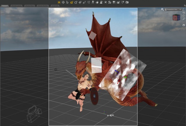
Another first for me in this piece was the use of a “cookie.”  I added a dapply light grayscale image I found to the Opacity Strength of a plane primitive (in the surfaces tab) and used it to break up the light on the dragon’s torso.  This darkened the area behind the guy’s left shoulder and side making him pop forward.  A few other “flags” and “nets” (semi-transparent planes) took care of other hot spots on the dragon.

dragon BTS cookie

Battle Damage

The body scars and blood smears were several separate add on products I bought at DAZ.  They had a lot of customization in terms of the types of injuries, color and size, but not much when it came to placement.  I would have liked some scratches on the right thigh and I needed more at the belt line where the dragon was grabbing him.  Maybe there’s a way to move the scratches but I think that would end up being a huge manual slider nightmare.  Anyway they worked for the most part.

I also used a Vascularity product to make it look like our hero was straining and his veins were popping out.  It caused a lot of problems though.  The veins kept popping through the clothing, especially the right arm and leg straps.  The veins screwed up the scratches and blood smears too.  Lots of fiddling with tons of sliders eventually fixed all that up.  It was worth it though, the veins really sell it.

dragon BTS vascularityLeft-wing Decisions

I spent a lot of time debating the dragon’s wing at the top right.  I set it there to look like our hero was surrounded.  I think it also works moved out of the way with a clear sky above, with our hero looking for a path to heaven, if you will.  It’s certainly simpler that way…  I don’t know.  I’m still second-guessing my decision to leave it.  I just hope the wing isn’t too distracting hanging up there.

dragon BTS lightroomThe End of the Line

I eventually stayed up all Wednesday night fiddling with details.  It was starting to look quite good and I didn’t want to upload it before I had smoothed out all the problem areas.  I managed to render it out of DAZ Studio, color correct it quickly in Lightroom, and upload it to Deviant Art an hour before the deadline!  What do you think?

Created in DAZ Studio 4.8
Rendered with 3Delight
Color Correction in Lightroom

Models used (from DAZ3D.com):
Gianni 6
DAZ Dragon 3
Peter for G2M
Dry Mud Desert
Body Scars for G2
Dirt and Blood for genesis and G2
Fantasy Weapons collection 3

The Creation of ATOM (hands)

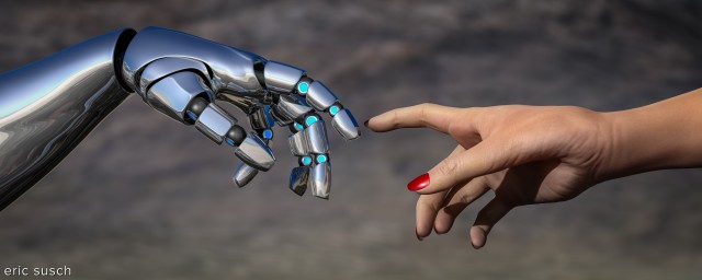
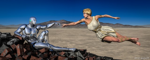
After Man destroys the planet Earth with nuclear weapons, God creates machine life to take his place.

The Creation of ATOM - handsIn light of the close up experiment I did last week, this one was a no-brainier.  Once again I didn’t just crop the original image.  I went back into the 3D space, set another camera in the exact position, and composed a new shot with a longer focal length.  That allowed me to create a new 10K render and also control the focus on the mountains in the background.

As I was color correcting this piece I noticed that you could see a reflection of God’s face in the machine-man’s middle finger.  Not sure what that means but it’s obviously important.

Created in DAZ Studio 4.8 beta
Rendered with 3Delight
Color Correction in Lightroom

Figures used:
bot Genesis
Lilith 6
Dry Mud Desert

The Creation of ATOM

I Was Fluid, Like Water (close up)

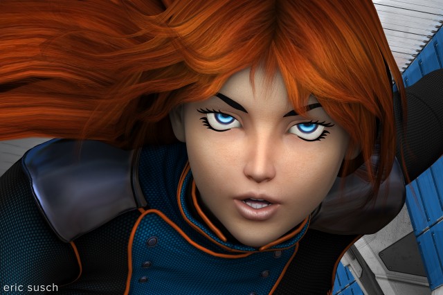
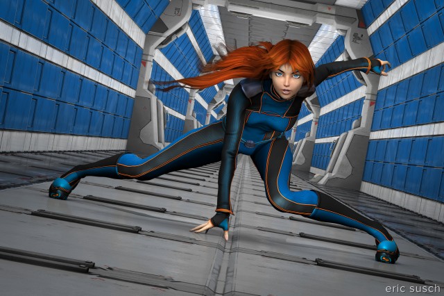
I was fluid, like water (close up)I’m frustrated with my work.  In most of my previous CGI pieces I started out with an idea that should be dynamic but ended up with something less exciting.  Most of my ideas have become medium to long shots of characters just standing there.  If I was directing a movie, this is when I would punch in for a close up to capture more of the emotion.

As an experiment, I’ve taken a previous piece I Was Fluid, Like Water and created a close up of the face.  It looks like a cropping of the previous image but that’s not how I created it.  I went back into the 3D space, set another camera in the exact position, and composed a new shot with a longer focal length.  That allowed me to create a new 10K render and not lose any of the small details like the stitching on the jacket.

The hair is still a problem, maybe even more so in the close-up.  I fixed it up a little in Photoshop but it’s still kinky and unrealistic.  The overall style is on the “doll-like anime” side with fake eyebrows etc. so maybe the kinky hair is OK.  What do you think?  Which do you like better, the original long shot or the close up?

I was fluid, like water

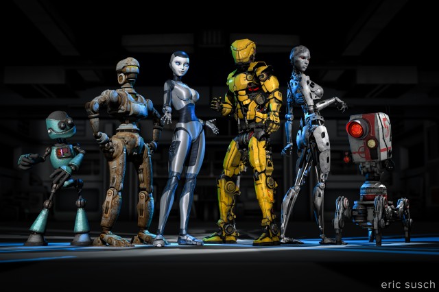
A Collection of Rusty Robots

Can six rusty robots fight crime without driving each other crazy?

A Collection of Rusty RobotsThis one was complicated. Six characters and twenty-five lights.

I was trying to emulate a team freeze frame at the end of an anime intro. I wanted to capture the uniqueness of each character. I even wrote out a short description of each robot to help me differentiate them. Looking at this piece now though, I think it ended up a little too “characters just standing there.” It could do with a few more action poses, but it’s done now so here it is.

I’m going to post my usual more in depth behind-the-scenes info but that will have to wait a few days since this piece is so complicated. It’ll probably end up as multiple posts. For now I’ll leave you with the character descriptions I wrote. Let me know what you think!

Meet the team!

(from left to right)

Gomer is a wise guy. He always has an opinion and he doesn’t take lip from anybody. He thinks he’s the leader but nobody else listens to him. When attacking a bad guy’s hideout the others always make him crawl in thru the air ducts which pisses him off. He thinks Brigitte is “hot stuff.”

Barney is a “can do” fella. He can fix just about anything. Knows how to make explosives too. He gets the job done while the rest are goofing around. Currently he’s in a romantic relationship with Alice.

Alice is a fighter. She can swiftly and silently take out a whole gang of bad guys. She’s a bit fussy though and, unlike the others, she likes to stay clean. She avoids the general dirt and grime of crime fighting. She’s in love with Barney even though he always seems to be a bit dirty. It’s OK though because she’s confident she can change him.

Jim is the leader of the team. He’s a powerful warrior but is totally lost trying to get the rest of the team to work together. He thinks Alice is his girlfriend even though she wants nothing to do with him. Alice thinks Jim is too full of himself.

Brigitte is a master of disguise and can wear a rubber mask to look human. She doesn’t really enjoy fighting crime but she hangs around because she likes Jim. Gomer is in love with Bridget but she can’t stand him.

Gronk (AKA “Five”) has a powerful Plasma Death Ray to blast holes in buildings and blow up cars. He wants to do more but doesn’t really have the ability. He trys.

Buy a print here –> http://www.deviantart.com/print/38109712/

Welcome to DAZneyland

Welcome to DAZneylandAfter walking for ages, our hero finds a curious place with two dimensional beings.

I put this image together mainly as my first test of the new nVidia Iray rendering engine in the just released DAZ Studio 4.8 beta.  The changes at first glance seem a bit like re-inventing the wheel but I’ve just started working with it and I’m still finding my way around.

I was initially attracted to DAZ Studio because of it’s simplicity.  Throw some twenty dollar models in a scene, light it properly, hit render, and it looks fantastic.  This new render engine seems much more complicated and I’m not sure what you get for all that extra work.  I’ve seen others rave that the renders look more “real” but so far I haven’t seen any comparisons where the Iray version is significantly better.  In fact in many comparisons I’ve seen the Iray version is significantly worse but it’s still early days and people are still learning.

One problem I’m seeing immediately with this new engine is the render time.  The very simple 3D scene above took about an hour to render at 4K (4000 x 2667) which is quite long for my relatively powerful system.  For comparison some of my previous (more complicated) scenes took anywhere from fifteen to thirty minutes to render at 10K.  Maybe I’m doing something wrong but I don’t see how.  This piece has only three elements: one character (with no clothes,) a sky dome, and two flats with photos on them.  This needs more testing but these types of render times just won’t work for me, especially when I get into animation.

I also had trouble with the sky dome.  I had to work quite hard in Lightroom to eliminate significant color banding across the sky in the picture above.  Everything was set to the default so I’m not sure how I could have avoided this.

As far as the rest of the picture quality, we’ll have to see.  The rendering technology is different and for a fair comparison I’ll need to get more proficient with all the new settings.  I’d like to see the best this new technology can do and compare it to the best of the old engine.  That’s the only true comparison and that’s going to take some time.  The old 3Delight render engine is still available in the new version of DAZ Studio so I’ll probably keep using that for my serious pieces while I continue further testing of the Iray engine.

Created in DAZ Studio 4.8 beta
Rendered with nVidia Iray
Color Correction in Lightroom

Figures used:
Infernal Behemoth
DAZneyland

The Creation of ATOM

Prints of this image are available on my Deviant Art page:
http://ericsusch.deviantart.com/art/The-Creation-of-ATOM-516835191

The Creation of ATOMAfter Man destroys the planet Earth with nuclear weapons, God creates machine life to take his place.

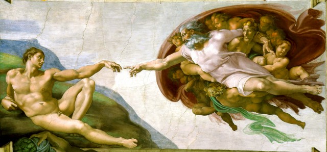
This CGI piece took me awhile. It’s based on the The Creation of Adam by Michelangelo, from the ceiling of the Sistine Chapel at the Vatican.  CAT and I were recently in Rome and were able to spend five minutes in the Sistine Chapel admiring all the artwork.  You couldn’t take any pictures of course, since the Japanese own the copyright.  (The Vatican is a strange place.)  So when we got back I decided to make my own creation imagery to hang on the wall.

I used this project to learn how to pose characters manually.  The poses were iconic and predetermined so I didn’t have to worry what was going to look good, just how to get the characters into position.  In the end It took some doing to get everything adjusted in three dimensions and looking correct for the camera.

Creación_de_Adám

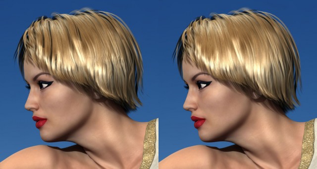
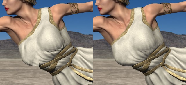
I don’t think a man can actually lean back in the real world the way Adam does in the original, at least an android can’t.  I have several of the robot joints pushed way beyond their limit and still he isn’t really in the same position.  It’s close enough to get the idea though.  The posing process was long and tedious but ultimately rewarding.  I’m especially happy with the hands in the center.The Creation of ATOM - handsI had problems again with kinky hair.  The short style I chose was an older mesh and didn’t have the smoothing control I used in the last piece.  I then discovered that the smoothing controls can be added to any object by selecting it and accessing the DAZ Studio menu in the upper right of the scene tab.  Select Edit / Apply Smoothing Modifier and then the smoothing controls will appear in the object’s Parameters tab.  This fixed the kinks but I still had hair shadow trouble.  Some of the underlying shadows were ending abruptly probably because some of the hair was poking into the skull.  Adjusting the hair didn’t resolve the problem.

The Creation of ATOM - bad hair 03To fix the funky shadows I rendered the hair again without shadows.  I then layered this underneath the head and used a matte in Photoshop to erase only the parts of the hair where I wanted to remove the shadows.  This left the shadows at the edges and bottom of the hair but eliminated the distracting ones deep within.

The biggest problem I had was the horrible, horrible dress.  I purchased and tried several Greek/Roman toga-esque dresses which were similar to what God is wearing in the original piece.  I really liked a dress that had one long sleeve but unfortunately it covered the wrong arm and I couldn’t figure out how to flip it.  This next best alternative was nice looking but turned out to be a disaster.  It had a million shaping controls but I couldn’t get it to fit correctly without the mesh bunching, tearing, and dripping all along the chest.  It was the only dress I had that looked right so I grit my teeth and fixed it with the spot healing brush in Photoshop.  That kind of fix isn’t going to work when I get into animation.

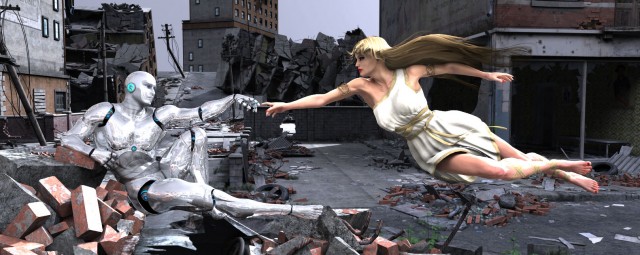
The Creation of ATOM - bad dress 03I struggled with the background again too.  The original idea was a destroyed city like after an earthquake or a nuclear attack.  It was way too busy and difficult to separate the characters, especially the chrome of the android, from the background.  There was just too much detail in the rubble.

creation of ADAM BTS 04CAT suggested I try a desert background.  I wasn’t sure.  I didn’t want it to look like an unrelated background photo.  After I tried it I changed my mind because the background became a metaphor to me.  It suggests nuclear testing, or maybe a Mad Max type social collapse.  What do you think?

The Creation of ATOMCreated in DAZ Studio
Postwork (fixing hair and dress) in Photoshop
Color Correction in Lightroom

Figures used:
bot Genesis
Lilith 6
City Ruins: Vehicles
Dry Mud Desert

Prints of this image are available on my Deviant Art page:
http://ericsusch.deviantart.com/art/The-Creation-of-ATOM-516835191