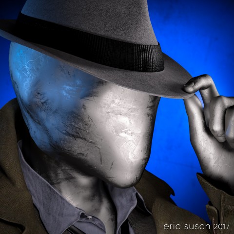
 My eternal quest for the perfect CGI avatar continues. I’ve grown tired of my current avatar artwork. People think it’s a picture of me and I have to explain that it’s CGI. I need something that doesn’t look human. Perhaps something creepy…
What to do?
Mannequins and faceless people have always freaked me out ever since I was young. I attribute that to this scene from Star Trek…
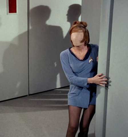 …and the Anything People on Sesame Street.
A freaky “no face” avatar would be cool and no one would think it was supposed to be me. Perfect!
Building a Mannequin
I started with a faceless character model I had and I replaced the skin like surface with a different shader. I experimented with many, many different surfaces trying to find something cool.
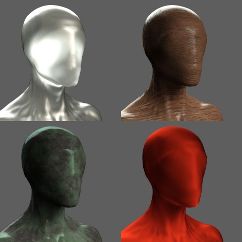 I tried cloth, wood, metal, rock, plastic, glass, grunge, paint, rubber, wax, anything I could think of.
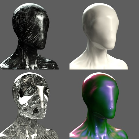 I tried to avoid chrome because I had done that several times in the past but in the end I caved, because I really liked this particular dusty anodized aluminum surface.
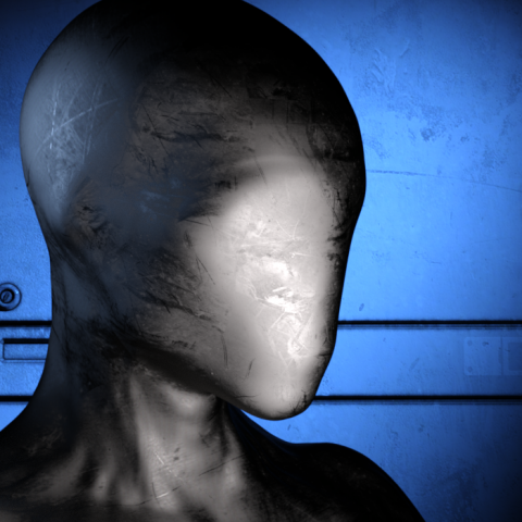 I posed the figure tipping his hat with a 1960s fedora. I wanted him to be creepy and friendly at the same time. A sloppy overcoat and loose necktie seemed to fit so I added that too.
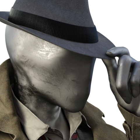 Give that man a hand
The fingers of the alien no-face character were creepy long, which looks OK but I like to make everything difficult so I decided to try and replace the hand with one that was human sized.
To do that I had to add another entire human sized figure and position the hand in the same place, grabbing the hat. It took awhile but I got it into position. Then I “turned off” (made invisible) the rest of that human character. For the no-face character I turned off the hand. The sleeve of the jacket was just long enough to hide the fact that the arm and hand didn’t meet exactly correctly. Everything came together when I layered the same aluminum shader on the human hand.
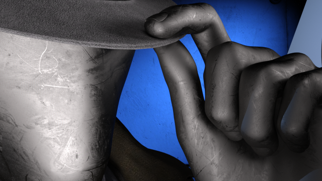 Dramatic Light
The lighting was difficult because of the reflective metal on the face. I ended up with a lot more spotlights than usual for a simple head shot just to get the reflections right. There are seven spot lights on the character and one blue spot on the background, which is just a gray wall panel.
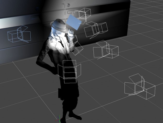 After rendering it out I pumped up the color a little in Lightroom…
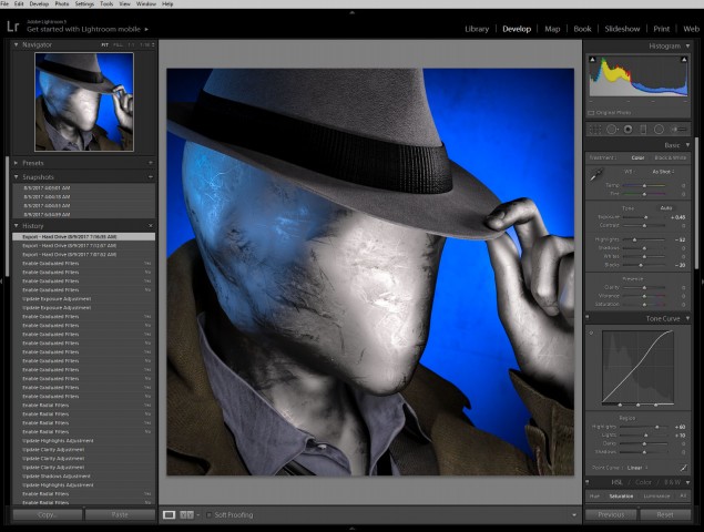 …and uploaded the avatar to Facebook.
![]()
Unfortunately I saw almost immediately that you couldn’t tell what the picture was at very small sizes. It was the high contrast lighting, the same problem I had before on my first CGI avatar. It looked fine at larger sizes but when it was super tiny the bright shine of the face looked like an unrecognizable white blob on a blue background.
Flat Light
I went back into DAZ Studio and tried to even out the lighting. The best way was to set up a few more lights to fill in the dark spots. I didn’t like it as much when I was done but I rendered it out anyway just to test it on facebook. This is the “flat light” version.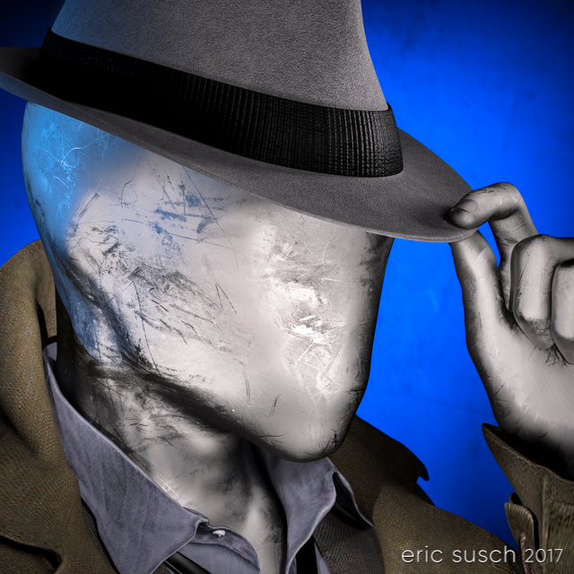 It worked better at small sizes as you can see but still not as well as other avatars I’ve created. Humans are programed to recognize faces easily, which is why facebook can make their avatars so small. I’m asking people to recognize “no face” so I guess that’s more difficult.
![]() So it sort of works at the tiny sizes and doesn’t look as good as it could at larger sizes. I guess that makes this avatar attempt a bit of a failure. I still like it though, so I’m going to keep it for a time before I try again. I can also upload the first version to other sites that don’t have such small avatars. What do you think?
So it sort of works at the tiny sizes and doesn’t look as good as it could at larger sizes. I guess that makes this avatar attempt a bit of a failure. I still like it though, so I’m going to keep it for a time before I try again. I can also upload the first version to other sites that don’t have such small avatars. What do you think?
 Created in DAZ Studio 4.9
Rendered with Iray
Color Correction in Lightroom
Figures used:
The Slim Man for Genesis 3 Male
Mec4d PBS Shaders vol.3 for Iray
Amazing Hat
Eldritch Seeker