Tag Archives: surreal
Inside our Secret Selves
Wesley Crusher riding a unicorn into battle
Last month actor and writer Wil Wheaton who played Wesley Crusher on Star Trek: the Next Generation, got a rare Dall-E invite, and used “Wesley Crusher riding a unicorn into battle” as his first prompt, “because OBVIOUSLY.” You can see what he got here on his tumbler.
I decided to see if the Midjourney art machine was up to the same challenge. After several tries with the Beta –test renderer that weren’t very good, I tried the good ol’ V3 engine and finally got this image. It almost looks like a Star Trek uniform. It almost looks like Wesley Crusher. …And he almost has legs. It’s wonkey and creepy but we like that, ‘cuz that’s the way AI art should be. A few years from now when AI art is perfectly realistic, artists will attempt to re-create this wonky style just like Instagram filters today try to make your digital pictures look like old fashioned faded film prints. Because realism is nice but interesting is better…
We Are All Connected
Rainbow Sky
Alien in the Elevator
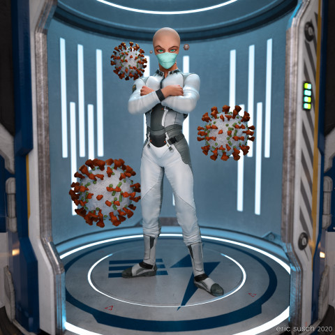
What is outside the door when it opens? This is the question I ask myself everyday now. Some alien organism hitchhiking on a friend? Wear a mask!
For this piece I went back to one of my TikTok animations, set up another camera with a square aspect ratio, and exported a high rez still.
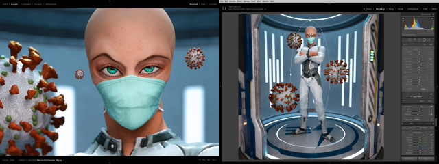
The color correction in lightroom made it pop quite nicely.
Created in DAZ Studio 4.12
Rendered with Iray
Color Correction in Lightroom
I Reveal My Innermost Self
While I was working on a previous art piece called Quirky Girl, I stumbled through a wormhole and accidentally created this:
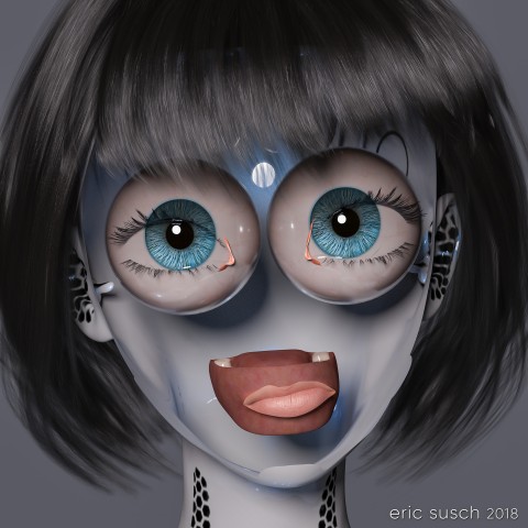
I stopped everything and rendered it out immediately! Enjoy!
I Reveal My Innermost Self
Created in DAZ Studio 4.11
Rendered with Iray
Color Correction in Lightroom
Figures used:
HPFK Lenora for Star 2.0 and Aiko 7
System 50 for G3F
Classic Bob Hair for G3+8F
Science Remembers
It’s the future and everyone is bald (of course.) Heads are bigger because brains are smarter and dreams are infinite. This is a simple portrait from the day after tomorrow.
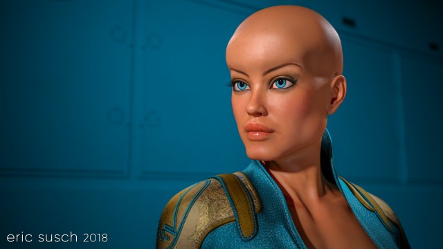
A girl, a camera, and a wall were all I needed to create this piece. …and lights. I needed lights too.
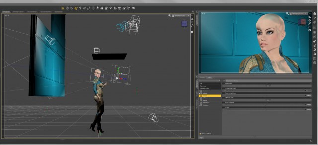
I threw a blue/green spot on the back wall to match her costume and eyes. The limited color pallet made her face pop.
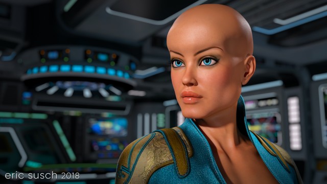
At one point I tried changing the background and put her on the bridge of a spaceship but it ended up too busy so I scrapped it.
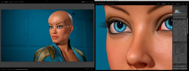
All it needed was minor color correction in lightroom. Not much at all. The final is essentially what was rendered out of DAZ studio.
What do you think? Is this our future?
Created in DAZ Studio 4.11
Rendered with Iray
Color Correction in Lightroom
Figures used:
Brenna for Ophelia 7
Sci-Fi Lieutenant Outfit for G3F
Wicked Fantasy Morphs for G3F
Generic Man
As you already know, my previous attempt to make the perfect social media avatar didn’t work out too well. Facebook was the biggest problem because sometimes their avatars are really, really tiny and the “man with no face” concept didn’t read. Also, shortly after I started using the side-view no-face avatar every single social media site changed their avatars from a square to a circle. Twitter, facebook, instagram, artstation, flicker… Everywhere. Aaaaarrrrrrgggggg!
OK, I needed something new, something simpler to understand and centered so it would look good in a circle. Enter Generic Man:
I kept things as simple as possible, centered face, no color, plain background. Getting the light right took time. Usually I like to set my own lights but this time I tried lighting exclusively with an HDRI dome. I tried many different light patterns until I got the glossy highlights and the deep set eye shadows just right. I didn’t want the light to be too flat but I also didn’t want it to be too shadowy either. This particular light pattern worked the best.
I also had to spend quite some time working on the white porcelain “skin” material too, especially since the neck of the original model was a different material. Finally I dialed in a slight asymmetrical facial expression just to give it a little something.
When I first rendered it out I kept the contrast very low. I liked the way it emphasized the eyes but it didn’t read well online at smaller sizes so I upped the contrast in Lightroom. This is the original render.
I’ve been using this avatar for several months now. It seems to work well at all sizes, even really small. It works in a square or a circle too. On Halloween I made an alternate and posted it for a day on facebook.
Here’s a few screenshot examples on social media. Facebook (so tiny!):
Deviant Art:
Tumblr:
It looks good in a square or circle, even very teeny-tiny on facebook. I think this one is going to last me for quite awhile.
Created in DAZ Studio 4.9
Rendered with Iray
Color Correction in Lightroom
Figures used:
HP Prototype YC-7 for Genesis 3 Male
iRadiance – Studio HDRIs for Iray
Mister Zero
My eternal quest for the perfect CGI avatar continues. I’ve grown tired of my current avatar artwork. People think it’s a picture of me and I have to explain that it’s CGI. I need something that doesn’t look human. Perhaps something creepy…
What to do?
Mannequins and faceless people have always freaked me out ever since I was young. I attribute that to this scene from Star Trek…
…and the Anything People on Sesame Street.
A freaky “no face” avatar would be cool and no one would think it was supposed to be me. Perfect!
Building a Mannequin
I started with a faceless character model I had and I replaced the skin like surface with a different shader. I experimented with many, many different surfaces trying to find something cool.
I tried cloth, wood, metal, rock, plastic, glass, grunge, paint, rubber, wax, anything I could think of.
I tried to avoid chrome because I had done that several times in the past but in the end I caved, because I really liked this particular dusty anodized aluminum surface.
I posed the figure tipping his hat with a 1960s fedora. I wanted him to be creepy and friendly at the same time. A sloppy overcoat and loose necktie seemed to fit so I added that too.
Give that man a hand
The fingers of the alien no-face character were creepy long, which looks OK but I like to make everything difficult so I decided to try and replace the hand with one that was human sized.
To do that I had to add another entire human sized figure and position the hand in the same place, grabbing the hat. It took awhile but I got it into position. Then I “turned off” (made invisible) the rest of that human character. For the no-face character I turned off the hand. The sleeve of the jacket was just long enough to hide the fact that the arm and hand didn’t meet exactly correctly. Everything came together when I layered the same aluminum shader on the human hand.
Dramatic Light
The lighting was difficult because of the reflective metal on the face. I ended up with a lot more spotlights than usual for a simple head shot just to get the reflections right. There are seven spot lights on the character and one blue spot on the background, which is just a gray wall panel.
After rendering it out I pumped up the color a little in Lightroom…
…and uploaded the avatar to Facebook.
Unfortunately I saw almost immediately that you couldn’t tell what the picture was at very small sizes. It was the high contrast lighting, the same problem I had before on my first CGI avatar. It looked fine at larger sizes but when it was super tiny the bright shine of the face looked like an unrecognizable white blob on a blue background.
Flat Light
I went back into DAZ Studio and tried to even out the lighting. The best way was to set up a few more lights to fill in the dark spots. I didn’t like it as much when I was done but I rendered it out anyway just to test it on facebook. This is the “flat light” version.It worked better at small sizes as you can see but still not as well as other avatars I’ve created. Humans are programed to recognize faces easily, which is why facebook can make their avatars so small. I’m asking people to recognize “no face” so I guess that’s more difficult.
So it sort of works at the tiny sizes and doesn’t look as good as it could at larger sizes. I guess that makes this avatar attempt a bit of a failure. I still like it though, so I’m going to keep it for a time before I try again. I can also upload the first version to other sites that don’t have such small avatars. What do you think?
Created in DAZ Studio 4.9
Rendered with Iray
Color Correction in Lightroom
Figures used:
The Slim Man for Genesis 3 Male
Mec4d PBS Shaders vol.3 for Iray
Amazing Hat
Eldritch Seeker