Tag Archives: makeSciFi

I Do the Job, and Then I Get Paid!

I do the job, and then I get paid!

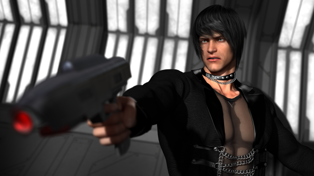
This is my newest CGI creation. It was a long road to get to this final image and I almost abandoned it. Here’s what happened.

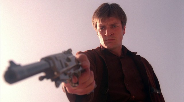
My initial idea was to do something similar to this famous pose from the TV show Firefly.

firefly - Mal points

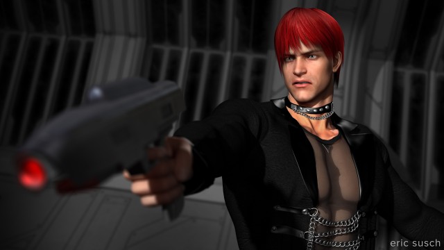
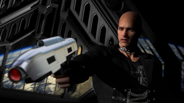
I’m starting to manually pose my characters and relying less on presets.  Could I capture the drama in this screen capture?  Well, I worked on it for a while and thought either I was still too inexperienced to capture the dynamics or maybe I picked the wrong image to emulate.   My version was just so meh.   There wasn’t any dramatic focus. Here’s what it looked like at that point:

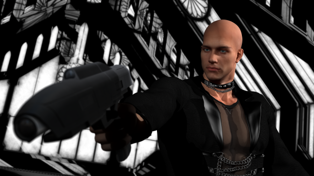
I had put the character in a large futuristic Gothic chamber to add some drama and I had sunlight streaming through the windows.  It was clear that the complexity of the architecture and the shadows made the background a mess.  I re-lit the scene for night.

Better but still busy in the background especially when I put anything outside the windows. I didn’t know what to do so I played around with the gun surface for a few hours and made it shiny.  That just put more emphasis on the gun and less on his face.

So I trashed the “location” and tried some others. I was fun to turn off the visibility of the “set” and load new environments just to see if they would work with the exact same character pose and camera shot.

alt location kitchen

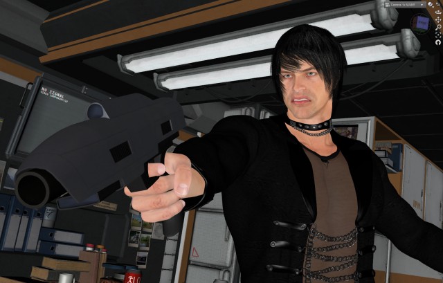
I tried a futuristic kitchen set…

alt location asylum

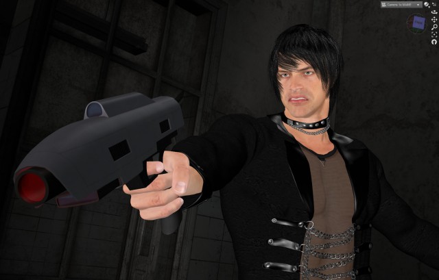
…a run down insane asylum…

alt location mars

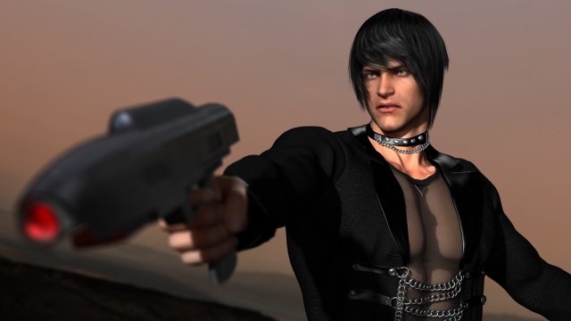
…and even the surface of the planet Mars.  The Mars landscape was the simplest and in keeping with the source inspiration but I really wanted to have more than a plain color as a background.

Finally I settled on simply rotating my original set so the character would be backed by the wall instead of the entire gothic chamber. This simplified the background while still keeping some of the look I was going for.  I also tried to make the windows look like lights on the wall, you know, like in the death star?  But I felt that was too bright and finally decided to just make them black. Anything else was too distracting.

Another element that I think didn’t work was the red light I put in the barrel of the laser pistol. I loved the effect but I thought it pulled the viewer’s eye away from his face. It took me an hour to get that light in the gun just right and I like it!  So to balance the red in the image I made the characters hair the same color.  I’m not sure but I think that works.

I do the job, and then I get paid!

This is probably not one of my best images but on the long road to its completion I learned plenty.  What do you think?

Love Is Not Enough

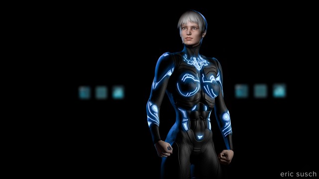
love is not enoughAdvanced lighting class!  A black suit against a dark background and forties film noir style glamor lighting on the face.  I’m now comfortable setting lights, well the spotlight at least, which is the most like a real Fresnel movie light.  Still not too sure about some of the other style lights available in the program.  I tried using a point light as a fill light and it was a disaster, very unrealistic looking.  I’m going to stick to spotlights for interior lighting.  Wish they had barn doors to make a quick slash on the wall.  I made a “flag” with a flattened solid primitive cube though and that worked.

The background is actually a scifi medical bay set with diagnostic beds and everything.  I spent hours trying different background lights but eventually settled on leaving it dark with only the computer monitors lit.  It just seems more mysterious that way.  It’s the same on a movie set.  If the lighting isn’t working you’re probably using too many lights.  Turn some off and see what it looks like.  Chances are it will be better.

A Million Faces, A Million Lies

a million faces, a million liesMaking movies is something I know about.  I know how to light a space and frame a shot on a real world film set.  It’s a process that makes sense to me.  That’s comforting when I’m floundering around with all the thousands of CGI controls that I have no clue about.  It gives me more time to experiment and learn.

This image actually came about serendipitously when I was setting the depth of field on the camera in the previous shot. I was off to the side (in a virtual sense) measuring the focal distance from camera to subject and this is what I saw. I set another camera, moved the red light a bit to adjust the shadow, and threw a cool blue light on the back wall. It’s just one of those happy accidents that sometimes becomes the coolest shot in your film.

a million faces, a million lies

What Do You Want?

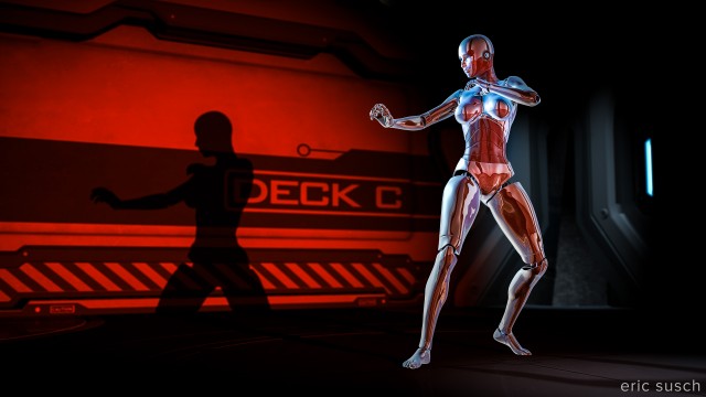
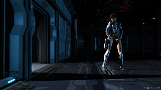
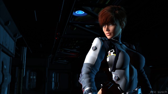
What do you want?One of the things I’m trying to do with my CGI work is develop a cinematic style.  Some of the digital art I see around the internet looks like it’s trying to imitate traditional illustration, other pieces look more like comic book or manga style, a lot looks like computer games.  This is all fine but I want my work to look like it came from a motion picture.  I want it to look like The Godfather, High and Low, Barry Lyndon, Days of Heaven, or Night of the Hunter.  I want these early test images to look like a still frame ripped from a longer dramatic story.

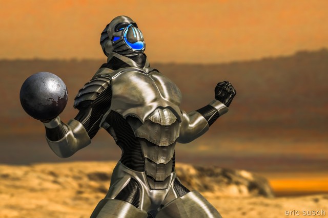
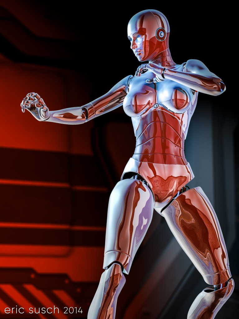
I actually thought this image would be more of a challenge than it actually was.  Lighting chrome in the real world is difficult.  I was ready to abandon it if it looked terrible.  I imagined I would have to light the entire set around the character but I tried lighting it directly first and it looked OK.  There are only four lights working here, a cool bluish key and two reddish fills on the character, and a light on the background.  I’d really like to see this character moving with all those reflections but that’s a little advanced for me right now.  I’ll have to come back to this one later when I start experimenting with animation.

Created in DAZ Studio 4
Rendered with 3Delight
Color Correction in Lightroom

Figures used:
Bot Genesis
Utopia Deck C

Thinking Of You

Thinking of You

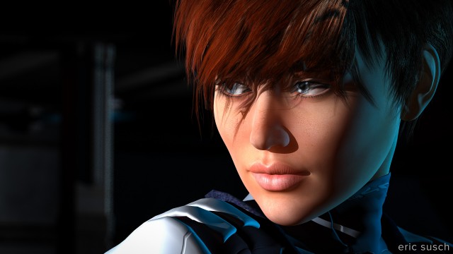
I went back to my first setup to try a long lens closeup.  I’m not really happy with the hair.  It’s a bit unrealistically kinky.  The shadow makes it worse, but that’s not what this shot is about.  The super exciting major point of this shot is the column in the background!  I actually set a light and adjusted it myself so you could see something back there!  Now I know how to set both cameras and lights!  Onward…

Make sure you click on the image to see it in the original 4K size.  The detail of these inexpensive models is stunning!

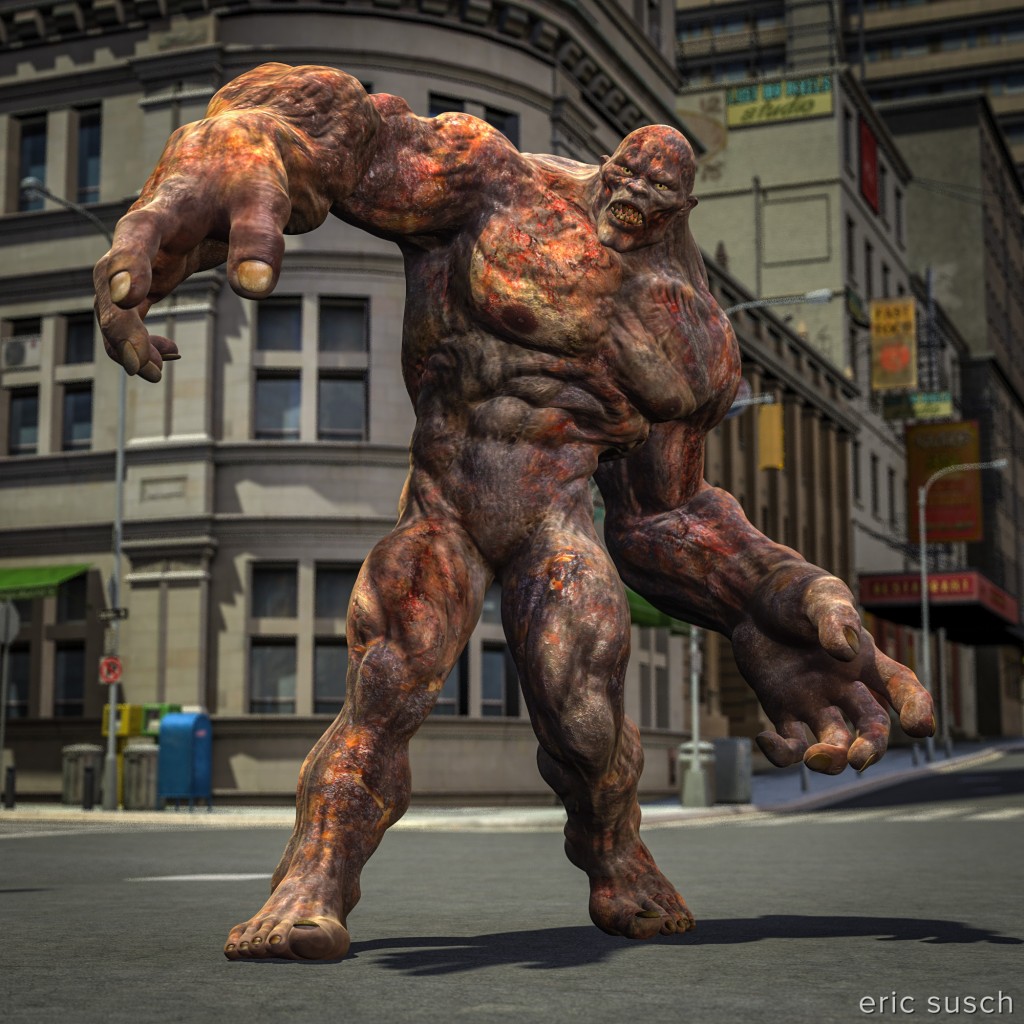
Oh NO! He’s loose in the city!

Another test in DAZ Studio.  This time in an exterior location.  (click to embiggen)

OH NO!

OH NO!

I think at this point I’ve mastered how to set a camera and control the depth of field, which has been my main focus up to now.

I’m still having trouble getting the feet on the ground correctly.  The back foot just doesn’t seem to be on the ground.  I think this has more to do with the shadow than anything else.  I’m still using light presets that come with the environment so I’ll play around with this more when I set some custom lights.

I color corrected this a bit in Lightroom to give it a bit more punch.  It makes a big difference.  The two images in my previous post were right out of DAZ Studio and I see now that I should have done the extra work and color corrected them too.

Models = Infernal Behemoth in Urban Sprawl 2

I’ve started experimenting with computer animation

That’s right.  This former model builder and stop motion animator is embracing the evil, evil world of CGI.

Way back in the before time when I was a kid, my first step into narrative film-making was stop motion animation.  I was a model builder and it was a natural step.  It was also the only way for me to create the SciFi worlds I saw in my young head.  Since then as technology advanced I always wanted to try computer animation.  In fact, when I bought my first non-linear editing system, it was a toss up between that and a Kinetix 3Dmax system.  I went the editing route and I have the heavy iron D/Vision workstation holding my door open to prove it!  Cut to today:

Right now I’m experimenting with DAZ studio which is free software for the new CGI/Illustration market.  (Go check out anything traditionally illustrated with paintings like romance novel covers and chances are you will see a CGI image created with DAZ models.)  DAZ also has a marketplace where you can buy reasonably priced CGI characters, clothes, environments, and yes, spaceshipsRight now I’m at the basic learning stage.  I have goals like: “Can I make a character stand in a room, set a camera, and render it properly?”  Well, what do you think?  (click to embiggen)

v6 test 09 cam 01 v6 test 08 cam 04 red light off