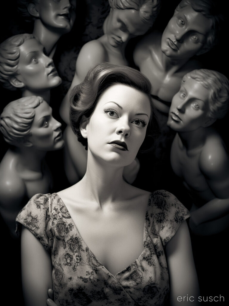
 So, when I was a kid I had this thing about statues coming to life…
#Art I made with #Midjourney #AI
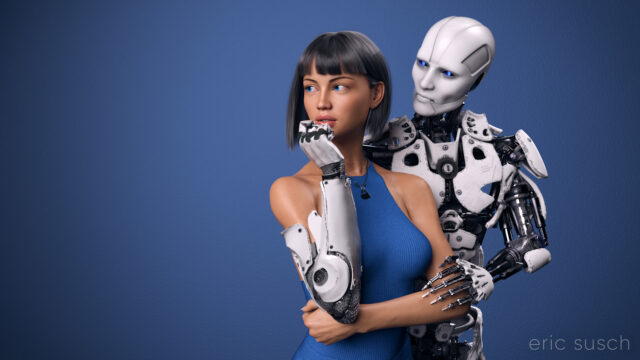 I’ve worked on this CGI scene longer than any other. I’ve spent years obsessing about every detail. I’m sure I’ve sucked the life out of it many times. I hope there’s still something good left in it but I can’t tell anymore. The only thing I can do is to let it go and put it out there hoping there’s still some life in it.
This is the second iteration of this piece. The first one, which you can read all about here, was square, with a grey background, and a different dress. I also added a pierced heart necklace to this new wide version. Those are the big differences. There are tons of other small changes.
 So, why a new version? Because I wasn’t satisfied with the old one. (Actually I grew to hate it.) For some reason this piece is an ongoing obsession. Even now I’m looking at the image above and wondering if the background is too dark, contemplating changing it again before posting this blog post. But I’m not going to. I have to let this one go and be done with it. Next step is to print it on metal like I’ve done with several of my other pieces and see how it comes out. If it needs tweaking after that, then I will, but for now, it’s done!
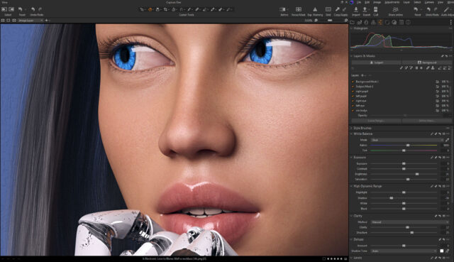 Color correction this time is in Capture One. I abandoned Lightroom a few years ago. I’m not interested in paying a subscription for my professional software. Buying a perpetual license for Capture One is actually more money but it’s worth it. If at some point I decide I can’t afford to upgrade anymore I won’t lose access to all my images and all the work I’ve done on them. Don’t ever let a company and their tools act as gatekeeper to your work. — I’m also liking the color correction controls a bit better in Capture One, thought Lightroom wasn’t bad.
Created in DAZ Studio 4.22
Rendered with Iray
Color Correction in Capture One
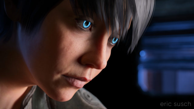 I’m still trying to make some of my CGI art look like it’s from a motion picture. What makes something look cinematic? Color? Framing? I’m still not sure. That’s what I was experimenting with in this portrait – a real person, in a real location, in a movie… A simple moment from a larger scene.
The setup was simple: face, hair, jacket, background. I set the camera lens at 100mm, 16×9 aspect ratio and found a good closeup. I messed with the depth of field quite a bit to get the background soft but not too soft (this isn’t a DSLR movie.)
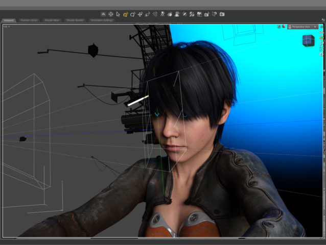 The green line in this screenshot shows how the camera (on the left) is focused precisely on the nearest eye and the two planes show the narrow depth of field on the face. The other eye is slightly out f focus.
The blue in the background is the soft blue backlight. I used only three lights, a key light on the face, the back light, and a light in the window. (And the eyes light up too.) No fill light.
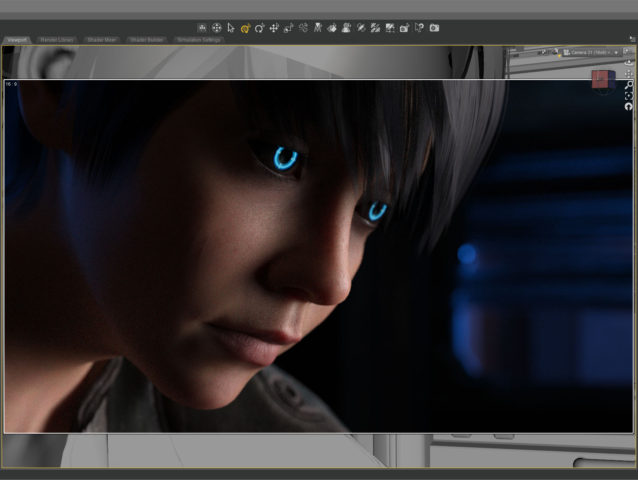 This screenshot shows how the initial render looked before color correction. It’s quite dark which means it takes longer to render but I liked the quality of light so I went for it. It took about five and a half hours to render the final file at 10800 x 6075. I stopped it at 4277 samples and 92 percent convergence even though my minimum is usually 95 percent and/or 5000 samples. It didn’t look like baking it any more would make a difference.
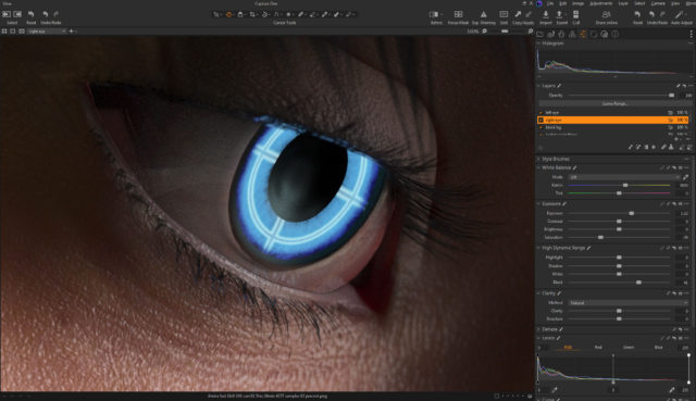 The whites of the eyes ended up quite dark in the render so I brightened them up in post. The eyes are a really old product and I don’t think I updated the reflectivity on the sclera quite right to render properly in iray.
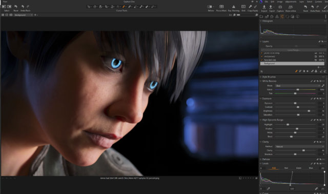 I also pulled the background completely black because I thought the muddy dark shapes distracted from the face.
This is the part of the post that I feel I really should evaluate the final result… then I decide not to say anything because I can only see the mistakes. After a few months not looking at it, I’m sure I’ll be able to figure out if I love it or hate it, but not now…
Created in DAZ Studio 4.21
Rendered with Iray
Color Correction in Capture One
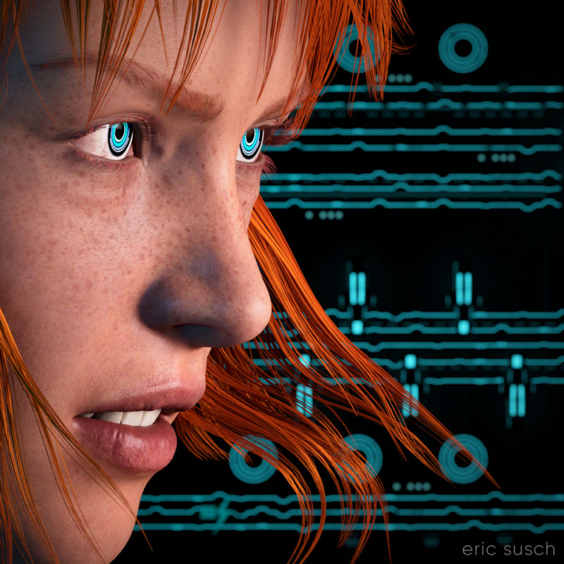 I think my CGI images tend to look better when I have something in closeup. It avoids the “medium shot of a character just standing there” that I struggle with. For this piece I started with an extreme close up and added cool robot eyes and dramatic flowing hair.
I also wanted a graphic background, something flat, technical. I have an ongoing issue with backgrounds. I get creatively stuck and I don’t know what to put back there. I end up trying scores of different things and nothing works.
What I ended up using here was actually a huge Tron like cityscape. The shapes and lines are actually building size structures seen from the top. This is what the cityscape looks like normally.
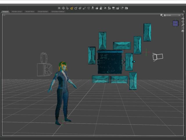
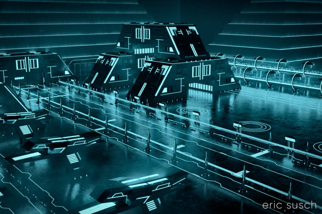 The entire environment is standing on it’s side waaaaaay far away. I turned on and off different elements depending on what looked good. It ended up being a real hassle having the background so far away though. Making adjustments took a long time. (I went back and figured it out. it’s 1.8 miles away! …or 3 kilometers) I should have scaled down the whole thing and moved it closer.
 I named it Music in the Metaverse because the graphic lines in the background ended up looking similar to a music staff.
 Created in DAZ Studio 4.20
Rendered with Iray
Color Correction in Capture One
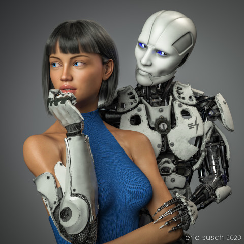 This piece was a marathon to create. A perpetual artistic labor. Unending. Frustrating. We had remodeled our kitchen and saved a space on the wall for an art piece, complete with it’s own special spotlight. The kitchen had taken over a year to complete and this art piece had to live up to that. It needed to be perfect. Constantly second guessing my creative choices, it took me a year to finish this, sometimes setting it aside, then diving back in to see if I could perfect it. Today I’m finally calling it done and I’m presenting it here hoping I haven’t completely strangled the emotional life out of it.
Some of the initial criteria: It was designed as a large piece, three feet square, so it needed to be extremely detailed. It had to match the modern aesthetic of our new kitchen. Colors needed to be white and gray with a blue accent. It needed to be bright, not the dark moody work I usually gravitate towards. I wanted two characters – an android and a cyborg – in love yet troubled, going through the same ups and downs we all do. …And it needed to be good. That was the most important criteria. It needed to be good.
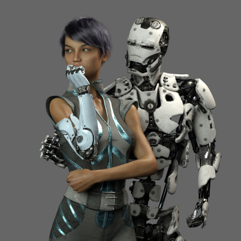 This is an in-progress test render from early on. As you can see the original composition was wider. The plan was to have the android’s right arm on her waist and she would be gently touching his metal fingers.
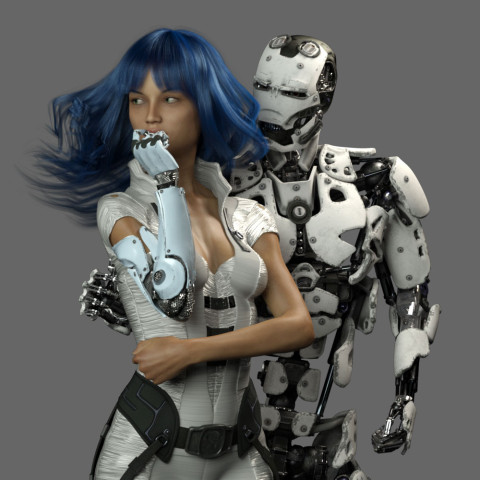 What to wear and what hair? I obsessed over endless choices.
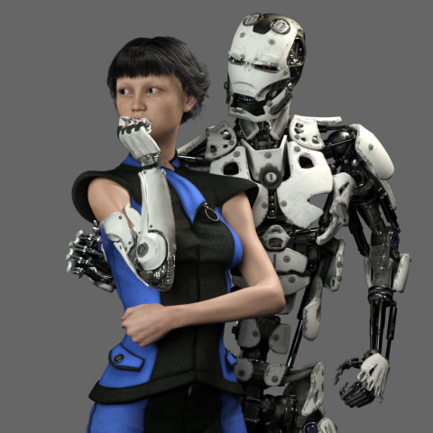 I tried many skin textures for the girl. I wanted to get the softness just right so it would contrast nicely with the hard metal of the android.
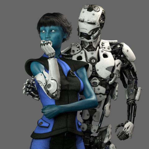 Maybe she should be an alien? Blue is the accent color so it makes sense. OK, maybe it’s too dark…
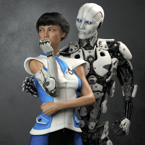 Angry robot face changed to gentle face. I needed to get some humanity in this android.
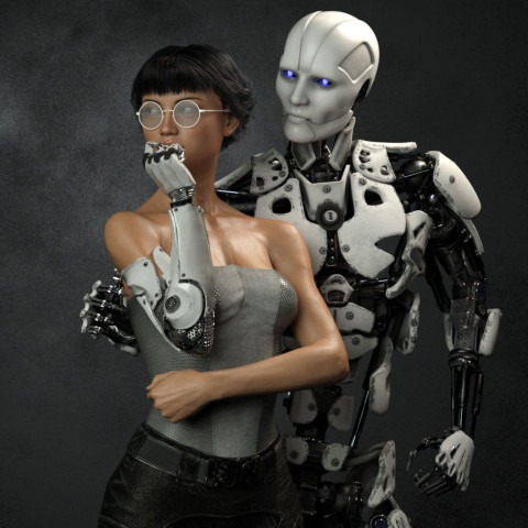 I eventually decided the girl needed bare shoulders to clearly see the cybernetic arm connection. I wanted it to be clear that she was human and only her arm was mechanical. This is also the reason I decided to ditch the idea of “space girl” type clothing which tends to be aggressive and hard. She needed to be soft, the soft spot between the hard metal of her arm and the android.
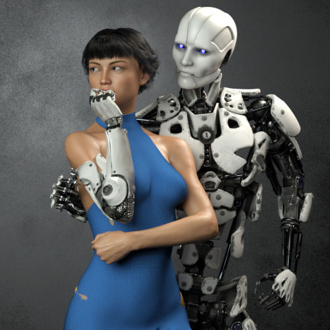 I finally decided to go with this “cold shoulder” dress. When I was working to make it blue, I changed the original cloth to a knit fabric because my wife CAT is a knitter. That just made sense to me.
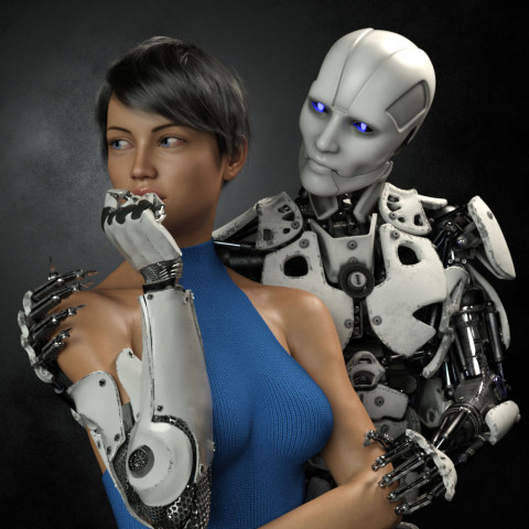 Eventually I realized that I had set the camera too far away, and moved in closer. This always happens. It’s always better after I move in. It’s just part of my process I guess.
Adjusting for the new composition, I tried moving the robots right hand up to her shoulder. It ended up too creepy though. Trying to get the sharp metal fingers to show some sensitivity was proving difficult. It also fouled up the clean skin / machine connection I wanted for her cybernetic arm. I eventually moved the android’s right hand behind her back out of sight and concentrated on getting the left hand in the correct position. It took me three tries to get the left arm to look relaxed and gentle.
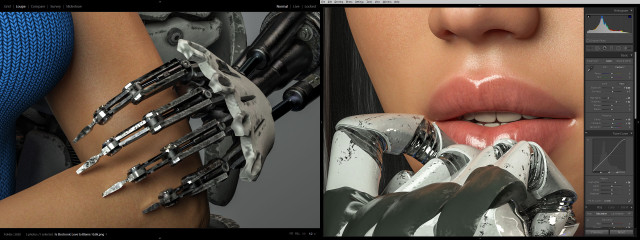 I also spent a tremendous amount of time trying to get the android fingers positioned just right so that they didn’t look like they were gouging the girl’s arm, yet at the same time, catching the light in a nice way. Skin against machine was becoming a major theme apparently. Same with the cybernetic fingers and her lips. I actually moved the camera and lengthened the girl’s neck at one point so you could see more of her mouth.
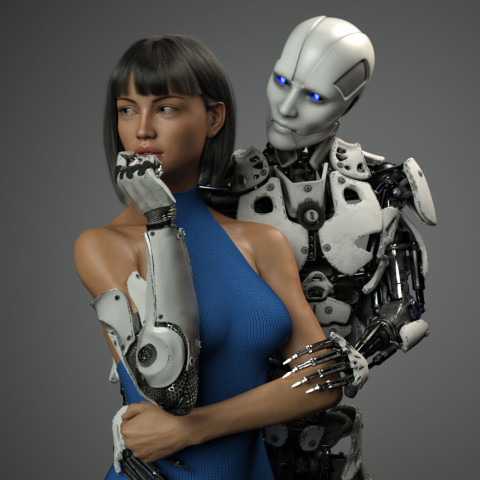 Then, of course I second guessed myself and pulled the shot back to re-visit the original concept of the hand around the waist. Worked on that for awhile but thankfully came to my senses. Maybe I’ll revisit this wider shot if I do a different version with a vertical aspect ratio.
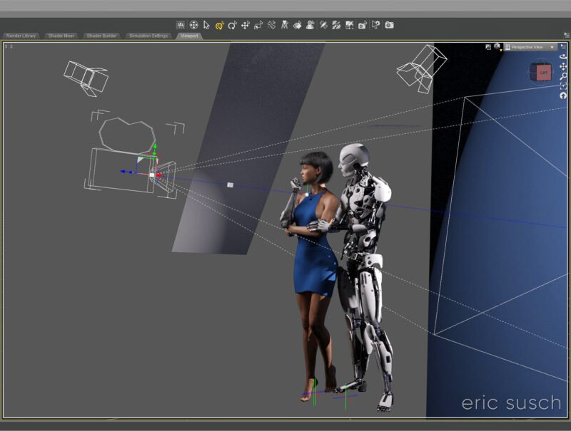
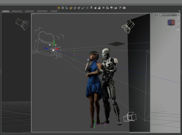 I only needed three lights to illuminate the scene. A key from the front doing most of the work. A hair light from the top that was also doubling as a fill light. And a spot on the gray background plane. I created another tiny plane just out of frame above the android to cut down the reflection on his white bald head.
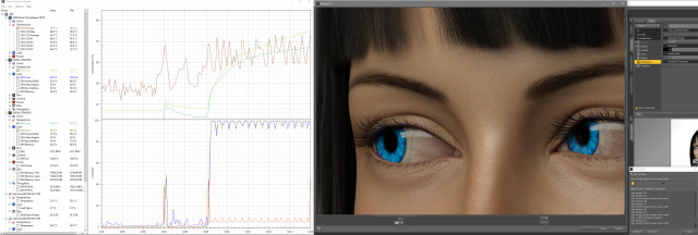 The final Iray render took about two hours at 10800 x 10800 resolution. I was surprised. That’s very fast. I’ve had renders at this resolution go ten hours or more. I’m guessing the plain background and the overall brightness of the scene helped.
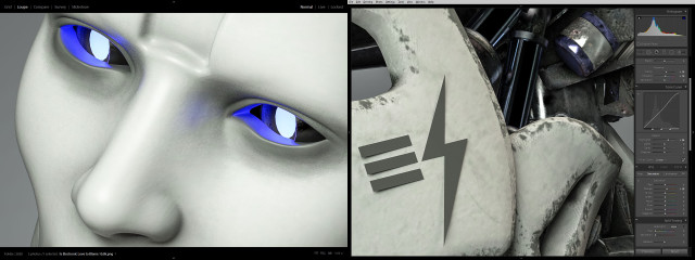 Color correcting in Lightroom I tried to bring out the hardness of the machine and the softness of the skin.
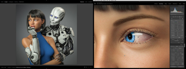 I lightened up the girl’s eyes and obsessed over everything for quite some time. Overall I brightened everything up and made it punch as much as possible.
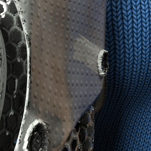 While color correcting I noticed a bizarre reflection coming off one of the poorly formed low-rez “screws” on the cybernetic arm. It had something to do with the normal map which wasn’t doing much on this surface. The screws were created with the displacement map. Not sure what was going on.
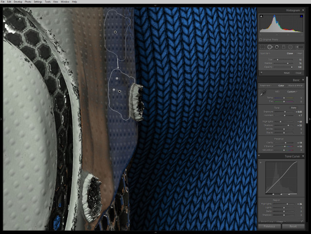 Anyway, I couldn’t figure out how to fix it in DAZ Studio without changing the character of the rest of the arm surface so I just used the spot remover in lightroom.
 So what do you think? Did I over think it and create something stilted? Or did I continually refine it and make it great? I can’t tell anymore.
Next step: print it and see what it looks like on the wall…
Created in DAZ Studio 4.12
Rendered with Iray
Color Correction in Lightroom
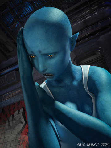 After George Floyd was killed and a week of protesting around the world, this was how I felt. I created a TikTok video where the camera cranes down from a fire escape and eventually tilts up on this character. You can see the video here: Despair on TikTok
After a bit of re-adjusting in DAZ Studio I came up with this high rez still version of the final frame. I rendered it at 10000 x 7500 pixels so I could print it out big and hang it on the wall.
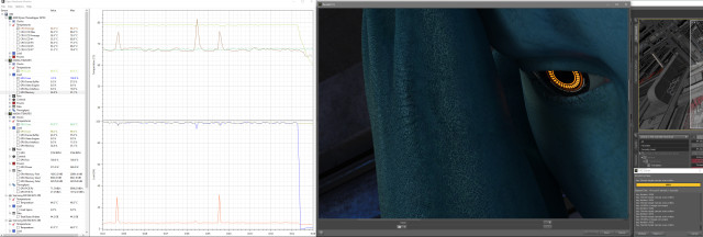
Shadow areas take a long time to render in Iray, especially if the canvas is large. With two Titan RTX graphic cards continuously screaming at 79 degrees Celsius, this image took fourteen hours to render. Not the longest render I’ve ever done (that would be 48 hours) but still a good exercise for my new computer workstation.
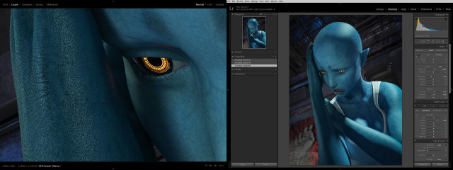
 Color correction in lightroom was relatively simple, essentially just brightening up everything so it pops and so all the shadow areas don’t print out too dark.
 Created in DAZ Studio 4.12
Rendered with Iray
Color Correction in Lightroom
While I was working on a previous art piece called Quirky Girl, I stumbled through a wormhole and accidentally created this:
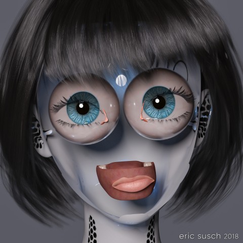 I stopped everything and rendered it out immediately! Enjoy!
I Reveal My Innermost Self
Created in DAZ Studio 4.11
Rendered with Iray
Color Correction in Lightroom
Figures used:
HPFK Lenora for Star 2.0 and Aiko 7
System 50 for G3F
Classic Bob Hair for G3+8F