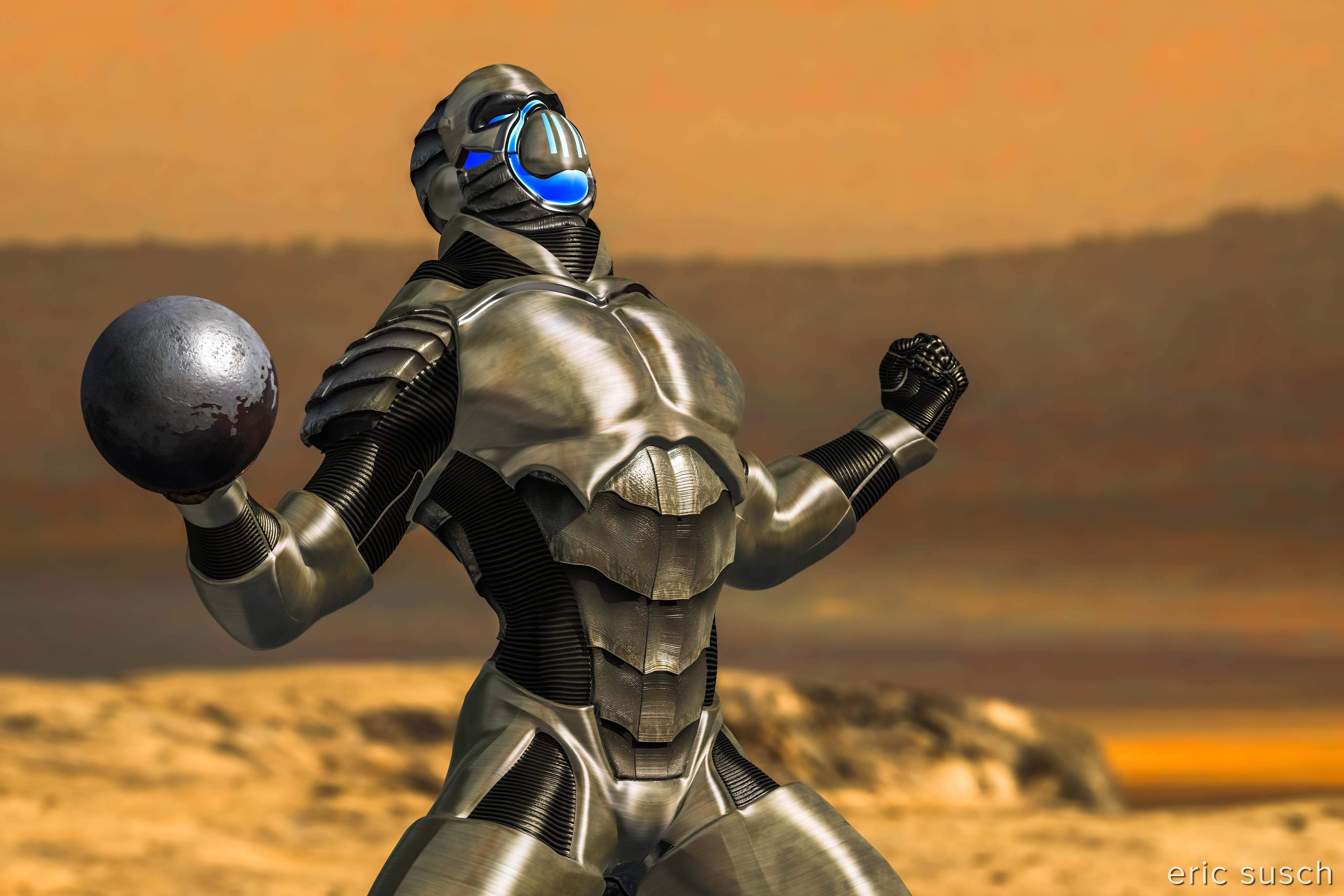
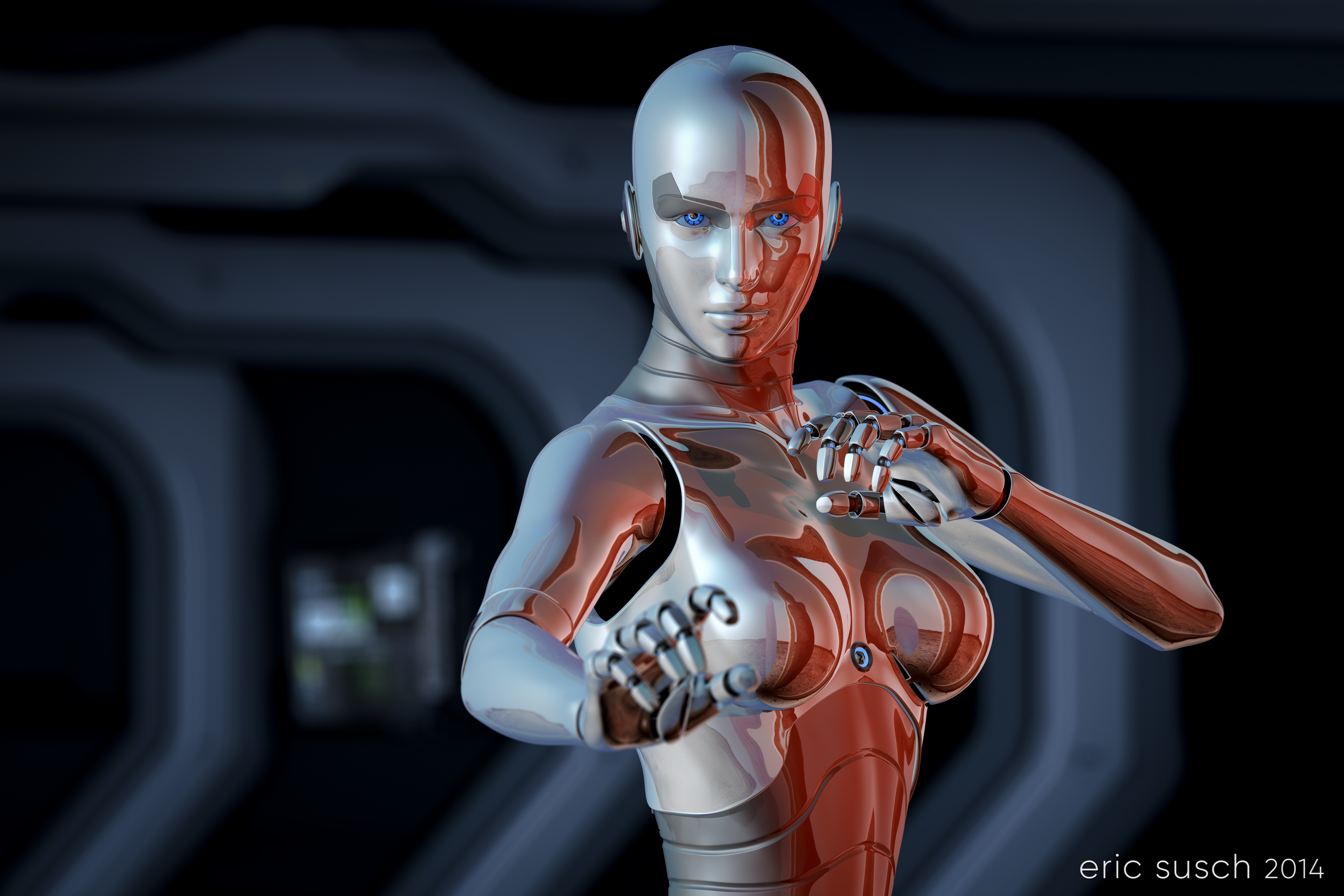
Prints of this image are available on my Deviant Art page.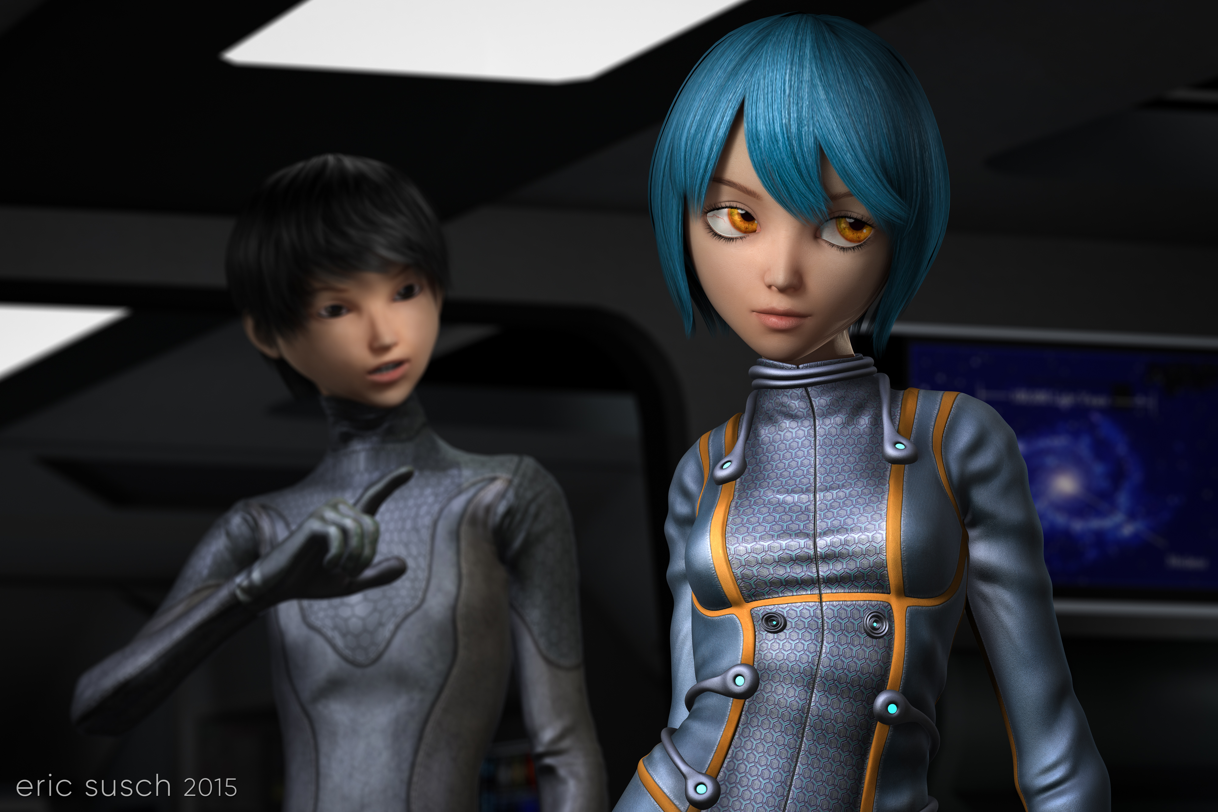
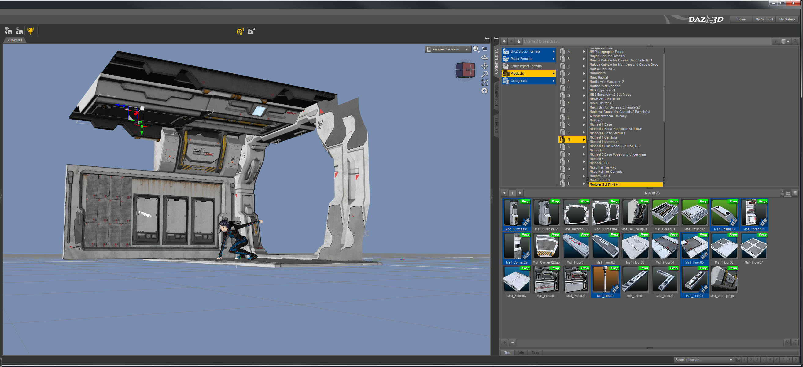
I’ve started working on a few CGI images with multiple characters but this is the first one I’ve been able to finish. Right now I have five or six projects that are stuck at various stages. One thing I’ve realized is I’m having tremendous difficulty with backgrounds. I’m consciously starting my scenes with character ideas first because I see that as the most important element in the image. I then end up trying eight or nine “sets” for the background and nothing seems to fit. It’s easy to move entire sets in and out in virtual space and try different things but I guess my brain just doesn’t work that way since it’s not how you make movies in the real world. All my creative experience starts with the location first, then the actors come in to block the scene, and finally the camera positions are locked down. I think I’m going to have to change my workflow and do it the way I know.
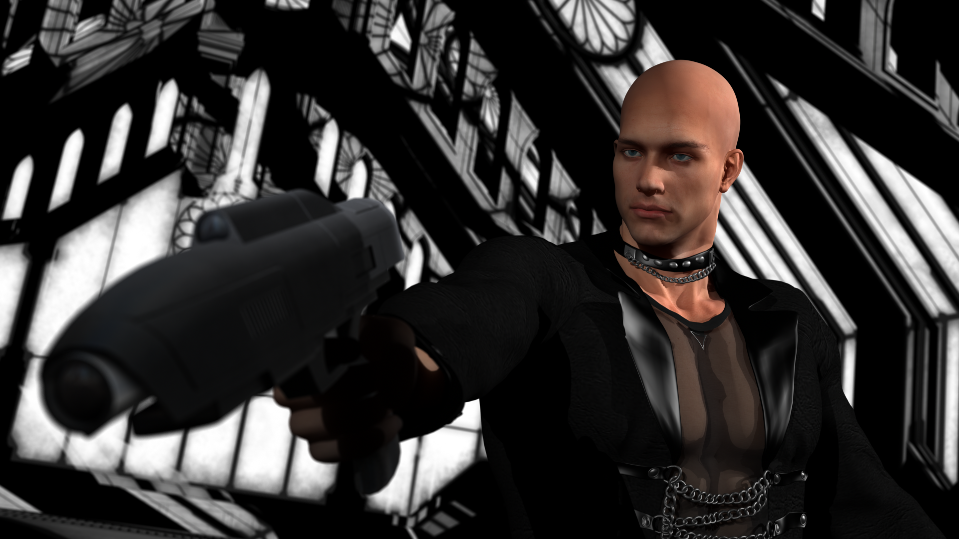
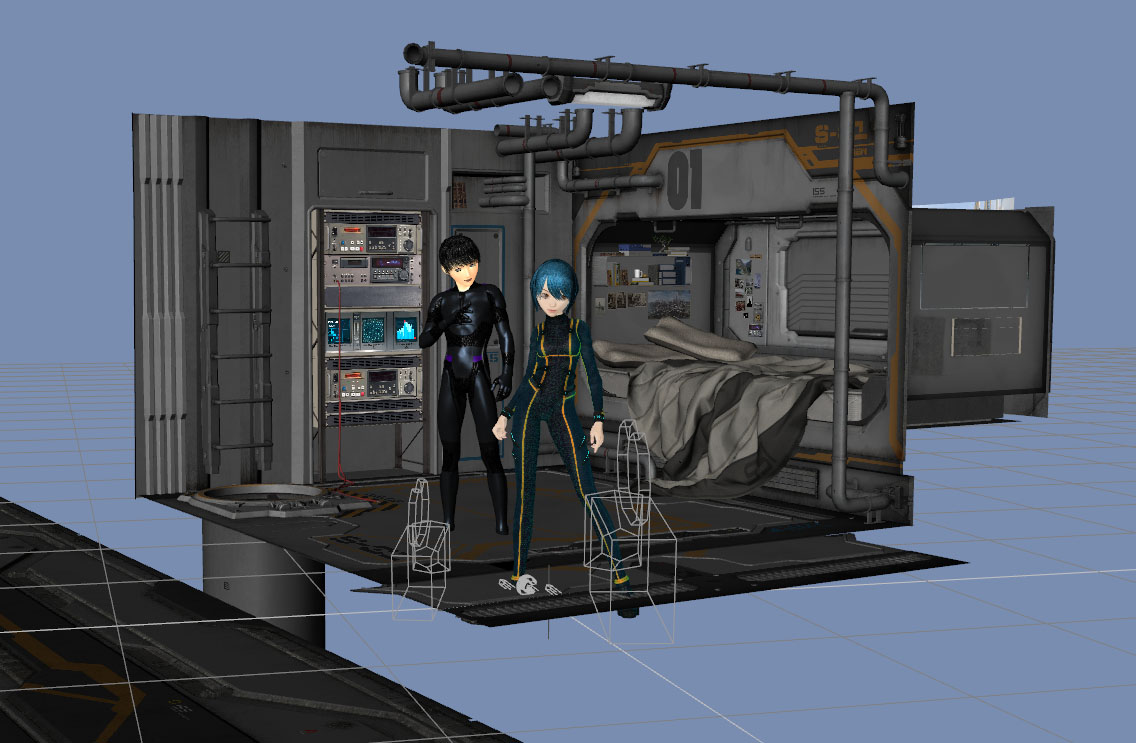
 I originally envisioned this scene as an exterior, but that didn’t work so I tried several interiors including this space bedroom complete with professional video tape rack.
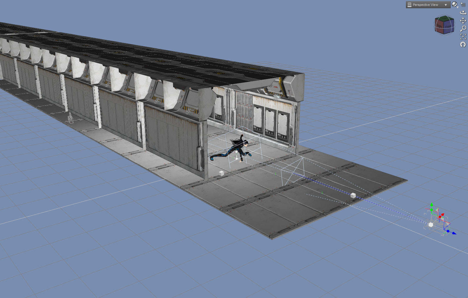
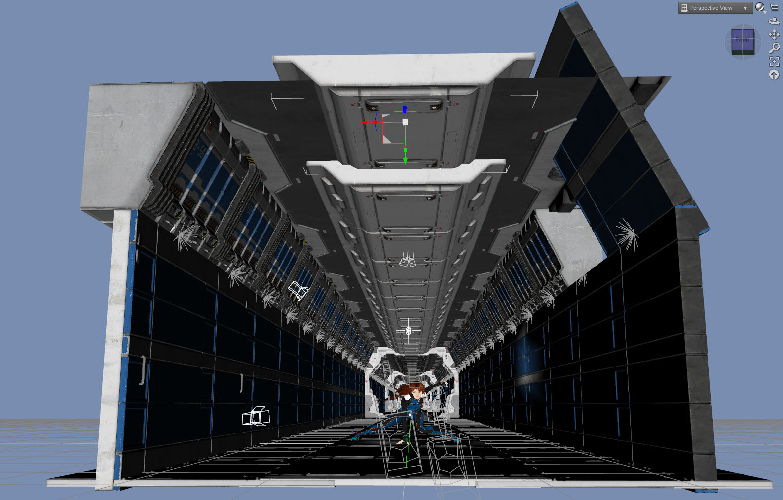
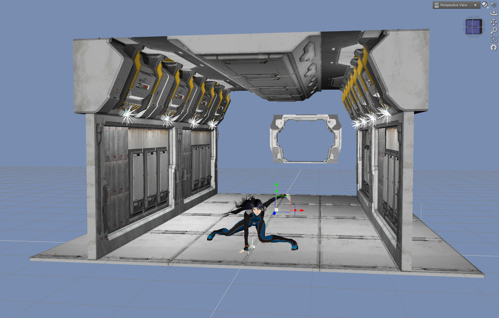
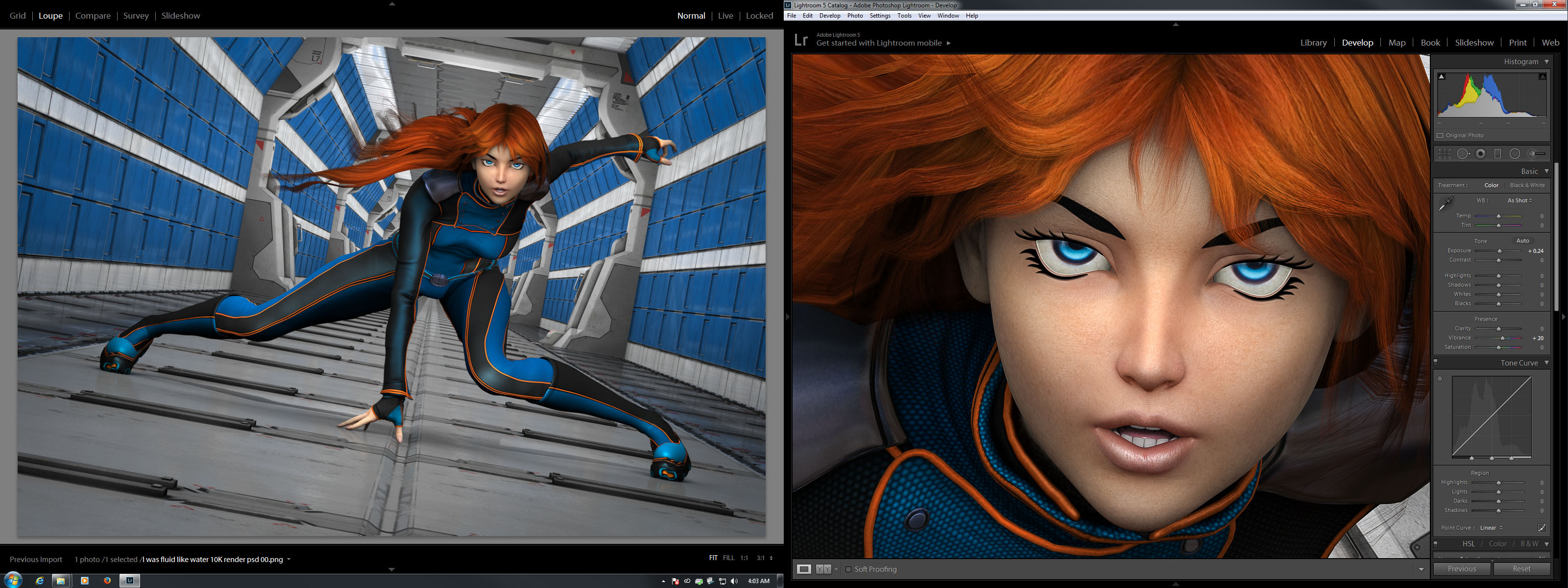
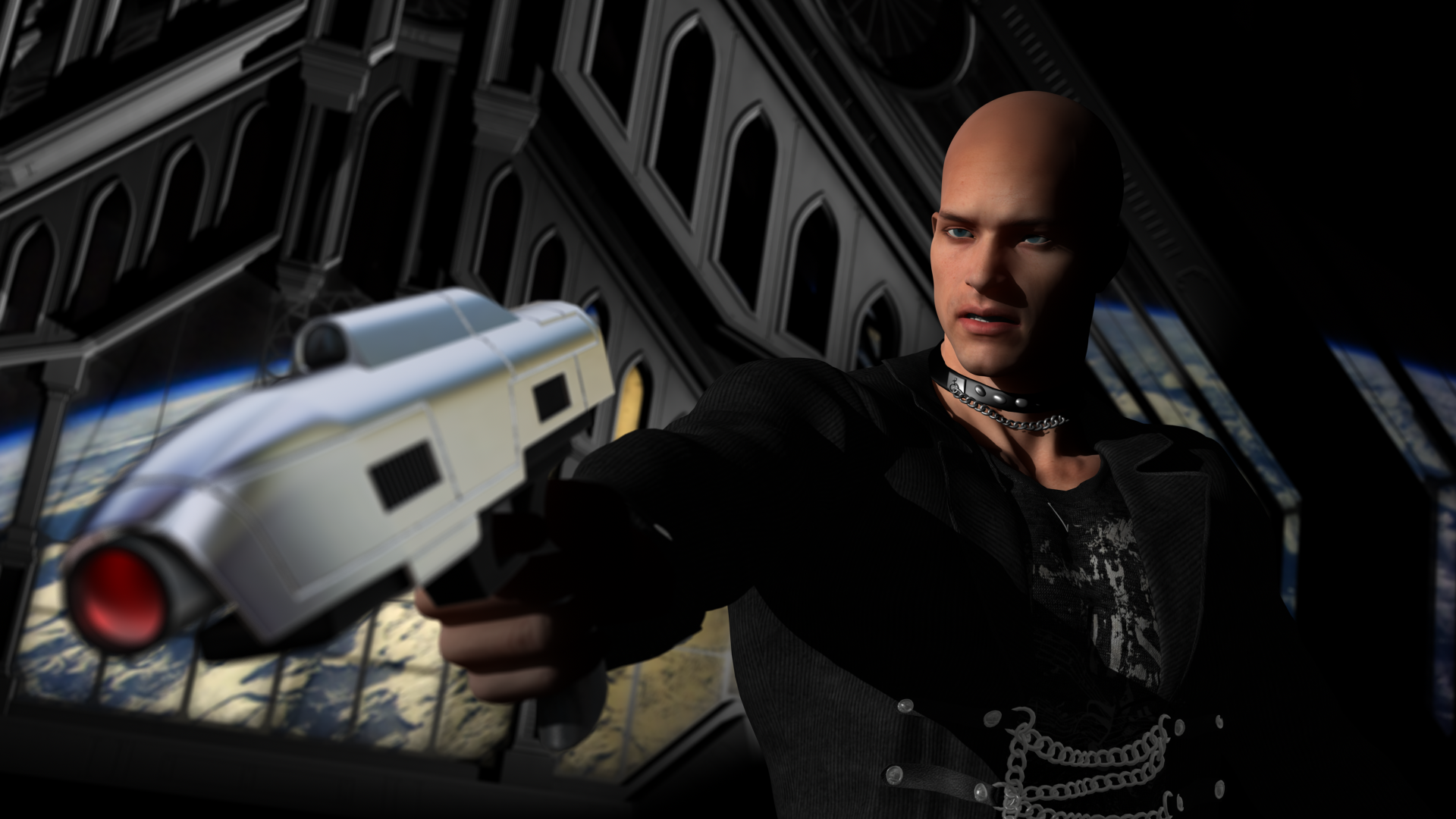
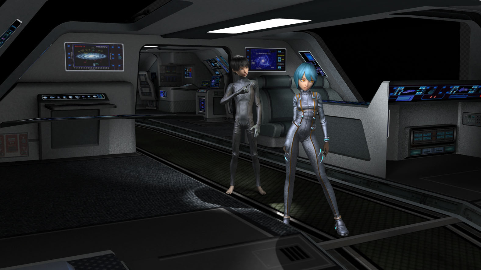
 I eventually settled on the interior of a shuttle type spaceship.
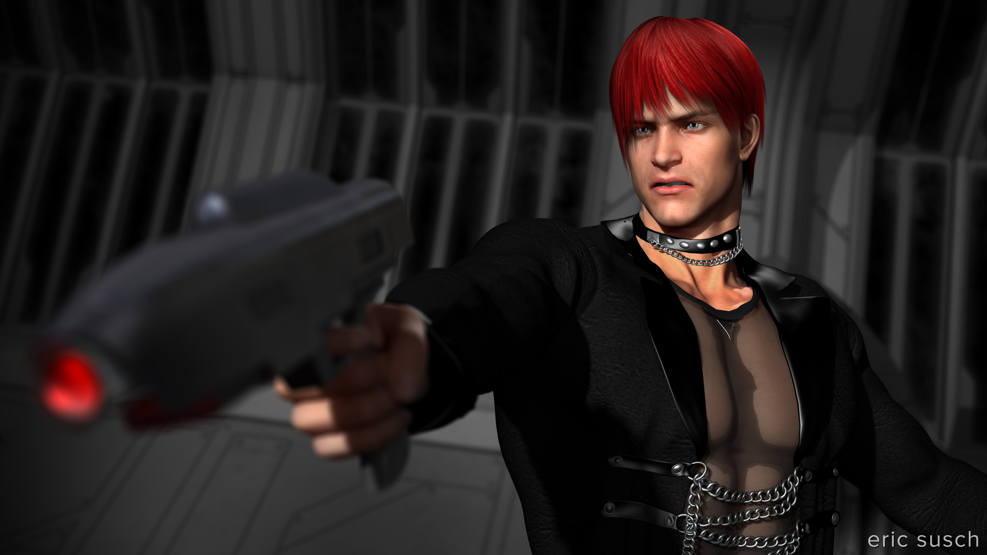
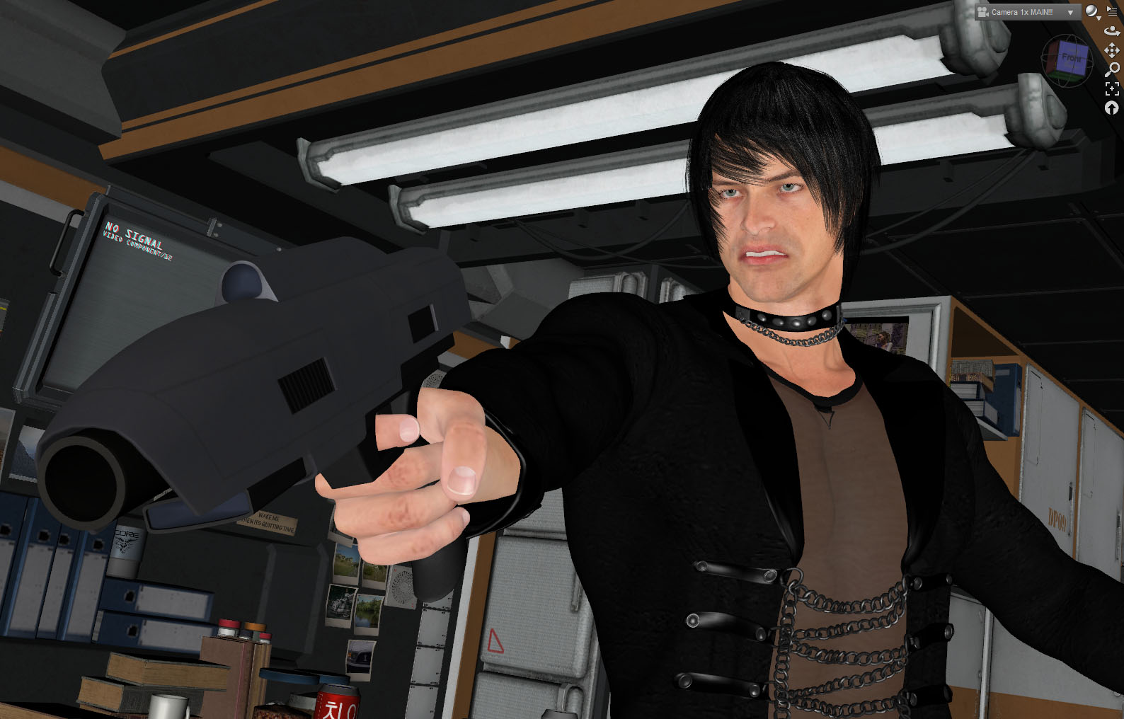
 You may have noticed I originally had a different character for the boy.
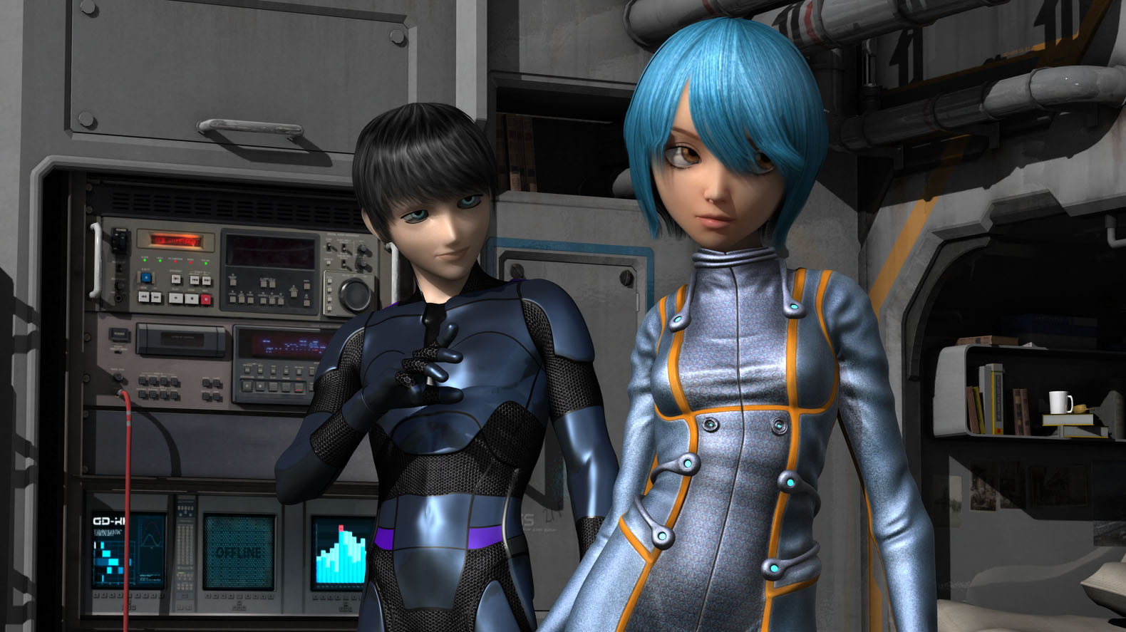 He was anime style but a bit too realistic for skinny toon/anime girl (Keiko 6.) Modifying a straight up toon style boy character (Animated Shapes for G2M) with a different skin texture and bigger eyes created a figure more in line with the anime style of the girl.
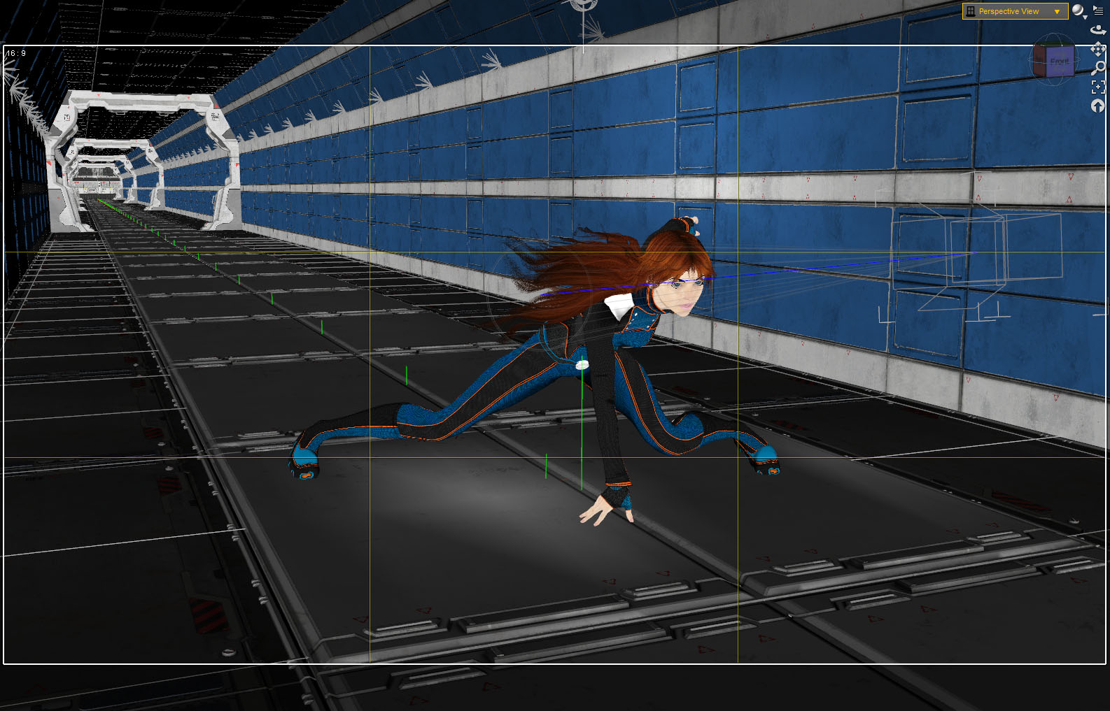
I had that kinky hair problem that I’ve mentioned before. You can see it here above the right eye.
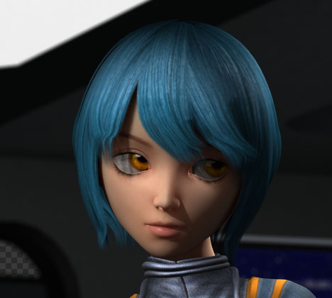
I asked about it on a DAZ facebook group and there is a fix! There’s a hidden control in the hair parameters called “smoothing iterations.” Increase it a bit and the kinkiness goes away. I found that you should only increase the smoothing just enough to solve the problem because higher numbers thin out the hair considerably making your character look like a post-apocalyptic radiation victim! (…which, come to think of it, may be a hair style I need some day.)
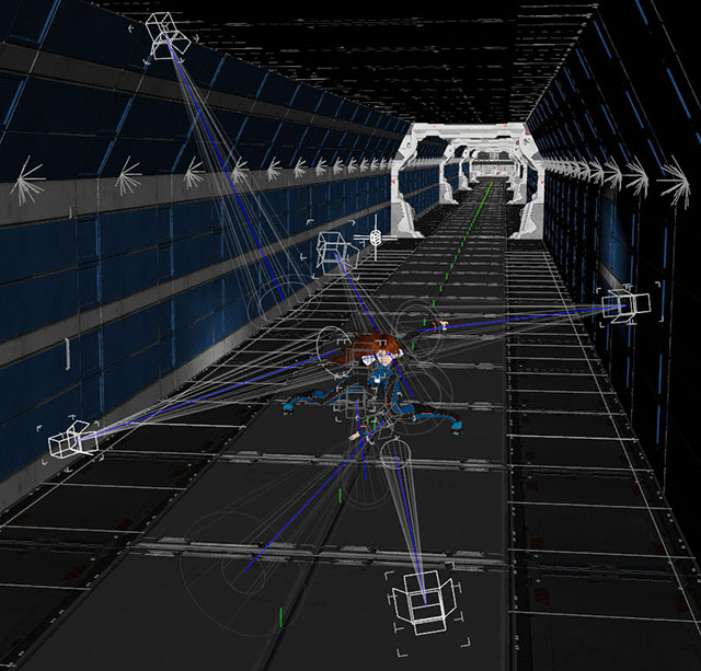
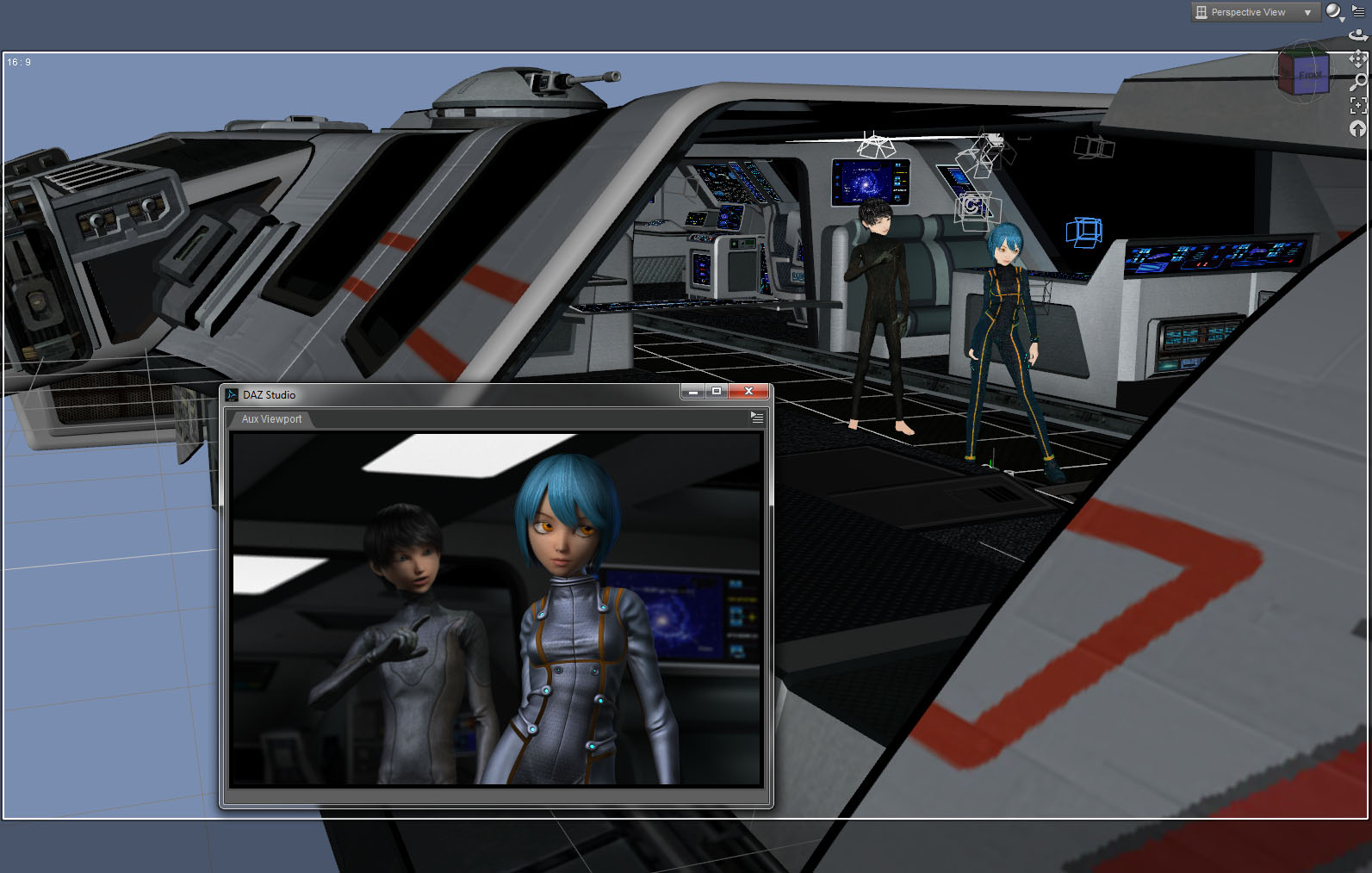 While working on this piece I started using the new Aux viewport in DAZ Studio 4.7. You can set it to continuously render so that, as you are working it will keep updating. It sort of works. My processors and fans were churning hard as it was trying to keep up with the changes. It’s usable for lighting, only re-rendering the area of the picture effected when you move a light. For moving models around the space it’s not as good. The screen update gets slow and you end up waiting a lot.
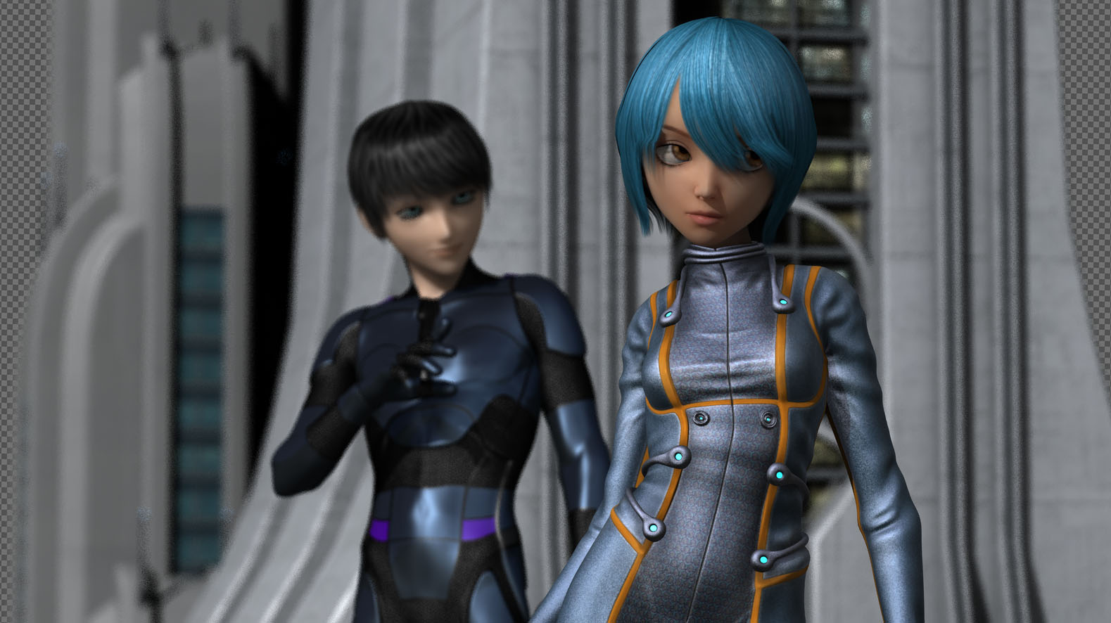
All in all I’m very happy with this piece. It’s my first with two characters interacting in a two shot which is more like a movie and less like a character just standing there.
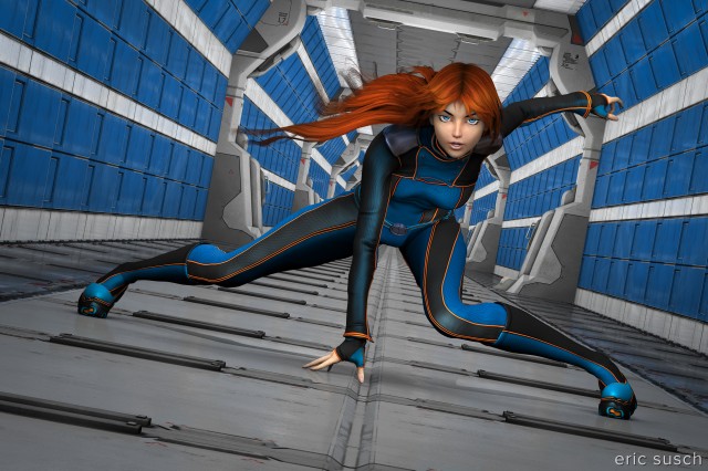
Prints of this image are available on my Deviant Art page:
http://ericsusch.deviantart.com/art/The-Space-Between-Us-513716053