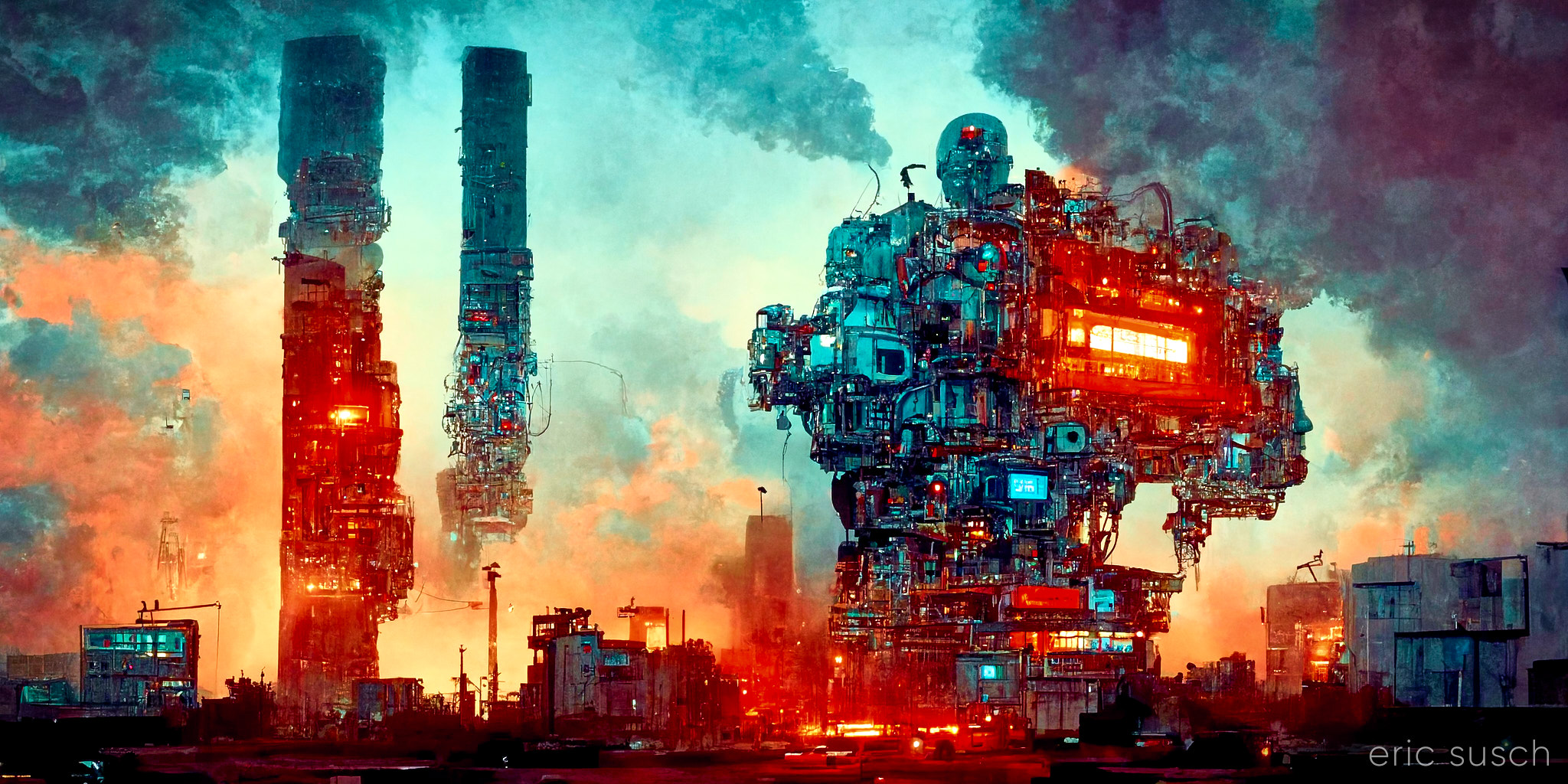
 #Art I made with #Midjourney #AI
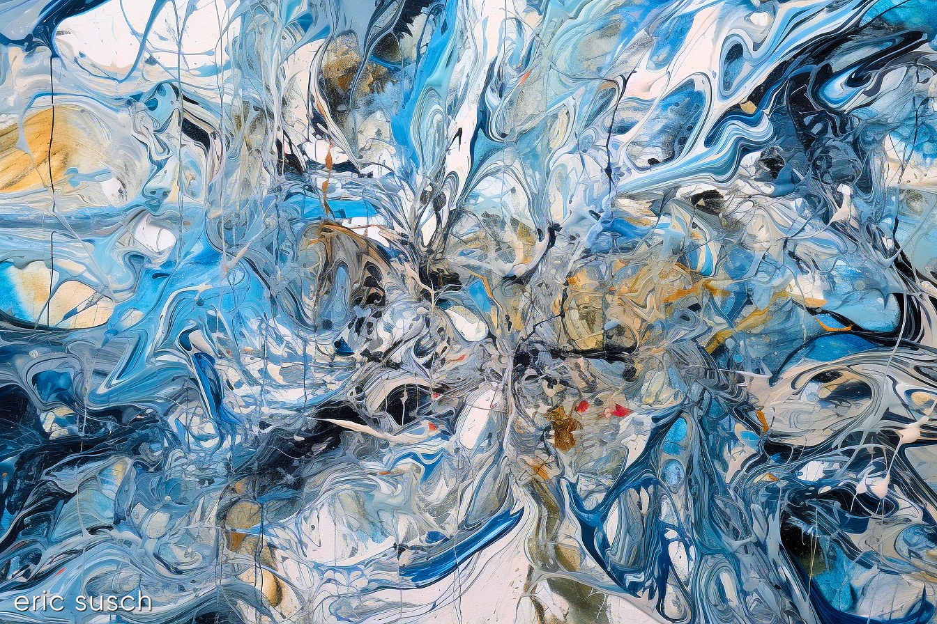
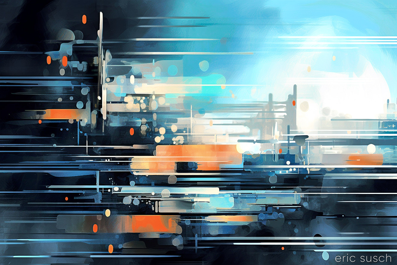
Abstract 004
Leave a reply
#Art I made with #Midjourney #AI
 #Art I made with #Midjourney #AI
 #Art I made with #Midjourney #AI
 #Art I made with #Midjourney #AI
 #Art I made with #Midjourney V3 #AI
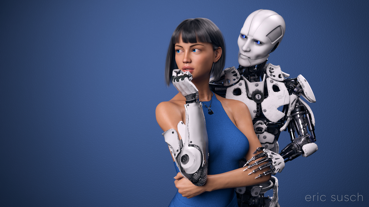 I’ve worked on this CGI scene longer than any other. I’ve spent years obsessing about every detail. I’m sure I’ve sucked the life out of it many times. I hope there’s still something good left in it but I can’t tell anymore. The only thing I can do is to let it go and put it out there hoping there’s still some life in it.
This is the second iteration of this piece. The first one, which you can read all about here, was square, with a grey background, and a different dress. I also added a pierced heart necklace to this new wide version. Those are the big differences. There are tons of other small changes.
 So, why a new version? Because I wasn’t satisfied with the old one. (Actually I grew to hate it.) For some reason this piece is an ongoing obsession. Even now I’m looking at the image above and wondering if the background is too dark, contemplating changing it again before posting this blog post. But I’m not going to. I have to let this one go and be done with it. Next step is to print it on metal like I’ve done with several of my other pieces and see how it comes out. If it needs tweaking after that, then I will, but for now, it’s done!
 Color correction this time is in Capture One. I abandoned Lightroom a few years ago. I’m not interested in paying a subscription for my professional software. Buying a perpetual license for Capture One is actually more money but it’s worth it. If at some point I decide I can’t afford to upgrade anymore I won’t lose access to all my images and all the work I’ve done on them. Don’t ever let a company and their tools act as gatekeeper to your work. — I’m also liking the color correction controls a bit better in Capture One, thought Lightroom wasn’t bad.
Created in DAZ Studio 4.22
Rendered with Iray
Color Correction in Capture One
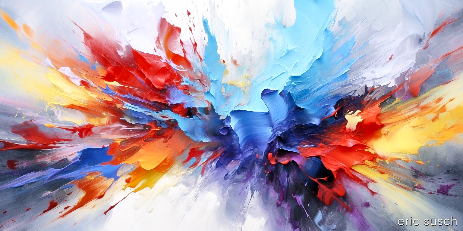
 I’m very pleased with this one. It reminds me of a whip pan. I’m wondering if there is a way to synthesize a whip pan video with AI? I’ll have to look into this. I bet you could make all kinds of cool stuff. We need to get back to whip pans as transitions…
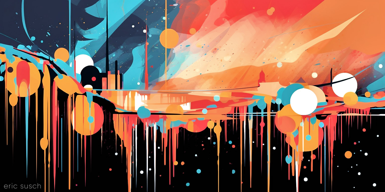
Originally this image was vertical.
 It looked great that way but just as I was finishing color correcting I tried it horizontal and liked it even better! Now I guess I have two versions. I’m probably going to print this one and, well, I guess I could hang it on the wall any which way I wanted!
#Art I made with #Midjourney #AI
 #Art I made with #Midjourney #AI
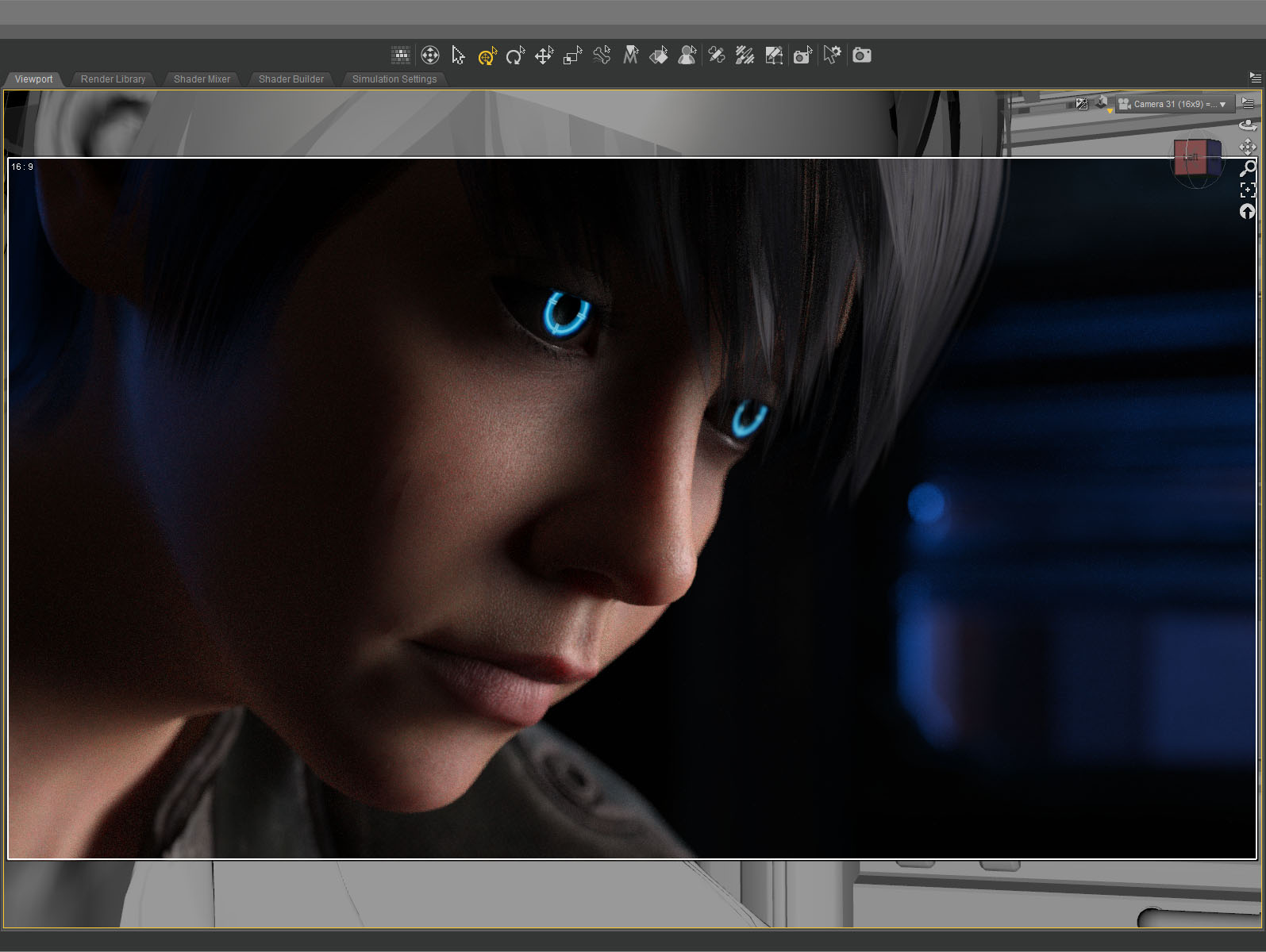
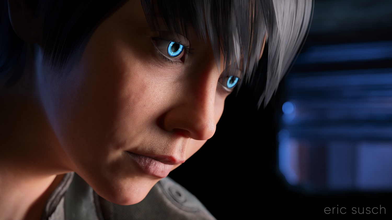 I’m still trying to make some of my CGI art look like it’s from a motion picture. What makes something look cinematic? Color? Framing? I’m still not sure. That’s what I was experimenting with in this portrait – a real person, in a real location, in a movie… A simple moment from a larger scene.
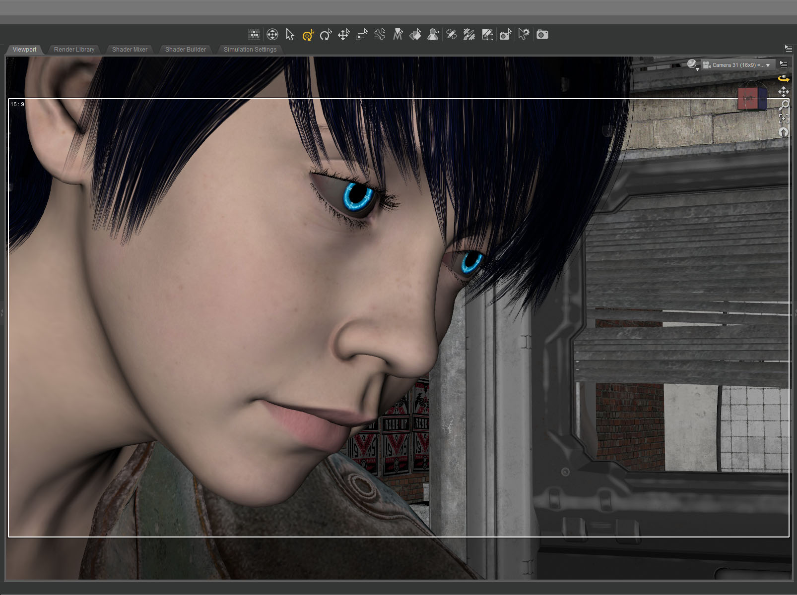
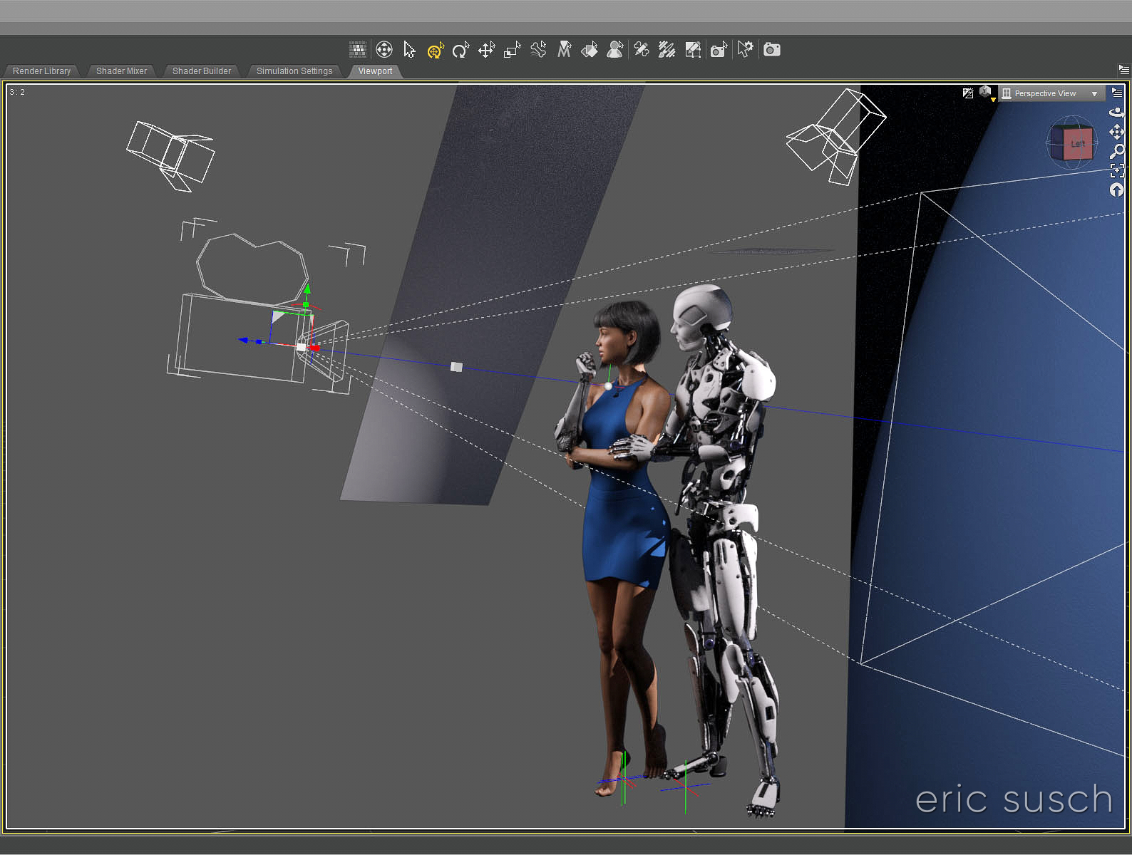
The setup was simple: face, hair, jacket, background. I set the camera lens at 100mm, 16×9 aspect ratio and found a good closeup. I messed with the depth of field quite a bit to get the background soft but not too soft (this isn’t a DSLR movie.)
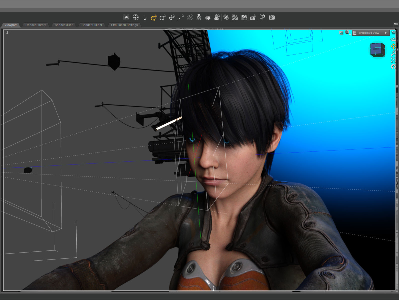 The green line in this screenshot shows how the camera (on the left) is focused precisely on the nearest eye and the two planes show the narrow depth of field on the face. The other eye is slightly out f focus.
The blue in the background is the soft blue backlight. I used only three lights, a key light on the face, the back light, and a light in the window. (And the eyes light up too.) No fill light.
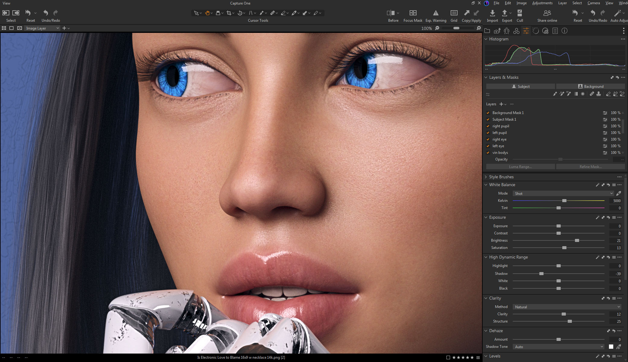
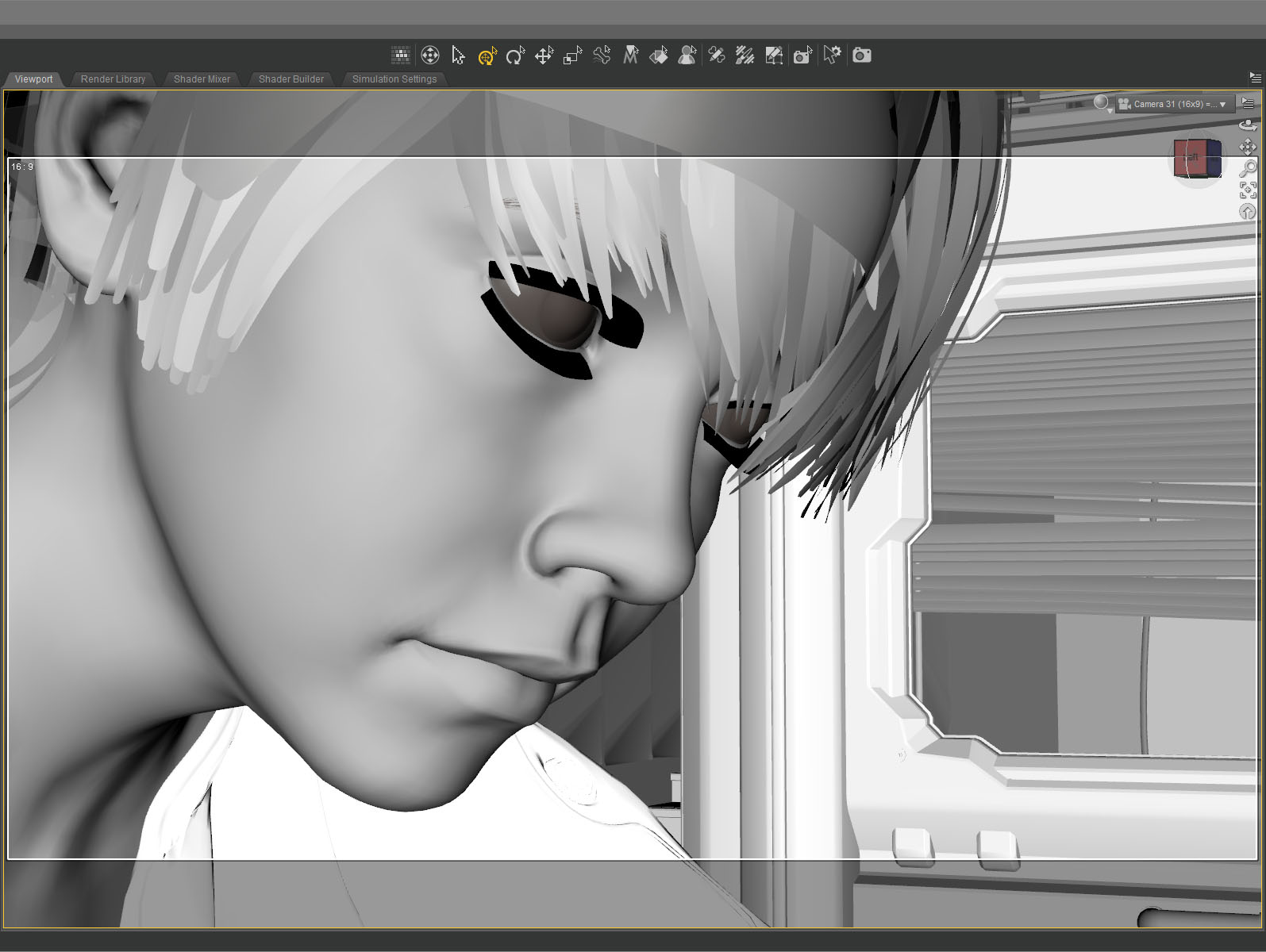
 This screenshot shows how the initial render looked before color correction. It’s quite dark which means it takes longer to render but I liked the quality of light so I went for it. It took about five and a half hours to render the final file at 10800 x 6075. I stopped it at 4277 samples and 92 percent convergence even though my minimum is usually 95 percent and/or 5000 samples. It didn’t look like baking it any more would make a difference.
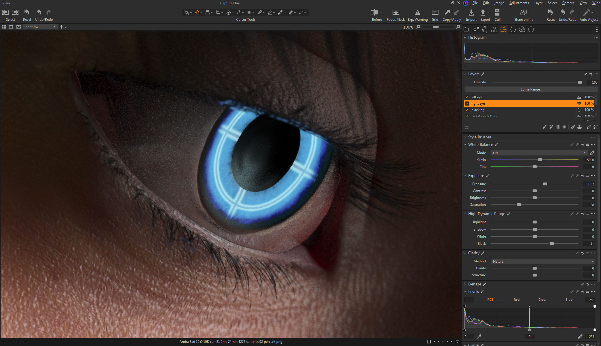 The whites of the eyes ended up quite dark in the render so I brightened them up in post. The eyes are a really old product and I don’t think I updated the reflectivity on the sclera quite right to render properly in iray.
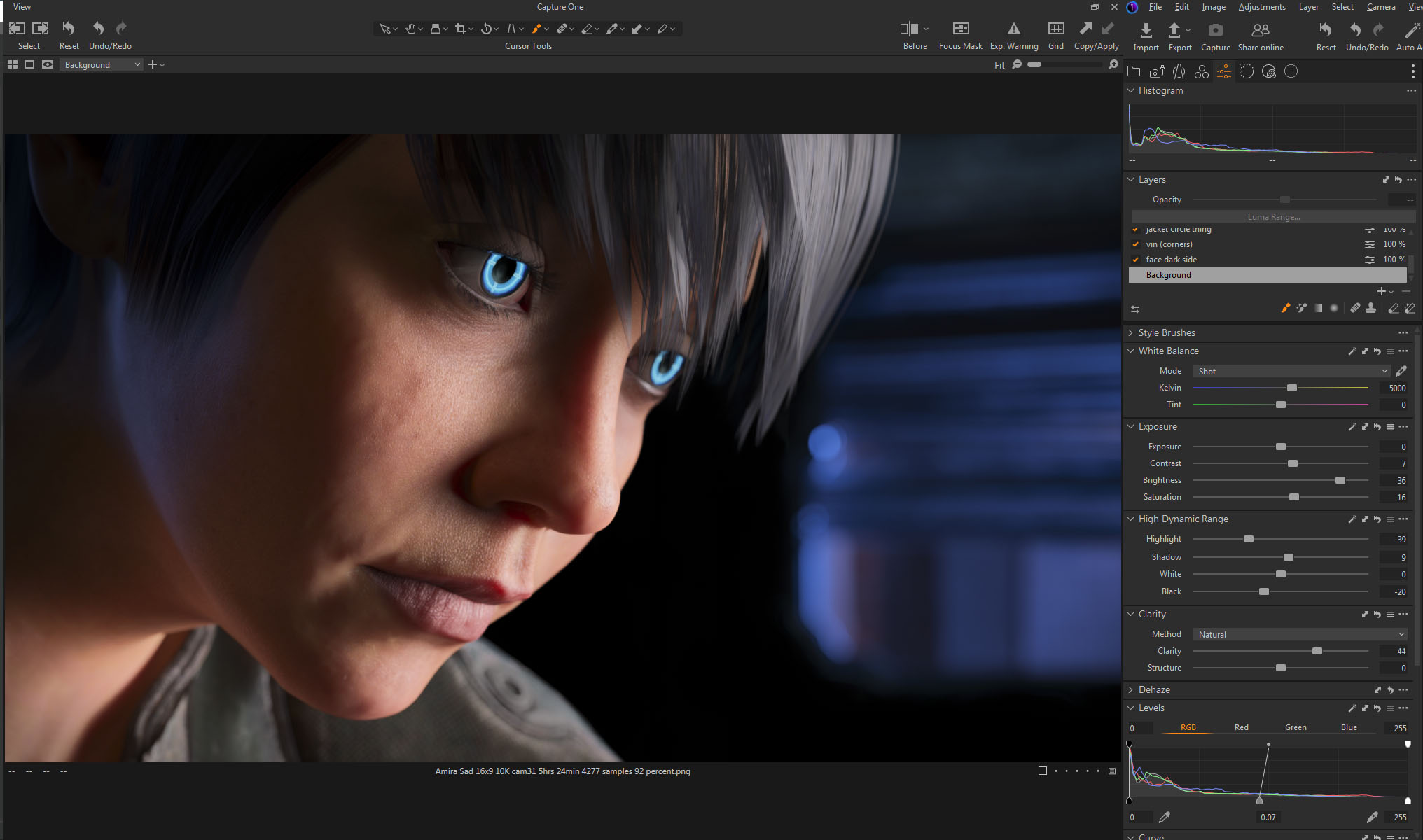 I also pulled the background completely black because I thought the muddy dark shapes distracted from the face.
This is the part of the post that I feel I really should evaluate the final result… then I decide not to say anything because I can only see the mistakes. After a few months not looking at it, I’m sure I’ll be able to figure out if I love it or hate it, but not now…
Created in DAZ Studio 4.21
Rendered with Iray
Color Correction in Capture One
 #Art I made with #Midjourney #AI