Tag Archives: girl

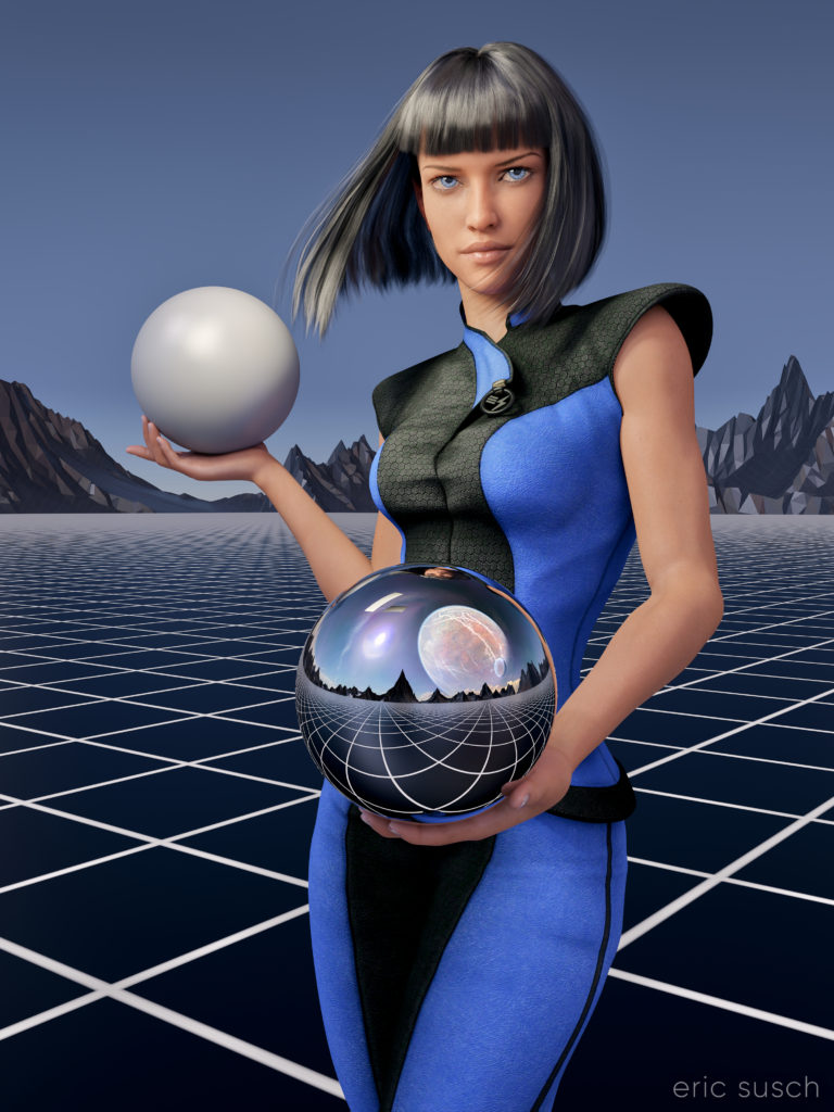
We Are the Dreamers of the Dream (sky grid update)

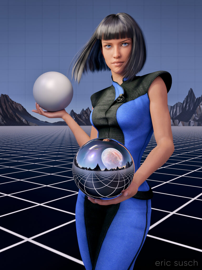
After my first experience making a puzzle I decided to update the artwork before printing another test puzzle.  I always thought the sky was a little plain in this piece especially since the sky reflected in the chrome sphere has a planet and clouds.  The plain blue at the top was also more difficult to piece together as a puzzle.  To give it some detail I decided to put a grid across the entire sky.  I think thematically this new grid shows that the image reflected in the sphere is actually a future dream.  The actual metaverse environment isn’t built yet.

I actually went all the way back into DAZ Studio to place the grid in 3D space and re-render the entire scene from the beginning.  I also took the chance to re-adjust the camera slightly to give more room around the edge of the frame for print bleed.  Final color correction is also slightly different.  If you’re re-doing it anyway, why not fix the things that bug you?

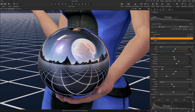
I also took the opportunity to fix another problem that I previously didn’t know how to fix and which has driven me insane since I first rendered the image.  In the original you’ll notice that the left armpit of her “space samurai” outfit is screwed up.
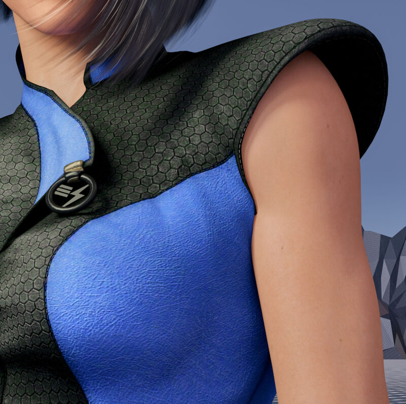
That’s because the clothing mesh is getting confused between the arm and the torso which are colliding.  I was able to grab the clothing mesh with a DAZ Studio plugin and pull it back toward the torso.  I actually had to stretch it quite a ways into the center of the character like a rubber band to get this small area to look better.

These changes were relatively small but I think they make a big difference.  Can’t wait to see this new version printed out.
Created in DAZ Studio 4.22
Rendered with Iray
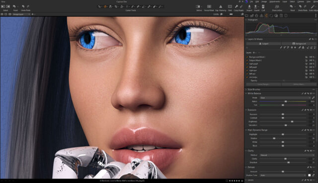
Color Correction in Capture One
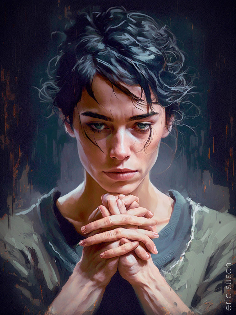
Am I Awake or Lost in Old Dreams?

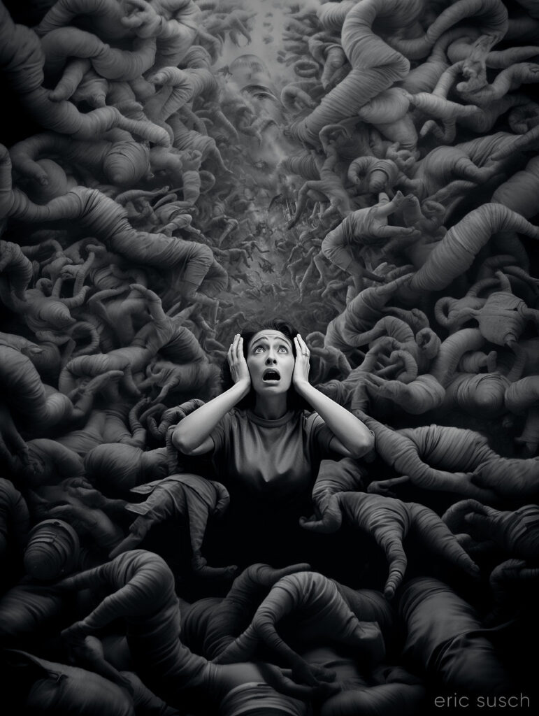
Need to do all the creepy hand portraits now.  AI art is advancing so fast the creepy hands will soon become a nostalgic moment in the past like pet rocks and bell bottoms.

#Art I made with #Midjourney #AI

Is Electronic Love to Blame? (16×9)

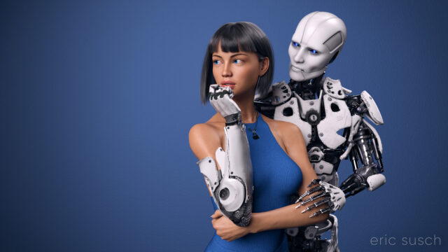
I’ve worked on this CGI scene longer than any other.  I’ve spent years obsessing about every detail.  I’m sure I’ve sucked the life out of it many times.  I hope there’s still something good left in it but I can’t tell anymore.  The only thing I can do is to let it go and put it out there hoping there’s still some life in it.

This is the second iteration of this piece.  The first one, which you can read all about here, was square, with a grey background, and a different dress.  I also added a pierced heart necklace to this new wide version.  Those are the big differences.  There are tons of other small changes.

So, why a new version?  Because I wasn’t satisfied with the old one.  (Actually I grew to hate it.)  For some reason this piece is an ongoing obsession.  Even now I’m looking at the image above and wondering if the background is too dark, contemplating changing it again before posting this blog post.  But I’m not going to.  I have to let this one go and be done with it.  Next step is to print it on metal like I’ve done with several of my other pieces and see how it comes out.  If it needs tweaking after that, then I will, but for now, it’s done!

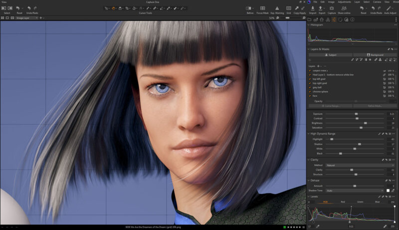
Color correction this time is in Capture One.  I abandoned Lightroom a few years ago.  I’m not interested in paying a subscription for my professional software.  Buying a perpetual license for Capture One is actually more money but it’s worth it.  If at some point I decide I can’t afford to upgrade anymore I won’t lose access to all my images and all the work I’ve done on them.  Don’t ever let a company and their tools act as gatekeeper to your work.  — I’m also liking the color correction controls a bit better in Capture One, thought Lightroom wasn’t bad.

Created in DAZ Studio 4.22
Rendered with Iray
Color Correction in Capture One
The Horror

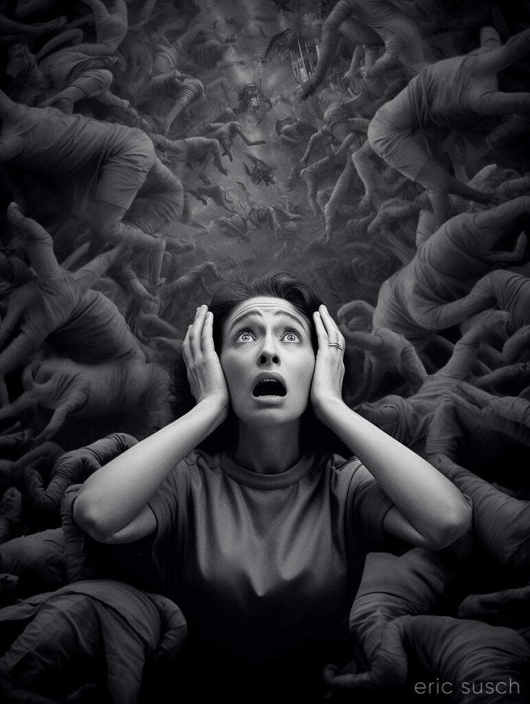
I finished two versions of this piece because I wasn’t sure which one was better.  This is the closer version:

The closer version would probably work better on social media, but I really like the wider version a lot better, especially since I’m trying to design my artwork to be printed big (poster size and larger.)

Part of me resents feeling like I have to constantly cater to people looking at stuff on the internet aka on their phones.  It really messes with my head when I’m trying to make creative decisions.  I think I have to actively resist the temptation to reduce everything to the least common denominator of what will get the most likes when viewed on a small screen.  It’s extremely limiting, not just because of the composition but also the subject matter.  What will get an immediate reaction so you get the most likes?  Subtly is lost and everything starts to look the same.

Social media really messes with your head.

#Art I made with #Midjourney #AI

Robot Romantic Getaway Goes Wrong

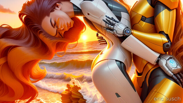
It’s not easy getting the art machine to do what you want. It’s like it has a mind of its own…

I’m trying to create a video with Stable Diffusion and Deforum.  Doing lots of experiments.  It’s becoming more and more clear that storytelling is next to impossible because there are just too many variables with AI art.  The machine is constantly throwing curve balls that derail the story.  The scene above was originally part of a Spaceship Hibernation story line.  It went something like this:

EXT. SPACE spaceship, stars, perhaps a nebula
INT. SHIP Wide shot, pipes, hibernation chambers
CU. Woman sleeping in a hibernation chamber
EXT. EARTH sunset, beautiful, idyllic
EXT. EARTH Woman and Man holding hands
EXT. EARTH sunset, man and woman kissing in love, sunset
EXT. SPACE spaceship flys into the distance

All kinds of things happened.  I couldn’t get the machine to give me a single spaceship in outer space.  At first there was a robot standing on the ground.  I tried a slew of negative prompts but always ended up with a fleet of ships, or planets, or no spaceship.

Also, the girl sleeping in the hibernation chamber always had her eyes opened.  Adjusting the prompt didn’t change this.

So I gave up on the spaceship-hibernation part of it and tried concentrating on the dream in the middle.  Still having trouble, but continuing with the tests.

#Art I made with #StableDiffusion #AI

Music in the Metaverse

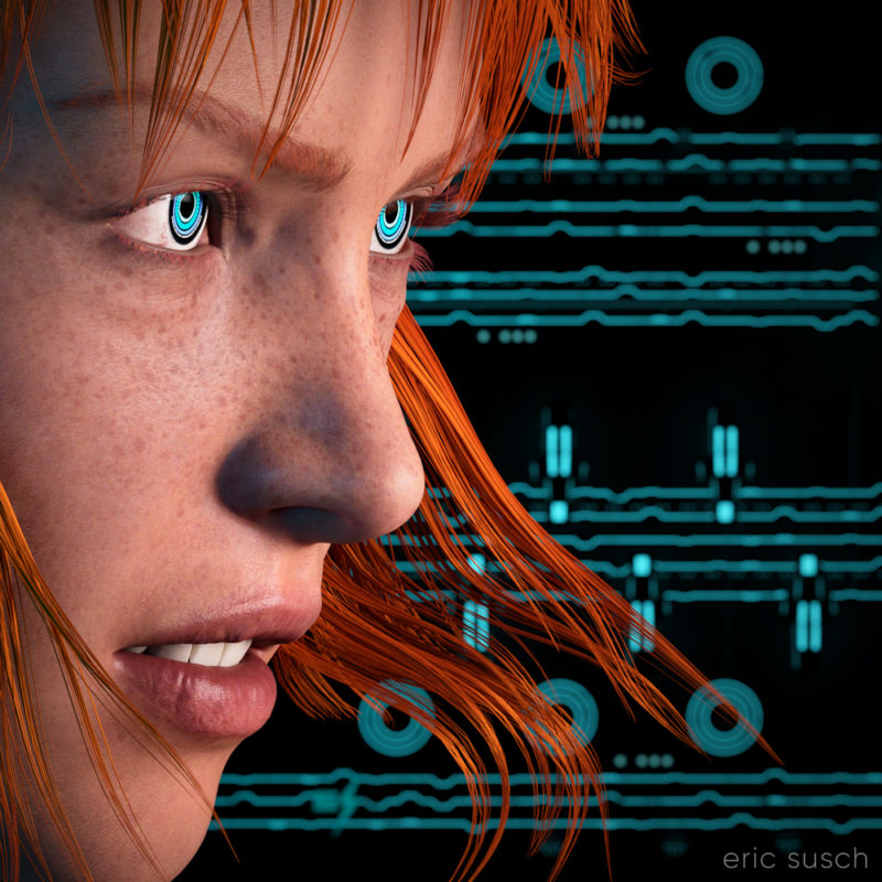
I think my CGI images tend to look better when I have something in closeup.  It avoids the “medium shot of a character just standing there” that I struggle with.  For this piece I started with an extreme close up and added cool robot eyes and dramatic flowing hair.

I also wanted a graphic background, something flat, technical.  I have an ongoing issue with backgrounds.  I get creatively stuck and I don’t know what to put back there.  I end up trying scores of different things and nothing works.

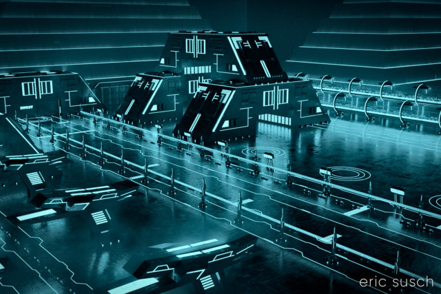
What I ended up using here was actually a huge Tron like cityscape.  The shapes and lines are actually building size structures seen from the top.  This is what the cityscape looks like normally.

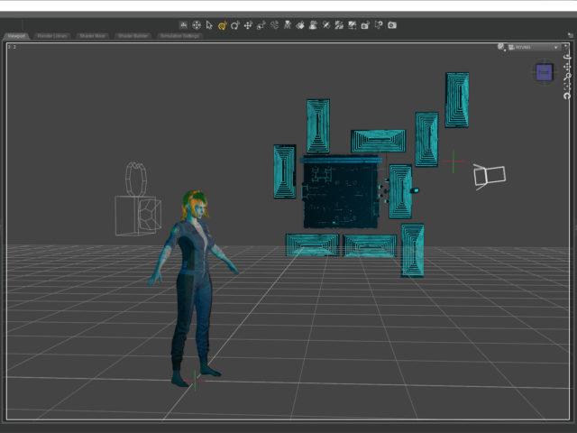
The entire environment is standing on it’s side waaaaaay far away.  I turned on and off different elements depending on what looked good.  It ended up being a real hassle having the background so far away though.  Making adjustments took a long time.  (I went back and figured it out.  it’s 1.8 miles away!  …or 3 kilometers)  I should have scaled down the whole thing and moved it closer.

I named it Music in the Metaverse because the graphic lines in the background ended up looking similar to a music staff.

Created in DAZ Studio 4.20
Rendered with Iray
Color Correction in Capture One
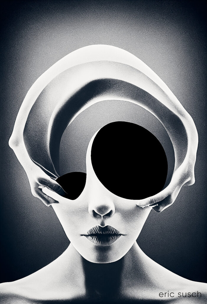
God is a Machine

This picture is the first image in a two part series.  The second image Deus Est Machina (which is the same title in Latin) was posted previously.

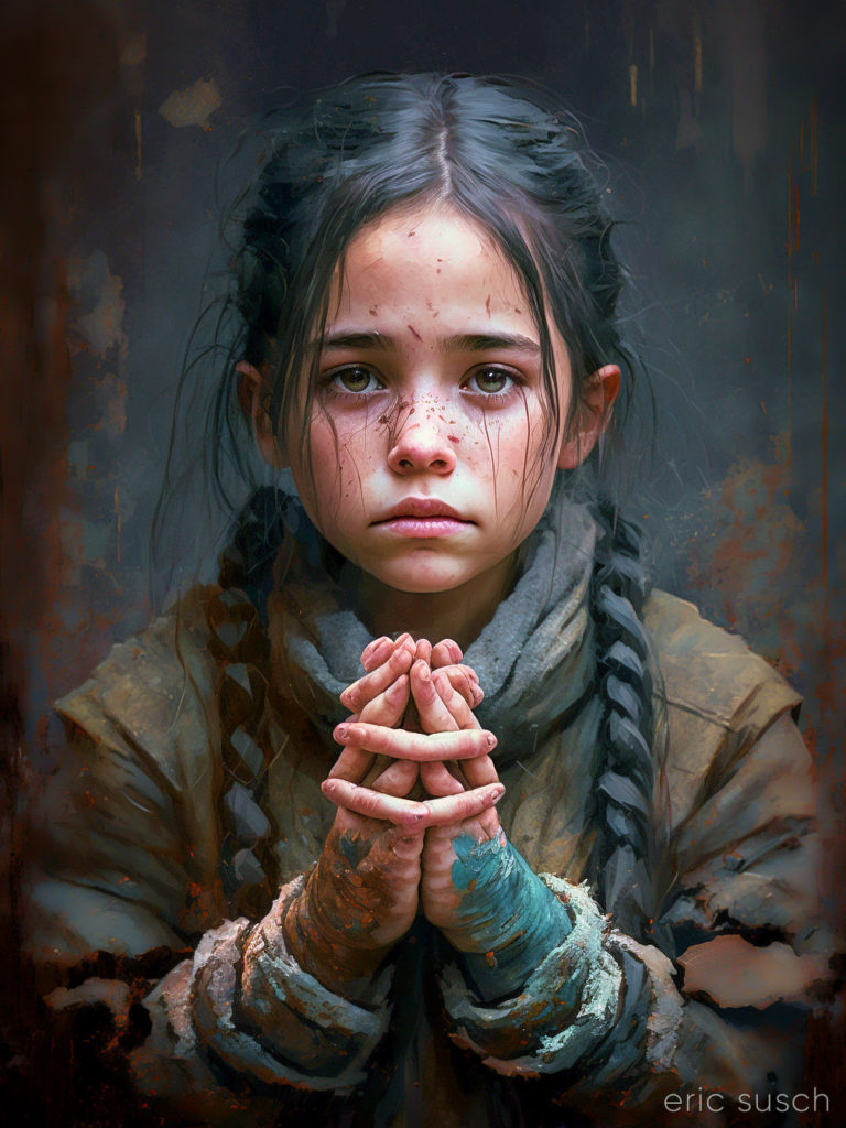
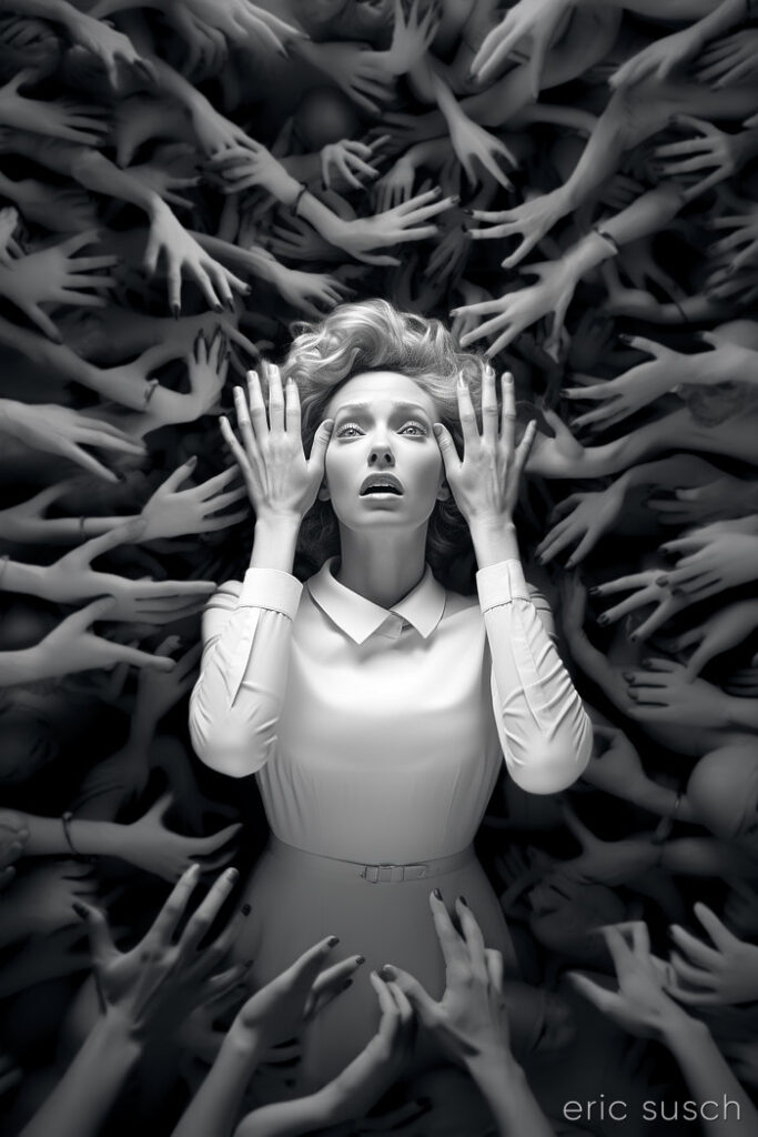
Deformed hands and tangled fingers have become an iconic symbol of AI art.  The art machine knows what things look like (most of the time) but it doesn’t know what they are.  It starts making a girl with braided hair then somewhere along the way… does it change it’s mind?  …or does it never really know what it’s trying to make?  The result is almost an optical illusion.  It looks correct at first glance but on closer inspection something isn’t quite right.

#Art I made with #Midjourney #AI


We Are the Dreamers of the Dream

Building the Metaverse to match the real world.

I made this CGI image about a year ago when the Metaverse was the shiny new tech thing.  Most people probably won’t get what it’s about so I’ll explain it, even though David Lynch would probably scold me for doing that.

The grey and chrome sphere are tools that special effects artists use to match 3D computer graphics to real world photography.  If you are shooting a film for example, and part of the scene will be CGI, you shoot a few extra feet of the environment with someone holding a grey and chrome sphere.  The chrome sphere reflects the entire environment and that reflected image can be “unwrapped” and placed as a dome over the CGI so the same light and colors shine on the computer generated elements as in the real scene.  (The chrome ball is actually an old fashioned “poor man’s” way of doing this.  There are 360 degree cameras now that can actually just take a picture of the entire environment right on the set.)

The grey sphere shows the quality of light shining on a specific place in the shot.

This image is about building a computer generated Metaverse that people can walk around in, just like real life.  It’s the dream of constructing a Metaverse as well as the Metaverse as a dreamscape… the birth of a new alternate world.

OK, enough of that…

The main difficulty I had in creating this image stems from the fact that the reflection in the chrome ball is actually the real reflection of the CGI environment.  It’s not a composite.  The mountains actually go all the way around the environment.  The grid floor goes out in all directions.  The “planet” and the “sun” seen in the ball are on the HRDI dome over the scene that is creating the ambient light.  The dome had to be lined up so the “planet” reflected in the sphere correctly.  The mountains had to be rotated in such a way that the peaks behind her and the ones in the chrome ball both looked good.  The main light in the scene is the keylight on the character which can be seen in the chrome sphere as a bright rectangle in the upper left of the sphere.  I could have removed that in post but I left it in because that’s the point.

The metaverse was supposed to be the future of everything.  Facebook even changed their name to Meta.  Now AI is the new thing.  Will the metaverse be created?  Will AI create the metaverse for us?  Who knows…

Created in DAZ Studio 4.20
Rendered with Iray
Color Correction in Capture One
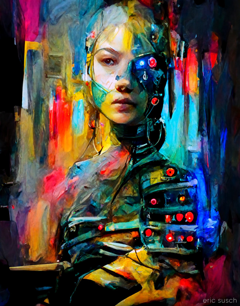
I wanted a Cyborg painting, and it gave me a painting of a Cyborg

The Art Machine doesn't always give you what you want.

The Art Machine doesn’t always give you what you want.  I’m trying to get away from simple portraits – of characters just sitting there – but Midjourney isn’t good with verbs or action.  It likes faces (with the tops of their heads cut off) or vast landscapes with tiny characters that have their backs turned.  Still it’s a nice painting of a Cyborg…

#Art I made with #Midjourney #AI