Robot Roll Call 0005
#Art I made with #Midjourney #AI
I’m continuing to check out art created by artificial intelligence at craiyon.com. You type in some words and the AI creates nine pictures from the prompt.
Yesterday I was trying to see if the AI could capture emotion on a face. It took some iterations but the answer? YES. A big yes. The final few renders were amazing. Here’s an example that I didn’t post yesterday:
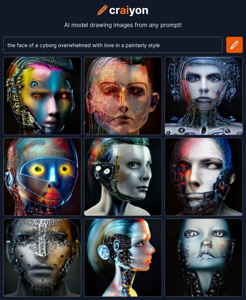 To get a good result the AI needed lots of very specific text telling it what to do and lots of trial and error to find the right words. The AI needed to understand the meaning and context of the words correctly. When it didn’t things fell apart and became superficial and symbolic, like bland clip-art.
But what if I started from scratch and gave the AI as little direction as possible? Where would it go? Will anything dramatic come out?
Lets begin with one word:
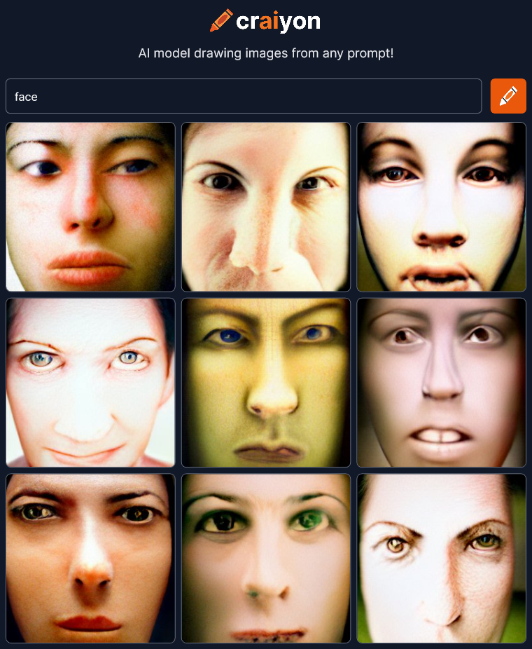 OK, not bad. Since I’m giving as little direction as possible, I’ll do two renders of every prompt just to see more variation.
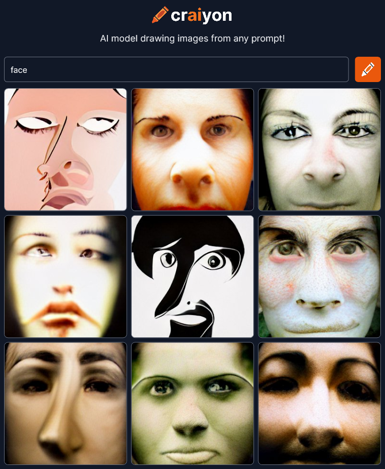 There’s some drawing style in this second one but essentially the same theme.
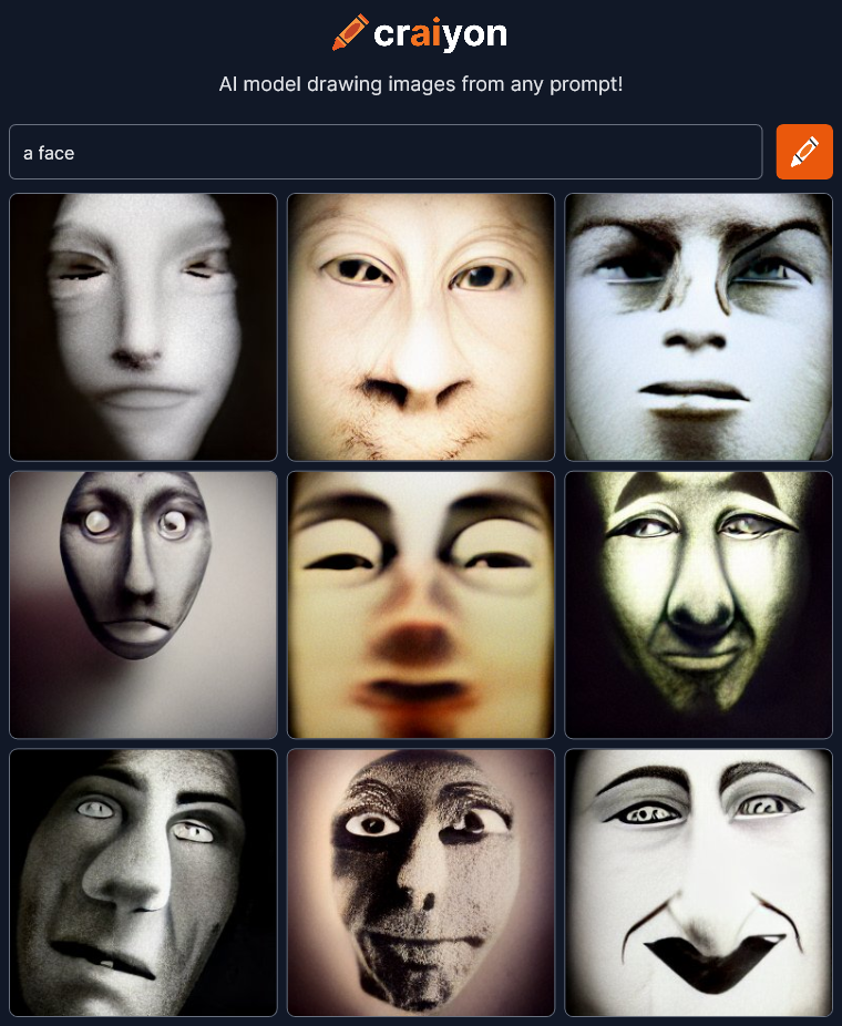
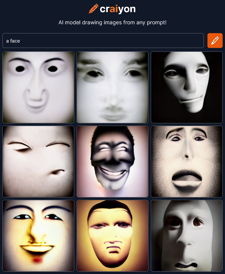 Things are already getting super cool and abstract. Let’s keep going…
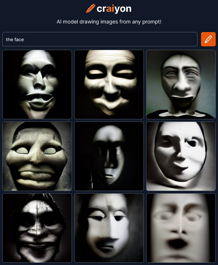
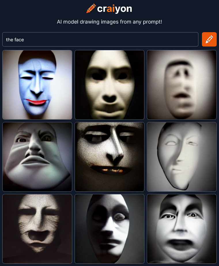 Changing the article seems to change the style. There’s an interesting lack of color in most of the pictures. I also get an old silent motion picture vibe… maybe even some German Expressionism.
These are all wonderfully artistic with deep expression and dramatic lighting. They are way, way beyond the bland images I was expecting.
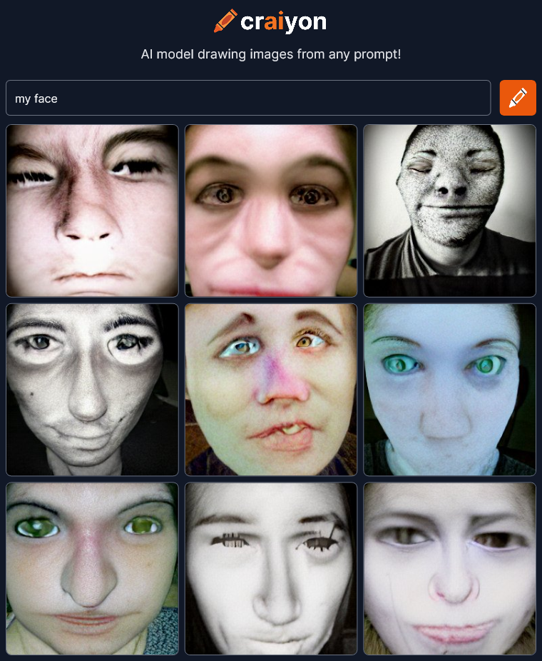
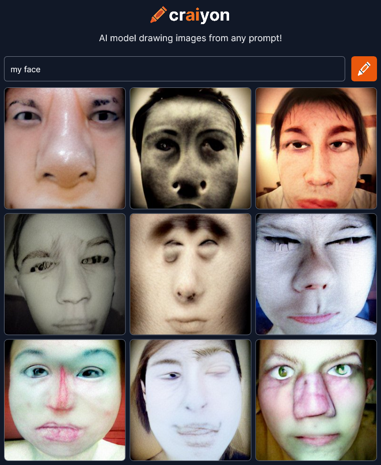 That changed the style quite a bit probably because the craiyon AI is now referencing all the selfie avatars of the world. That large pictorial reference contaminates this minimalist experiment a bit I think. And what’s up with all the messed up noses? Anyway, continuing on…
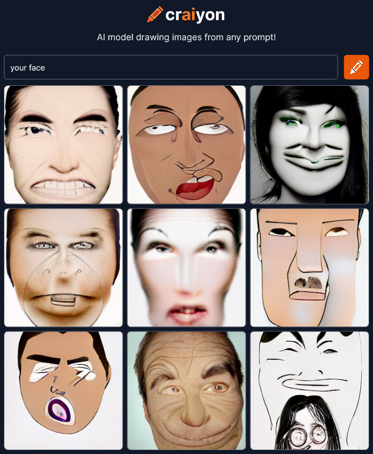
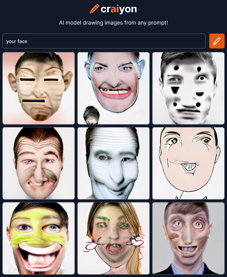 The thing I find interesting here is that “my face” really injected a sense of photo realism because of the selfie avatars but “your face” leans more toward cartoon drawings.
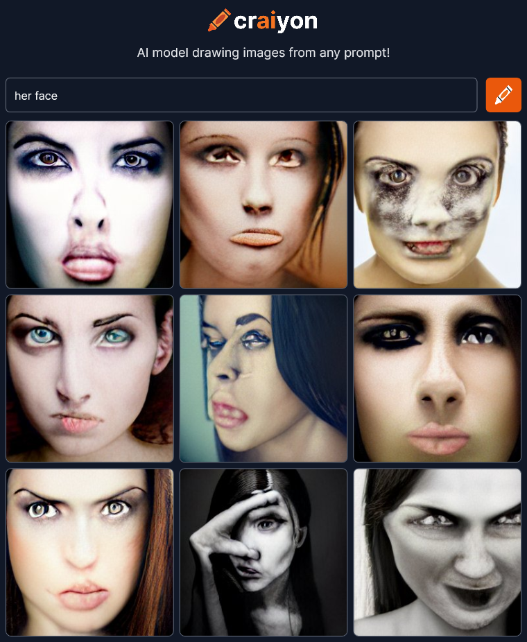
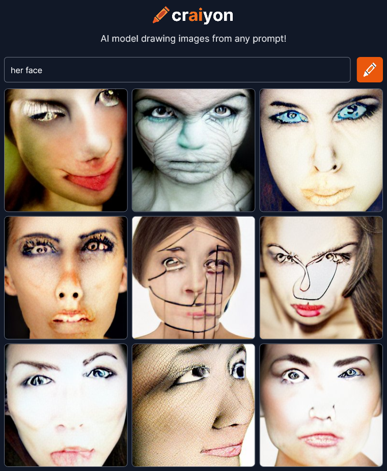 Not sure what to think here. The middle bottom of the first render is really creepy with what looks like a two fingered hand.
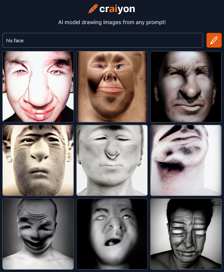
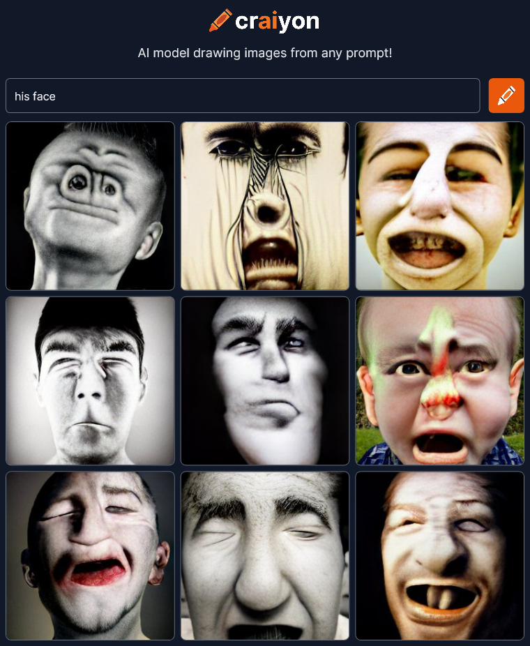 This is getting very strange. Do I see monkeys in some of these?
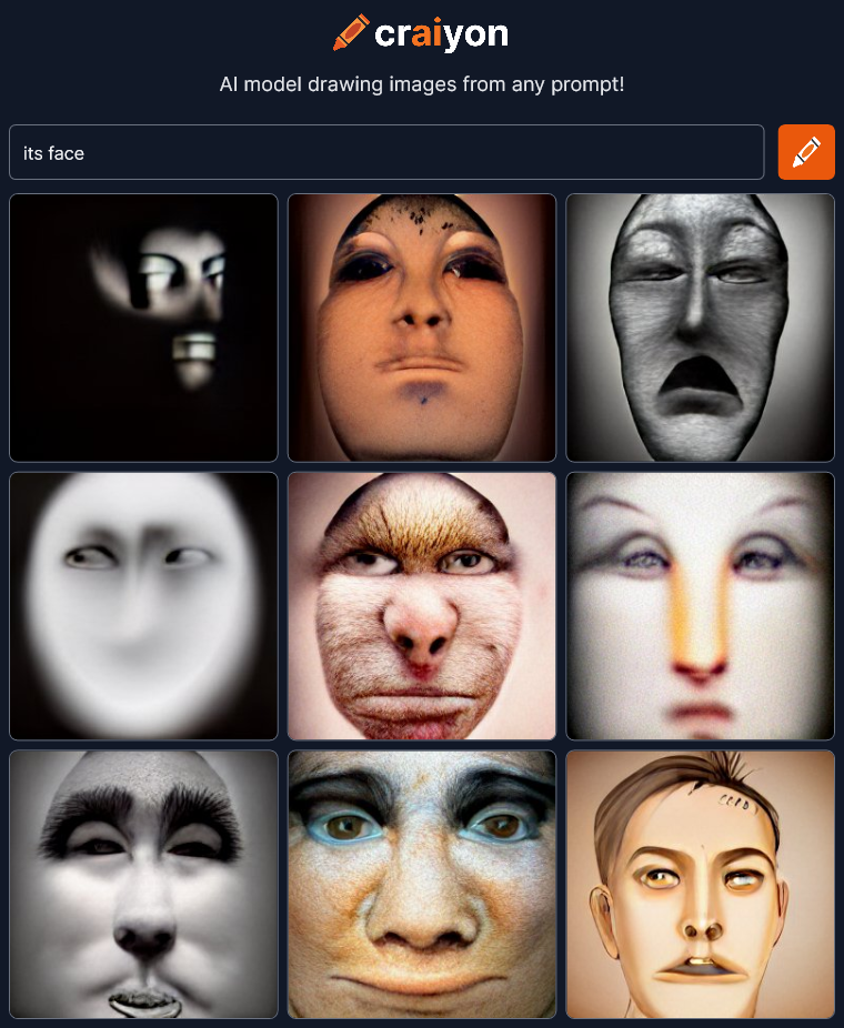
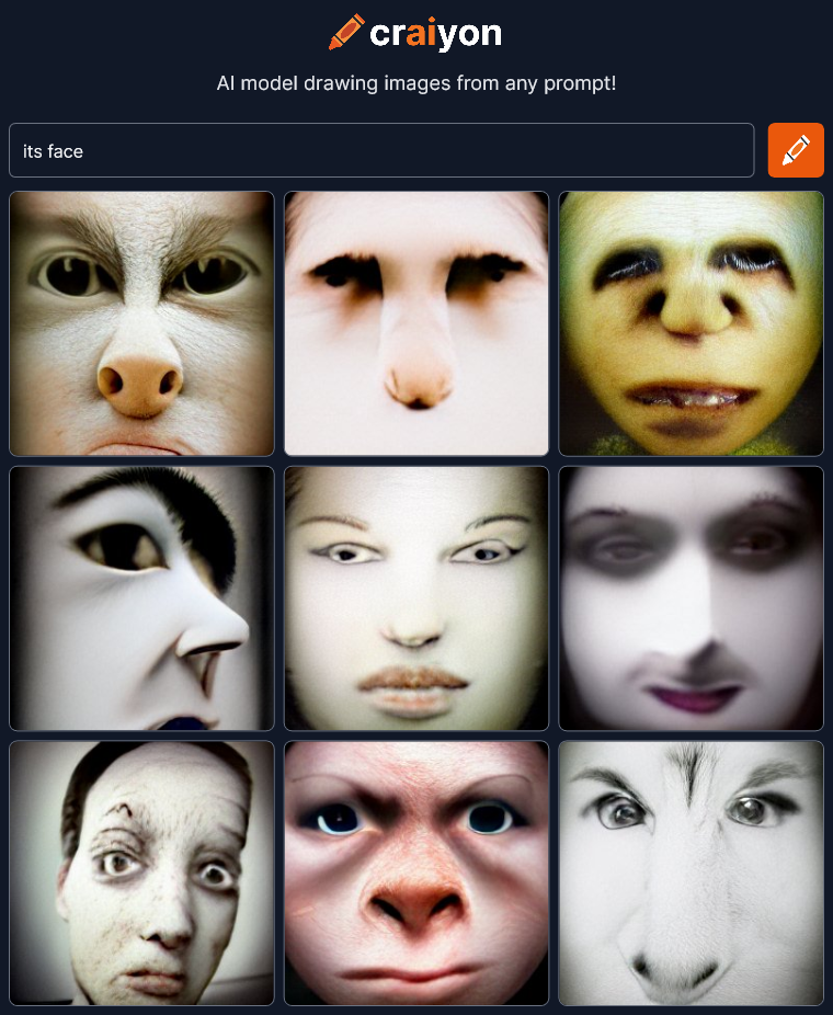 Definitely seeing monkeys again.
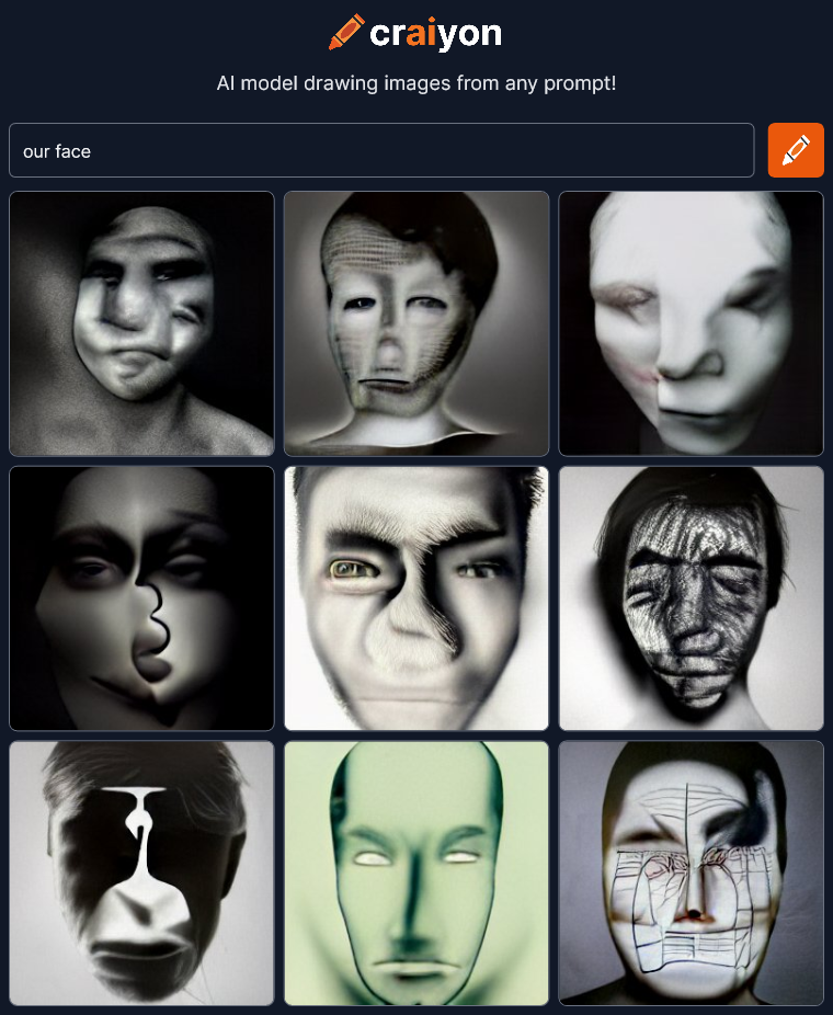
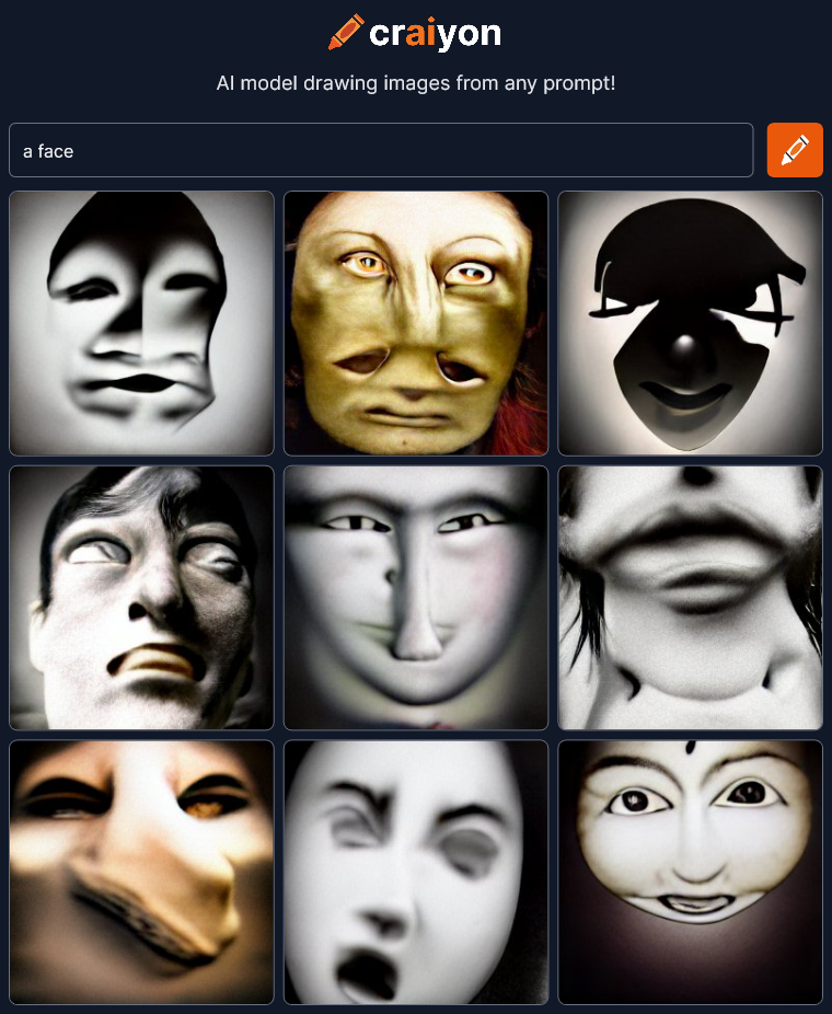
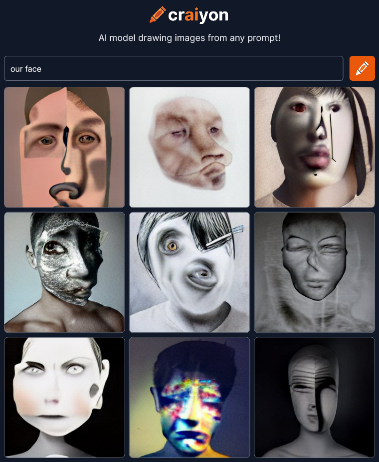 These are wonderful. Boy, if you ever need a creepy avatar for something, craiyon is the place to go.
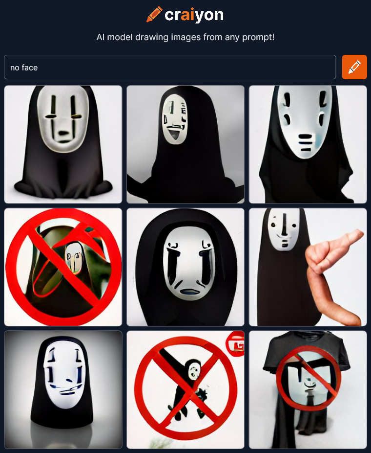 Uh oh… There’s a relatively well known character called “no face” in the animated film Spirited Away. Craiyon has choked and reverted to referencing character images as well as using symbols for concepts like the red circle with a line for “no.” It’s also bringing in a t-shirt again presumably because somewhere the no face character is for sale on t-shirts. This is definitely a fail for the AI. I should go back to something that worked, but first I absolutely must try the opposite of this prompt…
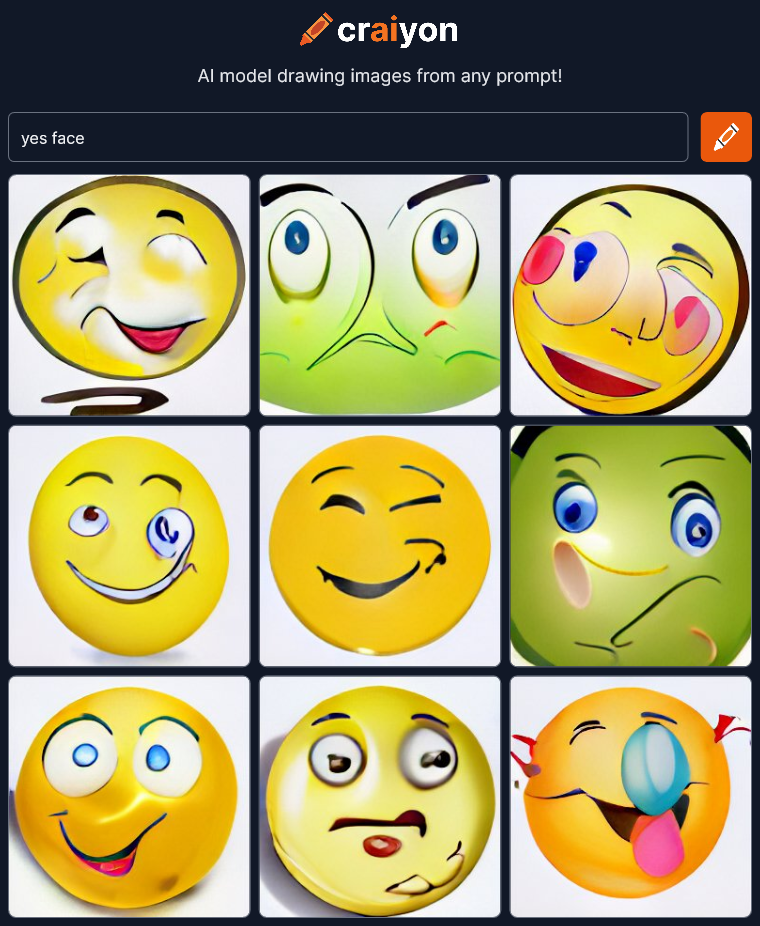 Oh no! Emojis! The ultimate symbol for emotions. Super FAIL! OK fun’s over. Time to get back to the good stuff. Lets go back to something that looked artistic and dramatic…
 I see people specifying different “Iterations” on Craiyon. Not sure what it does but I’m going to try it.
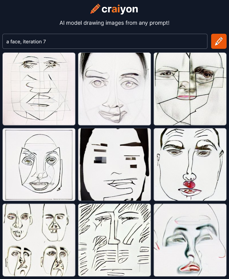 Hmmm… Flat abstract line drawings. Let’s try a few more…
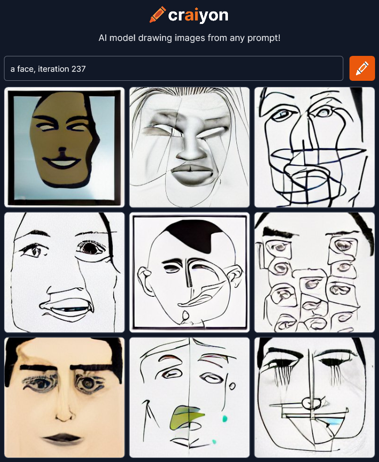
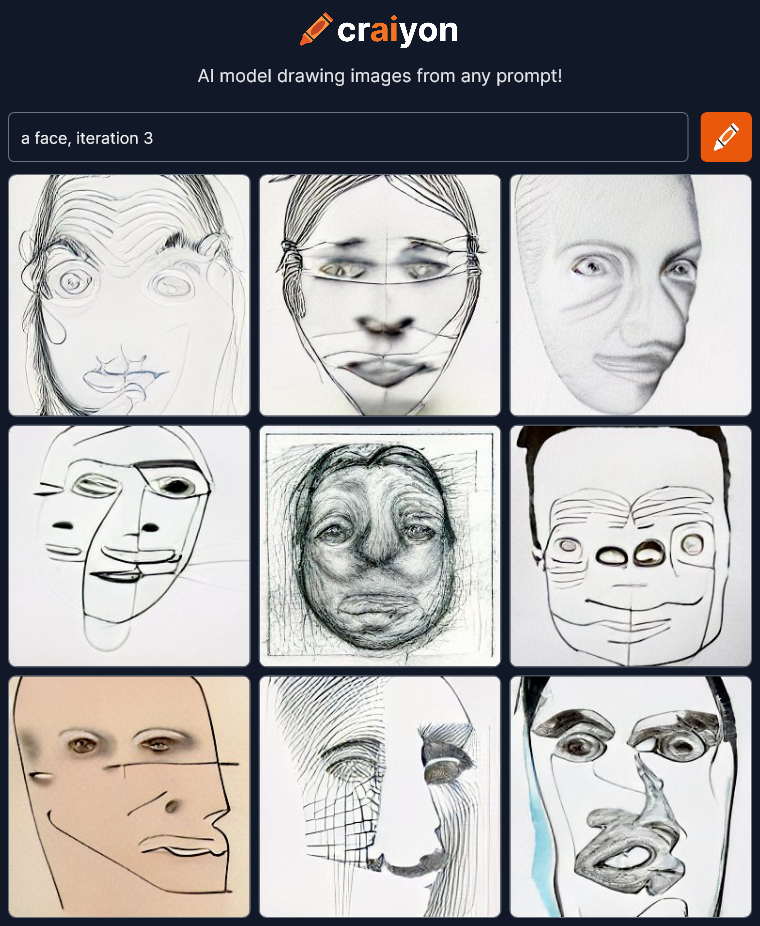
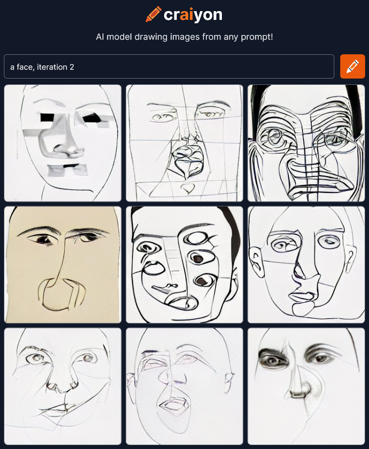 I’m not sure why all these are line drawings now. I’ll have to read up on what “iterations” do. Maybe I should try something more descriptive to add, like trying to make it a pencil sketch.
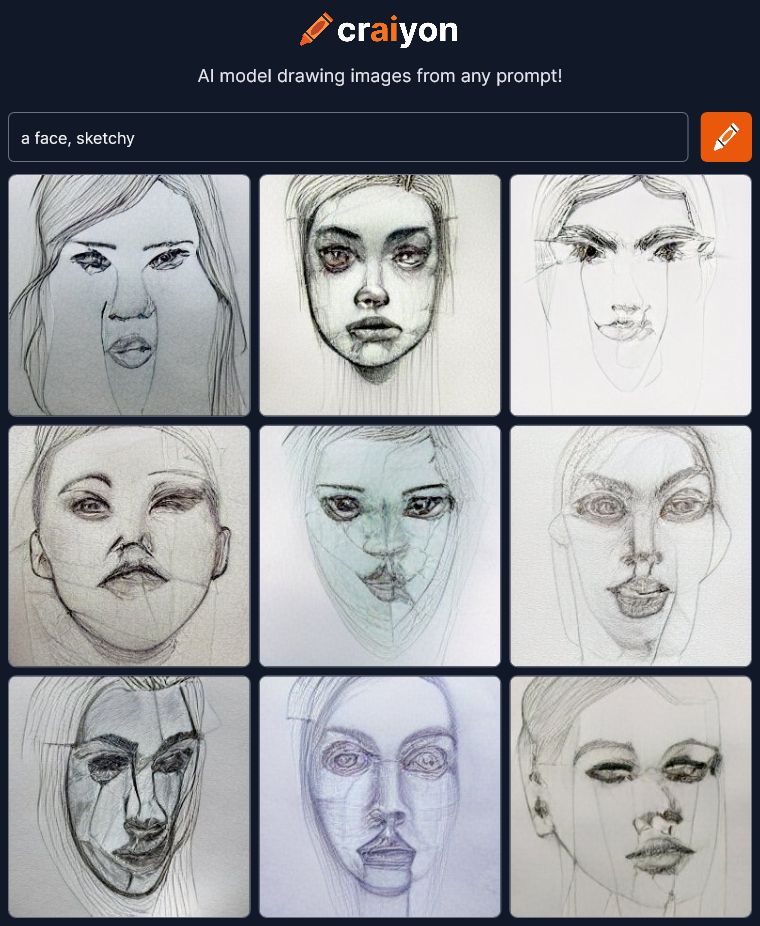 Not bad. The single word “sketchy” could be taken several ways, but it understood what I meant. Not a bad sketch top middle either, for an AI that usually makes horrible faces. What other description can we try?
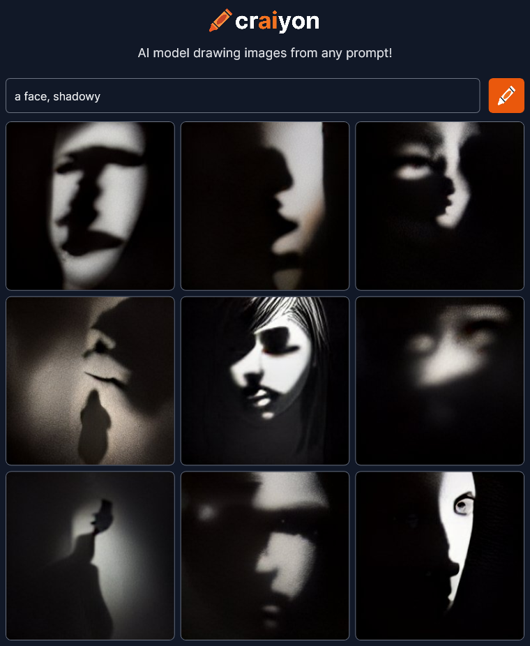 WOW!!! I need to try a few more of these!
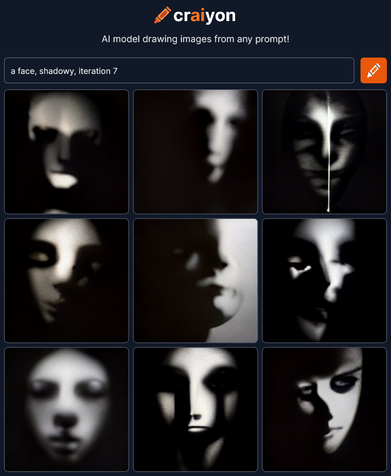
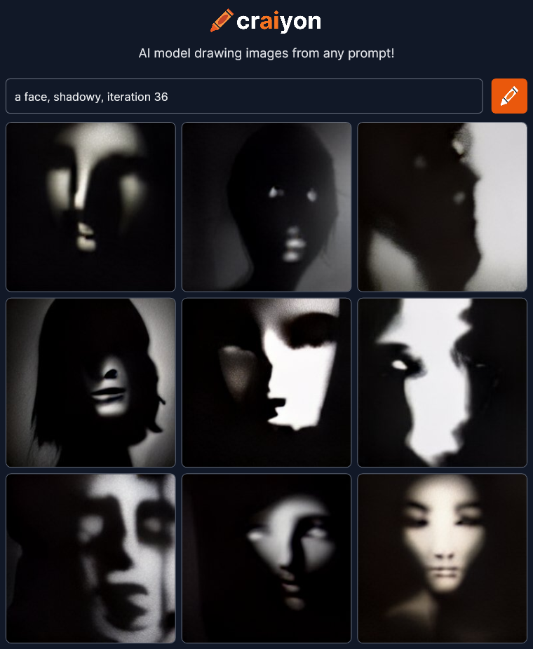
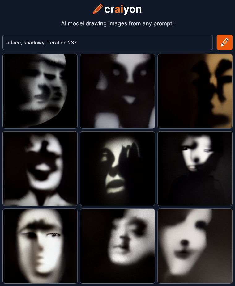 Amazing! Dramatic! Haunting! I could play with this all day!
Check out Craiyon for yourself at craiyon.com.
I’m continuing to check out art created by artificial intelligence at craiyon.com. You type in some words and the AI creates nine pictures from the prompt.
Yesterday on my first go I was just trying to see what the AI could do. What were the edges of it’s ability? Could it create anything really interesting? Answer: yes.
Today I’m going to try to get it to draw interesting and expressive faces. How dramatic can we make them? Here’s my first try:
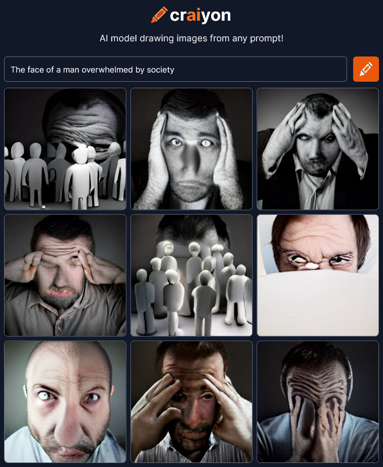 Wow, not bad. I’ve heard that Craiyon has difficulty with faces and they certainly are warped, but I like that. It makes them more dramatic and artistic. If these images were more realistic, like photographs, I don’t think they would be as interesting.
Let’s try some variations:
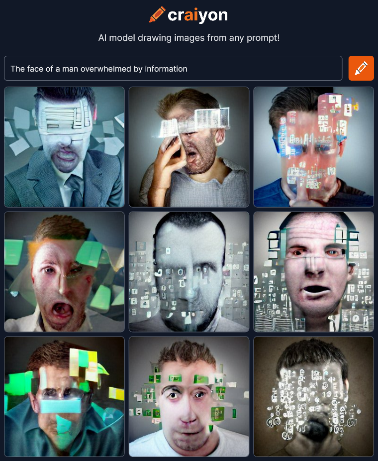 OK, not as good, but not bad. The “information” is kinda flat and covering too much of the face to see the emotion.
Next…
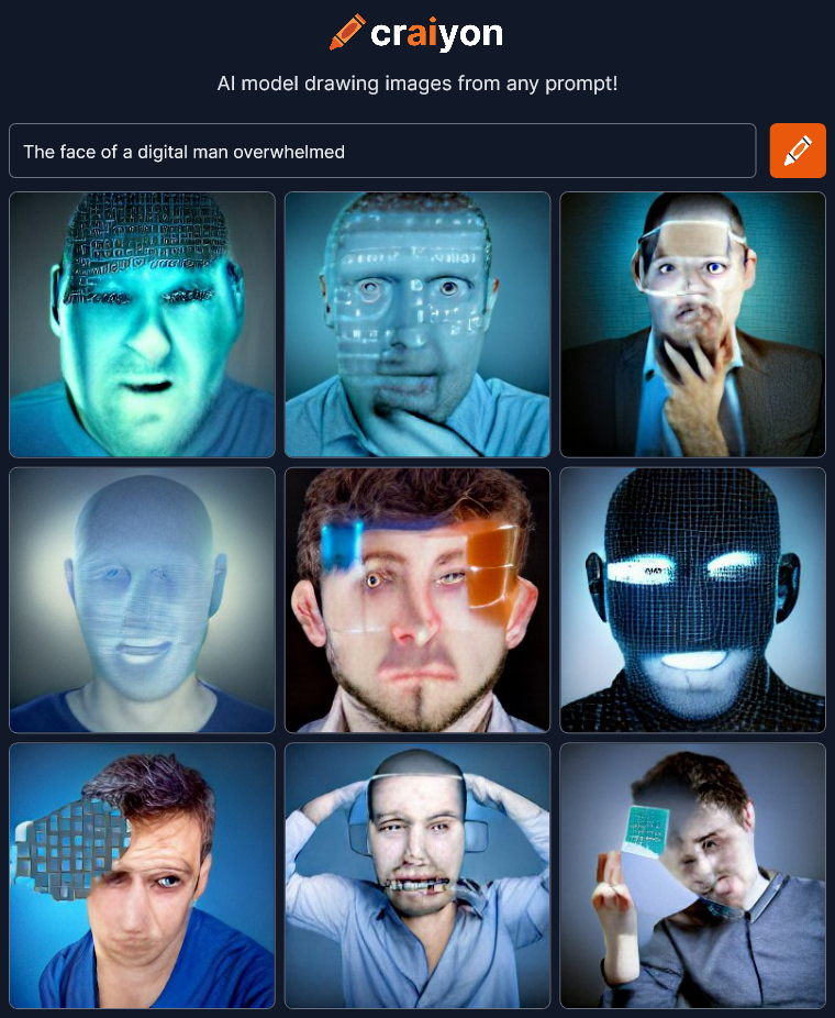 I was trying to get some sort of synthetic man under stress but ended up with heads with data projected on them.
Let’s try some women.
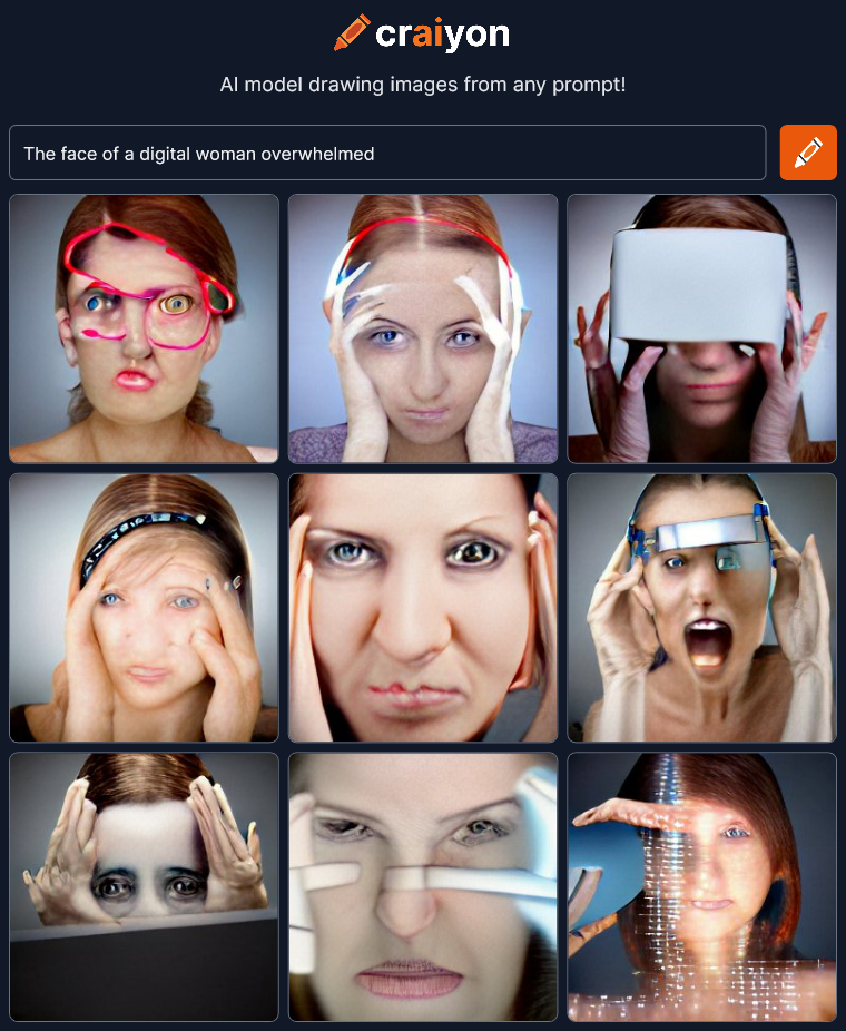 Hmmm… That’s a little more interesting. Not sure what the red line at the top left is but there’s more emotion in these faces. I think changing the gender made a difference.
Who else can be overwhelmed?
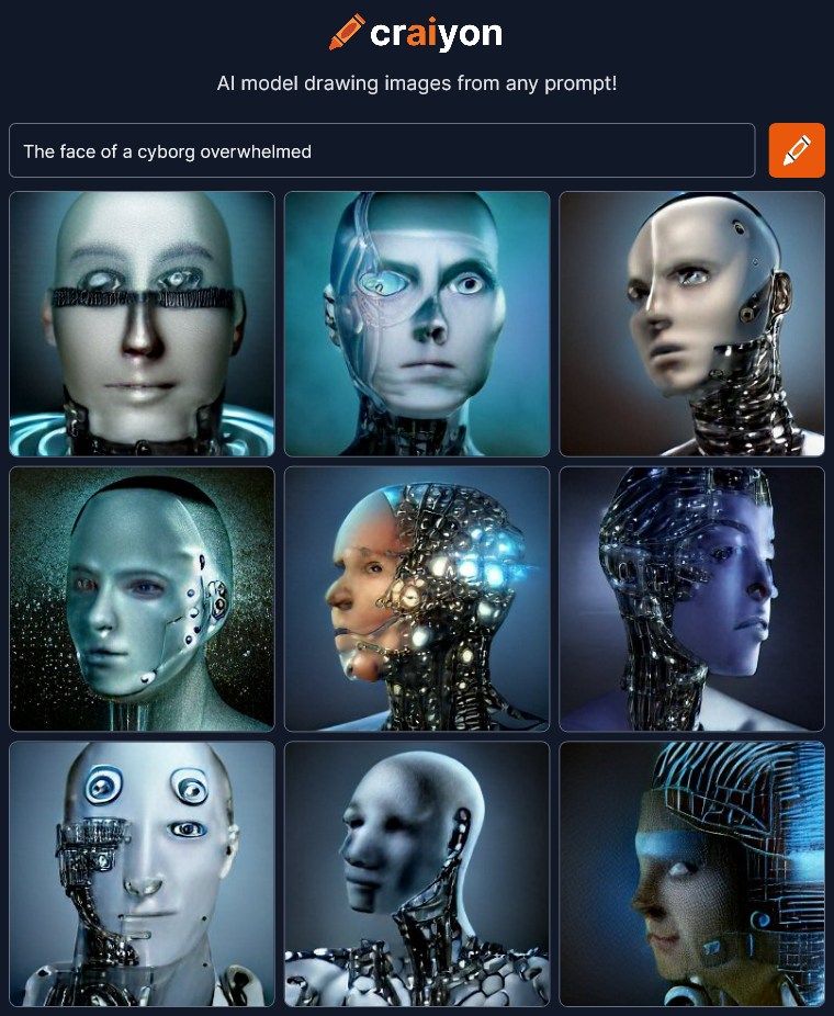 I’m liking this! What else can we try?
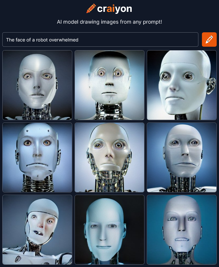 Eh… It’s that cliched white plastic robot face. We lost almost all the emotion and it’s all the same bland generic robot. Except it’s not just a robot. It’s an ANDROID.
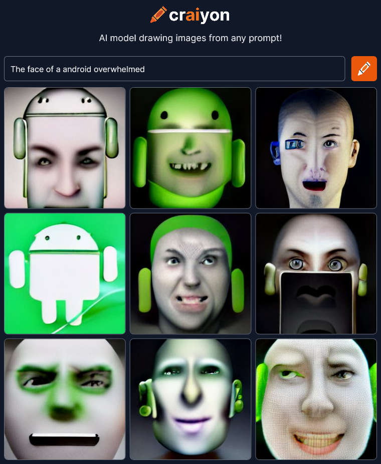 Oh no! Our corporate overlords are invading our art! Words change meaning over time. Context matters. Android isn’t a robot designed to emulate a human anymore. It’s a cartoon corporate mascot for a phone operating system! We’re way off track…
Tell the AI what to do!
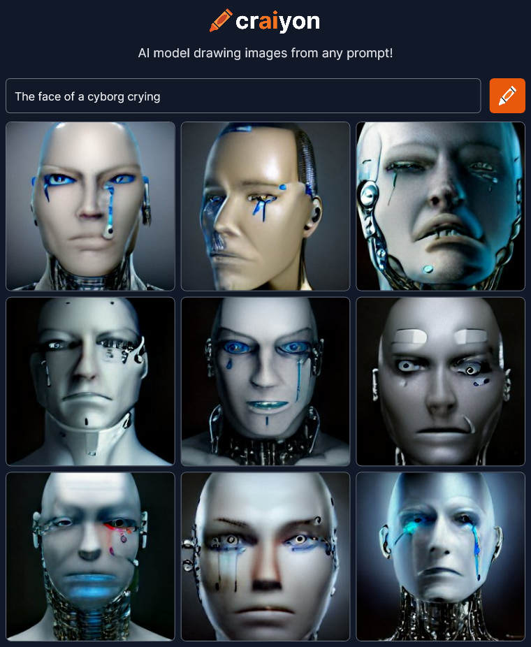 I love this thing! I could sit here all day typing variations!
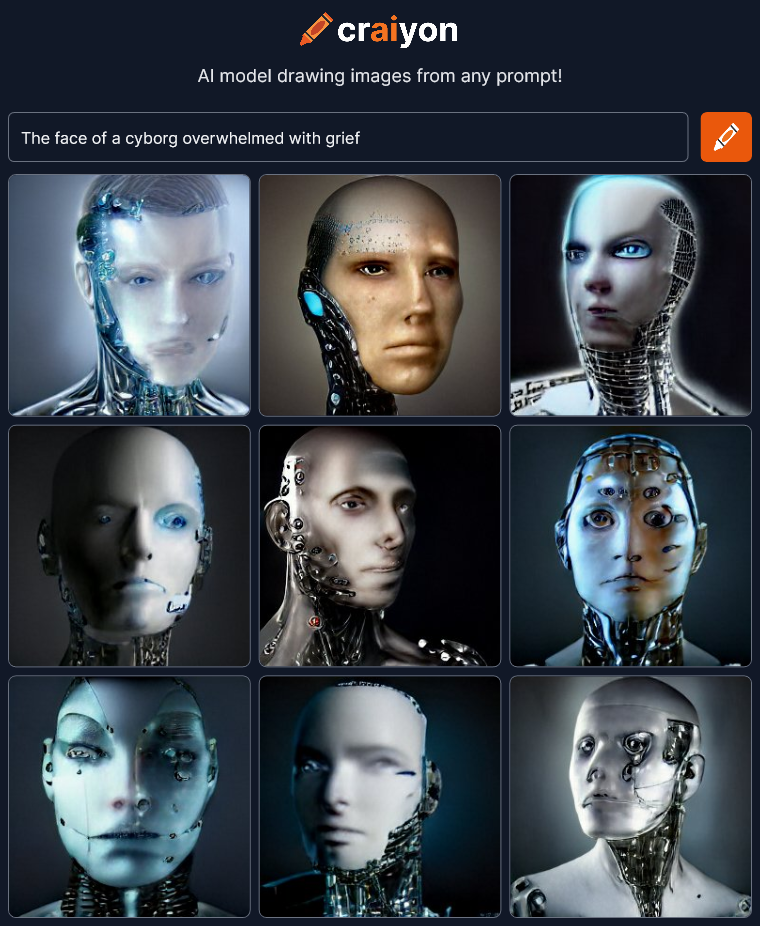 I’m surprised that this “grief” render doesn’t have any crying. …well, maybe the bottom right.
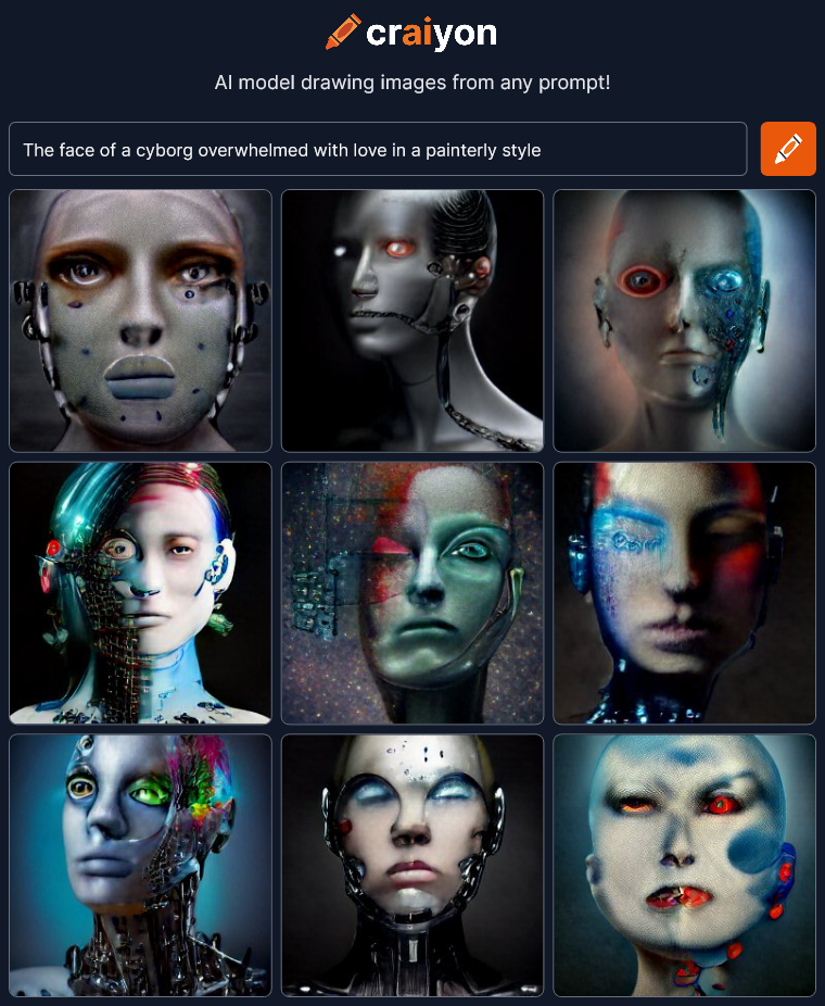 Now we’re talking! Let’s try this “painterly style” with other things.
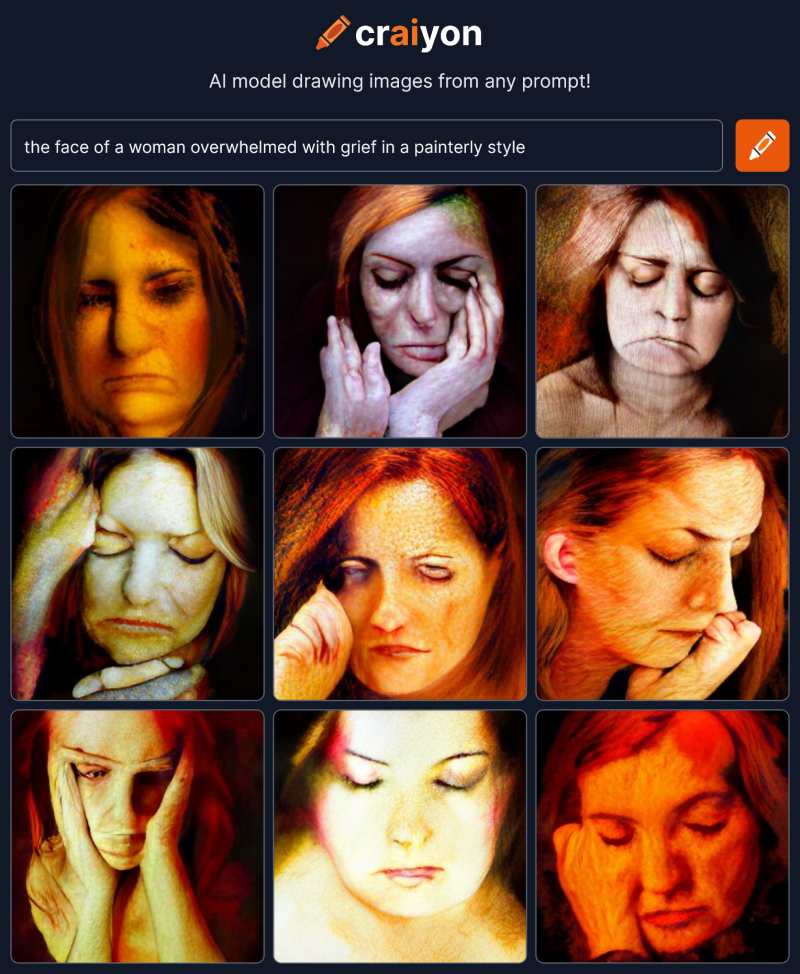 The answer is… Yes. Artificial intelligence can draw emotion in a face, you just have to find the right words to prompt it. It’s part the ability of the AI and part your direction. Iteration is the key. If you stumble across a corporate mascot, back up and try another path.
Next time I’m going to try to create interesting faces giving the craiyon AI as little information as possible.
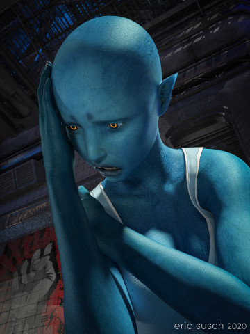 After George Floyd was killed and a week of protesting around the world, this was how I felt. I created a TikTok video where the camera cranes down from a fire escape and eventually tilts up on this character. You can see the video here: Despair on TikTok
After a bit of re-adjusting in DAZ Studio I came up with this high rez still version of the final frame. I rendered it at 10000 x 7500 pixels so I could print it out big and hang it on the wall.
Shadow areas take a long time to render in Iray, especially if the canvas is large. With two Titan RTX graphic cards continuously screaming at 79 degrees Celsius, this image took fourteen hours to render. Not the longest render I’ve ever done (that would be 48 hours) but still a good exercise for my new computer workstation.
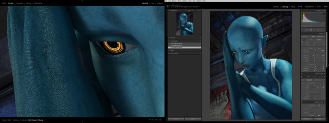
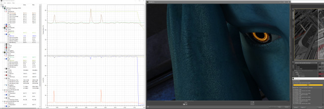 Color correction in lightroom was relatively simple, essentially just brightening up everything so it pops and so all the shadow areas don’t print out too dark.
 Created in DAZ Studio 4.12
Rendered with Iray
Color Correction in Lightroom
While I was working on a previous art piece called Quirky Girl, I stumbled through a wormhole and accidentally created this:
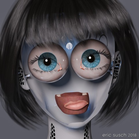 I stopped everything and rendered it out immediately! Enjoy!
I Reveal My Innermost Self
Created in DAZ Studio 4.11
Rendered with Iray
Color Correction in Lightroom
Figures used:
HPFK Lenora for Star 2.0 and Aiko 7
System 50 for G3F
Classic Bob Hair for G3+8F
This piece started off as a study of volumetric light. I wanted to practice creating an atmosphere in a large open space. I was also determined to make some art with a male figure instead of always using females. I ended up doing none of that! Hurtling down the creative path I diverged several times and ended up with an extreme close up of a toon anime girl. That’s the way it goes sometimes.
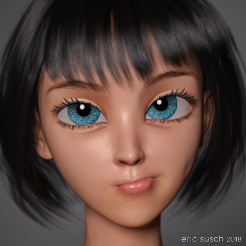 The base shape is a toon doll like character that was designed to be goth with lots of “broken china doll” features.
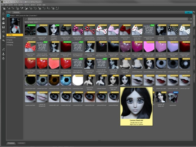 I tried some of the “broken” materials as well as the gothic makeup on the character but eventually moved on to other materials from elsewhere. One of those experiments lead to a happy accident and created a bizarre horrifying variation which ultimately became a completely new piece of art. …But that’s a post for another day.
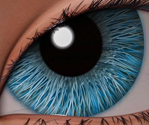 For this piece I eventually layered a more human material across the mesh and found these interesting eyes that look like they were made of brush bristles. They appeared realistic and fake at the same time. I wanted those eyes to be the focus.
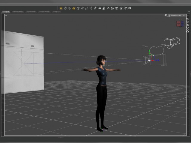 I set up a simple layout with the camera close on the face and only one light on the character. I spent a lot of time working on the quirky expression because I knew that would be where the emotion came from.
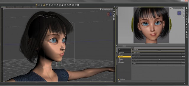 Even though the shot is essentially flat, I set up a limited depth of field on the camera anyway. The effect is subtle – the hair in the back, the neck, and the ears are a little soft – but I think it gives it a little something.
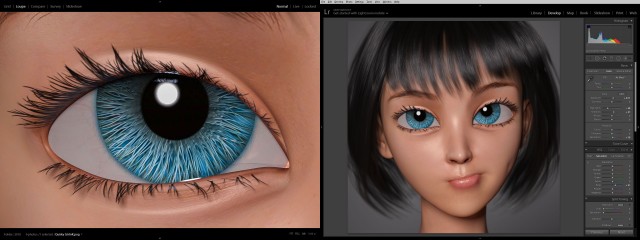 Color correction in lightroom was fairly straightforward. I bumped up the saturation of the blue channel to bring out the eyes. Simple.
Created in DAZ Studio 4.11
Rendered with Iray
Color Correction in Lightroom
Figures used:
HPFK Lenora for Star 2.0 and Aiko 7
Tamara Character and Hair for G3F
Classic Bob Hair for G3+8F
It’s the future and everyone is bald (of course.) Heads are bigger because brains are smarter and dreams are infinite. This is a simple portrait from the day after tomorrow.
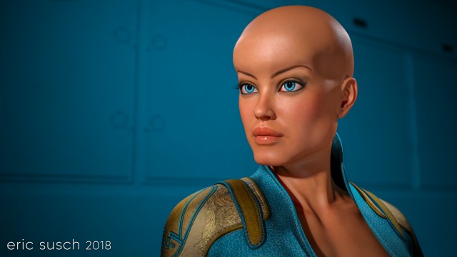 A girl, a camera, and a wall were all I needed to create this piece. …and lights. I needed lights too.
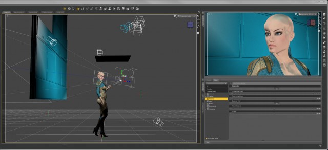 I threw a blue/green spot on the back wall to match her costume and eyes. The limited color pallet made her face pop.
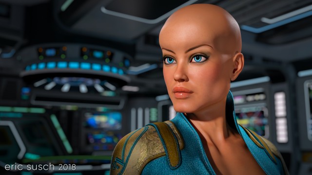 At one point I tried changing the background and put her on the bridge of a spaceship but it ended up too busy so I scrapped it.
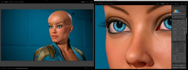 All it needed was minor color correction in lightroom. Not much at all. The final is essentially what was rendered out of DAZ studio.
What do you think? Is this our future?
Created in DAZ Studio 4.11
Rendered with Iray
Color Correction in Lightroom
Figures used:
Brenna for Ophelia 7
Sci-Fi Lieutenant Outfit for G3F
Wicked Fantasy Morphs for G3F
As you already know, my previous attempt to make the perfect social media avatar didn’t work out too well. Facebook was the biggest problem because sometimes their avatars are really, really tiny and the “man with no face” concept didn’t read. Also, shortly after I started using the side-view no-face avatar every single social media site changed their avatars from a square to a circle. Twitter, facebook, instagram, artstation, flicker… Everywhere. Aaaaarrrrrrgggggg!
OK, I needed something new, something simpler to understand and centered so it would look good in a circle. Enter Generic Man:
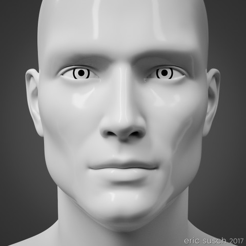 I kept things as simple as possible, centered face, no color, plain background. Getting the light right took time. Usually I like to set my own lights but this time I tried lighting exclusively with an HDRI dome. I tried many different light patterns until I got the glossy highlights and the deep set eye shadows just right. I didn’t want the light to be too flat but I also didn’t want it to be too shadowy either. This particular light pattern worked the best.
I also had to spend quite some time working on the white porcelain “skin” material too, especially since the neck of the original model was a different material. Finally I dialed in a slight asymmetrical facial expression just to give it a little something.
When I first rendered it out I kept the contrast very low. I liked the way it emphasized the eyes but it didn’t read well online at smaller sizes so I upped the contrast in Lightroom. This is the original render.
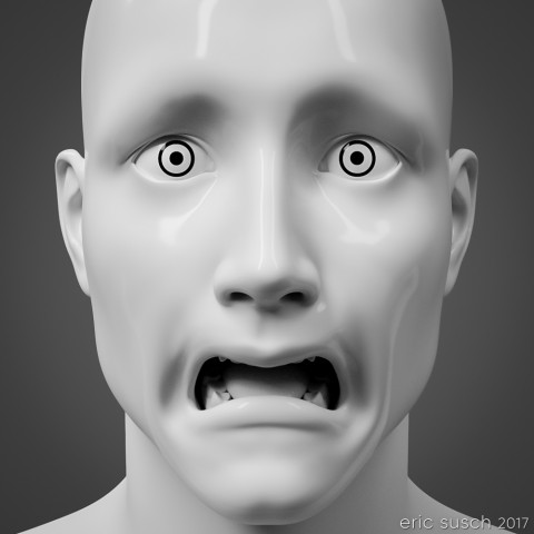
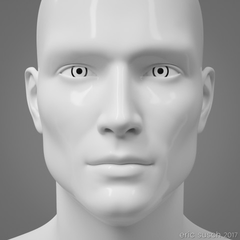 I’ve been using this avatar for several months now. It seems to work well at all sizes, even really small. It works in a square or a circle too. On Halloween I made an alternate and posted it for a day on facebook.
 Here’s a few screenshot examples on social media. Facebook (so tiny!):
Deviant Art:
Tumblr:
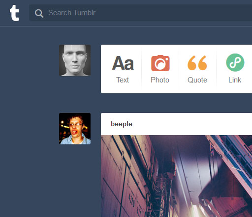 It looks good in a square or circle, even very teeny-tiny on facebook. I think this one is going to last me for quite awhile.
 Created in DAZ Studio 4.9
Rendered with Iray
Color Correction in Lightroom
Figures used:
HP Prototype YC-7 for Genesis 3 Male
iRadiance – Studio HDRIs for Iray