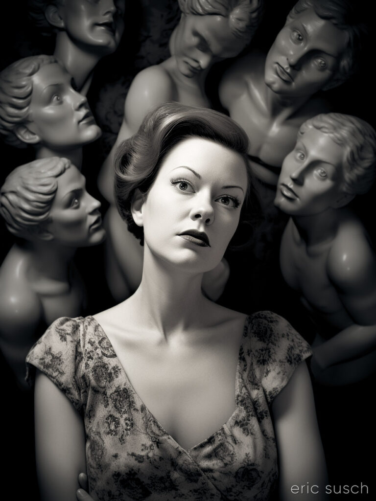
 So, when I was a kid I had this thing about statues coming to life…
#Art I made with #Midjourney #AI
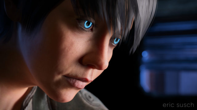 I’m still trying to make some of my CGI art look like it’s from a motion picture. What makes something look cinematic? Color? Framing? I’m still not sure. That’s what I was experimenting with in this portrait – a real person, in a real location, in a movie… A simple moment from a larger scene.
The setup was simple: face, hair, jacket, background. I set the camera lens at 100mm, 16×9 aspect ratio and found a good closeup. I messed with the depth of field quite a bit to get the background soft but not too soft (this isn’t a DSLR movie.)
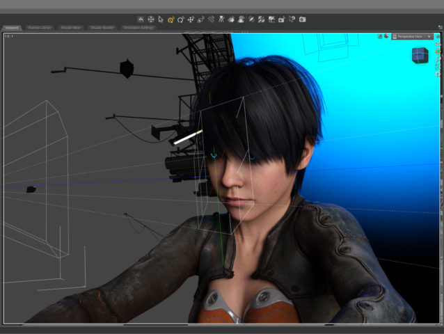 The green line in this screenshot shows how the camera (on the left) is focused precisely on the nearest eye and the two planes show the narrow depth of field on the face. The other eye is slightly out f focus.
The blue in the background is the soft blue backlight. I used only three lights, a key light on the face, the back light, and a light in the window. (And the eyes light up too.) No fill light.
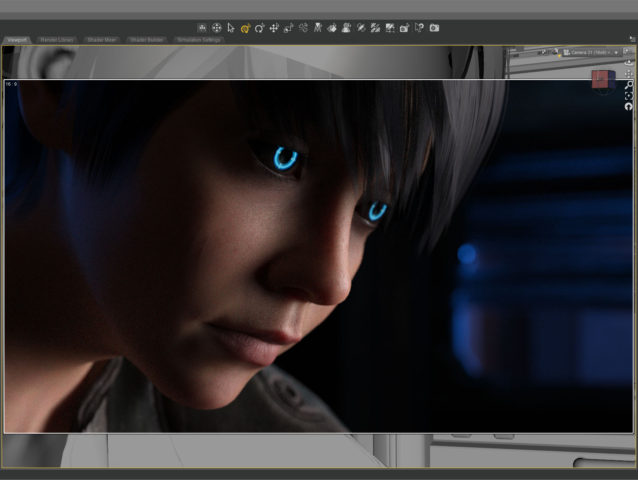 This screenshot shows how the initial render looked before color correction. It’s quite dark which means it takes longer to render but I liked the quality of light so I went for it. It took about five and a half hours to render the final file at 10800 x 6075. I stopped it at 4277 samples and 92 percent convergence even though my minimum is usually 95 percent and/or 5000 samples. It didn’t look like baking it any more would make a difference.
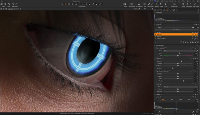 The whites of the eyes ended up quite dark in the render so I brightened them up in post. The eyes are a really old product and I don’t think I updated the reflectivity on the sclera quite right to render properly in iray.
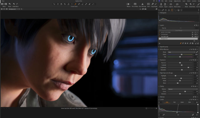 I also pulled the background completely black because I thought the muddy dark shapes distracted from the face.
This is the part of the post that I feel I really should evaluate the final result… then I decide not to say anything because I can only see the mistakes. After a few months not looking at it, I’m sure I’ll be able to figure out if I love it or hate it, but not now…
Created in DAZ Studio 4.21
Rendered with Iray
Color Correction in Capture One
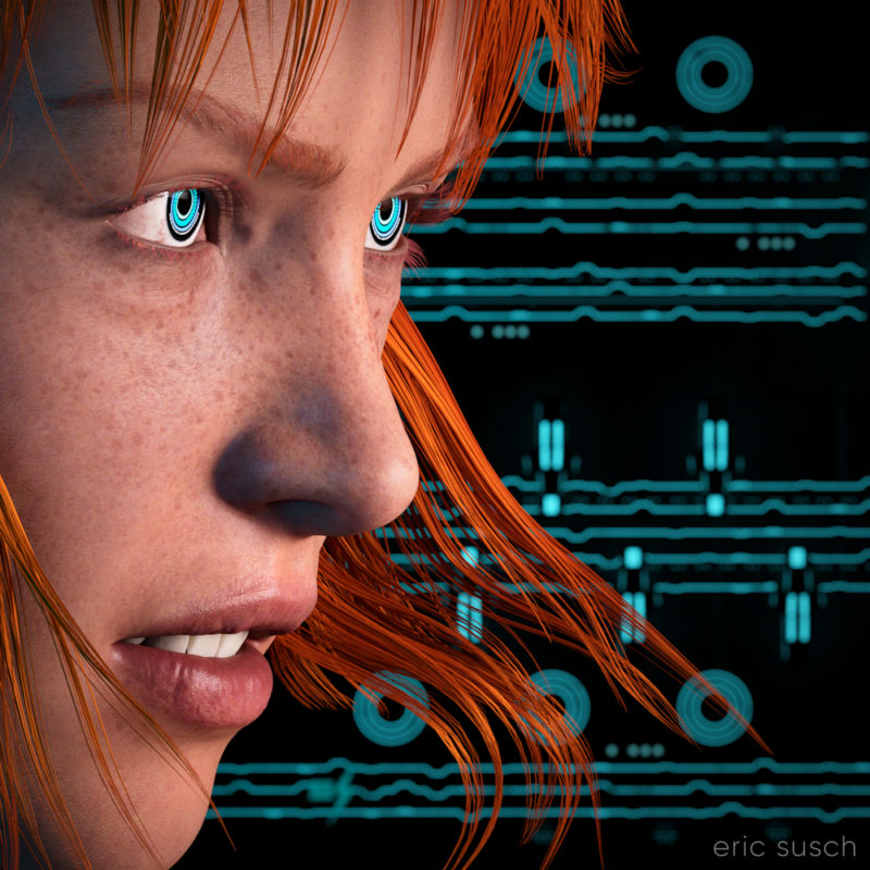 I think my CGI images tend to look better when I have something in closeup. It avoids the “medium shot of a character just standing there” that I struggle with. For this piece I started with an extreme close up and added cool robot eyes and dramatic flowing hair.
I also wanted a graphic background, something flat, technical. I have an ongoing issue with backgrounds. I get creatively stuck and I don’t know what to put back there. I end up trying scores of different things and nothing works.
What I ended up using here was actually a huge Tron like cityscape. The shapes and lines are actually building size structures seen from the top. This is what the cityscape looks like normally.
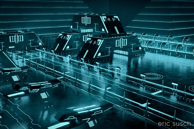 The entire environment is standing on it’s side waaaaaay far away. I turned on and off different elements depending on what looked good. It ended up being a real hassle having the background so far away though. Making adjustments took a long time. (I went back and figured it out. it’s 1.8 miles away! …or 3 kilometers) I should have scaled down the whole thing and moved it closer.
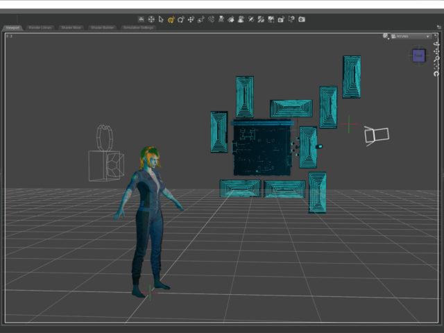 I named it Music in the Metaverse because the graphic lines in the background ended up looking similar to a music staff.
 Created in DAZ Studio 4.20
Rendered with Iray
Color Correction in Capture One
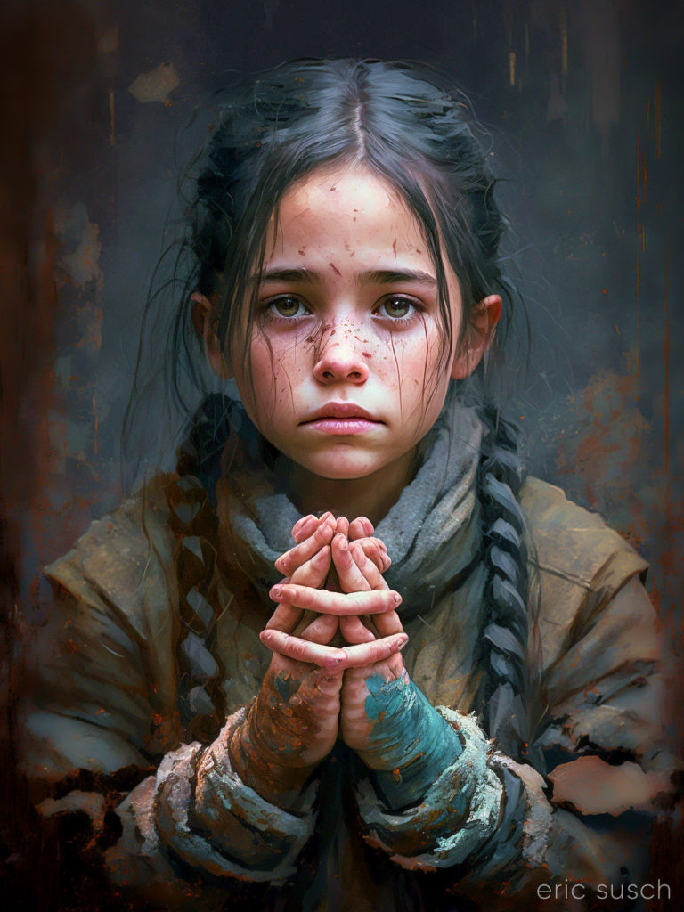 This picture is the first image in a two part series. The second image Deus Est Machina (which is the same title in Latin) was posted previously.
Deformed hands and tangled fingers have become an iconic symbol of AI art. The art machine knows what things look like (most of the time) but it doesn’t know what they are. It starts making a girl with braided hair then somewhere along the way… does it change it’s mind? …or does it never really know what it’s trying to make? The result is almost an optical illusion. It looks correct at first glance but on closer inspection something isn’t quite right.
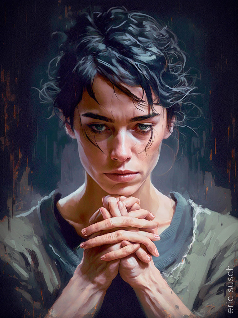 #Art I made with #Midjourney #AI
 I’m sure many would reject this AI render because the hands are all screwed up. The machine has a hard time with hands because it’s learning from pictures and it doesn’t really understand what a hand is. Hands look different depending on what they are holding in the training images so the machine gets confused.
For me the hands praying in this image is the point. I’m fascinated by the way AI can make something so creepy and wrong look relatively normal at first glance. She also has hair coming out of her eyes. One piece looks like it’s a disconnected continuation of a shadow on her forehead.
Great art happens at the edge of the medium you are working with. Finding those edges is the true work of the artist.
Whatever you now find weird, ugly, uncomfortable and nasty about a new medium will surely become its signature. CD distortion, the jitteriness of digital video, the crap sound of 8-bit – all of these will be cherished and emulated as soon as they can be avoided. It’s the sound of failure: so much modern art is the sound of things going out of control, of a medium pushing to its limits and breaking apart. The distorted guitar sound is the sound of something too loud for the medium supposed to carry it. The blues singer with the cracked voice is the sound of an emotional cry too powerful for the throat that releases it. The excitement of grainy film, of bleached-out black and white, is the excitement of witnessing events too momentous for the medium assigned to record them. — Brian Eno
#Art I made with #Midjourney #AI