Tag Archives: CGI

We Are the Dreamers of the Dream (sky grid update)

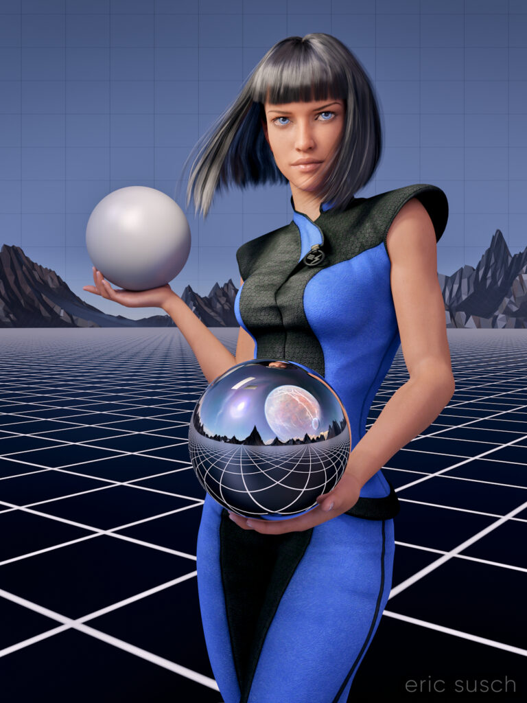
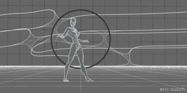
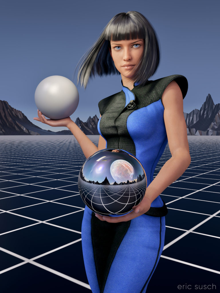
After my first experience making a puzzle I decided to update the artwork before printing another test puzzle.  I always thought the sky was a little plain in this piece especially since the sky reflected in the chrome sphere has a planet and clouds.  The plain blue at the top was also more difficult to piece together as a puzzle.  To give it some detail I decided to put a grid across the entire sky.  I think thematically this new grid shows that the image reflected in the sphere is actually a future dream.  The actual metaverse environment isn’t built yet.

I actually went all the way back into DAZ Studio to place the grid in 3D space and re-render the entire scene from the beginning.  I also took the chance to re-adjust the camera slightly to give more room around the edge of the frame for print bleed.  Final color correction is also slightly different.  If you’re re-doing it anyway, why not fix the things that bug you?

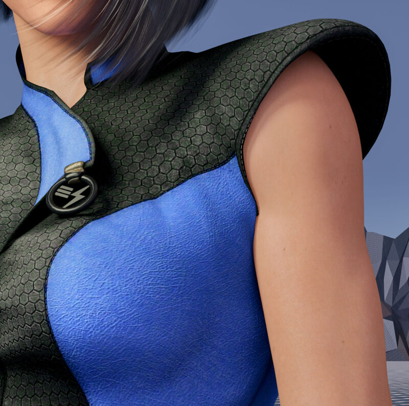
I also took the opportunity to fix another problem that I previously didn’t know how to fix and which has driven me insane since I first rendered the image.  In the original you’ll notice that the left armpit of her “space samurai” outfit is screwed up.

That’s because the clothing mesh is getting confused between the arm and the torso which are colliding.  I was able to grab the clothing mesh with a DAZ Studio plugin and pull it back toward the torso.  I actually had to stretch it quite a ways into the center of the character like a rubber band to get this small area to look better.

These changes were relatively small but I think they make a big difference.  Can’t wait to see this new version printed out.

Created in DAZ Studio 4.22
Rendered with Iray
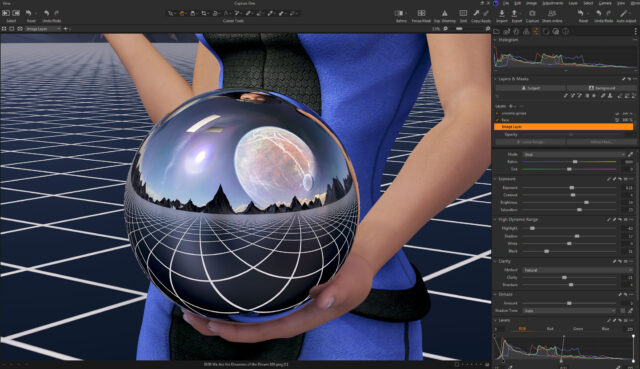
Color Correction in Capture One

Is Electronic Love to Blame? (16×9)

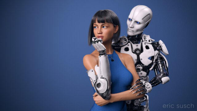
I’ve worked on this CGI scene longer than any other.  I’ve spent years obsessing about every detail.  I’m sure I’ve sucked the life out of it many times.  I hope there’s still something good left in it but I can’t tell anymore.  The only thing I can do is to let it go and put it out there hoping there’s still some life in it.

This is the second iteration of this piece.  The first one, which you can read all about here, was square, with a grey background, and a different dress.  I also added a pierced heart necklace to this new wide version.  Those are the big differences.  There are tons of other small changes.

So, why a new version?  Because I wasn’t satisfied with the old one.  (Actually I grew to hate it.)  For some reason this piece is an ongoing obsession.  Even now I’m looking at the image above and wondering if the background is too dark, contemplating changing it again before posting this blog post.  But I’m not going to.  I have to let this one go and be done with it.  Next step is to print it on metal like I’ve done with several of my other pieces and see how it comes out.  If it needs tweaking after that, then I will, but for now, it’s done!

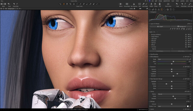
Color correction this time is in Capture One.  I abandoned Lightroom a few years ago.  I’m not interested in paying a subscription for my professional software.  Buying a perpetual license for Capture One is actually more money but it’s worth it.  If at some point I decide I can’t afford to upgrade anymore I won’t lose access to all my images and all the work I’ve done on them.  Don’t ever let a company and their tools act as gatekeeper to your work.  — I’m also liking the color correction controls a bit better in Capture One, thought Lightroom wasn’t bad.

Created in DAZ Studio 4.22
Rendered with Iray
Color Correction in Capture One

White Ring

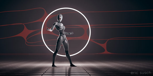
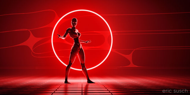
After creating my Red Ring CGI piece and having trouble with it being quite dim, I went back and changed a few things in the original project and re-rendered with a white ring of light.  I wanted this version to be different, not in silhouette, so I added an extra light to shine on the robot as well.

The robot is actually the same color as in the Red Ring image, except that I made the surface less glossy.  I also added a robot head with one circular eye.

Created in DAZ Studio 4.21
Rendered with Iray
Color Correction in Capture One

Is This The Life We Really Want?

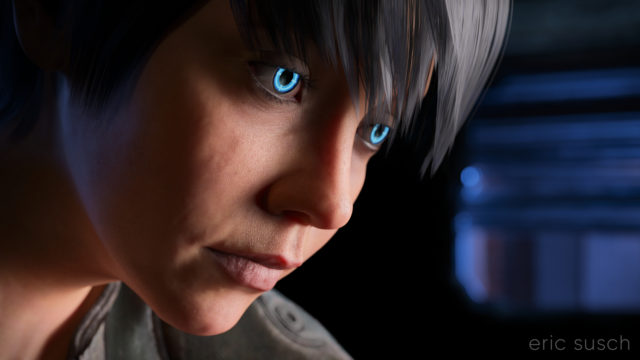
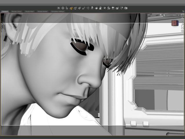
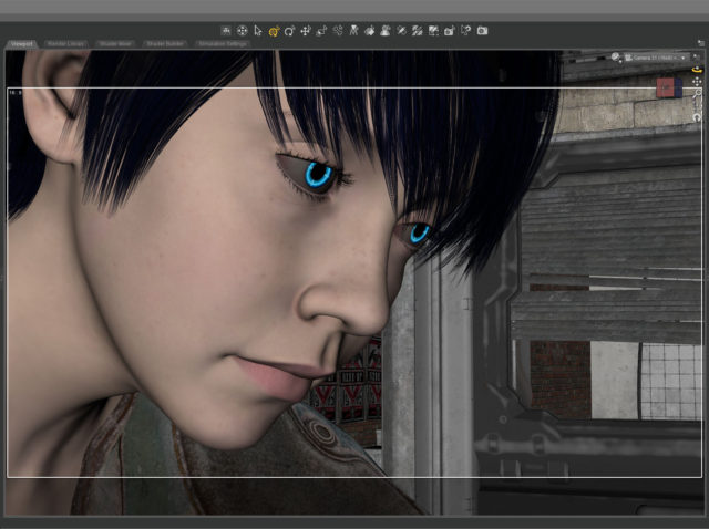
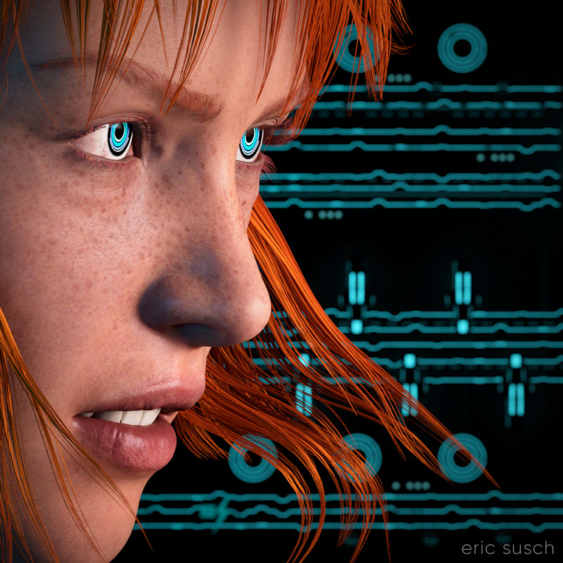
I’m still trying to make some of my CGI art look like it’s from a motion picture.  What makes something look cinematic?  Color?  Framing?  I’m still not sure.  That’s what I was experimenting with in this portrait – a real person, in a real location, in a movie…  A simple moment from a larger scene.

The setup was simple: face, hair, jacket, background.  I set the camera lens at 100mm, 16×9 aspect ratio and found a good closeup.  I messed with the depth of field quite a bit to get the background soft but not too soft (this isn’t a DSLR movie.)

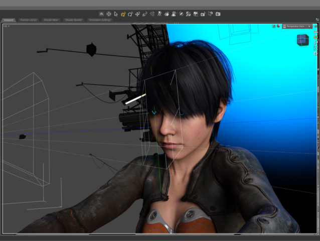
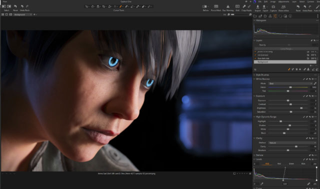
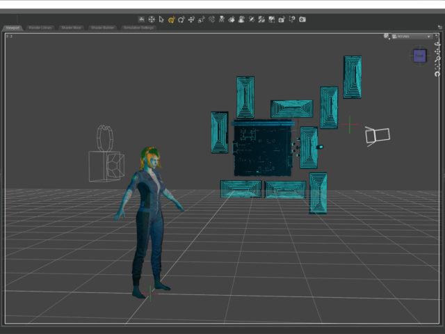
The green line in this screenshot shows how the camera (on the left) is focused precisely on the nearest eye and the two planes show the narrow depth of field on the face.  The other eye is slightly out f focus.

The blue in the background is the soft blue backlight. I used only three lights, a key light on the face, the back light, and a light in the window.  (And the eyes light up too.)  No fill light.

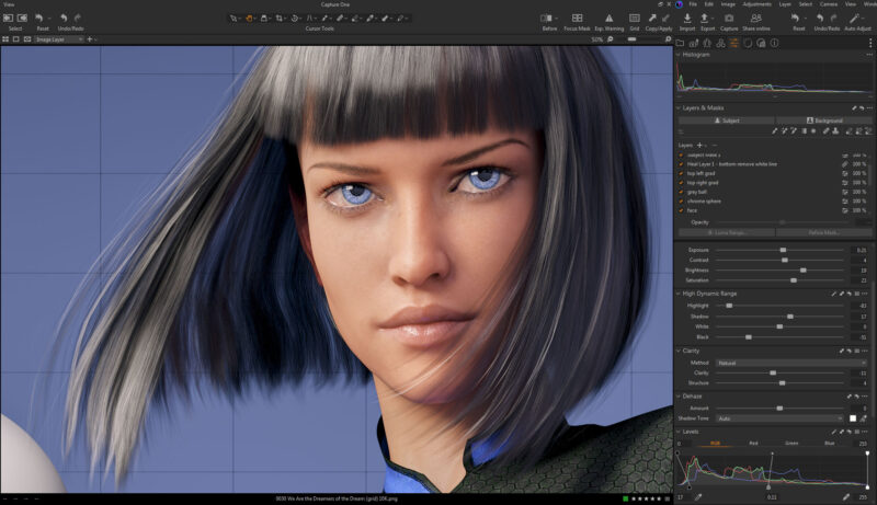
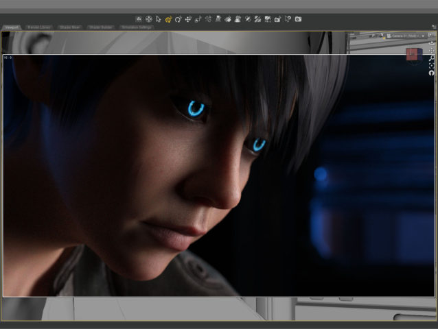
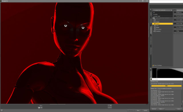
This screenshot shows how the initial render looked before color correction. It’s quite dark which means it takes longer to render but I liked the quality of light so I went for it.  It took about five and a half hours to render the final file at 10800 x 6075.    I stopped it at 4277 samples and 92 percent convergence even though my minimum is usually 95 percent and/or 5000 samples.  It didn’t look like baking it any more would make a difference.

The whites of the eyes ended up quite dark in the render so I brightened them up in post.  The eyes are a really old product and I don’t think I updated the reflectivity on the sclera quite right to render properly in iray.

I also pulled the background completely black because I thought the muddy dark shapes distracted from the face.

This is the part of the post that I feel I really should evaluate the final result… then I decide not to say anything because I can only see the mistakes.  After a few months not looking at it, I’m sure I’ll be able to figure out if I love it or hate it, but not now…

Created in DAZ Studio 4.21
Rendered with Iray
Color Correction in Capture One

Red Ring

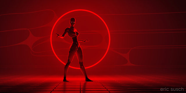
The vision in my head:

An intensely bright thin red ring light in the distance, a woman robot in silhouette, on an abstract shiny metal plate surface, hyper realistic, cinematic, dense atmosphere

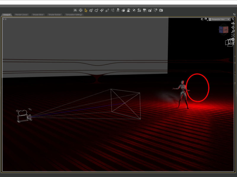
To manifest that vision I created a floor plane with a metal shader and another black plane as the backdrop.  A simple torus primitive served as the red ring light.

I wanted the red ring to frame the figure and at first I tried placing it way in the distance, but I found that it dipped below the floor plane and I wanted to see the full ring.  Moving it closer and scaling it down created the same composition with the added bonus of shining a strong rim light onto the robot figure.

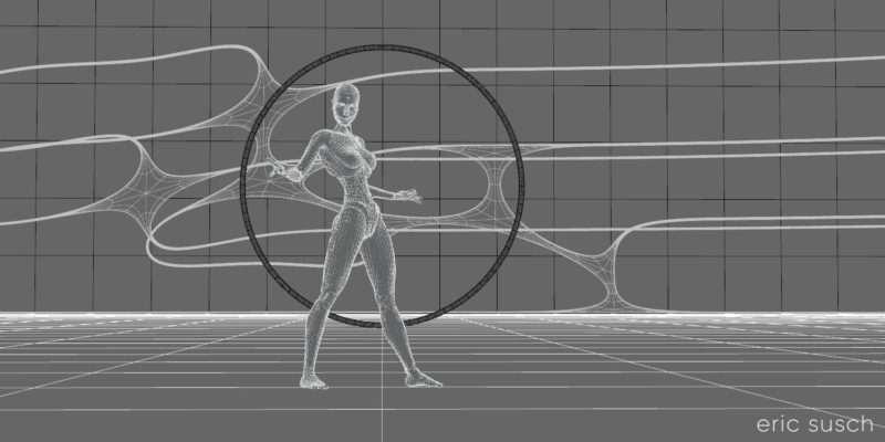
The shapes in the background are part of an abstract model that actually goes all the way around the landscape.  I found a part I liked and buried it in the fog to create a little texture in the background.

I spent quite some time adjusting the surfaces on the floor and the robot.  The entire scene is lit by the red ring.  The only other light is in the eyes.  The color and reflectivity of the surfaces really determined the quality of the image.  I wanted the floor to be shiny and reflective but not blown out.  I also wanted the robot to be in shadow.  A chrome or white surface didn’t work so the robot is actually shiny metallic dark grey and black.

Ultimately the original render was quite dark.  I felt the quality of the light was more important than the brightness.  I could always brighten it up later.

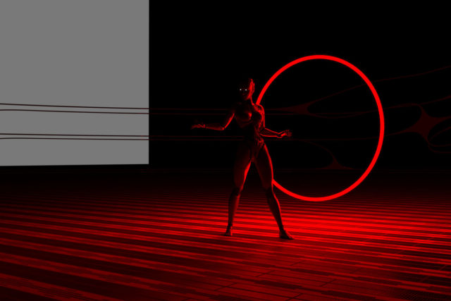
It took about seven and a half hours to render because of the fog and the dim light.  (Bright light renders a lot faster in Iray.)  I also rendered it at 14400 x 7200 so I could print it four feet wide and hang it on the wall if I really wanted to.  I’m crazy that way…

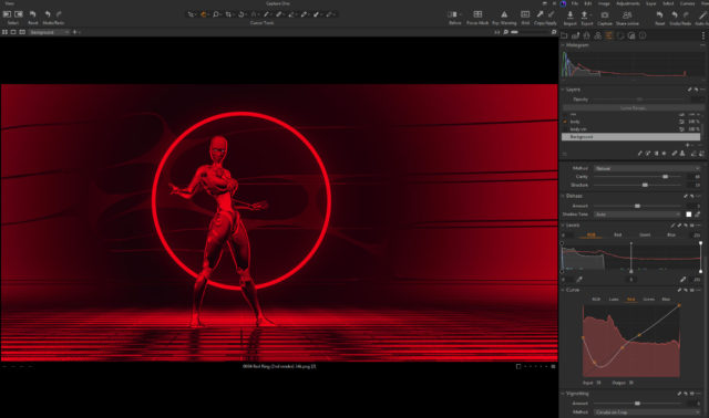
This screenshot shows the brightness of the original render just as it finished baking for seven hours.

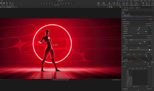
When color correcting I brought the brightness up quite a bit while trying to maintain the quality of the light. The problem was all the detail was in the red channel since all the light was pure red.  This left even a brightened image still dark.  This is all the brightness I could get out of the original color correction:

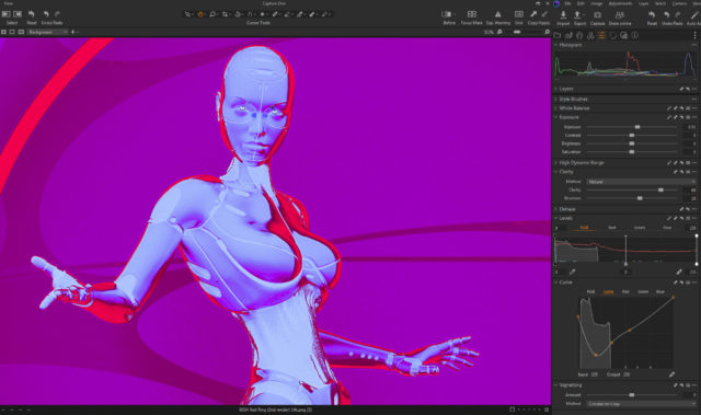
Later I went back and tried a few other things to brighten it up more.  I figured if I could get the ring to blow out (overexpose) and become white It would still look OK and be much brighter.  My color correction software, Capture One, is quite good and of course that means it doesn’t clip the high end even if you push it quite far.  I tried all sorts of crazy things, experimenting, just to see what the software could do.

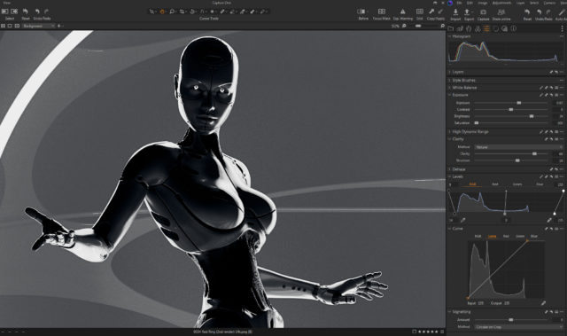
When I was screwing around with a black and white version I hit upon something…

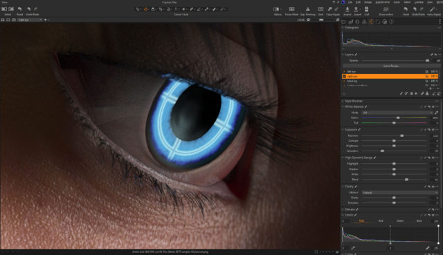
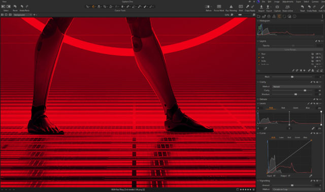
I found that if I messed with the top end of the LUMA channel on the CURVES tool and the top end of the RGB channel on the LEVELS tool they interacted and did exactly what I wanted, blowing out the top of the red channel.  (The LUMA channel in the Curves tool somehow only adjusts contrast without changing saturation.  It’s not the same as adjusting the full RGB.)

You can see the way I set both tools at the bottom of this screenshot:

This brightened up the entire image quite a bit and It’s how I created the final color correction.

Created in DAZ Studio 4.21
Rendered with Iray
Color Correction in Capture One

Music in the Metaverse

I think my CGI images tend to look better when I have something in closeup.  It avoids the “medium shot of a character just standing there” that I struggle with.  For this piece I started with an extreme close up and added cool robot eyes and dramatic flowing hair.

I also wanted a graphic background, something flat, technical.  I have an ongoing issue with backgrounds.  I get creatively stuck and I don’t know what to put back there.  I end up trying scores of different things and nothing works.

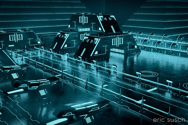
What I ended up using here was actually a huge Tron like cityscape.  The shapes and lines are actually building size structures seen from the top.  This is what the cityscape looks like normally.

The entire environment is standing on it’s side waaaaaay far away.  I turned on and off different elements depending on what looked good.  It ended up being a real hassle having the background so far away though.  Making adjustments took a long time.  (I went back and figured it out.  it’s 1.8 miles away!  …or 3 kilometers)  I should have scaled down the whole thing and moved it closer.

I named it Music in the Metaverse because the graphic lines in the background ended up looking similar to a music staff.

Created in DAZ Studio 4.20
Rendered with Iray
Color Correction in Capture One

Can AI draw a Red Ring of Light?

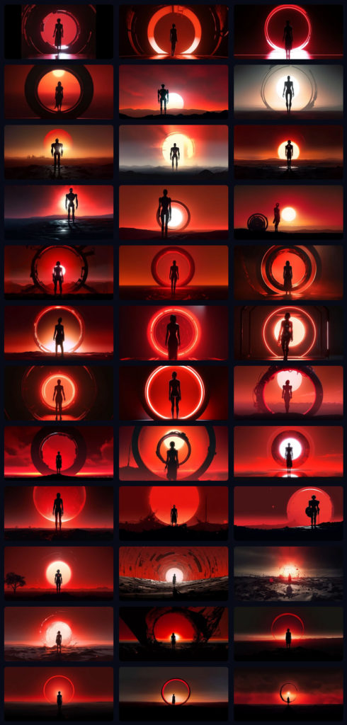
Recently I was experimenting with the Midjourney AI art engine.  I saw an image in my mind of a robot backlit by a red ring-light.  I typed it up as a prompt:

An intensely bright thin red ring light in the distance, a woman robot in silhouette, on an abstract shiny metal plate surface, hyper realistic, cinematic, dense atmosphere, intense, dramatic, hyper detailed, –ar 2:1 –v 5

I expected to get something like the image above.  That’s not what happened.  For the next hour I tried to get Midjourney to build something even close to what I envisioned. I typed and re-typed the prompt, changing the way I described the image.  Most of the time I couldn’t even get a red light ring.Midjourney kept trying to make a “sun” with a red sky.  There are round portal structures, some even reflecting red light, but almost none of them light up.  The light’s coming from somewhere else.

What I asked for was simple.  Why is this so hard?

I’m guessing it has to do with the data set the AI was trained on.  I bet there aren’t that many images of red light rings in there, maybe none at all.

One of the things that frustrates me about AI art is the way most things turn out looking generic, like everything you’ve seen a million times before.  This makes sense of course, because that’s how it works.  It studies what everything looks like and then create from that.  It’s almost a creation by consensus.  An unusual Red Ring isn’t part of the equation.  I could probably eventually get to what I wanted if I kept trying and perhaps made the prompts much longer describing every detail.  Maybe.

Or I could do what I did and create what I saw in my mind with CGI.

Has this put me off AI art?  No.  Every tool is good at what it’s good at, and it’s not at what it’s not.  I was looking for the edge of what this new tool could do (because that’s where the art is) and I found it.  There’s nothing really interesting right here but there’s a lot more to discover…

We Are the Dreamers of the Dream

Building the Metaverse to match the real world.

I made this CGI image about a year ago when the Metaverse was the shiny new tech thing.  Most people probably won’t get what it’s about so I’ll explain it, even though David Lynch would probably scold me for doing that.

The grey and chrome sphere are tools that special effects artists use to match 3D computer graphics to real world photography.  If you are shooting a film for example, and part of the scene will be CGI, you shoot a few extra feet of the environment with someone holding a grey and chrome sphere.  The chrome sphere reflects the entire environment and that reflected image can be “unwrapped” and placed as a dome over the CGI so the same light and colors shine on the computer generated elements as in the real scene.  (The chrome ball is actually an old fashioned “poor man’s” way of doing this.  There are 360 degree cameras now that can actually just take a picture of the entire environment right on the set.)

The grey sphere shows the quality of light shining on a specific place in the shot.

This image is about building a computer generated Metaverse that people can walk around in, just like real life.  It’s the dream of constructing a Metaverse as well as the Metaverse as a dreamscape… the birth of a new alternate world.

OK, enough of that…

The main difficulty I had in creating this image stems from the fact that the reflection in the chrome ball is actually the real reflection of the CGI environment.  It’s not a composite.  The mountains actually go all the way around the environment.  The grid floor goes out in all directions.  The “planet” and the “sun” seen in the ball are on the HRDI dome over the scene that is creating the ambient light.  The dome had to be lined up so the “planet” reflected in the sphere correctly.  The mountains had to be rotated in such a way that the peaks behind her and the ones in the chrome ball both looked good.  The main light in the scene is the keylight on the character which can be seen in the chrome sphere as a bright rectangle in the upper left of the sphere.  I could have removed that in post but I left it in because that’s the point.

The metaverse was supposed to be the future of everything.  Facebook even changed their name to Meta.  Now AI is the new thing.  Will the metaverse be created?  Will AI create the metaverse for us?  Who knows…

Created in DAZ Studio 4.20
Rendered with Iray
Color Correction in Capture One

Invasion!

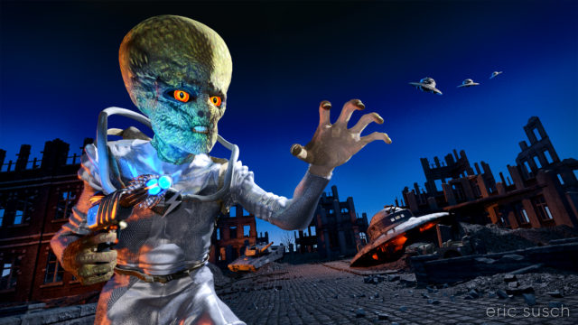
It’s been some time since I’ve posted any of my 3D creations.  This is actually something I started several years ago but never finished.  I had trouble with the lighting but it all came together recently when I decided to make it a night invasion.

Created in DAZ Studio 4.21
Rendered with Iray
Color Correction in Capture One

Is Electronic Love to Blame?

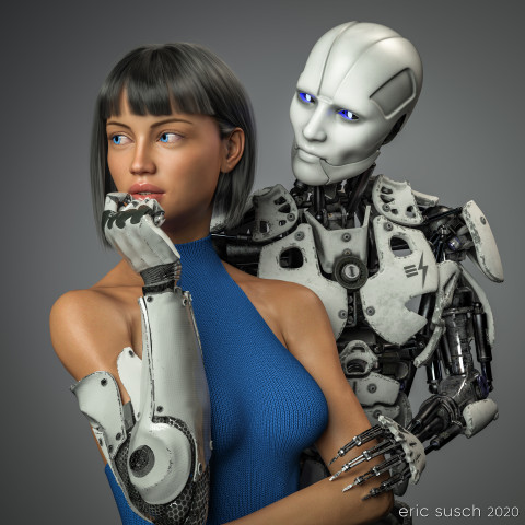
Is Electronic Love to Blame?This piece was a marathon to create.  A perpetual artistic labor.  Unending.  Frustrating.  We had remodeled our kitchen and saved a space on the wall for an art piece, complete with it’s own special spotlight.  The kitchen had taken over a year to complete and this art piece had to live up to that.  It needed to be perfect.  Constantly second guessing my creative choices, it took me a year to finish this, sometimes setting it aside, then diving back in to see if I could perfect it.  Today I’m finally calling it done and I’m presenting it here hoping I haven’t completely strangled the emotional life out of it.

Some of the initial criteria:  It was designed as a large piece, three feet square, so it needed to be extremely detailed.  It had to match the modern aesthetic of our new kitchen. Colors needed to be white and gray with a blue accent.  It needed to be bright, not the dark moody work I usually gravitate towards.  I wanted two characters – an android and a cyborg – in love yet troubled, going through the same ups and downs we all do.  …And it needed to be good.  That was the most important criteria.  It needed to be good.
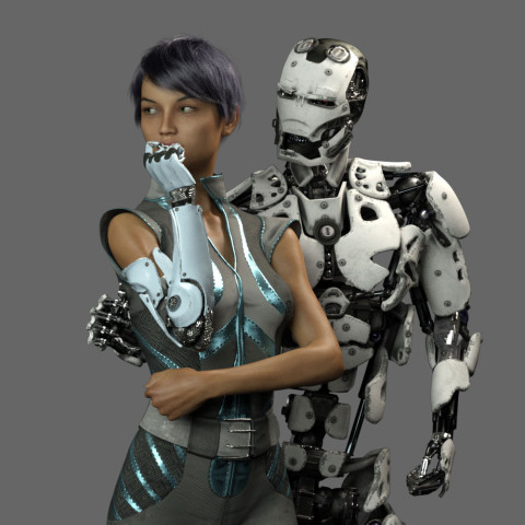
Cyborg loves Robot test render 14 ccThis is an in-progress test render from early on.  As you can see the original composition was wider.  The plan was to have the android’s right arm on her waist and she would be gently touching his metal fingers.
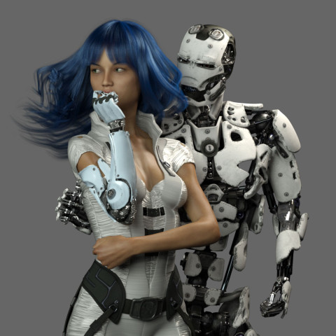
Cyborg loves Robot test render 15 ccWhat to wear and what hair?  I obsessed over endless choices.
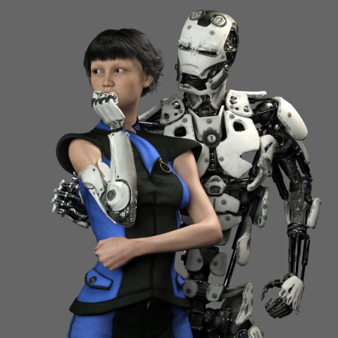
Cyborg loves Robot test render 23 misumi skin ccI tried many skin textures for the girl.  I wanted to get the softness just right so it would contrast nicely with the hard metal of the android.
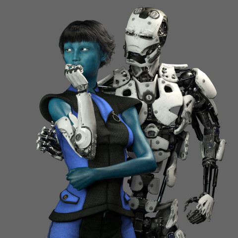
Cyborg loves Robot test render 26 lyflannery skin ccMaybe she should be an alien?  Blue is the accent color so it makes sense.  OK, maybe it’s too dark…
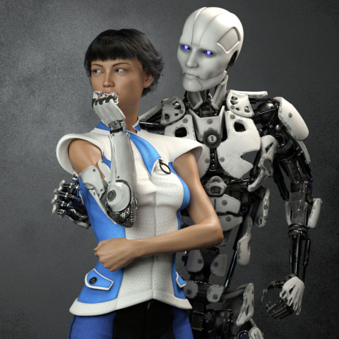
Cyborg loves Robot test render 39 ccAngry robot face changed to gentle face.  I needed to get some humanity in this android.
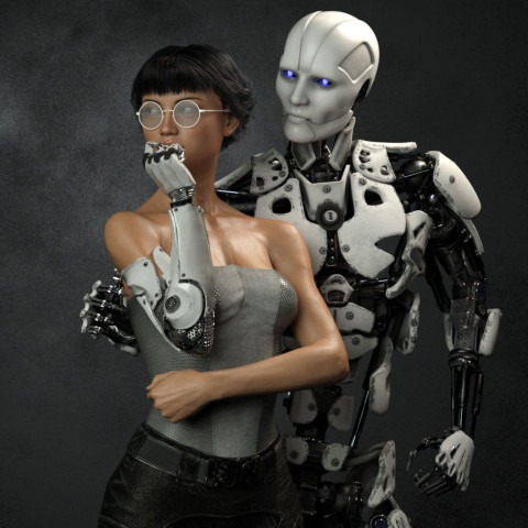
Cyborg loves Robot test render 46 fitness 50I eventually decided the girl needed bare shoulders to clearly see the cybernetic arm connection.  I wanted it to be clear that she was human and only her arm was mechanical.  This is also the reason I decided to ditch the idea of “space girl” type clothing which tends to be aggressive and hard.  She needed to be soft, the soft spot between the hard metal of her arm and the android.
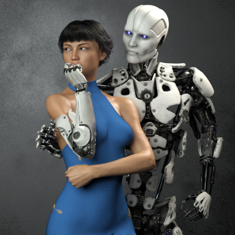
Is Electronic Love to Blame 12 04 cam 05 ccI finally decided to go with this “cold shoulder” dress.  When I was working to make it blue, I changed the original cloth to a knit fabric because my wife CAT is a knitter.  That just made sense to me.
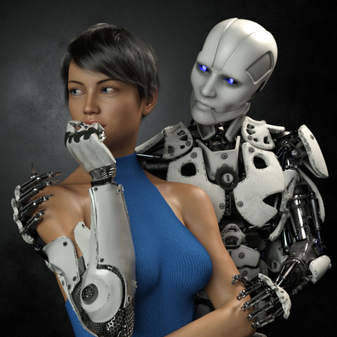
Is Electronic Love to Blame 14 00Eventually I realized that I had set the camera too far away, and moved in closer.  This always happens.  It’s always better after I move in.  It’s just part of my process I guess.

Adjusting for the new composition, I tried moving the robots right hand up to her shoulder.  It ended up too creepy though.  Trying to get the sharp metal fingers to show some sensitivity was proving difficult.  It also fouled up the clean skin / machine connection I wanted for her cybernetic arm.  I eventually moved the android’s right hand behind her back out of sight and concentrated on getting the left hand in the correct position.  It took me three tries to get the left arm to look relaxed and gentle.
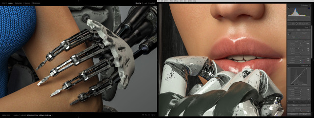
Cyborg loves Robot BTS skin and machineI also spent a tremendous amount of time trying to get the android fingers positioned just right so that they didn’t look like they were gouging the girl’s arm, yet at the same time, catching the light in a nice way.  Skin against machine was becoming a major theme apparently.  Same with the cybernetic fingers and her lips.  I actually moved the camera and lengthened the girl’s neck at one point so you could see more of her mouth.
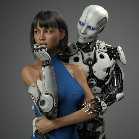
Is Electronic Love to Blame 23 00 cam 17 lower arms and neck movedThen, of course I second guessed myself and pulled the shot back to re-visit the original concept of the hand around the waist.  Worked on that for awhile but thankfully came to my senses.  Maybe I’ll revisit this wider shot if I do a different version with a vertical aspect ratio.
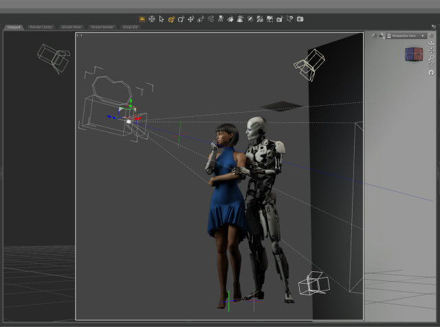
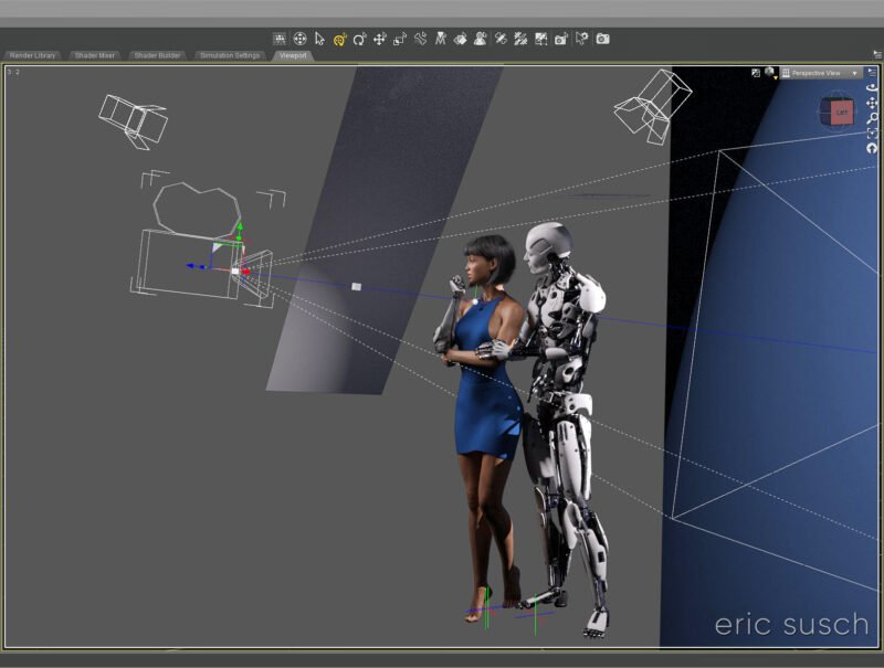
Cyborg loves Robot BTS camera setup 03I only needed three lights to illuminate the scene.  A key from the front doing most of the work.  A hair light from the top that was also doubling as a fill light.  And a spot on the gray background plane.  I created another tiny plane just out of frame above the android to cut down the reflection on his white bald head.
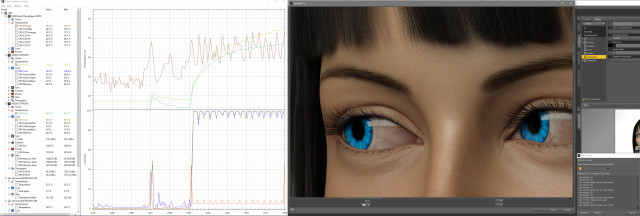
Cyborg loves Robot BTS renderingThe final Iray render took about two hours at 10800 x 10800 resolution.  I was surprised.  That’s very fast.  I’ve had renders at this resolution go ten hours or more.  I’m guessing the plain background and the overall brightness of the scene helped.
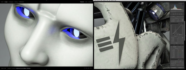
Cyborg loves Robot BTS robot cuColor correcting in Lightroom I tried to bring out the hardness of the machine and the softness of the skin.
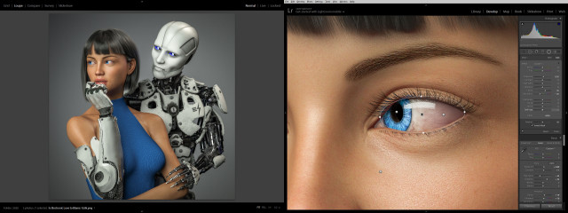
Cyborg loves Robot BTS eye cc 04 finalI lightened up the girl’s eyes and obsessed over everything for quite some time.  Overall I brightened everything up and made it punch as much as possible.
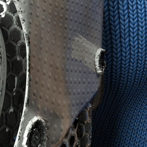
Is Electronic Love to Blame 33 06 normal map 1.0While color correcting I noticed a bizarre reflection coming off one of the poorly formed low-rez “screws” on the cybernetic arm.  It had something to do with the normal map which wasn’t doing much on this surface.  The screws were created with the displacement map.  Not sure what was going on.
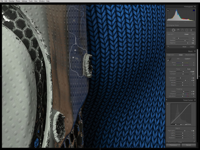
Cyborg loves Robot BTS screw reflection fixAnyway, I couldn’t figure out how to fix it in DAZ Studio without changing the character of the rest of the arm surface so I just used the spot remover in lightroom.

Is Electronic Love to Blame?So what do you think?  Did I over think it and create something stilted?  Or did I continually refine it and make it great?  I can’t tell anymore.

Next step: print it and see what it looks like on the wall…

Created in DAZ Studio 4.12
Rendered with Iray
Color Correction in Lightroom