 It’s not easy getting the art machine to do what you want. It’s like it has a mind of its own…
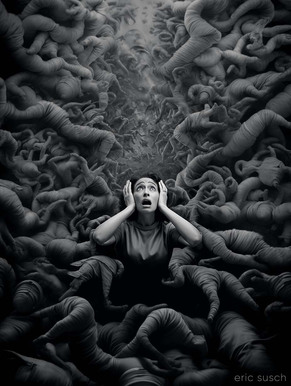
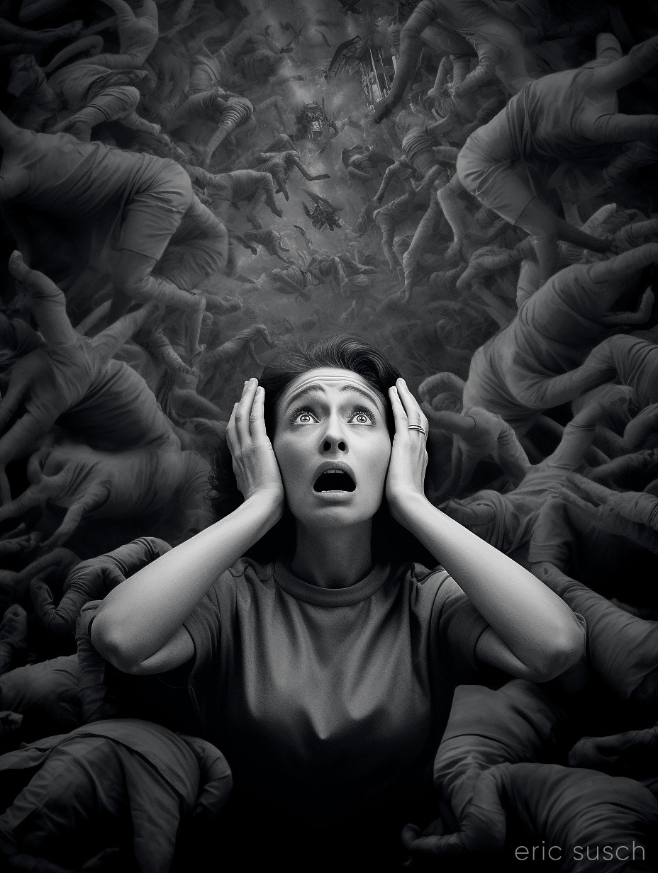
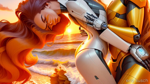
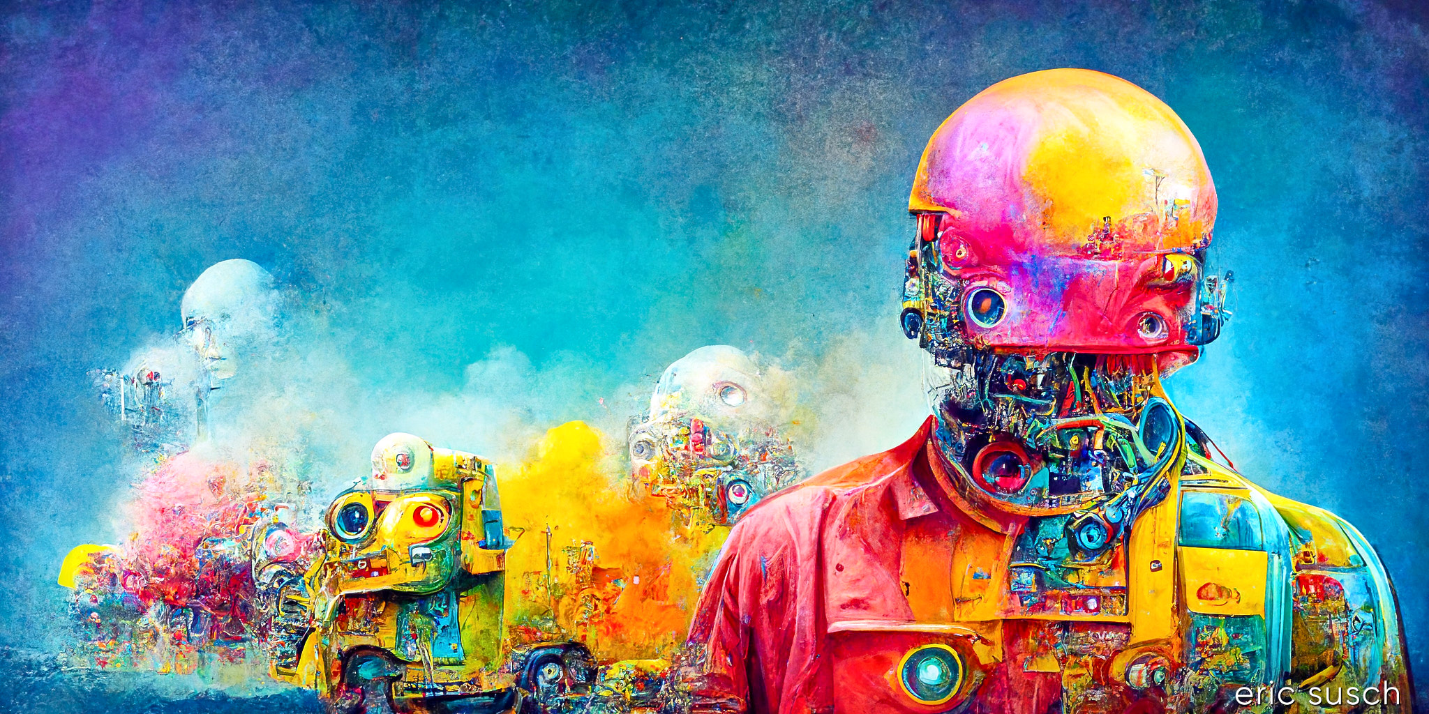
I’m trying to create a video with Stable Diffusion and Deforum. Doing lots of experiments. It’s becoming more and more clear that storytelling is next to impossible because there are just too many variables with AI art. The machine is constantly throwing curve balls that derail the story. The scene above was originally part of a Spaceship Hibernation story line. It went something like this:
EXT. SPACE spaceship, stars, perhaps a nebula
INT. SHIP Wide shot, pipes, hibernation chambers
CU. Woman sleeping in a hibernation chamber
EXT. EARTH sunset, beautiful, idyllic
EXT. EARTH Woman and Man holding hands
EXT. EARTH sunset, man and woman kissing in love, sunset
EXT. SPACE spaceship flys into the distance
All kinds of things happened. I couldn’t get the machine to give me a single spaceship in outer space. At first there was a robot standing on the ground. I tried a slew of negative prompts but always ended up with a fleet of ships, or planets, or no spaceship.
Also, the girl sleeping in the hibernation chamber always had her eyes opened. Adjusting the prompt didn’t change this.
So I gave up on the spaceship-hibernation part of it and tried concentrating on the dream in the middle. Still having trouble, but continuing with the tests.
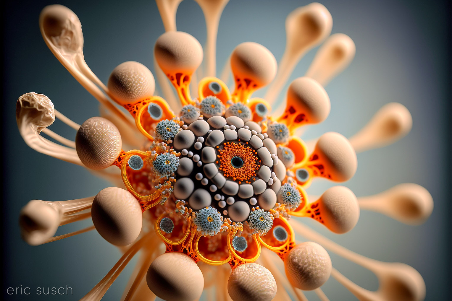
#Art I made with #StableDiffusion #AI
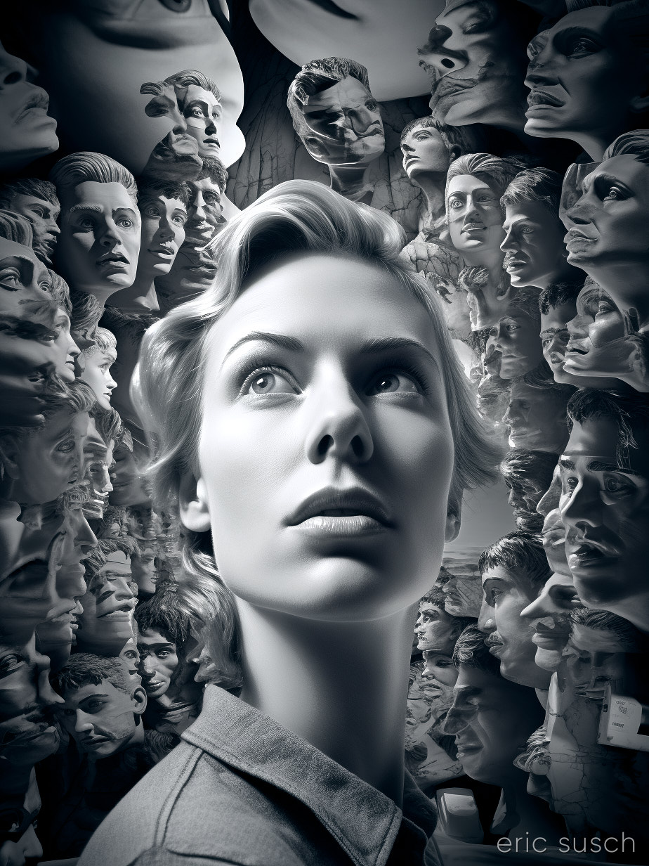
 I was looking back at all the images I rendered with Midjourney over the last year and a half. There’s some good stuff in there that got overlooked. I actually rendered this last year (2022) with Midjourney version 3.