Category Archives: SciFi

Robot Romantic Getaway Goes Wrong

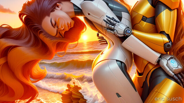
It’s not easy getting the art machine to do what you want. It’s like it has a mind of its own…

I’m trying to create a video with Stable Diffusion and Deforum.  Doing lots of experiments.  It’s becoming more and more clear that storytelling is next to impossible because there are just too many variables with AI art.  The machine is constantly throwing curve balls that derail the story.  The scene above was originally part of a Spaceship Hibernation story line.  It went something like this:

EXT. SPACE spaceship, stars, perhaps a nebula
INT. SHIP Wide shot, pipes, hibernation chambers
CU. Woman sleeping in a hibernation chamber
EXT. EARTH sunset, beautiful, idyllic
EXT. EARTH Woman and Man holding hands
EXT. EARTH sunset, man and woman kissing in love, sunset
EXT. SPACE spaceship flys into the distance

All kinds of things happened.  I couldn’t get the machine to give me a single spaceship in outer space.  At first there was a robot standing on the ground.  I tried a slew of negative prompts but always ended up with a fleet of ships, or planets, or no spaceship.

Also, the girl sleeping in the hibernation chamber always had her eyes opened.  Adjusting the prompt didn’t change this.

So I gave up on the spaceship-hibernation part of it and tried concentrating on the dream in the middle.  Still having trouble, but continuing with the tests.

#Art I made with #StableDiffusion #AI

Alien Lizard Soldiers from Another Dimension!

This is my first try at AI animation. I rendered it with Stable Diffusion and the Deforum plugin. I’m trying to see if I can create interesting shapes that morph from one object to another over time. There are a lot of amazing things going on in this short sequence, including a bit around 30 – 40 seconds where the objects at the bottom of the screen morph into a bizarre split screen. I love that kind of stuff.

It took about two hours to render out all the frames for this one minute video. I also rendered out six versions, changing the prompt and the render settings each time to get this one which was the best. That’s a lot of tedious rendering but I’m learning quite a bit.


I Made This!

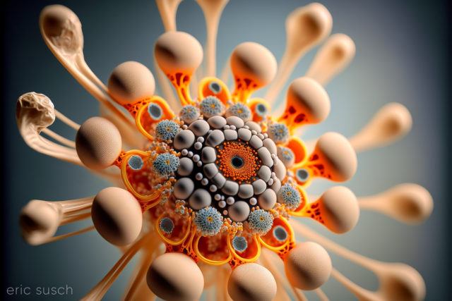
I thought I had posted this last year when I made it.  This was created with Midjourney version 3 (that’s two versions ago!)  It was another accident while I was trying to do something else.  The accidents are always the best stuff.

I almost titled this “You are what you make” but that’s a little on the nose, don’t you think?

#Art I made with #Midjourney #AI

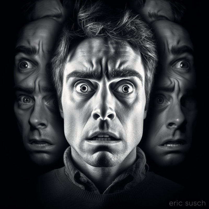
All of Us 001

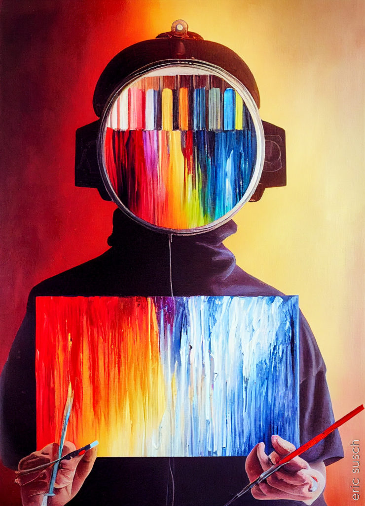
I’ve chosen this as the start of a new image series that deals with anxiety and confusion.  It’s about all those different voices inside our head that distract us from where we are, and where we’re going.

One thing that fascinates me is how the “Art Machine” understands what things look like but it doesn’t understand what the images mean.  It doesn’t understand metaphor or surrealism.  I’m hoping to get some interesting images exploring confusion and dreams.

#Art I made with #Midjourney #AI

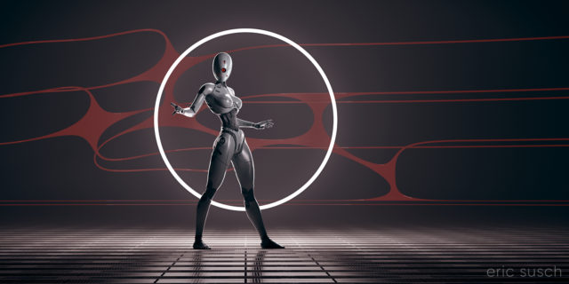
White Ring

After creating my Red Ring CGI piece and having trouble with it being quite dim, I went back and changed a few things in the original project and re-rendered with a white ring of light.  I wanted this version to be different, not in silhouette, so I added an extra light to shine on the robot as well.

The robot is actually the same color as in the Red Ring image, except that I made the surface less glossy.  I also added a robot head with one circular eye.

Created in DAZ Studio 4.21
Rendered with Iray
Color Correction in Capture One

Real or Fake?

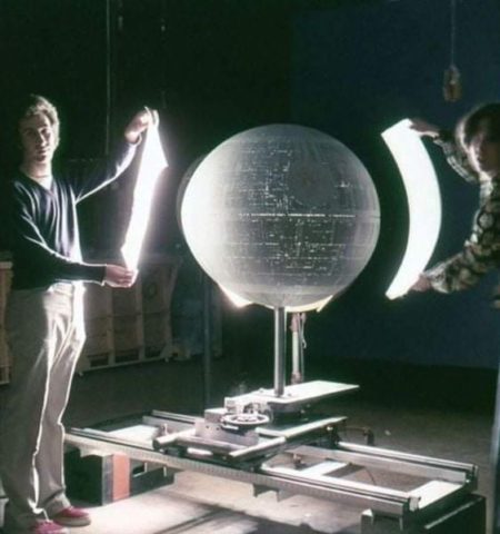
I’ve been looking at this picture for 10 minutes. It’s being presented to me on facebook as a behind the scenes picture from Star Wars 1977. I suspect this is AI…. maybe…. Here’s why:

1st – I’ve never seen this picture. I’ve seen just about every image behind the scenes or otherwise from the original Star Wars. Every once in awhile a new one does pop up though.

2nd – The Death Star doesn’t look round. It looks egg shaped to me.

3rd – What are they doing? There’s no reason to hold a bounce card that close to a model let alone curve it. It could be some sort of ad hoc preliminary light test though.

4th – Where’s the light coming from? If the guy on the left is holding a piece of diffusion the light should be coming from behind him. The light seems to be coming from the sheet he’s holding. Flexible flat panel lighting didn’t exist in 1977.

The one thing that makes me think it might be real:

The Mole Richardson wheeled light stand (with the painted brown parts) is mostly obscured by the Death Star yet the legs and wheels appear to be in the proper position. This is something that AI will almost always screw up.

This is where we are. Is it real or fake? How much of the rest of our lives will be spent trying to figure out things like this?

Is This The Life We Really Want?

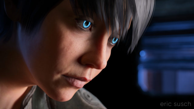
I’m still trying to make some of my CGI art look like it’s from a motion picture.  What makes something look cinematic?  Color?  Framing?  I’m still not sure.  That’s what I was experimenting with in this portrait – a real person, in a real location, in a movie…  A simple moment from a larger scene.
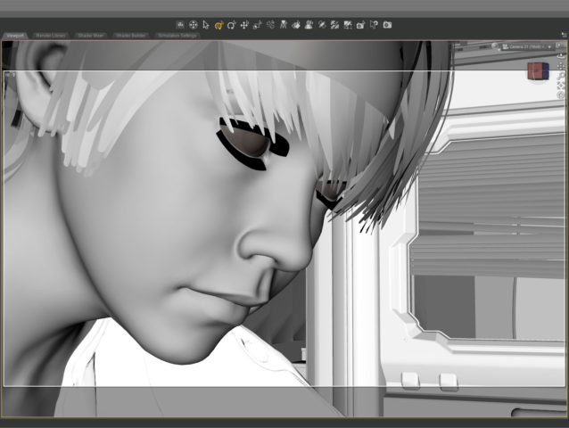
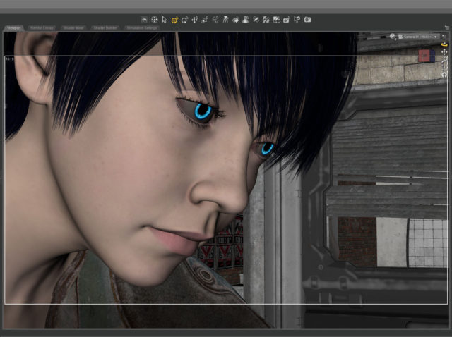
The setup was simple: face, hair, jacket, background.  I set the camera lens at 100mm, 16×9 aspect ratio and found a good closeup.  I messed with the depth of field quite a bit to get the background soft but not too soft (this isn’t a DSLR movie.)
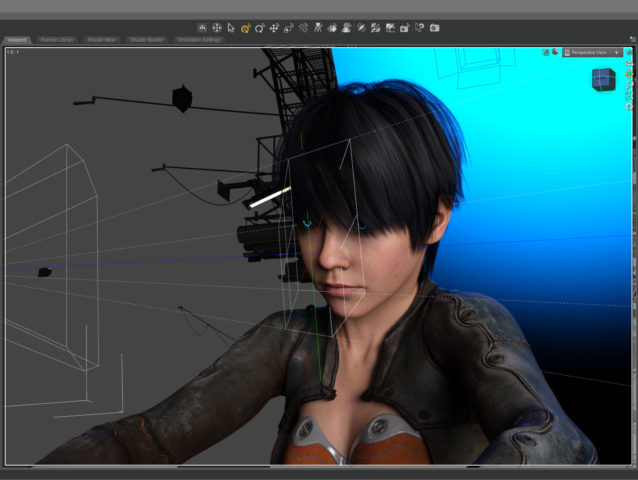
The green line in this screenshot shows how the camera (on the left) is focused precisely on the nearest eye and the two planes show the narrow depth of field on the face.  The other eye is slightly out f focus.

The blue in the background is the soft blue backlight. I used only three lights, a key light on the face, the back light, and a light in the window.  (And the eyes light up too.)  No fill light.
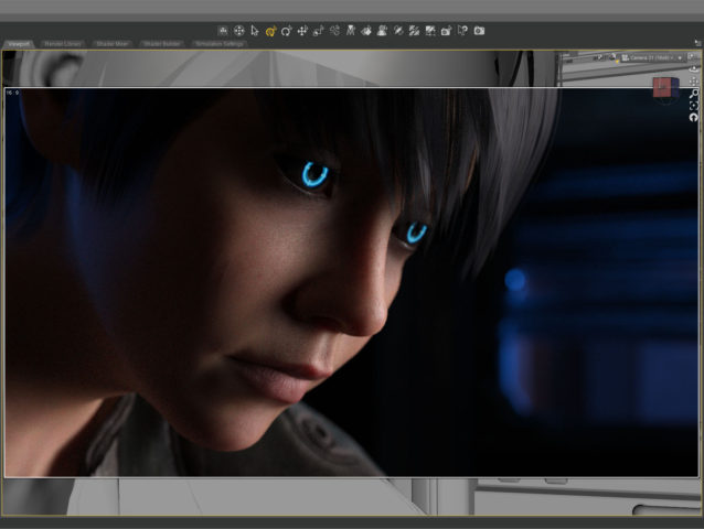
This screenshot shows how the initial render looked before color correction. It’s quite dark which means it takes longer to render but I liked the quality of light so I went for it.  It took about five and a half hours to render the final file at 10800 x 6075.    I stopped it at 4277 samples and 92 percent convergence even though my minimum is usually 95 percent and/or 5000 samples.  It didn’t look like baking it any more would make a difference.
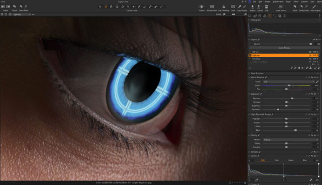
The whites of the eyes ended up quite dark in the render so I brightened them up in post.  The eyes are a really old product and I don’t think I updated the reflectivity on the sclera quite right to render properly in iray.
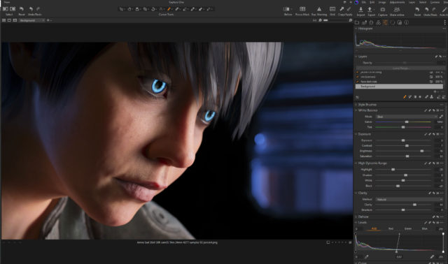
I also pulled the background completely black because I thought the muddy dark shapes distracted from the face.

This is the part of the post that I feel I really should evaluate the final result… then I decide not to say anything because I can only see the mistakes.  After a few months not looking at it, I’m sure I’ll be able to figure out if I love it or hate it, but not now…

Created in DAZ Studio 4.21
Rendered with Iray
Color Correction in Capture One
Successful Power Up

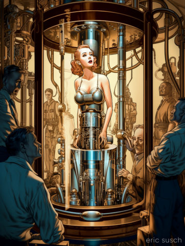
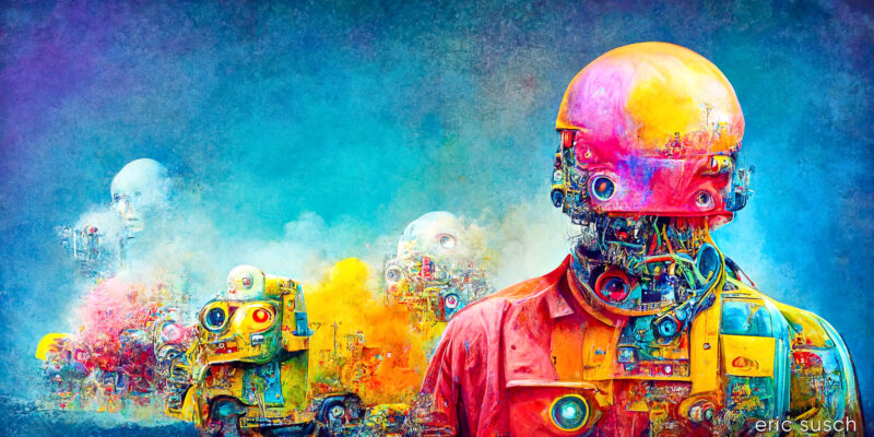
I wasn’t trying to make comic book art but that’s what the AI gave me.  This is one of the problems with AI art right now, so much of it is arbitrary.  You can get something pretty good but if you want any sort of control, it’s a roll of the dice.  Roll that dice a lot and you may get close.  This subject of this image is close to what I wanted but the style is not.  Here’s the exact prompt:

Massive machines build a beautiful metallic woman robot in a glass tube with men around controlling the machines, In the style of a 1930s SciFi pulp magazine cover, hyper detailed

It took over a hundred tries to get something close and then I did twenty more variations of this image which all came out essentially the same.  I just picked the best variation and here it is…

#Art I made with #Midjourney #AI

Red Ring

The vision in my head:

An intensely bright thin red ring light in the distance, a woman robot in silhouette, on an abstract shiny metal plate surface, hyper realistic, cinematic, dense atmosphere

To manifest that vision I created a floor plane with a metal shader and another black plane as the backdrop.  A simple torus primitive served as the red ring light.

I wanted the red ring to frame the figure and at first I tried placing it way in the distance, but I found that it dipped below the floor plane and I wanted to see the full ring.  Moving it closer and scaling it down created the same composition with the added bonus of shining a strong rim light onto the robot figure.

The shapes in the background are part of an abstract model that actually goes all the way around the landscape.  I found a part I liked and buried it in the fog to create a little texture in the background.

I spent quite some time adjusting the surfaces on the floor and the robot.  The entire scene is lit by the red ring.  The only other light is in the eyes.  The color and reflectivity of the surfaces really determined the quality of the image.  I wanted the floor to be shiny and reflective but not blown out.  I also wanted the robot to be in shadow.  A chrome or white surface didn’t work so the robot is actually shiny metallic dark grey and black.

Ultimately the original render was quite dark.  I felt the quality of the light was more important than the brightness.  I could always brighten it up later.

It took about seven and a half hours to render because of the fog and the dim light.  (Bright light renders a lot faster in Iray.)  I also rendered it at 14400 x 7200 so I could print it four feet wide and hang it on the wall if I really wanted to.  I’m crazy that way…

This screenshot shows the brightness of the original render just as it finished baking for seven hours.

When color correcting I brought the brightness up quite a bit while trying to maintain the quality of the light. The problem was all the detail was in the red channel since all the light was pure red.  This left even a brightened image still dark.  This is all the brightness I could get out of the original color correction:

Later I went back and tried a few other things to brighten it up more.  I figured if I could get the ring to blow out (overexpose) and become white It would still look OK and be much brighter.  My color correction software, Capture One, is quite good and of course that means it doesn’t clip the high end even if you push it quite far.  I tried all sorts of crazy things, experimenting, just to see what the software could do.

When I was screwing around with a black and white version I hit upon something…

I found that if I messed with the top end of the LUMA channel on the CURVES tool and the top end of the RGB channel on the LEVELS tool they interacted and did exactly what I wanted, blowing out the top of the red channel.  (The LUMA channel in the Curves tool somehow only adjusts contrast without changing saturation.  It’s not the same as adjusting the full RGB.)

You can see the way I set both tools at the bottom of this screenshot:

This brightened up the entire image quite a bit and It’s how I created the final color correction.

Created in DAZ Studio 4.21
Rendered with Iray
Color Correction in Capture One