 A friend of mine asked if I could “
She loved it and is printing it out and framing it! Next time I guess I should ask for money. ;-/
#Art I made with #Midjourney #AI
A friend of mine asked if I could “
She loved it and is printing it out and framing it! Next time I guess I should ask for money. ;-/
#Art I made with #Midjourney #AI

The exaggerated shallow depth of field is a bit much for me but damn, the AI constructed all this from just these words:
The future, the past, old friends long gone, cinematic, 8K, hyper detailed –ar 2:1
#Art I made with #Midjourney #AI
 Trying something more colorful this time on Midjourney. I type this:
modern city of the future, robots walking the street, clean, colorful, cinematic, atmosphere, beautiful –ar 2:1
Amazing. This is going to change everything in the art world.
#Art I made with #Midjourney #AI
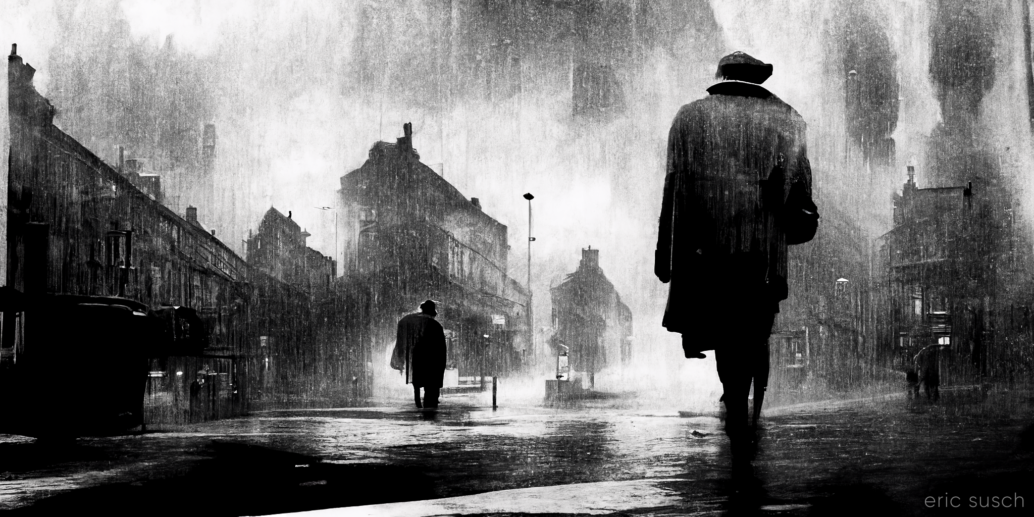
I started a free trial at Midjourney.com and I’m blown away. This is only my second attempt. I typed in: wet city street, moody, film noir, black and white, cinematic, atmospheric, a mysterious man –ar 2:1. This is one of the four results. These new AI art systems are unbelievable.
#Art I made with #Midjourney #AI
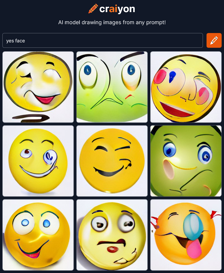
I’m continuing to check out art created by artificial intelligence at craiyon.com. You type in some words and the AI creates nine pictures from the prompt.
Yesterday I was trying to see if the AI could capture emotion on a face. It took some iterations but the answer? YES. A big yes. The final few renders were amazing. Here’s an example that I didn’t post yesterday:
 To get a good result the AI needed lots of very specific text telling it what to do and lots of trial and error to find the right words. The AI needed to understand the meaning and context of the words correctly. When it didn’t things fell apart and became superficial and symbolic, like bland clip-art.
But what if I started from scratch and gave the AI as little direction as possible? Where would it go? Will anything dramatic come out?
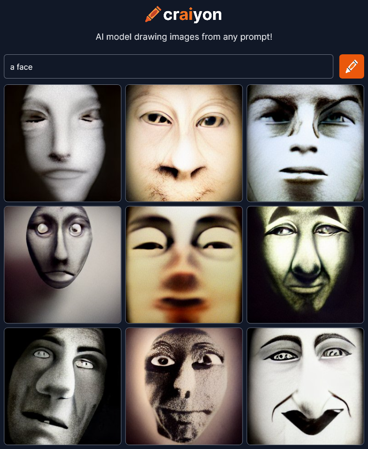
Lets begin with one word:
 OK, not bad. Since I’m giving as little direction as possible, I’ll do two renders of every prompt just to see more variation.
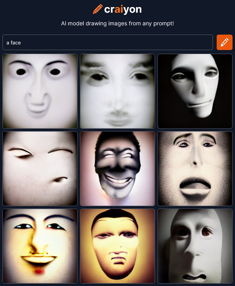
 There’s some drawing style in this second one but essentially the same theme.
 Things are already getting super cool and abstract. Let’s keep going…
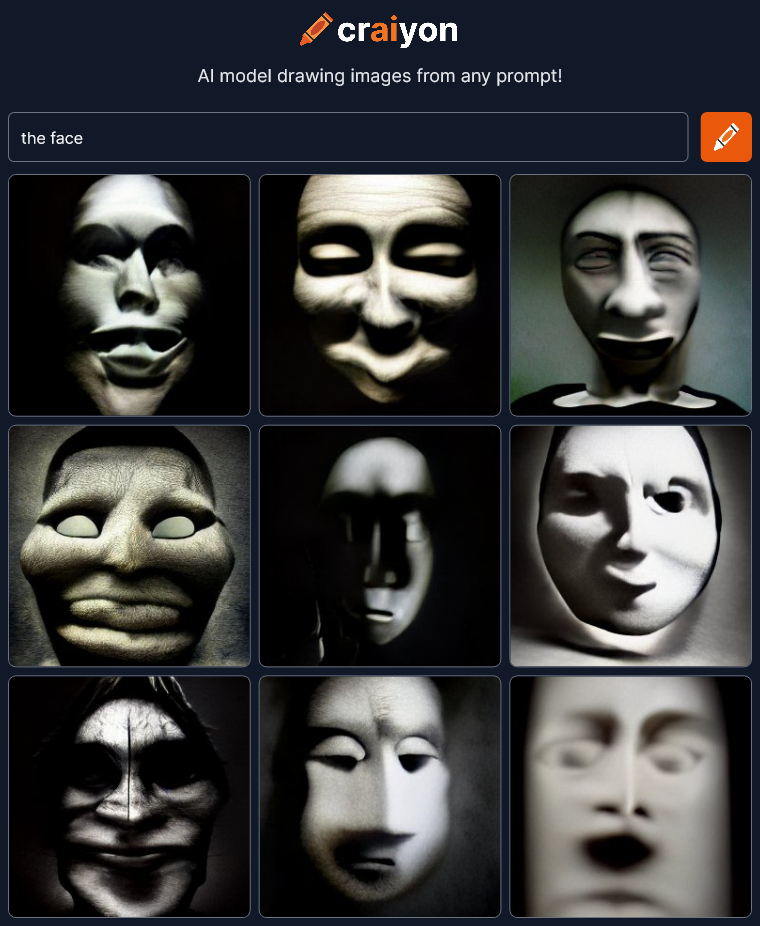
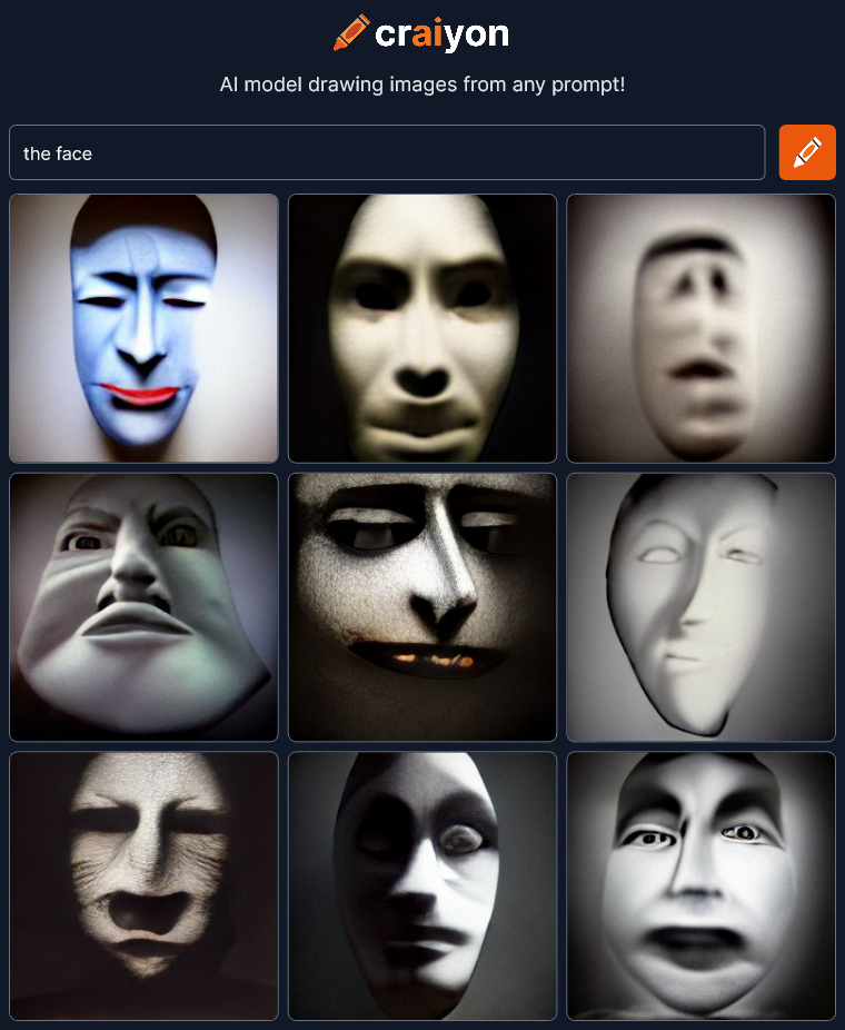 Changing the article seems to change the style. There’s an interesting lack of color in most of the pictures. I also get an old silent motion picture vibe… maybe even some German Expressionism.
These are all wonderfully artistic with deep expression and dramatic lighting. They are way, way beyond the bland images I was expecting.
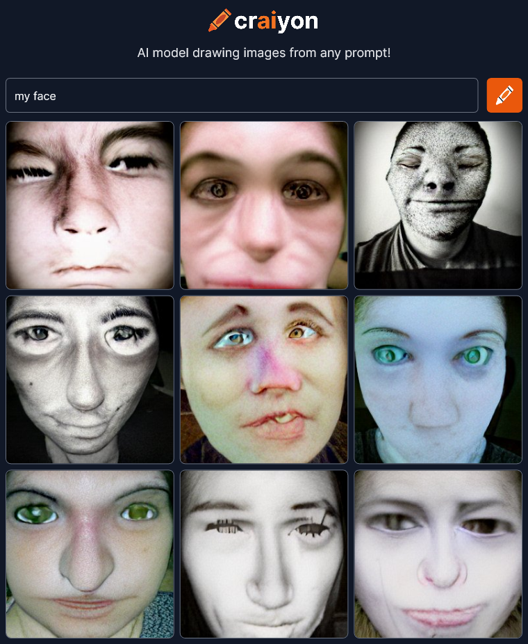
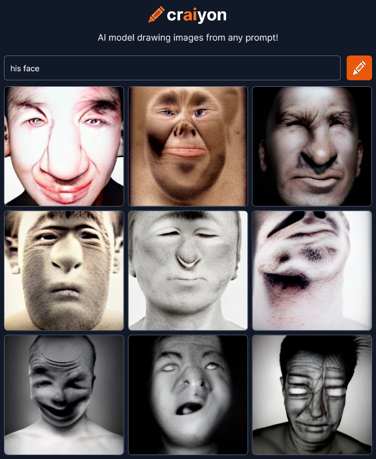
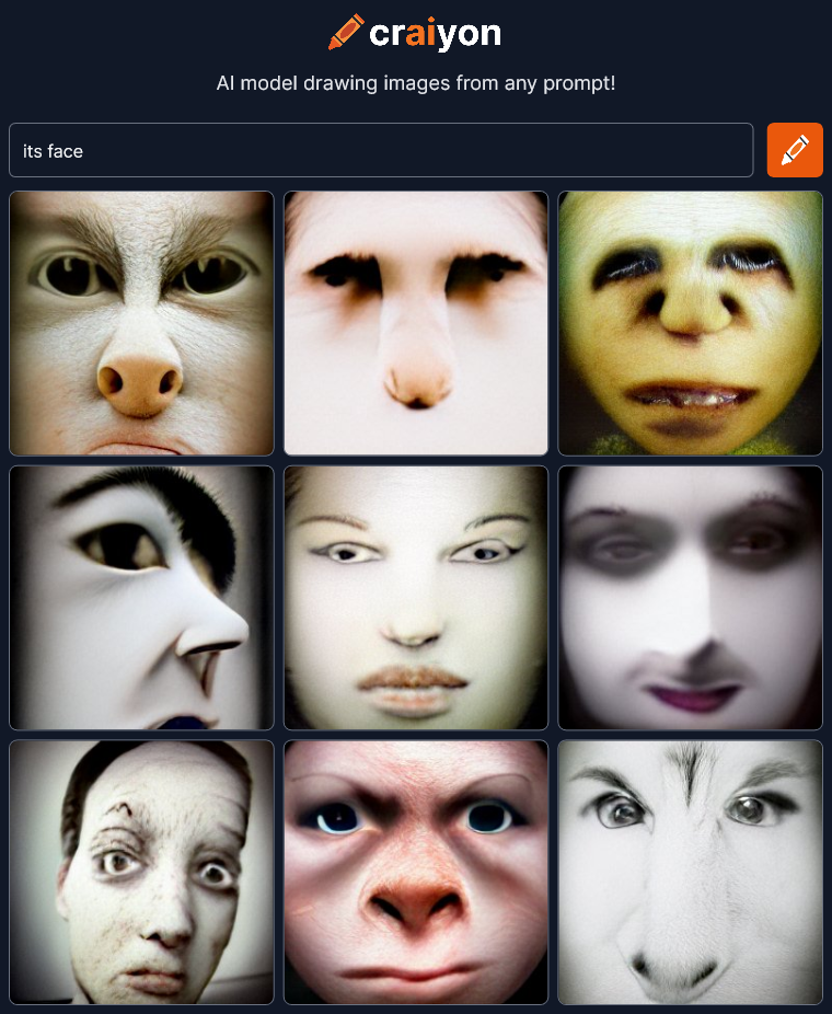
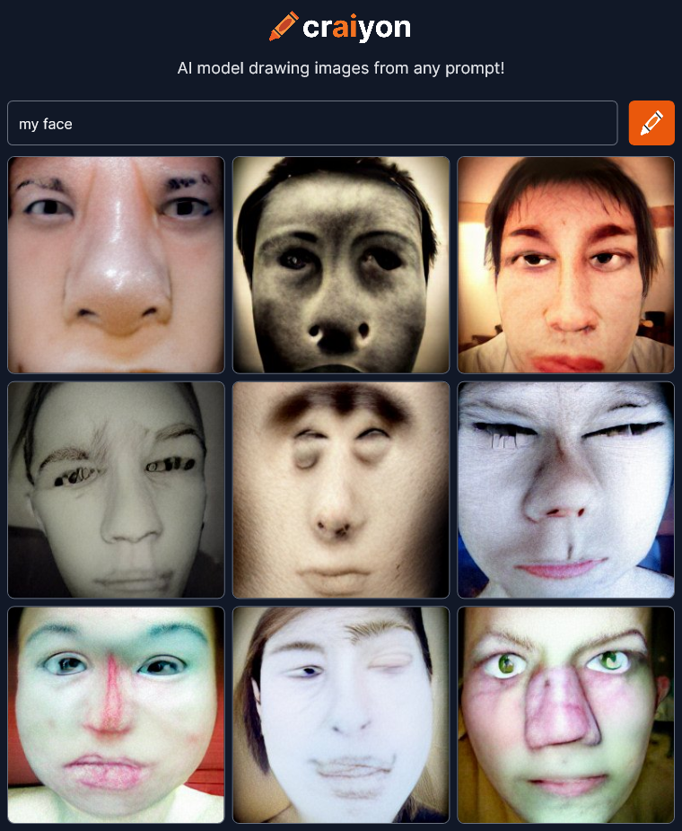 That changed the style quite a bit probably because the craiyon AI is now referencing all the selfie avatars of the world. That large pictorial reference contaminates this minimalist experiment a bit I think. And what’s up with all the messed up noses? Anyway, continuing on…

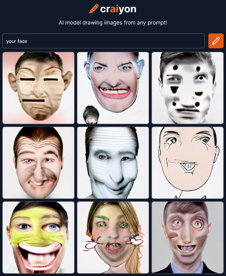 The thing I find interesting here is that “my face” really injected a sense of photo realism because of the selfie avatars but “your face” leans more toward cartoon drawings.
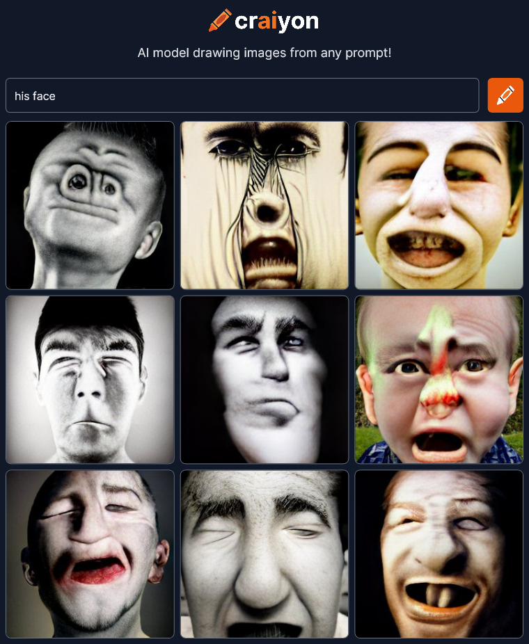
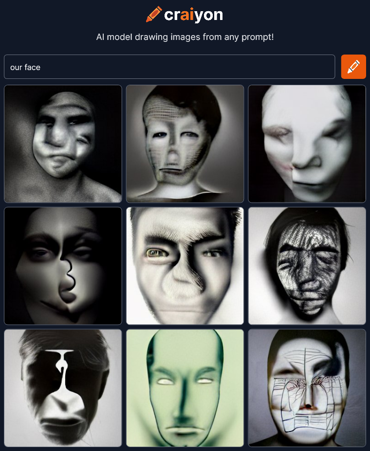
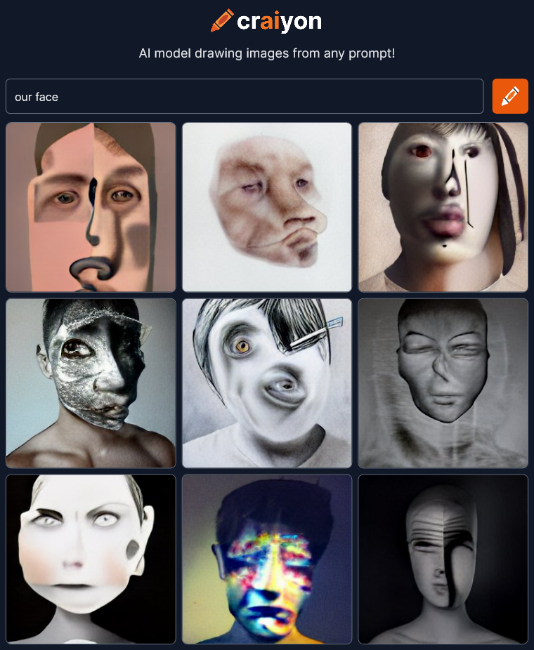
 Not sure what to think here. The middle bottom of the first render is really creepy with what looks like a two fingered hand.
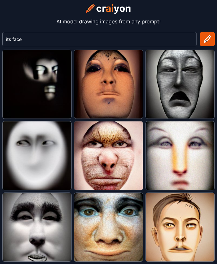
 This is getting very strange. Do I see monkeys in some of these?
 Definitely seeing monkeys again.
 These are wonderful. Boy, if you ever need a creepy avatar for something, craiyon is the place to go.
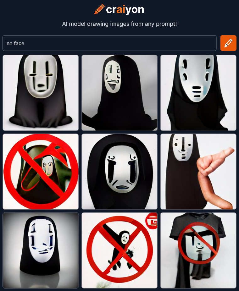 Uh oh… There’s a relatively well known character called “no face” in the animated film Spirited Away. Craiyon has choked and reverted to referencing character images as well as using symbols for concepts like the red circle with a line for “no.” It’s also bringing in a t-shirt again presumably because somewhere the no face character is for sale on t-shirts. This is definitely a fail for the AI. I should go back to something that worked, but first I absolutely must try the opposite of this prompt…
 Oh no! Emojis! The ultimate symbol for emotions. Super FAIL! OK fun’s over. Time to get back to the good stuff. Lets go back to something that looked artistic and dramatic…
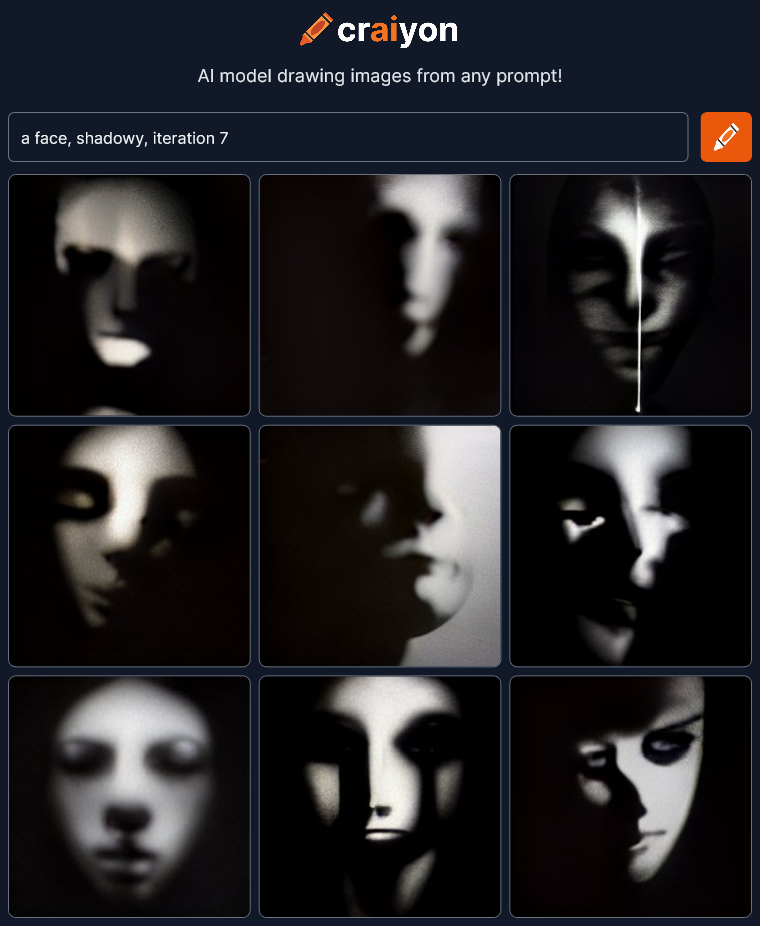
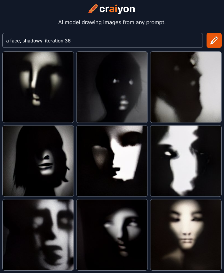
 I see people specifying different “Iterations” on Craiyon. Not sure what it does but I’m going to try it.
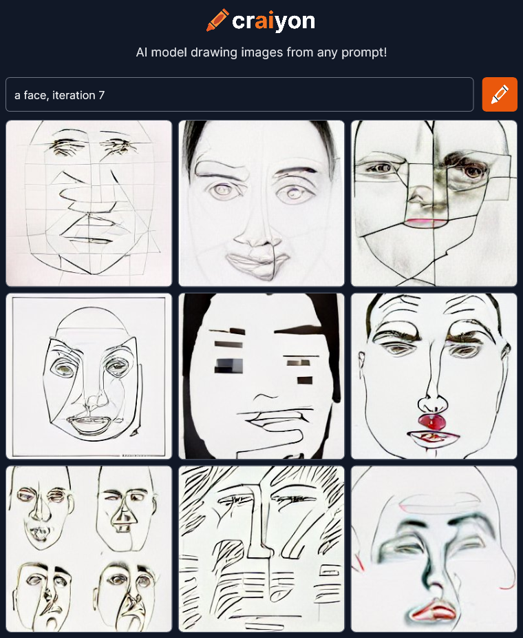 Hmmm… Flat abstract line drawings. Let’s try a few more…
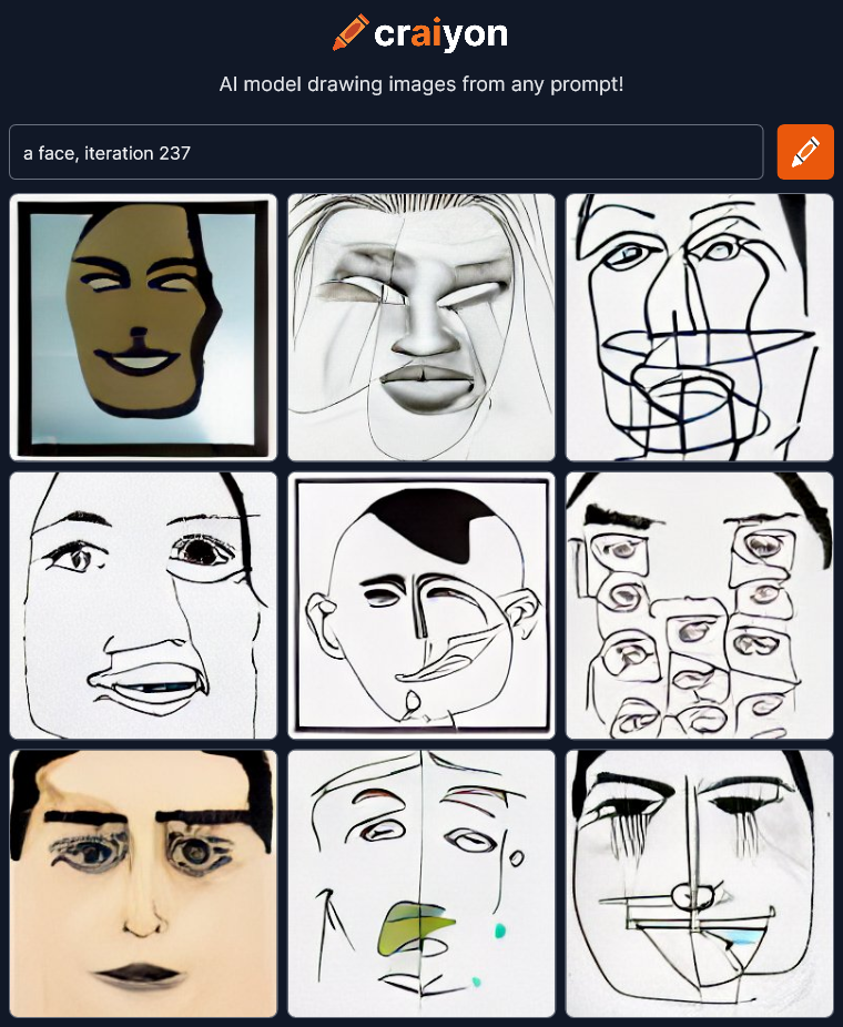
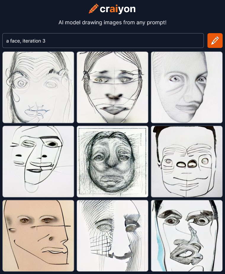
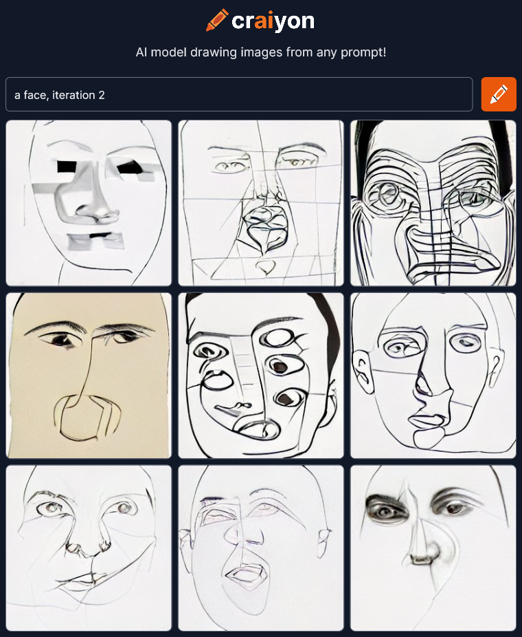 I’m not sure why all these are line drawings now. I’ll have to read up on what “iterations” do. Maybe I should try something more descriptive to add, like trying to make it a pencil sketch.
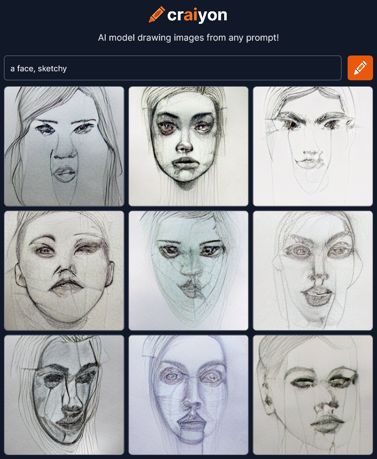 Not bad. The single word “sketchy” could be taken several ways, but it understood what I meant. Not a bad sketch top middle either, for an AI that usually makes horrible faces. What other description can we try?
 WOW!!! I need to try a few more of these!
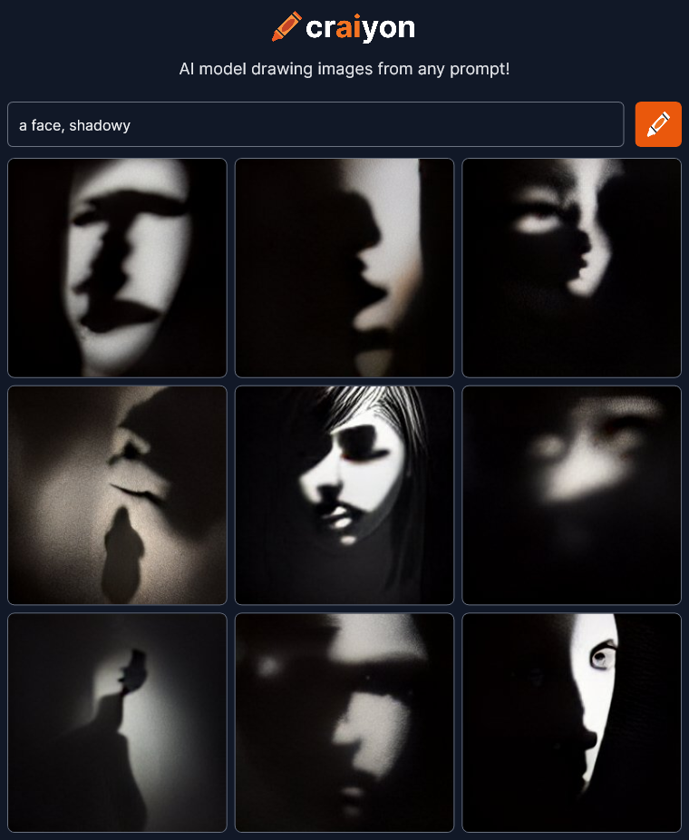
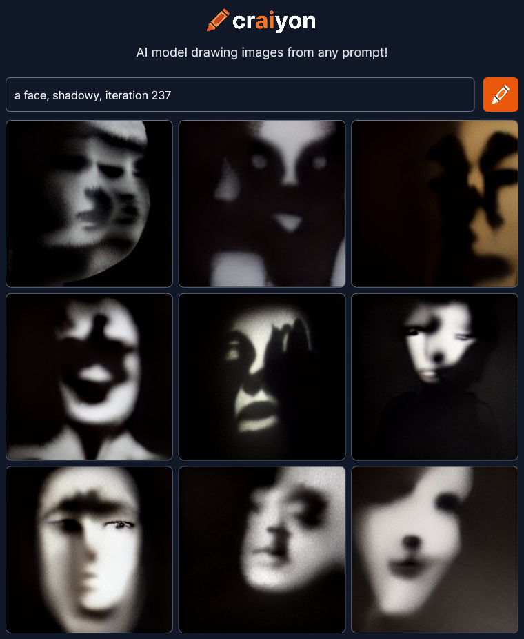 Amazing! Dramatic! Haunting! I could play with this all day!
Check out Craiyon for yourself at craiyon.com.
I’m continuing to check out art created by artificial intelligence at craiyon.com. You type in some words and the AI creates nine pictures from the prompt.
Yesterday on my first go I was just trying to see what the AI could do. What were the edges of it’s ability? Could it create anything really interesting? Answer: yes.
Today I’m going to try to get it to draw interesting and expressive faces. How dramatic can we make them? Here’s my first try:
 Wow, not bad. I’ve heard that Craiyon has difficulty with faces and they certainly are warped, but I like that. It makes them more dramatic and artistic. If these images were more realistic, like photographs, I don’t think they would be as interesting.
Let’s try some variations:
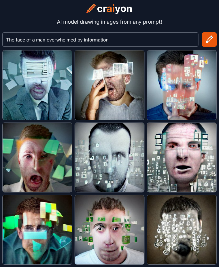 OK, not as good, but not bad. The “information” is kinda flat and covering too much of the face to see the emotion.
Next…
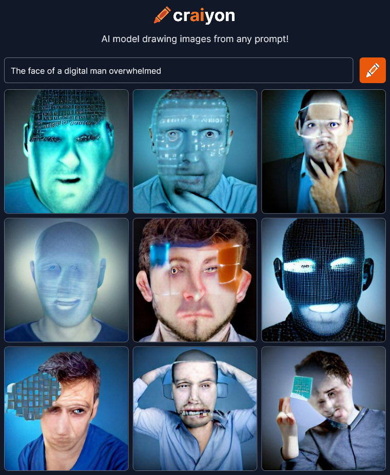 I was trying to get some sort of synthetic man under stress but ended up with heads with data projected on them.
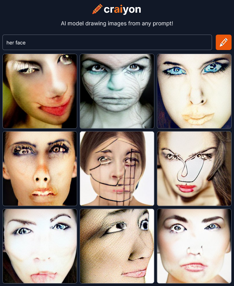
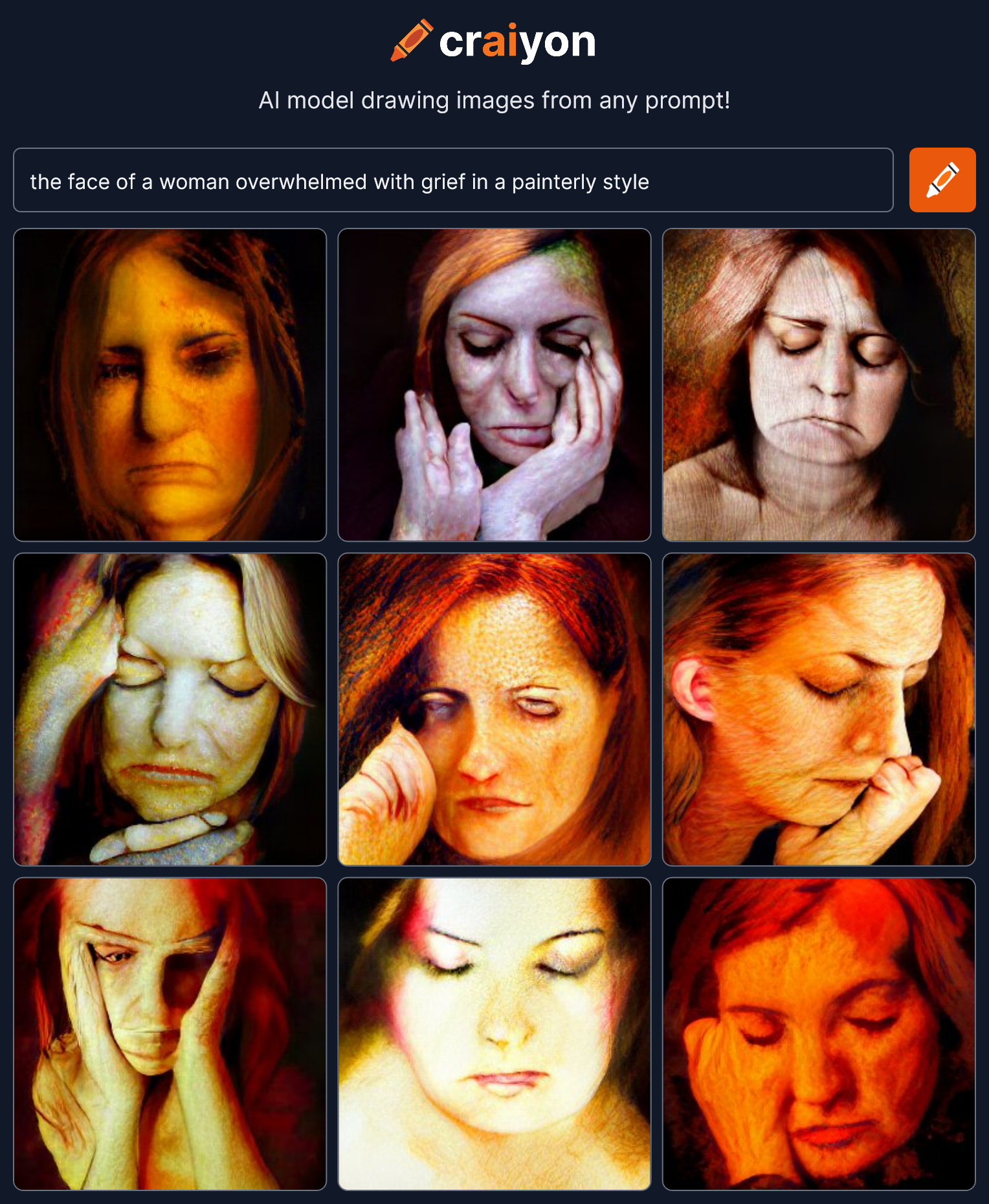
Let’s try some women.
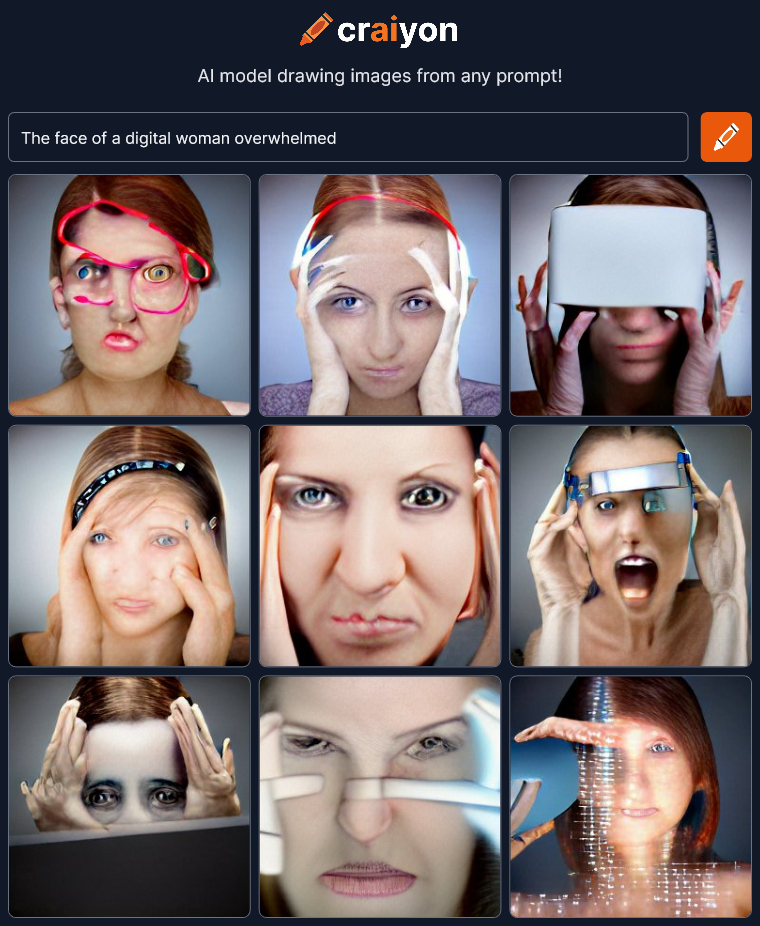 Hmmm… That’s a little more interesting. Not sure what the red line at the top left is but there’s more emotion in these faces. I think changing the gender made a difference.
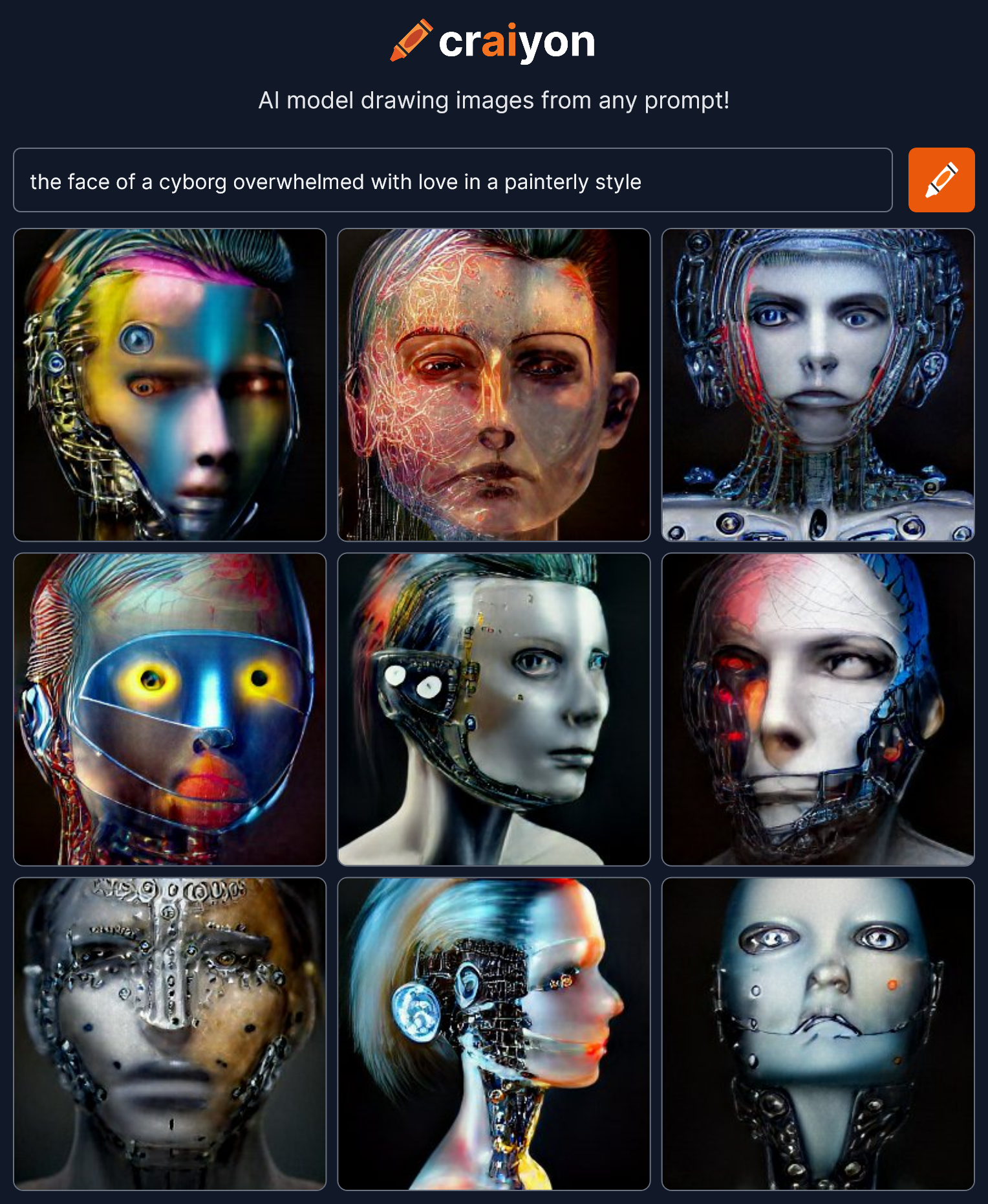
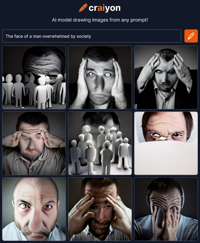
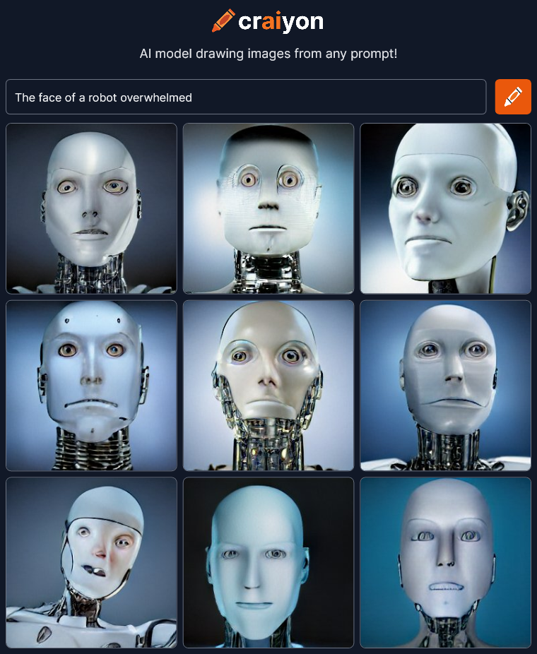
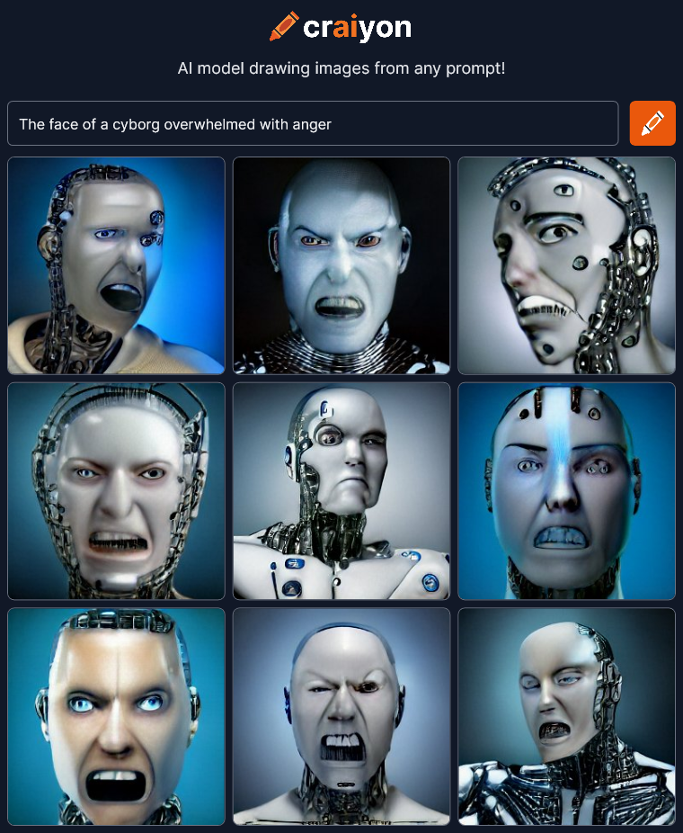
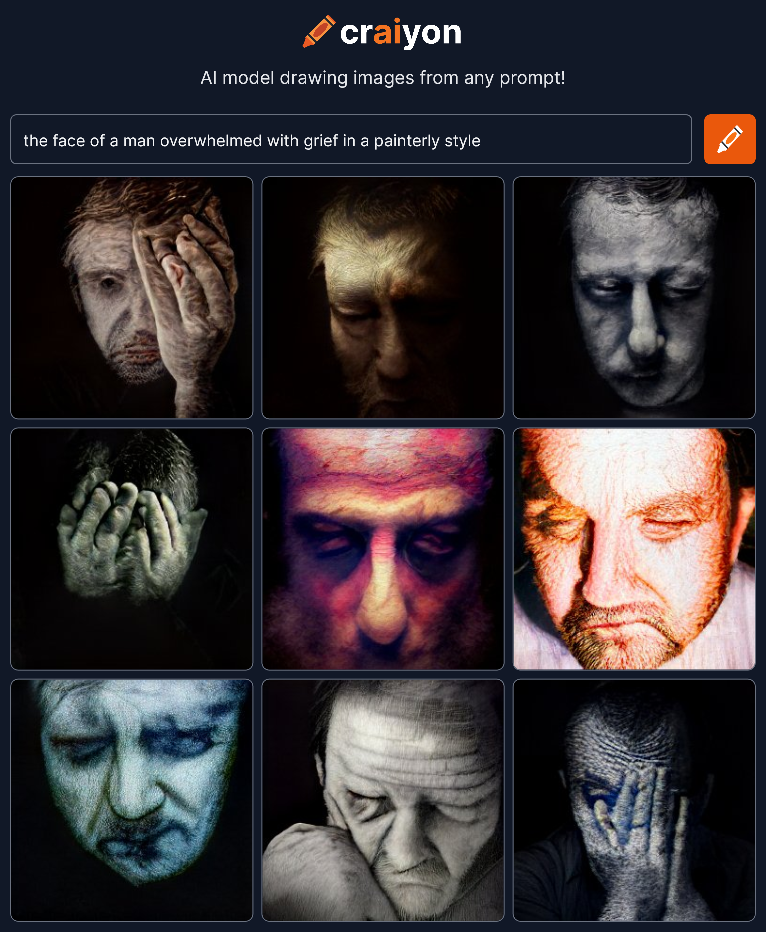
Who else can be overwhelmed?
 I’m liking this! What else can we try?
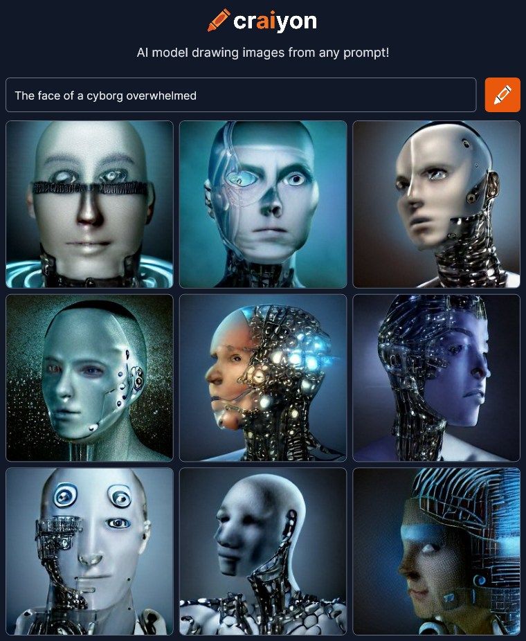
 Eh… It’s that cliched white plastic robot face. We lost almost all the emotion and it’s all the same bland generic robot. Except it’s not just a robot. It’s an ANDROID.
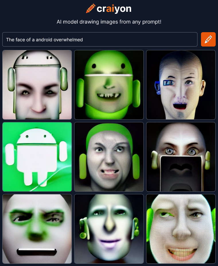 Oh no! Our corporate overlords are invading our art! Words change meaning over time. Context matters. Android isn’t a robot designed to emulate a human anymore. It’s a cartoon corporate mascot for a phone operating system! We’re way off track…
Tell the AI what to do!
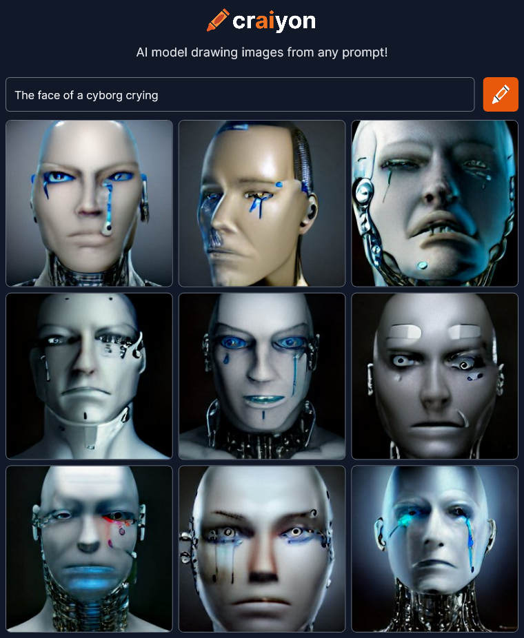 I love this thing! I could sit here all day typing variations!
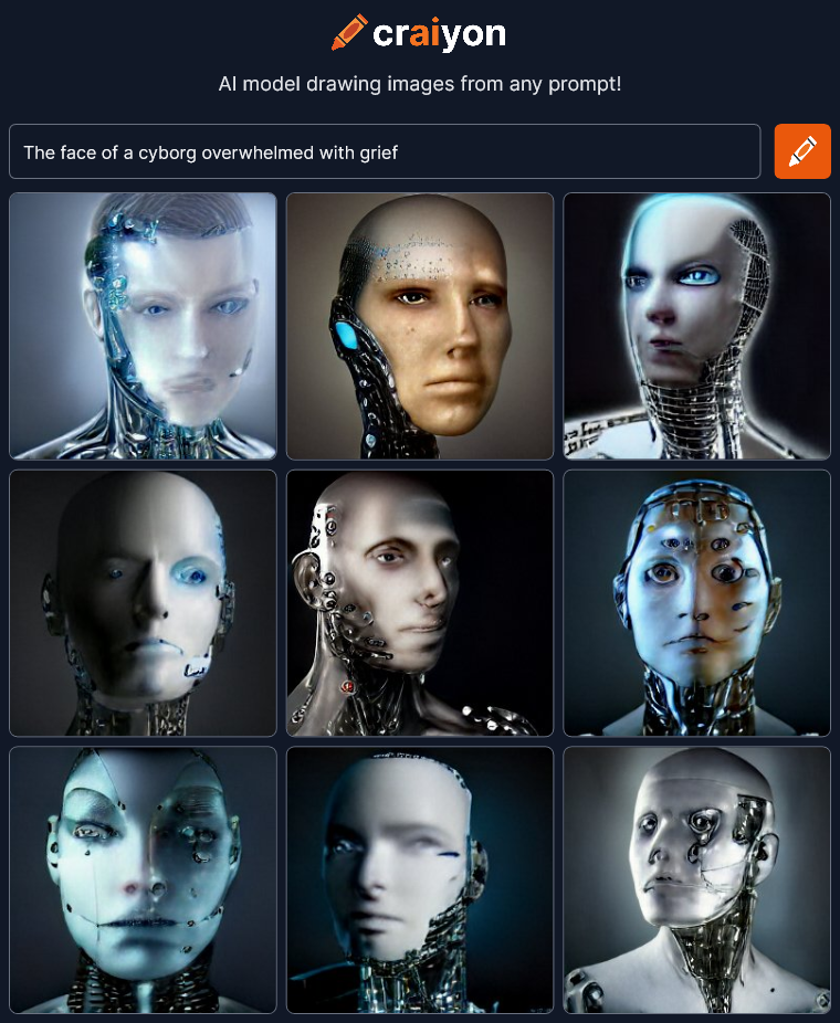 I’m surprised that this “grief” render doesn’t have any crying. …well, maybe the bottom right.
 No subtlety there…
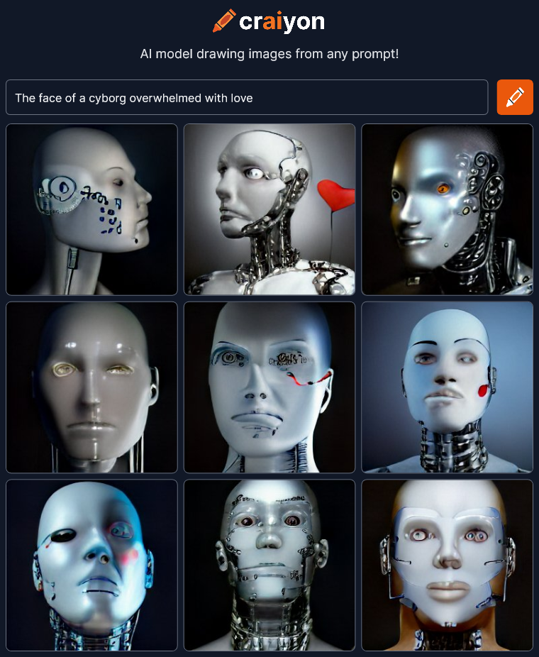 The heart – symbol of love.
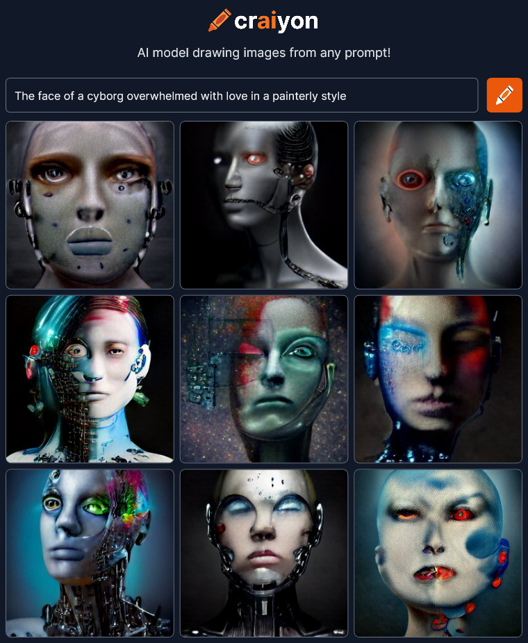 Now we’re talking! Let’s try this “painterly style” with other things.
 Amazing…
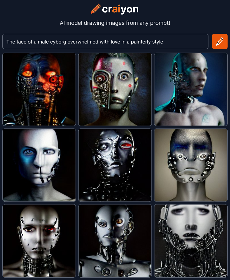
 😯 There are no words…
 The answer is… Yes. Artificial intelligence can draw emotion in a face, you just have to find the right words to prompt it. It’s part the ability of the AI and part your direction. Iteration is the key. If you stumble across a corporate mascot, back up and try another path.
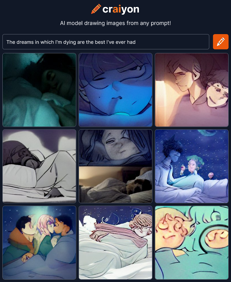
Next time I’m going to try to create interesting faces giving the craiyon AI as little information as possible.
I’m checking out art created by artificial intelligence at craiyon.com. You type in some words and the AI creates nine pictures from the prompt. My goal here is not to create great art but to see what the AI can do. What are the edges of it’s ability? Can it create anything really interesting?
Here’s the first thing I tried:
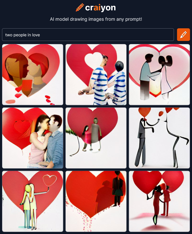 Interesting, but I was expecting more. There’s two figures in most of the images but the abstract concept of “love” is mostly expressed by red hearts. The AI is not showing “love” in the art it’s showing a symbol of love.
Maybe I’ve already found something it can’t do? Does it take abstract concepts like “love” and convert them to simple symbolic images? These look like bland lazy power point clip-art. Lets try some more:
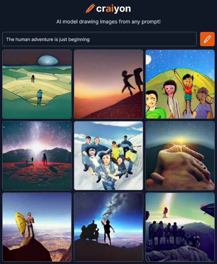 OK, that’s better. I can see “adventure” expressed in most of the images. It’s mostly outdoor mountain climbing but that’s better than just simple heart symbols.
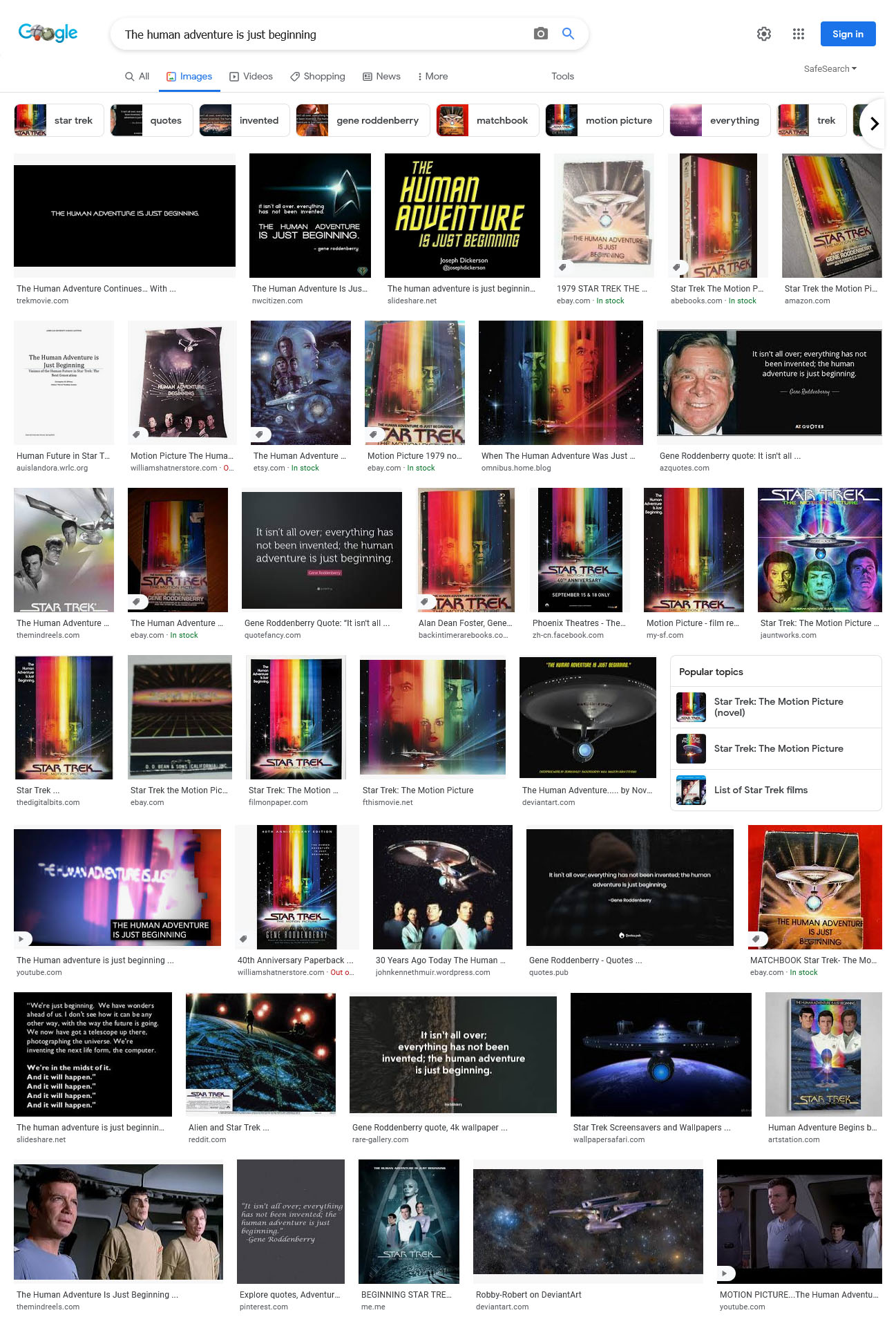
“The human adventure is just beginning” is the tagline to Star Trek – the Motion Picture, but I guess Craiyon didn’t get that at all. Searching on the same words in Google Images returns ONLY Star Trek pictures so this AI works very differently. It’s not just trolling the internet to find images that are related. There’s nothing in the Craion’s images to suggest Star Trek at all.
 OK, let’s try something REALLY abstract…
 OK, I don’t know what to make of this at all. It’s interesting which is good but I’m not sure where any of this is coming from. Maybe “people in the news”?
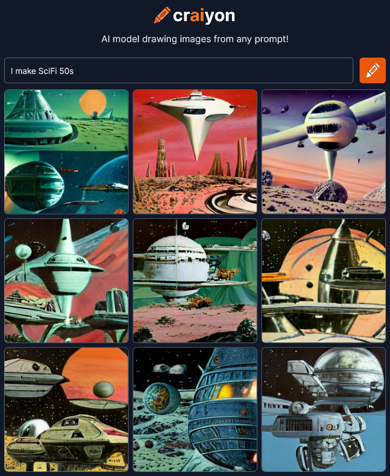
Let’s try something more direct.
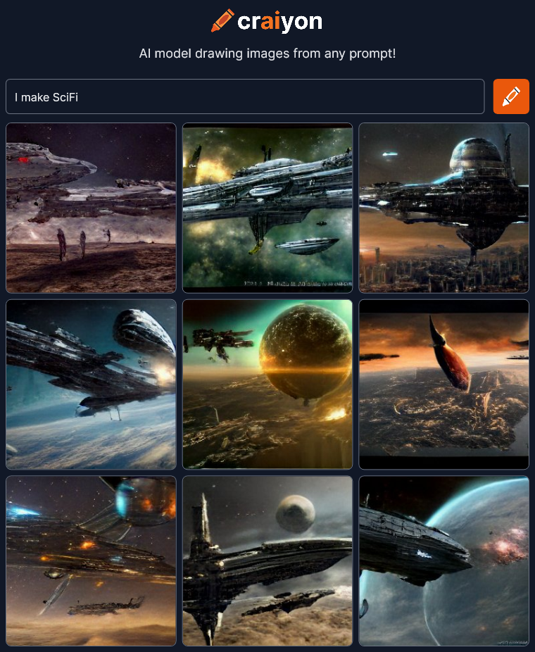 OK… Looks good but all the pictures have exactly the same style of SciFi even down to the spaceship designs. It’s that generic SciFi style you see everywhere especially in games these days. Maybe I should type out “science fiction” instead of using an abbreviation.
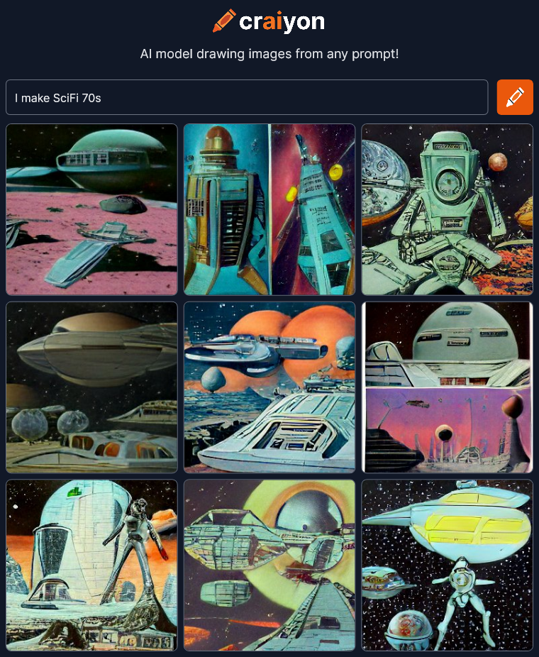
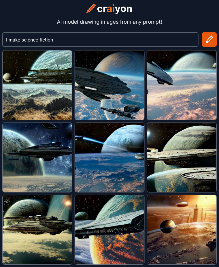 That’s pretty much exactly the same…
 OK, there’s a different style, though I’d say it’s a little more 70s than 50s.
 Hmmm… It’s not getting the style differences for the years. Maybe I should try robots?
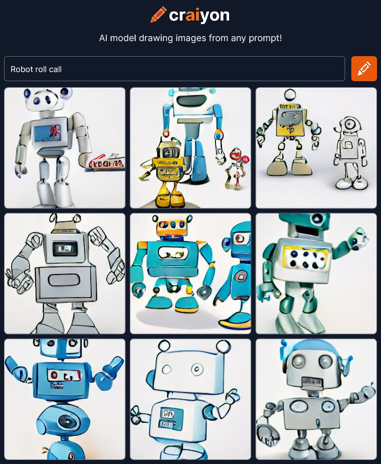 Now everything is a cartoon. I wonder how it determines the style if you aren’t specific about it. I’m going to just keep trying different stuff.
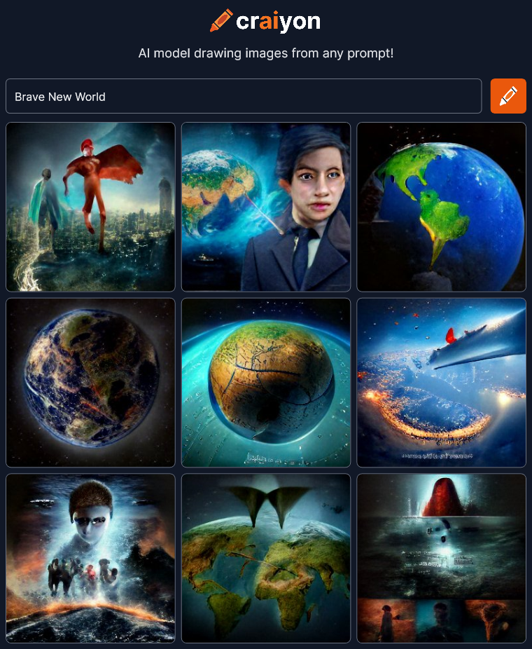 Wow! That’s interesting. There’s certainly some variety and emotion here. I guess you just have to hit on the right phrase for it to make a leap beyond the surface meaning of the words.
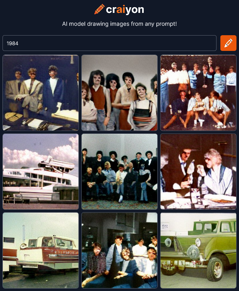
Well it didn’t get the reference to the novel by Orwell (I didn’t think it would) but I guess it DID understand the number was supposed to be a year. All the images seem to be from a mid-eighties time period, I think.
I wonder what would happen if I input some song lyrics?
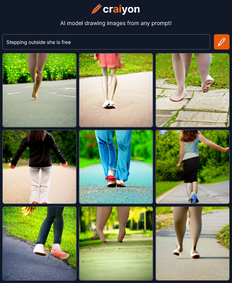 Well… Feet walking outside. These images didn’t pick up the poetry of the line at all.
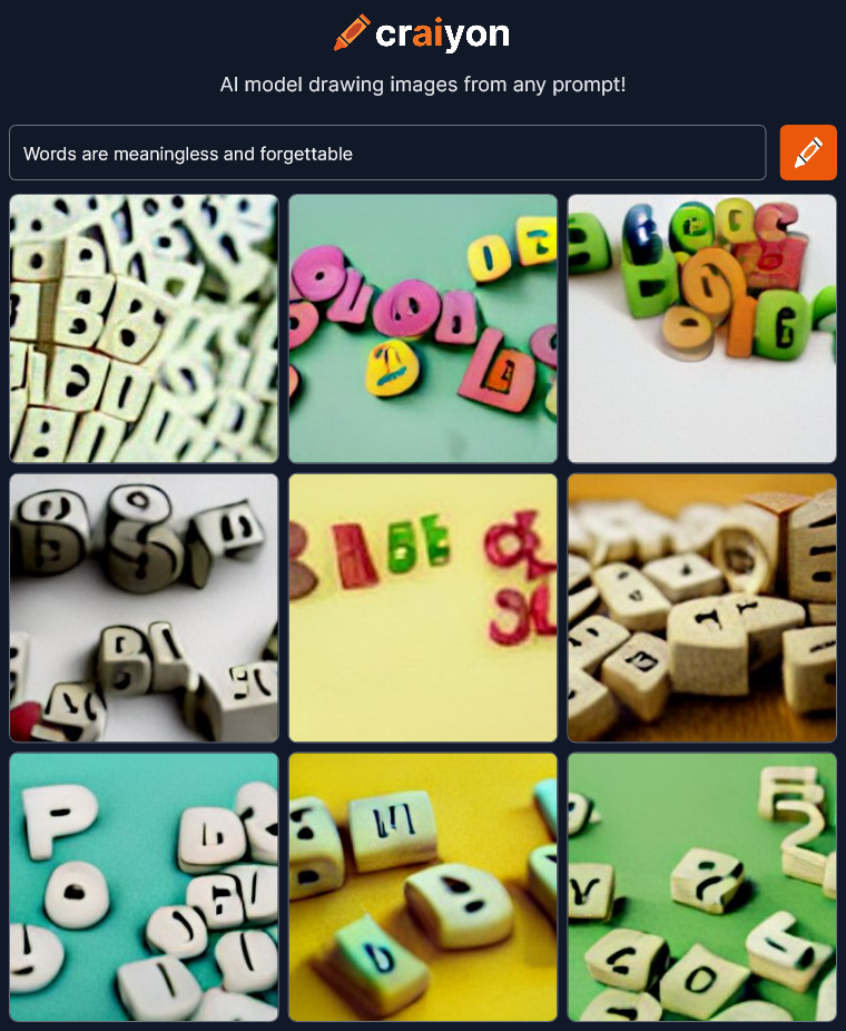 More symbols. “Words” = scrabble pieces. More clip-art for corporate power point presentations. The letters are unreadable but I don’t think that has anything to do with the phrase I typed in. I have heard that Craiyon has trouble with text.
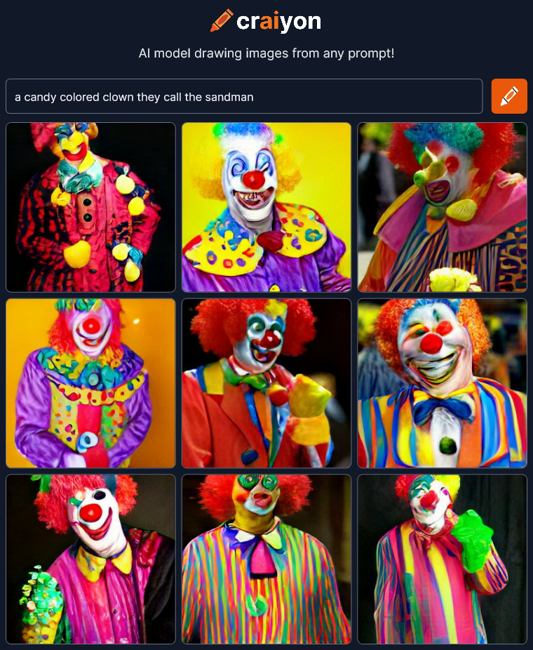 Woah! Yep, those are Candy Colored Clowns. The direct straightforward descriptions yield predictable results.
 Wow! That went somewhere interesting. I wasn’t expecting the drama in these images.
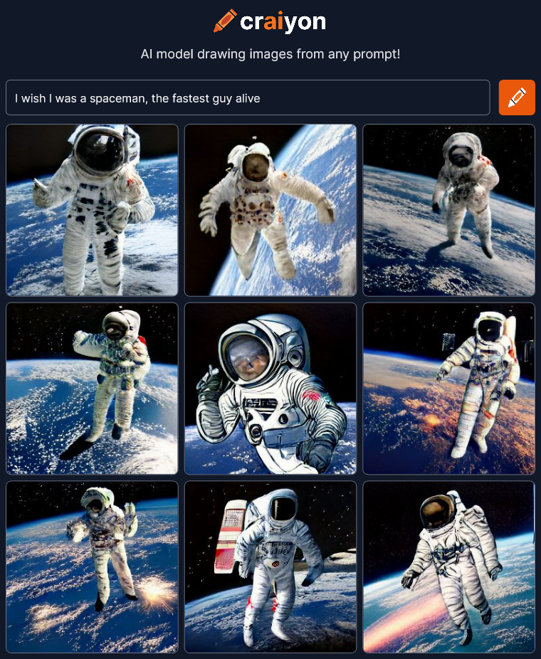 Oh well… Spaceman, that’s about it. I was at least expecting some of the images to reflect the speed aspect.
Expecting it to find the poetry of a phrase seems to be hit or miss. Maybe I should stop trying to throw it curve balls and be more descriptive and tell it specifically what I want.
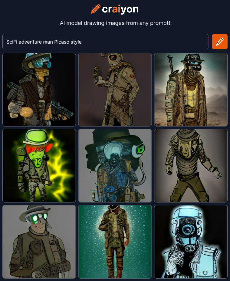 Hmmm… OK. Sure… It’s a SciFi adventure man if he’s in a post-apocalyptic world. Not sure if this really looks like Picasso though. Oh wait I mis-spelled Picasso….
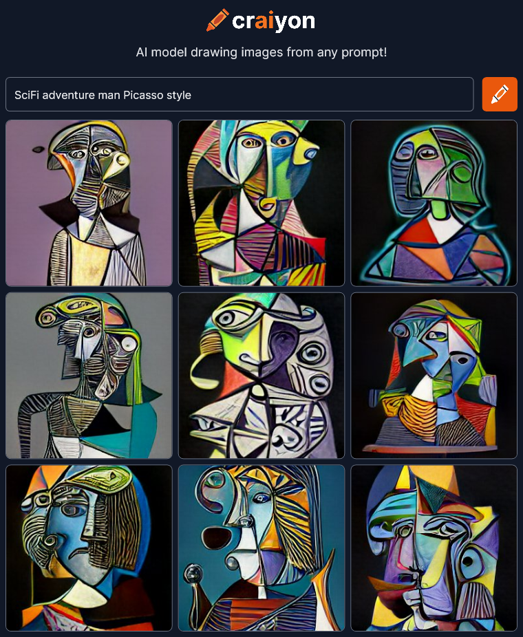 Woah! There’s Picasso! One letter off made a big difference! I think the SciFi got buried in the style though.
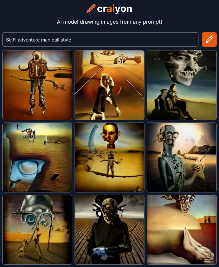 We’re making some art now! SciFi still means roaming the post apocalyptic desert apparently. Let’s try spelling out “science fiction” to see if it changes things.
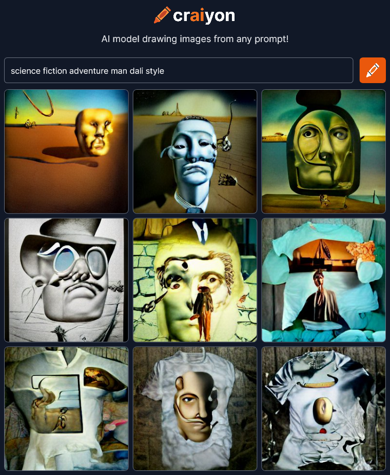 Eh… Not as interesting. And apparently t-shirts are part of it now presumably because you can buy Dali’s art on t-shirts somewhere on the internet.
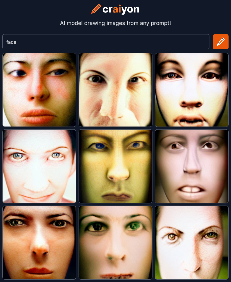
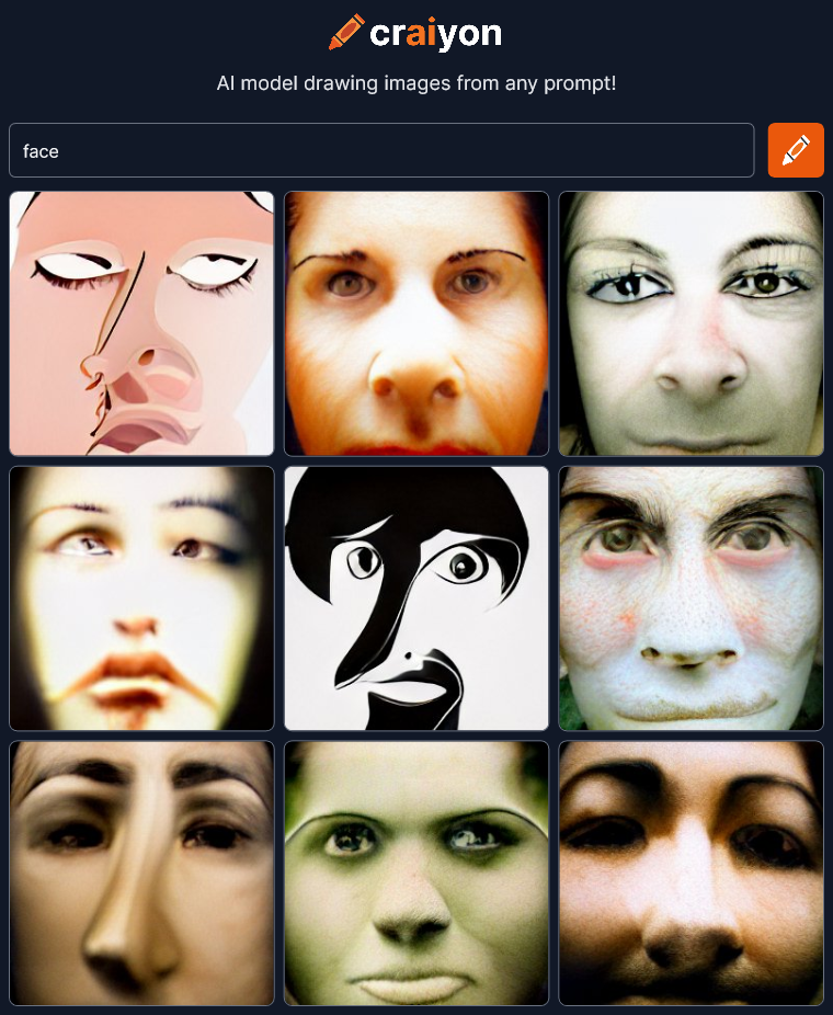
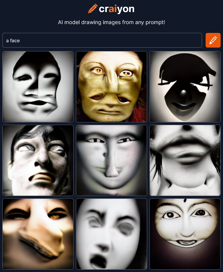
I’m going to try adding the word “face” to get a close-up of the man.
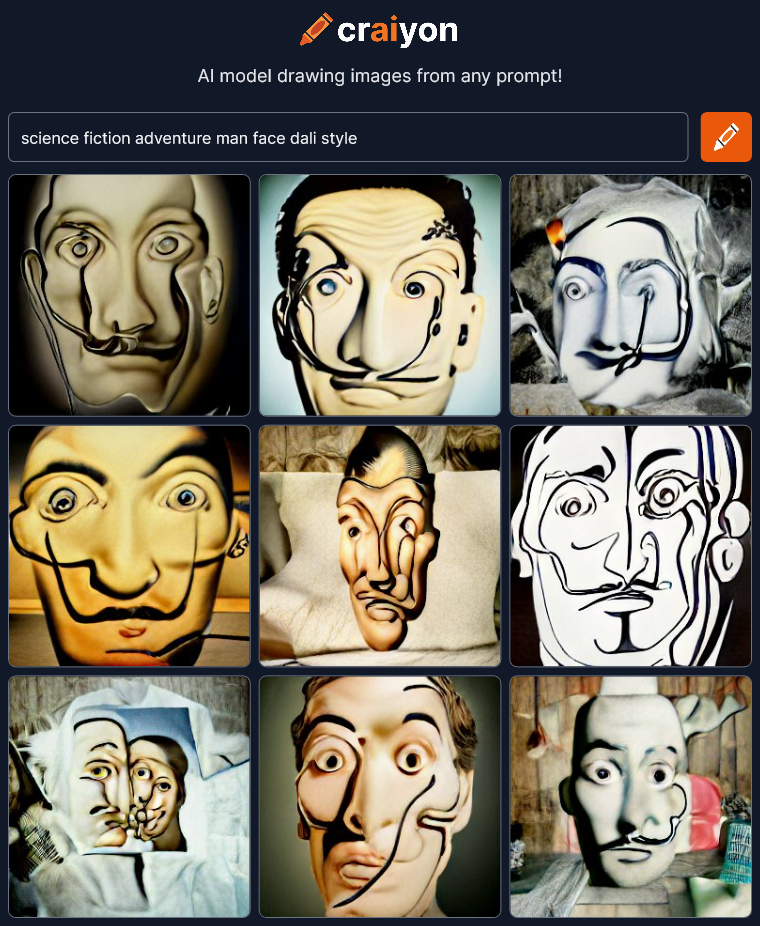 OK, Now we’re getting just Dali’s face with hints of t-shirts. Craiyon is getting off track. I’m going to try limiting everything to faces next to see what happens. I’ll leave that to the next post though because this is already getting way too long.
Craiyon seems much more primitive than other AI art projects I have seen (but not tried) like Dall-E 2 and Midjourney. Those others seem to be able to create images that are much more realistic like they were made by professional artists. I bet they’re much more controllable too. That’s great but maybe not quite as interesting to me as Craiyon’s screwed up faces and unexpected results. Realistic is good, but I think interesting is better.
I’m concerned that as AI drawing technology gets better and better, all AI art might become more bland and predictable, just like what’s happened to most of the art on sites like ArtStation. A group-think of what is good and professional develops in the community that is then picked up and exaggerated by an algorithm that brings all the “best” to the top. Pretty soon everything looks exactly the same. Everyone is seeing and creating the same thing.
This is a special moment in the nascent development of AI art creation and we should take the time to appreciate the crazy and unexpected images for what they are, ART.
Check it out Craiyon for yourself.
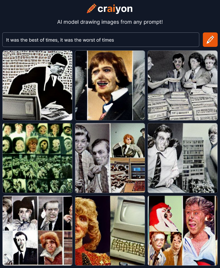
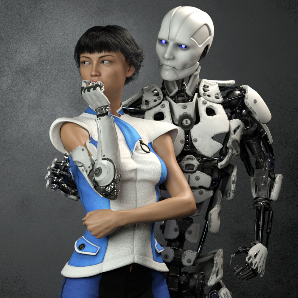
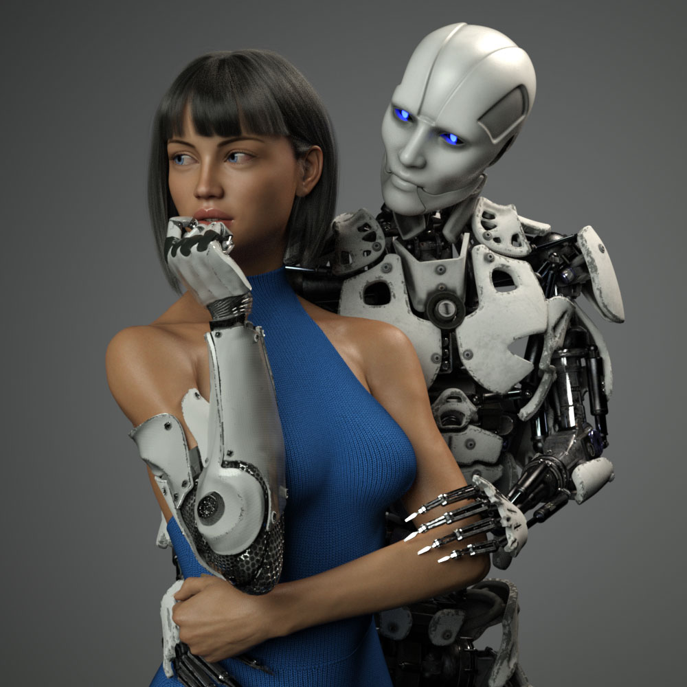
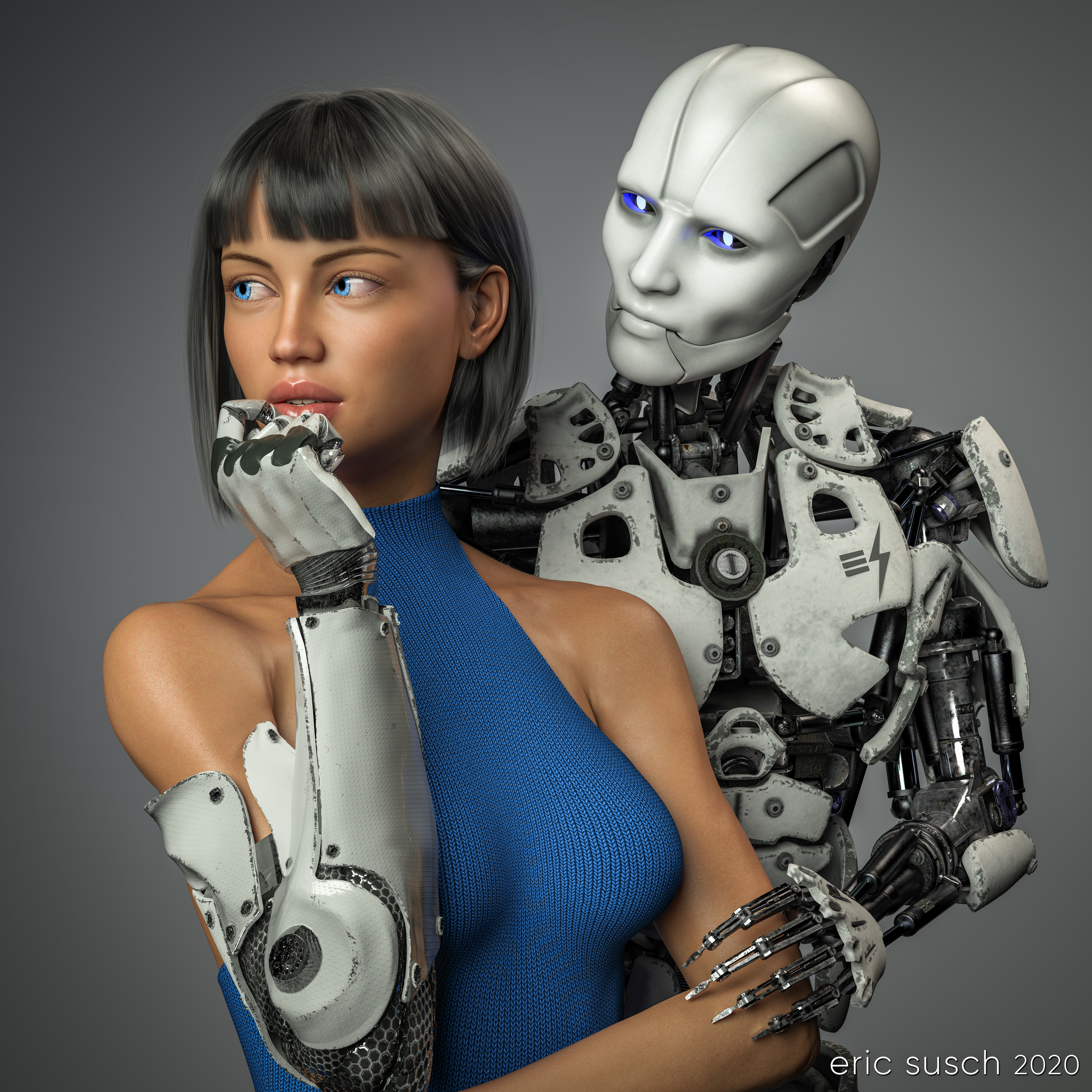 This piece was a marathon to create. A perpetual artistic labor. Unending. Frustrating. We had remodeled our kitchen and saved a space on the wall for an art piece, complete with it’s own special spotlight. The kitchen had taken over a year to complete and this art piece had to live up to that. It needed to be perfect. Constantly second guessing my creative choices, it took me a year to finish this, sometimes setting it aside, then diving back in to see if I could perfect it. Today I’m finally calling it done and I’m presenting it here hoping I haven’t completely strangled the emotional life out of it.
Some of the initial criteria: It was designed as a large piece, three feet square, so it needed to be extremely detailed. It had to match the modern aesthetic of our new kitchen. Colors needed to be white and gray with a blue accent. It needed to be bright, not the dark moody work I usually gravitate towards. I wanted two characters – an android and a cyborg – in love yet troubled, going through the same ups and downs we all do. …And it needed to be good. That was the most important criteria. It needed to be good.
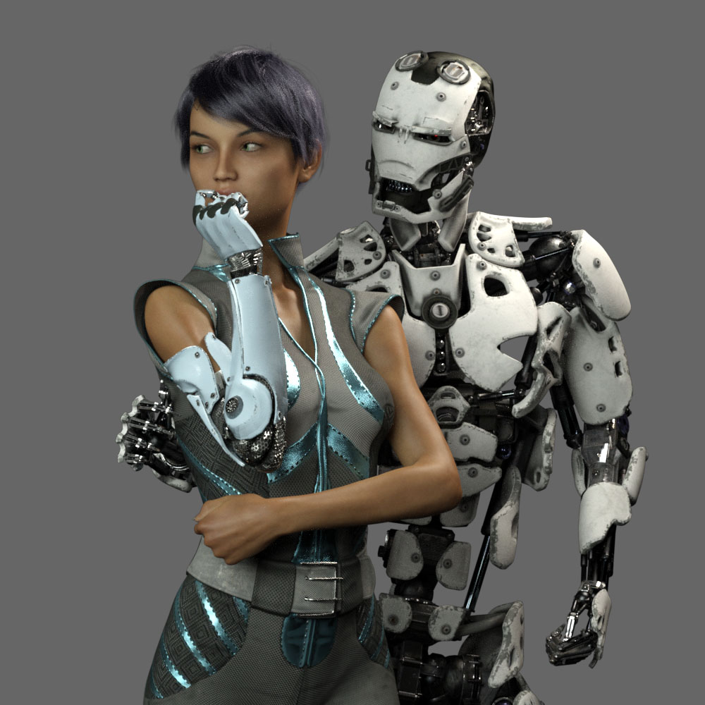 This is an in-progress test render from early on. As you can see the original composition was wider. The plan was to have the android’s right arm on her waist and she would be gently touching his metal fingers.
 What to wear and what hair? I obsessed over endless choices.
 I tried many skin textures for the girl. I wanted to get the softness just right so it would contrast nicely with the hard metal of the android.
 Maybe she should be an alien? Blue is the accent color so it makes sense. OK, maybe it’s too dark…
 Angry robot face changed to gentle face. I needed to get some humanity in this android.
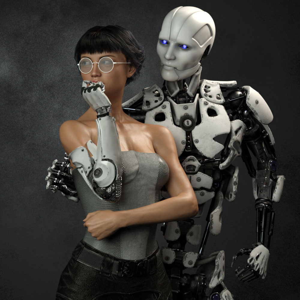 I eventually decided the girl needed bare shoulders to clearly see the cybernetic arm connection. I wanted it to be clear that she was human and only her arm was mechanical. This is also the reason I decided to ditch the idea of “space girl” type clothing which tends to be aggressive and hard. She needed to be soft, the soft spot between the hard metal of her arm and the android.
 I finally decided to go with this “cold shoulder” dress. When I was working to make it blue, I changed the original cloth to a knit fabric because my wife CAT is a knitter. That just made sense to me.
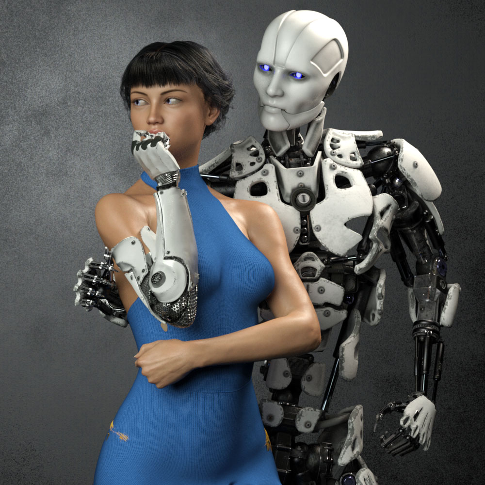
 Eventually I realized that I had set the camera too far away, and moved in closer. This always happens. It’s always better after I move in. It’s just part of my process I guess.
Adjusting for the new composition, I tried moving the robots right hand up to her shoulder. It ended up too creepy though. Trying to get the sharp metal fingers to show some sensitivity was proving difficult. It also fouled up the clean skin / machine connection I wanted for her cybernetic arm. I eventually moved the android’s right hand behind her back out of sight and concentrated on getting the left hand in the correct position. It took me three tries to get the left arm to look relaxed and gentle.
 I also spent a tremendous amount of time trying to get the android fingers positioned just right so that they didn’t look like they were gouging the girl’s arm, yet at the same time, catching the light in a nice way. Skin against machine was becoming a major theme apparently. Same with the cybernetic fingers and her lips. I actually moved the camera and lengthened the girl’s neck at one point so you could see more of her mouth.
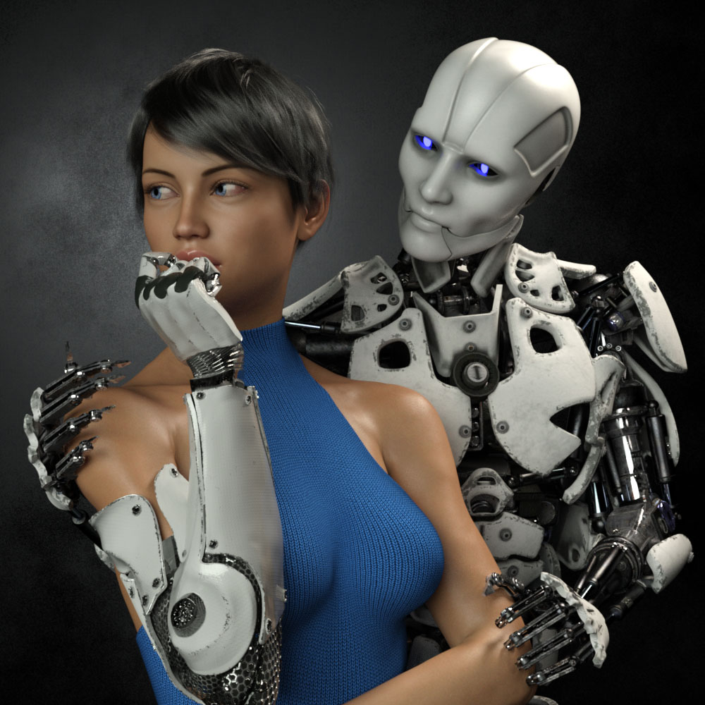
 Then, of course I second guessed myself and pulled the shot back to re-visit the original concept of the hand around the waist. Worked on that for awhile but thankfully came to my senses. Maybe I’ll revisit this wider shot if I do a different version with a vertical aspect ratio.
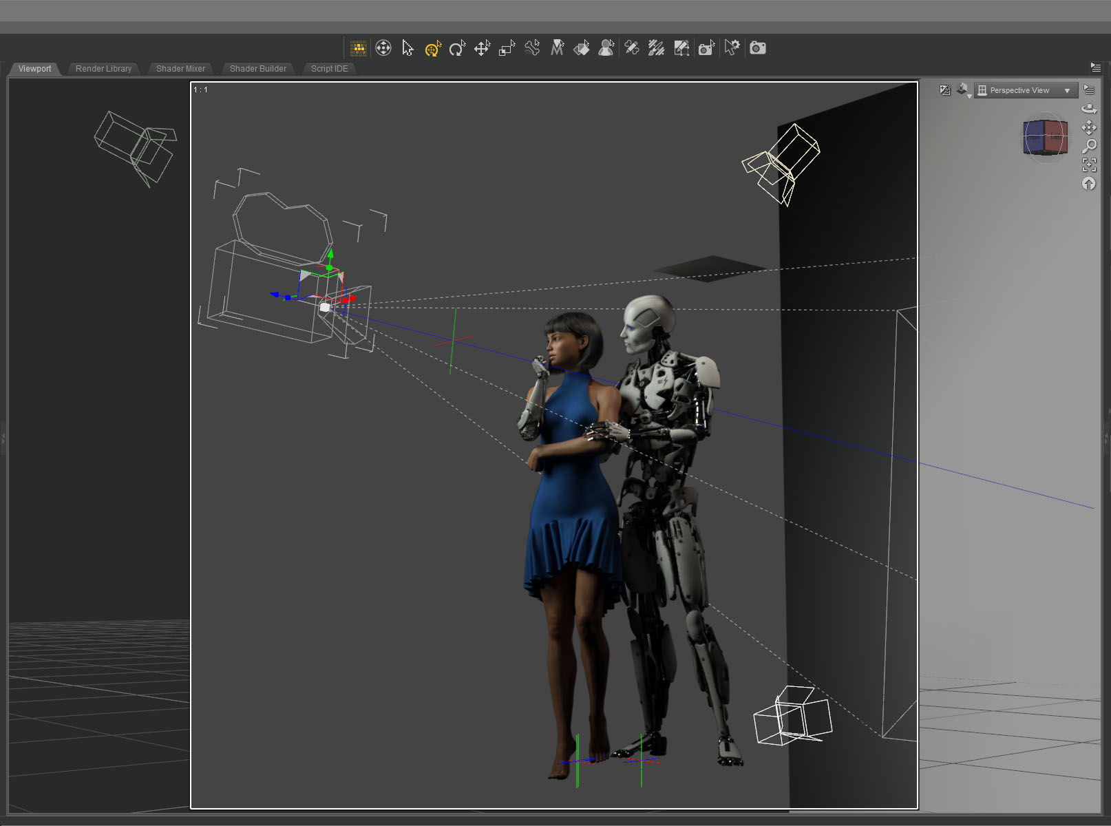 I only needed three lights to illuminate the scene. A key from the front doing most of the work. A hair light from the top that was also doubling as a fill light. And a spot on the gray background plane. I created another tiny plane just out of frame above the android to cut down the reflection on his white bald head.
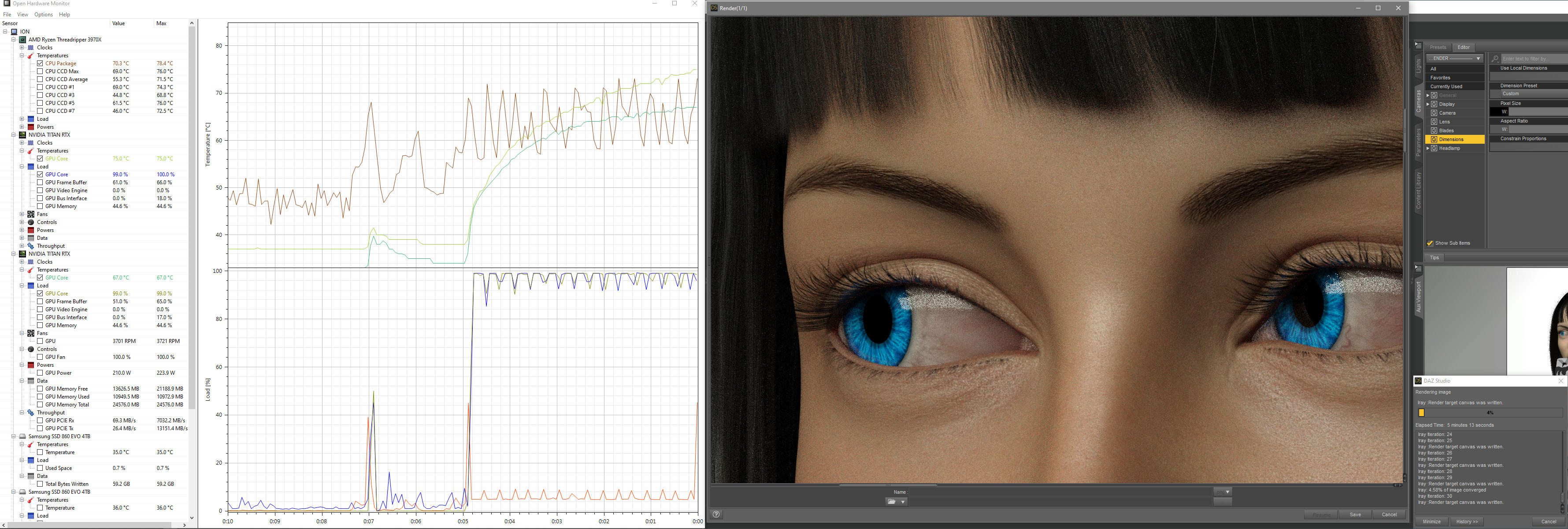 The final Iray render took about two hours at 10800 x 10800 resolution. I was surprised. That’s very fast. I’ve had renders at this resolution go ten hours or more. I’m guessing the plain background and the overall brightness of the scene helped.
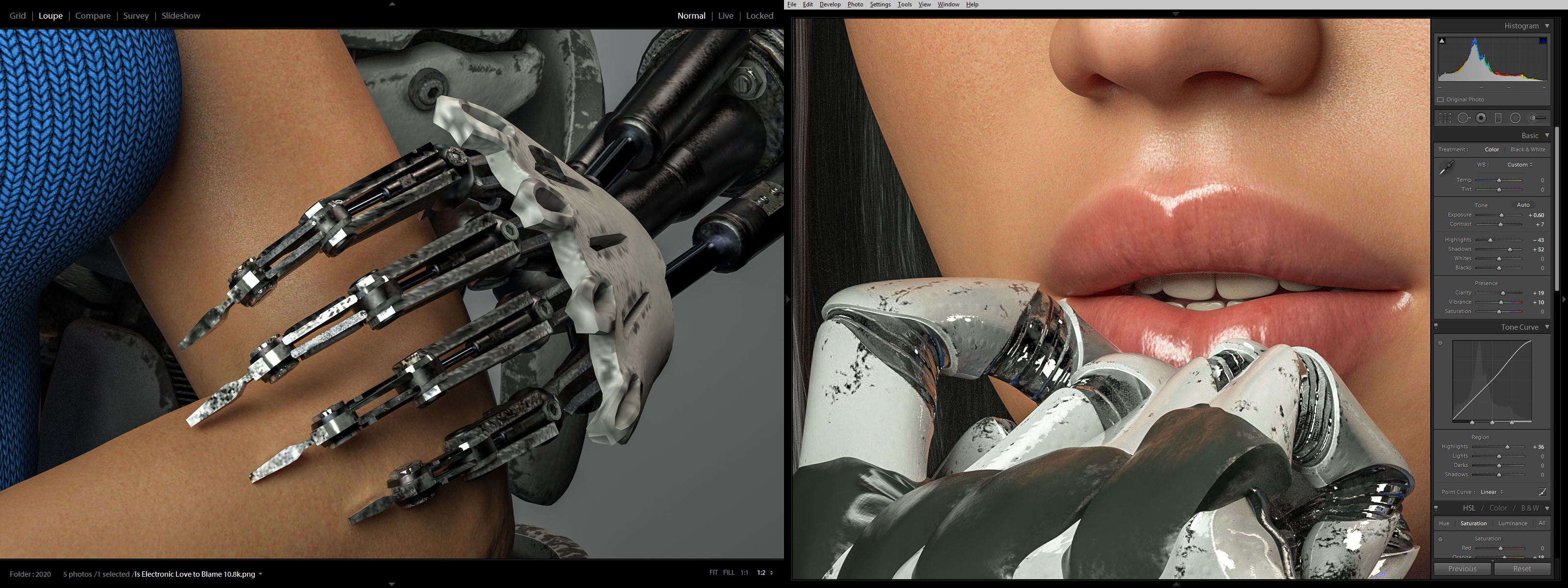
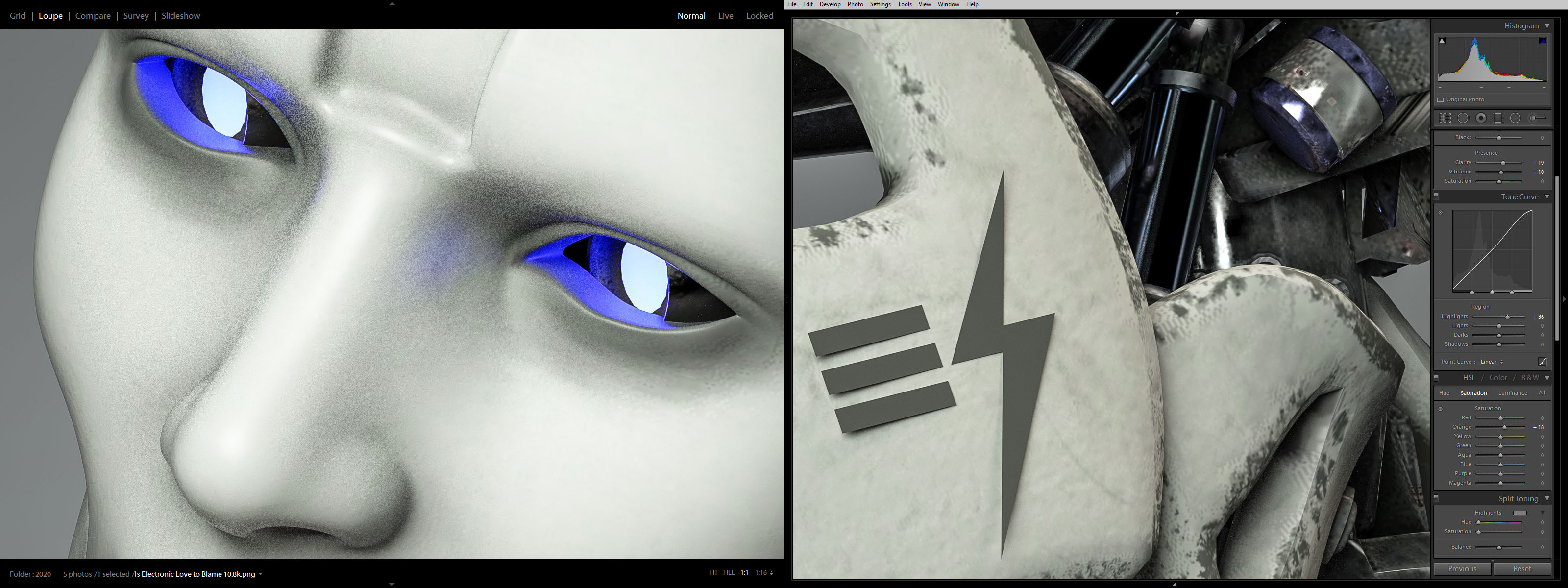 Color correcting in Lightroom I tried to bring out the hardness of the machine and the softness of the skin.
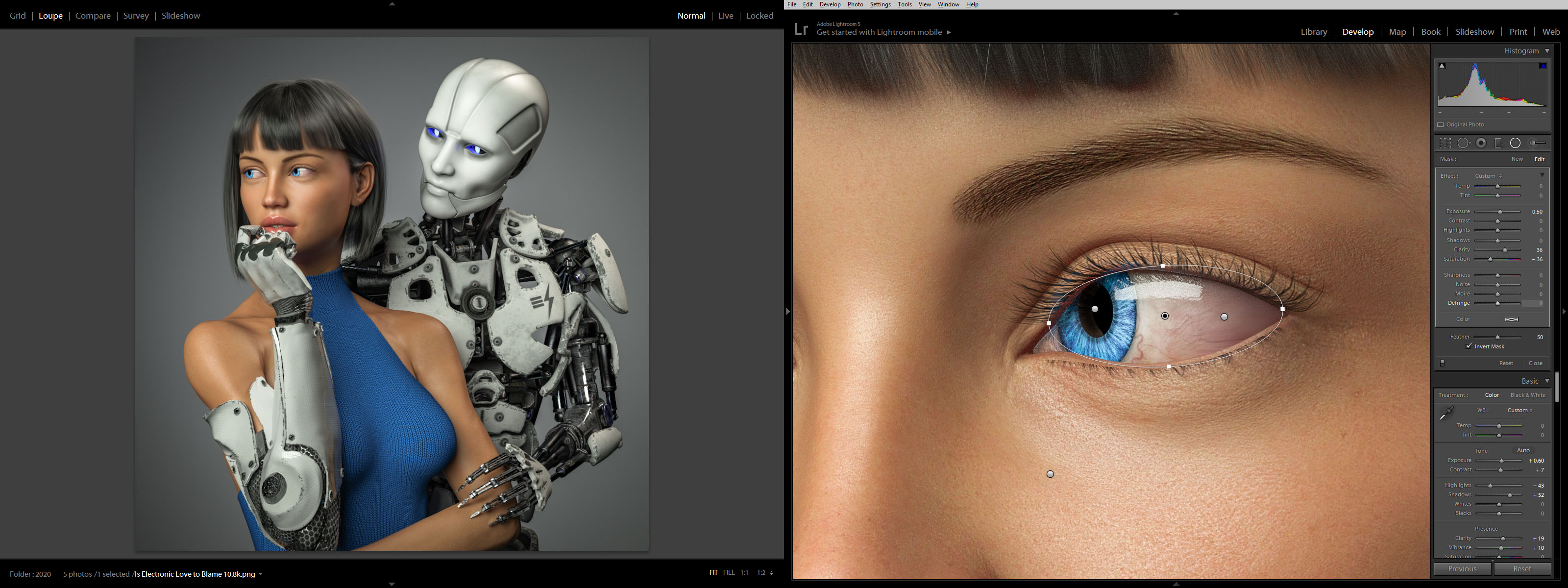 I lightened up the girl’s eyes and obsessed over everything for quite some time. Overall I brightened everything up and made it punch as much as possible.
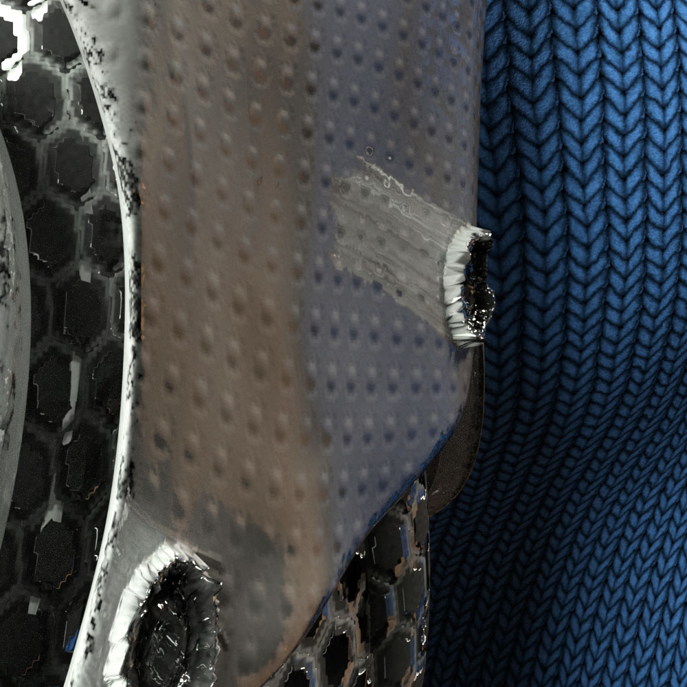 While color correcting I noticed a bizarre reflection coming off one of the poorly formed low-rez “screws” on the cybernetic arm. It had something to do with the normal map which wasn’t doing much on this surface. The screws were created with the displacement map. Not sure what was going on.
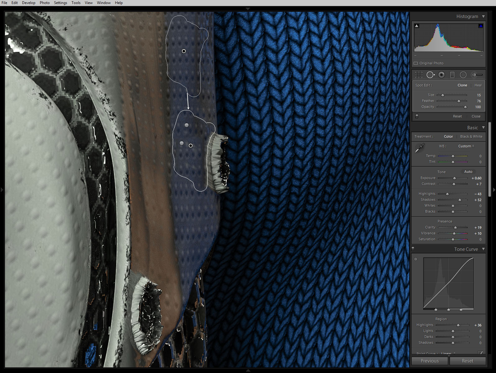 Anyway, I couldn’t figure out how to fix it in DAZ Studio without changing the character of the rest of the arm surface so I just used the spot remover in lightroom.
So what do you think? Did I over think it and create something stilted? Or did I continually refine it and make it great? I can’t tell anymore.
Next step: print it and see what it looks like on the wall…
Created in DAZ Studio 4.12
Rendered with Iray
Color Correction in Lightroom
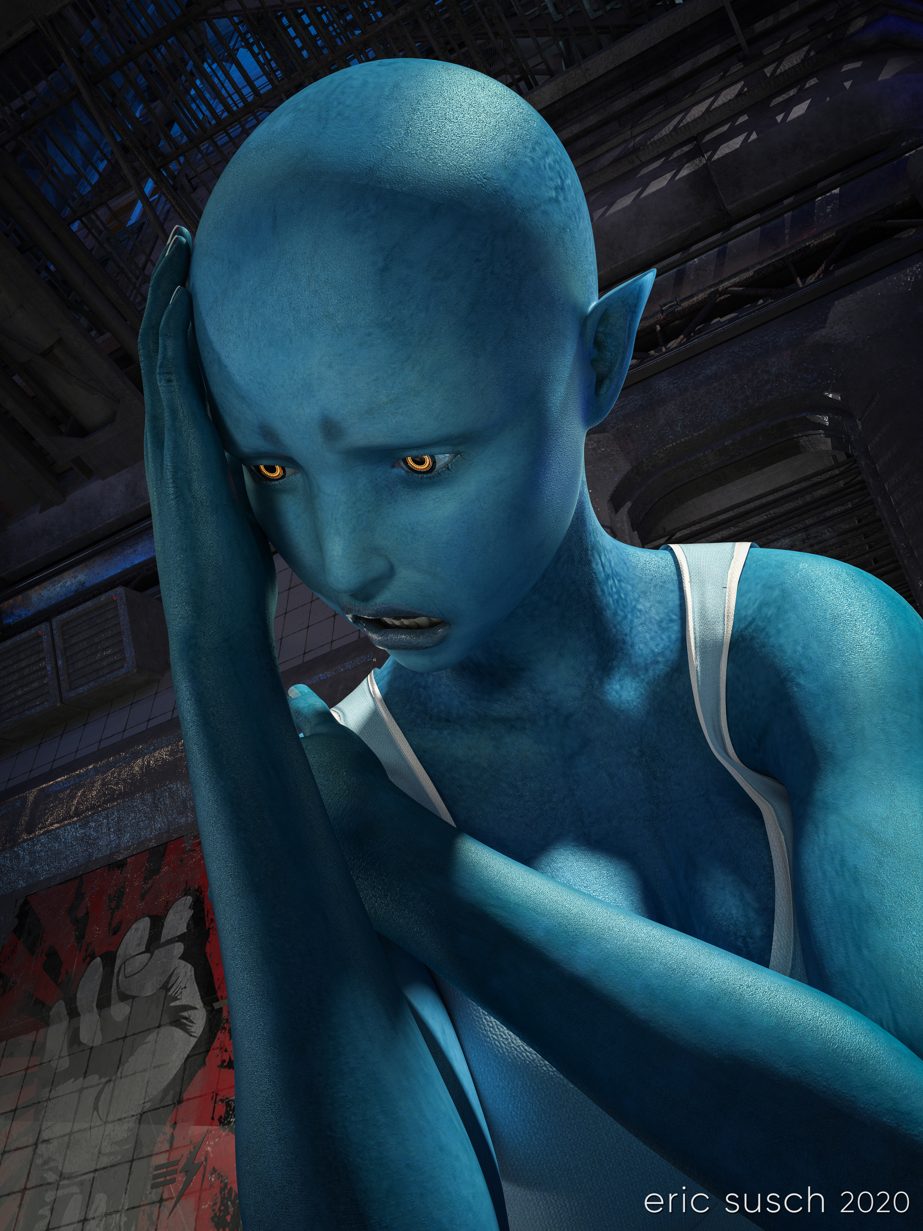 After George Floyd was killed and a week of protesting around the world, this was how I felt. I created a TikTok video where the camera cranes down from a fire escape and eventually tilts up on this character. You can see the video here: Despair on TikTok
After a bit of re-adjusting in DAZ Studio I came up with this high rez still version of the final frame. I rendered it at 10000 x 7500 pixels so I could print it out big and hang it on the wall.
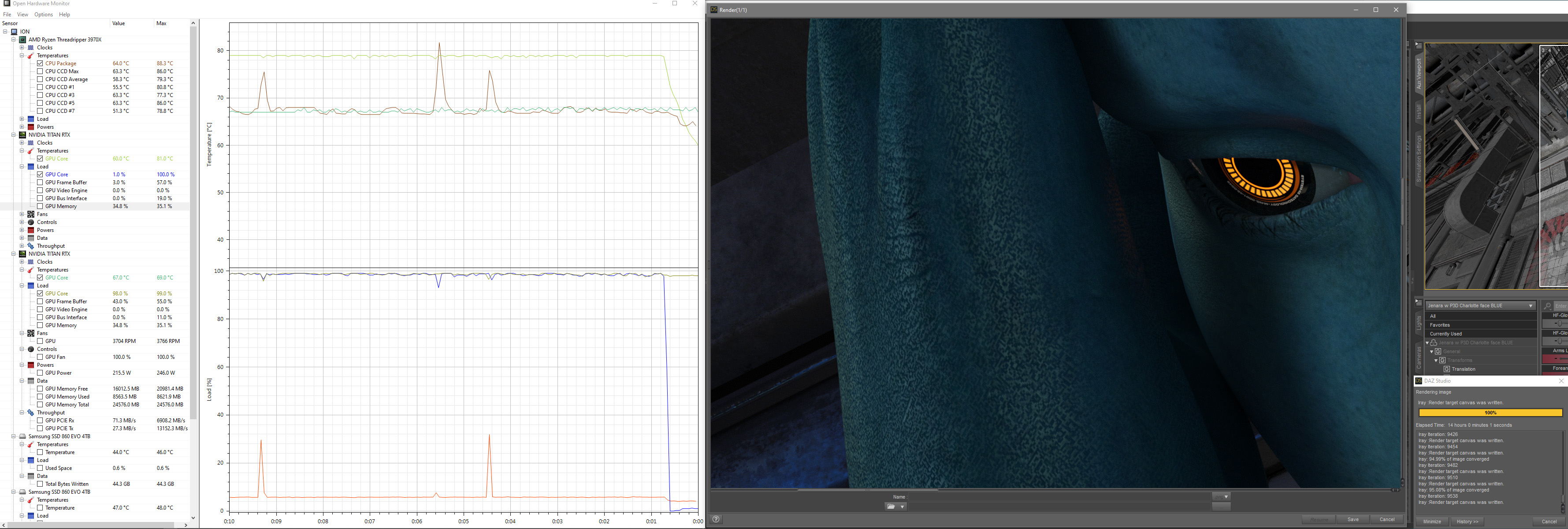
Shadow areas take a long time to render in Iray, especially if the canvas is large. With two Titan RTX graphic cards continuously screaming at 79 degrees Celsius, this image took fourteen hours to render. Not the longest render I’ve ever done (that would be 48 hours) but still a good exercise for my new computer workstation.
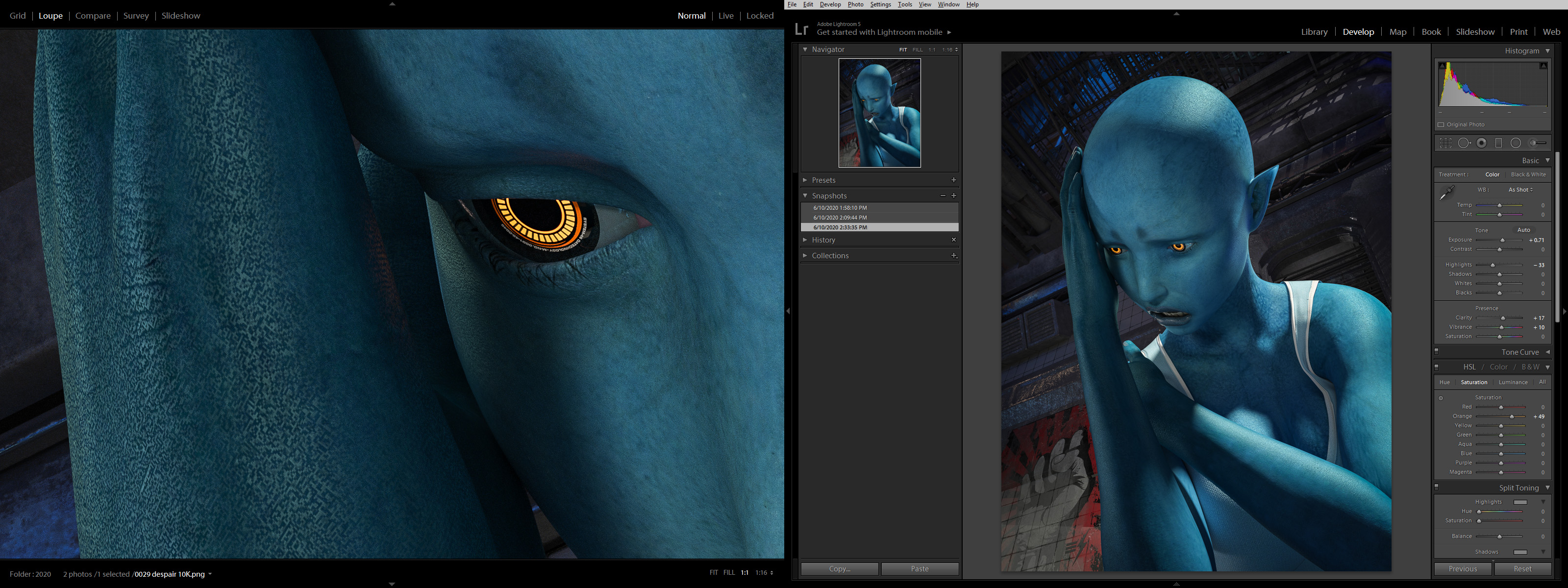
 Color correction in lightroom was relatively simple, essentially just brightening up everything so it pops and so all the shadow areas don’t print out too dark.
 Created in DAZ Studio 4.12
Rendered with Iray
Color Correction in Lightroom
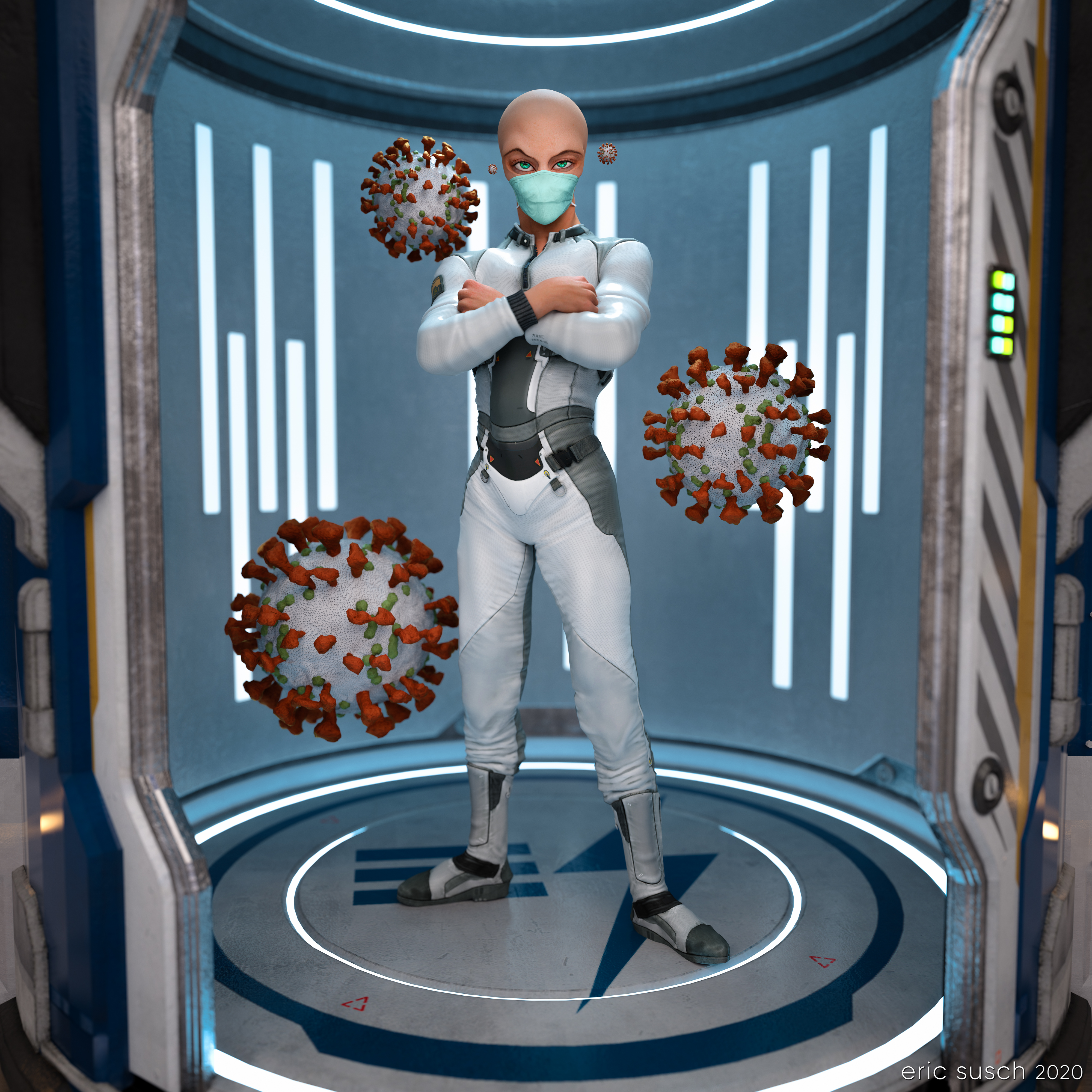 What is outside the door when it opens? This is the question I ask myself everyday now. Some alien organism hitchhiking on a friend? Wear a mask!
For this piece I went back to one of my TikTok animations, set up another camera with a square aspect ratio, and exported a high rez still.
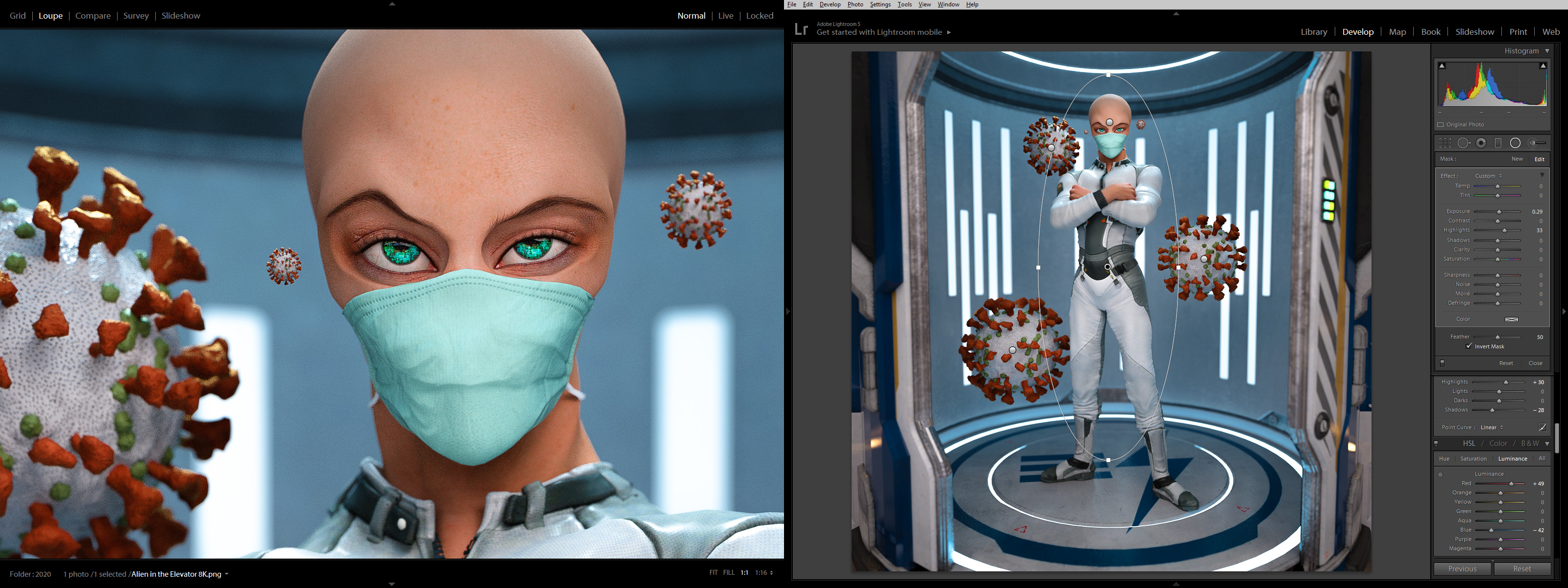 The color correction in lightroom made it pop quite nicely.
Created in DAZ Studio 4.12
Rendered with Iray
Color Correction in Lightroom