Author Archives: eric susch

Today I let Artificial Intelligence draw what it wants

I’m continuing to check out art created by artificial intelligence at craiyon.com.  You type in some words and the AI creates nine pictures from the prompt.

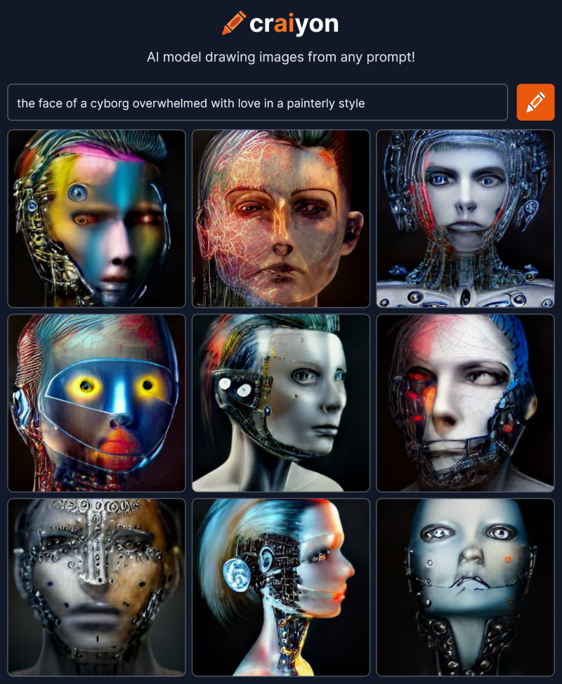
Yesterday I was trying to see if the AI could capture emotion on a face.  It took some iterations but the answer?  YES.  A big yes.  The final few renders were amazing.  Here’s an example that I didn’t post yesterday:

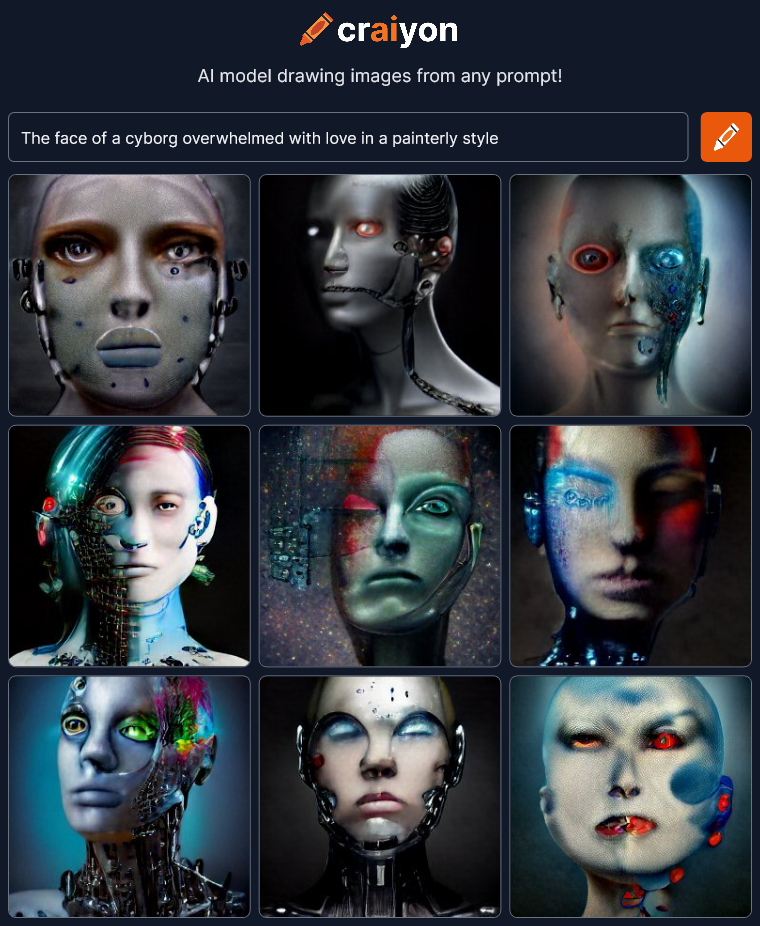
the face of a cyborg overwhelmed with love in a painterly style

craiyon_070222_the_face_of_a_cyborg_overwhelmed_with_love_in_a_painterly_style_br_To get a good result the AI needed lots of very specific text telling it what to do and lots of trial and error to find the right words.  The AI needed to understand the meaning and context of the words correctly.  When it didn’t things fell apart and became superficial and symbolic, like bland clip-art.

But what if I started from scratch and gave the AI as little direction as possible?  Where would it go?  Will anything dramatic come out?

Lets begin with one word:

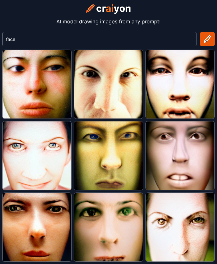
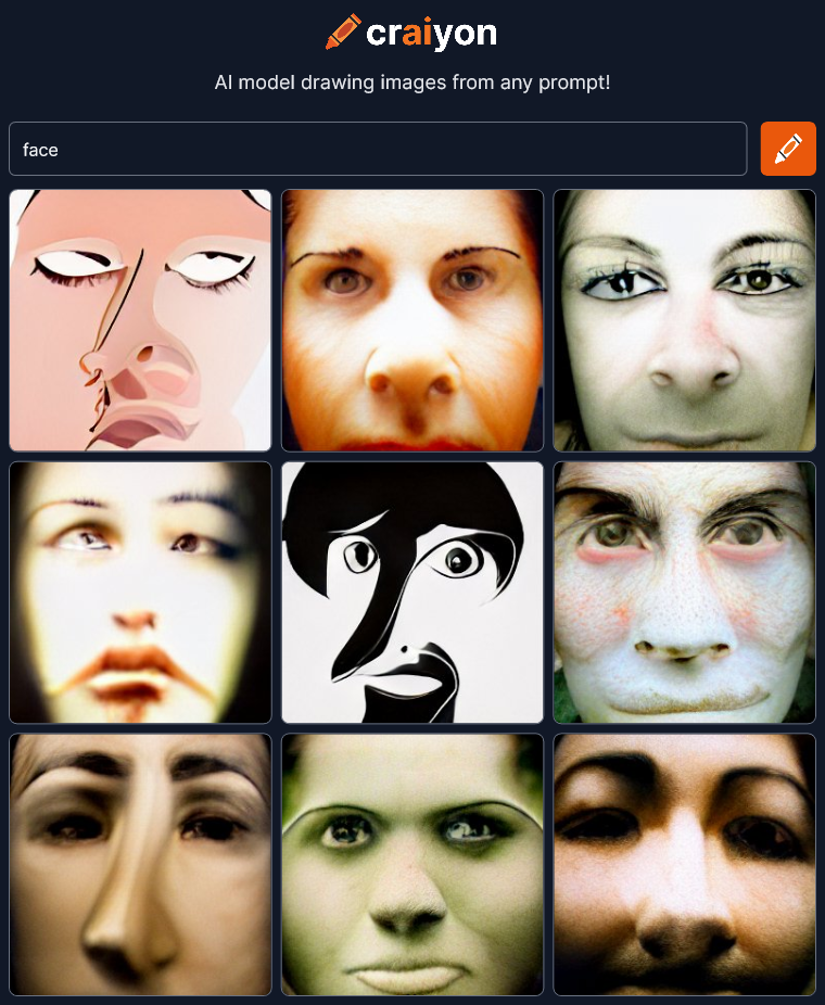
face

craiyon_160707_face_br_OK, not bad.  Since I’m giving as little direction as possible, I’ll do two renders of every prompt just to see more variation.

craiyon_160948_face_br_There’s some drawing style in this second one but essentially the same theme.

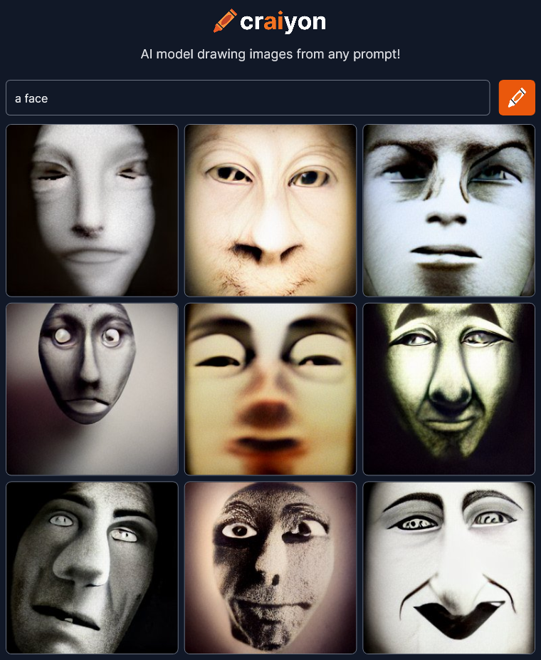
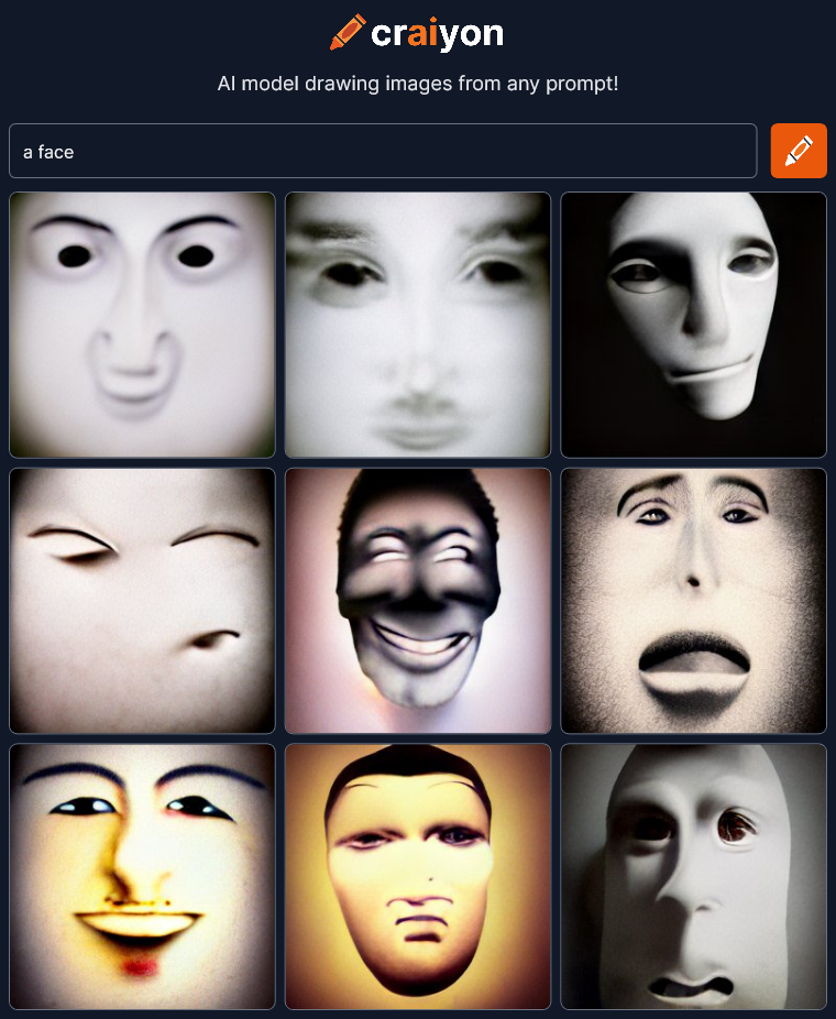
a face

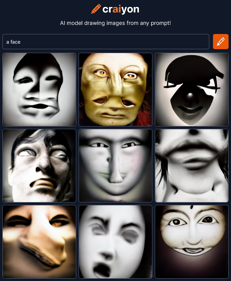
craiyon_160826_a_face_br_craiyon_161121_a_face_br_Things are already getting super cool and abstract.  Let’s keep going…

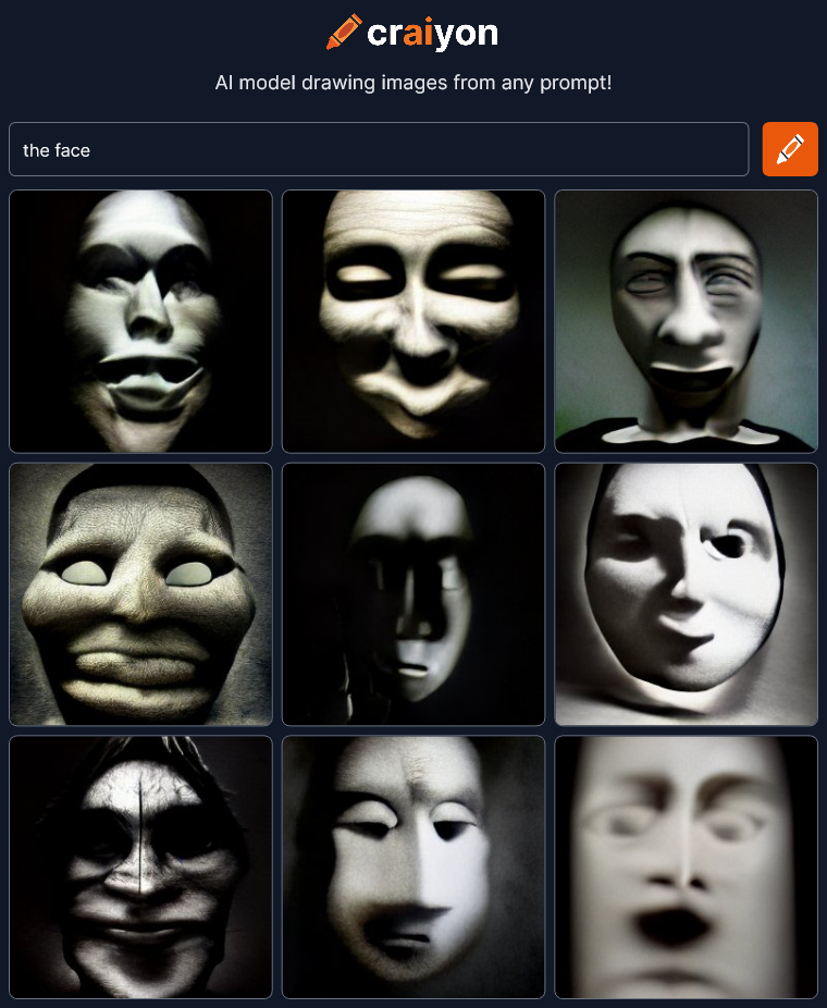
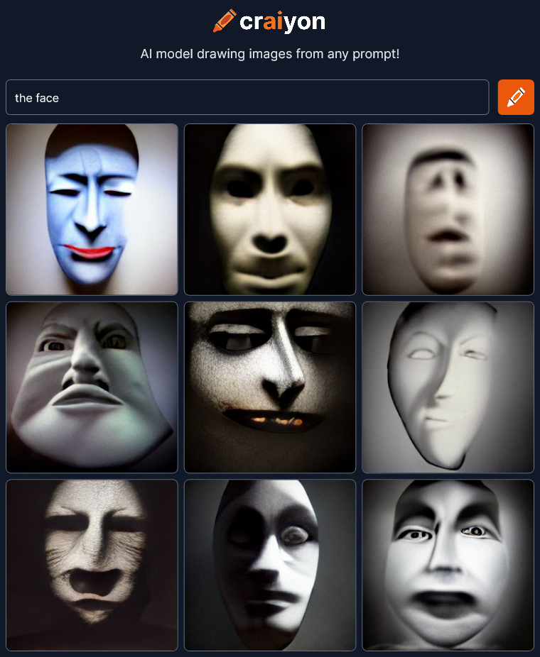
the face

craiyon_161344_the_face_br_craiyon_161538_the_face_br_Changing the article seems to change the style.  There’s an interesting lack of color in most of the pictures.  I also get an old silent motion picture vibe… maybe even some German Expressionism.

These are all wonderfully artistic with deep expression and dramatic lighting.  They are way, way beyond the bland images I was expecting.

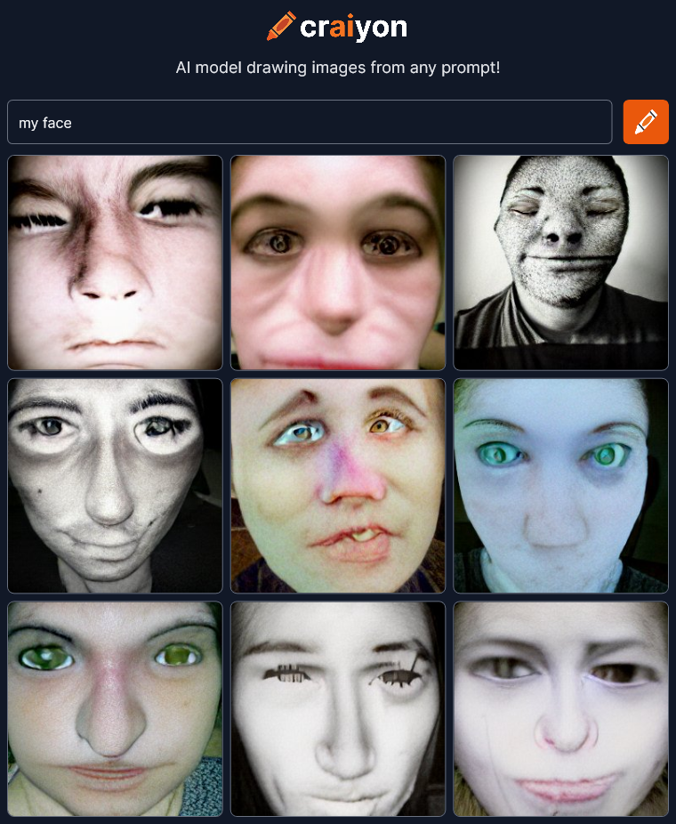
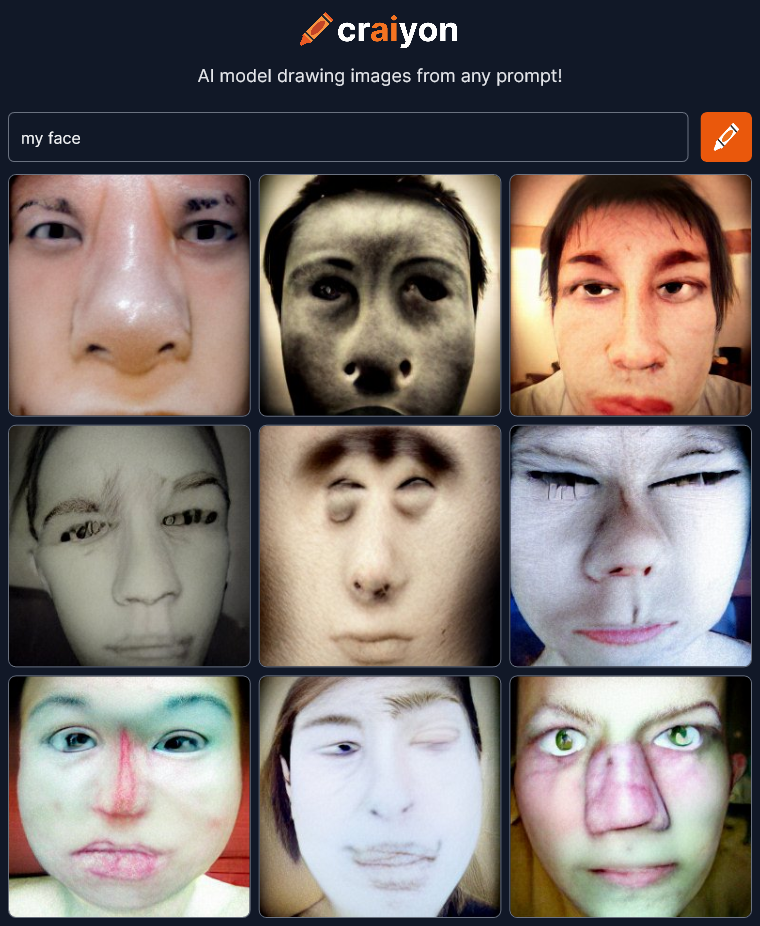
my face

craiyon_161651_my_face_br_craiyon_161924_my_face_br_That changed the style quite a bit probably because the craiyon AI is now referencing all the selfie avatars of the world.  That large pictorial reference contaminates this minimalist experiment a bit I think.  And what’s up with all the messed up noses?    Anyway, continuing on…

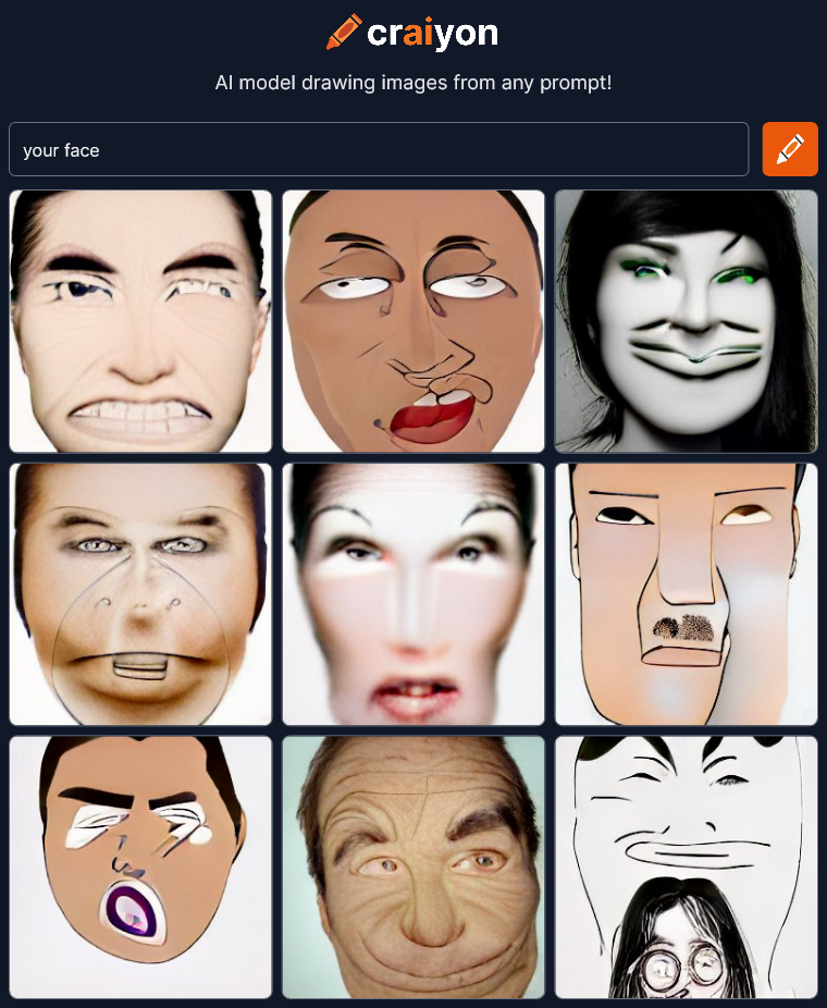
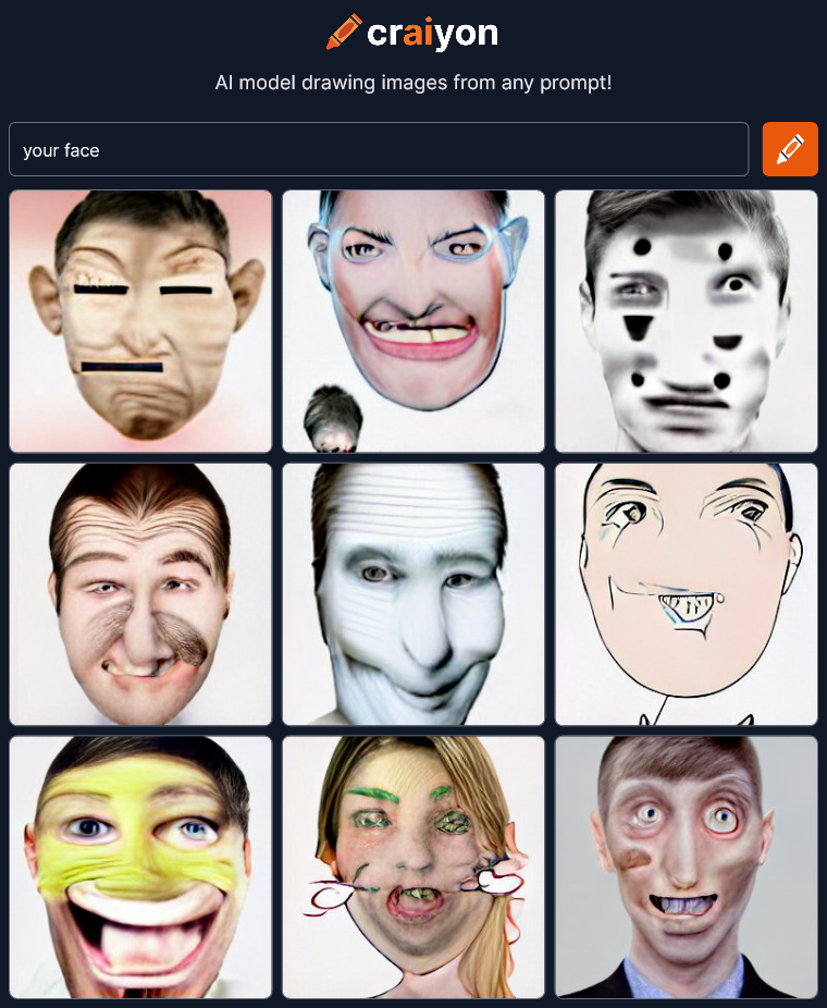
your face

craiyon_161804_your_face_br_craiyon_162343_your_face_br_The thing I find interesting here is that “my face” really injected a sense of photo realism because of the selfie avatars but “your face” leans more toward cartoon drawings.

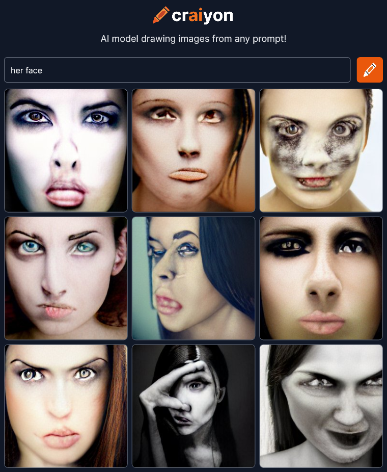
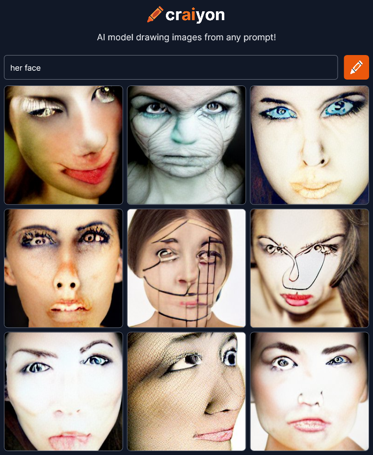
her face

craiyon_162609_her_face_br_craiyon_162842_her_face_br_Not sure what to think here.  The middle bottom of the first render is really creepy with what looks like a two fingered hand.

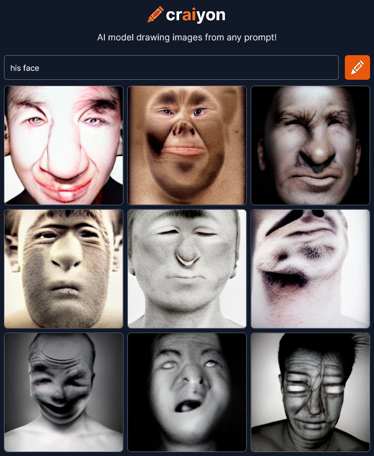
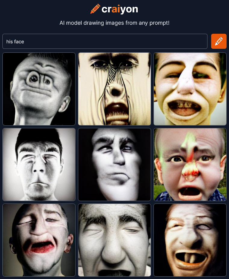
his face

craiyon_163020_his_face_br_craiyon_163138_his_face_br_This is getting very strange.  Do I see monkeys in some of these?

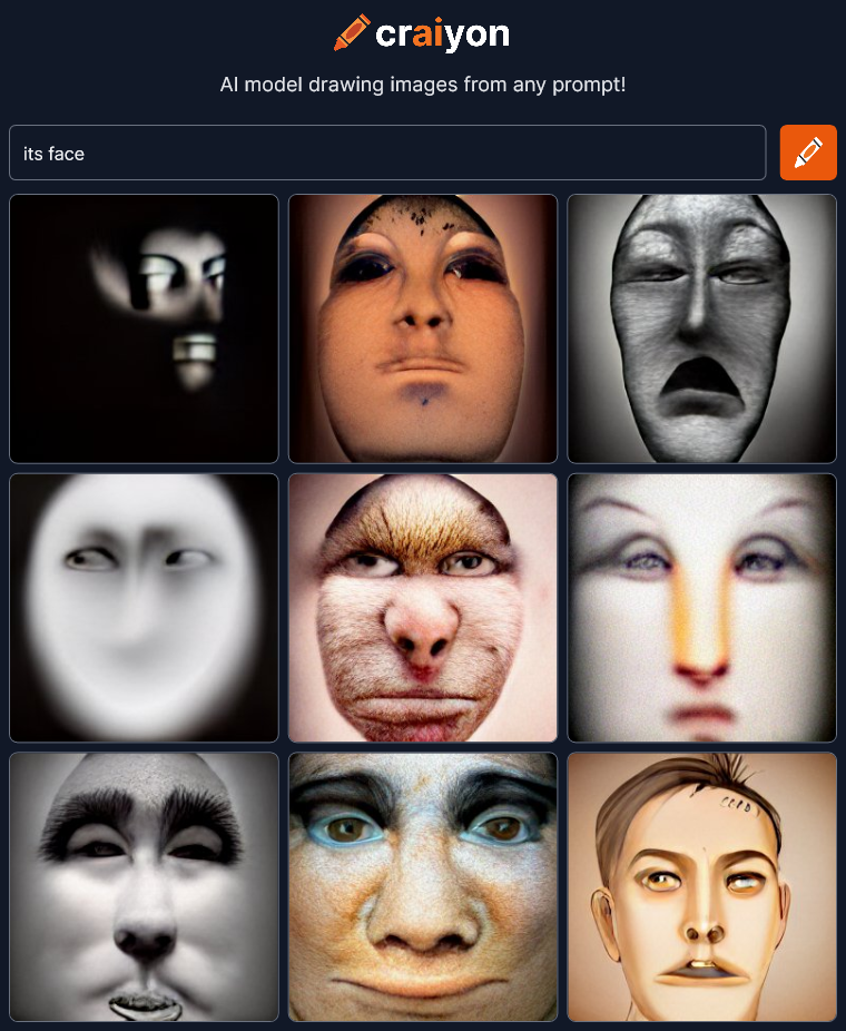
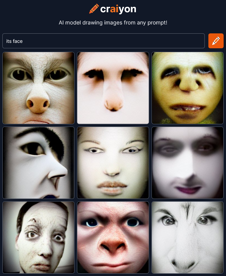
its face

craiyon_163306_its_face_br_craiyon_163414_its_face_br_Definitely seeing monkeys again.

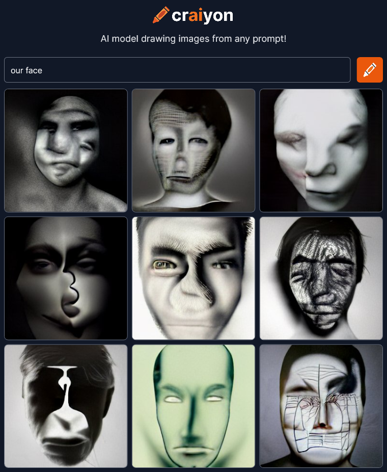
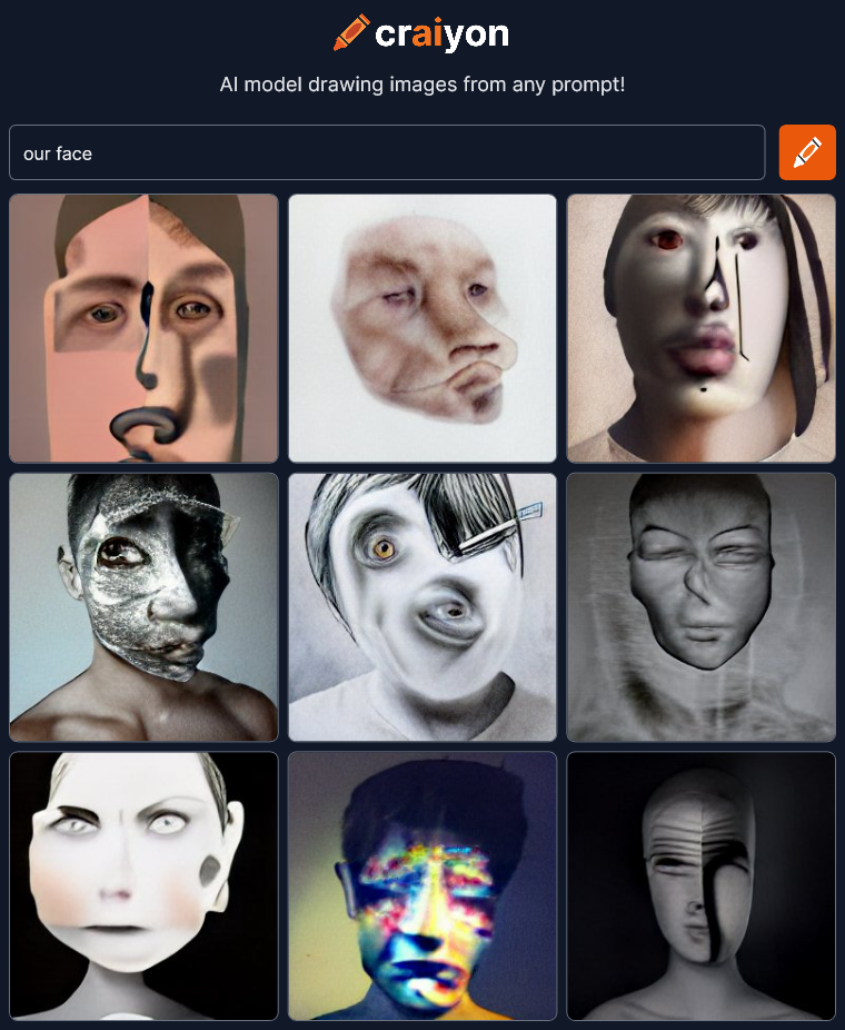
our face

craiyon_163542_our_face_br_craiyon_163748_our_face_br_These are wonderful.  Boy, if you ever need a creepy avatar for something, craiyon is the place to go.

no face

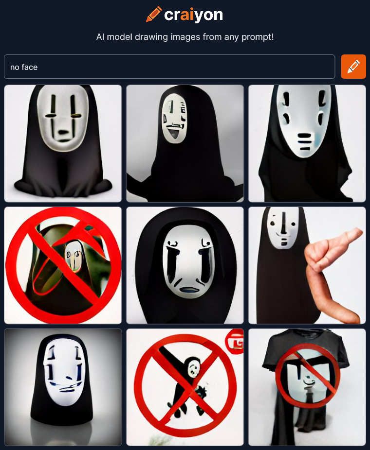
craiyon_164425_no_face_br_Uh oh… There’s a relatively well known character called “no face” in the animated film Spirited Away.  Craiyon has choked and reverted to referencing character images as well as using symbols for concepts like the red circle with a line for “no.”  It’s also bringing in a t-shirt again presumably because somewhere the no face character is for sale on t-shirts.  This is definitely a fail for the AI.  I should go back to something that worked, but first I absolutely must try the opposite of this prompt…

yes face

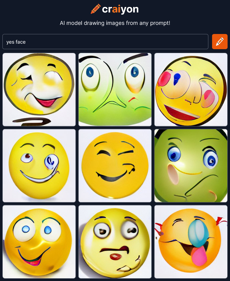
craiyon_164600_yes_face_br_Oh no!  Emojis!  The ultimate symbol for emotions.  Super FAIL!  OK fun’s over.  Time to get back to the good stuff.  Lets go back to something that looked artistic and dramatic…

a face

craiyon_165427_a_face_br_I see people specifying different “Iterations” on Craiyon.  Not sure what it does but I’m going to try it.

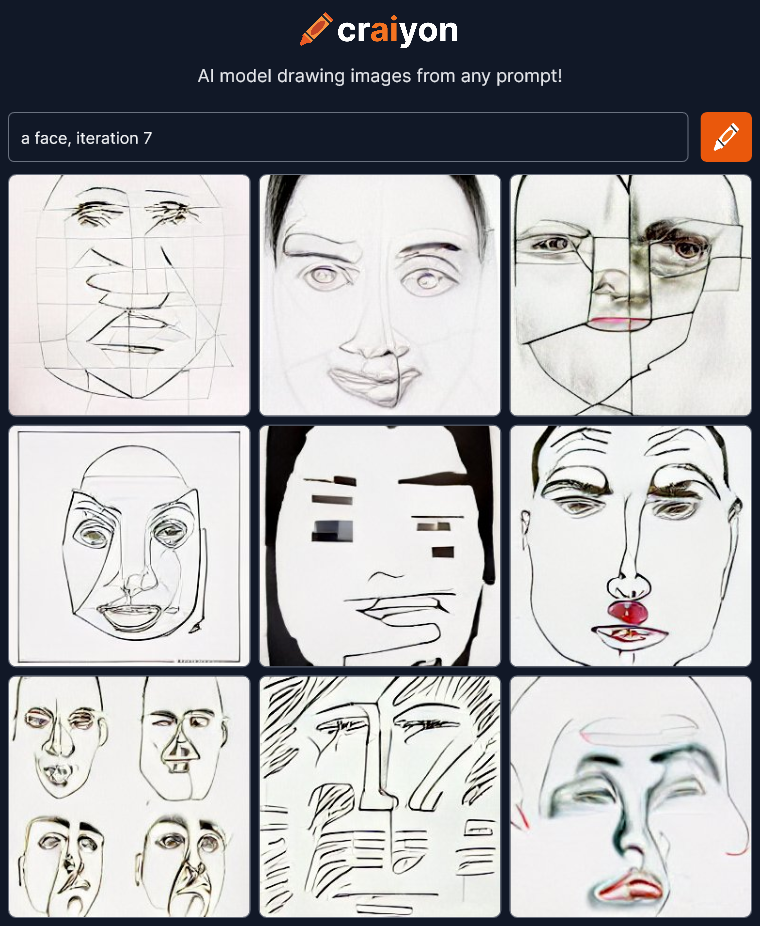
a face, iteration x

craiyon_165614_a_face__iteration_7_br_Hmmm… Flat abstract line drawings.  Let’s try a few more…

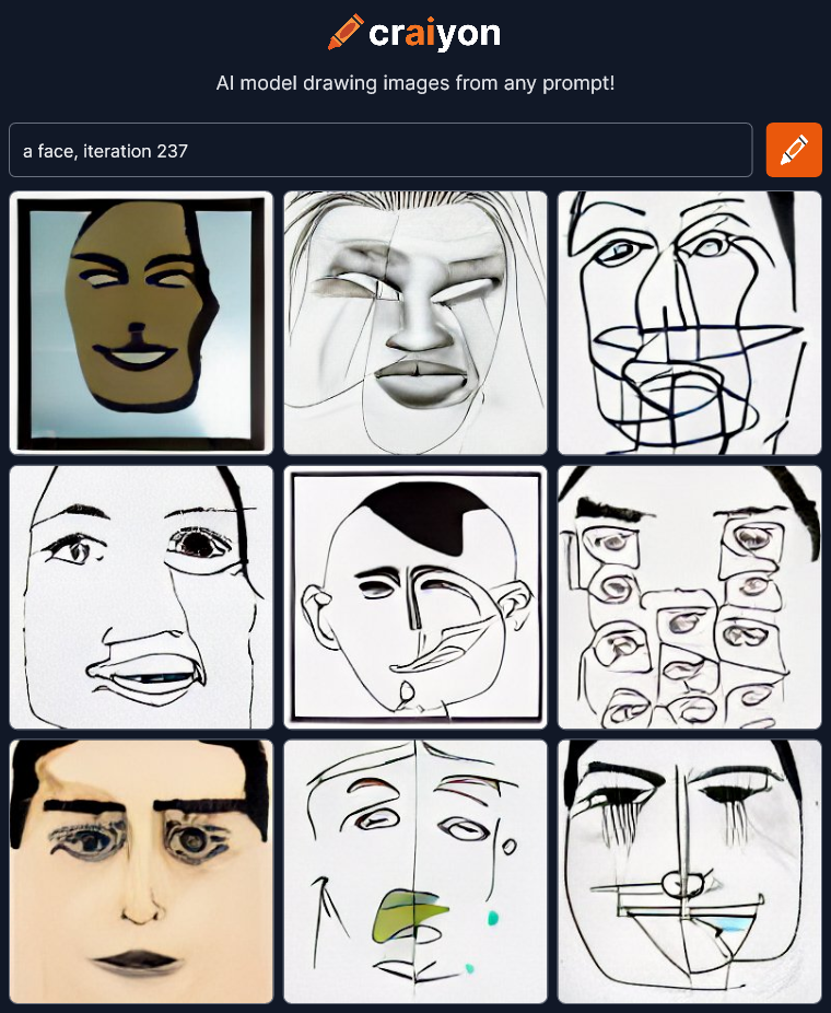
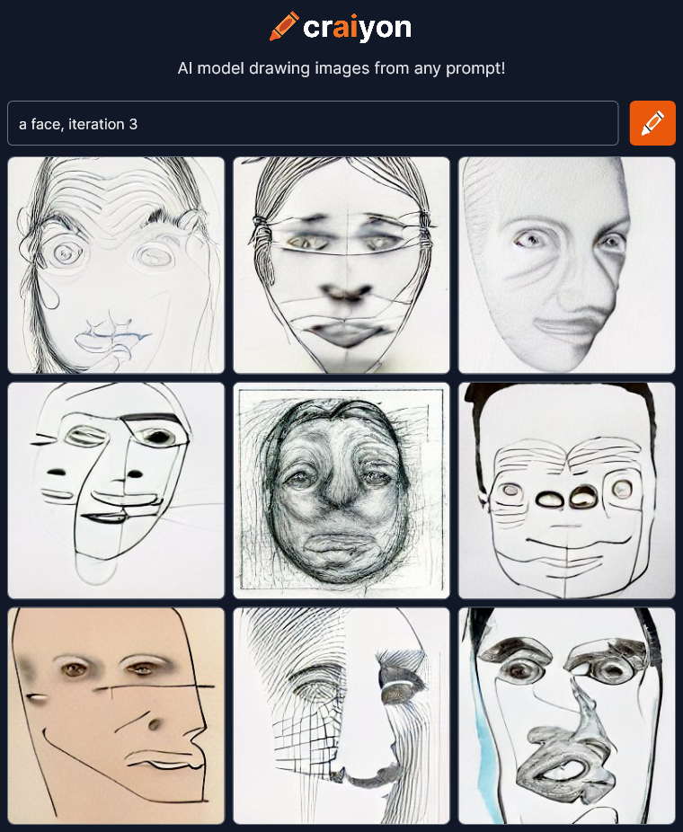
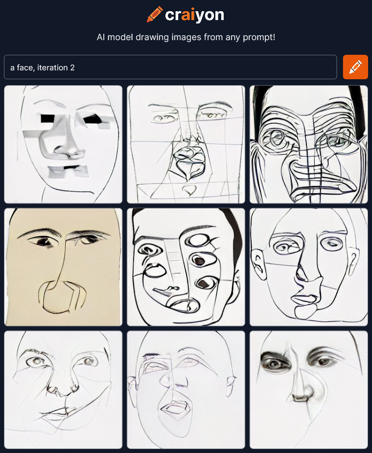
craiyon_165730_a_face__iteration_237_br_craiyon_165900_a_face__iteration_3_br_craiyon_170007_a_face__iteration_2_br_I’m not sure why all these are line drawings now.  I’ll have to read up on what “iterations” do.  Maybe I should try something more descriptive to add, like trying to make it a pencil sketch.

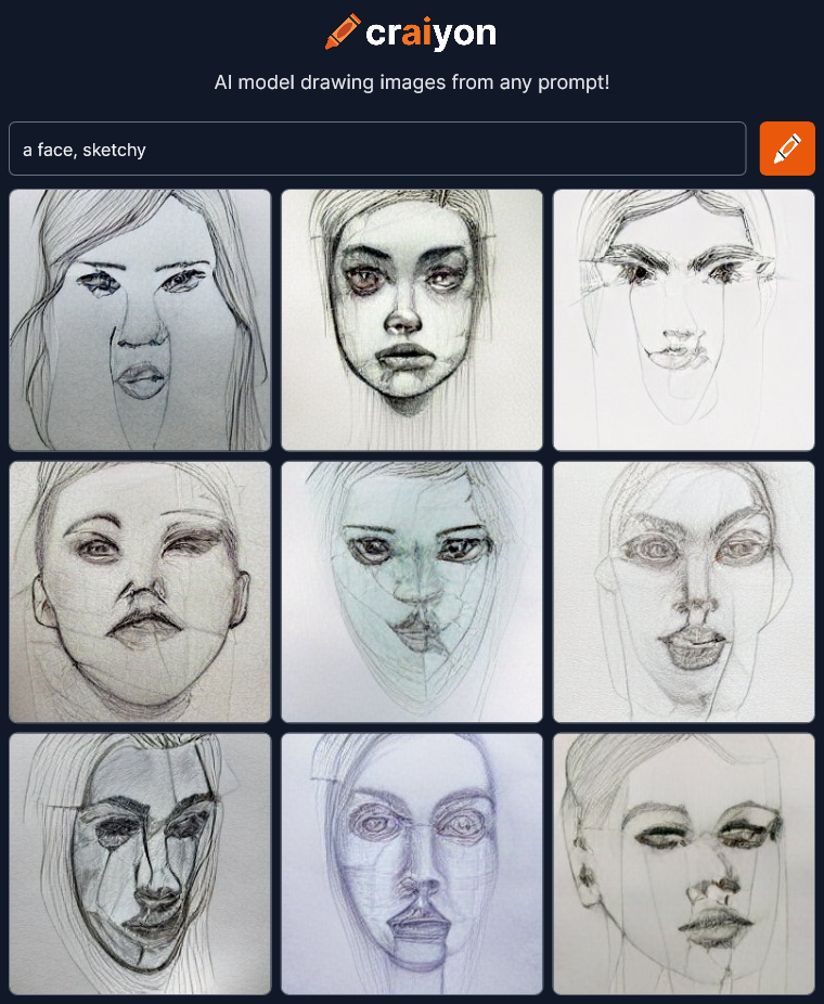
a face, sketchy

craiyon_170213_a_face__sketchy_br_Not bad.  The single word “sketchy” could be taken several ways, but it understood what I meant.  Not a bad sketch top middle either, for an AI that usually makes horrible faces.  What other description can we try?

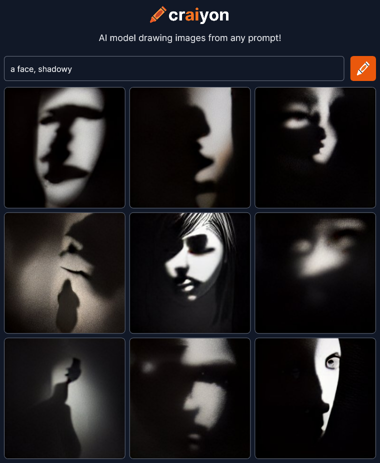
a face, shadowy

craiyon_170450_a_face__shadowy_br_WOW!!!  I need to try a few more of these!

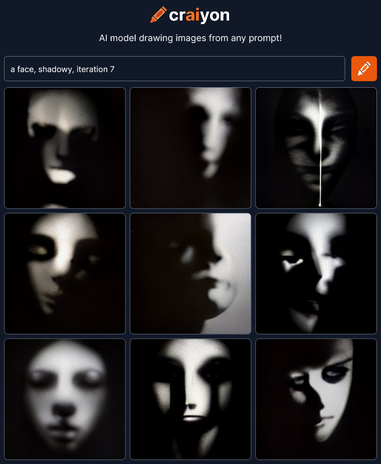
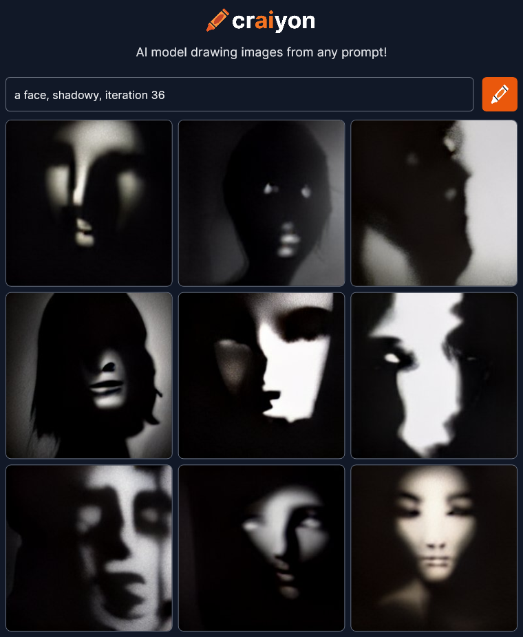
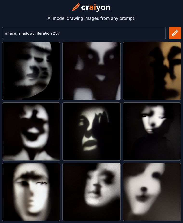
craiyon_171154_a_face__shadowy__iteration_7_br_craiyon_171340_a_face__shadowy__iteration_36_br_craiyon_171649_a_face__shadowy__iteration_237_br_Amazing!  Dramatic!  Haunting!  I could play with this all day!

Check out Craiyon for yourself at craiyon.com.

Can Artificial Intelligence Draw Emotion in a Face?

I’m continuing to check out art created by artificial intelligence at craiyon.com.  You type in some words and the AI creates nine pictures from the prompt.

Yesterday on my first go I was just trying to see what the AI could do.  What were the edges of it’s ability?  Could it create anything really interesting?  Answer: yes.

Today I’m going to try to get it to draw interesting and expressive faces.  How dramatic can we make them?  Here’s my first try:

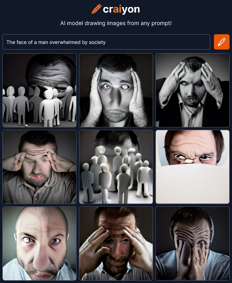
The face of a man overwhelmed by society

craiyon_044534_The_face_of_a_man_overwhelmed_by_society_br_Wow, not bad.  I’ve heard that Craiyon has difficulty with faces and they certainly are warped, but I like that.  It makes them more dramatic and artistic.  If these images were more realistic, like photographs, I don’t think they would be as interesting.

Let’s try some variations:

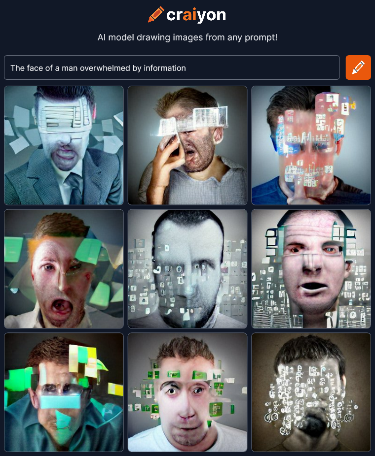
The face of a man overwhelmed by information

craiyon_044711_The_face_of_a_man_overwhelmed_by_information_br_OK, not as good, but not bad.  The “information” is kinda flat and covering too much of the face to see the emotion.

Next…

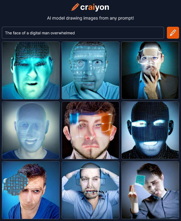
The face of a digital man overwhelmed

craiyon_044906_The_face_of_a_digital_man_overwhelmed_br_I was trying to get some sort of synthetic man under stress but ended up with heads with data projected on them.

Let’s try some women.

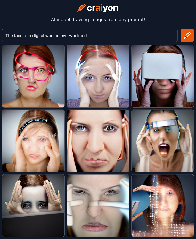
The face of a digital woman overwhelmed

craiyon_045041_The_face_of_a_digital_woman_overwhelmed_br_Hmmm… That’s a little more interesting.  Not sure what the red line at the top left is but there’s more emotion in these faces.  I think changing the gender made a difference.

Who else can be overwhelmed?

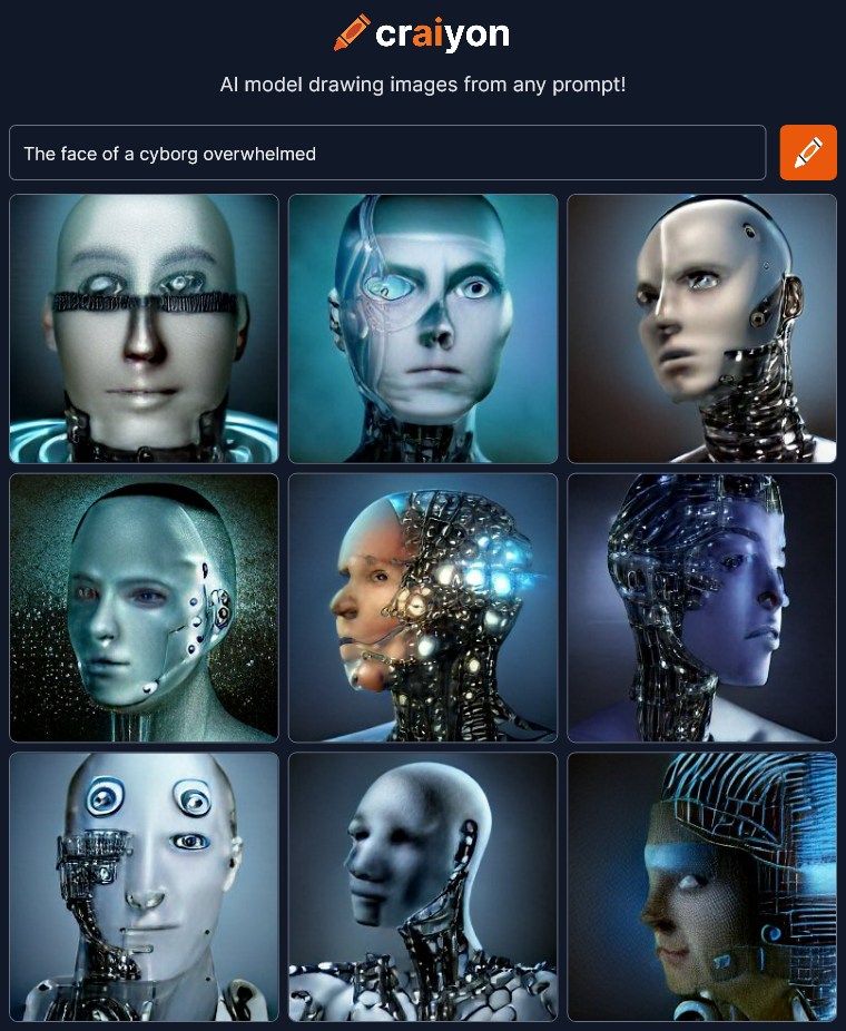
The face of a cyborg overwhelmed

craiyon_045211_The_face_of_a_cyborg_overwhelmed_br_I’m liking this!  What else can we try?

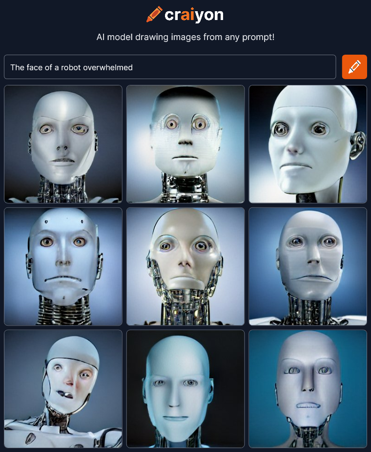
The face of a robot overwhelmed

craiyon_045428_The_face_of_a_robot_overwhelmed_br_Eh… It’s that cliched white plastic robot face.  We lost almost all the emotion and it’s all the same bland generic robot.  Except it’s not just a robot.  It’s an ANDROID.

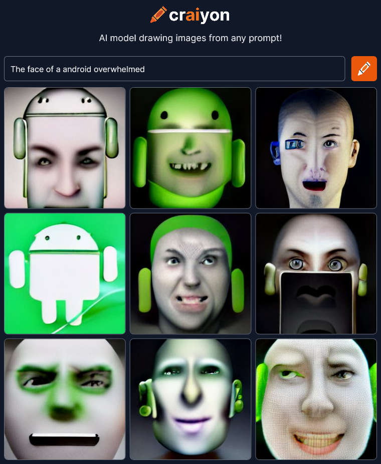
The face of an android overwhelmed

craiyon_045553_The_face_of_a_android_overwhelmed_br_Oh no!  Our corporate overlords are invading our art!  Words change meaning over time.  Context matters.  Android isn’t a robot designed to emulate a human anymore.  It’s a cartoon corporate mascot for a phone operating system!  We’re way off track…

Tell the AI what to do!

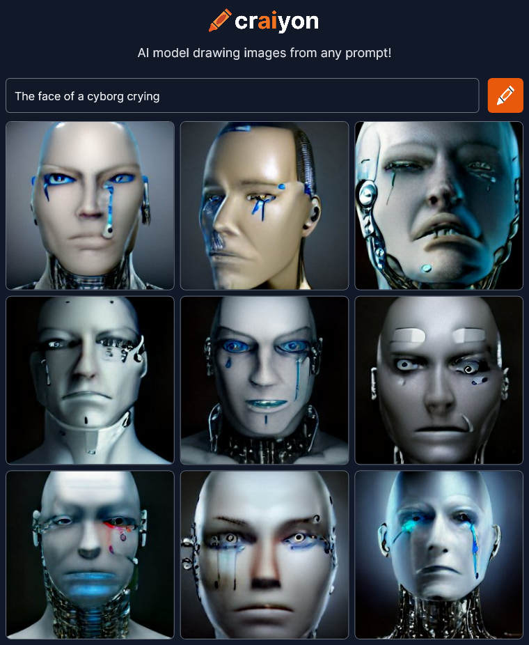
The face of a cyborg crying

craiyon_045814_The_face_of_a_cyborg_crying_br_I love this thing!  I could sit here all day typing variations!

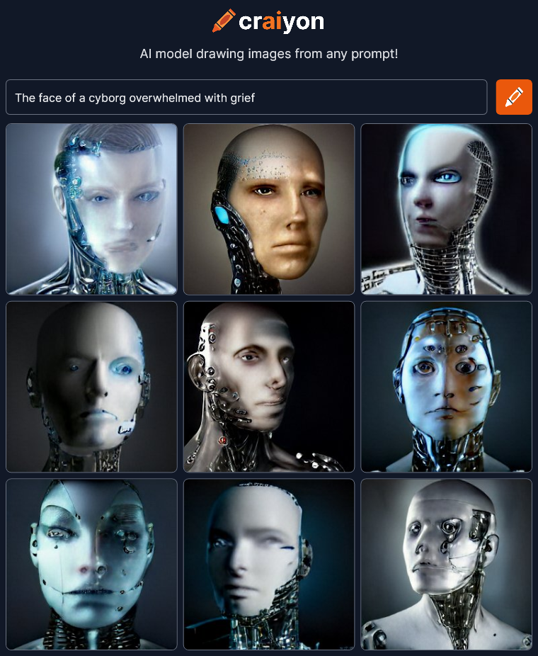
The face of a cyborg overwhelmed with grief

craiyon_050029_The_face_of_a_cyborg_overwhelmed_with_grief_br_I’m surprised that this “grief” render doesn’t have any crying.  …well, maybe the bottom right.

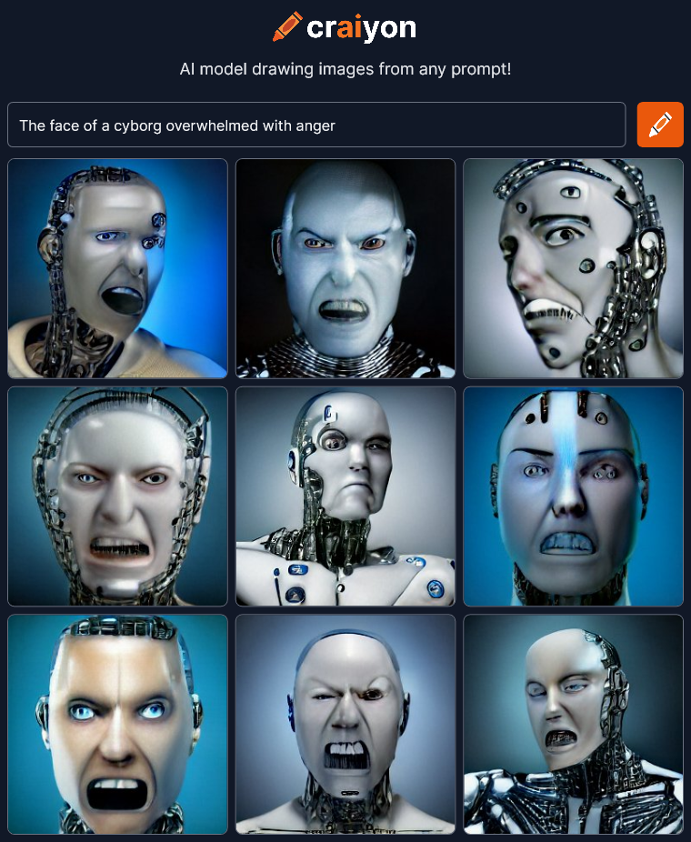
The face of a cyborg overwhelmed with anger

craiyon_050319_The_face_of_a_cyborg_overwhelmed_with_anger_br_No subtlety there…

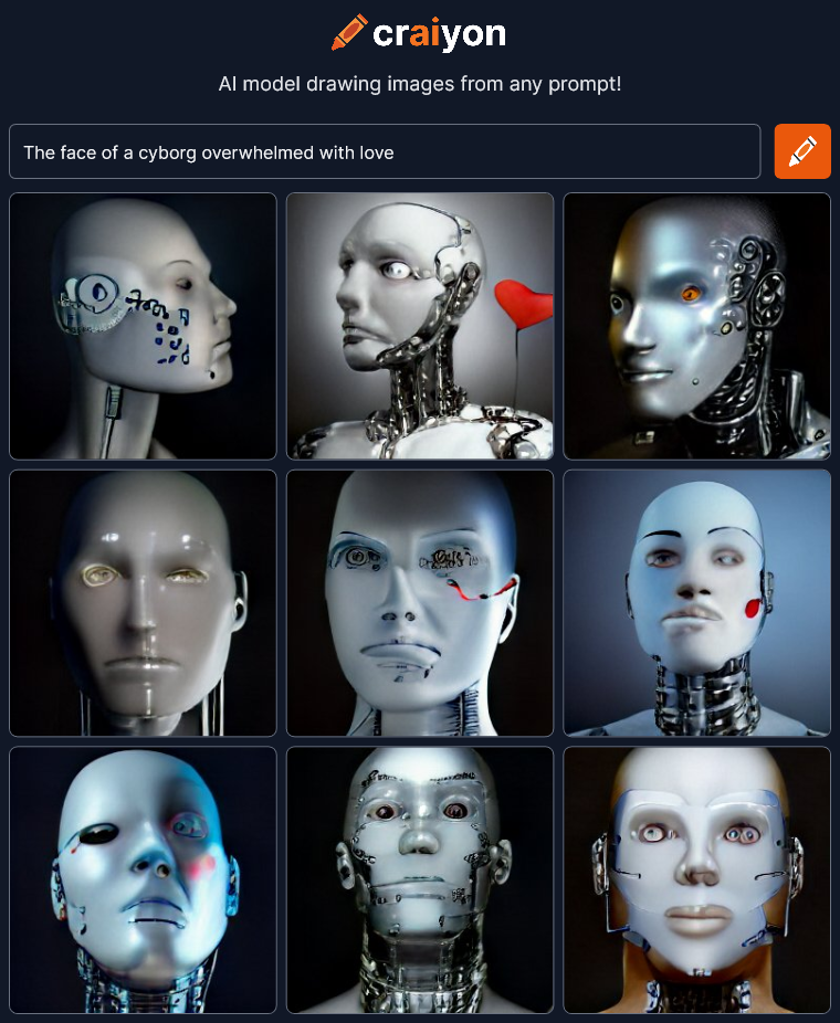
The face of a cyborg overwhelmed with love

craiyon_050446_The_face_of_a_cyborg_overwhelmed_with_love_br_The heart – symbol of love.

The face of a cyborg overwhelmed with love in a painterly style

craiyon_050817_The_face_of_a_cyborg_overwhelmed_with_love_in_a_painterly_style_br_Now we’re talking!  Let’s try this “painterly style” with other things.

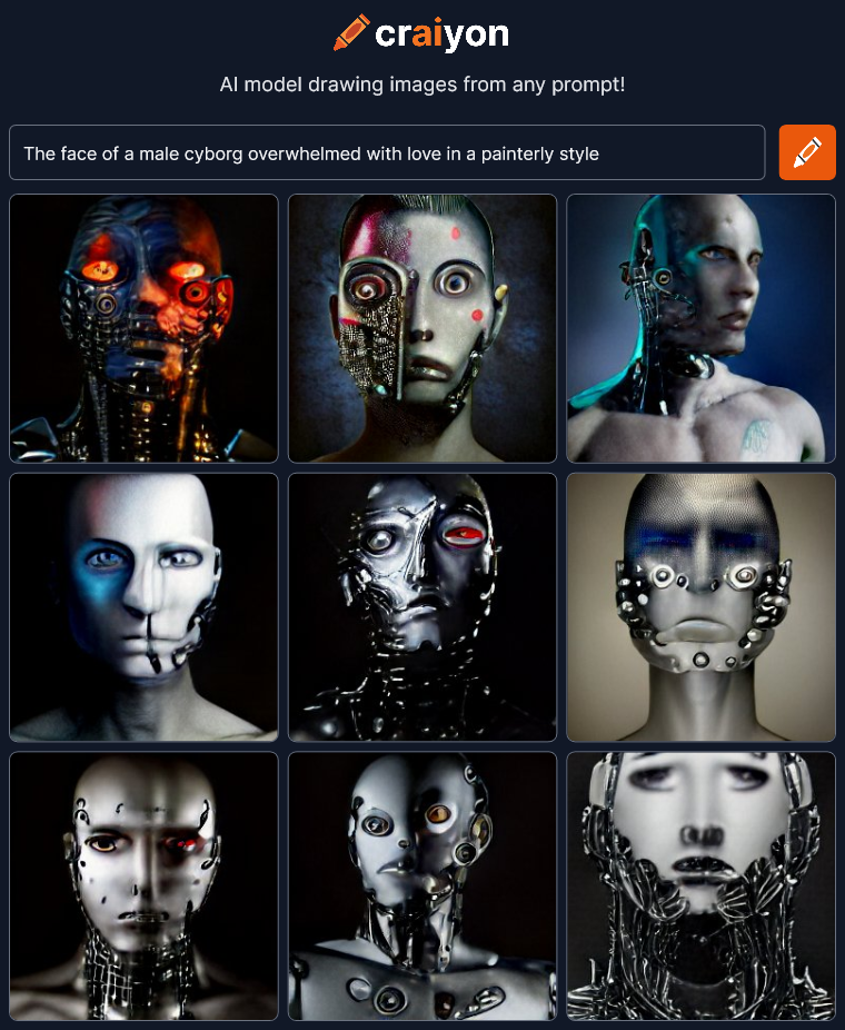
The face of a male cyborg overwhelmed with love in a painterly style

craiyon_050952_The_face_of_a_male_cyborg_overwhelmed_with_love_in_a_painterly_style_br_Amazing…

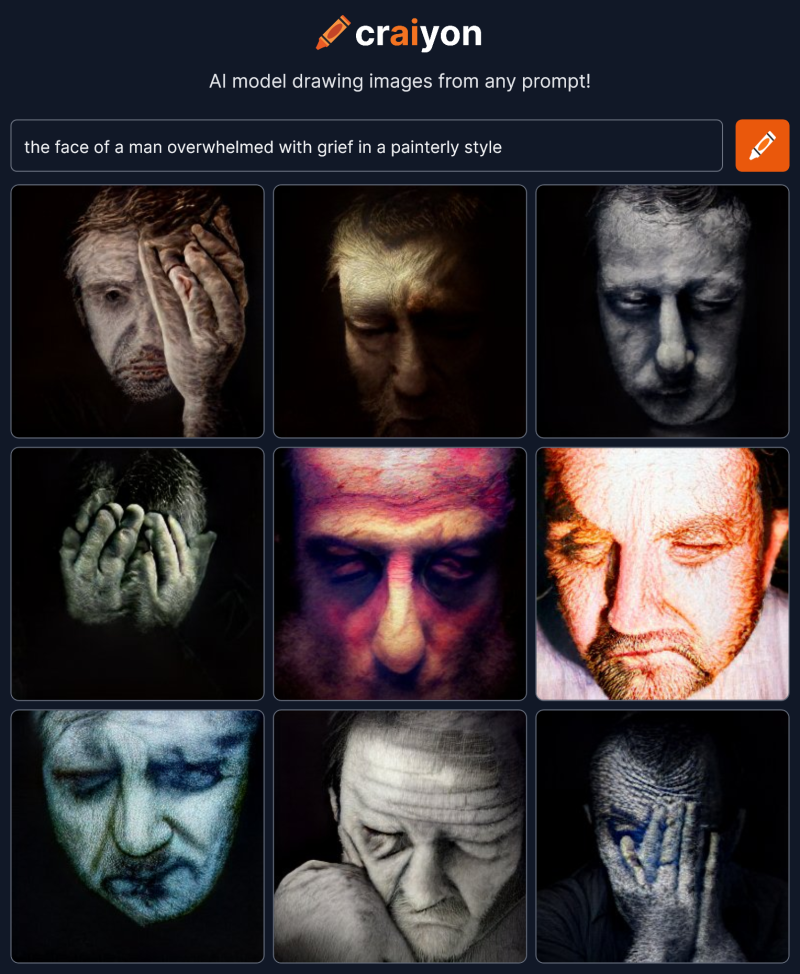
The face of a man overwhelmed with grief in a painterly style

craiyon_065722_the_face_of_a_man_overwhelmed_with_grief_in_a_painterly_style_br_😯 There are no words…

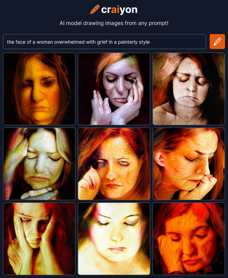
The face of a woman overwhelmed with grief in a painterly style

craiyon_065846_the_face_of_a_woman_overwhelmed_with_grief_in_a_painterly_style_br_The answer is… Yes.  Artificial intelligence can draw emotion in a face, you just have to find the right words to prompt it.  It’s part the ability of the AI and part your direction.  Iteration is the key.  If you stumble across a corporate mascot, back up and try another path.

Next time I’m going to try to create interesting faces giving the craiyon AI as little information as possible.


Artificial Intelligence – Can It Make Art?

I’m checking out art created by artificial intelligence at craiyon.com.  You type in some words and the AI creates nine pictures from the prompt.  My goal here is not to create great art but to see what the AI can do.  What are the edges of it’s ability?  Can it create anything really interesting?

Here’s the first thing I tried:

Two people in love
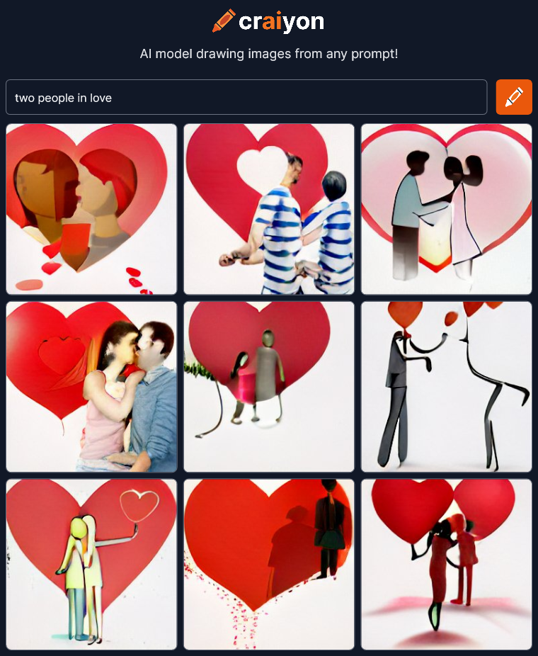
craiyon_031225_two_people_in_love_br_Interesting, but I was expecting more.  There’s two figures in most of the images but the abstract concept of “love” is mostly expressed by red hearts.  The AI is not showing “love” in the art it’s showing a symbol of love.

Maybe I’ve already found something it can’t do?  Does it take abstract concepts like “love” and convert them to simple symbolic images?  These look like bland lazy power point clip-art.  Lets try some more:

The human adventure is just beginning
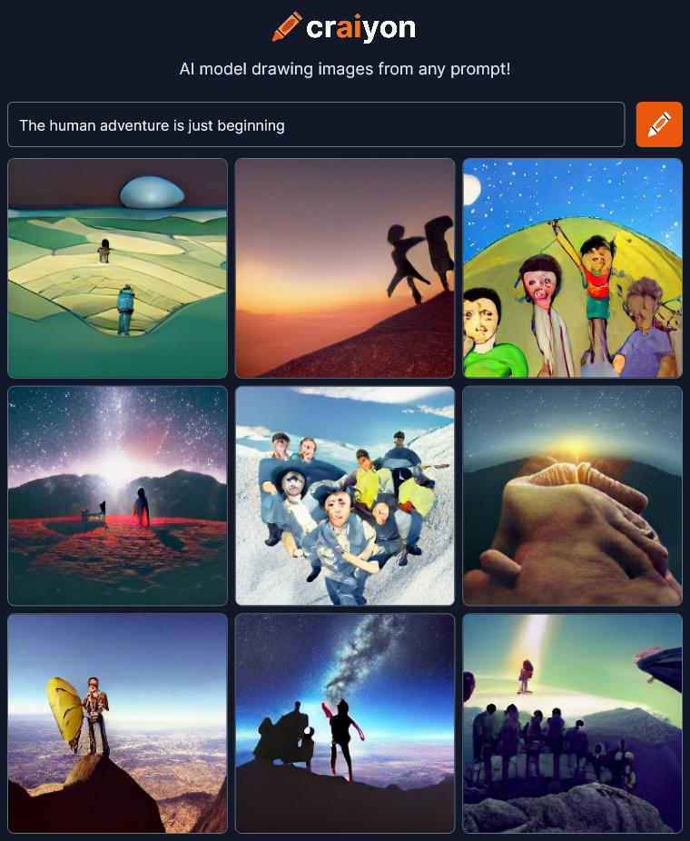
craiyon_031803_The_human_adventure_is_just_beginning_br_OK, that’s better.  I can see “adventure” expressed in most of the images.  It’s mostly outdoor mountain climbing but that’s better than just simple heart symbols.

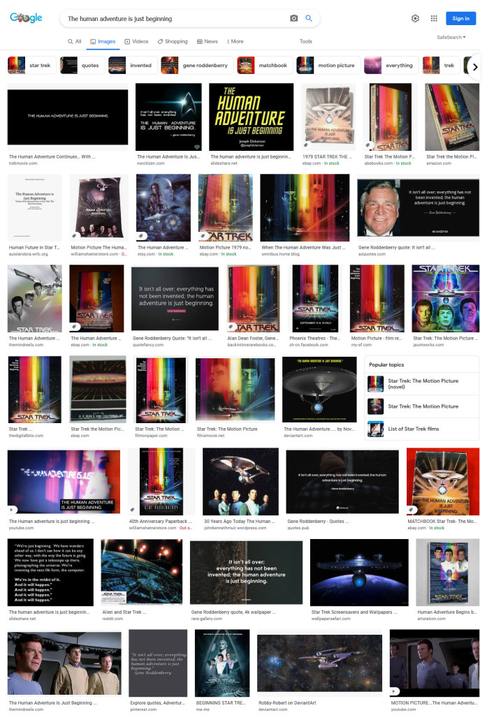
The human adventure is just beginning” is the tagline to Star Trek – the Motion Picture, but I guess Craiyon didn’t get that at all.  Searching on the same words in Google Images returns ONLY Star Trek pictures so this AI works very differently.  It’s not just trolling the internet to find images that are related.  There’s nothing in the Craion’s images to suggest Star Trek at all.
Screenshot 2022-08-01 at 20-58-52 The human adventure is just beginning - Google Search cropOK, let’s try something REALLY abstract…

It was the best of times, it was the worst of times
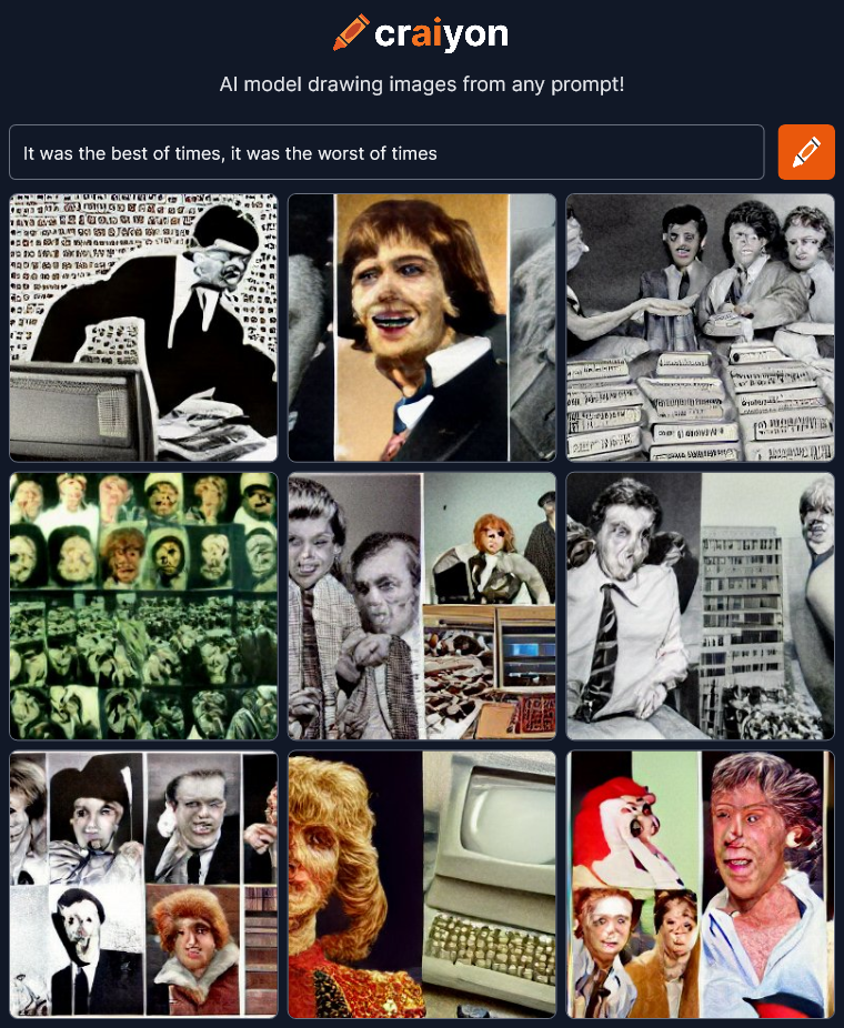
craiyon_032554__span__em_It_was_the_best_of_times__it_was_the_worst_of_times__em___span_OK, I don’t know what to make of this at all.  It’s interesting which is good but I’m not sure where any of this is coming from.  Maybe “people in the news”?

Let’s try something more direct.

I make SciFi
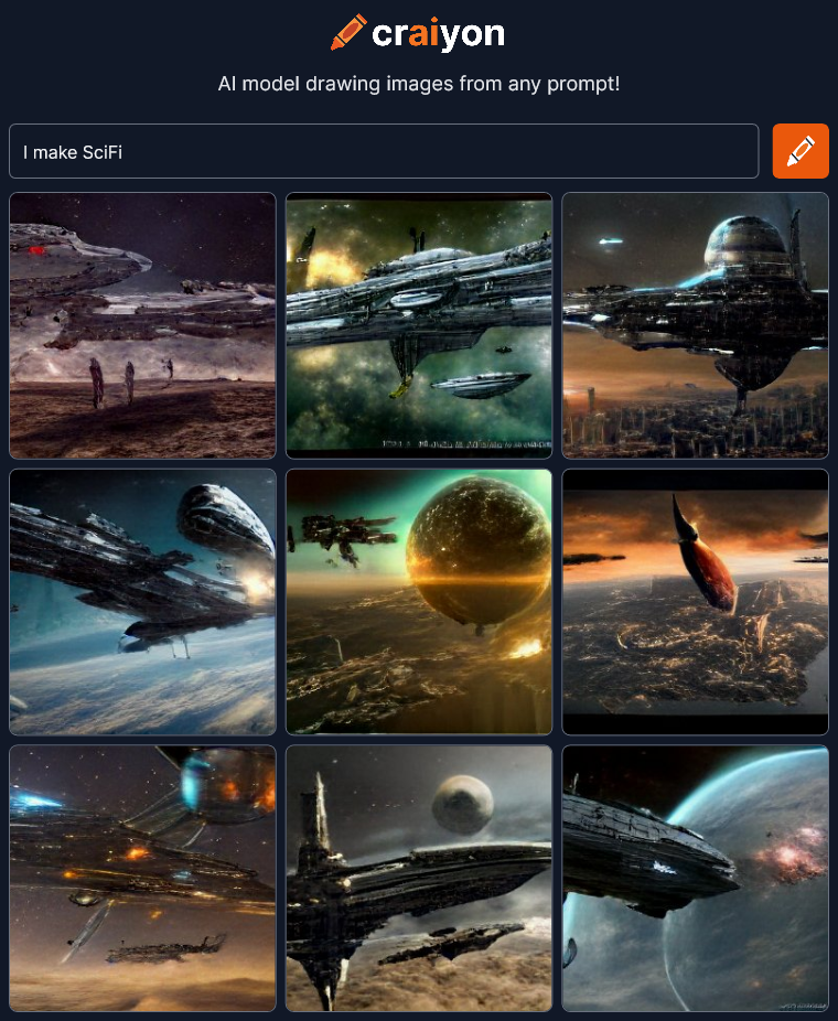
craiyon_033416_I_make_SciFi_br_OK…  Looks good but all the pictures have exactly the same style of SciFi even down to the spaceship designs.  It’s that generic SciFi style you see everywhere especially in games these days.  Maybe I should type out “science fiction” instead of using an abbreviation.

I make science fiction
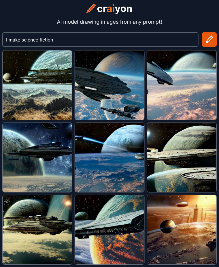
craiyon_033543_I_make_science_fiction_br_That’s pretty much exactly the same…

I make SciFi 50s
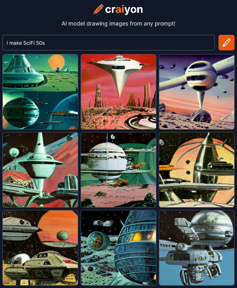
craiyon_033741_I_make_SciFi_50s_br_OK, there’s a different style, though I’d say it’s a little more 70s than 50s.

I make SciFi 70s
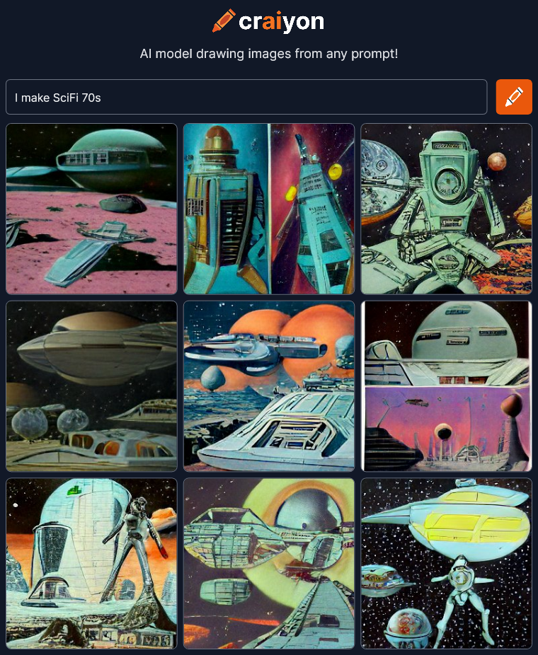
craiyon_033932_I_make_SciFi_70s_br_Hmmm…  It’s not getting the style differences for the years.  Maybe I should try robots?

Robot roll call
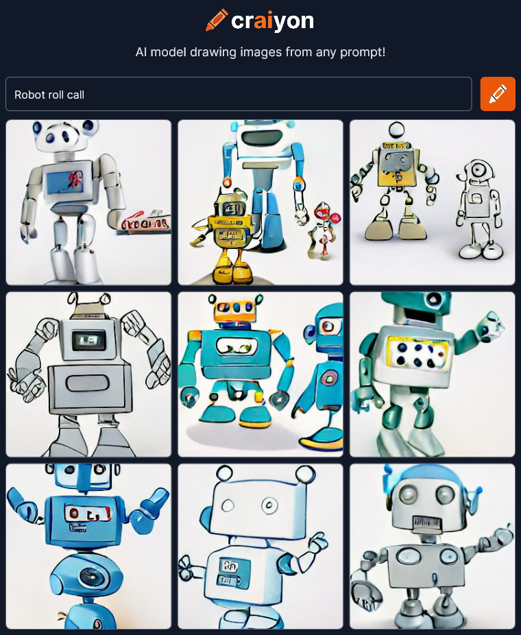
craiyon_034233_Robot_roll_call_br_Now everything is a cartoon.  I wonder how it determines the style if you aren’t specific about it.  I’m going to just keep trying different stuff.

Brave New World
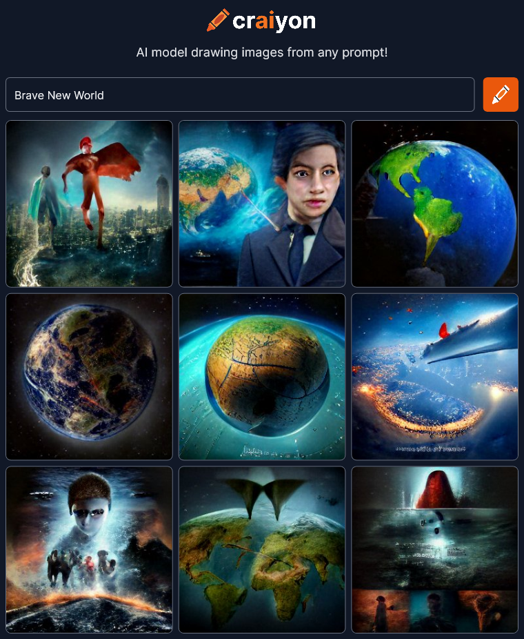
craiyon_034542_Brave_New_World_br_Wow!  That’s interesting.  There’s certainly some variety and emotion here.  I guess you just have to hit on the right phrase for it to make a leap beyond the surface meaning of the words.

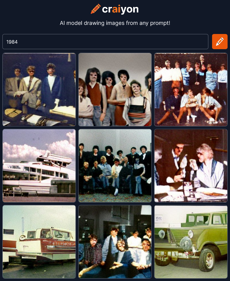
1984
craiyon_034742_1984_br_

Well it didn’t get the reference to the novel by Orwell (I didn’t think it would) but I guess it DID understand the number was supposed to be a year.  All the images seem to be from a mid-eighties time period, I think.

I wonder what would happen if I input some song lyrics?

Stepping outside she is free
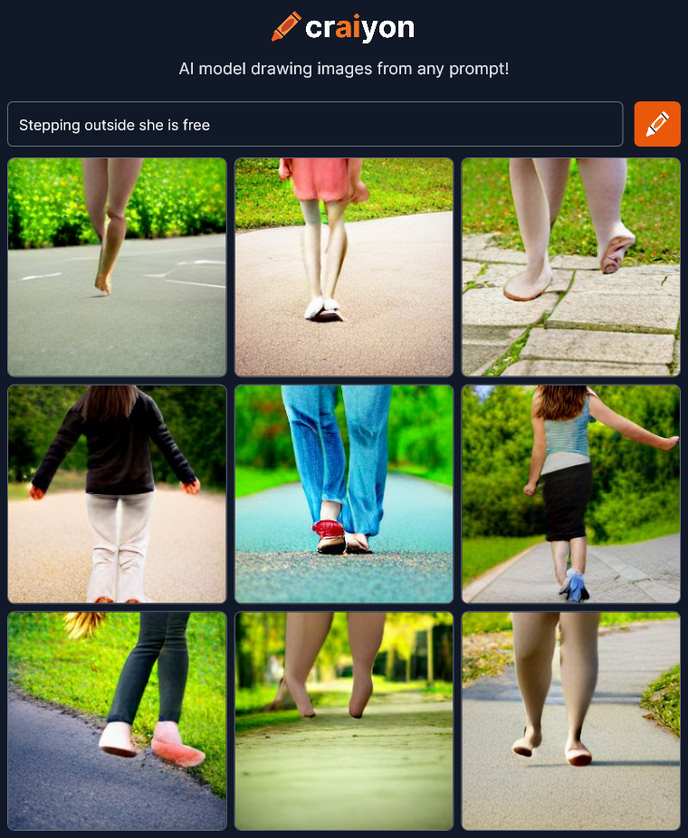
craiyon_035519_Stepping_outside_she_is_free_br_Well… Feet walking outside.  These images didn’t pick up the poetry of the line at all.

Words are meaningless and forgettable
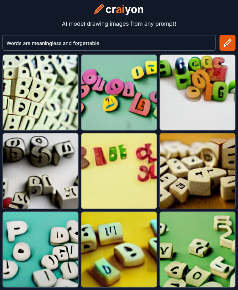
craiyon_035935_Words_are_meaningless_and_forgettable_br_More symbols.  “Words” = scrabble pieces.  More clip-art for corporate power point presentations.  The letters are unreadable but I don’t think that has anything to do with the phrase I typed in.  I have heard that Craiyon has trouble with text.

a candy colored clown they call the sandman
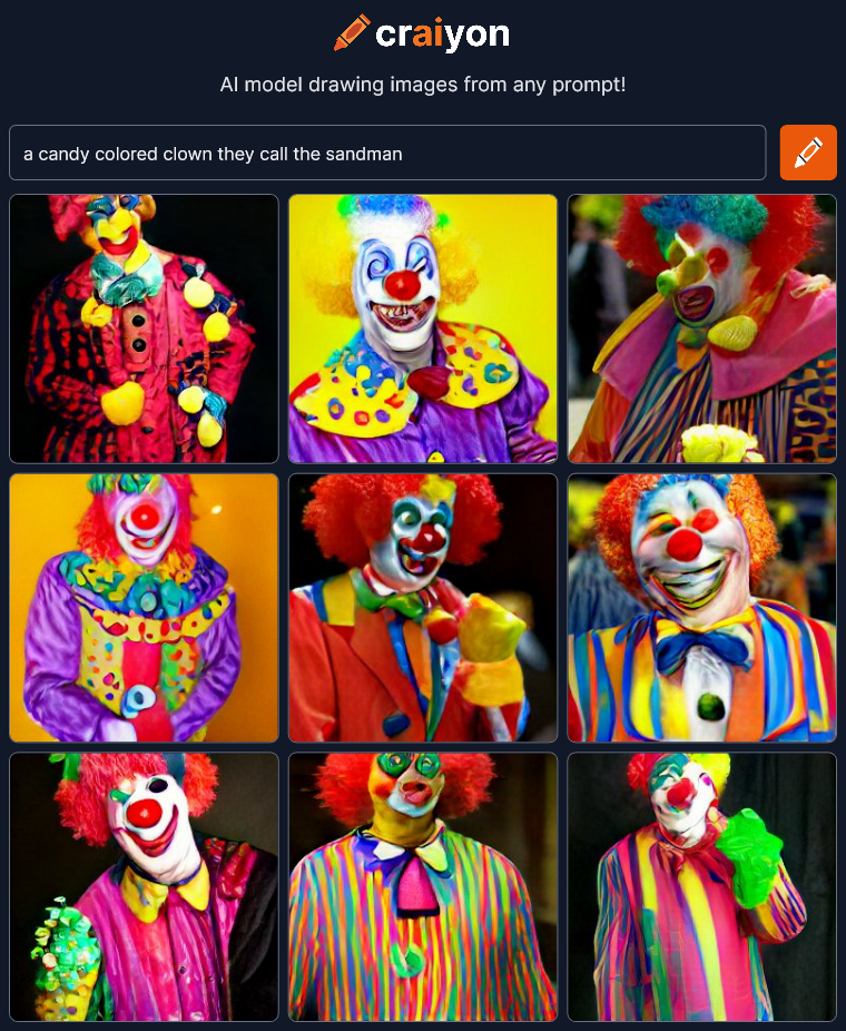
craiyon_040413_a_candy_colored_clown_they_call_the_sandman_br_Woah!  Yep, those are Candy Colored Clowns.  The direct straightforward descriptions yield predictable results.

The dreams in which I’m dying are the best I’ve ever had
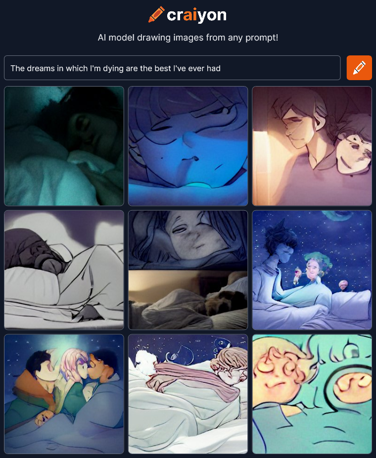
craiyon_040827_The_dreams_in_which_I_m_dying_are_the_best_I_ve_ever_had_br_Wow!  That went somewhere interesting.  I wasn’t expecting the drama in these images.

I wish I was a spaceman, the fastest guy alive
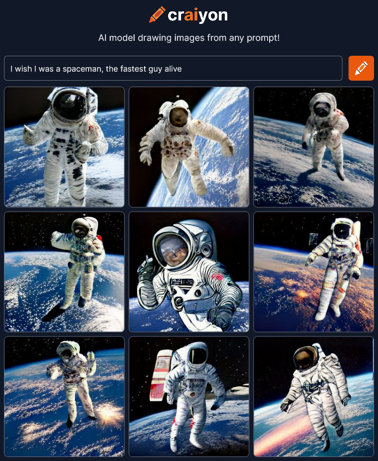
craiyon_041219_I_wish_I_was_a_spaceman__the_fastest_guy_alive_br_Oh well… Spaceman, that’s about it.  I was at least expecting some of the images to reflect the speed aspect.

Expecting it to find the poetry of a phrase seems to be hit or miss.  Maybe I should stop trying to throw it curve balls and be more descriptive and tell it specifically what I want.

SciFi adventure man Picaso style
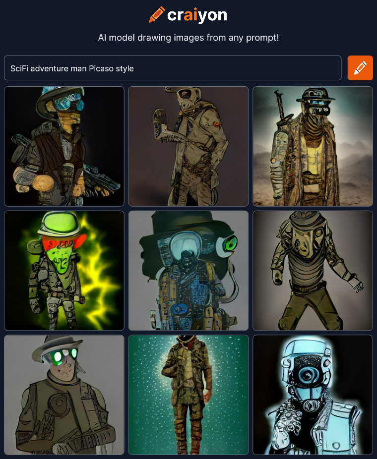
craiyon_041632_SciFi_adventure_man_Picaso_style_br_Hmmm… OK. Sure… It’s a SciFi adventure man if he’s in a post-apocalyptic world.  Not sure if this really looks like Picasso though.  Oh wait I mis-spelled Picasso….

SciFi adventure man Picasso style
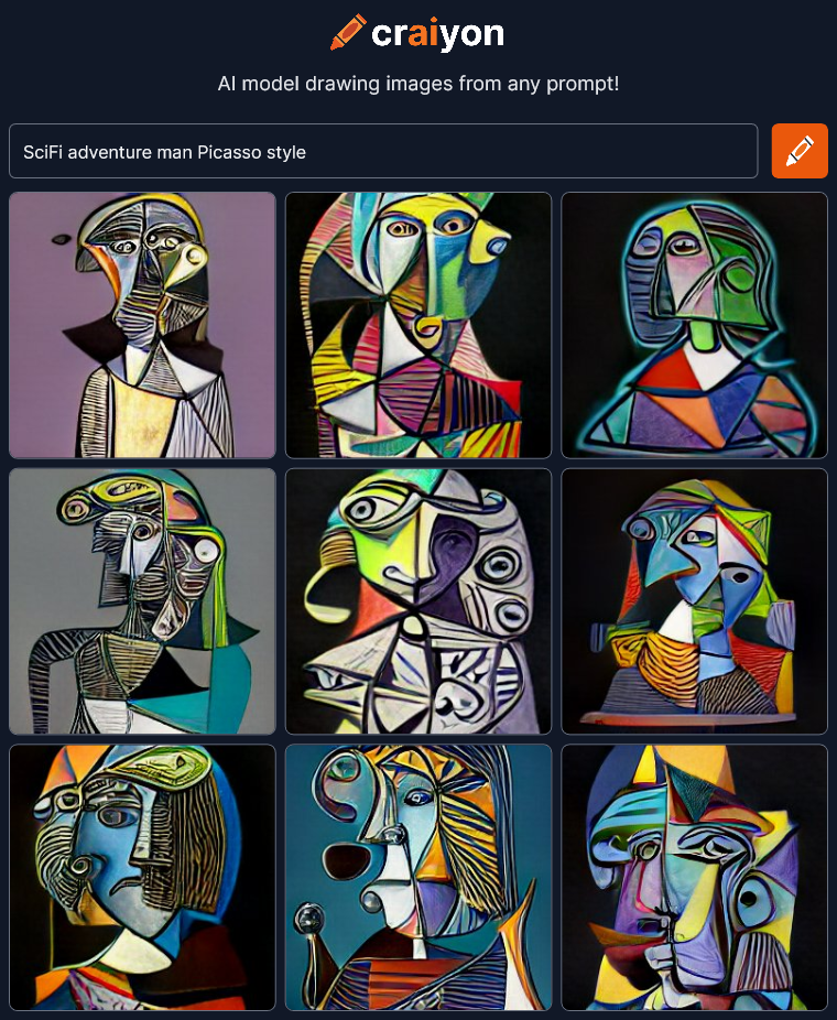
craiyon_042028_SciFi_adventure_man_Picasso_style_br_Woah!  There’s Picasso!  One letter off made a big difference!  I think the SciFi got buried in the style though.

SciFi adventure man dali style
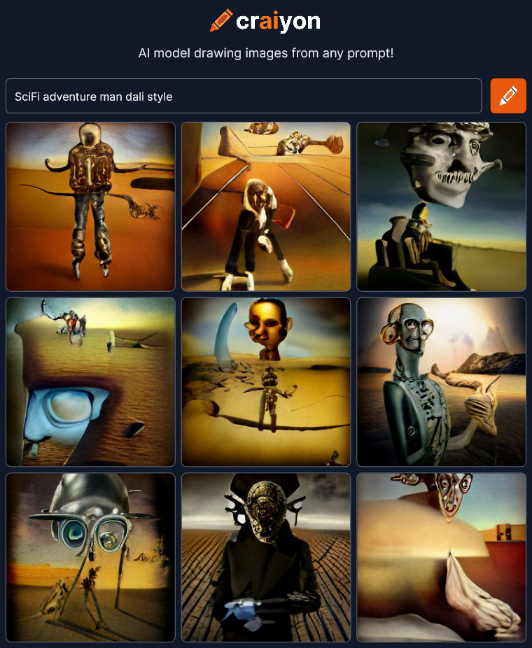
craiyon_042635_SciFi_adventure_man_dali_style_br_We’re making some art now!  SciFi still means roaming the post apocalyptic desert apparently.  Let’s try spelling out “science fiction” to see if it changes things.

science fiction adventure man dali style
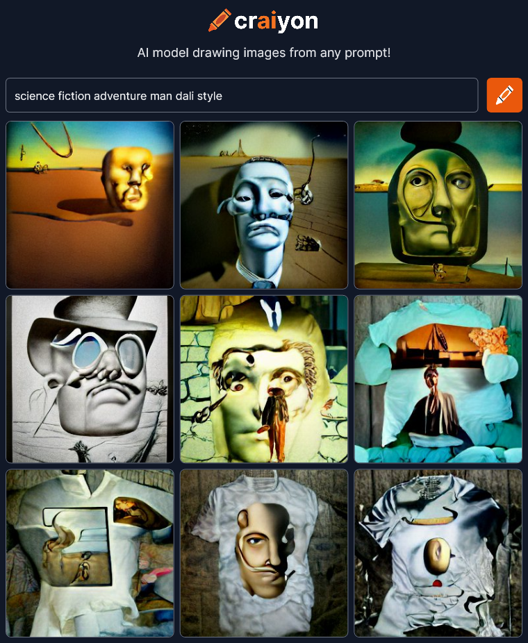
craiyon_042908_science_fiction_adventure_man_dali_style_br_Eh… Not as interesting.  And apparently t-shirts are part of it now presumably because you can buy Dali’s art on t-shirts somewhere on the internet.

I’m going to try adding the word “face” to get a close-up of the man.

science fiction adventure man face dali style
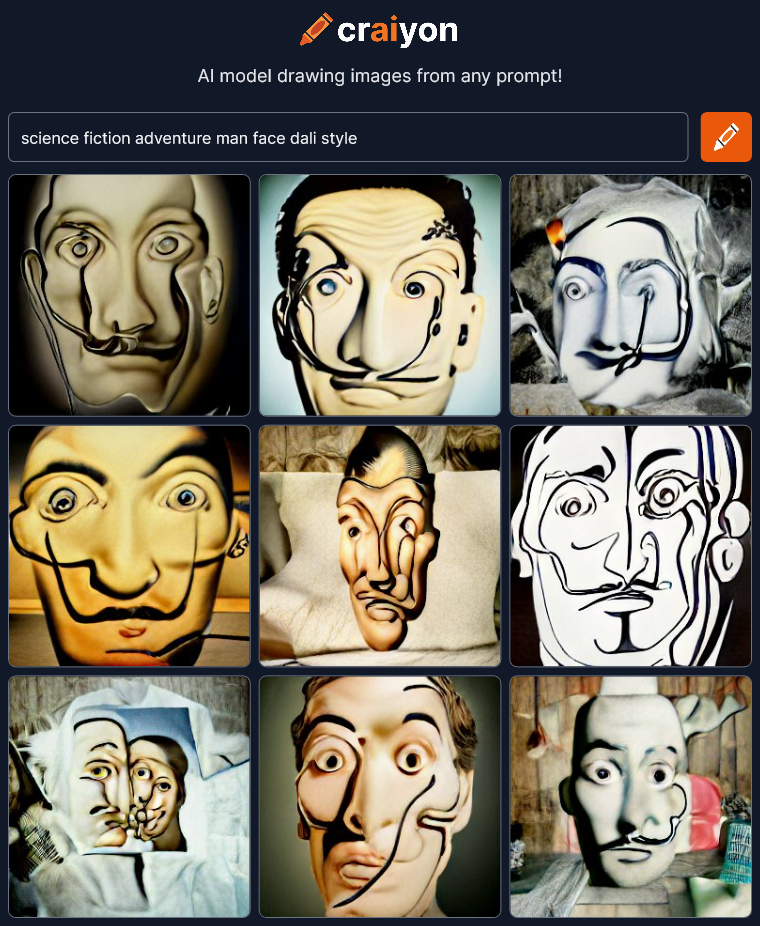
craiyon_043042_science_fiction_adventure_man_face_dali_style_br_OK, Now we’re getting just Dali’s face with hints of t-shirts.  Craiyon is getting off track.  I’m going to try limiting everything to faces next to see what happens.  I’ll leave that to the next post though because this is already getting way too long.

Craiyon seems much more primitive than other AI art projects I have seen (but not tried) like Dall-E 2 and Midjourney.  Those others seem to be able to create images that are much more realistic like they were made by professional artists.  I bet they’re much more controllable too.  That’s great but maybe not quite as interesting to me as Craiyon’s screwed up faces and unexpected results.  Realistic is good, but I think interesting is better.

I’m concerned that as AI drawing technology gets better and better, all AI art might become more bland and predictable, just like what’s happened to most of the art on sites like ArtStation.  A group-think of what is good and professional develops in the community that is then picked up and exaggerated by an algorithm that brings all the “best” to the top.  Pretty soon everything looks exactly the same.  Everyone is seeing and creating the same thing.

This is a special moment in the nascent development of AI art creation and we should take the time to appreciate the crazy and unexpected images for what they are, ART.

Check it out Craiyon for yourself.
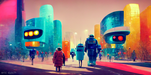
 

Is Electronic Love to Blame?

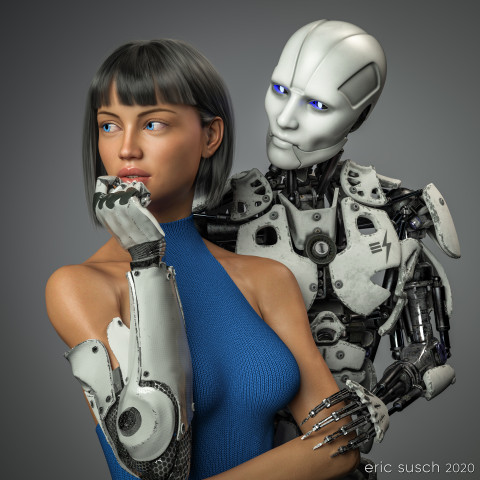
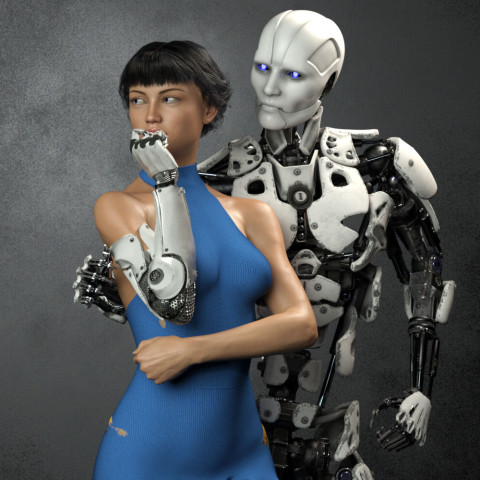
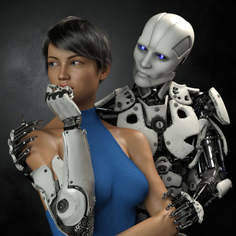
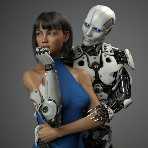
Is Electronic Love to Blame?This piece was a marathon to create.  A perpetual artistic labor.  Unending.  Frustrating.  We had remodeled our kitchen and saved a space on the wall for an art piece, complete with it’s own special spotlight.  The kitchen had taken over a year to complete and this art piece had to live up to that.  It needed to be perfect.  Constantly second guessing my creative choices, it took me a year to finish this, sometimes setting it aside, then diving back in to see if I could perfect it.  Today I’m finally calling it done and I’m presenting it here hoping I haven’t completely strangled the emotional life out of it.

Some of the initial criteria:  It was designed as a large piece, three feet square, so it needed to be extremely detailed.  It had to match the modern aesthetic of our new kitchen. Colors needed to be white and gray with a blue accent.  It needed to be bright, not the dark moody work I usually gravitate towards.  I wanted two characters – an android and a cyborg – in love yet troubled, going through the same ups and downs we all do.  …And it needed to be good.  That was the most important criteria.  It needed to be good.

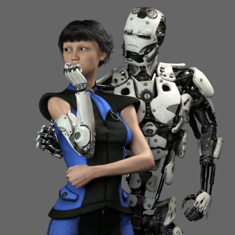
Cyborg loves Robot test render 14 ccThis is an in-progress test render from early on.  As you can see the original composition was wider.  The plan was to have the android’s right arm on her waist and she would be gently touching his metal fingers.

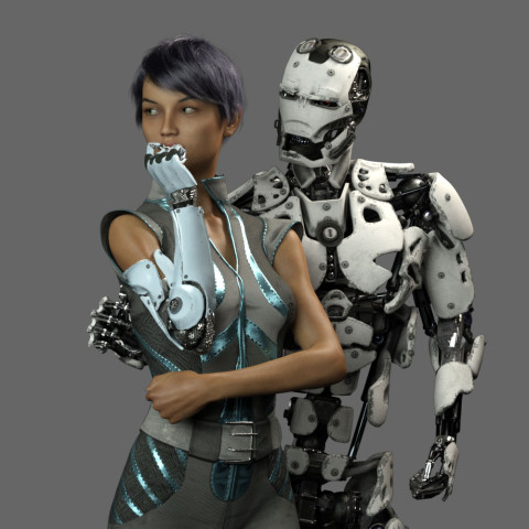
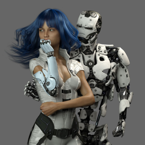
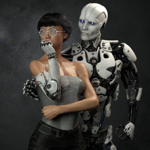
Cyborg loves Robot test render 15 ccWhat to wear and what hair?  I obsessed over endless choices.

Cyborg loves Robot test render 23 misumi skin ccI tried many skin textures for the girl.  I wanted to get the softness just right so it would contrast nicely with the hard metal of the android.

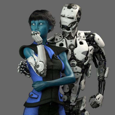
Cyborg loves Robot test render 26 lyflannery skin ccMaybe she should be an alien?  Blue is the accent color so it makes sense.  OK, maybe it’s too dark…

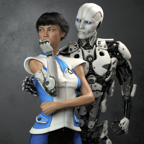
Cyborg loves Robot test render 39 ccAngry robot face changed to gentle face.  I needed to get some humanity in this android.

Cyborg loves Robot test render 46 fitness 50I eventually decided the girl needed bare shoulders to clearly see the cybernetic arm connection.  I wanted it to be clear that she was human and only her arm was mechanical.  This is also the reason I decided to ditch the idea of “space girl” type clothing which tends to be aggressive and hard.  She needed to be soft, the soft spot between the hard metal of her arm and the android.

Is Electronic Love to Blame 12 04 cam 05 ccI finally decided to go with this “cold shoulder” dress.  When I was working to make it blue, I changed the original cloth to a knit fabric because my wife CAT is a knitter.  That just made sense to me.

Is Electronic Love to Blame 14 00Eventually I realized that I had set the camera too far away, and moved in closer.  This always happens.  It’s always better after I move in.  It’s just part of my process I guess.

Adjusting for the new composition, I tried moving the robots right hand up to her shoulder.  It ended up too creepy though.  Trying to get the sharp metal fingers to show some sensitivity was proving difficult.  It also fouled up the clean skin / machine connection I wanted for her cybernetic arm.  I eventually moved the android’s right hand behind her back out of sight and concentrated on getting the left hand in the correct position.  It took me three tries to get the left arm to look relaxed and gentle.

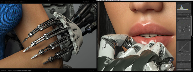
Cyborg loves Robot BTS skin and machineI also spent a tremendous amount of time trying to get the android fingers positioned just right so that they didn’t look like they were gouging the girl’s arm, yet at the same time, catching the light in a nice way.  Skin against machine was becoming a major theme apparently.  Same with the cybernetic fingers and her lips.  I actually moved the camera and lengthened the girl’s neck at one point so you could see more of her mouth.

Is Electronic Love to Blame 23 00 cam 17 lower arms and neck movedThen, of course I second guessed myself and pulled the shot back to re-visit the original concept of the hand around the waist.  Worked on that for awhile but thankfully came to my senses.  Maybe I’ll revisit this wider shot if I do a different version with a vertical aspect ratio.

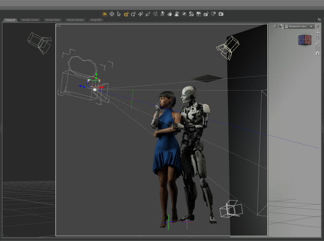
Cyborg loves Robot BTS camera setup 03I only needed three lights to illuminate the scene.  A key from the front doing most of the work.  A hair light from the top that was also doubling as a fill light.  And a spot on the gray background plane.  I created another tiny plane just out of frame above the android to cut down the reflection on his white bald head.

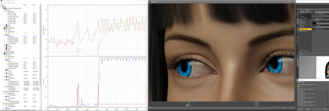
Cyborg loves Robot BTS renderingThe final Iray render took about two hours at 10800 x 10800 resolution.  I was surprised.  That’s very fast.  I’ve had renders at this resolution go ten hours or more.  I’m guessing the plain background and the overall brightness of the scene helped.

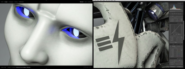
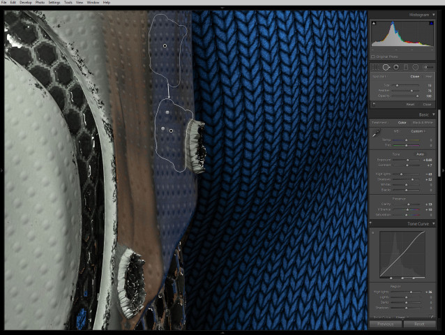
Cyborg loves Robot BTS robot cuColor correcting in Lightroom I tried to bring out the hardness of the machine and the softness of the skin.

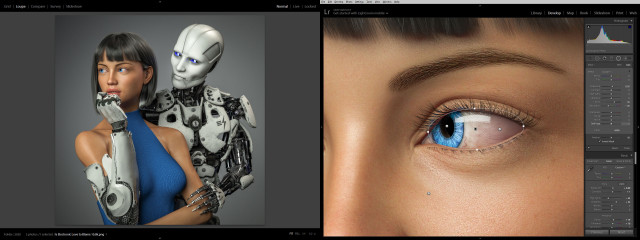
Cyborg loves Robot BTS eye cc 04 finalI lightened up the girl’s eyes and obsessed over everything for quite some time.  Overall I brightened everything up and made it punch as much as possible.

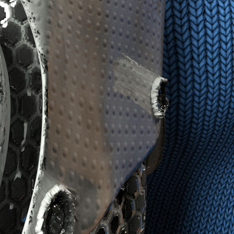
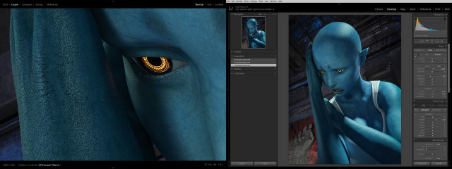
Is Electronic Love to Blame 33 06 normal map 1.0While color correcting I noticed a bizarre reflection coming off one of the poorly formed low-rez “screws” on the cybernetic arm.  It had something to do with the normal map which wasn’t doing much on this surface.  The screws were created with the displacement map.  Not sure what was going on.

Cyborg loves Robot BTS screw reflection fixAnyway, I couldn’t figure out how to fix it in DAZ Studio without changing the character of the rest of the arm surface so I just used the spot remover in lightroom.

Is Electronic Love to Blame?So what do you think?  Did I over think it and create something stilted?  Or did I continually refine it and make it great?  I can’t tell anymore.

Next step: print it and see what it looks like on the wall…

Created in DAZ Studio 4.12
Rendered with Iray
Color Correction in Lightroom

Despair


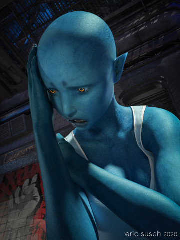
DespairAfter George Floyd was killed and a week of protesting around the world, this was how I felt. I created a TikTok video where the camera cranes down from a fire escape and eventually tilts up on this character.  You can see the video here: Despair on TikTok

After a bit of re-adjusting in DAZ Studio I came up with this high rez still version of the final frame.  I rendered it at 10000 x 7500 pixels so I could print it out big and hang it on the wall.

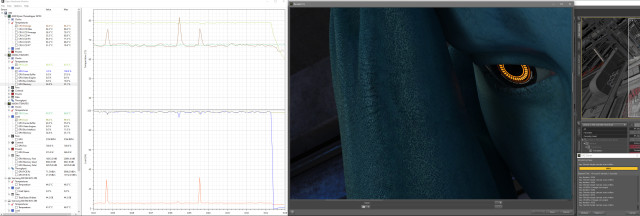
Shadow areas take a long time to render in Iray, especially if the canvas is large.  With two Titan RTX graphic cards continuously screaming at 79 degrees Celsius, this image took fourteen hours to render.  Not the longest render I’ve ever done (that would be 48 hours) but still a good exercise for my new computer workstation.

0050 despair BTS daz render2Color correction in lightroom was relatively simple, essentially just brightening up everything so it pops and so all the shadow areas don’t print out too dark.

0050 despair BTS lightroomCreated in DAZ Studio 4.12
Rendered with Iray
Color Correction in Lightroom

Alien in the Elevator

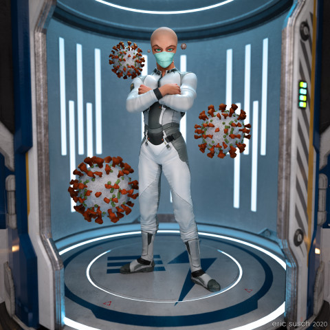
Alien in the ElevatorWhat is outside the door when it opens?  This is the question I ask myself everyday now.  Some alien organism hitchhiking on a friend?  Wear a mask!

For this piece I went back to one of my TikTok animations, set up another camera with a square aspect ratio, and exported a high rez still.

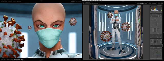
0040 alien in the elevator BTS 00 lightroomThe color correction in lightroom made it pop quite nicely.

Created in DAZ Studio 4.12
Rendered with Iray
Color Correction in Lightroom

1st Tesla Model 3 Road Trip!! – Where’s the Juice?

Our first long trip with our new Tesla Model 3 (December 2018) We try auto pilot and juice up with a super-charger for the first time! It’s an electric motoring adventure!!  We visit The Roscoe Diner in Roscoe, NY (The Roscoe charging station was finished in February 2019.) …and The Spot Diner in Binghamton NY.

update:  100,000 views in 90 days on YouTube!  Not bad.  Lots of comments on the video though.  Here are answers to some of the most common questions:

The car is dual motor (AWD) with the extend range battery, auto pilot, and 19 inch wheels.

We stopped in Binghamton twice to charge up. It took about twenty minutes each time. The first time was when the battery was lower the cost was $8.64. The second time on the way back it was $3.60. (When your battery is relatively full the charging goes much slower.) You don’t need a credit card. The charger recognizes your car and bills your Tesla account directly. The price shows up on the screen inside the car. 6:47

We were following the Roscoe super charger construction for a long time. The only information on the Tesla page for completion was “forth quarter 2018.” Since it was the end of the year and we were stopping anyway we gave it a shot.

The video was mostly shot with a sony a6000 with a sony ecm-xyst1m mic on top. Some of it was shot with a GoPro when the sony batteries died.


I Reveal My Innermost Self

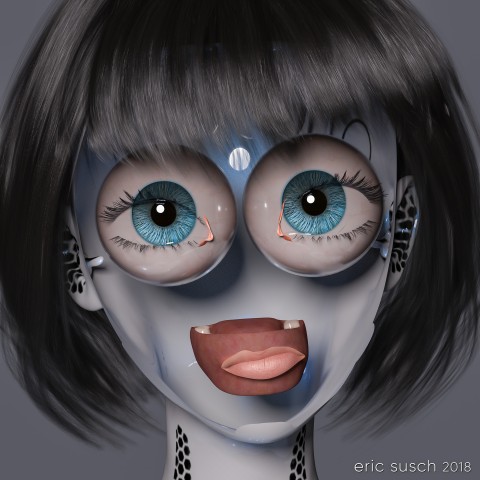
While I was working on a previous art piece called Quirky Girl, I stumbled through a wormhole and accidentally created this:
I Reveal My Innermost SelfI stopped everything and rendered it out immediately!  Enjoy!

I Reveal My Innermost Self

Created in DAZ Studio 4.11
Rendered with Iray
Color Correction in Lightroom

Figures used:
HPFK Lenora for Star 2.0 and Aiko 7
System 50 for G3F
Classic Bob Hair for G3+8F

Quirky Girl

This piece started off as a study of volumetric light.  I wanted to practice creating an atmosphere in a large open space.  I was also determined to make some art with a male figure instead of always using females.  I ended up doing none of that!  Hurtling down the creative path I diverged several times and ended up with an extreme close up of a toon anime girl. That’s the way it goes sometimes.

Quirky GirlThe base shape is a toon doll like character that was designed to be goth with lots of “broken china doll” features.

Quirky Girl BTS LenoraI tried some of the “broken” materials as well as the gothic makeup on the character but eventually moved on to other materials from elsewhere.  One of those experiments lead to a happy accident and created a bizarre horrifying variation which ultimately became a completely new piece of art.  …But that’s a post for another day.

Quirky GirlFor this piece I eventually layered a more human material across the mesh and found these interesting eyes that look like they were made of brush bristles.  They appeared realistic and fake at the same time.  I wanted those eyes to be the focus.

Quirky Girl BTS setupI set up a simple layout with the camera close on the face and only one light on the character.  I spent a lot of time working on the quirky expression because I knew that would be where the emotion came from.

Quirky Girl BTS DOFEven though the shot is essentially flat, I set up a limited depth of field on the camera anyway.  The effect is subtle – the hair in the back, the neck, and the ears are a little soft – but I think it gives it a little something.

Quirky Girl BTS ccColor correction in lightroom was fairly straightforward.  I bumped up the saturation of the blue channel to bring out the eyes.  Simple.

Quirky GirlQuirky Girl

Created in DAZ Studio 4.11
Rendered with Iray
Color Correction in Lightroom

Figures used:
HPFK Lenora for Star 2.0 and Aiko 7
Tamara Character and Hair for G3F
Classic Bob Hair for G3+8F

Science Remembers

It’s the future and everyone is bald (of course.)  Heads are bigger because brains are smarter and dreams are infinite.  This is a simple portrait from the day after tomorrow.

Science RemembersA girl, a camera, and a wall were all I needed to create this piece.  …and lights.  I needed lights too.

Science Remembers BTS cameraI threw a blue/green spot on the back wall to match her costume and eyes.  The limited color pallet made her face pop.

Science RemembersAt one point I tried changing the background and put her on the bridge of a spaceship but it ended up too busy so I scrapped it.

Science Remembers BTS ccAll it needed was minor color correction in lightroom.  Not much at all.  The final is essentially what was rendered out of DAZ studio.

What do you think?  Is this our future?

Science RemembersScience Remembers

Created in DAZ Studio 4.11
Rendered with Iray
Color Correction in Lightroom

Figures used:
Brenna for Ophelia 7
Sci-Fi Lieutenant Outfit for G3F
Wicked Fantasy Morphs for G3F