
The exaggerated shallow depth of field is a bit much for me but damn, the AI constructed all this from just these words:
The future, the past, old friends long gone, cinematic, 8K, hyper detailed –ar 2:1
#Art I made with #Midjourney #AI
The exaggerated shallow depth of field is a bit much for me but damn, the AI constructed all this from just these words:
The future, the past, old friends long gone, cinematic, 8K, hyper detailed –ar 2:1
#Art I made with #Midjourney #AI
 Trying something more colorful this time on Midjourney. I type this:
modern city of the future, robots walking the street, clean, colorful, cinematic, atmosphere, beautiful –ar 2:1
Amazing. This is going to change everything in the art world.
#Art I made with #Midjourney #AI
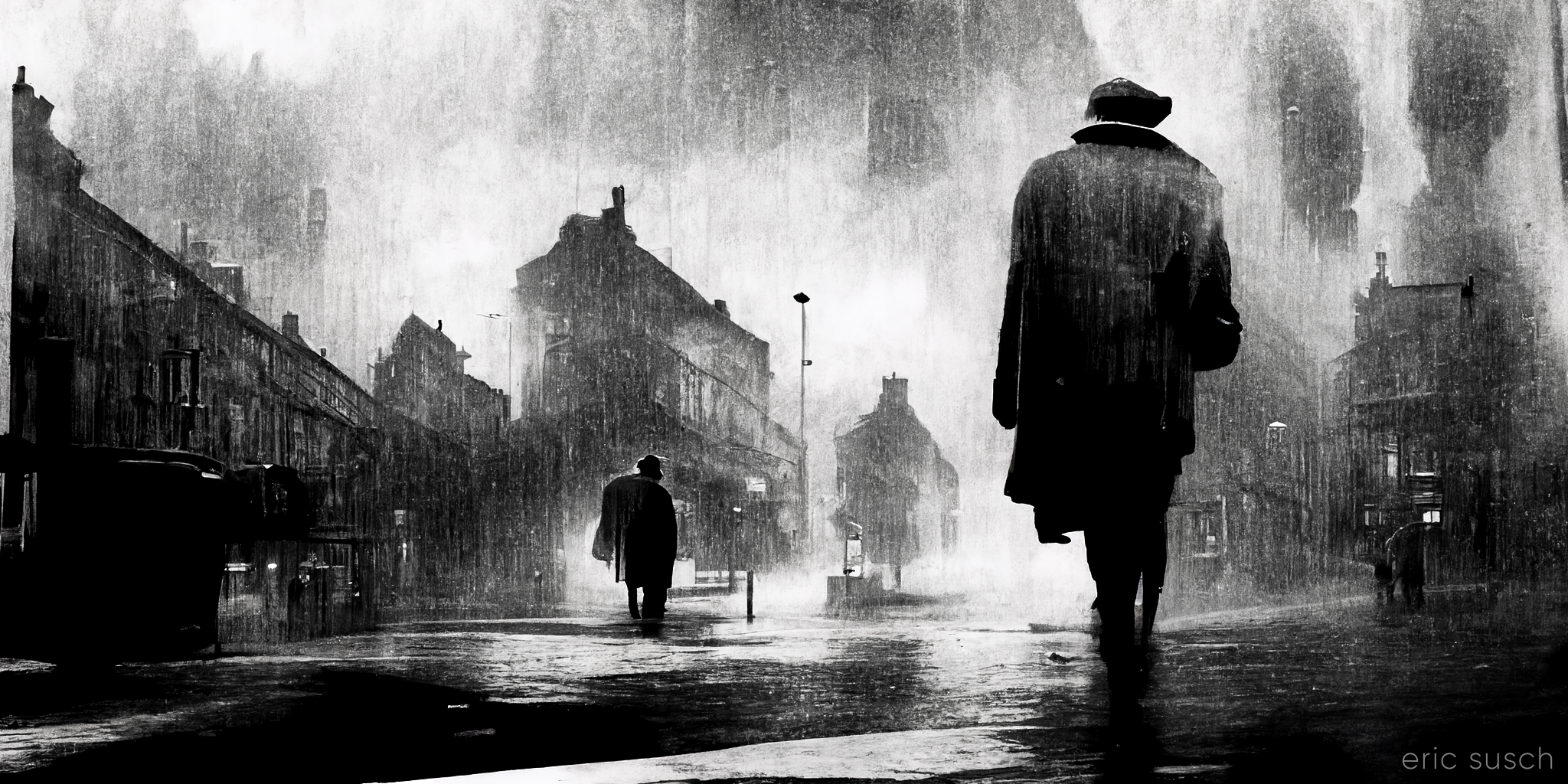
I started a free trial at Midjourney.com and I’m blown away. This is only my second attempt. I typed in: wet city street, moody, film noir, black and white, cinematic, atmospheric, a mysterious man –ar 2:1. This is one of the four results. These new AI art systems are unbelievable.
#Art I made with #Midjourney #AI
I’m checking out art created by artificial intelligence at craiyon.com. You type in some words and the AI creates nine pictures from the prompt. My goal here is not to create great art but to see what the AI can do. What are the edges of it’s ability? Can it create anything really interesting?
Here’s the first thing I tried:
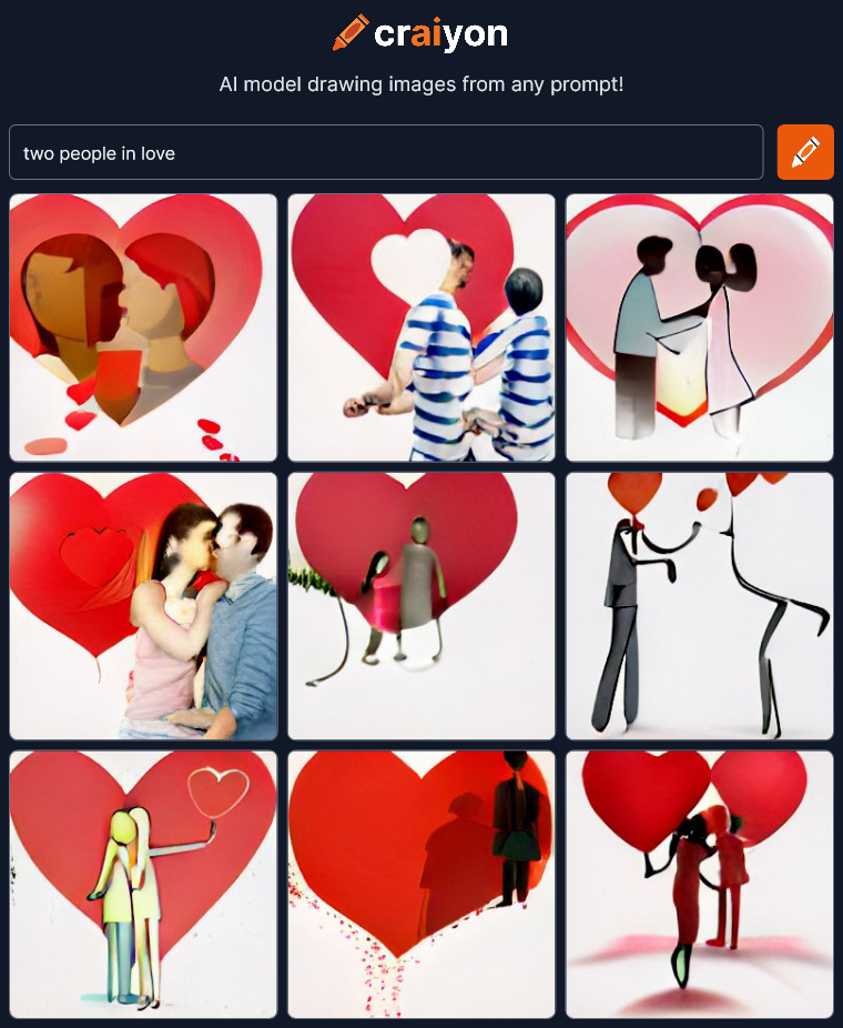 Interesting, but I was expecting more. There’s two figures in most of the images but the abstract concept of “love” is mostly expressed by red hearts. The AI is not showing “love” in the art it’s showing a symbol of love.
Maybe I’ve already found something it can’t do? Does it take abstract concepts like “love” and convert them to simple symbolic images? These look like bland lazy power point clip-art. Lets try some more:
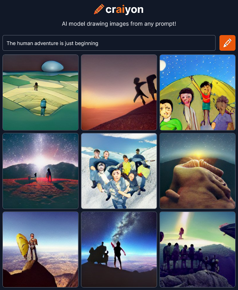 OK, that’s better. I can see “adventure” expressed in most of the images. It’s mostly outdoor mountain climbing but that’s better than just simple heart symbols.
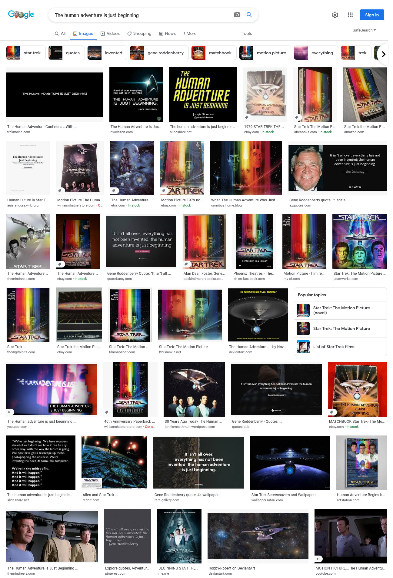
“The human adventure is just beginning” is the tagline to Star Trek – the Motion Picture, but I guess Craiyon didn’t get that at all. Searching on the same words in Google Images returns ONLY Star Trek pictures so this AI works very differently. It’s not just trolling the internet to find images that are related. There’s nothing in the Craion’s images to suggest Star Trek at all.
 OK, let’s try something REALLY abstract…
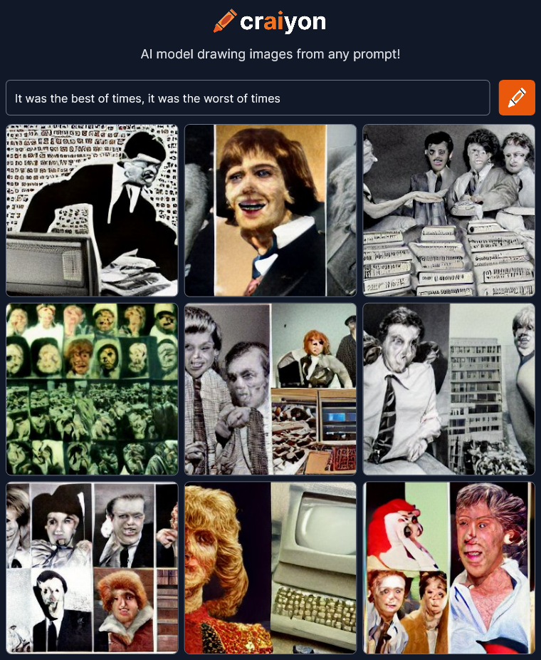 OK, I don’t know what to make of this at all. It’s interesting which is good but I’m not sure where any of this is coming from. Maybe “people in the news”?
Let’s try something more direct.
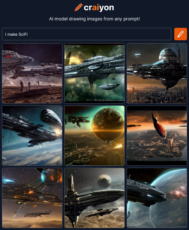 OK… Looks good but all the pictures have exactly the same style of SciFi even down to the spaceship designs. It’s that generic SciFi style you see everywhere especially in games these days. Maybe I should type out “science fiction” instead of using an abbreviation.
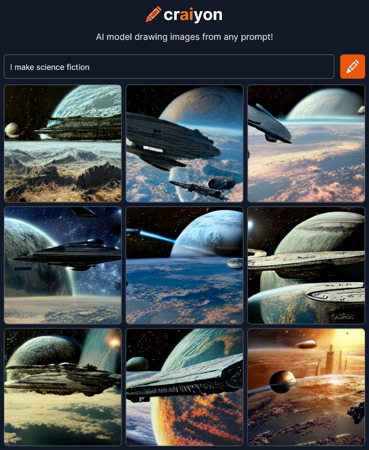 That’s pretty much exactly the same…
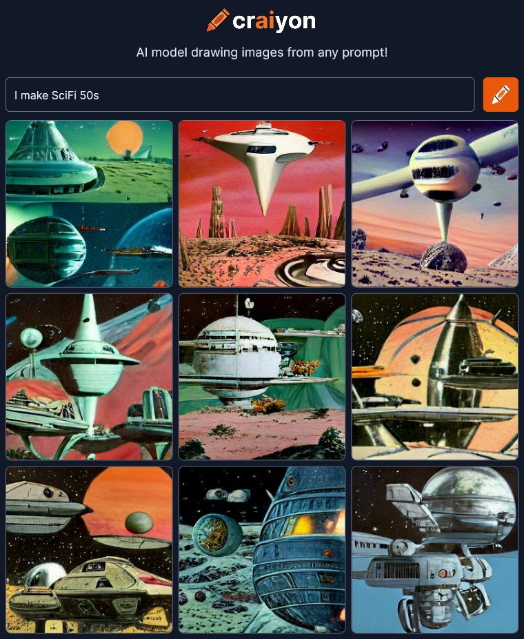 OK, there’s a different style, though I’d say it’s a little more 70s than 50s.
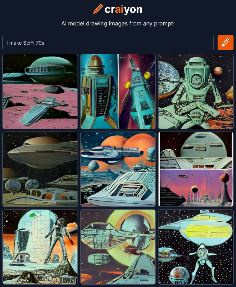 Hmmm… It’s not getting the style differences for the years. Maybe I should try robots?
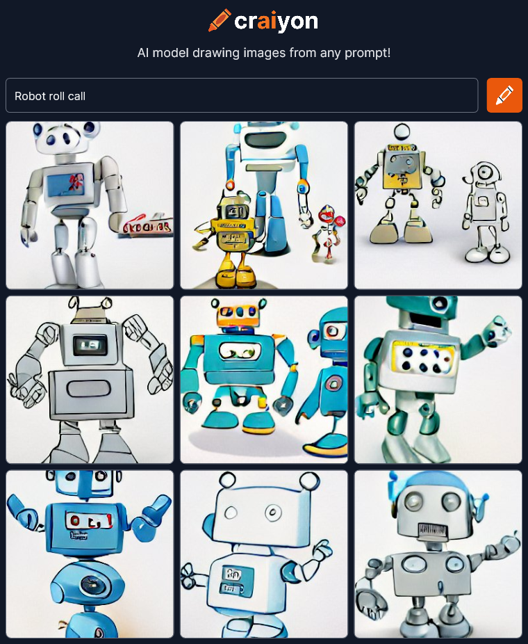 Now everything is a cartoon. I wonder how it determines the style if you aren’t specific about it. I’m going to just keep trying different stuff.
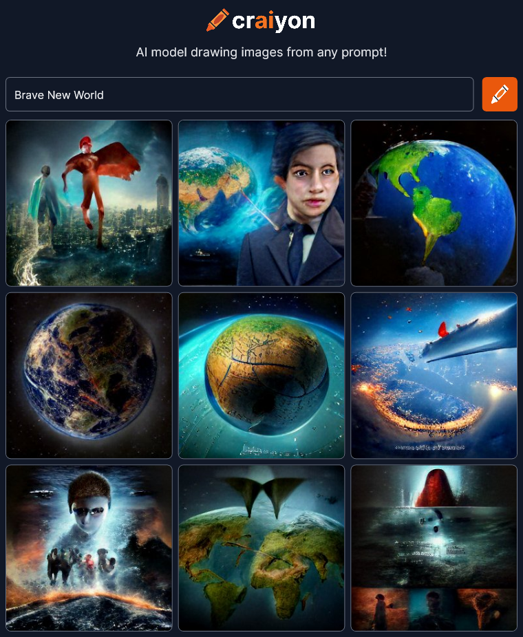 Wow! That’s interesting. There’s certainly some variety and emotion here. I guess you just have to hit on the right phrase for it to make a leap beyond the surface meaning of the words.
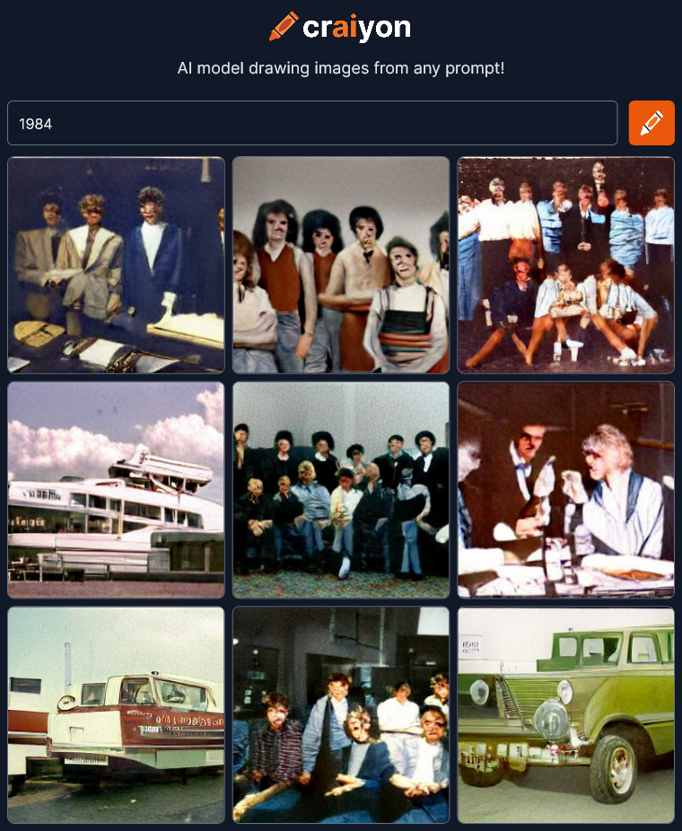
Well it didn’t get the reference to the novel by Orwell (I didn’t think it would) but I guess it DID understand the number was supposed to be a year. All the images seem to be from a mid-eighties time period, I think.
I wonder what would happen if I input some song lyrics?
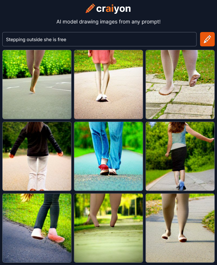 Well… Feet walking outside. These images didn’t pick up the poetry of the line at all.
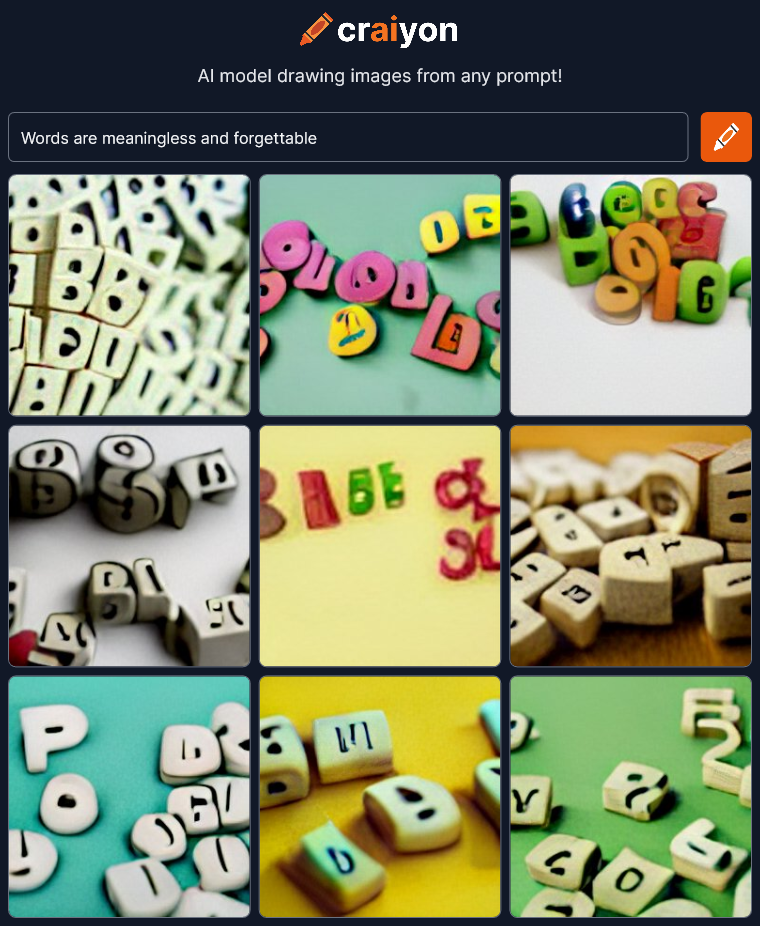 More symbols. “Words” = scrabble pieces. More clip-art for corporate power point presentations. The letters are unreadable but I don’t think that has anything to do with the phrase I typed in. I have heard that Craiyon has trouble with text.
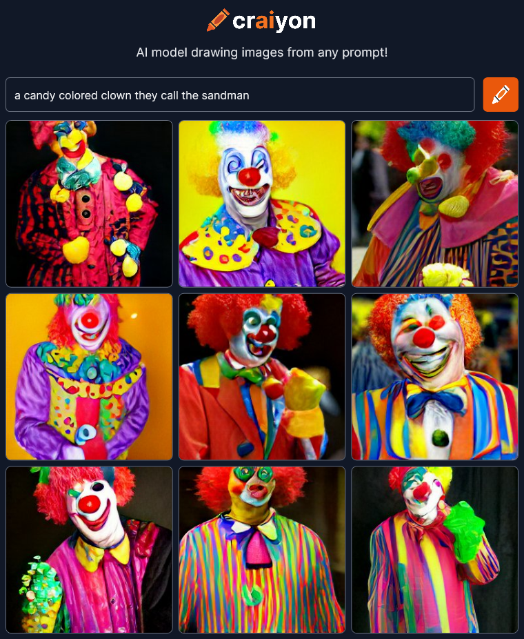 Woah! Yep, those are Candy Colored Clowns. The direct straightforward descriptions yield predictable results.
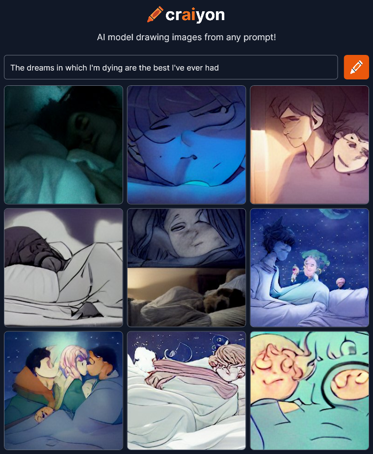 Wow! That went somewhere interesting. I wasn’t expecting the drama in these images.
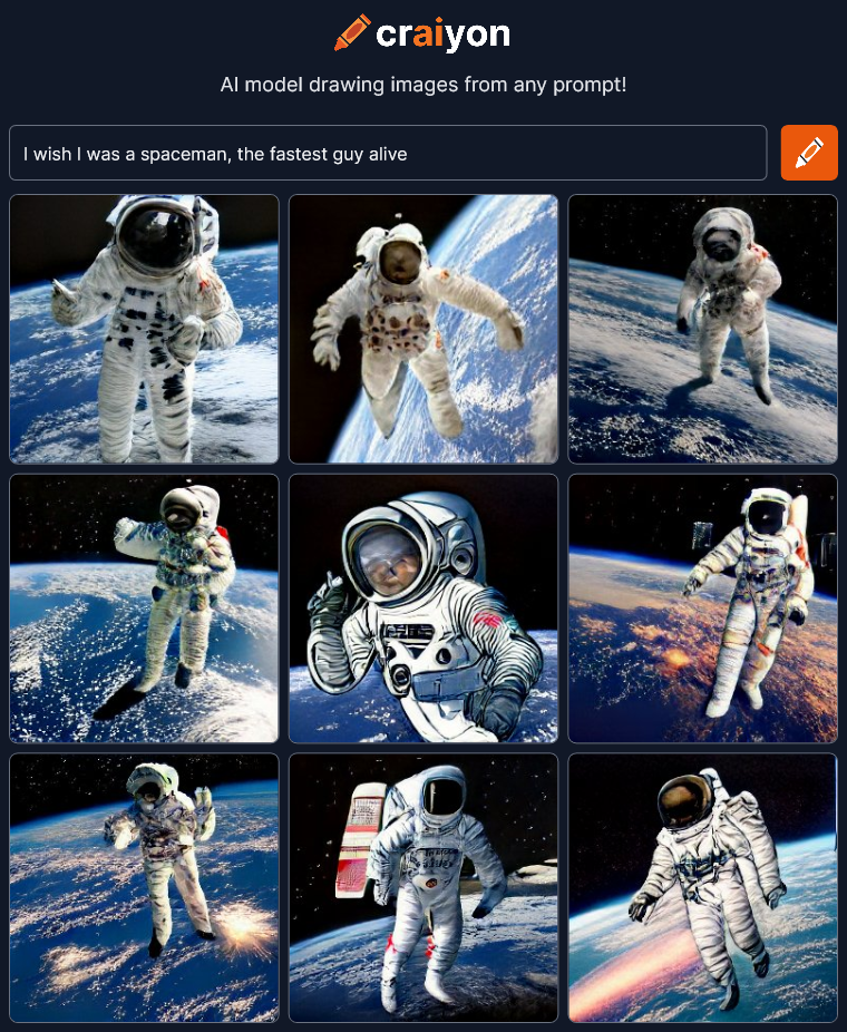 Oh well… Spaceman, that’s about it. I was at least expecting some of the images to reflect the speed aspect.
Expecting it to find the poetry of a phrase seems to be hit or miss. Maybe I should stop trying to throw it curve balls and be more descriptive and tell it specifically what I want.
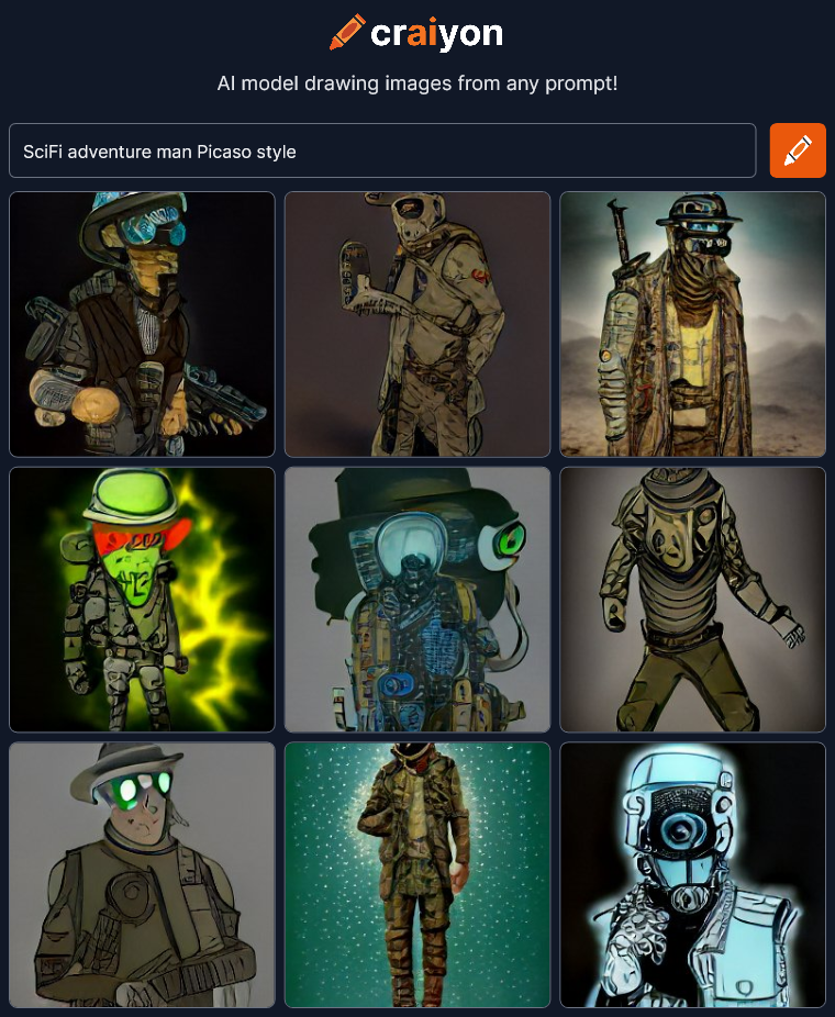 Hmmm… OK. Sure… It’s a SciFi adventure man if he’s in a post-apocalyptic world. Not sure if this really looks like Picasso though. Oh wait I mis-spelled Picasso….
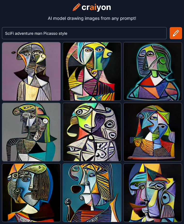 Woah! There’s Picasso! One letter off made a big difference! I think the SciFi got buried in the style though.
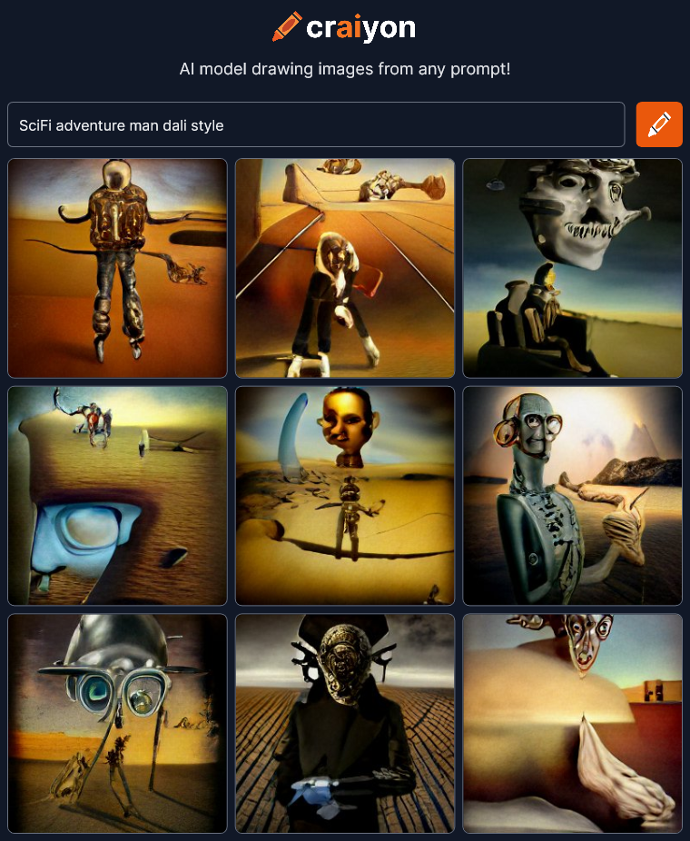 We’re making some art now! SciFi still means roaming the post apocalyptic desert apparently. Let’s try spelling out “science fiction” to see if it changes things.
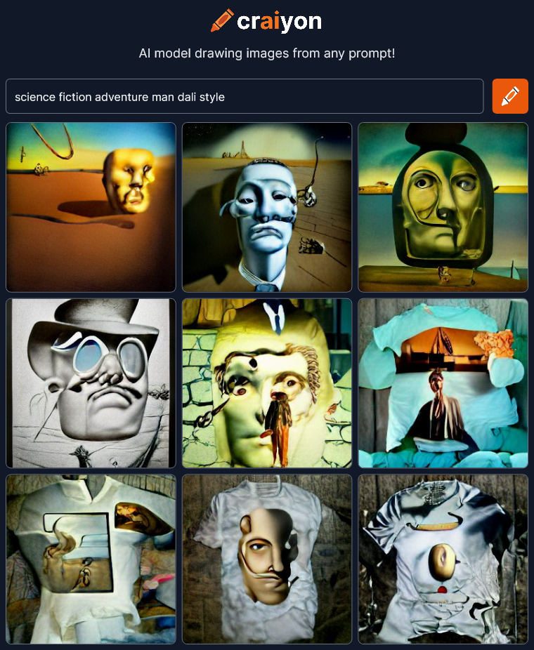 Eh… Not as interesting. And apparently t-shirts are part of it now presumably because you can buy Dali’s art on t-shirts somewhere on the internet.
I’m going to try adding the word “face” to get a close-up of the man.
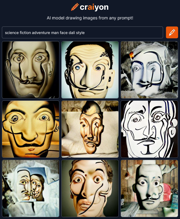 OK, Now we’re getting just Dali’s face with hints of t-shirts. Craiyon is getting off track. I’m going to try limiting everything to faces next to see what happens. I’ll leave that to the next post though because this is already getting way too long.
Craiyon seems much more primitive than other AI art projects I have seen (but not tried) like Dall-E 2 and Midjourney. Those others seem to be able to create images that are much more realistic like they were made by professional artists. I bet they’re much more controllable too. That’s great but maybe not quite as interesting to me as Craiyon’s screwed up faces and unexpected results. Realistic is good, but I think interesting is better.
I’m concerned that as AI drawing technology gets better and better, all AI art might become more bland and predictable, just like what’s happened to most of the art on sites like ArtStation. A group-think of what is good and professional develops in the community that is then picked up and exaggerated by an algorithm that brings all the “best” to the top. Pretty soon everything looks exactly the same. Everyone is seeing and creating the same thing.
This is a special moment in the nascent development of AI art creation and we should take the time to appreciate the crazy and unexpected images for what they are, ART.
Check it out Craiyon for yourself.