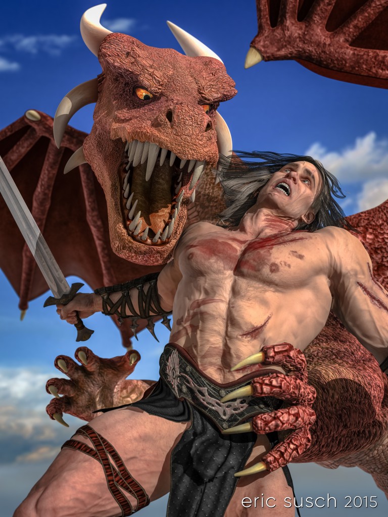
 My wife CAT suggested the idea of a man fighting a dragon some time ago. It’s been banging around in my head but I wasn’t sure how to compose the characters in the heat of battle and still see both of their faces. I had a few false starts that really didn’t work but then DAZaholics, one of my favorite groups over on Deviant Art, announced a weekly challenge with the theme: Trial By Combat. I strapped myself to a chair Monday morning with the goal of figuring this one out. Apparently the challenge worked because by Monday evening the pieces were all fitting together quite nicely. I had the basic construction of the piece, but if I wanted to enter the contest I would have to finish and upload it by Thursday 7AM Pacific time.
Vertical Integration
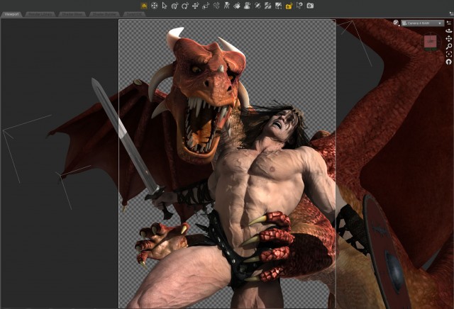
That first day I focused mostly on the character poses, facial expressions, and camera position. I wanted to try a vertical frame which I had never done before. As a filmmaker I’m used to a horizontal frame and I wasn’t sure if I could make it work. I also wanted to keep the shot as close as possible for the most dramatic impact. Ultimately that meant losing the shield off the edge of frame but It felt so much more dramatic in close.
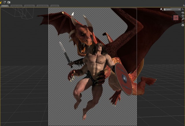 I’m spending more and more time in these pieces getting the expressions right. It’s not easy. There are hundreds of morph sliders to adjust and it’s hard to get a realistic expression on a human. Lots of tedious work with breaks to keep perspective. Much of the dragon’s expression is due to the shape of the head so I concentrated on that, and getting the eyes right. For our hero, I just kept at it over the three days.
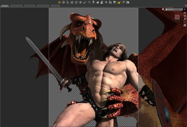 One Light (or six)
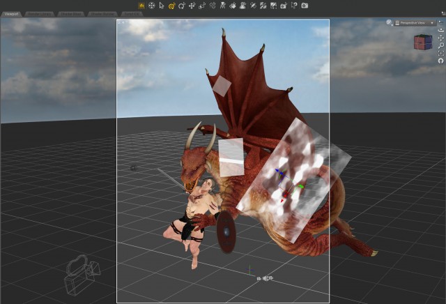
The light was tricky. It’s outdoors so it’s basically just one light, the Sun. I wanted to dramatically rake the light across the guy’s chest but at the same time I needed to get the light in his eyes and illuminate the dragon’s face as well. I found a position that worked but it took some doing including adjusting the characters a bit. Unfortunately that left the sword arm in darkness under the wing. To bring it out a bit I shot a warm spotlight up from below simulating a reflection from the ground. I set another cool spotlight from the left to simulate skylight. That highlighted the ribbing on the dragon’s wing and added a nice rim light on the side of the guy’s chest.
The dragon’s eyes are very deep set. It was impossible to get the sun in there so I also aimed two spotlights at just the eyeballs. I’ve been doing this for awhile now, especially with robots. It gives the eyes a nice glow.
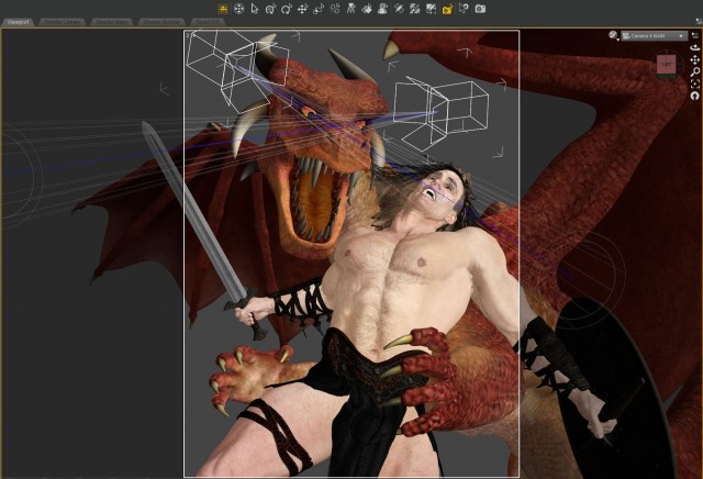 What the hell is a Cucoloris?
Another first for me in this piece was the use of a “cookie.” I added a dapply light grayscale image I found to the Opacity Strength of a plane primitive (in the surfaces tab) and used it to break up the light on the dragon’s torso. This darkened the area behind the guy’s left shoulder and side making him pop forward. A few other “flags” and “nets” (semi-transparent planes) took care of other hot spots on the dragon.
Battle Damage
The body scars and blood smears were several separate add on products I bought at DAZ. They had a lot of customization in terms of the types of injuries, color and size, but not much when it came to placement. I would have liked some scratches on the right thigh and I needed more at the belt line where the dragon was grabbing him. Maybe there’s a way to move the scratches but I think that would end up being a huge manual slider nightmare. Anyway they worked for the most part.
I also used a Vascularity product to make it look like our hero was straining and his veins were popping out. It caused a lot of problems though. The veins kept popping through the clothing, especially the right arm and leg straps. The veins screwed up the scratches and blood smears too. Lots of fiddling with tons of sliders eventually fixed all that up. It was worth it though, the veins really sell it.
 Left-wing Decisions
I spent a lot of time debating the dragon’s wing at the top right. I set it there to look like our hero was surrounded. I think it also works moved out of the way with a clear sky above, with our hero looking for a path to heaven, if you will. It’s certainly simpler that way… I don’t know. I’m still second-guessing my decision to leave it. I just hope the wing isn’t too distracting hanging up there.
 The End of the Line
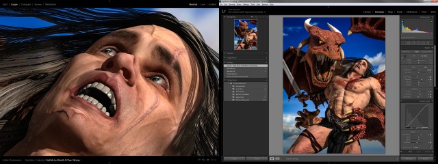
I eventually stayed up all Wednesday night fiddling with details. It was starting to look quite good and I didn’t want to upload it before I had smoothed out all the problem areas. I managed to render it out of DAZ Studio, color correct it quickly in Lightroom, and upload it to Deviant Art an hour before the deadline! What do you think?
Created in DAZ Studio 4.8
Rendered with 3Delight
Color Correction in Lightroom
Models used (from DAZ3D.com):
Gianni 6
DAZ Dragon 3
Peter for G2M
Dry Mud Desert
Body Scars for G2
Dirt and Blood for genesis and G2
Fantasy Weapons collection 3