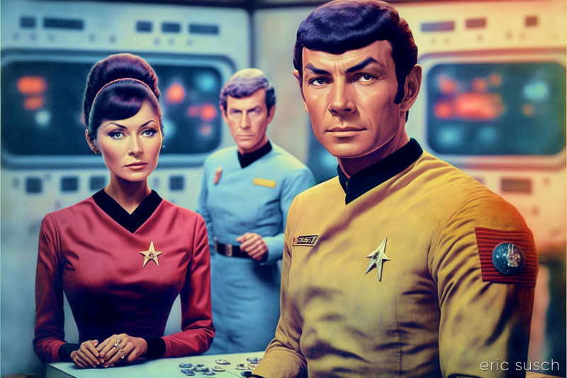
 The text to art machine Midjourney recently released an upgrade – version 4. Let’s see what it can do.
I’ve seen a few people posting v4 renders with the simple prompt: “on the set of Star Wars” which created images that were sort of like Star Wars but were just a bit off. I loved the quirky weirdness and decided to try a similar text prompt: “on the set of Star Trek the Original Series in 1966.” I added the year to emphasize that I wanted the original series and not any of the other later versions of Star Trek.
I ran the prompt many times. Here are some of the best images:
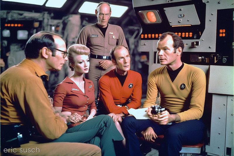
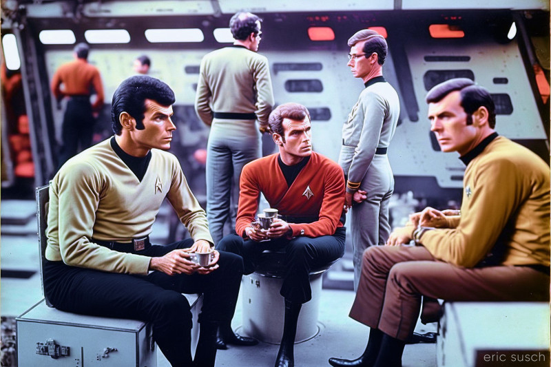
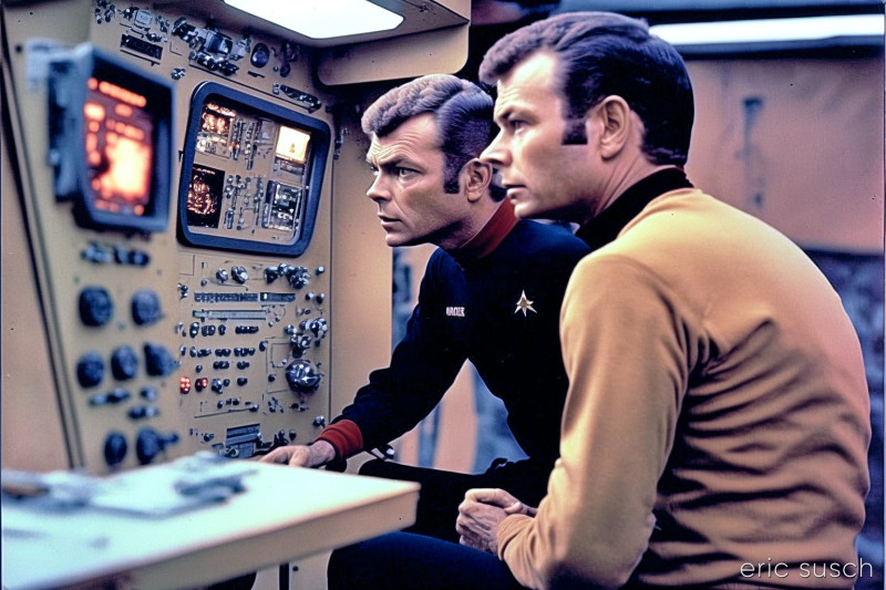
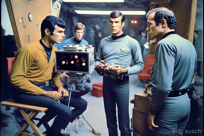 OK. We’ve got people in colorful shirts with black collars who look like they are on a TV show set. But the surroundings don’t really feel like Star Trek. …and is that machine floating in front of them?
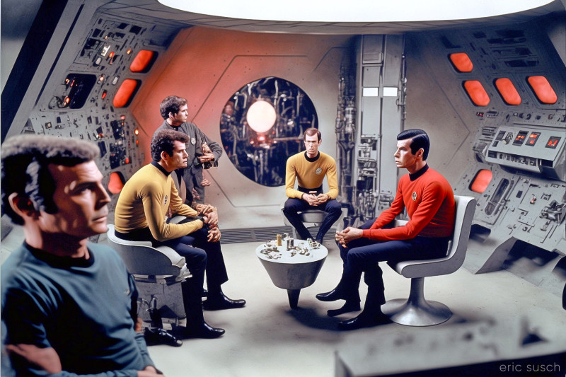 Clearly the new V4 still has problems with hands based on the guy sitting on the left. Also check out the super long arms and multiple legs on red shirt. Still, V4 is an improvement if you’re looking for more realism. If anything the added realism makes the weird stuff seem more weird.
Some of the images came out black and white. Since this was supposed to be 1966 when B&W promotional photos were more common, I guess that makes sense. The lack of color strips away any sense of Start Trek though.
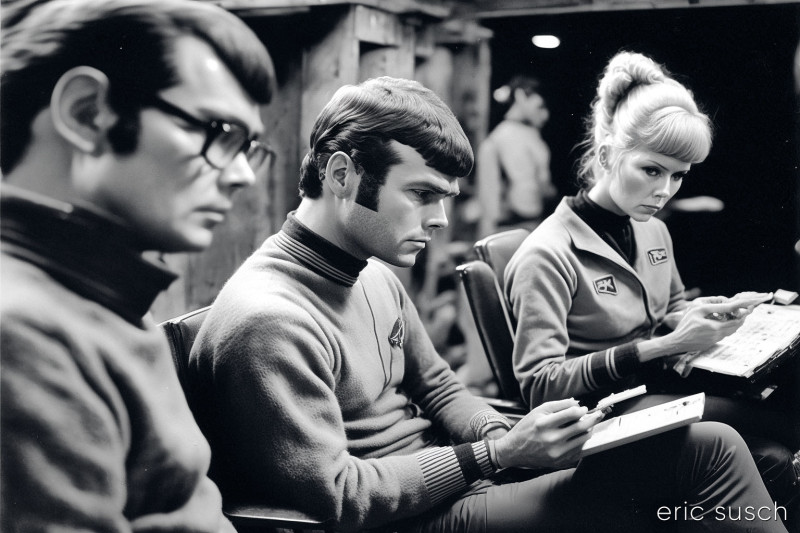
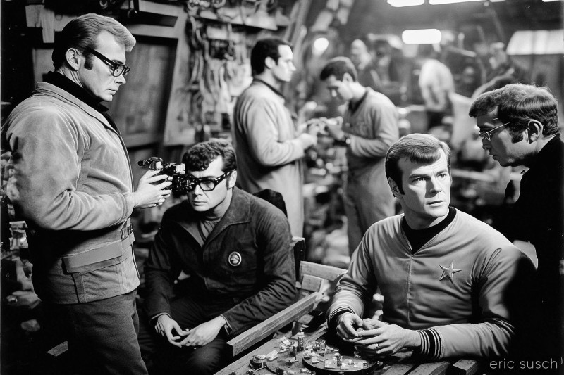
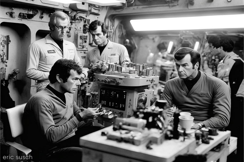 Many of the shots have what look like multiples of the same person, creepy clones lounging on the set. None of the people in any of the pictures look like any of the actors in Star Trek. Occasionally one of the characters looks vaguely Vulcan but that’s about it.
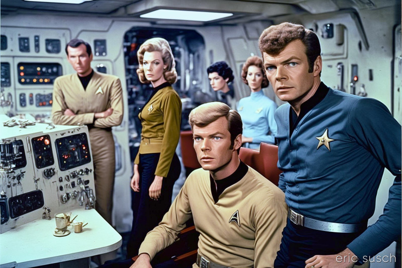 This render really feels like an Irwin Allen show rather than Star Trek — maybe Voyage to the Bottom of the Sea. Also, Midjourney really wants to make the delta shield on their chest into a star. That shows up in a lot of the images. The worst part of this particular image though is probably the floating head woman in the back. In spite of all the weird stuff, version four still feels like a big step forward.
To improve the environment and make it seem more like Star Trek, I tried replacing “on the set” with “on location.” this is what I got:
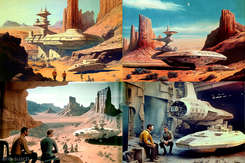 Wasn’t expecting spaceship models and matte paintings to be part of “on location.” I uprezzed one of the shots anyway.
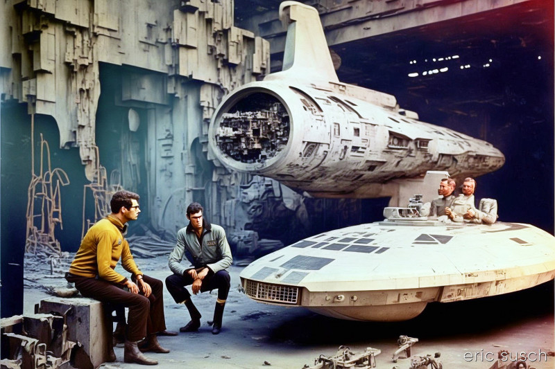 This was interesting. In this uprezzed version two guys appear on the right sitting in the model spaceship, along with some extra arms. They weren’t in the low-rez render at all. Also, kneeling man now has an unfortunate third hand.
OK, second attempt to create a more Star Trek environment. I tried adding “on the bridge” to the prompt.
Now we’re all walking across bridges. Not what I wanted.
I then realized that maybe it was the “1966” that was throwing off the environment, so I dropped it and tried some more renders. The prompt for these was “on the set of Star Trek the original series.”
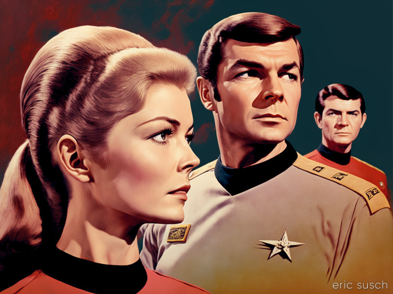
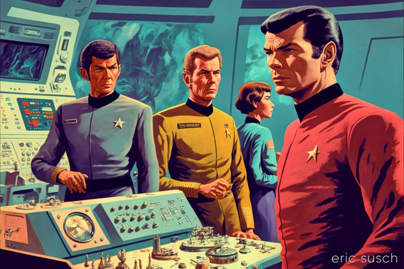
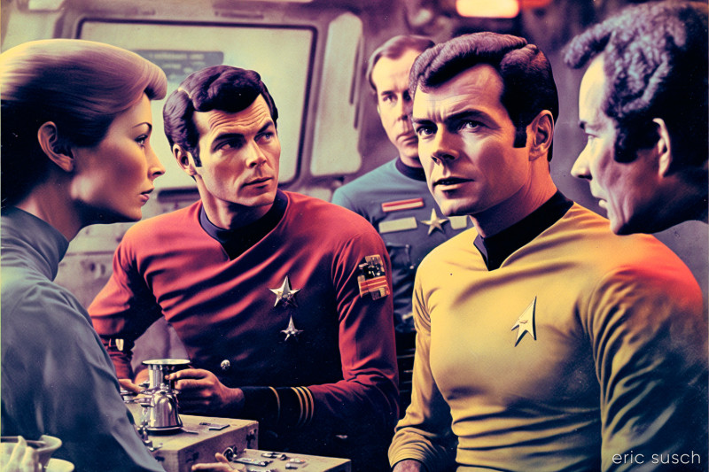
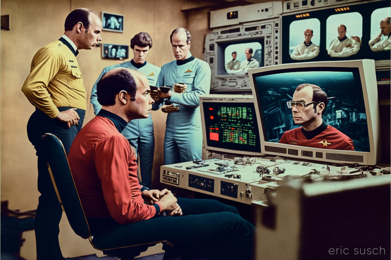
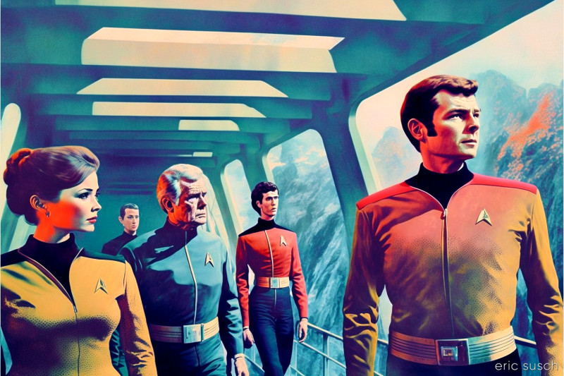
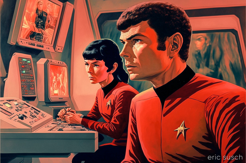 Better, I guess, though still the only real Star Trek reference is the colorful shirts with the black collar – and the delta shield symbol which is most times trying to be a star.
Several of the images are now leaning toward or full-on illustration. The style seems arbitrary.
Another thing I’m noticing is the odd way characters almost, but don’t quite, overlap in some of the compositions. Usually you try to have the characters either overlap or be separated by some space. It’s odd to have them just touching like in the first and last image above.
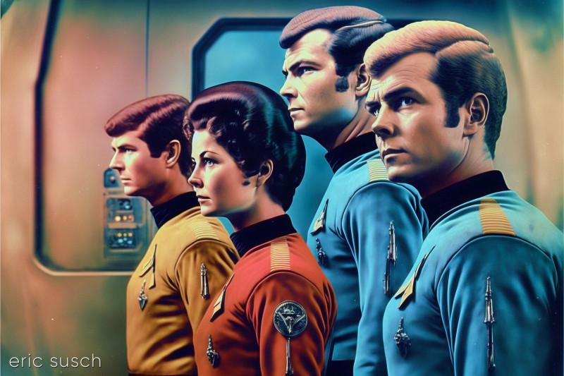 Or even worse… Who’s in front and who’s behind? Is the guy in the middle in front or behind the woman? I don’t think Midjourney knows. (I hope the AI controlling the self drive option on our Tesla model 3 has a better handle on this.)
Also this bunch above is obviously from the mirror universe. Look at all those medals.
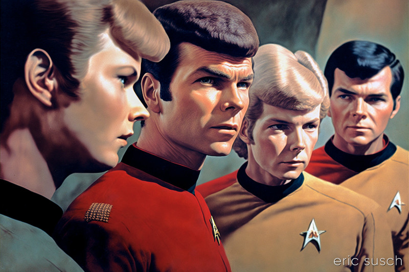 Of all the images I rendered in this experiment, I think this one actually captures the spirit of Star Trek the Original Series the most. Not sure what it is. Maybe it’s the hair?
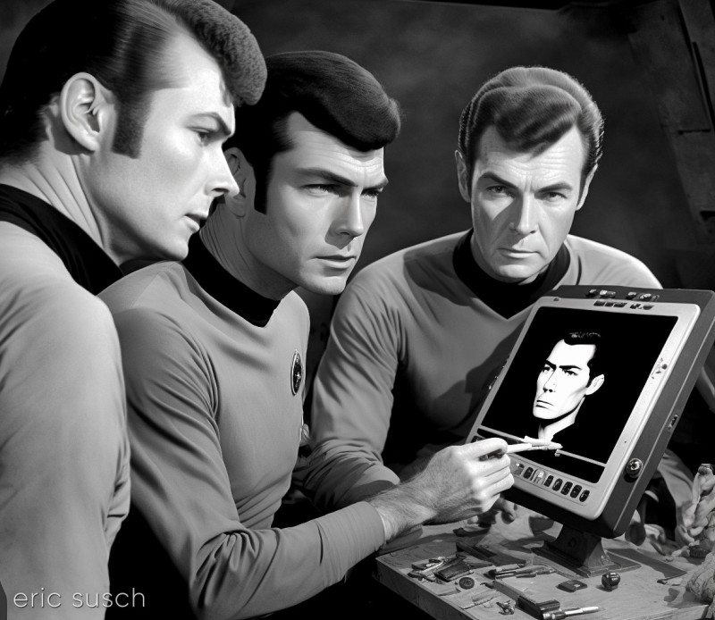 This is one of the strangest renders. What the heck is going on here? Art class on the Enterprise?
Just for fun, I tried adding “film camera” to the prompt to create some images of actually making the Star Trek show, instead of just sitting or standing around. Here’s what I got:
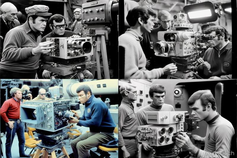
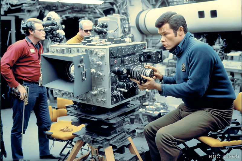 Wow. Film making is complicated but I’ve never seen any film cameras like that.
OK, my last iteration was to try to strip everything from the prompt and try simply “Star Trek the Original Series.” This is what i got:
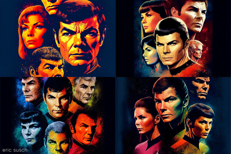 What the heck? Headshots? With Midjourney’s frustrating “cut the head off” composition? I switched the aspect ratio to vertical and tried again.
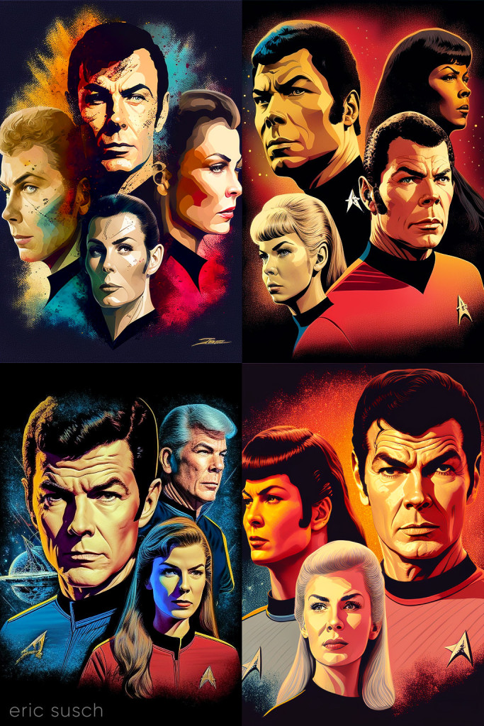 More heads, but now they’re right along the edge. How about square?
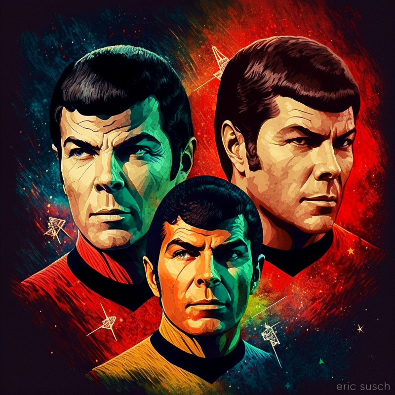
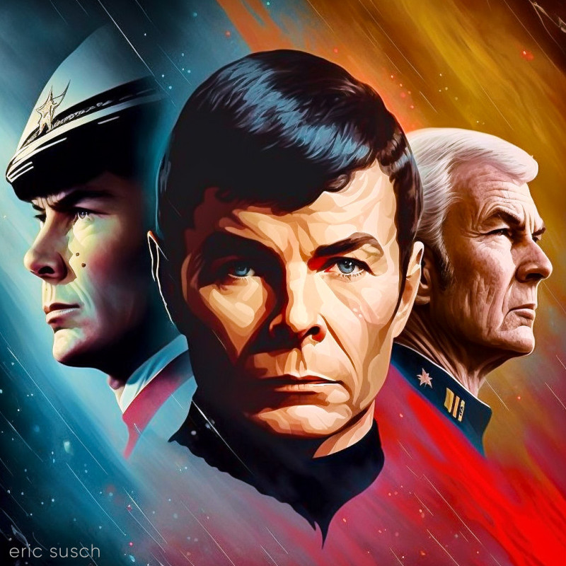
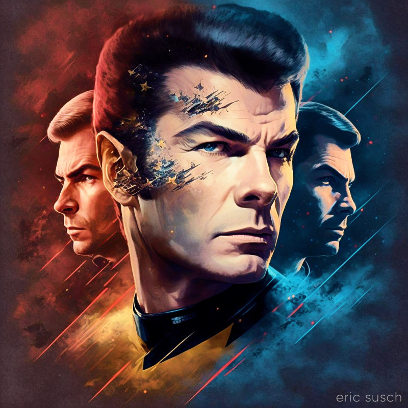 OK… Not sure why I’m only getting these strange headshots that look like a movie poster or the cover of a comic book. With all the pictorial references to Star Trek you’d think there would be more variety.
And why is that guy’s face falling apart in the last picture? Maybe he’s a robot?
Anyway, Midjourney version four looks promising so far. More experiments to come…
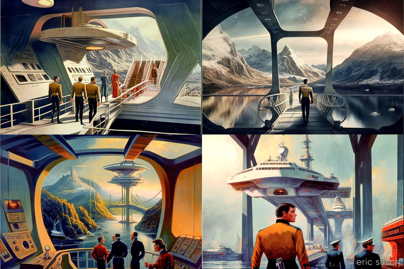
The Art Machine will someday be perfect… But will it be interesting?
Thank you! This was absolutely fascinating!