This is my newest CGI creation. It was a long road to get to this final image and I almost abandoned it. Here’s what happened.
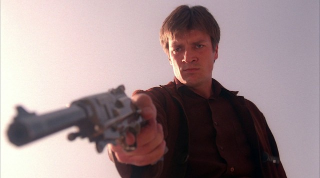
My initial idea was to do something similar to this famous pose from the TV show Firefly.
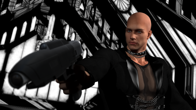
I’m starting to manually pose my characters and relying less on presets. Could I capture the drama in this screen capture? Well, I worked on it for a while and thought either I was still too inexperienced to capture the dynamics or maybe I picked the wrong image to emulate. My version was just so meh. There wasn’t any dramatic focus. Here’s what it looked like at that point:
I had put the character in a large futuristic Gothic chamber to add some drama and I had sunlight streaming through the windows. It was clear that the complexity of the architecture and the shadows made the background a mess. I re-lit the scene for night.
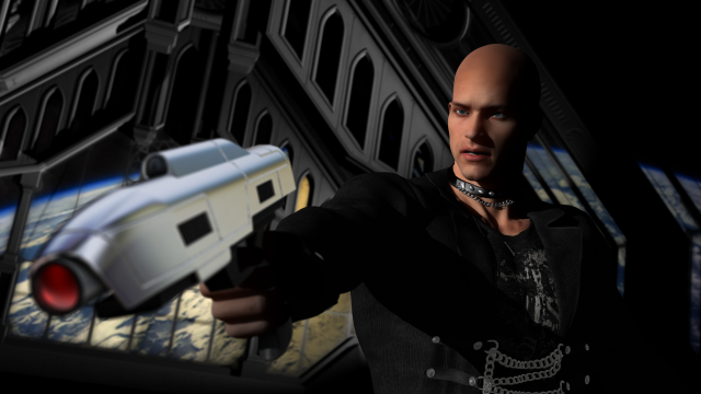
Better but still busy in the background especially when I put anything outside the windows. I didn’t know what to do so I played around with the gun surface for a few hours and made it shiny. That just put more emphasis on the gun and less on his face.
So I trashed the “location” and tried some others. I was fun to turn off the visibility of the “set” and load new environments just to see if they would work with the exact same character pose and camera shot.
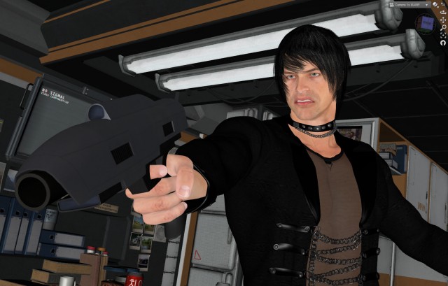
I tried a futuristic kitchen set…
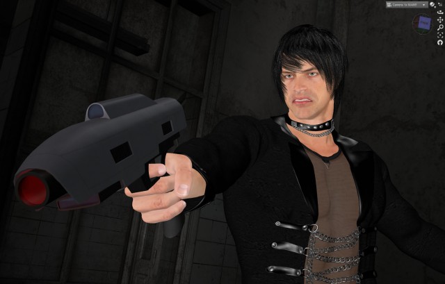
…a run down insane asylum…
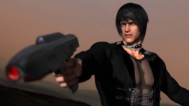
…and even the surface of the planet Mars. The Mars landscape was the simplest and in keeping with the source inspiration but I really wanted to have more than a plain color as a background.
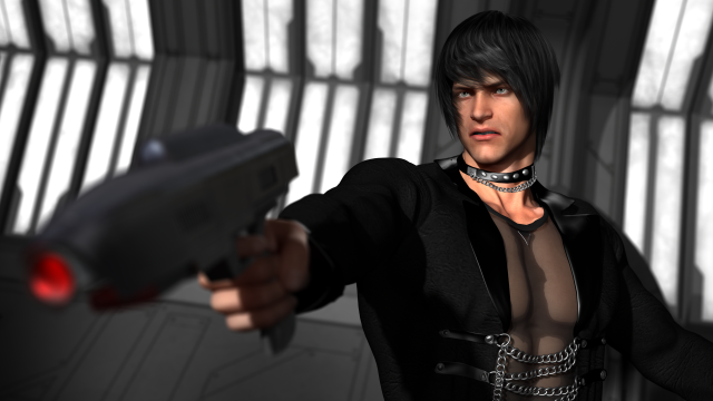
Finally I settled on simply rotating my original set so the character would be backed by the wall instead of the entire gothic chamber. This simplified the background while still keeping some of the look I was going for. I also tried to make the windows look like lights on the wall, you know, like in the death star? But I felt that was too bright and finally decided to just make them black. Anything else was too distracting.
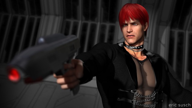
Another element that I think didn’t work was the red light I put in the barrel of the laser pistol. I loved the effect but I thought it pulled the viewer’s eye away from his face. It took me an hour to get that light in the gun just right and I like it! So to balance the red in the image I made the characters hair the same color. I’m not sure but I think that works.
This is probably not one of my best images but on the long road to its completion I learned plenty. What do you think?
