Prints of this image are available on my Deviant Art page.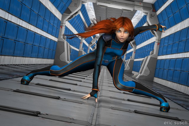
Looking back, my previous CGI images have all been very static, essentially characters just standing there. I wanted this one to be dynamic! I imagined something less realistic looking with an Anime flavor that said, “Stand by for ACTION!”
I also wanted to keep it bright. Almost all my previous images have dark low key lighting, mainly because I like the visual drama that creates. This needed to be bright not only because of the comic book animation inspiration but also because I wanted to offer this image as a print. I wasn’t sure how well my previous dark images would translate to a printed photo on the wall.
To create drama in the background I wanted a long space corridor. With a wide camera lens the one point perspective could simulate a stylized anime background action burst. I wanted it to look like a comic book splash page. I imagined a long space hallway like the white corridor on the rebel blockade runner at the beginning of the original Star Wars.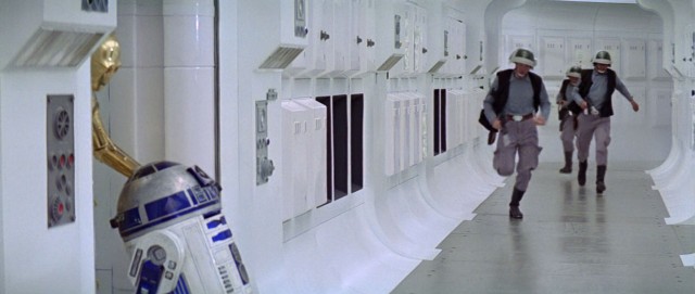
I tried every hallway set, factory, train station, and urban exterior I have, SciFi or otherwise, but nothing really worked. I did have a modular SciFi construction kit with various wall and floor panels so I decided to build the corridor I needed myself.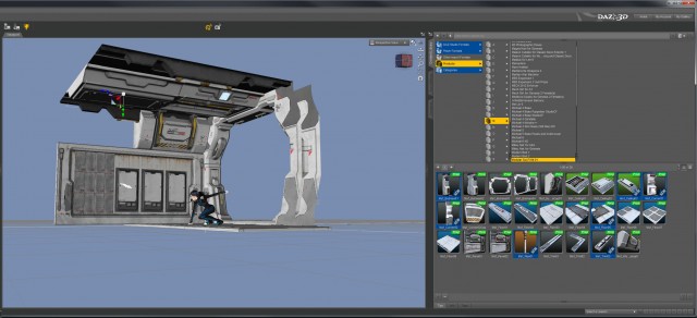
It had to be quite long and recede far into the distance. I tried many different combinations of the panels but most of them didn’t work. I found that even slight raised details changed the character of the panel lines when viewed edge on, especially way in the back. Getting strong unbroken lines down the corridor was difficult and took a long time.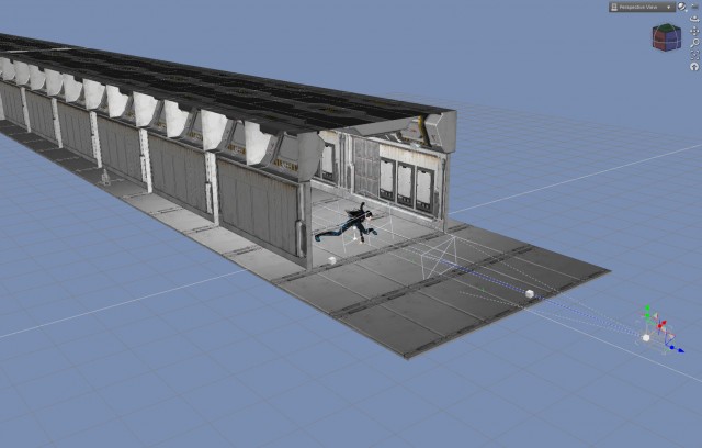
Whenever I tried something and it didn’t work I had to propagate a change down the entire length of the hallway. Fortunately most of the pieces in the construction kit were similar sizes so it became a matter of knowing the offsets of sections further down the hall and simply replacing the objects. Relatively easy but tedious.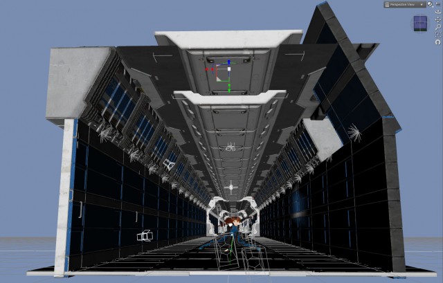
In the end one panel with two blue painted lines became the theme of the entire space. The blue was similar to the blue in the “spacesuit” I had picked out for the girl so that helped.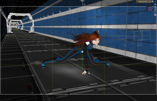
Initially I had built the lighting into the walls of the set. I had placed small “practical” lights along the top angled section of both walls. Extending those lights down the entire length of the hall created an even overall “hall light.” It worked OK but became unwieldy when making so many changes to get the walls correct. There ended up being over a hundred of these small lights that had to be moved every time there was a change, so I dumped them.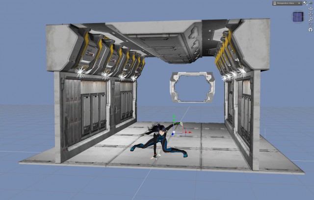
I decided to try the Advanced Ambient Light by Age of Armour that had been recommended to me awhile back. An ambient light is able to bring up the light level of everything in the scene all at once. I was leery of using it because it creates a very flat and unrealistic light, but it did exactly what was needed for the background down the long hall.
The ambient light lit up the main character too but the quality of light was just so blah. I added seven very specific spot lights on the girl to punch it up. These lights aren’t bright but they’re angled in such a way to model the face, hands, legs, etc. and give the character more dimension. Each light is subtle but all of them together make quite a bit of difference.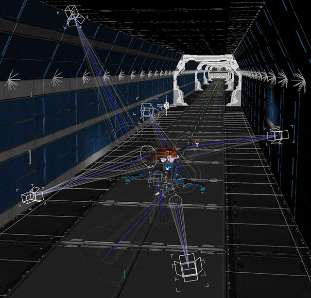
Setting them was tricky because if you weren’t careful you could end up with some crazy shadows on the background. The lights needed to be very focused.
After rendering out of DAZ studio at 10K, post work on the image was minimal. I fixed a few minor problems with the hair in Photoshop and did a little bit of color correction in Lightroom. What do you think? 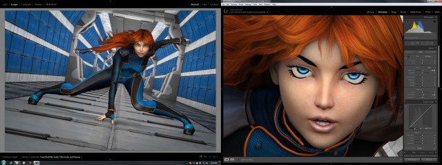
Prints are available on my Deviant Art page. Hang one on your wall today!