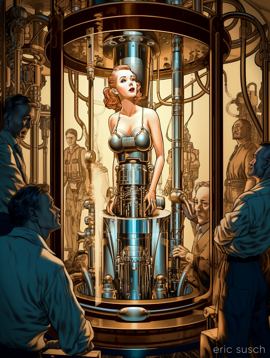
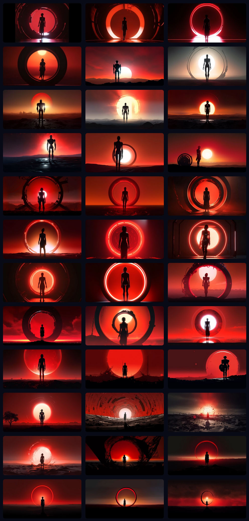
 The vision in my head:
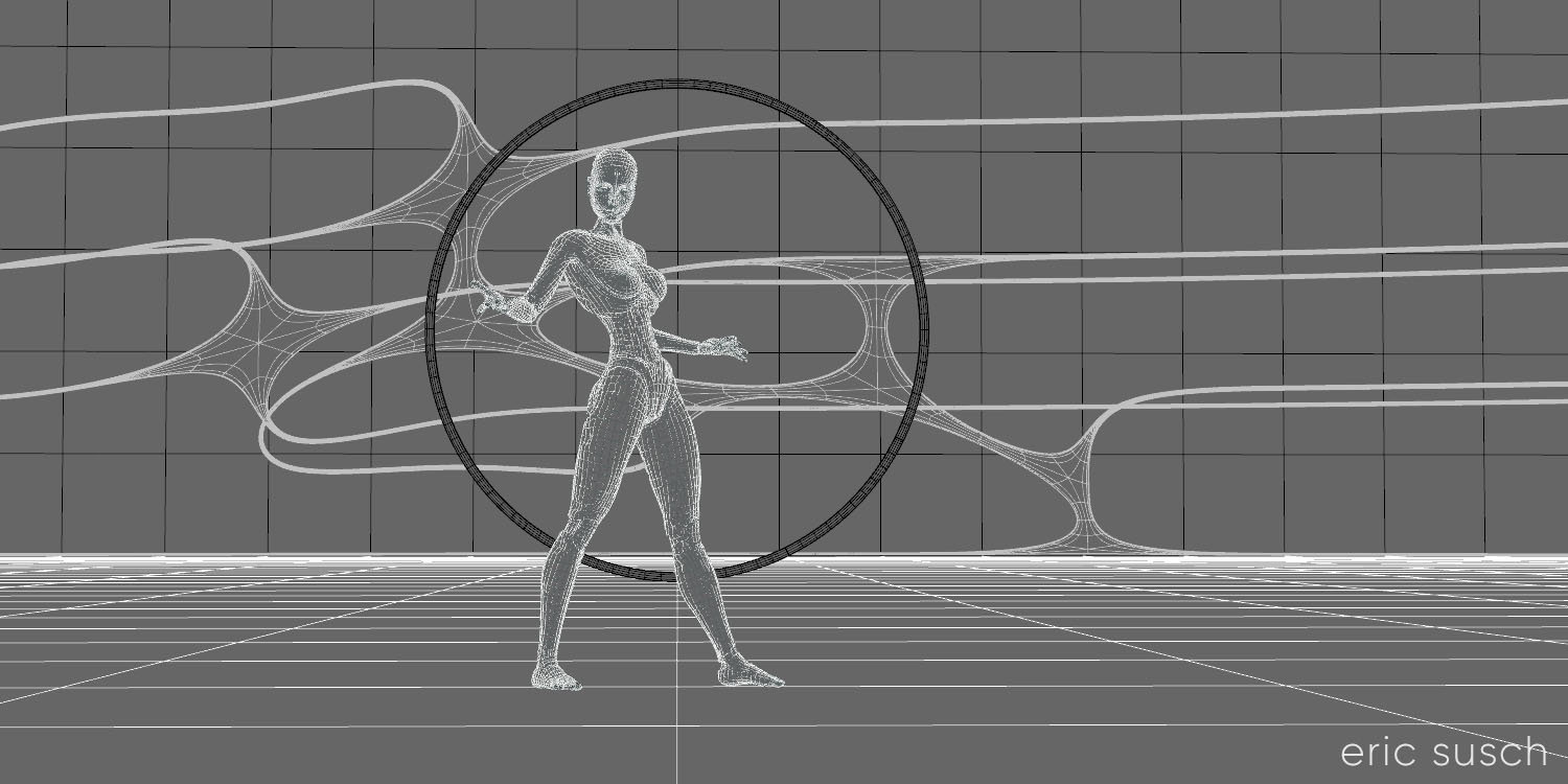
An intensely bright thin red ring light in the distance, a woman robot in silhouette, on an abstract shiny metal plate surface, hyper realistic, cinematic, dense atmosphere
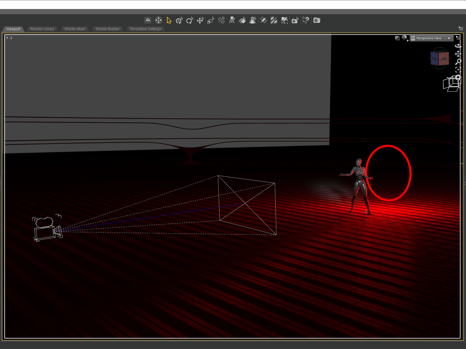
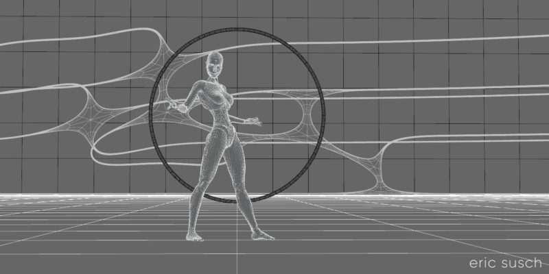
To manifest that vision I created a floor plane with a metal shader and another black plane as the backdrop. A simple torus primitive served as the red ring light.
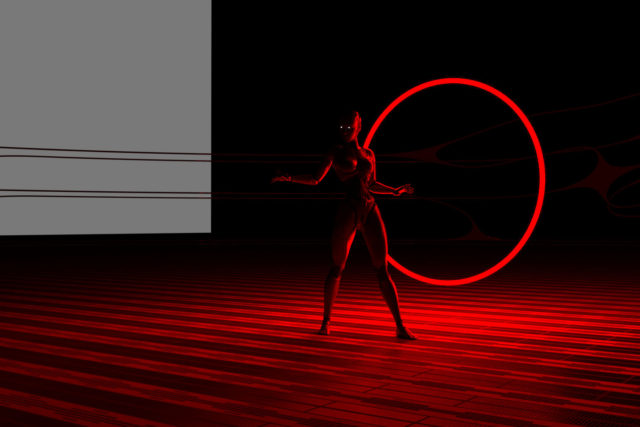 I wanted the red ring to frame the figure and at first I tried placing it way in the distance, but I found that it dipped below the floor plane and I wanted to see the full ring. Moving it closer and scaling it down created the same composition with the added bonus of shining a strong rim light onto the robot figure.
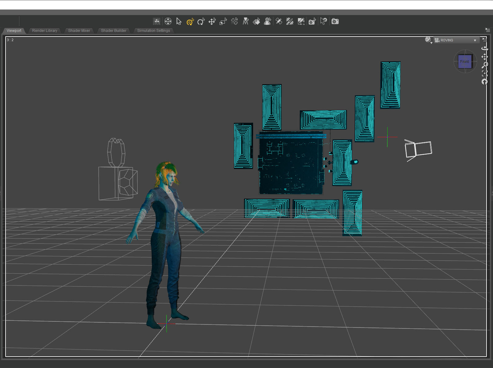
 The shapes in the background are part of an abstract model that actually goes all the way around the landscape. I found a part I liked and buried it in the fog to create a little texture in the background.
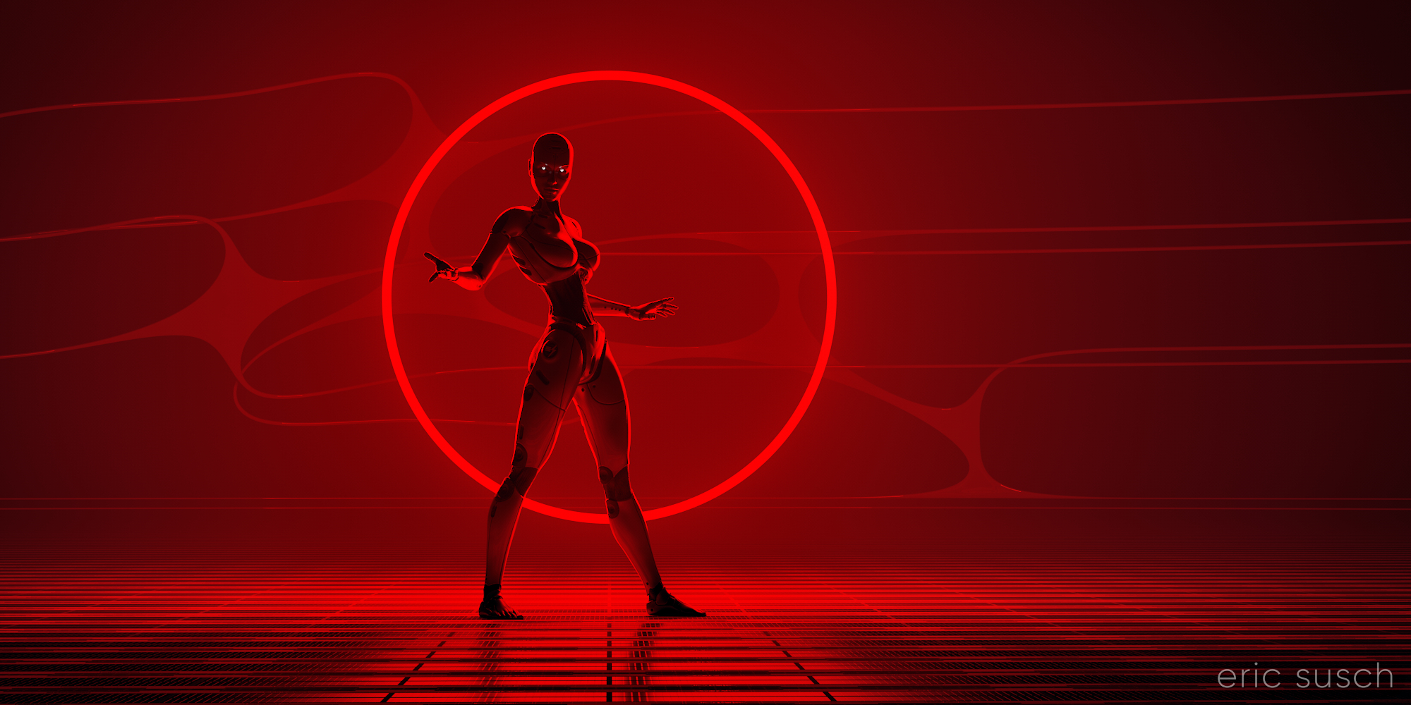
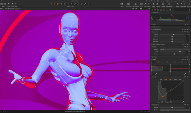
 I spent quite some time adjusting the surfaces on the floor and the robot. The entire scene is lit by the red ring. The only other light is in the eyes. The color and reflectivity of the surfaces really determined the quality of the image. I wanted the floor to be shiny and reflective but not blown out. I also wanted the robot to be in shadow. A chrome or white surface didn’t work so the robot is actually shiny metallic dark grey and black.
 Ultimately the original render was quite dark. I felt the quality of the light was more important than the brightness. I could always brighten it up later.
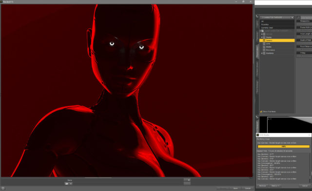
It took about seven and a half hours to render because of the fog and the dim light. (Bright light renders a lot faster in Iray.) I also rendered it at 14400 x 7200 so I could print it four feet wide and hang it on the wall if I really wanted to. I’m crazy that way…
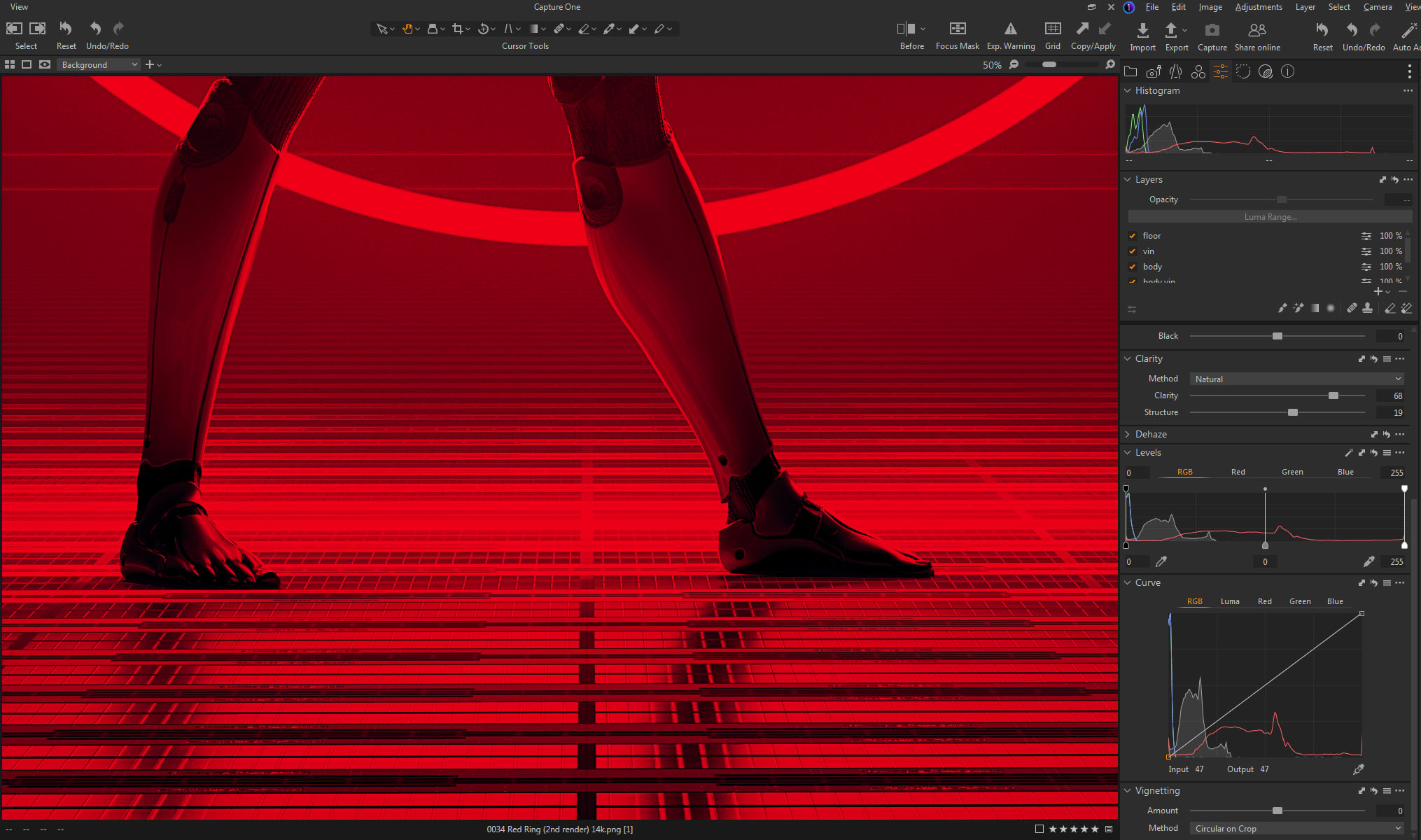
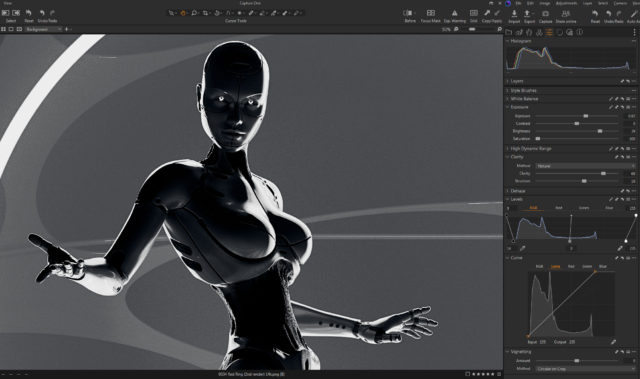
This screenshot shows the brightness of the original render just as it finished baking for seven hours.
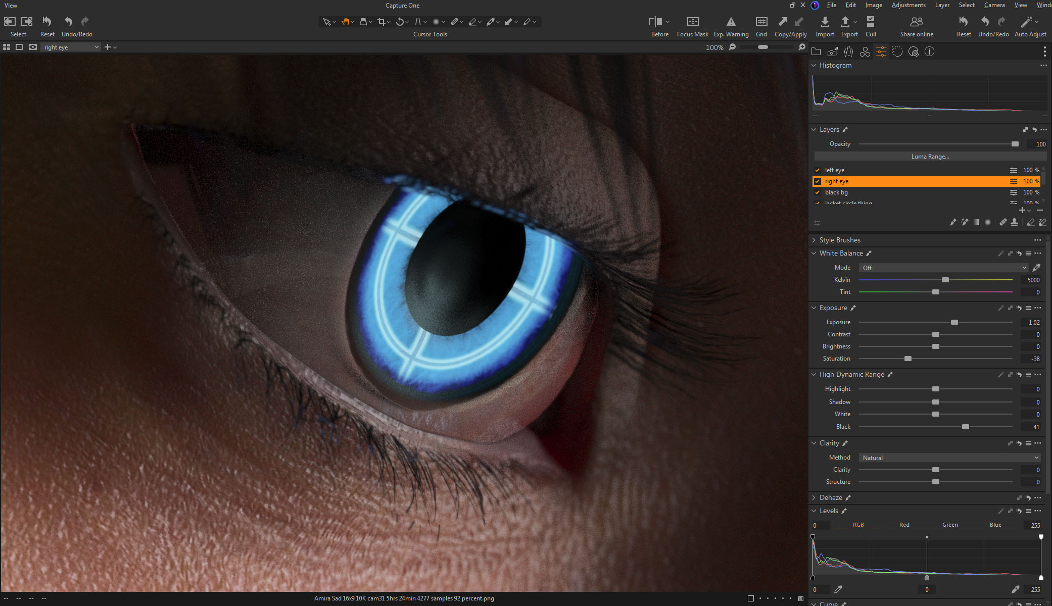
 When color correcting I brought the brightness up quite a bit while trying to maintain the quality of the light. The problem was all the detail was in the red channel since all the light was pure red. This left even a brightened image still dark. This is all the brightness I could get out of the original color correction:
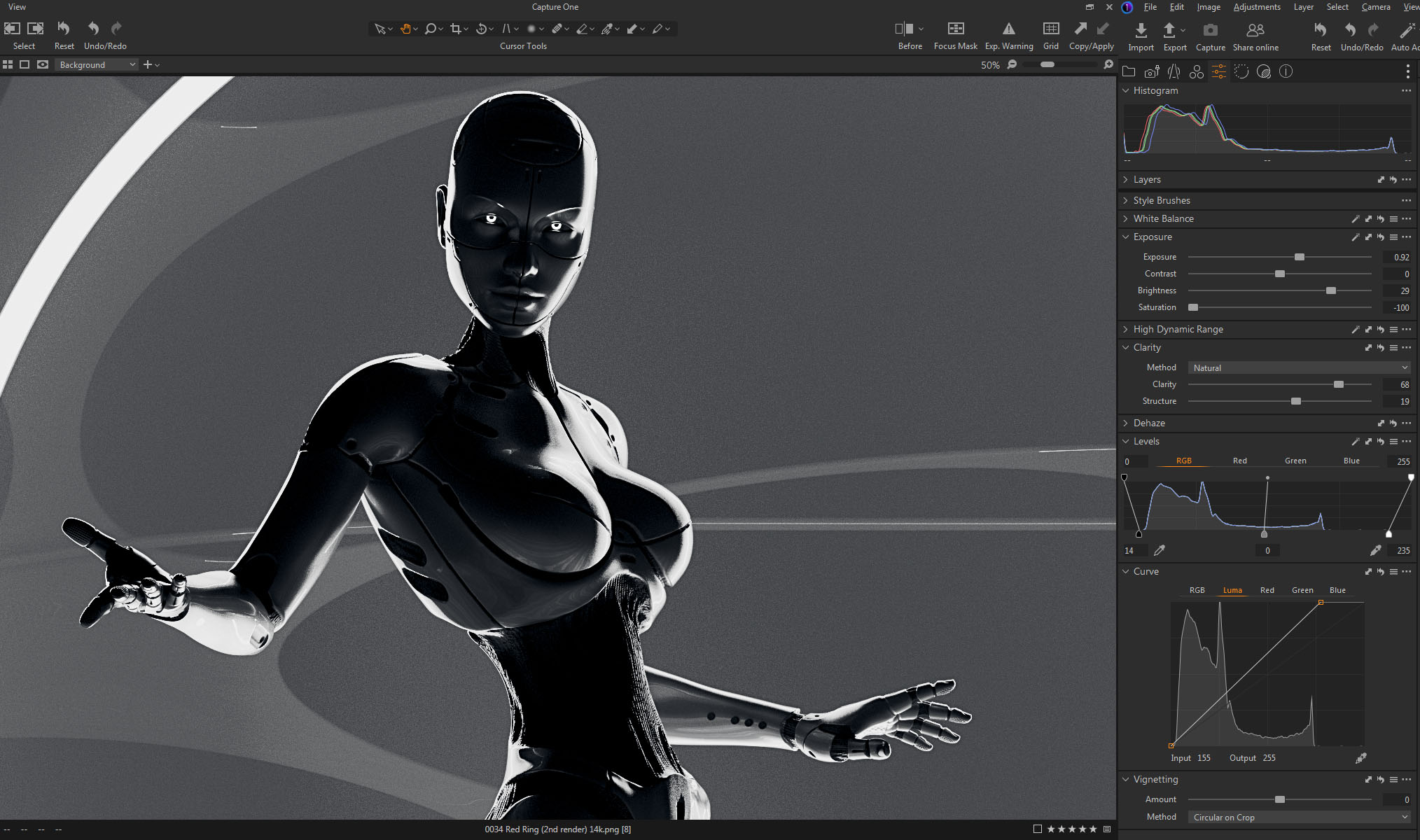
 Later I went back and tried a few other things to brighten it up more. I figured if I could get the ring to blow out (overexpose) and become white It would still look OK and be much brighter. My color correction software, Capture One, is quite good and of course that means it doesn’t clip the high end even if you push it quite far. I tried all sorts of crazy things, experimenting, just to see what the software could do.
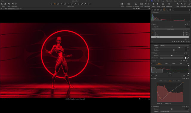
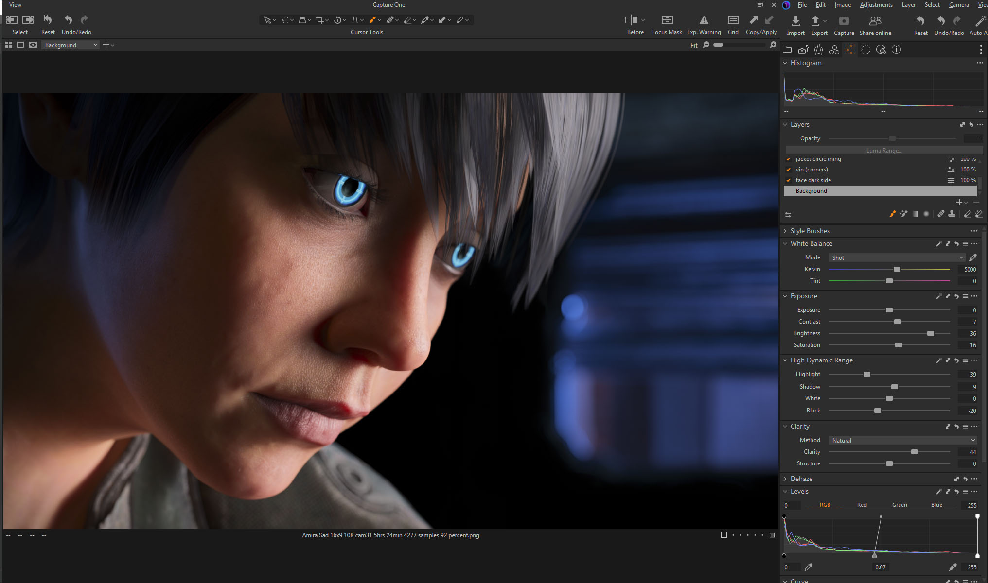
 When I was screwing around with a black and white version I hit upon something…
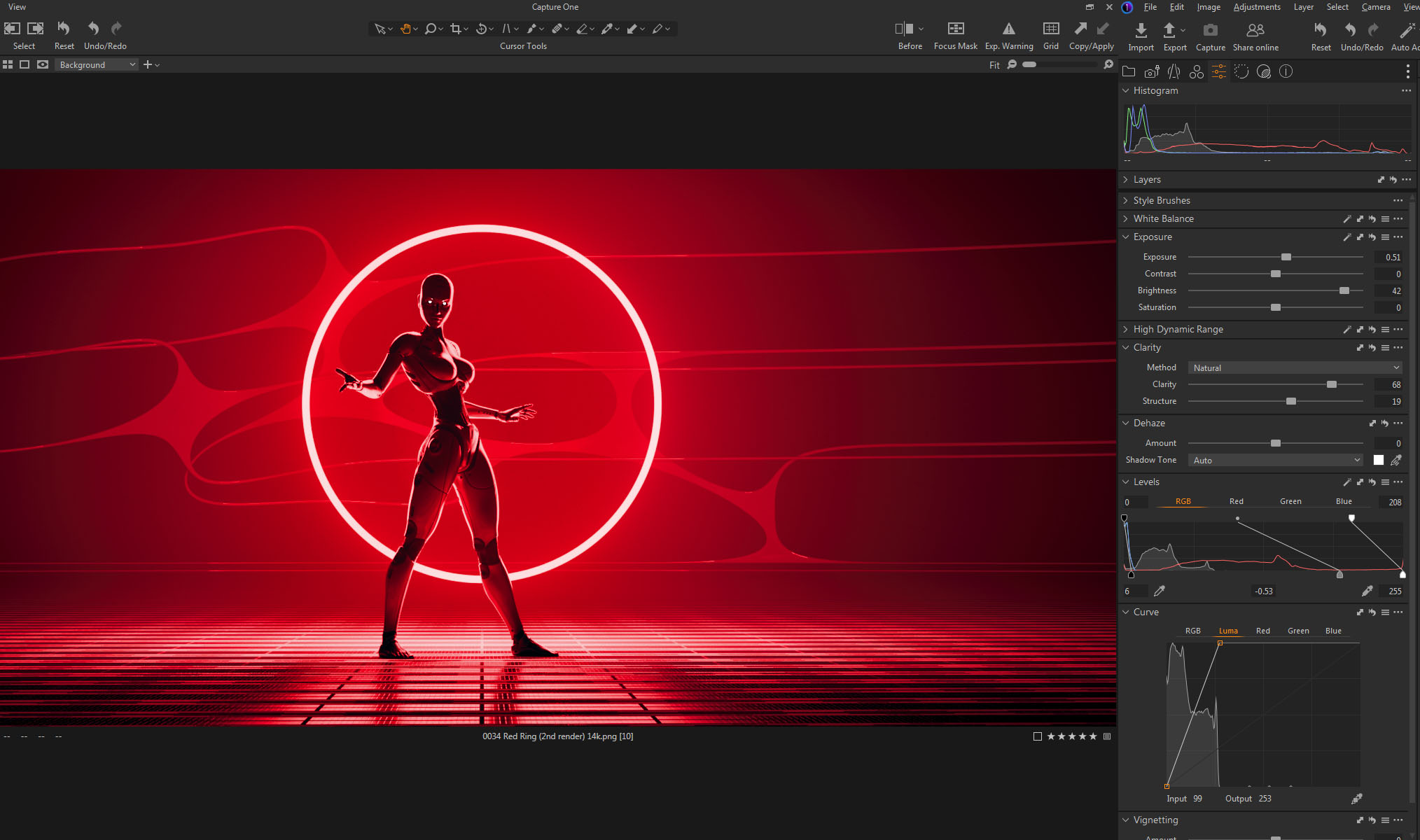
I found that if I messed with the top end of the LUMA channel on the CURVES tool and the top end of the RGB channel on the LEVELS tool they interacted and did exactly what I wanted, blowing out the top of the red channel. (The LUMA channel in the Curves tool somehow only adjusts contrast without changing saturation. It’s not the same as adjusting the full RGB.)
You can see the way I set both tools at the bottom of this screenshot:
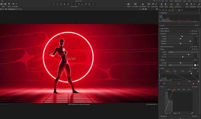
This brightened up the entire image quite a bit and It’s how I created the final color correction.
Created in DAZ Studio 4.21
Rendered with Iray
Color Correction in Capture One
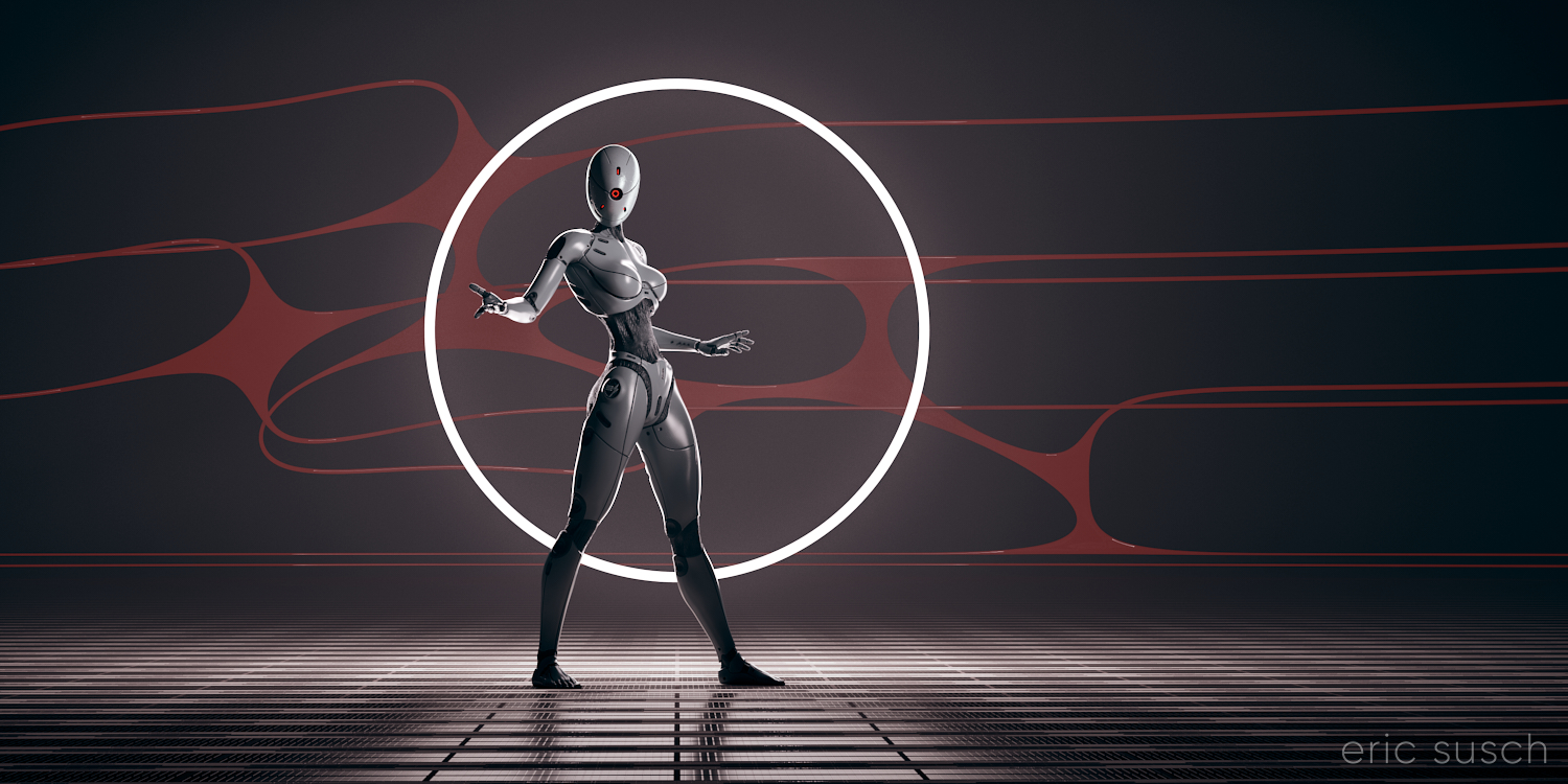 After creating my Red Ring CGI piece and having trouble with it being quite dim, I went back and changed a few things in the original project and re-rendered with a white ring of light. I wanted this version to be different, not in silhouette, so I added an extra light to shine on the robot as well.