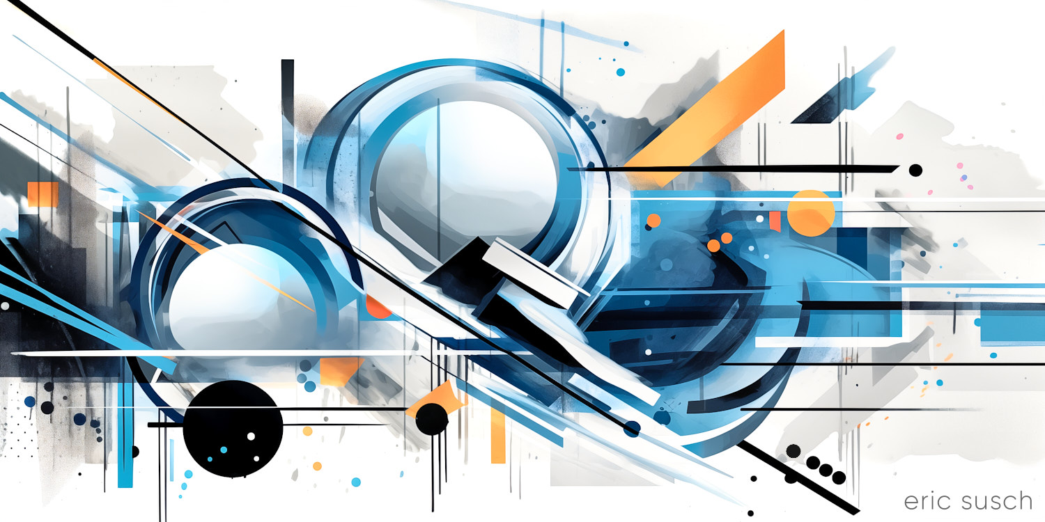
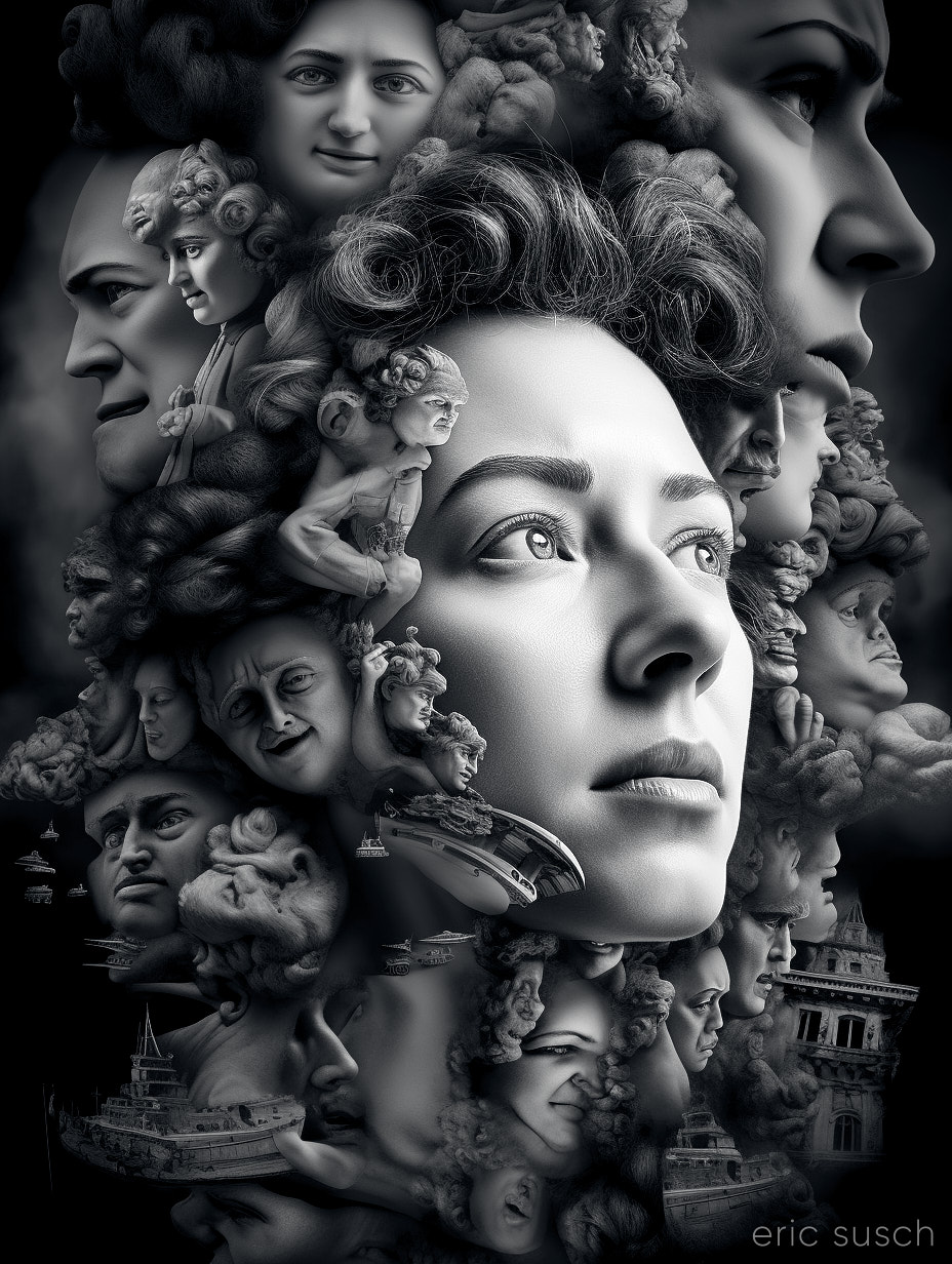
 #Art I made with #Midjourney #AI
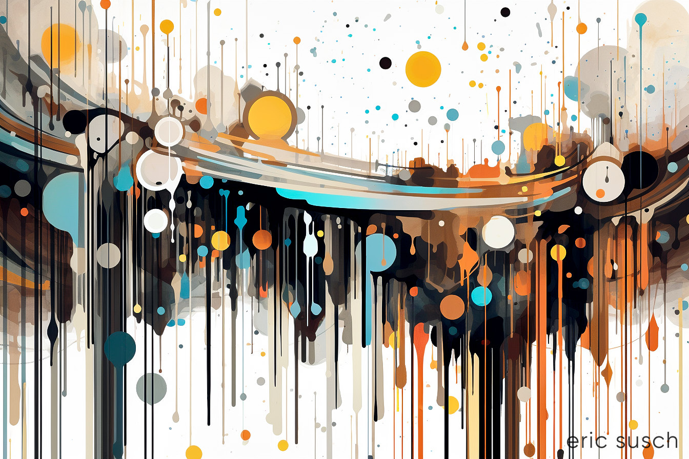
Galactic Vibrations
Leave a reply
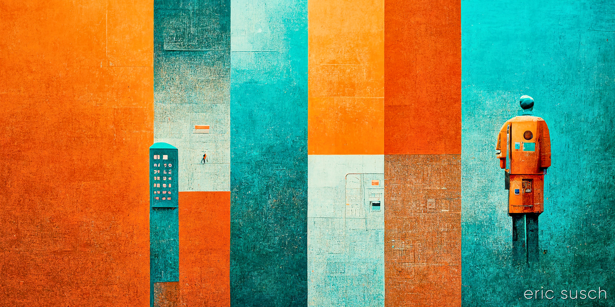
#Art I made with #Midjourney #AI
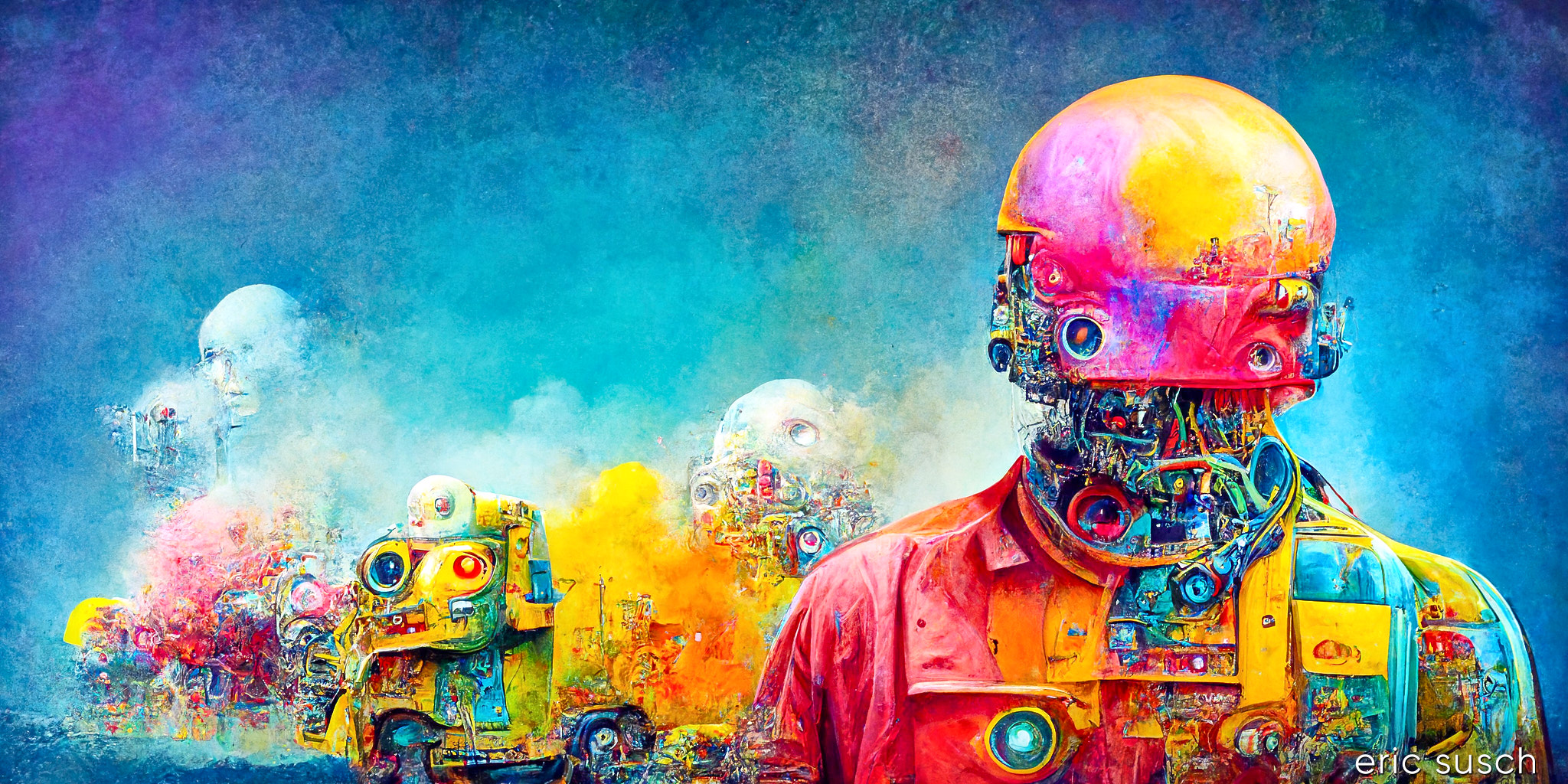
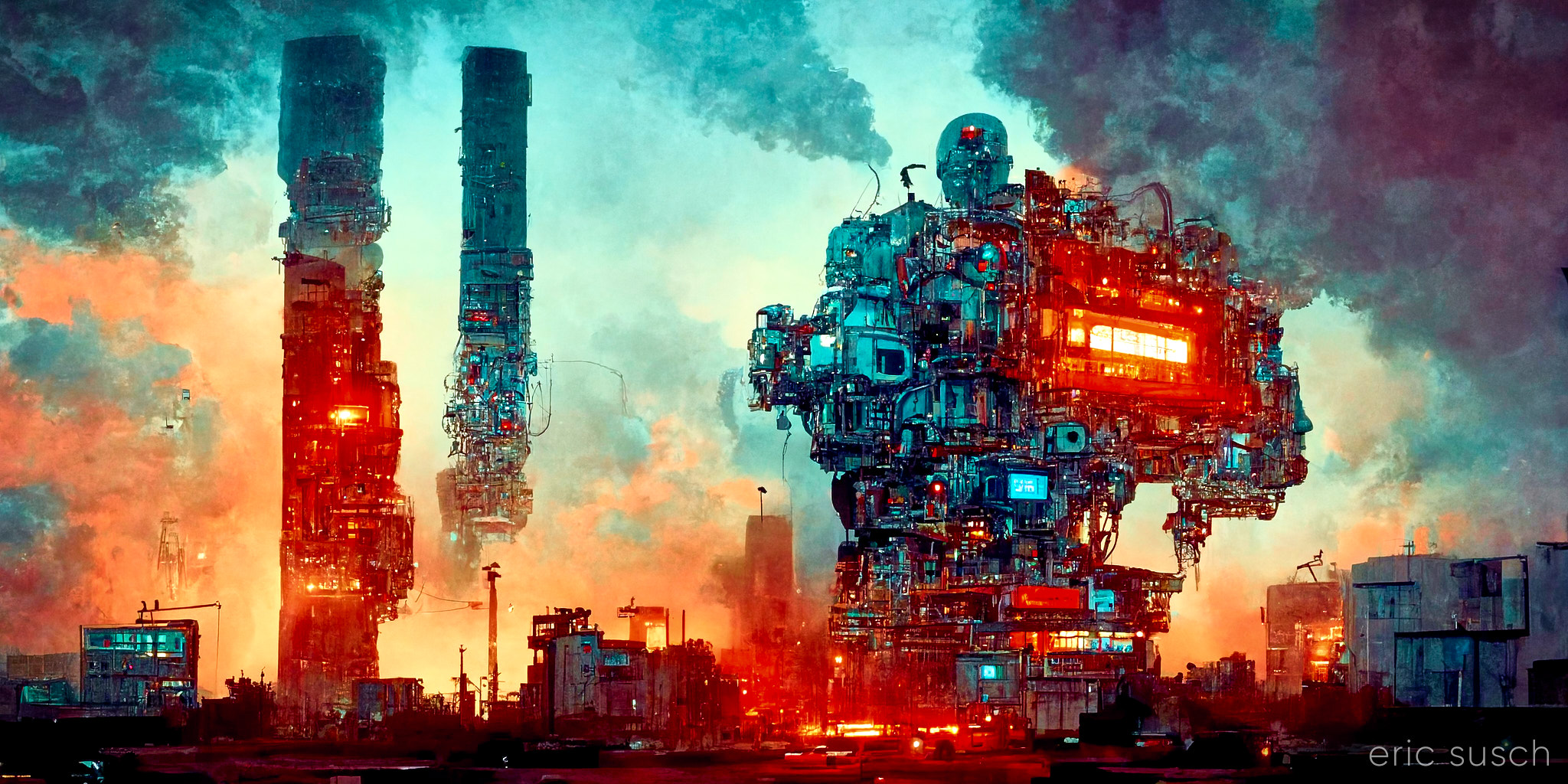 #Art I made with #Midjourney V3 #AI
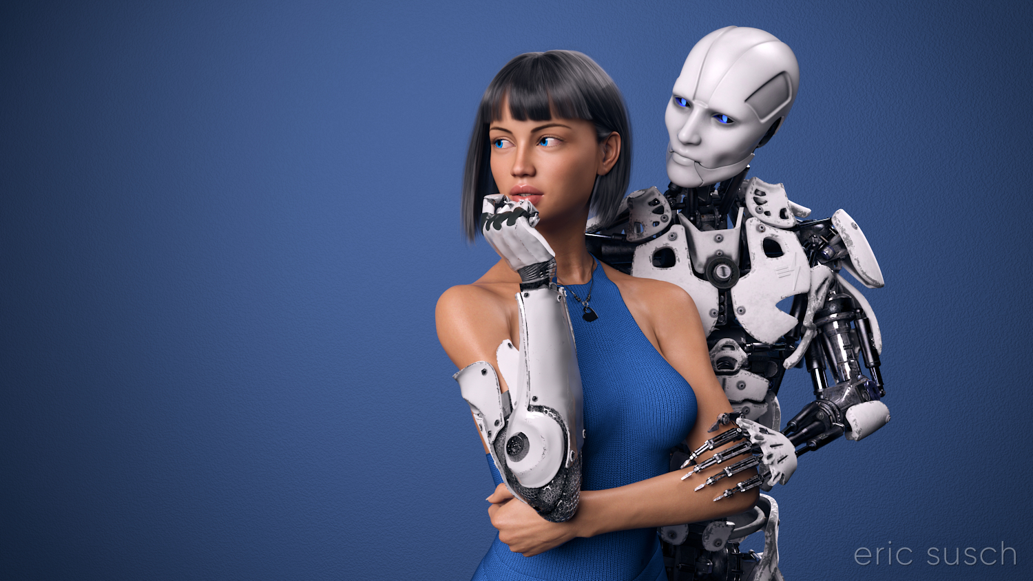 I’ve worked on this CGI scene longer than any other. I’ve spent years obsessing about every detail. I’m sure I’ve sucked the life out of it many times. I hope there’s still something good left in it but I can’t tell anymore. The only thing I can do is to let it go and put it out there hoping there’s still some life in it.
This is the second iteration of this piece. The first one, which you can read all about here, was square, with a grey background, and a different dress. I also added a pierced heart necklace to this new wide version. Those are the big differences. There are tons of other small changes.
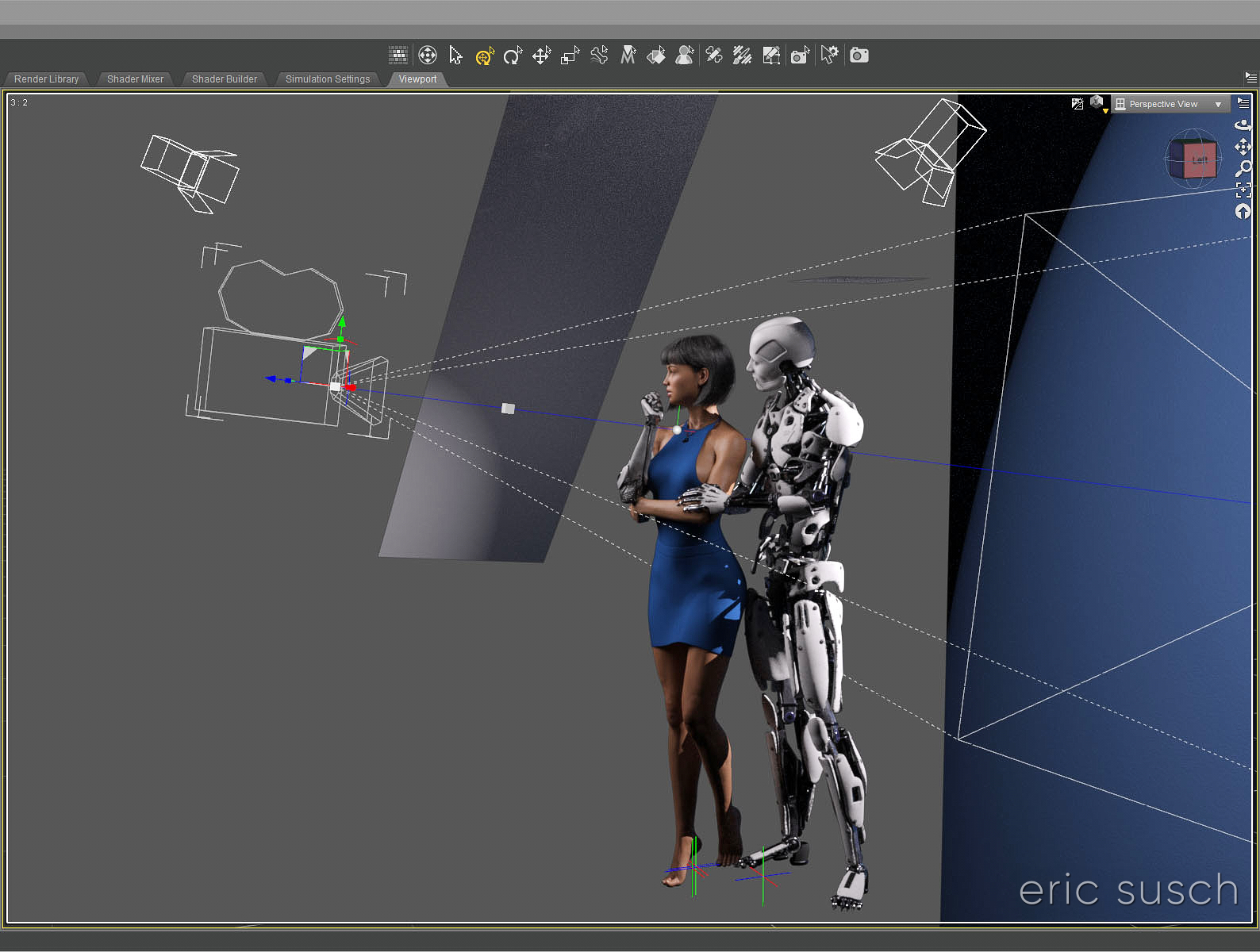 So, why a new version? Because I wasn’t satisfied with the old one. (Actually I grew to hate it.) For some reason this piece is an ongoing obsession. Even now I’m looking at the image above and wondering if the background is too dark, contemplating changing it again before posting this blog post. But I’m not going to. I have to let this one go and be done with it. Next step is to print it on metal like I’ve done with several of my other pieces and see how it comes out. If it needs tweaking after that, then I will, but for now, it’s done!
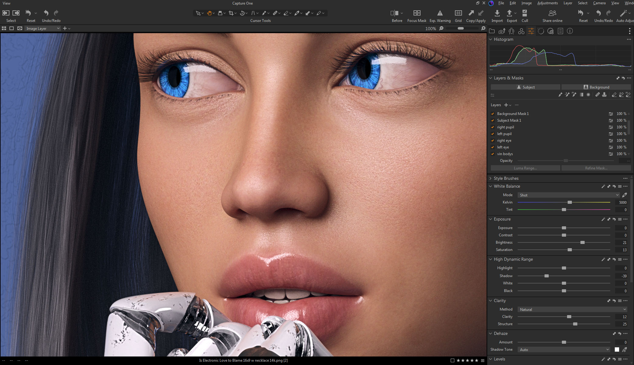 Color correction this time is in Capture One. I abandoned Lightroom a few years ago. I’m not interested in paying a subscription for my professional software. Buying a perpetual license for Capture One is actually more money but it’s worth it. If at some point I decide I can’t afford to upgrade anymore I won’t lose access to all my images and all the work I’ve done on them. Don’t ever let a company and their tools act as gatekeeper to your work. — I’m also liking the color correction controls a bit better in Capture One, thought Lightroom wasn’t bad.
Created in DAZ Studio 4.22
Rendered with Iray
Color Correction in Capture One
 #Art I made with #Midjourney #AI
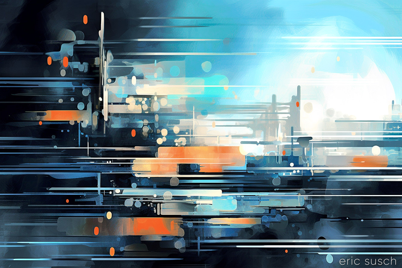 I’m very pleased with this one. It reminds me of a whip pan. I’m wondering if there is a way to synthesize a whip pan video with AI? I’ll have to look into this. I bet you could make all kinds of cool stuff. We need to get back to whip pans as transitions…
Originally this image was vertical.
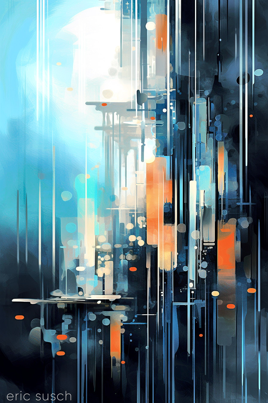 It looked great that way but just as I was finishing color correcting I tried it horizontal and liked it even better! Now I guess I have two versions. I’m probably going to print this one and, well, I guess I could hang it on the wall any which way I wanted!
#Art I made with #Midjourney #AI
 #Art I made with #Midjourney #AI
 #Art I made with #Midjourney #AI
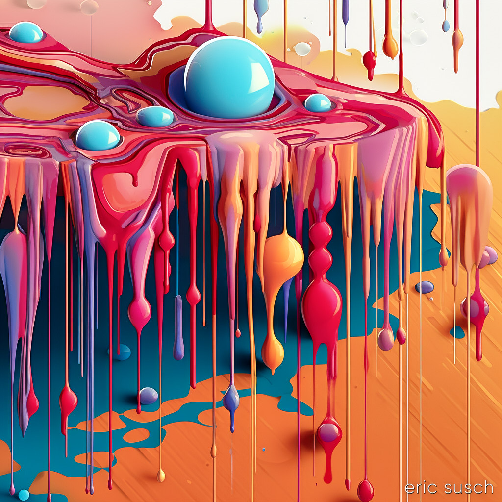
 #Art I made with #Midjourney V3 #AI
 I was looking back at all the images I rendered with Midjourney over the last year and a half. There’s some good stuff in there that got overlooked. I actually rendered this last year (2022) with Midjourney version 3.
I could have opted to crop this square and make it all about the figure, but that is so boring and just like every other image on the internet. This composition reminds me of art you would see on a gatefold vinyl LP double album from back in the day, with the front cover on the right and the back on the left, and the art continuously wrapping around.
#Art I made with #Midjourney V3 #AI
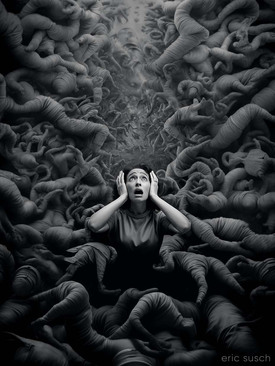 I finished two versions of this piece because I wasn’t sure which one was better. This is the closer version:
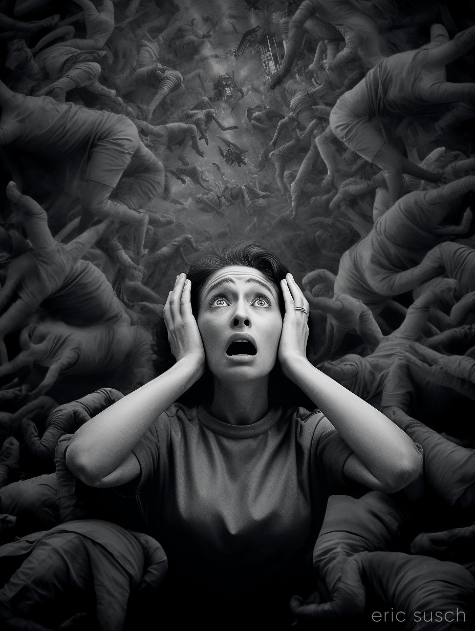 The closer version would probably work better on social media, but I really like the wider version a lot better, especially since I’m trying to design my artwork to be printed big (poster size and larger.)
Part of me resents feeling like I have to constantly cater to people looking at stuff on the internet aka on their phones. It really messes with my head when I’m trying to make creative decisions. I think I have to actively resist the temptation to reduce everything to the least common denominator of what will get the most likes when viewed on a small screen. It’s extremely limiting, not just because of the composition but also the subject matter. What will get an immediate reaction so you get the most likes? Subtly is lost and everything starts to look the same.
Social media really messes with your head.
#Art I made with #Midjourney #AI